10,000 search results
(0.021 seconds)
- Tip Me Cheapy - Unknown license

- KR Call Me - Unknown license

- Let Me Ride by Mans Greback,
$59.00
- Kiss Me Dead by PizzaDude.dk,
$20.00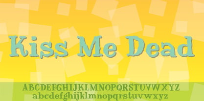
- MD-Type Rounded by MD-Type,
$25.00 MD-Type Rounded is a modern, stylish font family. The family consists of five fonts (Regular, Bold, Light, Block, Black) which are formed by all capital letters. The strong and accented letters were rounded on the corners and therefore softened. The font family supports Turkish language as well.
 - Stand By Me by Natural Ink,
$12.00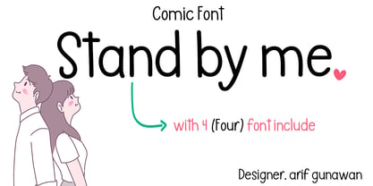 Stand By Me Display is a modern calligraphy design, including Regular. This font is casual and beautiful with swash. Can be used for various purposes. such as logos, product packaging, wedding invitations, branding, headlines, signage, labels, signatures, book covers, posters, quotes, and more.
 - Believe In Me by PizzaDude.dk,
$20.00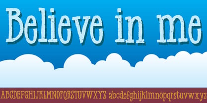
- Talk To Me by PizzaDude.dk,
$20.00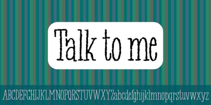
- Stay With Me by PizzaDude.dk,
$20.00Slightly grungy and blurred-edged combined with a thick stroke and a fat drop shadow. This font is eye catching in many ways! - FS Me Paneuropean by Fontsmith,
$90.00Mencap When most of us go about everyday tasks, we take for granted the reading that’s involved, on instructions, labels and so on. For people with learning disabilities, reading is made much harder by certain fonts. FS Me is designed specifically to improve legibility for people with learning disabilities. The font was researched and developed with – and endorsed by – Mencap, the UK’s leading charity and voice for those with learning disabilities. Mencap receive a donation for each font license purchased. Every letter of FS Me was tested for its appeal and readability with a range of learning disability groups across the UK. Inclusive Fontsmith were determined to design a font that was accessible to those with learning disabilities without standing out as such – one that was inclusive of all readers. It should comply with accessibility guidelines and work best at 12pt, but still have a character of its own that was warm and approachable. “So much accessible design is done separately to the main body of brand work,” says Jason Smith. “We wanted to make a typeface that covered both brand tone and neutrality, and that could be used legitimately as a brand font as well as in accessible design.” Me, you, everyone FS Me is about design that doesn’t patronise. People with learning disabilities are often treated as inferior by childlike design. FS Me is designed for adults, not children – a beautifully-designed font for everyone. Its features include very subtle distinguishing elements of each letter to aid the reading and comprehension of texts, and tails, ascenders and descenders that have been extended for extra clarity. What the people said... Here is a sample of comments from the extensive research groups that helped to shape the letterforms of FS Me: “I want something round, clear and friendly.” “We like movement in the letters but don’t want anything childish.” “The ‘b’ and ‘d’ need to be different as they can be confused.” “I prefer the handwriting-style ‘a’.” “It’s important to have an accessible ‘a’ and ‘g’. Teachers sometimes complain that learners cannot read or understand the inaccessible ‘a’ and ‘g’.” - Pardon Me Boy! by Greater Albion Typefounders,
$8.00 Pardon me boy, is that the Chattanooga Choo-choo? Well, not quite, but "Pardon Me Boy!" is a set of silhouette based ornaments capturing railway locomotives and rolling stock from around the world. Use it to form up trains to make suitable themed rules and borders, or just for fun anywhere a bit of locomotive power will add life and movement!
 - Schnebel Sans ME by URW Type Foundry,
$35.99 It took me 12 years to bring this extensive font family to completion. A lot has been changed, transformed, peeled and developed in all those years. For many of my projects I used it as my quarry and so it might have become something like a synthesis of all my imaginations and experiences. To me »Schnebel Sans« represents the optimal design of a contemporary grotesque that perfectly unites dynamics with statics. For copy text the typefaces are very legible, neutrally and remain in the background, but despite this generate the necessary tension when set as headlines. »Schnebel Sans« is available in 48 different styles. It is available as a Pro Font, containing West, East Greek, and Cyrillic or as the Schnebel Sans ME, also containing Arabic and Hebrew. The scripts include small caps and various figure sets.This big range of styles from Thin to Black and from Compressed to Expanded offer many possibilities for design and fulfill all requirements for a professional use. Because of the supplement of several non-Latin character sets, the »Schnebel Sans« is perfectly suitable for global services too. Volker Schnebel, 2016
 - P22 Ed Rogers by P22 Type Foundry,
$24.95 Ed Rogers (1925-2002) was an unlikely and unintentional art figure. Ed Rogers' vibrant lettering is compelling in its characteristic inconsistency. The Ed Rogers font set features digitized versions of his lettering for truly unique design possibilities.
 - Giambattista by Wiescher Design,
$39.50 Giambattista is a long-time project of mine finally come to an end. After redesigning all of Giambattista Bodoni's work and then some additional cuts I started a long time ago with this Non-Bodoni Bodoni. The idea came to me while redesigning the original Chancellerosa (chancery). I thought Bodoni just didn't have the right approach to a chancery, this was just not his cup of tea! Maybe that is why he never used the Chancellerosa very much for his own printshop in Parma. So I thought someone has to design a script, that looks like Bodoni could have designed it but is more lively than his. Over the years I have been working on and off on the face and it turned out to become three typefaces which can be freely mixed. Here is my modern version of a script in the style of Giambattista, meant as an hommage, I called it Giambattista. Your modern scribe Gert Wiescher
 - Font in a Red Suit - Unknown license

- Zeppelin 2 - Unknown license

- Body Copy Sans Pro by Hackberry Font Foundry,
$24.95This new OpenType pro family has four members so far with 473 characters and glyphs each. It is a redrawing of Albe Sans, which has been found to be very readable, elegant, and extremely useful for books, newsletters, or anything you need. It is a humanist sans that works well for body copy or headlines. A black version is in the works. - Lovely Amatis Signature - Personal use only

- NOW YOU SEE ME - Personal use only

- Give Me The Scoop - Unknown license

- KG Kiss Me Slowly - Personal use only

- KG Part of Me - Personal use only

- She Paints Me Blue - Personal use only

- KR Floral Color Me - Unknown license

- KR Christmas Color Me - Unknown license

- Bring Me The Horizon by Struggle Studio,
$20.00 BringMeTheHorizon is a modern handwritten display font. With Brush strokes, scribbled characters. To give you extra creative work. BringMeTheHorizon font supports multilingualism of more than 100+ languages. This font is great for logo designs, social media, Movie Titles, Book Titles, short text even long text letters and great for your secondary text font in sans or serif. Create stunning works with the BringMeTheHorizon font.
 - KG Wake Me Up by Kimberly Geswein,
$5.00 Fun blocky typewriter-esque lettering.
 - Shiver Me Timbers NF by Nick's Fonts,
$10.00Avast, me hearties! Here be a serious pirate font, based loosely on several of Victor Hammer’s uncial typefaces, designed between 1925 and 1953, and liberally weathered and corroded for that authentic barnacle-encrusted look. The bullet character is suitable for marking where the treasure is buried, and the section mark is a Jolly Roger. Both versions of the font include 1252 Latin, 1250 CE (with localization for Romanian and Moldovan). - KG Part Of Me by Kimberly Geswein,
$5.00 Very neat kid-friendly handwritten lettering.
 - KG Next To Me by Kimberly Geswein,
$5.00 Hand sketched lettering in a chalkboard, Pinterest inspired style.
 - Make Fun Of Me by PizzaDude.dk,
$20.00 This 3D lettering font was done with my inky ballpoint pen. Comes with ligatures for double lettering and alternate letters in upper- and lowercase.
 - Call Me Ishmael NF by Nick's Fonts,
$10.00 That she blows! Another disco-era delight, this typeface is based on an Affolter and Gschwind release called Moby Dick. Both versions of this font support the Latin 1252, Central European 1250, Turkish 1254 and Baltic 1257 codepages.
 - KG Call Me Maybe by Kimberly Geswein,
$5.00 Thin, neat handwritten letters.
 - Better Part Of Me by Epiclinez,
$18.00 Introducing Better Part of Me, a fun and quirky font for adding a touch of whimsy and personality to your designs. This eye-catching font is perfect for creating attention-grabbing headlines, posters, and logos. With its playful style and cheerful spirit, it's sure to brighten up your day. Better Part of Me font includes : Standard Latin Uppercase and Lowercase Numbers, symbols, and punctuations Multilingual Support. PUA Encoded and fully accessible without additional design software Simple Installations Works on PC & Mac Thank You.
 - Dont Bug Me JNL by Jeff Levine,
$29.00Don't Bug Me JNL is a collection of twenty-six of the cutest critters you've ever seen. Originally released as a freeware font in late 1999 to poke fun of the Y2K bug, the art has been cleaned up for more commercial or decorative appeal. - KG Kiss Me Slowly by Kimberly Geswein,
$5.00 Super curly letters with a playful vibe. Whimsical, fun, and cute- yet still legible enough that you can read it! Cute doesn't have to be painful to read!
 - KG All Of Me by Kimberly Geswein,
$5.00 A stamped, eroded font with the texture of a real rubber stamped image.
 - Parma by Monotype,
$29.99Giambattista Bodoni (1740-1813) was called the King of Printers; he was a prolific type designer, a masterful engraver of punches and the most widely admired printer of his time. His books and typefaces were created during the 45 years he was the director of the fine press and publishing house of the Duke of Parma in Italy. He produced the best of what are known as modern" style types, basing them on the finest writing of his time. Modern types represented the ultimate typographic development of the late eighteenth and early nineteenth centuries. They have characteristics quite different from the types that preceded them; such as extreme vertical stress, fine hairlines contrasted by bold main strokes, and very subtle, almost non-existent bracketing of sharply defined hairline serifs. Bodoni saw this style as beautiful and harmonious-the natural result of writing done with a well-cut pen, and the look was fashionable and admired. Other punchcutters, such as the Didot family (1689-1853) in France, and J. E. Walbaum (1768-1839) in Germany made their own versions of the modern faces. Even though some nineteenth century critics turned up their noses and called such types shattering and chilly, today the Bodoni moderns are seen in much the same light as they were in his own time. When used with care, the Bodoni types are both romantic and elegant, with a presence that adds tasteful sparkle to headlines and advertising. Parma was designed by the monotype Design Team after studying Bodoni's steel punches at the Museo Bodoniana in Parma, Italy. They also referred to specimens from the "Manuale Tipografico," a monumental collection of Bodoni's work published by his widow in 1818. - Margarita by PampaType,
$60.00 Alejandro Lo Celso’s tribute to Bodoni takes the form of a humorous fat face for display use, in both solid and engraved forms. Four years after Bodoni’s death, Margherita, Giambattista’s widow, published the two volumes of the famous Manuale Tipografico, a significant catalogue even today. Margarita’s curves are extremely sensual, it should be set only at huge sizes. The typeface includes several ligatures both standard and discretionary, and a set of contemporary ornaments to set nice frames and patterns. We hope you enjoy working with this fancy type. See more at PampaType.com.
 - Just Me Again Down Here - Personal use only


