10,000 search results
(0.197 seconds)
- Blaak by Mans Greback,
$19.00 Blaak is an interpretation of a Modern Classic typeface with a beautiful and strong impression for editorial design. The sharp serif combined with curves gives Blaak a fabulous, glamorous and bold look; at the same time doesn't sacrifice its functionality.
 - Italican Script by Typotheticals,
$4.00 This font is an addition to the Italican Oblique family, where the lower case characters have been redeveloped to give an impression of script. While some characters join together, there was no intention to create this style throughout the whole font.
 - Dawnora by Typomancer,
$24.00 Inspired by aurora, one of the most impressive phenomenon. Dawnora is a spirited serif font comes with various weights and many opentype features, suitable for both simple text and elegant lettering. Especially, Initials style for drop cap and special usage.
 - The Blast by Vultype Co,
$29.00 Blast is a font with a futuristic edge, geometric corners, perfect for technology theme. As with its Blast, Blast makes a strong impression in print, headlines, video, and social media – whether paired with a contrasting typeface or on its own.
 - Darken by limitype,
$17.00 Darken is a display typeface with a modern and futuristic impression with bold characters suitable for your display, headline, logo and branding needs. Darken is available in uppercase, numbers, symbols and multilingual and several alternatives. free and commercial versions available
 - Quirk Chick by Four Lines Std,
$15.00 Designed with graphic designers in mind, Quirk Chick font offers versatility and flexibility making it perfect for logos, branding, invitations, packaging, and so much more. Let your imagination run wild as you create eye-catching designs that leave a lasting impression.
 - Boldu by Ryzhychenko Olga,
$4.00 Boldu is a simple grotesque font. I created it using simple forms. I love geometry and tried use only one size of lines. Boldu was created being impressed by works of beginning of 20th century - period of strict and geometric forms
 - Hookline by WAP Type,
$15.00 HOOKLINE Font will be perfect for a variety of projects such as logo & branding, headlines, invitations, posters, flyers, wedding designs, social media posts, advertisements, product packaging, product designs, labels, photography, watermarks, special events or poster titles.
 - Radical Brush by Hanoded,
$15.00 Radical Brush is a rather radical font: I made it with a really wild brush and Chinese Ink. I’d probably use it for revolutionary posters, packaging design for extreme products or for R-rated movie posters.
 - Crossbar by Gassstype,
$27.00 Crossbar - Natural Hand Drawn Typeface Introducing of our new product that inspired by Street Tagging, graffiti style with a fun theme very good for graffity poster, Hip Hop music, kids poster, flyer, childrenbook, cartoon, comic etc
 - Rostey by Dhan Studio,
$17.00 Rostey is a beautiful calligraphic brush font, specially designed for a variety of designs today, very suitable for branding, logos, business cards, posters, invitations, greeting cards, news, product packaging, blog posters, all including personal charms etc.
 - Le Havre Rounded by insigne,
$24.99 The Le Havre series is a series of geometric sans serifs inspired by the dignified era of the passenger ship, when getting to your destination was a delight in and of itself. Le Havre Rounded is a fun and new interpretation of geometric sans serifs. Le Havre Rounded features its sister family's compressed capitals, low x-height and geometric construction, and its rounded forms lend it to be used in contemporary and technology settings. Le Havre OpenType features include twenty five alternate characters, ligatures and old style figures. The Le Havre family includes a spectrum of weights for many design options.
 - Temporal Shift by Comicraft,
$19.00You're trapped in an endless now... seconds seem to be stretching out interminably... There’s an eternity between every tick, every tock of the clock... Your consciousness is stretched to the limit as time is expanded to fill the void between each microsecond. There’s a signpost up ahead... the letters appear to stretch into infinity. Anyone know the name of the font it’s set in? See the families related to Temporal Shift & Gap Expanded: Temporal Shift & Gap & Temporal Shift & Gap Compressed Features Four fonts (Shift Regular, Shift Bold, Gap Regular & Gap Bold) with upper and lowercase characters. - Korolev Rough by Device,
$39.00 Korolev Rough is an inky, distressed version of Korolev , designed to mimic vintage letterpress, photocopies or hot metal on rough paper. A 20-weight sans serif family based on lettering by an anonymous Soviet graphic designer from the propaganda displays at the Communist Red Square parade in 1937, it has been named in honor of Sergey Pavlovich Korolyov, or Korolev, considered by many to be the father of practical astronomics. Every weight and style comes with an alternate double-story “a”. The complete Korolev family includes standard, italic, condensed, and compressed versions, each in five weights.
 - Sommet by insigne,
$24.99 Project a powerful image with Sommet. Sommet is a sans-serif with a high-tech web 2.0 feel. The typeface family is a powerful and sharp design that is highly legible onscreen even at small sizes. Sommet features a tall x-height, and its letterforms are compressed, perfect for when layout space is at a premium. Updated in early 2010, the Sommet family now includes six weights and italics for plenty of design options and is suitable for body copy and display text. Be sure to check out Sommet’s companion faces, Sommet Rounded and Sommet Slab.
 - Gramma by CAST,
$45.00 Gramma is a compact sans with big x-height, a robust and balanced typeface that work well both for headlines and main bodies of text. The initial constructions, assembled from a few well-defined geometric modules, were later polished into more organic forms; the letters’ arches are quite squared, and the counters and other internal negative spaces push outward, creating a tension that balances the forms’ compression. Gramma’s most evident characteristic is its “bird-beak” terminals (present in many letters, including the c, e, f, s...) that replicate the unconnected junctures between stem and curve, visible in the a,b,d,g,h.
 - Krooner by Nois,
$24.00 Krooner is a serif display typeface that seeks sophistication through elegance. With a compressed style and wide circular figures, it stands out as a typeface for short titles, its italic version has a high level of readability for long texts without losing its style in small sizes. The characters are created with a great level of detail that can be appreciated in its greatest splendor in large sizes. It has more than 600 characters and ligatures that together with its rational, humanist and contemporary serif features make it very versatile for a large number of applications.
 - Fact by ParaType,
$29.00 Fact is a workhorse open sans serif type system. It is inspired by the great Frutiger typeface. While the Regular style is slightly modernized but still quite close to Frutiger, changing the weight or width makes differences of the design more pronounced. The style range of Fact is wider than of any cognate type family, including weights from Thin to Black and widths from Compressed to Expanded. Fact type system contains 48 upright styles and 48 italics with variations in width and weight. The font was designed by Alexandra Korolkova and Manvel Shmavonyan and released by Paratype in 2018-2019.
 - Iki Mono by CAST,
$45.00 Iki Mono is a multifaceted monospaced typeface designed for publishing and coding. Its sans serif structure displays some letterforms (as well as a degree of contrast) that are reminiscent of 19th-century grotesques, while in the non-oblique versions the letters have been very slightly slanted leftwards. Like typewriter typefaces Iki Mono has to cope with the limitations of a width system that forces shapes into a specific space. This extensive type family of forty weights and styles – from Compressed Thin to ExtraExpanded Bold, including their slanted versions – takes its name ‘Iki’ from the Japanese word for breath.
 - Temporal by Comicraft,
$19.00 You're trapped in an endless now... seconds seem to be stretching out interminably... There’s an eternity between every tick, every tock of the clock... Your consciousness is stretched to the limit as time is expanded to fill the void between each microsecond. There’s a signpost up ahead... the letters appear to stretch into infinity. Anyone know the name of the font it’s set in? See the families related to Temporal Shift & Gap Expanded: Temporal Shift & Gap & Temporal Shift & Gap Compressed Features Four fonts (Shift Regular, Shift Bold, Gap Regular & Gap Bold) with upper and lowercase characters.
 - Brutal Milk No 1 by Casloop Studio,
$9.00 Introducing Brutal Milk Font Collection where prominence, trustworthiness, and sophistication converge. Brutal Milk is a captivating grotesque typeface that seamlessly blends the robust aesthetics of brutalism with the sleek sophistication of Swiss Design and the nostalgia of Y2K. This collection featuring three distinctive variants – Brutal Milk No1, Brutal Milk No2, and Brutal Milk No3 – offers a unique typographic journey for extraordinary design. Let's break down what we present in this work - Brutal Milk No.1 | Modern Elegance with a Brutal Twist Aims for body text with the perfect balance of elegance and modernity. Brutal Milk No.1 is meticulously crafted for optimal readability, making it an ideal choice for a wide range of applications. - Brutal Milk No.2 | Softened Brutalism for Approachable Headers Aims for display/header text with a gentle and approachable impression. Brutal Milk No.2 is crafted to add a touch of warmth to your designs, making it perfect for conveying a friendly and inviting tone. - Brutal Milk No.3 | Rigid Rebellion for Prominent Headers Make a bold statement with headers that exude firmness. Brutal Milk No.3 is designed to capture attention with its rigid impression, injecting a sense of prominence and confidence into a visual identity. The Features The Brutal Milk Font Collection comes loaded with features such as case-sensitive forms, discretionary ligatures, ordinals, fractions, denominators, numerators, superscripts, and scientific inferiors – ensuring flexibility in design needs. Language Support From Western and Central European languages to South Eastern European, South American, Oceanian, and even Esperanto, Brutal Milk Collections caters to a diverse range of linguistic needs. Brutal Milk stands as a testament to versatility and innovation. Whether you're crafting a sleek logo, establishing a brand identity, adorning decor, creating impactful posters, delivering compelling presentations, designing dynamic websites, refining UI/UX experiences, or engaging in graphic design endeavour. The impressions it imparts—modern, minimal, youthful, funky, groovy, trendy, hip, fly, and undeniably cool—speak volumes about its adaptability to contemporary design trends. Redefine the boundaries of creativity and immerse yourself in the dynamic world of Brutal.
 - Brutal Milk No 2 by Casloop Studio,
$9.00 Introducing Brutal Milk Font Collection where prominence, trustworthiness, and sophistication converge. Brutal Milk is a captivating grotesque typeface that seamlessly blends the robust aesthetics of brutalism with the sleek sophistication of Swiss Design and the nostalgia of Y2K. This collection featuring three distinctive variants – Brutal Milk No1, Brutal Milk No2, and Brutal Milk No3 – offers a unique typographic journey for extraordinary design. Let's break down what we present in this work - Brutal Milk No.1 | Modern Elegance with a Brutal Twist Aims for body text with the perfect balance of elegance and modernity. Brutal Milk No.1 is meticulously crafted for optimal readability, making it an ideal choice for a wide range of applications. - Brutal Milk No.2 | Softened Brutalism for Approachable Headers Aims for display/header text with a gentle and approachable impression. Brutal Milk No.2 is crafted to add a touch of warmth to your designs, making it perfect for conveying a friendly and inviting tone. - Brutal Milk No.3 | Rigid Rebellion for Prominent Headers Make a bold statement with headers that exude firmness. Brutal Milk No.3 is designed to capture attention with its rigid impression, injecting a sense of prominence and confidence into a visual identity. The Features The Brutal Milk Font Collection comes loaded with features such as case-sensitive forms, discretionary ligatures, ordinals, fractions, denominators, numerators, superscripts, and scientific inferiors – ensuring flexibility in design needs. Language Support From Western and Central European languages to South Eastern European, South American, Oceanian, and even Esperanto, Brutal Milk Collections caters to a diverse range of linguistic needs. Brutal Milk stands as a testament to versatility and innovation. Whether you're crafting a sleek logo, establishing a brand identity, adorning decor, creating impactful posters, delivering compelling presentations, designing dynamic websites, refining UI/UX experiences, or engaging in graphic design endeavour. The impressions it imparts—modern, minimal, youthful, funky, groovy, trendy, hip, fly, and undeniably cool—speak volumes about its adaptability to contemporary design trends. Redefine the boundaries of creativity and immerse yourself in the dynamic world of Brutal.
 - Astro Serif by Typehead Studio,
$15.00 Introducing Astro, a charming serif font designed to bring an elegant and classic touch to your designs. Crafted with meticulous attention to detail and inspired by mid-millennium Serifs, Astro seamlessly blends traditional sophistication with contemporary elements, making it suitable for a variety of design projects, both print and digital. Enchanting Letter Shape Designs: Astro exudes charm with its letter design that is heavily inspired by the mid-millennium Serifs often found in European and American designs. Each letter is carefully carved to create a charming and luxurious impression. Unique Alternative Glyphs: Astro is not just a font; it is a standout typographic masterpiece. By offering several unique alternative glyphs, such as the letters a, g, and k, Astro gives designers the freedom to express their creativity in a unique and personal way. Mid-Millennium Serif Elegance: Astro features smooth lines and proportions, creating an elegant impression characteristic of mid-millennium Serifs. This design provides a timeless classic touch making it suitable for a variety of design needs, including books, magazines, posters and other printed materials. Ease Readability: While the Astro exudes striking elegance, its design also prioritizes readability and comfort. Each letter is created with balanced proportions and optimal contrast, ensuring text appears clear and easy to read, whether on a large or small scale. Flexible Use: Astro is designed to provide flexible use across a variety of design platforms. From the logo design to the magazine layout, Astro adapts beautifully, maintaining a consistent feel that enhances the aesthetic quality of the design. European and American inspiration: Astro creates a bridge between European and American typographic styles, combining the best elements of both traditions. This makes it the perfect choice for projects that combine elements from both continents. Astro is more than just a font, it is an artistic statement that leaves an unforgettable impression on any design project. Suitable for designers who appreciate classic beauty and modern uniqueness, Astro brings a special and charming feel to every character it creates.
 - Qalloky by Ardyanatypes,
$10.00 Qalloky is a stunning representation of modern style in the serif font category. Carefully designed, this font exudes a clean and elegant impression, suitable for various graphic design projects. With rich OpenType features, Qalloky showcases versatility in its usage. The sharpness and smoothness of its letterforms give a futuristic impression while maintaining exceptional readability. Each character is crafted with precision, making every word written with Qalloky a work of art in itself. The advantages of OpenType allow limitless variations and creativity in using this font. From elegant ligatures to intriguing alternate characters, every detail is meticulously considered to provide maximum visual beauty. Not only that, the multilingual capability of this font enables its extensive use in various languages, expanding its coverage and flexibility in diverse design projects worldwide. With Qalloky, your designs will be enhanced to become more dynamic, modern, and impressive. A guide to accessing all alternatives can be read at http://adobe.ly/1m1fn4Y Adobe Photoshop go to Window - glyphs Adobe Illustrator go to Type - glyphs Features: A – Z Character Set a – z Characters set Numerals & Punctuations Ligatures & Alternates Multilingual
 - Brubecks Cube by Chank,
$99.00 A foxy, boxy, hand-drawn poster font.
 - Frontline by TypeArt Foundry,
$45.00 Thrilling titler for grade-B movie poster.
 - Profihouse by Ivan Akinin,
$9.99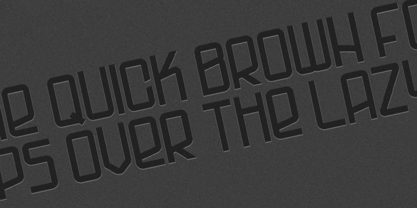 Perfect font for logo designs and posters.
 - Square Spray by Blankids,
$22.00 Introducing of our new product the name is Square Spray Graffiti Font, Square Spray inspired by graffiti style with a fun theme very good for graffity poster, Hip Hop music, kids poster, flyer, childrenbook, cartoon, comic etc
 - Bomber Throw by Blankids,
$21.00 Introducing of our new product the name is Bomber Throw Graffiti Font, Bomber Throw inspired by graffiti style with a fun theme very good for graffity poster, Hip Hop music, kids poster, flyer, childrenbook, cartoon, comic etc
 - Street Lord by Blankids,
$23.00 Introducing of our new product the name is Street Lord Graffiti Font, Street Lord inspired by graffiti style with a fun theme very good for graffity poster, Hip Hop music, kids poster, flyer, childrenbook, cartoon, comic etc
 - Bubble Boom by Blankids,
$18.00 Bubble Boom is inspired by graffiti, and fits well for themes such as graffiti posters, Hip Hop music, kids posters, flyers, children books, cartoons, comics, and more. Features included: Uppercase Lowercase Number Punctuation Multilingual PUA Encode OpenType
 - Best Strong by Yoga Letter,
$18.00 "Best Strong" is an elegant and professional blackletter font. This font is equipped with uppercase, lowercase, numerals, punctuation, and multilingual support. Very suitable for invitations, weddings, engagements, certificates, Christmas, Valentine's, winter, posters, tattoos, stickers, posters, and others.
 - EBRATHO by Twinletter,
$17.00 Ebratho is a superhero-themed display font that brings strength, courage, and modernity to your projects. With a strong, bold, and full-of-character style, this font is the perfect solution for creating an impressive and aggressive look. In every letter, Ebratho radiates soul-stirring power. Each character is designed with meticulous detail and a unique style, creating a strong and compelling impression on your audience. With a modern and charismatic look, this font will give your project an unforgettable touch. Ebratho is packed with creative tools, including ligatures and alternates, that allow you to combine elements of this font in various ways to create interesting and unique stylistic variations. Additionally, multilingual support allows you to use Ebratho in multiple languages, making your project accessible to a global audience. If you’re looking for a strong, bold, modern, and bold font with a superhero touch, Ebratho is the right choice. With benefits that include the ability to create impressive looks and creative features such as ligatures and alternates, this font will quickly catch the attention of your potential customers and make a memorable impression in no time. What’s Included : File font All glyphs Iso Latin 1 Alternate, Ligature Simple installations We highly recommend using a program that supports OpenType features and Glyphs panels like many Adobe apps and Corel Draw so that you can see and access all Glyph variations. PUA Encoded Characters – Fully accessible without additional design software. Fonts include Multilingual support
 - PAG Etiketa by Prop-a-ganda,
$19.99Prop-a-ganda offers retro-flavored fonts inspired by lettering on retro propaganda posters, retro advertising posters, retro packages all the world over. This is perfect font for your retrospective project. You may not feel strange if you find PAG Etiketa in news papers, noble film posters, or fashion magazines. This font has both a retro and modern side, so it is an all-rounder font for your design project. - PAG Bankas by Prop-a-ganda,
$19.99Prop-a-ganda offers retro-flavored fonts inspired by lettering on retro propaganda posters, retro advertising posters, retro packages all the world over. This is perfect font for your retrospective project. PAG Bankas is a vintage and old-fashioned that we can find in the posters of old silent film. Bankas’s retro forms lend itself to many design projects from branding to packaging, magazine headlines and so on. - Diaper Bag by Bellafonts,
$25.00 Diaper Bag is a ding bat font providing images related to baby: bottles, pacifiers, rattles, cribs, bassinets, safety pins, and some random things like umbrellas (for a baby shower), expecting moms, storks, baby feet, teddy bear, rubber duckey, booties, teething ring, etc. You can use these to make baby shower invites, baby announcements, and anything you can customize with your own design. Bellafonts' user license allows for commercial use so you can make products for re-sale, including services offering graphic design.
 - FF Tibere by FontFont,
$41.99 French type designer Albert Boton created this serif FontFont in 2003. The family has 7 weights, ranging from Light to Bold (including italics) and is ideally suited for book text, film and tv, editorial and publishing as well as small text. FF Tibere provides advanced typographical support with features such as swashes, ligatures, small capitals, petite capitals, alternate characters, and case-sensitive forms. It comes with a complete range of figure set options – oldstyle and lining figures, each in tabular and proportional widths.
 - Asian Railway JNL by Jeff Levine,
$29.00 A poster for the 1932 film “Shanghai Express” starring Marlene Dietrich has the films name is a semi-Asian lettering style. This bold poster font is now available as Asian Railway JNL in both regular and oblique versions.
 - Andarillo by Franklin Veiga,
$10.00 Andarillo is a display typeface inspired by vintage travel posters and magazines. The complete glyph set contains uppercase, small caps, numerals, punctuation, ligatures and multilingual support. Andarillo is perfect for logotypes, magazines, titles, posters, advertising and branding communication.
 - Hapshash by K-Type,
$20.00 Hapshash is an all capitals font inspired by the 1960s psychedelic posters of British designers Hapshash and the Coloured Coat (Michael English and Nigel Waymouth), in particular their 1968 poster for the First International Pop Festival in Rome.