3,182 search results
(0.016 seconds)
- Bodoni Black Condensed by Red Rooster Collection,
$45.00 Designed by R.H. Middleton for Ludlow, circa 1930. Digitally engineered by Steve Jackaman.
 - Ghitta Bodoni Cancellaresca by Spurnej Type Foundry,
$39.00 Giambattista Bodoni was an Italian engraver, printer, and publisher who was one of the best typographers of the 18th century and became known worldwide for his iconic serif typeface. In the posthumous edition of Bodoni’s “Manual of Typography” published in 1818 by his widow Margherita “Ghitta” Dall’Aglio may also be found, among the other treasures, the Cancellaresca (Chancery). Ghitta is a redesign of this typeface in its finest form. With strong stroke contrast in 4 optical grades, 850 glyphs with wide range of language support, accented ligatures, oldstyle figures, 8 stylistic sets, and unique way of letter connection, Ghitta Bodoni Cancellaresca follows and builds on the best of Bodoni’s historical prototype and shifts further to a contemporary script typeface full of grace, neatness, and beauty. *** This font is powered by OpenType feature “Ligatures”, so it is necessary to have this function turned on. If you need support or more information, please kindly contact me: spurnej@email.cz
 - Bodoni Classic Chancery by Wiescher Design,
$55.00 I became interested in designing Bodoni Classic because of a lazy graphic designer at Jacques Damase publishing house. He had to change a single letter on a bookcover about J. B. BODONI. The French call him Jean Baptiste instead of Giambattista! And that unknown graphic designer just took any old “J” from some newly cut Bodoni. All the new Bodoni cuts have square serifs, whereas the originals had rounded serifs and slightly concave feet. The single letter “J” with the squared off serif was for me like a road sign to start redesigning the entire Bodoni family. That’s exactly what I started in 1993 and a dozen years later I am finished. Okay, I am still adding new Bodoni Classics, but those are my personal additions. Yours very retro, Gert Wiescher
 - Bodoni Classic Swashes by Wiescher Design,
$39.50 Bodoni Classic Swashes is my personal addition to Bodoni’s family of typefaces. Bodoni did not design a decorative version. His quest was for purity in book design. Even though in his days it was not called design; he thought of himself purely as a printer. But I think, especially after visiting the Bodoni museum in Parma, if Giambattista were alive today he would design a decorative typeface. Yours classico, Gert Wiescher
 - Bodoni Classic Fleurs by Wiescher Design,
$39.00 Bodoni Classic Fleurs is beautifully decorated with lots of alternate glyphs for many languages.
 - ITC Bodoni Brush by ITC,
$29.99Giambattista Bodoni (1740-1813) was called the King of Printers; he was a prolific type designer, a masterful engraver of punches and the most widely admired printer of his time. His books and typefaces were created during the 45 years he was the director of the fine press and publishing house of the Duke of Parma in Italy. He produced the best of what are known as modern" style types, basing them on the finest writing of his time. Modern types represented the ultimate typographic development of the late eighteenth and early nineteenth centuries. They have characteristics quite different from the types that preceded them; such as extreme vertical stress, fine hairlines contrasted by bold main strokes, and very subtle, almost non-existent bracketing of sharply defined hairline serifs. Bodoni saw this style as beautiful and harmonious-the natural result of writing done with a well-cut pen, and the look was fashionable and admired. Other punchcutters, such as the Didot family (1689-1853) in France, and J. E. Walbaum (1768-1839) in Germany made their own versions of the modern faces. Even though some nineteenth century critics turned up their noses and called such types shattering and chilly, today the Bodoni moderns are seen in much the same light as they were in his own time. When used with care, the Bodoni types are both romantic and elegant, with a presence that adds tasteful sparkle to headlines and advertising. ITC Bodoni™ was designed by a team of four Americans, after studying Bodoni's steel punches at the Museo Bodoniana in Parma, Italy. They also referred to specimens from the "Manuale Tipografico," a monumental collection of Bodoni's work published by his widow in 1818. The designers sought to do a revival that reflected the subtleties of Bodoni's actual work. They produced three size-specific versions; ITC Bodoni Six for captions and footnotes, ITC Bodoni Twelve for text settings, and ITC Bodoni Seventytwo - a display design modeled on Bodoni's 72-point Papale design. ITC Bodoni includes regular, bold, italics, Old style Figures, small caps, and italic swash fonts. Sumner Stone created the ornaments based on those found in the "Manuale Tipografico." These lovely dingbats can be used as Bodoni did, to separate sections of text or simply accent a page layout or graphic design." - Bodoni Classic Text by Wiescher Design,
$55.00 I became interested in designing Bodoni Classic because of a lazy graphic designer at Jacques Damase publishing house. He had to change a single letter on a bookcover about J. B. BODONI. The French call him Jean Baptiste instead of Giambattista! And that unknown graphic designer just took any old “J” from some newly cut Bodoni. All the new Bodoni cuts have square serifs, whereas the originals had rounded serifs and slightly concave feet. The single letter “J” with the squared off serif was for me like a road sign to start redesigning the entire Bodoni family. That’s exactly what I started in 1993 and a dozen years later I am finished. Okay, I am still adding new Bodoni Classics, but those are my personal additions. Yours very retro, Gert Wiescher
 - Bodoni Campanile Pro by Red Rooster Collection,
$60.00 Bodoni Campanile Pro is a font that bridges the gap between a “fat” and a compressed traditional serif typeface. It was originally designed in 1936 by Robert H. Middleton for Ludlow. International TypeFounders exclusively licensed the family from the Ludlow Collection, and Steve Jackaman (ITF) produced a digital version in 1998. Jackaman completely redrew the font for its 2017 release. Bodoni Campanile Pro, much like its transitional status as a font, is successful in both formal and casual roles. The free-flowing aspects of the family, seen especially in the lowercase ‘g’ and the leg of the uppercase ‘R,’ give the family an air of elegance.
 - Bodoni Sans Text by J Foundry,
$25.00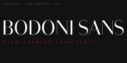
- LTC Bodoni 26 by Lanston Type Co.,
$24.95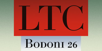
- Bodoni Classic Inline by Wiescher Design,
$49.00 Bodoni Classic Inline is a very elaborate extension of my Bodoni Classic family. The font has 5 different swashes for each capital letter, diverse swashes for lowercase letters and a full set of ligatures, oldstyle and normal numerals, all together 669 glyphs. This Inline font is good for all kind of official looking documents and of course goes together well with my forever growing Bodoni Classic family. Your Bodonian type-designer Gert Wiescher
 - New Bodoni DT by DTP Types,
$49.00A revival design by Malcolm Wooden of DTP Types Limited with associated Small Capitals and Old Style Figures. - ITC Bodoni Six by ITC,
$40.99Giambattista Bodoni (1740-1813) was called the King of Printers; he was a prolific type designer, a masterful engraver of punches and the most widely admired printer of his time. His books and typefaces were created during the 45 years he was the director of the fine press and publishing house of the Duke of Parma in Italy. He produced the best of what are known as modern" style types, basing them on the finest writing of his time. Modern types represented the ultimate typographic development of the late eighteenth and early nineteenth centuries. They have characteristics quite different from the types that preceded them; such as extreme vertical stress, fine hairlines contrasted by bold main strokes, and very subtle, almost non-existent bracketing of sharply defined hairline serifs. Bodoni saw this style as beautiful and harmonious-the natural result of writing done with a well-cut pen, and the look was fashionable and admired. Other punchcutters, such as the Didot family (1689-1853) in France, and J. E. Walbaum (1768-1839) in Germany made their own versions of the modern faces. Even though some nineteenth century critics turned up their noses and called such types shattering and chilly, today the Bodoni moderns are seen in much the same light as they were in his own time. When used with care, the Bodoni types are both romantic and elegant, with a presence that adds tasteful sparkle to headlines and advertising. ITC Bodoni™ was designed by a team of four Americans, after studying Bodoni's steel punches at the Museo Bodoniana in Parma, Italy. They also referred to specimens from the "Manuale Tipografico," a monumental collection of Bodoni's work published by his widow in 1818. The designers sought to do a revival that reflected the subtleties of Bodoni's actual work. They produced three size-specific versions; ITC Bodoni Six for captions and footnotes, ITC Bodoni Twelve for text settings, and ITC Bodoni Seventytwo - a display design modeled on Bodoni's 72-point Papale design. ITC Bodoni includes regular, bold, italics, Old style Figures, small caps, and italic swash fonts. Sumner Stone created the ornaments based on those found in the "Manuale Tipografico." These lovely dingbats can be used as Bodoni did, to separate sections of text or simply accent a page layout or graphic design." - Bodoni Egyptian Pro by Shinntype,
$59.00 Beneath the dominant signifier of identity, a surprising dimension of Bodoni is revealed—its core architecture, stripped of the famous high contrast cloak. Further subverting typographic norms, a monoline of even width (in all but the heaviest weights) here describes capitals, lower case, and serifs. And yet a certain quaintness is evident; this is, after all, both deconstruction and historical fiction.
 - Bodoni Old Fashion by URW Type Foundry,
$35.00
- Bodoni Classic Pro by Wiescher Design,
$49.50 This is my new, completely worked over and fine-tuned Bodoni Classic for Europe (no Greek and Cyrillic). I have added a set of elegant Swashes (B) and 2 alternating uppercase swirly Initials (C) as well as two lowercase end-letters (D). The fonts A and B have extensive kerning, which the initials (C) don't need, they are aligned to replace the standard capital letter. The lowercase end-letters (D) are aligned to replace the standard lowercase letters, so you might need to add a blank after the swirl. For good measure I throw in an extra set of swings for 1 Dollar (E). Your Bodoni maniac, Gert Wiescher
 - Bodoni Classic Hand by Wiescher Design,
$55.00 I became interested in designing Bodoni Classic because of a lazy graphic designer at Jacques Damase publishing house. He had to change a single letter on a bookcover about J. B. BODONI. The French call him Jean Baptiste instead of Giambattista! And that unknown graphic designer just took any old “J” from some newly cut Bodoni. All the new Bodoni cuts have square serifs, whereas the originals had rounded serifs and slightly concave feet. The single letter “J” with the squared off serif was for me like a road sign to start redesigning the entire Bodoni family. That’s exactly what I started in 1993 and a dozen years later I am finished. Okay, I am still adding new Bodoni Classics, but those are my personal additions. Yours very retro, Gert Wiescher
 - Poster Bodoni WGL by Bitstream,
$49.00A slightly more refined revival of the Fat Face, as supervised by Chauncey Griffith at Mergenthaler one year after ATF’s Ultra Bodoni. - Bodoni At Home by Resistenza,
$39.00
- MPI Bodoni Ultra by mpressInteractive,
$5.00 Old Style is an example of classic roman type design. It has little contrast in stroke weight, small rounded serifs, open characters, and is very easy to read. It is based on wood type of unknown origin.
 - Bodoni Classic Swirls by Wiescher Design,
$39.50 Bodoni Classic Swirls breaks all the rules. The idea of Bodoni typefaces is no embellishments and here I go again and do another decorated set of Bodonis. But I find this is another very nice and useful typeface for all kinds of cards and certificates. Enjoy! Yours, again breaking the rules, Gert Wiescher
 - Bodoni Classic Cyrillic by Wiescher Design,
$55.00 One day shortly after Christmas 2004, the art-director of Vogue Moscow called me. Would I maybe make a Cyrillic version of my Bodoni Classic Text typeface? Well, since I had been thinking about doing it since a long time, this was the perfect reason to finally do it. It was not an easy venture, since I do not have the faintest idea of Russian but, together with those nice people in Russia and a fellow helpful type designer in Kiev, I managed. I did an enormous amount of kerning, thanks to the help of the Moscow Vogue office. Here the fonts are now for all of you: five text cuts, plus one standard roman cut that has no Cyrillic letters but an extra set of medieval numbers. At Vogue they are happy with the fonts, even though I did not quite adhere to Bodoni's originals in this case. Nastarowje (or whatever you say in Russia), Gert Wiescher
 - CAL Bodoni Casale by California Type Foundry,
$47.00 This typeface has been beloved throughout history. Bodoni used it to print his first masterwork, but it has never before been publicly available. Now available for the first time, CAL Bodoni Casale has been painstakingly crafted from hi-res scans of 4 original Bodoni printings. Unlike many Bodonis drawn from computerized straight lines, this Bodoni follows the original contours of the master himself. With small caps, old style numbers, special options for $, %, £, €, Bodoni Casale allows you to make elegant pricing, sales signs, or logos. Besides it's authentic origins, Casale's 21st century debut includes Features & Alternates never seen before, including Frankenfont (giving the font 6 fun alternative uses with 1 click!). Other alternates, such as the $ and €, give the user options when styling their work. Various word and letter spacing options are also automatically included so the user can choose to preserve Bodoni's original spacings or go with a more modern look. The Bodoni for White on Black Most Bodoni fonts will start to disappear on black. Bodoni Casale’s robust strokes don’t disappear, even when set to smaller sizes. The robust strokes of this Bodoni font also lend visibility and legibility at large sizes with dark background, such as on signage. What You Get ✓Bodoni's original font, Roman + Italic and small caps ✓Style Sets for quick and beautiful formatting ✓5 Unicase Options ✓An army of percentage signs, dollar signs, and money symbols. ✓Punctuation Options for any reading situation ✓A Realistic and Inky look ✓Designed by Bodoni Himself For a Full Tour of Bodoni Casale, here's a video!
 - Bodie MF - Unknown license

- LC Body - Unknown license

- Rustproof Body - Unknown license

- Body Shaking by Shape Studio,
$12.00 Introducing "Body Shaking" Body Shaking- A Halloween Font You Can Mix And Match for Your Awesome Project This fonts is ideal for crafting, branding and decorate your any project. This fonts are perfect for wedding invitation or your blog. Also with their help, you can create a logo or beautiful frame for your home. Or just use for your business, book covers, stationery, marketing, magazines and more. FEATURES : Uppercase & Lowercase Number & Punctuation Multilingual Language PUA Encode
 - Heavenly Bodies by Aah Yes,
$0.25 All 6 fonts use the characters A - K and a - k to show two planets/stars/moons moving across each other. Nice and simple. There's a different number of points on the stars, or they're different sizes, and some appear to pass left-to-right, and some appear to pass the other way. Just type in ABCDEFGHIJK or abcdefghijk and you'll see. Two fonts have all the characters on the same level, (All-Black and Black+White). The Offset font has the 'sun/moon' with one slightly above the other and in black and white, and Half has them all-black. Partial has them even further separated in 2-tone. NearMiss is a very close shave. Comma, hyphen, and full stop/period give just a single symbol; there's a Space, and that's it.
 - Body Goat by Typodermic,
$11.95 Welcome to the bizarre world of typography where the surreal meets the extraordinary! Introducing Body Goat, a hand-painted display typeface that will leave you spellbound. Its compact design may seem unassuming at first, but the inky quality of its letters draws you in with a hypnotic effect. But that’s just the beginning. When Body Goat is colored, it transforms into a fantastical creature that is both playful and powerful. Its casual appearance is deceptive, as it is perfect for creating headlines that command attention and make a bold statement. With Body Goat, you can create a world that defies the norms of typography, where the rules are rewritten, and the possibilities are endless. Whether you’re a designer, artist, or just a curious outsider, let Body Goat take you on a journey of surreal proportions. Most Latin-based European writing systems are supported, including the following languages. Afaan Oromo, Afar, Afrikaans, Albanian, Alsatian, Aromanian, Aymara, Bashkir (Latin), Basque, Belarusian (Latin), Bemba, Bikol, Bosnian, Breton, Cape Verdean, Creole, Catalan, Cebuano, Chamorro, Chavacano, Chichewa, Crimean Tatar (Latin), Croatian, Czech, Danish, Dawan, Dholuo, Dutch, English, Estonian, Faroese, Fijian, Filipino, Finnish, French, Frisian, Friulian, Gagauz (Latin), Galician, Ganda, Genoese, German, Greenlandic, Guadeloupean Creole, Haitian Creole, Hawaiian, Hiligaynon, Hungarian, Icelandic, Ilocano, Indonesian, Irish, Italian, Jamaican, Kaqchikel, Karakalpak (Latin), Kashubian, Kikongo, Kinyarwanda, Kirundi, Kurdish (Latin), Latvian, Lithuanian, Lombard, Low Saxon, Luxembourgish, Maasai, Makhuwa, Malay, Maltese, Māori, Moldovan, Montenegrin, Ndebele, Neapolitan, Norwegian, Novial, Occitan, Ossetian (Latin), Papiamento, Piedmontese, Polish, Portuguese, Quechua, Rarotongan, Romanian, Romansh, Sami, Sango, Saramaccan, Sardinian, Scottish Gaelic, Serbian (Latin), Shona, Sicilian, Silesian, Slovak, Slovenian, Somali, Sorbian, Sotho, Spanish, Swahili, Swazi, Swedish, Tagalog, Tahitian, Tetum, Tongan, Tshiluba, Tsonga, Tswana, Tumbuka, Turkish, Turkmen (Latin), Tuvaluan, Uzbek (Latin), Venetian, Vepsian, Võro, Walloon, Waray-Waray, Wayuu, Welsh, Wolof, Xhosa, Yapese, Zapotec Zulu and Zuni.
 - Isle Body by Mans Greback,
$19.00 Isle Body is a high-quality serif typeface family, drawn by Måns Grebäck during 2018 and 2019. It is a sweet font with a casual and calm look, with generous spacing and an even weight, adapted for body texts and small sized type settings. It comes in four weights, each one as italic, totaling in eight styles: Light and Light Italic, Medium and Medium Italic, Bold and Bold Italic, Black and Black Italic. The font family can be used in a combination with a font of a different style, or together with its sister font Isle Headline, also a serif font, which has the same basic structure but more distinct weights and a sharper look. Each style contains ligatures and support for a wide range of languages.
 - Body Art by Celebrity Fontz,
$24.99Body Art is a unique font whose upper-case and lower-case characters are formed by combining the silhouettes of two to four men and women of different figures and sizes to form the letters of the alphabet. Each of these carefully orchestrated combinations of human silhouettes is its own unique example of inspired typographic body art. - Body Friend by Create Big Supply,
$15.00 Body Friend is a cute Display Sans Serif script typeface with a playful look. This type of font is very suitable to be applied especially to logos, and various other formal forms such as invitations, labels, logos, magazines, books, greeting cards, packaging, fashion, make up, stationery, novels, labels, covers or whatever. Features: Uppercase & lowercase Numbers and punctuation Multilingual PUA Encoding Full Character Set !"#$%&()*+,-./:;?@ABCDEFGHIJKLMNOPQRSTUVWXYZ[\]^_abcdefghijklmnopqrstuvwxyz{|}~ ¡¢£¤¥§©ª«®°±²³¹º»¿ÀÂÃÄÅÆÇÈÉÊËÌÍÎÏÑÒÓÔÕÖ×ØÙÛÜÝÞßàáâãäåæçèéêëìíîïñòóôõö÷øùúûüýþÿıŒœŠšŸž–—‘’“”†•‹›€−
 - Body Pretty by Create Big Supply,
$15.00 Body Pretty is a Monoline Bold Script. Perfect for all your design needs such as branding designs, logos, and more. This font is PUA encoded which means you can access all the amazing glyphs and ligatures easily Features: Uppercase & lowercase Numbers and punctuation Multilingual Ligatures Alternates PUA Encoding Full Character Set !"#$%&'()*+,-./0123456789:;?@ABCDEFGHIJKLMNOPQRSTUVWXYZ[\]^_`abcdefghijklmnopqrstuvwxyz{|}~¡¢£¤¥§¨©ª«®¯°±²³´¹º»¿ÀÁÂÃÄÅÆÇÈÉÊËÌÍÎÏÑÒÓÔÕÖ×ØÙÚÛÜÝÞßàáâãäåæçèéêëìíîïñòóôõö÷øùúûüýþÿ•†‹›?–ˆ?˜€“‘ŸœŒš?”’?žŠ
 - Today I Feel - Personal use only

- Today Sans Now by Elsner+Flake,
$59.00 With the publication of the “Today Sans Now” Elsner+Flake extends its offering of the “Today Sans Serif” type family, developed in 1988 by Volker Küster for Scangraphic, by another cut so that the gradation of the stroke width can now be more finely calibrated. The type complement is available for 72 Latin-based languages as well as Cyrillic. Where available, small caps were integrated, and mathematical symbols as well as fractions were included. In order to make the symbols for text applications in regard to headlines more flexible, the insertions which were formerly added, for technical reasons in order to sharpen the corners, were eliminated, and the optical size adjustments of the vertical and diagonal stem endings (I, v, H, V) to the horizontal bars (z, Z) were scaled back. Already since the end of 1984, Volker Küster experimented with broad sticks of chalk and a broad felt pen in order to develop a new sans serif typeface which, in the interest of easy legibility, would be built on the basic structures and proportions of the Renaissance-Antiqua. Using a normal angle of writing, his experiments lead to the form structure of the characters: a small contrast between bold and light weights, serif-like beginning and end strokes in some of the lower-case characters, and the typical, left-leaning slant of all round lower-case letters and the typical left-leaning axis of all round letter forms. In this way, a rhythmization of a line of type was achieved which created a lively image without being “noisy”. With this concept, Volker Küster has enlarged the Sans Serif by a distinctive, trend-setting form variation.
 - Today I Feel by Kimberly Geswein,
$5.00 Cute emoticons showing a variety of smiles, frowns, and faces and words reflecting those emotions.
 - Today We Escape by PizzaDude.dk,
$20.00 Today We Escape has got rugged edges and a slightly worn surface without overdoing it. The letters are ALL CAPS, but upper and lower case are different. Today we escape comes with substitution characters for double letters!
 - Bouncy PERSONAL USE ONLY - Personal use only

- Wood Type Bodoni JNL by Jeff Levine,
$29.00 Wood Type Bodoni JNL is a variant of the popular ultra bold version of the classic Bodoni design, with variants in character widths and shapes. Based on a vintage set of wood type, the "hairline" strokes of the 4 and 8 have been made ever-so-slightly thicker in spots to add a modest amount of additional contrast.
 - Bodoni No. 1 SB by Scangraphic Digital Type Collection,
$26.00Since the release of these fonts most typefaces in the Scangraphic Type Collection appear in two versions. One is designed specifically for headline typesetting (SH: Scangraphic Headline Types) and one specifically for text typesetting (SB Scangraphic Bodytypes). The most obvious differentiation can be found in the spacing. That of the Bodytypes is adjusted for readability. That of the Headline Types is decidedly more narrow in order to do justice to the requirements of headline typesetting. The kerning tables, as well, have been individualized for each of these type varieties. In addition to the adjustment of spacing, there are also adjustments in the design. For the Bodytypes, fine spaces were created which prevented the smear effect on acute angles in small typesizes. For a number of Bodytypes, hairlines and serifs were thickened or the whole typeface was adjusted to meet the optical requirements for setting type in small sizes. For the German lower-case diacritical marks, all Headline Types complements contain alternative integrated accents which allow the compact setting of lower-case headlines.


