3,182 search results
(0.016 seconds)
- Monotype Bodoni by Monotype,
$40.99 Bodoni expresses the beginning of the Industrial Revolution; its serifs are flat, think and unbracketed, while the stress is always on the mathematically vertical strokes. Bodoni believed in plenty of white space and therefore descenders are long. The M is rather narrow; in the Q the tail at first descends vertically and the R has a curled tail. The italic, like most continental modern faces, has roman serifs. Monotype Bodoni provides a clear-cut effect due to its simplicity. It reproduces well, particularly in sizes over 12pt. This font is slightly darker than Bauer Bodoni. The contrast makes Monotype Bodoni appear more condensed.
 - Bodoni Serial by SoftMaker,
$15.99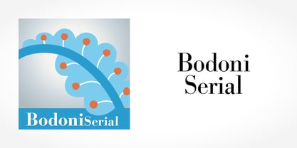
- Shore Bodoni by BA Graphics,
$45.00A Bold new re cut of Bodoni, designed with a more contemporary look. Also has matching Italic. - Donna Bodoni by Wiescher Design,
$39.50 DonnaBodoni was inspired by David Farey. He once wrote, somebody should honor the widow of Giambattista Bodoni the brave Signora Paola Margherita Dall 'Aglio for her effort to have the Manuale tipografico di Giambattista Bodoni published after his death. Since I have redesigned a good deal of Bodoni’s work and added some of my own, I thought it was my duty to do at least this for Bodoni’s unknown widow. Here is my 3-cut script in her honor. The design is remotely based on Bodoni’s English-Initials. Your honorable Gert Wiescher
 - Eurotypo Bodoni by Eurotypo,
$48.00 Talking about the numerous types that today bear the name of Giambattista Bodoni are a kind of tribute as much to his reputation as a printer as to his ability as designer and engraver. In fact, all of them tent to be more in the way or style of Bodoni than simply copy of his letterforms. Like many other type designers, we’ve been seduced also to develop our own point of view of his work, nowadays enriched by some features of OpenType format that allows a variety of combinations: standard ligatures, discretional ligatures, stylistic alternates and old styles figures. Whereas the Bodoni serif in the capitals was of the same weight as the thin stroke but joined with a very slight fillet (Bracket) and the lowercase serif were like his French rivals, the Didots, featured straight- edged serifs that were unbracketed. The ascenders and descenders of this new Bodoni are shorter, giving in this way, more space for enlarge x high. Specially designed for editorial design and advertising, can be used in magazines, annual reports and all kind of fine print materials or web pages. The beauty of his letterforms can enrich headlines; this font can also be used as body text for its good legibility and accurate kerning.
 - Bodoni Sans by J Foundry,
$25.00Bodoni Sans is a new classic built on the foundation of two centuries of history. Fresh and contemporary, while feeling familiar. Stylish and sophisticated, confident and elegant. Bodoni Sans is more than just chopping off the serifs. The classical proportions of the capitals and x-heights were maintained, but the letterforms were rebalanced for use without serifs. Contemporary modifications were made to some widths, as well as an all new Light weight was created. High contrast is the key feature of Bodoni Sans. To maintain this contrast over a wide range of sizes, three optical sizes were drawn: Standard, Display and Text. Contrast adjustments were made for each optical size for optimal performance. The Standard was designed for the mid range of 12 to 60pt, Display for 48pt and above, and Text for 6 to 12pt. Web/Digital use was also considered while developing Bodoni Sans. The fonts were tested as web formats, and examined on a variety of screens, to ensure seamless use in both print and digital applications. - Bodoni Comedia by Wiescher Design,
$39.50 Bodoni Comedia is for the funny, happy things in life. I really enjoyed doing this one. - your funny type designer Gert Wiescher
 - Bodoni Poster by Linotype,
$29.99 Giambattista Bodoni (1740–1813) was called the King of Printers and the Bodoni font owes its creation in 1767 to his masterful cutting techniques. Predecessors in a similar style were the typefaces of Pierre Simon Fournier (1712–1768) and the Didot family (1689–1836). The Bodoni font distinguishes itself through the strength of its characters and embodies the rational thinking of the Enlightenment. The new typefaces displaced the Old Face and Transitional styles and was the most popular typeface until the mid-19th century. Bodoni’s influence on typography was dominant until the end of the 19th century and even today inspires new creations. Working with this font requires care, as the strong emphasis of the vertical strokes and the marked contrast between the fine and thick lines lessens Bodoni’s legibility, and the font is therefore better in larger print with generous spacing. Chauncey H. Griffith’s Poster Bodoni displays characteristics of the advertisement fonts of the first half of the 20th century. The font was most often used for posters and signs, eventually including neon signs.
 - Bodoni Ornamental by FontMesa,
$30.00 New for 2020 Bodoni Ornamental now has two italics to choose from, one basic italic and a second which is more of a true italic with a few uppercase letters that have been stylized. Only one italic can be style linked to the regular upright version so in the second italic we've added Avanti to the name which means forward in Italian. When purchasing the regular upright and Avanti italic together they will install as two separate families. Bodoni Ornamental is a revival of a very old typeface based on the Poster Bodoni letter shape. Giambattista Bodoni passed away in 1813, this decorative version was created in the 1820’s or 1830’s which was the time period when many of these ultra bold decorated type faces began to appear, the original artist is currently unknown. The original version of this ornate classic was only available as a set of uppercase letters, today over one hundred eighty years later this font is now complete with a new lowercase, numbers and accented characters for Eastern, Central and Western European countries. Due to the ornate detail in Bodoni Ornamental when printing itís recommended to use a laser printer 600dpi or greater, a 1200dpi printer will give you the best results rendering the most detail at the smallest possible point size for this font. Small home user Ink Jet printers are not recommended for Bodoni Ornamental unless you set the font to a very large point size. With Ink Jet printers much of the detail in the letters will bleed together as the ink hits the page, commercial Ink Jet printers such as GiclÈe printers may give good results. When using Bodoni Ornamental for digital images including web site graphics it may help to add a one pixel stroke fill around the letters setting color to white or grey, this may help the web site images display better on some computer's. You will need a photo editing application such as Adobe Photoshop to create your image adding the stroke fill and save as a jpg , png or gif file. I hope you enjoy this old font as much as I did making it. Note: When previewing the Bodoni Ornamental font in the Windows font preview you may notice some letters appearing lighter and some darker, this is a problem with the preview window and some ornate fonts, Bodoni Ornamental will print normal and not with mixed light and dark letters.
 - Freaky Bouncy by Allouse Studio,
$16.00 Proudly Presenting, Freaky Bouncy A Bold Handwritten Font. Freaky Bouncy is perfect for any titles, logo, product packaging, branding project, megazine, social media, wedding, or just used to express words above the background. Freaky Bouncy also come with Multi-Lingual Support. Enjoy the font, feel free to comment or feedback, send me PM or email. Thank You!
 - Bodoni Classic by Wiescher Design,
$55.00 I became interested in designing Bodoni Classic because of a lazy graphic designer at Jacques Damase publishing house. He had to change a single letter on a bookcover about J. B. BODONI. The French call him Jean Baptiste instead of Giambattista! And that unknown graphic designer just took any old “J” from some newly cut Bodoni. All the new Bodoni cuts have square serifs, whereas the originals had rounded serifs and slightly concave feet. The single letter “J” with the squared off serif was for me like a road sign to start redesigning the entire Bodoni family. That’s exactly what I started in 1993 and a dozen years later I am finished. Okay, I am still adding new Bodoni Classics, but those are my personal additions. Recently I designed a family of seven »Bodonian Script« fonts, that can be mixed with most of my Bodonis. Yours very retro, Gert Wiescher
 - Bodoni Unique by Monotype,
$29.99This Bodoni caps only font was an experiment from Dave Farey how tall such a Bodoni could be elongated in its design. It reminds to the look of a fence, but in large sizes it may fit on a narrow window. - Bodoni FB by Font Bureau,
$40.00 Working at American Type Founders from a Bruce Foundry recutting, Morris Fuller Benton worked out the dramatics of the English Fat Face, and in 1928 produced Ultra Bodoni, a headline spectacular. Using Benton’s 1933 Ultra Bodoni Extra Condensed, Richard Lipton digitized Bodoni FB Bold Condensed, then took compression even further and designed Bodoni FB Bold Compressed, a real technical tour de force; FB 1992
 - Body by Zetafonts,
$39.00 Body graphic project at Behance Body is a type family designed for Zetafonts by Cosimo Lorenzo Pancini with Andrea Tartarelli. Conceived as a contemporary alternative to modernist superfamilies like Univers or Helvetica, Body tries to maximize text readability while providing a wide range of options for the designer. It comes in two variants (Body Text and Body Grotesque), each in four widths and four weights: regular and bold for basic typesetting, light and extrabold for display use. Body Grotesque applies to the sans serif modernist skeleton little imperfections and quirks inspired by our research in early 20th century type specimens. Curves are slightly more calligraphic and a light inverse contrast is applied to bold weights, giving the typeface a slight vintage appearance in display use. Body Text, on the contrary, challenges the modernist aesthetics maximizing horizontal lines and using open terminals for letters like “s” and “a” that appear normally dark in modernist grotesques. For both variants, the normal width family is slightly condensed in an effort to maximize space usage; the Slim width is provided for extremely dense texts or side notes while the Fit width is optimized for display usage as in logos, headings or titles. The Large width manages to look elegant in its light weight while becoming a valid heading or subtitle font in its extrabold weights. All the 64 fonts in the Body superfamily include a complete latin extended character set with small caps for over 70 languages, Russian cyrillic, open type positional numbers, stylist sets and alternate forms.
 - Youth Today by Crumphand,
$20.00 hello, Introducing the new textured brush fonts Youth Today Youth Today is textured brush (Transparency) fonts. easy to read, easy to access opentype, good kerning, strong. what's included inside the fonts ? Uppercase Lowercase Numerals Symbols Stylistic Set 1 Stylistic Set 2 Standart Ligature European Multilingual Thank You, Regards!
 - Wakeup Today by Gassstype,
$23.00 Wakeup Today - Slab Rough Brush Font Club Strong Brush Font is a Authentic brush Font that is written casually and quickly. Every glyphs are made with Procreate. Then trace down into a vector format, and carefully crafted into a typeface. That is why Wakeup Today has rough, authentic and strong characteristic more natural look. You can activate Ligature OpenType panel. Wakeup Today Perfect for designs,branding projects, Logo design, Quotes product packaging and another Project thet require cool strong brush font.
 - Editorial Today by UICreative,
$23.00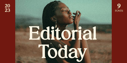 Introducing our new product the name Editorial Today Serif Font Family comes with 9 different weights. Modern Serif font that feels beautiful classy, elegant, and modern. This font is perfectly suited for a wide variety of projects, such as signature, stationery, logo, wedding, typography quotes, magazine or book covers, website headers, clothing, branding, packaging design, and more. Also for fashion-related branding or editorial design and displays both masculine and feminine qualities.
 - Cherish Today by Sarid Ezra,
$15.00 Cherish Today is a quotable handwritten sans with cutout form. You can use this font for any project such as a merchandise, t-shirt design, or simple quotes. This font will make your project more natural and humanist. Cherish Today is a nice and never goes wrong choice for your instagram post! This font also contains unique lowercase that will make your project less ordinary. This font also support multilingual.
 - Monday Today by Sensatype Studio,
$15.00 Monday Today is a fun and playful cute typeface. It is perfect for logotype, flyer, greeting cards, packaging, book cover, printed quotes, headings, etc. What will you get: All Characters (from A to Z) Numbers and Punctuation Works on PC & Mac Simple installations PUA Encoded Thanks and have a wonderful day. :)
 - Wonderful Today by Subectype,
$16.00 Wonderful Today is a Whimsical Display font, described by a Cute style touch, perfect for your favorite projects. Fall in love with its incredibly distinct and timeless style and use it to create spectacular designs! Thank You, Subectype
 - ABCTech Bodoni Cactus - Unknown license

- Bodoni Classic Ultra by Wiescher Design,
$39.50 Bodoni Classic Ultra is my really fat, high contrast extension to my ever expanding Bodoni Classic family. The Script cut is very decorative, the italic cut can be mixed with it to give it a calmer touch.
 - CAL Bodoni Ferrara by California Type Foundry,
$47.00 Bodoni Ferrara™ Fashionable, Luxury Heritage: The Original Bodoni Ferrara Sculpted from hi-res photos and scans of Bodoni's original Ferrara Font—his 1818 Manuale Tipografico and 1768 specimens. It has never before been available. This cut of Bodoni specially selected by Dave Lawrence from rare book specimens. Part of the California Type Foundry Origin Series. 3 Display Fonts in One!! And 6+ style mixes. Bodoni's 1st Draft - Transitional Serif Bodoni was often inspired by French type designs. His first draft of Ferrara was inspired by Pierre Simon Fournier. But Bodoni added his own Italian sensibilities. Bododni’s first, transitional style can pair with humanist sans, and transitional fonts. Bodoni's Rework - Modern Serif Later, Bodoni reworked Ferrara to match the later neo-classic style or modern serif of Firmin Didot¹. Bodoni’s modern style can pair with geometric sans, grotesque sans, neo-grotesque sans, gothic sans, copperplate script, . Informal On™ - Informal Mode by CAL Type Foundry This can pair with “infant” fonts. Geometric sans, and other sans or serifs with one-storied a’s. + Bodoni’s Tivoli a for another option! Works great with Fournier¹ fonts and grotesques, since the terminals will match. Font Pairing Guide This font includes a 78 page Ferrara Pairing Guide. This book shows you 131 pairings with text fonts. 47 pairings with subheader fonts! We want to help you get more out of your font collection. Design Features • Subtle forward angle (0.5-1.5°) makes Ferrara more lively and engaging than most Bodoni or Didot fonts. • Round curves make this font feel letter-pressed. • Bodoni's original tall x-height and slightly condensed proportions: great for headlines, where space is at a premium. • Better uppercase. Uppercase punctuation for design apps. • Proportional oldstyle and lining figures, both modern style and transitional numbers. Every pair of numbers is kerned for display sizes: no unsightly gaps! • Multiple special symbols for whenever you need a design to pop, including 3 of Bodoni’s amazing ampersands. Language Features Latin standard for western European and other languages. +Advanced support for: German, French, Spanish, Portuguese, Italian, and French. Special, uppercase umlauts for titles! Compare to metal Bauer¹ Bodoni! Special context kerning for French, Spanish, Portuguese, Italian, and French, to allow better better words like L'Angelique & “¿Nosotros?”. This kerning gets rid of unsightly gaps between “¿ and other combinations. Can’t Find the Pairing Guide? Can't find the pairing guide? Google “California Type Foundry” and grab the pairing guide. Get another free pro font while you’re there! Ferrara: many sizes, styles, moods and situations. It's a classic, fashionable font for display, headlines, and titles. Grab Ferrara today! ----------- ¹Trademarks of their respective owners. Ferrara™ is a trademark of the California Type Foundry.
 - Bodoni Classic Swing by Wiescher Design,
$55.00 Bodoni Classic Swing is another of my decorative additions to Bodoni’s family of typefaces. Bodoni did not design decorative versions. His quest was for purity in book design. He was purely as a printer who had to cut his own fonts because there simply weren't any foundries in those days. I think if Giambattista were alive today he would design many decorative typefaces. Yours molto classico, Gert Wiescher
 - Bodoni Classic Deco by Wiescher Design,
$39.50 Bodoni Classic Deco is against all rules. Giambattista Bodoni himself would probably hate me for doing it; he was a real purist. The whole idea of the Bodoni typeface is no embellishments and here I go and decorate those nice clear letters. Shame on me! But I find this is a very nice and useful typeface for all kinds of cards and certificates. So I just did it for all of you out there that are not born purists, but want a little embellishment to their lives. And to make things worse, I added a Small Caps cut. I even decorated it. Enjoy! Yours, breaking all the rules, Gert Wiescher
 - LTC Bodoni 175 by Lanston Type Co.,
$39.95 Giambattista Bodoni created this modern typeface in 1790 which served as the structural model for Sol Hess’s faithful rendition. Hess made necessary adjustments for mechanical typesetting on Lanston’s Monotype composition system. Remastered in 2006 by Paul Hunt.
 - Bodoni Sans Display by J Foundry,
$25.00 - ITC Bodoni Seventytwo by ITC,
$29.99Giambattista Bodoni (1740-1813) was called the King of Printers; he was a prolific type designer, a masterful engraver of punches and the most widely admired printer of his time. His books and typefaces were created during the 45 years he was the director of the fine press and publishing house of the Duke of Parma in Italy. He produced the best of what are known as modern" style types, basing them on the finest writing of his time. Modern types represented the ultimate typographic development of the late eighteenth and early nineteenth centuries. They have characteristics quite different from the types that preceded them; such as extreme vertical stress, fine hairlines contrasted by bold main strokes, and very subtle, almost non-existent bracketing of sharply defined hairline serifs. Bodoni saw this style as beautiful and harmonious-the natural result of writing done with a well-cut pen, and the look was fashionable and admired. Other punchcutters, such as the Didot family (1689-1853) in France, and J. E. Walbaum (1768-1839) in Germany made their own versions of the modern faces. Even though some nineteenth century critics turned up their noses and called such types shattering and chilly, today the Bodoni moderns are seen in much the same light as they were in his own time. When used with care, the Bodoni types are both romantic and elegant, with a presence that adds tasteful sparkle to headlines and advertising. ITC Bodoni™ was designed by a team of four Americans, after studying Bodoni's steel punches at the Museo Bodoniana in Parma, Italy. They also referred to specimens from the "Manuale Tipografico," a monumental collection of Bodoni's work published by his widow in 1818. The designers sought to do a revival that reflected the subtleties of Bodoni's actual work. They produced three size-specific versions; ITC Bodoni Six for captions and footnotes, ITC Bodoni Twelve for text settings, and ITC Bodoni Seventytwo - a display design modeled on Bodoni's 72-point Papale design. ITC Bodoni includes regular, bold, italics, Old style Figures, small caps, and italic swash fonts. Sumner Stone created the ornaments based on those found in the "Manuale Tipografico." These lovely dingbats can be used as Bodoni did, to separate sections of text or simply accent a page layout or graphic design." - Bodoni Classic Ad by Wiescher Design,
$55.00 I became interested in designing Bodoni Classic because of a lazy graphic designer at Jacques Damase publishing house. He had to change a single letter on a bookcover about J. B. BODONI. The French call him Jean Baptiste instead of Giambattista! And that unknown graphic designer just took any old “J” from some newly cut Bodoni. All the new Bodoni cuts have square serifs, whereas the originals had rounded serifs and slightly concave feet. The single letter “J” with the squared off serif was for me like a road sign to start redesigning the entire Bodoni family. That’s exactly what I started in 1993 and a dozen years later I am finished. Okay, I am still adding new Bodoni Classics, but those are my personal additions. Yours very retro, Gert Wiescher
 - Bodoni Classic Initials by Wiescher Design,
$55.00 I became interested in designing Bodoni Classic because of a lazy graphic designer at Jacques Damase publishing house. He had to change a single letter on a bookcover about J. B. BODONI. The French call him Jean Baptiste instead of Giambattista! And that unknown graphic designer just took any old “J” from some newly cut Bodoni. All the new Bodoni cuts have square serifs, whereas the originals had rounded serifs and slightly concave feet. The single letter “J” with the squared off serif was for me like a road sign to start redesigning the entire Bodoni family. That’s exactly what I started in 1993 and a dozen years later I am finished. Okay, I am still adding new Bodoni Classics, but those are my personal additions. Yours very retro, Gert Wiescher
 - CAL Bodoni Palazzo by California Type Foundry,
$47.00 The Greatest Caps Of The Greatest Font Designer Bodoni's Most Beautiful Display Caps, Finally Available in Digital This font is the largest display caps that Bodoni ever made, painstakingly handcarved and now digitized to wow in any situation. It is one of the most beautiful fonts for whenever you need a stunning all caps display. The obvious and easy choice over tired standards like Trajan, Palazzo will be a highlight in your font collection. Bodoni Palazzo was updated in 2021 to include Small Caps and other new features. Previously only included the "old style" figures (top); Now with lining figures to better match all caps, and small caps numbers to match the small caps. CAL Bodoni Palazzo is a member of our Origin Series. Origin Fonts are designed to be true to the original designer's intentions and fonts. Our Bodoni origin fonts ARE Bodoni fonts, not imitations or interpretations. They were drawn by Bodoni, our team just expanded it for modern use.
 - Bauer Bodoni EF by Elsner+Flake,
$35.00 - Bodoni No. 2 by URW Type Foundry,
$35.99 - ITC Bodoni Twelve by ITC,
$29.99Giambattista Bodoni (1740-1813) was called the King of Printers; he was a prolific type designer, a masterful engraver of punches and the most widely admired printer of his time. His books and typefaces were created during the 45 years he was the director of the fine press and publishing house of the Duke of Parma in Italy. He produced the best of what are known as modern" style types, basing them on the finest writing of his time. Modern types represented the ultimate typographic development of the late eighteenth and early nineteenth centuries. They have characteristics quite different from the types that preceded them; such as extreme vertical stress, fine hairlines contrasted by bold main strokes, and very subtle, almost non-existent bracketing of sharply defined hairline serifs. Bodoni saw this style as beautiful and harmonious-the natural result of writing done with a well-cut pen, and the look was fashionable and admired. Other punchcutters, such as the Didot family (1689-1853) in France, and J. E. Walbaum (1768-1839) in Germany made their own versions of the modern faces. Even though some nineteenth century critics turned up their noses and called such types shattering and chilly, today the Bodoni moderns are seen in much the same light as they were in his own time. When used with care, the Bodoni types are both romantic and elegant, with a presence that adds tasteful sparkle to headlines and advertising. ITC Bodoni™ was designed by a team of four Americans, after studying Bodoni's steel punches at the Museo Bodoniana in Parma, Italy. They also referred to specimens from the "Manuale Tipografico," a monumental collection of Bodoni's work published by his widow in 1818. The designers sought to do a revival that reflected the subtleties of Bodoni's actual work. They produced three size-specific versions; ITC Bodoni Six for captions and footnotes, ITC Bodoni Twelve for text settings, and ITC Bodoni Seventytwo - a display design modeled on Bodoni's 72-point Papale design. ITC Bodoni includes regular, bold, italics, Old style Figures, small caps, and italic swash fonts. Sumner Stone created the ornaments based on those found in the "Manuale Tipografico." These lovely dingbats can be used as Bodoni did, to separate sections of text or simply accent a page layout or graphic design." - Bodoni Classic Condensed by Wiescher Design,
$39.50 Bodoni Classic Condensed is another personal addition to my Bodoni Classic family. Giambattista never designed a condensed typeface, but I think it is really fitting into the family. Yours, family minded, Gert Wiescher
 - LTC Bodoni Bold by Lanston Type Co.,
$24.95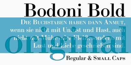
- Bodoni Classic Stencil by Wiescher Design,
$39.50 Bodoni Classic Stencil is another of my personal additions to the Bodoni Classic Family that Giambattista would have never made. In his days people had enough skill and the neccessary time to put beautiful handlettering on parcels and cases. No need for stencils! Today we do not need them either since shipping has gone barcode crazy, but for some reason stencil-letters are very much in fashion. Bodoni letters lend themselves perfectly to be stenciled so I just did the whole alphabet; not just the capitals. Yours, Gert Wiescher
 - Bodoni Egyptian Mono by Shinntype,
$39.00 As an ironic gloss on the unsophisticated “typewriter” genre, the Bodoni Egyptian Mono typeface channels the classic dignity of early 19th century letter forms, presenting a quite proper family of OpenType fonts, with a copious range of OpenType features—small caps, fractions, superior and inferior figures, alternate old style figures—rendered throughout five weights in both roman and italic.
 - ITC Bodoni Ornaments by ITC,
$29.99Giambattista Bodoni (1740-1813) was called the King of Printers; he was a prolific type designer, a masterful engraver of punches and the most widely admired printer of his time. His books and typefaces were created during the 45 years he was the director of the fine press and publishing house of the Duke of Parma in Italy. He produced the best of what are known as modern" style types, basing them on the finest writing of his time. Modern types represented the ultimate typographic development of the late eighteenth and early nineteenth centuries. They have characteristics quite different from the types that preceded them; such as extreme vertical stress, fine hairlines contrasted by bold main strokes, and very subtle, almost non-existent bracketing of sharply defined hairline serifs. Bodoni saw this style as beautiful and harmonious-the natural result of writing done with a well-cut pen, and the look was fashionable and admired. Other punchcutters, such as the Didot family (1689-1853) in France, and J. E. Walbaum (1768-1839) in Germany made their own versions of the modern faces. Even though some nineteenth century critics turned up their noses and called such types shattering and chilly, today the Bodoni moderns are seen in much the same light as they were in his own time. When used with care, the Bodoni types are both romantic and elegant, with a presence that adds tasteful sparkle to headlines and advertising. ITC Bodoni™ was designed by a team of four Americans, after studying Bodoni's steel punches at the Museo Bodoniana in Parma, Italy. They also referred to specimens from the "Manuale Tipografico," a monumental collection of Bodoni's work published by his widow in 1818. The designers sought to do a revival that reflected the subtleties of Bodoni's actual work. They produced three size-specific versions; ITC Bodoni Six for captions and footnotes, ITC Bodoni Twelve for text settings, and ITC Bodoni Seventytwo - a display design modeled on Bodoni's 72-point Papale design. ITC Bodoni includes regular, bold, italics, Old style Figures, small caps, and italic swash fonts. Sumner Stone created the ornaments based on those found in the "Manuale Tipografico." These lovely dingbats can be used as Bodoni did, to separate sections of text or simply accent a page layout or graphic design." - CAL Bodoni Terracina by California Type Foundry,
$47.00 Bodoni Terracina is a legible, fun-formal script face, with lots of curls. Sometimes script faces are hard to read. Sometimes being formal means that there’s no personality and there’s no fun. Enter Terracina: one of the masterpieces of font design. Some of the most personable italics ever carved. Includes powerful new features for: • Dates • Pricings • Addresses Not is only Terracina formal but fun, it’s also fun to use! In a program like Adobe Indesign or Illustrator, just highlight a word and see lots of fun options. Bodoni himself etched these symbols, and his fun-loving personality shines through. As a semi-script, it can go together with many script fonts, but it is more readable. When you need something equal parts elegant and whimsical, Terracina strikes a perfect balance to let the fun shine through, such as for holiday designs or fairytales. Terracina is a subheads font, but Bodoni also used it for paragraphs. So Terracina works well doing subhead paragraphs, especially when contrasting with the mood of the first font. And because of the swash variety, it works well for setting German and other European languages. CAL Bodoni Terracina is a member of our Origins Series. Origin Fonts are designed to be true to the original designer's intentions and fonts. Our Bodoni origin fonts ARE Bodoni fonts, not imitations or interpretations. They were drawn by Bodoni, our team just expanded it for modern use. For Terracina, Bodoni's original weight is the "Quasi-Lite" option, all other weights have been meticulously matched by the CAL Origins Team.
