10,000 search results
(0.035 seconds)
- Sibre by 38-lineart,
$80.00 We present "Sibre," a flexible and dependable serif family font that is ideal for any design project. This font family offers a wide range of possibilities for headers, subheaders, body text, captions, and displays. A total of 16 fonts are available, including 7 regular weights, 7 italics. 1 regular varible and 1 italic variable The font "Sibre" has a flexible appearance and a distinctive, quirky, and memorable name. It can be either feminine or masculine, glamorous or elegant, or anything in between, depending on your design. A variety of uses are considered in the design of Soulkind. It works perfectly for both contemporary digital designs and classic print media like books and newspapers. Furthermore, this font family is multilingual and supports a variety of languages in Latin. All in all, the Sibre font family is adaptable, authoritative, and created to make your content stand out. It doesn't matter if you're designing a website, a brand identity, or anything else—Soulkind is the best option.
 - Deco Sans by Alan Ronn,
$30.00This font was created while looking at the various shapes my handwriting consistently took, especially in the ways that letters would have breaks in them. Over the course of a few months I continually tweaked the letter forms and shapes, and lo and behold, I developed Deco Sans. This family currently only includes a thin weight, as I'm only one person, and very busy with college. I'm continuing work on a regular, bold, and possibly a future italic weight, but these may not be released for many months to come. As this is a very thin font, it should be used at sizes no smaller than around 16 or 18pt as it tends to get lost in whitespace, and looks best at large sizes. As such, this weight should be considered more of a display font than a text font, however, I predict a regular weight to be very readable and much more useable for the everyday. - Big River by Ana's Fonts,
$15.00 Big River is an elegant sans serif and handwritten font duo with lots of extras. It includes: - A wide sans serif font in three weights (with caps and small caps); - A handwritten font with a regular and slant version, and bonus swashes to give your designs a more natural look. Each font includes: - A-Z, a-z, 0-9, accents, punctuation and symbols - Contextual alternates (script) - Ligatures (script) This font duo makes it so easy to achieve beautiful and eye-catching designs, and is perfect for both short and longer texts. It can be used for making postcards and notes, creating logotypes, social media posts, branding and packaging, etc. Please note: No special software is needed in order to access the extras, as they are in a different font file. You can simply access them directly in your font bar (a-z for terminals in regular, A-Z for terminals in italic, and 0-1 for squiggles).
 - Omega Pixel by João Henrique Lopes,
$- OmegaPixel Font Description I created this font for the game Hyper Ninja Blast (but made it useful to all kinds of games!). While creating the game, I searched for pixel fonts, but could not find a suitable one. The fonts were generally ugly and lacking the basic variations (italic and bold). So I decided to create my own pixel font. Just as pixel art can be better than a high-resolution painting, so pixel fonts don’t need to be always worse than traditional fonts. In OmegaPixel I tried to achieve elegance, readability and flexibility within the limitations of a 6 pixel x-height. With 4 versions (regular, italic, bold and bold italic), and a neutral feel, OmegaPixel can be used in any genre of games. Considering the general lack of money among indie game devs, I’m giving the regular version for free! For inspiration, I often remebered Minion’s lowercase ‘a’, Galliard italic lowercase ‘g’, and the calligraphy of Chinese emperor Huizong.
 - Bourton Text by Kimmy Design,
$25.00 Bourton Text is a modern sans-serif typeface family perfect for both text type settings and display purposes. While it’s not a layering type family like its brother, Bourton, it come packed with features, extras and over 2,000 characters that make it stand on its own. HISTORY Bourton Text is a new take of the Bourton family that was one of the best-selling and favorite fonts of 2016. After countless requests for lowercase alphabet, or suggestions for a font pairing with Bourton, this new text setting family is based on the original shapes of Bourton. DESIGN & CREATION In taking Bourton Base was the starting point as they narrowest width and boldest weight. From there, lowercase shapes were designed that matched the aesthetic and details of the popular capitals. As Bourton was a heavy display font, some small tweaks were done to make it more fitting for smaller text settings, including reducing the letter-spacing and reworking some counters. Some areas needed complete reconstruction, such as the figures. The design of those began anew with a style that worked with the capitals and lowercase but also as a standalone set. Currency shapes were updated to match the numerals. Punctuation was also reimagined to work better in smaller type settings. Diacritics and extended language support was also updated and expanded to include full Latin plus language support for 219 latin based language spoken in 212 countries. Once the basic alphabet for Bourton Text Bold Narrow was formed, the font was expanded in both weight and width. Taking the weight from Bold down to Hairline, it allowed for more range in use. The typeface needed to be expanded in order to reach better as a book weight and width, in addition to a regular width, a wider version was create as well. FEATURES Once the extremes were set in place, small capital forms were designed for text and display purposes. These also allow for nested capital letters, lifted small caps and other display features offered in the typeface. One of the most popular fonts in the Bourton layering font family is Bourton Line. This led to an experimentation with rounded Bourton Text completely and thus a complete set of duplicated characters with rounded terminals. By using the Opentype Panel, a rounded font is a single click away. Every feature has been carefully thought out and updated across the entire font. In total, Bourton boasts over 2,300 glyphs, 42 font files with 3 widths and 7 weights in upright and italic.
 - Torcao by insigne,
$24.00 Torcao is one of the sporks of the font universe, a useful and functional outlier. Half square, half circle, this uncommon squircle of a family with its asymmetry of curved and angular shapes drives through headlines and body copy with forward velocity. The robust, technical appearance is light-hearted and inviting, and its organic nature plays off of its one-of-a-kind kinks and hybrid forms. Torcao is not merely an experimental font, though. The figures have been crafted and refined into a functional, hard-working typeface that lends itself to many sizes and environments. The font family features a tall x-height and light modulation, which give the typography its unique color highly effective in headlines but still quite legible in longer text. This family contains a comprehensive range of nine weights--slender to black--and features condensed and extender selections for a complete set of forty-eight fonts. The font has been decked out for experienced typographers, together with swash alternates and simplified titling. The typeface also contains a range of numeral sets, together with fractions and old-style figures. OpenType-capable programs including Quark or the Adobe suite allow quick changes to ligatures and alternates. Previews of these options can be found in the .pdf brochure. Torcao also features the glyphs to enable all Central, Eastern, and Western European languages. In all, the font supports around forty languages that utilize the prolonged Latin script, making it an excellent option for multi-lingual publications and packaging. Simple, technical, and open, the Torcao type family could just be the perfect choice for your web type or print project.
 - Rhomus by Typotheticals,
$4.00A Blocky face with a slight hint of angularity. The Omnilots are a free addition to the set. - Ayasha by LightHouse,
$49.00Fun angular letters was the idea behind this font. Very simple! Ayasha is an OpenType/TTF Unicode font. - Shiver by Volcano Type,
$19.00The displayfont Shiver is characterized by its strong shaped letters and the mix of angular and round shapes. - Saline by Melvastype,
$35.00 Saline is a angular and bumpy brush script. It includes set of nautical ornaments as an OpenType feature.
 - The Underwood1913 font by Gilles Le Corre is a striking typeface that vividly captures the essence and nostalgic charm of early 20th-century typewriting. Inspired by the Underwood No. 5 typewriter, w...
- Brother 1816 by TipoType,
$24.00 This year we commemorate the 200th anniversary of the first sans-serif typeface. and what better way to celebrate, than to design our own sans-serif! Brother 1816 is a very flexible, multifaceted and solid typeface, mixing Geometric shapes with Humanistic strokes at the same time. You can choose between a pure geometric or humanistic style, or even mix the +20 alternate characters to create the feeling that you need for your projects. Its humanistic nature makes it easy to read, legible in small sizes; perfect for branding, editorial and signage. Its geometric nature works for bigger applications in need of more personality, like branding, headlines, posters, etc... This makes Brother an excellent tool for an incredible wide range of uses. It has a total of 32 fonts, which are divided into 2 groups: normal (16 weights) & printed (16 weights). Each weight has +460 characters, +20 alternates, angular and straight edges, swashes, fractions, ordinals and much more.... Brother has also been specially designed for web (using hinting instructions), making it work in small and large sizes on different types of screen resolutions.
 - Sequel Geo by OGJ Type Design,
$35.00 Sequel Geo is a geometric/neo-grotesque hybrid superfamily, influenced by formalized sans-serif typefaces from Germany and Swiss modernist type design—particularly Max Bill’s greek-styled lettering. 8 subfamilies and 120 individual fonts allow for a wide range of typographic expressions. Sequel Geo’s hallmark features, such as the circular “G” and punctuation, simple “t”, and two-story “a” turning one-story in bolder weights, persist throughout all styles. But it’s the formal and functional differences between subfamilies that let you really fine-tune your layouts. The three optical sizes of the core collection, “Body Text”, “Headline”, and “Display”, boast optimized spacing for the intended use. “Extended” packs some extra punch with 18 display-oriented styles. Finally, 48 “Graphic” styles in 4 subfamilies push to the Geometric side, replacing horizontal and vertical stroke endings with angular ones, simplifying letterforms. Sequel Geo is a journey through time and space. From 1920s Germany to 1950s Switzerland. All the while, its archetypal shapes are neutral yet confident, its appearance is classic.
 - Ares by Adam Jagosz,
$15.00 Ares is a crisp all-caps display typeface suitable for sci-fi logos and titles. It owes its peculiar futuristic vibe to angular, top-heavy letters that hang from the cap-height instead of sitting on the baseline. The typeface consists of six subfamilies available in 10 weights, as well as as two variable fonts of three axes: Weight [wght], ranging from 1 to 1000, Mid-height [MHGT], ranginf from 0 to 1000, Tracking [TRAK], ranging from 0 to -40. The mid-height axis affects the typeface's waistline, including crossbars, and divides the fonts into three subfamilies: Ares Lo, Ares, and Ares Hi. These three families are solid-stroked, and the other three families are their stencil-stylized counterparts: Ares Broken Hi, Ares Broken, and Ares Broken Lo. The tracking axis is only available in the variable versions, and proportionally affects the kerning, thus helping set the type more tightly without effort. Ares supports a wide range of Latin-based orthographies, including not only European, but also Vietnamese as well as major African languages like Hausa, Fula or Ewe.
 - Zierde Grotesk by Lewis McGuffie Type,
$35.00 Zierde is a take on early advertising, small-copy grotesks of the late 19th/early 20th century, and is largely inspired by Miller & Richard’s own range of Grotesques. More importantly, Zierde is accompanied by a large set of ornaments (+200) which hark back to the look-and-feel of the early-modernist arts and crafts movement. The ornaments in, and presentation of, Zierde owe much credit to J.G Schelter & Giesecke’s 1913 type specimen book ‘Die Zierde’. The strong functional uppercase sans-serifs alongside luscious, beautiful patterns in ‘Die Zierde’ make for beautiful combinations. This early-modernist use of grotesk alongside ornament looks bizarre in the eyes of us used to seeing sans-serifs in more formal, sterile settings. The face itself retains some historical flourishes such as the eccentric leaning angle of the italics, the long cross-bar on the ‘G’, the gammy-leg of the ‘R’, a strange ampersand and some irregular terminals across the weights. Zierde is display face meant for headlines, titles, short-copy, labels and logos. It comes in caps and small caps, Latin and Cyrillic.
 - P22 Preissig Calligraphic by P22 Type Foundry,
$29.95 P22 Preissig Calligraphic was originally designed by Czech typographer, artist, and designer Vojtěch Preissig (1873–1944). Preissig developed this type design in 1928 and has remained unpublished until recently. One can only speculate why this wonderful design was never produced into a commercially available typeface. His original designs feature an accompanying italic as well as small caps. Preissig had originally named the typeface design after his former employer in New York, Butterick Publishing Co. The ‘Butterick’ typeface retains the angularity of his previous typeface, Preissig Antiqua (AKA P22 Preissig Roman), but displays a more fluid calligraphic influence. P22 Preissig Calligraphic was started shortly after Richard Kegler saw the original drawings in an exhibit in Prague in 2004. A sympathetic security guard allowed a few photographs and the contraband images fueled a development of the typefaces. The design simmered for many years and is now ready to enter the world of contemporary design. P22 Preissig Calligraphic is a 2 font family that contains the originally designed small caps as an OpenType feature, as well as all the necessary diacritical to cover most European languages.
 - Debacle by Reserves,
$39.99 Debacle is a super bold contrastive display face built upon pure geometric shapes. Sharp, angular lines are countered against obtuse rounded forms creating a striking visual discord. Select inner corners are rounded, giving characters dual attributes, while linear round-end counters simultaneously contrast and compliment the square-ended punctuation and symbols. Stylistically, Debacle’s prominent letterforms effortlessly create type-as-image text settings. Its style relates to the lush display typefaces from the seventies, yet is highly contemporary in its refinement and finish. Features include: Precision kerning Basic Ligature set including ‘f’ ligatures (ae, oe, fi, fl, ffi, ffl, ff, fh, fj, ft, tt, th, ct, st, la, aj, fa, ls, es, ev, ew, tz, lv, lw, ti, it, ea, kv, ka, ky, yx, xy, yy, km, yw, wy, yv, vy, kw) Alternate characters (O, Q, _, $, ®, •) Slashed zero Full set of numerators/denominators Automatic fraction feature (supports any fraction combination) Extended language support (Latin-1 and Latin Extended-A) *Requires an application with OpenType and/or Unicode support.
 - Magical Mystery Tour Outline Shadow - Unknown license

- Static Cling - Unknown license

- Favourite by Fidan Fonts,
$18.60 Favourite is a hand-lettered font. Mix it up with uppercase and lowercase and you'll get a different vibes from it. It's works perfectly for headlines, pull quotes, wordmark logos, posters and many more. Latin-based Language Support (You can check your language typing characters in text box below). Happy creating!
 - Fux by Rodrigo Fuenzalida,
$25.00 Fux is a condensed, neutral looking font, that features and extended ligature set, small caps, old style numbers and stylistic alternates, that should help to fulfill all your type setting needs. Is perfect to be used as big display and title font, and works very good in small sizes and paragraphs.
 - Garamold by E-phemera,
$20.00Garamold and Garamold Italic are inspired by specimens of classic French type. At smaller sizes, the rough edges give it a very organic feel. The font contains classic ligatures and the long s for authentic vintage typography. Automatic long s substitution is accessible through the historical or titling alternates OpenType features. - FF Masterpiece by FontFont,
$41.99 Slovakian type designer Peter Bil'ak created this script FontFont in 1996. The family contains 2 weights and is ideally suited for festive occasions. FF Masterpiece provides advanced typographical support with features such as ligatures, alternate characters, case-sensitive forms, and stylistic alternates. It comes with proportional lining and proportional oldstyle figures.
 - Squeam by PizzaDude.dk,
$17.00 Here's a fun font that is quirky, jumpy and uneven. It's also unpredictable, but not more than your text will be clear and legible...but in a fun way! :) I've added several lowercase versions that automatically cycles as you type. A great way to make your text random and lively
 - Filogofil by Muksal Creatives,
$12.00 Filogofil is a sophisticated type of sans serif logo font. Inspired by a mix of logos and philosophies, a solid, uncompromising style can be felt through controlled letterforms and a modern twist. A balance of hard lines and smooth curves.Filogofil are perfect for logo projects and great for any design project
 - Cupcake Mystery by Bogstav,
$17.00 Who took the last cupcake? It's a mystery! This lovely cookie Is made out of crunchy handmade lines, and comes with 7 different versions of each letter - these automatically cycles as you type. Pretty lovely, if you ask me! On top of all this, Cupcake Mystery has multilingual support! Enjoy!
 - Plz Print by Outside the Line,
$19.00 A happy, friendly hand printed font for many uses. Works as a display or body copy font. Great for that letter home to Mom or when you need a casual look. It can also be found in the book "Indie Fonts 3, a Compendium of Digital Type from Independent Foundries".
 - RMU Gong by RMU,
$30.00 Based upon an Arno Drescher design for Schriftguss, RMU Gong was freshly redrawn and redesigned and is intended for being a splendid font for headlines, subtitles, ads, posters etc. It comes with full sets of superior and inferior numbers, and even a long s can be accessed by typing [alt] + b.
 - Charme by Linotype,
$29.99In 1957, Helmut Matheis designed Charme for the Ludwig and Mayer type foundry, located in Frankfurt am Main, Germany. This informal script is of medium weight and has some variation of color. The caps are flowing and the lower case letters are close fitting. Their is a bold companion, called Slogan. - Lord Mayor by Solotype,
$19.95We know very little about this font. A printer in Lisbon had it, but said it came from England. Nicolette Gray shows it in her Nineteenth Century Ornamented Type Faces as Lord Mayor from the British Typefoundry. We never got the complete font, but drawing the missing letters was not difficult. - MPI Deco by mpressInteractive,
$5.00 Deco is a minimal, easy-to-read gothic without fuss. Geometry is sharp, strokes are uniform throughout, and characters are slightly condensed. This version is based on wood type of unknown origin, but the design was likely based on lettering from the Art Deco period of the 1920s and '30s.
 - Churchward Marianna by BluHead Studio,
$25.00Churchward Marianna and Churchward Marianna Shadow are two more OpenType font releases by BluHead Studio, LLC from the exciting and unique library of Joseph Churchward type designs. The round, bulbous letterforms take on individual personalities of their own. These fonts can't wait to express humor, spunk and just plain bold fun! - Broadsheet by Three Islands Press,
$29.00 A full-featured typeface that simulates old newspaper text from the 1700s, Broadsheet gives you all the “long s” ligatures you could ever dream of. Wonderfully authentic in either display type or long blocks of body copy. Includes a couple of printer’s flourishes. (Based on antique publications from 1728 and 1776.)
 - Oksana by AndrijType,
$40.00 Oksana is a Ukrainian female name. As a true native Ukrainian, this semi-serif type family has a strong structure, but soft and friendly nature. In six weights from thin to heavy it is perfect for titles and short texts lines. Look how people use it: http://use.type.org.ua/tagged/oksana
 - Hellmond by Ditatype,
$29.00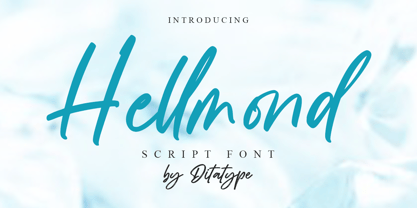 Hellmond is a natural handwritten font. It brings a modern and beautiful typeface. Made for any professional project branding. It is the best for logos, branding, and quotes. Includes: Hellmond (OTF) Features: Beautiful Ligatures Multilingual Support PUA Encoded Numerals and Punctuation Thank you for downloading premium fonts from Dita Type
 - ITC Ozwald by ITC,
$29.99ITC Ozwald was designed by David Farey and is a revival of a little-known typeface of American type designer Oswald Cooper called Cooper Fullface. The original was intended to be a modernized version of Bodoni and Farey captured all the charm, wit and creativity of the original in ITC Ozwald. - MBF Alphamoon by Moonbandit,
$15.00 AlphaMoon is a very versatile all-rounder font family. This typeface is crafted to be a go-to font for multi purpose project. From logo, poster, headline, text, editorial, you name it, AlphaMoon can handle it. This type family also comes in 4 weights, capable to achieve contrast in the work.
 - Gautami by Microsoft Corporation,
$49.00Gautami™ is an OpenType font for the Indic script Telugu. Telugu is based on Unicode, contains TrueType outlines and was designed by Raghunath Joshi (Type Director) and Omkar Shende for use as a UI font. Copyright ™ 2001 Microsoft Corporation. All rights reserved. Gautami Character Set: Latin-1, Telugu - Bloomilife by Timurtype,
$14.00 Introducing by Timur type Proudly Present, Bloomilife Bloomilife A Handwritten Script Font Bloomilife is perfect for product packaging, branding project, megazine, social media, wedding, or just used to express words above the background. Bloomilife also multilingual support. Embelish your designs with our original fonts. Enjoy the font 😉 Thank you!
 - Partial Eclipse JNL by Jeff Levine,
$29.00 Take a classic wood type design, add some white panels to parts of the letters and numbers and you end up with Partial Eclipse JNL, a novelty display font that adds a clean, yet unique look to your digital or print project. A little experimentation can go a long way!

