4,912 search results
(0.022 seconds)
- Die Lara by Ingo,
$27.00 A girl’s handwriting written on the iPad Writing changes – throughout history over centuries, but also from generation to generation. Each new generation of students learns to write the basic forms of the letters a little differently than their predecessors. The role model is also changing. The cursive handwriting taught in school is getting closer and closer to printed type. The children no longer learn the forms of cursive handwriting required for connected writing, but first the “block letters”, only later should they develop their own individual handwriting from this, which many of them no longer do. And the writing tool is also changing. Of course, script looks different when children no longer learn to write on paper with a fountain pen, but on a tablet computer with the “pencil”. The writing experience is completely different, and the “material properties” are different too. There is practically no writing resistance that would make it difficult to move against the direction of writing. "Die Lara" was created based on the template by Lara Mörwald from the winter of 2023. The font version "Black" corresponds to the handwritten original, all thinner variants up to the wafer-thin "Hairline" are derived from it. In the variable font, the intermediate forms can be selected steplessly. In order to preserve the handwritten character of the font, "Die Lara" contains several alternates to most letters and numerals, so that different character forms alternate in the typeface. If the "ligatures" function is activated in the app (which is the default in most programs), these alternates appear automatically as you type. There is also an alternative "swashed" variant of some letters. So you can set somewhat livelier accents at the beginning or end of a word. "Die Lara" also contains fractions and tabular figures.
 - Pinocchio by TrueBlue,
$20.00This font is a classic scholastic handwriting font designed to help students learn to write. - FG Lana by YOFF,
$13.95 FG Lana is a teenager with big visions and a bit naive kind of writing.
 - Casual Script by Jesse Tilley,
$19.95My own hand writing, which is surprisingly messy for a font artist. Hope you enjoy! - Woody by Wiescher Design,
$39.50 Frans Masereel wrote or should I rather say cut some "novels in pictures" around 1927. They are written in powerful black and white woodcuts and were apparently printed from the original cuttings, at least that what it looks like. On the cover he cut the titles in rough wooden letters. Those letters inspired me to produce Woody. Maybe some day I will add a second weight, wich will be an extended cut. But for the time being this is enough woodwork. Your woodcutter Gert Wiescher
 - Chadlershire by Uncurve,
$20.00 Chadlershire is font duo a perfectly blended type for any art work. Comes with emboss, inline and shadow layering styles, including alternates and some extra ornaments. Chadlershire is inspired by typografic design, sign painters, lettering, vintage art, tattoo art, and ephemera label. Perfect for labels, posters, branding, logotypes, headers, titles, packaging, display, and more.
 - Her Song by Allouse Studio,
$16.00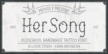 Proudly Present, Her Song a Oldschool Handmade Tattoo Font Her Song is perfect for product packaging, branding project, megazine, social media, wedding, or just used to express words above the background. Her Song also come with Multi-Lingual Support. Enjoy the font, feel free to comment or feedback, send me PM or email. Thank You!
 - Forest Ghost by Kaer,
$19.00 Forest Ghost is a font family with Regular and Textured styles. You'll get a playful font for your Scary corporate identity, Circus emblem, Halloween posters, Rock'n'roll flyer, Tattoo studio, Western-style design, and etc. Font features: All-caps, numbers, punctuation, and multilanguage support. Please feel free to request to add characters you need: kaer.pro@gmail.com
 - Arhoky by Product Type,
$17.00 If you are looking for a unique and unique gothic blackletter font that will set your project apart from the rest, look no further! ARHOKY is the perfect font for adding a touch of elegance to all kinds of creative work - including wedding invitations, tattoos, and packaging designs. Use it immediately to realize amazing projects!
 - Klute by Alias Collection,
$60.00 Klute references stylised forms of writing; historic Germanic, blackletter letterforms and graffiti and tagging. Its references are based on a personal idea of lettering - the action of writing is more personal and human than the craft of calligraphy or the mechanics of typing. These references suggest the idea of saying something particular and personal.
 - Gartisans by Sign Studio,
$10.00 Gartisans are inspired by the appearance of games produced by Japan. Has a distinctive curves on the character (writing with Katakana). By using this font you will be able to feel the feel of the Katakana writing style (simple, clear, characterized). It is suitable for book cover design, poster, game UI, and logo making.
 - Space Rave - Personal use only

- the haine au carre ! - Personal use only

- Scary Movie Gallery - Personal use only

- BN Manson Nights - Unknown license

- Cack-handed by Kerry Colpus Designs,
$25.00 Cack-handed was created by writing with my left hand even though I am right handed.
 - FG Suzanne by YOFF,
$13.95 Suzanne in a can is an expressive yet naive writing that has a straightforwardness about it.
 - Tag Banger by Okaycat,
$12.50 TagBanger WADE1 is the first in a short graffiti font series. This series will showcase the hand-styles of various mature street artists that Okaycat is working with. This first release highlights the style of one such graffiti writer, WADE1, who has an eclectic writing style after many years proliferating street art. Long-term graffiti artists develop their own style over their careers, spending as many endless hours honing their letter-forms as any full-time professional typographical artist. Style, individuality, and originality are everything. These attributes are key to the graffiti artist's tao. A writer who copies, or "bites" loses respect -- their work will be painted over or "crossed out" by all other writers. Okaycat's TagBanger series aims to demonstrate just how widely these individual styles can diverge, likely due, at least in part, to the social pressures of a community that ruthlessly punishes copycats. WADE1's tags were transformed into vector format from a generous sampling of their most recent scrawls. Our TagBanger series may not be composed of the most legible or beautiful fonts, but we imagine there are uses for these whenever highly unusual handwriting is needed. TagBanger WADE1 is extended, containing the full West European diacritics & a full set of ligatures, making it suitable for multilingual environments & publications.
 - MGN Ismawan by Morgana Studio,
$17.50 MGN Ismawan. This font was created in 2022 and was inspired by the Helvetica font. With a standard shape and being a bit wide, this font is suitable for writing, but for headlines, we think it's still OK. There are several forms of this font that have a distinctive character, which makes this font suitable for logo writing.
 - Cresci LP by LetterPerfect,
$39.00 Cresci is a carefully digitized reproduction of an alphabet of Giovan Francesco Cresci, the pre-eminent Renaissance writing master whose lettering virtuosity presaged the exuberance of the Baroque. His published writing book, "Il Perfetto Scrittore" (1570) was the inspiration for the typeface, designed by Garrett Boge in 1996. Cresci is part of the LetterPerfect Baroque Set.
 - Dez Petranian by Dezcom,
$40.00 Dez Petranian is a story-telling fantasy friendly family of fonts. It is a warm face that looks like the spoken word, perfect for tall tails, fantasy-world adventure books, creative writing, and poetry. Dez Petranian includes multiple language support, nearly 1,200 glyphs, stylistic sets, and many alternates. Think of it as a warm souvenir of real story writing.
 - Kite Script by Fontdation,
$20.00 Kite Script: my another hand-lettering that comes to font. A script typeface that combined thick-thin lines, inconsistent height, loose-tight kerning and unique baseline combinations for natural hand-writing feels. Easy and super playful to customize, suits best for almost all of your designing project; wedding invitations, t-shirt designs, fancy logotype, quote writings, etc.
 - MTF Dear Santa Pro by Miss Tiina Fonts,
$9.00 If you’re writing Santa a letter, use this adorable, handwritten childlike font! Dear Santa PRO not only gives you inspiration on how to start the letter, but it also has neat and original characters. This typeface duo also comes with some cute Christmas doodles to complement your writing. Have fun, and create something spectacular this Christmas!
 - Dashing by Twinletter,
$14.00 Dashing, a beautiful geometric font for writing titles and sentences that are comfortable to see when reading, a simple but elegant impression makes this font suitable for you to use for various needs of your design projects. smooth, casual and formal. This font is an alternate character in each letter, especially uppercase letters, which you can apply in writing to create a new and captivating look in writing names or trademarks, and so on. This font is perfect as text with displays for a wide variety of branding, advertising, posters, banners, packaging, news headlines, magazines, websites, logo design, and more.
 - Rolls Sling by Jehansyah,
$10.00 Rolls Sling this is a font that comes from its predecessor with us modifying it into a soft tattoo and very friendly to use, this design will depict luxury in a very confident form, there are several alternatives that you can use, to make your design look more manly and bold include : numeric punctuation alternate Thank You Very Much
 - Old Skull by Gleb Guralnyk,
$14.00 Hi, presenting a blackletter font named Old Skull. This vintage gothic look typeface was originally made using a flat calligraphic pen what makes it more organic and natural. Old Skull typeface suits the best for original t-shirt prints and tattoo designs. This font supports most of the European languages, please check out the screenshot with all available characters.
 - Balmoral by ITC,
$40.99 Renowned British designer Martin Wait designed Balmoral in 1978. Balmoral is an elegant and free-flowing copperplate script style typeface. Generous initial capitals complement the more restrained lowercase letters that join for balanced letter spacing in word settings. Balmoral is excellent for use on certificates, citations, diplomas, and in greeting card applications. Featured in: Best Fonts for Tattoos
 - Inked Bones by Mans Greback,
$59.00 Inked Bones is a hand painted blackletter typeface, created by Måns Grebäck during 2019. It works perfectly in Medieval contexts as well as in modern Gothic style typesetting. Use the typeface for a tattoo graphic or for your Middle Age project. The font supports all Latin-based European languages, contains numbers and all symbols you'll ever need.
 - Straight Flush Block by Inumocca,
$18.00 Straight Flush font family inspiration from Old school traditional tattoo font, simple and Strong Charachters. come with some simple Alternates for covering your Project, like Branding, Movie Title, Headline Letter, Bookcover or Book Content, Magazine cover, Poster, Quotes Lettering, Logos, and more your project design. - Unique glyphs - Multilingual Characters - UPPERCASE - Lowercase - Numeric - Symbol - Punctuation Character - Alternates inumocca type Studio
 - Othelie by Creativemedialab,
$15.00 Othelie - Fashionable Gothic Font Bold and Beautiful Othelie comes in Regular & Line version with tons of alternates. Othelie is Perfect for Heading, Logo creation, Clothing design, Tattoo Lettering, Advertisements, Labels, Halloween concept, Poster and much more! Get inspired by its Gothic appeal! To access alternate: Adobe Photoshop go to Window - glyphs Adobe Illustrator go to Type - glyphs
 - Rawuh by Product Type,
$18.00 Rawuh is a unique gothic blackletter for your designs. If you want to stand out from the crowd and add a touch of elegance, then this is the font you need. The blackletter style works perfectly for any Gothic themed tattoo, label, packaging, branding or project! use this font right away to make awesome projects happen!
 - Uylus - Unknown license

- Celtic-BA by Bannigan Artworks,
$19.95This is my interpretation of the writing in ancient Celtic manuscripts such as the Book of Kells. - LDJ Squirrel Tracks by Illustration Ink,
$3.00If squirrels could write, chances are they would love to use this perky new font from Jillustration. - Daggers Alphabet by Deniart Systems,
$10.00Also known as The Alphabet of Daggers, this alphabet was primarily used for writings with magical purpose. - HOON Kkokkachamsae by Ziwoosoft,
$300.00 The final consonant was small designed to express cuteness. The changing writing line added a casual feeling.
 - Edge Of Madness - Personal use only

- Art Techno JNL by Jeff Levine,
$29.00 The simple song title "May I", found on the sheet music from the 1934 Bing Crosby-Carole Lombard film "We're Not Dressing" was hand lettered in a blocky, ultra-bold Art Deco design that foreshadowed the techno look of the 1970s and 1980s. This became the basis for Art Techno JNL.
 - 8th Avenue by Our House Graphics,
$16.00 Inspired by the strange, blocky lettering on the sides of a set of a set of plastic kitchen containers in my childhood home, 8th Avenue is a sophisticated, somewhat syncopated font with a retro look and feel that at the same time brings a very modern attitude to your design. 8th Avenue works well as display font for packaging, headlines and logos. Those pastel turquoise plastic boxes from the early 1950s, with white screen printed letters reading FLOUR, SUGAR, COFFEE etc. on one side were a simple quiet presence in our home back then and for decades after. Seeing them, even that soft blue-green colour felt like home. SUGAR, the soul survivor of that set has become one of those mundane items of daily life that somehow become simple icons of another time, ripe with memories. Obviously I had to make a font. September 2014
 - Coriander by Adobe,
$29.00Coriander is the work of British designer Timothy Donaldson. It started out as a doodle one afternoon Donaldson was bored and uninspired. He wrote the word Coriander" and was then distracted by the sun beating through an adjacent window. He taped the writing paper up on the window as a shade. He took it down a few months later, folded it up, and stuck it in his pocket. When the piece of paper fell out of his pocket a week later, he was inspied to draw the rest of the characters, two alphabets in his sketchbook. The final digitized characters were created by Donaldson using a Wacom tablet and later refined on the screen."


