10,000 search results (0.027 seconds)
  1. EF Witches Brood by Elsner+Flake, $35.00
  2. We Love Nature Blooms by kapitza, $85.00
    A beautiful new addition to our We Love Nature flower font collection. We Love Nature Blooms consists of 52 highly detailed drawings of buds and blooms which can be used on their own or in combination with the other illustrations in the ‘We Love Nature’ font collection. All illustrations are drawn by hand and of the highest quality.
  3. Ines - 100% free
  4. Ines by DSType, $40.00
    Ines is a full featured typeface with seven weights and italics, including Small Capitals, smart fractions and several ligatures. Ines was specially designed for books, with a slight short x-height, making the ascenders and descenders more elegant and tall.
  5. Put Another One In - Unknown license
  6. A beautiful new addition to our We Love Nature flower font collection. We Love Nature Blooms Outline consists of 52 highly detailed outline drawings of buds and blooms which can be used on their own or in combination with the other illustrations in the ‘We Love Nature’ font collection. All illustrations are drawn by hand and of the highest quality.
  7. Quirkus Out - 100% free
  8. 4YEO OUT - Unknown license
  9. Poultrygeist Out - Unknown license
  10. Barred Out - Unknown license
  11. Schools Out by Comicraft, $39.00
    Originally created for Sound Effects in Marvel's GHOST RIDER 2099, our spraycan stylish HOOKY font has just the right Scrawl of the Wild for graph-iti enthusiasts everywhere -- and they wash right off with just a little splash of 'delete'. Spray it, don't Say it!
  12. Scratch Out by Pixesia Studio, $23.00
    Introducing Scratch Out - Urban Brush Font Scratch Out is an edgy and modern brush font that is perfect for adding a rough, urban look to your designs. The brush strokes give it a handmade, authentic feel that is perfect for streetwear brands, music album covers, posters, and more. With its bold and rough style, Scratch Out is sure to make a statement and catch the eye of your audience. This font is versatile and can be used for a wide range of projects where you want to create a raw and energetic look. FEATURES - Stylistic Alternates - Ligatures - PUA Encoded - Uppercase and Lowercase letters - Numbering and Punctuations - Multilingual Support - Works on PC or Mac - Simple Installation - Support Adobe Illustrator, Adobe Photoshop, Adobe InDesign, also works on Microsoft Word Hope you Like it. Thanks.
  13. Steppin Out by Bitstream, $50.99
    Nick Curtis has created this stylish, Deco inspired design, packed full of quirky features and characters. Some of the letterforms, like the uppercase K, appear to be walking. And dig that lowercase ‘g’! There is a lot of lively design happening here, so much so that its a battle not to be stylish when you are Steppin Out.
  14. Shout Out by Comicraft, $19.00
    Here's a big shout out to all our Loud and Proud font homies -- If you've got a good set of lungs on you -- fill 'em up and get ready to Shout, SHOUT! Yes, let it all out because this is a font you can't do without -- It will make you wanna SHOUT! Throw your hands up, SHOUT! Kick your heels back, SHOUT! Throw your head back, SHOUT! Come on now, SHOUT! And don't forget to say you will... Don't forget to SHOUT! Yeah yeah yeah yeah, SHOUT! A little bit softer now, (Shout) A little bit softer now, (Shout) A little bit softer now, (Shout) A little bit louder now, SHOUT! A little bit louder now, SHOUT! A LITTLE BIT LOUDER NOW! SHOUT! SHOUT! SHOUT! SHOUT! PHEW -- Who says Comicraft doesn't know how to Pump it Up AND Get Down?!
  15. Spaced Out by TypeArt Foundry, $45.00
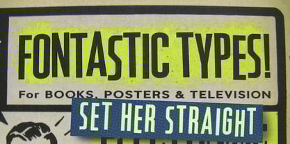
  16. Black-Out by Wordshape, $25.00
    Bohemian Modern slab stencil display font Black–Out is a result of three things: the need for a distinctive ultra-black display typeface, an admiration for slab-serifs and Clarendons, and the love of systematic stencil type. Fusing all the desires together resulted in Black–Out. What was the inspiration for designing the font? Slab serifs + Clarendons + systematic stencil type = Black-Out! What are its main characteristics and features? It is a massive chunk of type, contemporary in nature while also harking back to the sun-drenched Modernism of California of the 1970s. Usage recommendations: Display type for use in materials that are meant to evoke a range of emotions.
  17. Out Back by chicken, $17.00
    A twice-painted sign in Tobago's back country was the seed for this weird grab-bag of chunky, slightly sleazy letterforms.
  18. Cut Cut Cut by Green Type, $19.00
    Cut Cut Cut is a decorative font family. Designed for use in outdoor advertisements, branding, packaging. Cut Cut Cut is also perfect for children's books and cartoon, greeting cards and posters. It is also suitable for use in online activities. Cut Cut Cut contains latin, cyrillic and greek gliphs. There is also a free symbols style.
  19. Plasma Drip BRK - Unknown license
  20. Beurk - Unknown license
  21. Subtlety - Unknown license
  22. Shlop - Unknown license
  23. Bloodgutter 99 - Unknown license
  24. Bloodsuckers - Unknown license
  25. BloodFeast - Unknown license
  26. Cut - Unknown license
  27. But by Nicole Fally, $40.00
    Bold, black and square. But was first drawn as a logotype for the magazine "BUT – Bilder und Texte" (pictures and texts) which was published by an experimentally-oriented non-commercial initiative. In consideration of the unusual dimensions of the magazine (6 x 14 cm / 2,4 x 5,5 inch), I decided to fill as much space as possible with the body of type. This formal idea refers to the meaning of the title by blurring the border between legible letters and abstract shapes. Because of its origin, But is ideal for short messages in headline point size. Despite its blocky shapes, But creates a friendly atmosphere. The details are as playful as the restrictions that are given by the concept allow them to be. Punctuation marks and other special characters contrast the boldness of the design since they are matching the thin parts of upper- and lowercase letters. This also avoids gaps when longer texts are set. But is available in open type format and has an extended character set (Latin extended A). Two sets of numerals, one matching the x-height and another one matching the cap-height, are provided.
  28. Cut by Turtle Arts, $20.00
    Cut is a font made from rubber stamps that were specially hand carved by Kerrie. Cut is a single case alphabet, but the font includes Cut Regular and Cut Reversed (the upper and lower case letters) with numbers and extra image symbols.
  29. Tout by Eurotypo, $28.00
  30. Outr by Outerend, $20.00
    The fonts "Outr" were created with the concept of typography in motion. These display fonts look unique as movie titles, TV show logos, game titles, and many other products, especially with edgy and tech designs on screens. These are more suitable for and work very well in 2D and 3D motion graphics.
  31. Oun by Ezzazebra, $15.00
    Inspired from Cambodia’s alphabet, Khmer. I tried to explore the visual of the original character in Latin characters. Inspired by 2 gothic fonts, Old London (for the modern/straight feel) and Berliner (for the dynamic between thin and bold line). The letters are made with pencil in a millimeter block book, then scanned into clean vector format. And the result can be use for Display or a Headline with traditional or ethnic theme, including film, game, event, etc.
  32. Crushed Out Girl - Unknown license
  33. Cacophony Out Loud - Unknown license
  34. Boldly Go Out - Unknown license
  35. Supervixen Honeyed Out - Personal use only
  36. Out of sight - Unknown license
  37. Decked Out NF by Nick's Fonts, $10.00
    Inlines that go over, under sideways, down! Deck out your headlines in grand style with this unusual inline face, based on Dektiv, a seventies-style classic from "Homage to the Alphabet." Both versions include the complete Latin 1252, Central European 1250 and Turkish 1254 character sets, as well as localization for Moldovan and Romanian.
  38. Evening Out JNL by Jeff Levine, $29.00
    Based on an example of [circa] 1950 Finnish embroidery lettering, Evening Out JNL is a classic Art Deco design with contrasting thick and thin lines. This elegant and stylish typeface is available in both regular and oblique versions.
Looking for more fonts? Check out our New, Sans, Script, Handwriting fonts or Categories
abstract fontscontact usprivacy policyweb font generator
Processing