10,000 search results (0.042 seconds)
  1. Germanica - 100% free
  2. Schmalfette Fraktur - Personal use only
  3. Murrx - 100% free
  4. Iron Maiden - Unknown license
  5. Iwata UD Maru Gothic Pro by IWATA, $199.00
    ???????????UD????????????????? ??????????????????????????????????????????
  6. OL Raleigh Gothic A Display by Dennis Ortiz-Lopez, $40.00
  7. ITC Avant Garde Gothic¿ was designed by Herb Lubalin and Tom Carnase in 1970. They based it on Lubalin¿s logo for Avant Garde Magazine - an exciting construction of overlapping and tightly-set geometric capitals. ITC Avant Garde is a geometric sans serif; meaning the basic shapes are constructed from circles and straight lines, much like the work from the 1920s German Bauhaus movement. The early versions of ITC Avant Garde became well-known for their many unique alternates and ligatures that still conjure up the typographic aura of the 1970s. These fonts contain the basic alphabets (without the old unusual ligatures). Still strong and modern looking, ITC Avant Garde has become a solid staple in the repertoire of today's graphic designer. The large, open counters and tall x-heights seem friendly, and help to make this family work well for short texts and headlines. The condensed weights were drawn by Ed Benguiat in 1974, and the obliques were designed by Andr¿ G¿rtler, Erich Gschwind and Christian Mengelt in 1977. ITC Avant Garde¿ Mono is a monospaced version done by Ned Bunnel in 1983.
  8. OL Raleigh Gothic B Display by Dennis Ortiz-Lopez, $40.00
  9. Iwata News Gothic NK Pro by IWATA, $309.00
    数多くの新聞社で使われてきた伝統ある「岩田新聞呉竹体」を再現した「イワタ新聞ゴシック体」と、かなを現代風にアレンジした「イワタ新聞ゴシック体新がな」があります。
  10. Iwata News Gothic NK Std by IWATA, $199.00
    数多くの新聞社で使われてきた伝統ある「岩田新聞呉竹体」を再現した「イワタ新聞ゴシック体」と、かなを現代風にアレンジした「イワタ新聞ゴシック体新がな」があります。
  11. Franklin Gothic Raw Semi Serif by Wiescher Design, $19.50
    When drawing a new font, there is a time when the final form is found – almost – but the curves are not slick and clean yet, that's what I call the "raw" form. Raw – no sweeteners added! In this family I redefined this moment in type development for the eternally beautiful "Franklin Gothic". I call the design "Franklin Gothic Raw". This packet is the semi-serif addition. There never was a Franklin-Gothic with serifs but actually the font lends itself perfectly to a slab-serif. I started with adding a half serif and eventually add a full slab-serif later on.
  12. Trade Gothic Next Soft Rounded by Linotype, $53.99
    In 1948, Mergenthaler Linotype released the first weights of Trade Gothic, designed by Jackson Burke. Over the next 12 years, Burke, who was the company’s Director of Typographic Development from 1948 through 1963, continued to expand the family. Trade Gothic Next is the 2008 revision of Jackson Burke’s design. Developed over a prolonged period of time, the original Trade Gothic showed many inconsistencies. Under the direction of Linotype’s Type Director Akira Kobayashi, American type designer Tom Grace, a graduate of the MA Typeface Design in Reading, has redesigned, revised and expanded the Trade Gothic family. Many details were improved, such as the terminals and stroke endings, symbols, and the spacing and kerning. Moreover, there are newly added compressed widths and heavy weights perfect for setting even more powerful headlines. Trade Gothic Next brings more features and better quality for today’s demanding typographers. Trade Gothic Next Soft Rounded introduces a new friendliness and warmth to the family.
  13. YD Gothic 100 for ZEISS by Yoon Design, $400.00
  14. Franklin Gothic Hand Demi Shadow by Wiescher Design, $39.50
    Franklin Gothic Hand Demi Shadow is another one in my series of hand-drawn fonts from way back in time – before computers changed the way we worked in advertising. This one was especially used for what we called "pork-belly-ads": ads for food-stores! I think it is very useful for all kinds of advertising that demands a lot of bang! Your powerful typedesigner Gert Wiescher
  15. SEPTEMBER 11 ICON - Personal use only
  16. Aon Cari Celtic - Unknown license
  17. Cone Of Silence - Unknown license
  18. Covington SC Cond - Unknown license
  19. Avondale SC Cond - Unknown license
  20. Covington SC Cond - Unknown license
  21. KR Cow Juice - Unknown license
  22. Markus the Cow - Unknown license
  23. Covington SC Cond - Unknown license
  24. Persona Non Grata - Unknown license
  25. Twelve Ton Sushi - Personal use only
  26. Avondale SC Cond - Unknown license
  27. Twelve Ton Fishstick - Personal use only
  28. Covington SC Cond - Unknown license
  29. Frigate Katakana - Cond - Unknown license
  30. Twelve Ton Goldfish - Unknown license
  31. KR Firefighter Ron - Unknown license
  32. SP Don Mills by Remote Inc, $39.00
    A font family inspired by the twists and turns of North Americas first planned community.
  33. Sassoon Primary Cond by Sassoon-Williams, $48.00
    Those who design books for young children should consider the different needs of their readers. When laying out pages for young readers, particular care should be taken over word spacing. Don't forget that justifying short lines disrupts spacing. Justification should be used only when absolutely necessary. In the research undertaken with young readers the importance of consistent spacing was clear. It also appeared that the poorer readers profited from wider word spacing, while spacing that suited the poorest readers, positively annoyed the better readers. These typefaces have built-in letter spacing because of their exit strokes, as well as extra clarity designed into them. Sassoon Primary Medium Condensed is a compact style for headlines combining the right amount of weight, yet in a friendly style. When used at large sizes the friendliness of Sassoon types really shines. Why not use it for headings throughout a book. You can find many other new ways to use this typeface. Ideal perhaps for the masthead or a magazine? Free to download resources: How to access Stylistic Sets of alternative letters in these fonts
  34. Polytype Business Icons by Prime Graphics, $45.00
  35. Euro Icon Kit by TypoGraphicDesign, $9.00
    The typeface EURO Icon Kit is designed at 2020 for the font foundry Typo Graphic Design by Manuel Viergutz. The display font is inspired by the here and now. 763 glyphs incl. icons, dingbats & symbols. Decorative extras like arrows, emojis, ornaments, geometric shapes, catchwords, decorative ligatures (type the word #LOVE for ❤ or #SMILE for ☺ as OpenType-Feature dlig) and stylistic alternates (20 stylistic sets) + sign of the zodiac. Have fun with this font & use the DEMO-Font (with reduced glyph-set) for FREE!
  36. Altemus Web Icons by Altemus Creative, $11.00
    A collection of 174 website button icons and designs.
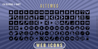
  37. Bon Mot NF by Nick's Fonts, $10.00
    What’s the good word? This elegant, stylish typeface, based on an early twentieth-century Barnhart Brothers & Spindler release, named simply "Engravers Upright Script". Based on French ronde letterforms, this version is bolder—which makes it suitable for text settings, even at smaller sizes—and has more pronounced stroke contrast—which makes it suitable for headlines. Versatile, handsome and charming, this typeface is an invaluable addition to any type repertoire. Both versions of the font contain the complete Unicode 1252 (Latin) and Unicode 1250 (Central European) character sets, with localization for Romanian and Moldovan.
  38. Only You Icons by LeType, $19.90
    Only You Icons, with more than 300 options between icons, ribbons and frames that will make your project very attractive and romantic. Only You Icons is brilliant. Also available Only you Pro.
  39. Zwoelf Ton B by Volcano Type, $19.00
Looking for more fonts? Check out our New, Sans, Script, Handwriting fonts or Categories
abstract fontscontact usprivacy policyweb font generator
Processing