10,000 search results (0.051 seconds)
  1. Contane by Hoftype, $49.00
    Contane is a new font with a classical character. It is high-contrasted and nobel in appearance, but still objective and clean. It is predestined for headlines, editorials and small text applications. All Italic weights also contain Swash Capitals for especially fancy occasions. Contane supports up to 80 languages and it’s OpenType format allows a wide range of typographic applications. 20 styles offer fine graduation of the weights. All weights contain small caps, ligatures, superior characters, proportional lining figures, tabular lining figures, proportional old style figures, lining old style figures, matching currency symbols, fraction- and scientific numerals, matching arrows and alternate characters.
  2. Eight Fifteen - Unknown license
  3. rusted plastic - Unknown license
  4. Mr. Wade - Unknown license
  5. CType - Unknown license
  6. CherryBomb - Unknown license
  7. Lochen - Unknown license
  8. Don Giovonni - Unknown license
  9. MailBomb - Unknown license
  10. Cry Kitty - Unknown license
  11. SPARKS Free for All - Unknown license
  12. OrnaMental - Unknown license
  13. Gentle Redhead - Unknown license
  14. Rebuffed - Personal use only
  15. Stillhouse by Surplus Type Co, $16.00
    Stillhouse is a vintage serif font that features 2 styles - Textured & Solid. This typeface is great for achieving that rustic aesthetic which is popular in restaurant branding, apparel designs and product packaging.
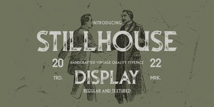
  16. Tel Aviv by Yinon Ezra, $1.00
    Tel Aviv, Display San-serif typeface, 2 Widths, 4&5 Weights. Structured Shapes with familiar look, yet unique! Can be used for wide range of uses, also function well as short text.
  17. Platinum Sign Over - Personal use only
  18. LT Diploma - 100% free
  19. Signerica Fat - Personal use only
  20. The Rich Family - Personal use only
  21. 101 Puppies SW - Unknown license
  22. Obscure Actions - Unknown license
  23. He's Dead Jim - Unknown license
  24. Derradeira - Personal use only
  25. abc - Personal use only
  26. SF Diego Sans - Unknown license
  27. Octavus Caps Black - Personal use only
  28. Pickle Standard by bb-bureau, $65.00
    Pickle Standard is the display version of bb-Standard rigorously built on a grid. Read the article by Madeleine Morley for Eye on Design: A Font as Crisp, Squat + Rounded as a Pickle 3 styles: italic, regular and reversed italic
  29. Liet Display by Stanley fonts, $9.99
    Casual and Elegant. Liet Display© is an upright italic that plays with formality by subtly exploring the spaces between serif, sans-serif and italic styles. I recommend Liet Display© for post-apocalyptic packaging, branding, and editorial design. Dominic
  30. A La Nage - Personal use only
  31. Engebrechtre - Unknown license
  32. SF Laundromatic - Unknown license
  33. SF Wasabi - Unknown license
  34. SF Retroesque - Unknown license
  35. SF Speedwaystar - Unknown license
  36. SF DecoTechno - Unknown license
  37. Spectrum by Monotype, $29.99
    Spectrum font is based on a design by Jan van Krimpen, who worked on his font from 1941 to 1943 for use in a Bible of the Spectrum publishing house in Utrecht. The bible project was later cancelled but the font was so beautifully formed and universal that the Monotype Corporation in London completed it. Distinctive are the reserved elegance and unmistakeable beauty of form. The italic was kept fine and is a wonderful complement to the other weights, making it perfect for emphasis in text. The form of the lower case italic g is reminiscent of van Krimpen's italic for Lutetia and Romanée. A similar font in form is the Perpetua from Eric Gill. It displays not only similar forms to those of Spectrum, both fonts also have uniquely designed old style figures. The 7 is particularly unusual with its slanted horizontal stroke and marked bend to the left in the lower third of the form. Spectrum is an extremely legible font even in smaller point sizes and is just as suitable for headlines as for long texts.
  38. Caslon #540 by Linotype, $29.99
    The Englishman William Caslon punchcut many roman, italic, and non-Latin typefaces from 1720 until his death in 1766. At that time most types were being imported to England from Dutch sources, so Caslon was influenced by the characteristics of Dutch types. He did, however, achieve a level of craft that enabled his recognition as the first great English punchcutter. The original Caslon specimen sheets and punches have long provided a fertile source for the range of types bearing his name. Identifying characteristics of most Caslons include a cap A with a scooped-out apex; a cap C with two full serifs; and in the italic, a swashed lowercase v and w. A few of the many interpretations from the early twentieth century were true to the source, as well as strong enough to last into the digital era. These include two from the American Type Founders company, Caslon 540 and the slightly heavier Caslon #3. Both fonts are relatively wide, and come complete with small caps, old style figures, and italics.
  39. Mangerica by Ndiscover, $25.00
    This design incorporates different styles into a consistent look. A pinch of script, a little of geometric and some humanistic shapes as well create a very distinguishable sans-serif. It has an overall good feeling specially on the heavier weights that have intended contrast irregularities to create a 'cartoonish' look. On the intermediate weights the design will preform well on small font sizes because of its large counters, low contrast and large x-height, but as you go to the extremes you will see shapes full of personality that will pop out in large font sizes. The font is loaded with opentype features such as small caps, ligatures, alternates, old style figures, and much more. The italic version is deeply rooted in the calligraphic heritage of the Italics. This way the brush inspired strokes are emphasized as well as an overall calligraphic look. Far from being a mere slant, Mangerica Italic had every lowercase glyph redesigned as well as some uppercase, besides that, every glyph was optically adjusted to ensure not only aesthetics but functionality too.
  40. RNS Camelia - 100% free
Looking for more fonts? Check out our New, Sans, Script, Handwriting fonts or Categories
abstract fontscontact usprivacy policyweb font generator
Processing