10,000 search results
(0.041 seconds)
- Chipen by 38-lineart,
$14.00 I am pleased to present you an excellent futuristic font "Chipen" in unique graphic style! This font consists of regular, expanded, regular italic and expanded italic, these 4 fonts are encapsulated in one variable. With one font variable, this will cover 4 styles and cover all the weights between regular and expanded. If you are used to working with variable fonts it will give you more weight options, if you have never tried this variable font it will be an amazing new experience for you, take a look at this video snippet: https://youtu.be/jgqNPGeoVjc Chipen comes in bold and with a “RoundCube” cut, this is perfect for modern, Sci-Fi, and technology themes. Coupled with the stripe in the middle of the makes it appear more sporty. Not only that, this stripe can also display "Eighties" if you package it in a retro concept. Another strength of this font is the lowercase ligature, we present a lot of ligatures and one of them might be suitable for your logo brand. Finally, this font is a dynamic font with a variable concept capable of covering more 'weight', unique to appearing in various eras, exploring the world of retro and even science and fiction.
 - Cadho Toys by Alit Design,
$20.00 Introducing CADHO TOYS, an exciting and playful bubble display font that will add a touch of whimsy to your designs. This font features a unique alternate ligature style that combines bubbles and letters, creating a fun and engaging visual experience. With its lively appearance, CADHO TOYS is perfect for various design projects, especially those aimed at children, toys, games, or anything that requires a cheerful and vibrant aesthetic. This font is carefully crafted with 707 characters, ensuring versatility and multilingual support. Whether you’re designing in English, French, Spanish, German, or any other language, CADHO TOYS has got you covered. The font includes special characters, punctuation marks, numerals, and a wide range of glyphs, allowing you to express your creativity without limitations. One of the standout features of CADHO TOYS is its support for PUA Unicode. This means that you can access the font’s extensive character set through private use area codes, giving you even more freedom to customize and personalize your designs. Let your imagination run wild as you combine different characters and ligatures to create captivating typographic compositions. CADHO TOYS will bring joy and excitement to any project it graces. Whether you’re designing posters, logos, packaging, websites, or any other creative endeavor, this bubble display font is bound to make a lasting impression. Its alternate ligature style adds a touch of uniqueness and flair, setting your designs apart from the crowd. So why wait? Get your hands on CADHO TOYS today and unlock a world of creativity, fun, and boundless possibilities. Let this font take your designs to new heights and bring smiles to the faces of your audience. Language Support : Latin, Basic, Western European, Central European, South European,Vietnamese. In order to use the beautiful swashes, you need a program that supports OpenType features such as Adobe Illustrator CS, Adobe Photoshop CC, Adobe Indesign and Corel Draw. but if your software doesn’t have Glyphs panel, you can install additional swashes font files.
 - Connected Neon by Ditatype,
$29.00 Connected Neon is a mesmerizing display font that encapsulates the vibrant glow of neon lights, fusing it with a unique twist of connected letterforms. With its bold and uppercases design, this typeface commands attention, drawing the viewer into a captivating visual experience. The defining feature of Connected Neon lies in its elegant lines that seamlessly connect each letter, creating a unified and harmonious composition. These delicate lines flow effortlessly from one character to the next, accentuating the connectivity between them. As a result, the letters appear to dance with an electric energy, forming an enchanting tapestry of illuminated artistry. The neon-inspired style of Connected Neon is a nod to the retro-futuristic aesthetics of the 80s, reminiscent of the vibrant signage that adorned the bustling city streets. The font's luminous glow radiates with an otherworldly aura, casting a vivid hue that is both nostalgic and contemporary, evoking a sense of vibrant energy and modernity. Each character in Connected Neon has been meticulously crafted to strike the perfect balance between legibility and decorative flair. The bold letterforms boast a sleek, sans-serif design, ensuring clarity even in the midst of the dynamic interplay of lines. The seamless connections between letters create a sense of continuity and fluidity, enhancing the visual appeal without compromising readability. Enjoy the various features available in this font. Features: Multilingual Supports PUA Encoded Numerals and Punctuations Connected Neon is ideal for a range of creative projects that demand a touch of charismatic flair. From eye-catching headlines on posters and advertisements to striking branding elements, this font adds a touch of electrifying allure to any design. Whether you're designing a captivating logo, crafting an attention-grabbing title, or bringing a digital artwork to life, Connected Neon will effortlessly infuse your creations with a radiant glow and a sense of interconnectedness. Find out more ways to use this font by taking a look at the font preview. Thanks for purchasing our fonts. Hopefully, you have a great time using our font. Feel free to contact us anytime for further information or when you have trouble with the font. Thanks a lot and happy designing.
 - Structia by Typodermic,
$11.95 As you consider the words you need to convey, it’s clear that you’re looking for something that feels just as precise and intentional as the message you’re promoting. Structia is a typeface that does not shy away from its influence—it leans into the hard edges and geometries that are typically associated with brutalist architecture. And yet, even as it draws inspiration from an austere and somewhat daunting aesthetic, Structia also possesses a sense of control and discipline that is undeniably alluring. At the core of Structia’s appeal is its mechanical precision. Every line, every curve, is carefully calculated and crafted to create a sense of mathematical accuracy that is difficult to resist. There is no room for error or imperfection in Structia—every stroke is sharp and precise, with chamfered corners that add an extra layer of texture and visual interest. This is not a typeface that allows for ambiguity—it demands clarity and specificity, and it delivers both with remarkable consistency. But Structia is more than just a collection of angular shapes and precise lines. It is a typeface that conveys a sense of scientific accuracy and chilly logic—a kind of elegance and refinement that is unexpected. There is a beauty in the way that Structia balances the hard-edged geometries of brutalism with a sense of control and finesse that is undeniably modern. It is a typeface that feels at once futuristic and timeless—a design that can be used in a wide variety of contexts and still feel fresh and relevant. And then there are the two effect styles—Structia Panel and Structia War—which take the basic geometry of the typeface and push it even further into the realm of science fiction. Structia Panel feels like something you might see on a spacecraft or in the architecture of an alien planet, with thin, laser-like struts that give it a futuristic edge. Structia War, meanwhile, takes the concept of Structia Panel and adds a layer of battle damage, as if the letters have been through a cosmic conflict and emerged victorious. In the end, Structia is a typeface that demands attention and respect. It is not a typeface that will fade into the background or blend in with the crowd—it is a design that is meant to be noticed and admired. And yet, even as it draws your eye with its hard-edged geometries and precise lines, it also possesses a sense of elegance and refinement that is undeniably alluring. Structia is a typeface that balances the old and the new, the hard and the soft, the mechanical and the human—and the result is something truly remarkable. Most Latin-based European, and some Cyrillic-based writing systems are supported, including the following languages. A Afaan Oromo, Afar, Afrikaans, Albanian, Alsatian, Aromanian, Aymara, Bashkir (Latin), Basque, Belarusian (Latin), Bemba, Bikol, Bosnian, Breton, Bulgarian, Cape Verdean, Creole, Catalan, Cebuano, Chamorro, Chavacano, Chichewa, Crimean Tatar (Latin), Croatian, Czech, Danish, Dawan, Dholuo, Dutch, English, Estonian, Faroese, Fijian, Filipino, Finnish, French, Frisian, Friulian, Gagauz (Latin), Galician, Ganda, Genoese, German, Greenlandic, Guadeloupean Creole, Haitian Creole, Hawaiian, Hiligaynon, Hungarian, Icelandic, Ilocano, Indonesian, Irish, Italian, Jamaican, Kaqchikel, Karakalpak (Latin), Kashubian, Kikongo, Kinyarwanda, Kirundi, Komi-Permyak, Kurdish (Latin), Latvian, Lithuanian, Lombard, Low Saxon, Luxembourgish, Maasai, Macedonian, Makhuwa, Malay, Maltese, Māori, Moldovan, Montenegrin, Ndebele, Neapolitan, Norwegian, Novial, Occitan, Ossetian, Ossetian (Latin), Papiamento, Piedmontese, Polish, Portuguese, Quechua, Rarotongan, Romanian, Romansh, Russian, Sami, Sango, Saramaccan, Sardinian, Scottish Gaelic, Serbian, Serbian (Latin), Shona, Sicilian, Silesian, Slovak, Slovenian, Somali, Sorbian, Sotho, Spanish, Swahili, Swazi, Swedish, Tagalog, Tahitian, Tetum, Tongan, Tshiluba, Tsonga, Tswana, Tumbuka, Turkish, Turkmen (Latin), Tuvaluan, Uzbek (Latin), Venetian, Vepsian, Võro, Walloon, Waray-Waray, Wayuu, Welsh, Wolof, Xhosa, Yapese, Zapotec Zulu and Zuni.
 - Juvenis by Storm Type Foundry,
$32.00Designs of characters that are almost forty years old can be already restored like a historical alphabet – by transferring them exactly into the computer with all their details. But, of course, it would not be Josef Tyfa, if he did not redesign the entire alphabet, and to such an extent that all that has remained from the original was practically the name. Tyfa published a sans-serif alphabet under the title Juvenis already in the second half of the past century. The type face had a large x-height of lower-case letters, a rather economizing design and one-sided serifs which were very daring for their time. In 1979 Tyfa returned to the idea of Juvenis, modified the letter “g” into a one-storey form, narrowed the design of the characters even further and added a bold and an inclined variant. This type face also shows the influence of Jaroslav Benda, evident in the open forms of the crotches of the diagonal strokes. Towards the end of 2001 the author presented a pile of tracing paper with dozens of variants of letter forms, but mainly with a new, more contemporary approach: the design is more open, the details softer, the figures and non-alphabetical characters in the entire set are more integral. The original intention to create a type face for printing children’s books thus became even more emphasized. Nevertheless, Juvenis with its new proportions far exceeds its original purpose. In the summer of 2002 we inserted all of this “into the machine” and designed new italics. The final computer form was completed in November 2002. All the twelve designs are divided into six variants of differing boldness with the corresponding italics. The darkness of the individual sizes does not increase linearly, but follows a curve which rises more steeply towards the boldest extreme. The human eye, on the contrary, perceives the darkening as a more fluent process, and the neighbouring designs are better graded. The x-height of lower-case letters is extraordinarily large, so that the printed type face in the size of nine points is perceived rather as “ten points” and at the same time the line spacing is not too dense. A further ingenious optical trick of Josef Tyfa is the figures, which are designed as moderately non-aligning ones. Thus an imaginary third horizontal is created in the proportional scheme of the entire type face family, which supports legibility and suitably supplements the original intention to create a children’s type face with elements of playfulness. The same applies to the overall soft expression of the alphabet. The serifs are varied; their balancing, however, is well-considered: the ascender of the lower-case “d” has no serif and the letter appears poor, while, for example, the letter “y”, or “x”, looks complicated. The only serif to be found in upper-case letters is in “J”, where it is used exclusively for the purpose of balancing the rounded descender. These anomalies, however, fit perfectly into the structure of any smoothly running text and shift Juvenis towards an original, contemporary expression. Tyfa also offers three alternative lower-case letters *. In the case of the letter “g” the designer follows the one-storey form he had contemplated in the eighties, while in “k” he returns to the Benda inspiration and in “u” adds a lower serif as a reminder of the calligraphic principle. It is above all the italics that are faithful to the tradition of handwritten lettering. The fairly complicated “k” is probably the strongest characteristic feature of Juvenis; all the diagonals in “z”, “v”, “w”, “y” are slightly flamboyant, and this also applies to the upper-case letters A, V, W, Y. Juvenis blends excellently with drawn illustrations, for it itself is modelled in a very creative way. Due to its unmistakable optical effect, however, it will find application not only in children’s literature, but also in orientation systems, on posters, in magazines and long short-stories. - Scriptina Pro - 100% free

- Amerika Pro - 100% free

- Myosotis Regular by La Boîte Graphique,
$30.00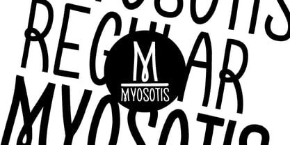 handwriting font
 - Scrapbook by Bedoodle,
$11.00Decorative font. - Nivel by La Boîte Graphique,
$29.00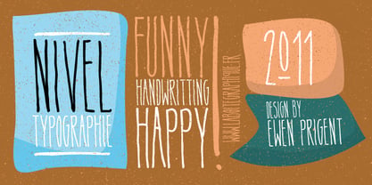 Handwriting font
 - Nouville by Bogusky 2,
$20.00Modern font - Ruthie by TypeSETit,
$24.95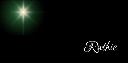 Elegant font.
 - Schneidler Zierbuchstablen by Intellecta Design,
$23.90fancy font - Monogram by Bedoodle,
$10.00Decorative font. - Petemoss by TypeSETit,
$19.95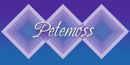 Contemporary font.
 - Angeline by Bedoodle,
$10.00Decorative font. - Angelique by Bedoodle,
$9.00Decorative font. - Garden Gate by Bedoodle,
$11.00Decorative font. - Split splat splodge - Unknown license

- tasapainoaisti - Unknown license

- Creaky Frank - Personal use only

- Backcab - Unknown license

- FD Deer Deer - Personal use only

- Mario and Luigi - Unknown license

- Silent Hill Nightmares - Unknown license

- Pokemon pixels 1 - Unknown license

- Zipple - Unknown license

- Space Gimboid - Unknown license

- Croatia Hrvatska - Unknown license

- Pokemon pixels 2 - Unknown license

- Far Away, So Close - Unknown license

- Donkey Kong World - Unknown license

- Tube Station-Plus. - Unknown license

- Sphericals - Unknown license

- the Gingerbread House - Unknown license

- Chicagogo - Unknown license

- the Gingerbread House - Unknown license

- Jump Style by Maulana Creative,
$15.00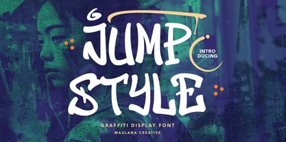 Give your designs an graffiti display Font handcrafted feel. “Jump Style Graffiti Display Font” is perfectly suited to stationery, logos and much more. Many Thanks, Maulana Creative
 - Maqueen by Forberas Club,
$16.00 Maqueen font create with simple and clean style. You can apply this font to simple and happy design. Can be use too for cover and cartoony style.
 - Gabton Malgora by Letterena Studios,
$17.00 Gabton Malgora is a bold and stylish serif font. This font is PUA encoded which means you can access all of the glyphs and swashes with ease!


