10,000 search results
(0.616 seconds)
- Gracia Series 50 by astype,
$30.00 Gracia is a classic connected script design. OpenType features: - over 700 glyphs - central European faces - connection forms & stylistic alternates - proportional, mediaeval numerals & Roman numerals - numerators, denominators and fractions
 - Gracia Series 40 by astype,
$30.00 Gracia is a classic connected script design. OpenType features: - over 700 glyphs - central European faces - connection forms & stylistic alternates - proportional, mediaeval numerals & Roman numerals - numerators, denominators and fractions
 - Alfie by Monotype,
$29.99 Alfie™ is lively, friendly, inviting and easy on the eyes. What more could you want in a script? How about four flavors of the same design? Alfie Script is a delightful connecting script with a touch of comfortable elegance. Use it for everything from social announcements to headlines and packaging. Alfie Casual is a little more laid-back with letters standing on their own. It works great in short blocks of text copy, subheads and navigational links. Alfie Informal has spirited serifs and its own demeanor, while Alfie Small Caps does a fine job of supporting its other siblings. There’s an immediacy to words and messages set in these lighthearted confections. Jim Ford was practicing drawing with a new brush pen when the inspiration for Alfie came to him. He had filled several pages in a notebook with letters and, at one point, realized that there might be a typeface among them. As it turned out, there were four. The process, however, wasn’t choosing one design and modifying it. The makings of all the designs were on the pages. It was just a matter of culling out the right collection of characters to build the foundations for the four flavors of Alfie. Because they share the same family roots, each design in the Alfie family can be paired and intermixed. Ford admits that there’s a hint of Emil Klumpp’s 1950s Murray Hill typeface (https://www.myfonts.com/fonts/bitstream/murray-hill/) in the Alfie family. Just enough to give the design a 50s vibe. (Some fashions never go out of style.)
 - Sympathetic by Bülent Yüksel,
$19.00 “Sympathetic Font” multi-purpose use is an open designed font. It is possible to produce unlimited designs using this font. “Sympathetic Font” is made up of 24 different forms. Hearts, square, triangle, circles, moon and stars, horizontal and vertical lines, sloping inner lines and wavy lines. Shading and decorations are also available. Ideally suited for advertising and packaging, logo, branding, slogans and creative industries, poster and billboards as well as web and screen design. You can create unique designs using fonts in layers. TECHNICAL: Sympathetic provides advanced typographical support for Latin-based languages. An extended character set, supporting Central, Western and Eastern European languages, rounds up the family. “Sympathetic” has 24 different forms and italics total 48 types. The family contains a set of 321 characters. Stylistic Alternates, Localized Forms and Old Style Figures just one touch easy In all graphic programs. Sympathetic is the perfect font for web use. You can enjoy using it.
 - TrajanusBricks is a unique and artistically designed font, inspired by ancient history yet infused with a contemporary flair. This typeface draws its essence from the grandeur of Roman architecture, ...
- The Coventysh by DLetters Studio,
$30.00 The Coventysh is a beautiful and Elegant Mono-Line Script Font, Available 2 weight styles are perfect for Logo Design, Branding, Clothing Design, Signage, Poster, Wedding Invitations and so much more! My goal for this font was to create an easy-to-read Monoline Font Script that serves a variety of purposes. The Coventysh, It has a handcrafted feel and natural touch then tidied up to create a consistent character set. It is perfect for your creative projects. What’s Included : S-Alt, SS01, SS02, SS03, Ligature 2 Weight Style (Regular and Light) Works on Win, Mac Simple installations Accessible in Adobe Illustrator, Adobe Photoshop, Adobe InDesign, even work on Microsoft Word. PUA Encoded Characters Fully accessible without additional design software. Hope you enjoy with The Coventysh font! Contact me if you have questions
 - AmpleAlt by Soneri Type,
$50.00 AmpleAlt is a alternate version derived from Ample type family. AmpleAlt is a display type family, optical mono linear and a bit squarish in nature. It has smooth curve instead of sharp angle formed by the junction of two strokes, which is a prominent feature of its design. It is designed to be a little eye-catching yet legible. It has clear and distinguishable letterforms, which helps to elaborate and emphasis the message. It is graphically strong and command viewer's attention. The overall appearance of type is suitable in setting it as heading, title, headline, etc. The type family consists of six weights viz. Thin, ExLight, Light, Regular, Medium and Bold. Considering the nature of this type family, italics have been excluded. AmpleAlt is designed by Aakash Soneri in the year 2014.
 - AmpleSoft by Soneri Type,
$50.00 AmpleSoft is a softer version derived from Ample type family. AmpleSoft is a display type family, optical mono linear and a bit squarish in nature. It has smooth curve instead of sharp angle formed by the junction of two strokes, which is a prominent feature of its design. It is designed to be a little eye-catching yet legible. It has clear and distinguishable letterforms, which helps to elaborate and emphasis the message. It is graphically strong and command viewerís attention. The overall appearance of type is suitable in setting it as heading, title, headline, etc. The type family consists of six weights viz. Thin, ExLight, Light, Regular, Medium and Bold. Considering the nature of this type family, italics have been excluded. AmpleSoft is designed by Aakash Soneri in the year 2014.
 - AmpleSoftPro by Soneri Type,
$60.00AmpleSoft Pro is an extended version of AmpleSoft type family. AmpleSoft Pro Includes Extended Languages Character Set for following: Azerbaijan, Belarus, Bulgaria, Czech Republic, Kazakhstan, Latvia, Lithuania, Polish, Romania, Russia, Slovakia, Ukraine, Uzbekistan, Vietnam. AmpleSoft Pro is a display type family, optical mono linear and a bit squarish in nature. It has smooth curve instead of sharp angle formed by the junction of two strokes, which is a prominent feature of its design. It is designed to be a little eye-catching yet legible. It has clear and distinguishable letterforms, which helps to elaborate and emphasis the message. It is graphically strong and command viewer's attention. The overall appearance of type is suitable in setting it as heading, title, headline, etc. The type family consists of six weights: Thin, ExLight, Light, Regular, Medium and Bold. - African Gold by Scholtz Fonts,
$19.00 The name African Gold is associated with Johannesburg, the "City of Gold"; (the Zulu name for Johannesburg is eGoli). The font was so named for two reasons: the intricate African patterns within the characters of the font suggest the shafts and tunnels of a gold mine, and, as with a gold mine, the richness lies within. African Gold is a display font that is best used at larger sizes, however, it contains a full character set with all accents, special characters, diacritical marks and all the characters are carefully spaced and kerned. The numerals are mono-spaced so that they will line up correctly in columns of figures. The letters of the alphabet are spaced according to their width and are carefully kerned to create an attractive appearance.
 - Buket by Ahmet Altun,
$19.00 Bouquet or in Turkish, Buket Font Collection includes 18 styles and textures which are different but compatible with each other. Decorative and script sans fonts include several useful ornaments. It can be created elegant and decorative typographic designs and additionally, eye-pleasing designs can be made even in miniscule texts.
 - Minomu by Owl king project,
$37.00 Minomu consists of twenty sans serif font families, With a thicker weight, Minomu can be applied as an attractive and bold appearance for title letters, not only that, but Minomu's family with lowercase letters can also be used in designs with use as body text, to create more detailed descriptions.
 - Savattera by Prioritype,
$18.00 Introducing a new script font with a beautiful, uniquely elegant and very charming look, you can click it and can be used in your projects such as wedding invitations, quotes, creative posts, clothing product packaging, promotions, video preview images, logos and much more to explore. because it has many cool variations. As a picture you can see the preview above. Features: -Uppercase -Lowercase -Numeral -Punctuation -Multilingual -Alternate -Ligature -Swash Thanks.
 - HV Frankfurt by Harmonais Visual,
$12.00 Frankfurt - a clean, display sans serif with great versatility. With multiple weights, this typeface can be used to create a wide range of designs looking to achieve a fun, modern, and youthful look.
 - Knappolog by Cercurius,
$19.95 Negative sans-serif capitals in squares with rounded corners, looking like tiles, pushbuttons or computer keys. The font can be used for logos, signs and labels, and for markings on maps and charts.
 - Quethy by Zamjump,
$10.00 Quethy is a playful font that can be applied to many of your precious designs. It's very simple handwritten and has an elegant style that makes this font a lot of fun. Quethy has a characteristic that is handwriting with a simple pen. You can use it for posters, titles, greeting cards, packaging, invitations and more.Included : - Multi-language
 - Monalissa by Yoga Letter,
$12.00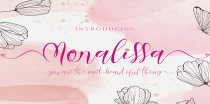 Monalissa is a very beautiful, high-quality font that is made with great love. This font can make your work more beautiful and elegant. This font is perfect for marketing your products, promoting your business, making quotes, weddings, invitation cards, logos, branding and status updates on social media, can also be used to beautify your beautiful moments, and others.
 - Kochire by Grontype,
$10.00 About the Product : Richest is a very attractive display font, each Fonts has its own uniqueness, is made with great care to produce a good work. Richest font can be used to make flyer banners title, logo, Book or magazine header. it also can be used for product branding Features : Kochire All Character Ligature Alternate Character Multilingual Support
 - Ruina One by RodrigoTypo,
$25.00 Ruina One is a Rough and distressed font, but at the same time very gestural. It is especially great for youth and child graphics, but can be applied in many other domains too. Ruina One contains various ligatures.
 - Cheesegum by PizzaDude.dk,
$20.00 Cheesegum is super legible even at very small sizes. If you use Cheesegum at larger sizes, you can see the delightful crucnhy edges! Kinda like roasted cheese! The crunchier, the lovelier! :) Just go ahead and eat some Cheesegum!!!
 - Conture Script by Mans Greback,
$59.00 Conture Script is a classic script typeface with a thin contour. This high-quality font is drawn and created by Måns Grebäck during 2017. With its hundreds of glyphs, Conture Script supports a very wide range of languages.
 - Tschicholina by Type-Ø-Tones,
$40.00 Tschicholina is inspired by a project by Jan Tschichold dating back to 1929. It is a unicase "universal" font which has always been considered to have very little future; this is why we have it in our catalogue.
 - Rocker stage by Jehansyah,
$9.00 This font is very beautiful if we combine it into a design that wants to appear bold, bold and unique, there are several alternatives that you can use to make this font as support for your design project.
 - New Millennium by Three Islands Press,
$24.00New Millennium is one of three font families that share a common name, a common design philosophy, a common x-height, and basic character shapes. (The others are New Millennium Sans and New Millennium Linear; all three work well together.) New Millennium is a serif face of what some might describe as a "modern style." But although it has flat serifs, it differs markedly from, say, Bodoni or Didot -- especially in the italic, which is a radical departure from tradition. (The bold styles are in fact sans-serif, identical to those of New Millennium Sans.) There's also a nice, dark Headline style for display text. New Millennium is a distinctive, legible, accessible text face that might be well suited to, say, scientific documentation. - Xylo Script by Wiescher Design,
$49.50 XyloScript is my first script with a woodcut look to it. Still, it is very elegant. Xylo is Greek and means “wood”. This script is another one I designed in the tradition of the 18th-century English calligrapher George Bickham and the 19th-century American calligrapher Platt Rogers Spencer. I like it, your very crafty Gert Wiescher BTW if your font manager tells you that the font is corrupted, just ignore that! This script is very complex and that’s causing some font managers to say the font is corrupted. I have tested it and it works fine!
 - Kyoto Northern by 38-lineart,
$14.00 Kyoto Northern is a great choice for a brand identity, suitable for packaging, web banners, headlines and business cards, very unique and natural. This font is handwritten using a marker pen, equipped with a ligature following the habit of writing quickly, so you can feel the sensation of handwriting which is very natural. When you write in a relaxed and calm state, your writing will look very good and the writing flows well. Kyoto is the name of the city that we chose as a representative of calm and natural. Type and feel the amazing handwriting.
 - Wham! - Unknown license

- Voluptate by Fontscafe,
$39.00 The "Voluptate Pack" font is a smart sophisticated handwriting pack that includes ‘Voluptate’, ‘Voluptate Classic’ and ‘Voluptate Elements.’ Every single character in our ‘Voluptate’ font distinct and given every letter a unique identity – very much like a person’s handwriting. Of course the characters are similar enough to work hand in hand, but not so similar as to appear as an obviously computer generated type set. The ‘Voluptate Classic’ is very similar in design and ever so slightly informal in its appearance. A thoughtful mix-and-match of both these fonts can give a delightful appearance to your designs. You could use the Voluptate on most areas of the text for example, and the ‘classic’ to emphasize a more personal touch to certain areas, say for example where you may be quoting somebody’s word. When you get the pack you also get a handy ‘Voluptate Elements’ set of designs that can enhance your creations in so many ways. All 3 are available individually, but it's like getting the elements for free when you buy the pack.
 - Fantasy by Typesenses,
$49.00 Fantasy draws on a series of historical calligraphic traditions: Roman capitals, Lombardic initials, enlightenment era ornamentation and refinement. The user is invited to deploy their imagination playing with the alternates, ornaments and frames in different universes like publications and stationery. Fantasy Pro is the fully-featured OpenType version with two styles of capitals and plenty of swash alternates and ornaments. Each of these varieties is available as a separate font in addition to Fantasy Std, a set of unadorned standard characters for smaller settings. Use professional software that widely support Open Type features. Otherwise, you may not have access to some glyphs. Give a touch of magic to your work!
 - Aerodyne by Mysterylab,
$10.00 Introducing Aerodyne, a highly versatile font family with seven weights and italics. While both modern and sleek in its line quality and flow, the fundamentals of this font set takes many of its design cues from more antiquated typestyles of the Roman era, especially in the capital letter set. Pair that up with the influence of mid-20th century humanist letterforms, and you have a type that is full of individual character, but with a smooth uniformity that conjures great beauty and individuality without drawing too much undue attention to itself. The subtle serifs give the font a unique character at both text and display sizes.
 - Preto Serif OT Std by DizajnDesign,
$50.00 Preto is an extensive type family, which explores the function of serifs on readability and legibility. Preto consist of three subfamilies: Sans, Semi and Serif. Preto is designed for multilingual typesetting. All of the subfamilies have equal gray value but different texture which can be use to differentiate languages. Preto sub-families have two text weights and two bold styles (Regular -> Bold, Medium -> Black). Every weight has a companion Italic style as well. The serif version has been designed to work best at small point sizes (around 8, 9 points). You will not achieve calm, boring or invisible look of your text with Preto Serif. Its long, spiky and sharp serifs contribute to give the typeface a distinct and energetic character. It is very suitable for magazines, corporate identity, brochures or other print materials where a typeface for continuous reading is required. The ligatures in Preto Serif are very special. You can set them in different tracking values and spacing will increase/decrease consistently in the ligatures as well. Alternative characters in the font files allow you to change the feeling of the text from typical to more special (J, Q, g , &). Each font contains a full set of small caps and many alternative characters for complex typesetting.
 - Salt & Spices Pro by Fontforecast,
$29.00 Salt&Spices Pro is a welcome addition to the ever popular modern calligraphy genre. Digitizing the many handwritten samples into a fully functional connected script was done with great precision, carefully guarding the authentic look and feel of vintage dip pen calligraphy. Salt&Spices Pro is a very versatile 9 font family, consisting of 3 casual styles: Regular, Bold and Shadow. With 587 glyphs each, they offer great flexibility in customizing words and phrases to suit your personal taste. For instance: the appearance of initial and terminal letters can be customized using the glyph pallet. Contextual alternates, Swashes and Stylistic sets give you the ability to replace spaces by 3 alternate connecting spaces or add swashes to initial/terminal letters. Double letter ligatures help sustain the natural flow of handwriting. In addition to the 3 calligraphic family members 3 SmallCaps Sans styles and 3 SmallCaps Serif styles were added. They all have 435 glyphs and match very well because they were designed using the same vintage nib. Each of the styles can add great variation to your designs and they supplement and support each other perfectly. Add exceptional language support to all that and you have the perfect ingredient to spice up even the most demanding design project.
 - Preto Serif by DizajnDesign,
$24.00 Preto is an extensive type family, which explores the function of serifs on readability and legibility. Preto consist of three subfamilies: Sans, Semi and Serif. Preto is designed for multilingual typesetting. All of the subfamilies have equal gray value but different texture which can be use to differentiate languages. Preto sub-families have two text weights and two bold styles (Regular -> Bold, Medium -> Black). Every weight has a companion Italic style as well. The serif version has been designed to work best at small point sizes (around 8, 9 points). You will not achieve calm, boring or invisible look of your text with Preto Serif. Its long, spiky and sharp serifs contribute to give the typeface a distinct and energetic character. It is very suitable for magazines, corporate identity, brochures or other print materials where a typeface for continuous reading is required. The ligatures in Preto Serif are very special. You can set them in different tracking values and spacing will increase/decrease consistently in the ligatures as well. Alternative characters in the font files allow you to change the feeling of the text from typical to more special (J, Q, g , &). Each font contains a full set of small caps and many alternative characters for complex typesetting.
 - 360 by Wilton Foundry,
$29.00Distorted fonts are great but are mostly not very practical - 360 is an attempt to create a simple distorted font that can be used far beyond a few logos or headlines. Each 360 character averages roughly half the number of sharp angles of a regular sans serif. This gives it an unusually fresh and timeless appeal and creates a dynamic presence across body text that is very legible and compact without looking overly condensed. 360 was chosen as a name because it can be used as an everyday font, all year round, and because 360 has so many unusual angles that don't conform to normal font conventions. 360 also happens to be a cool number: 360 makes a highly composite number. 360 is also a superior highly composite number and a colossally abundant number. A circle is divided into 360 degrees for the purpose of angular measurement. 360° is also called round angle. 360 is a convenient standard since, 360 being highly composite, it allows a circle to be divided into equal segments with each segment measured in integer degrees rather than fractional degrees. 360 is the sum of a twin prime (179 + 181). A year is roughly calculated as 360 days. - SparkPlug by Just Font You,
$15.00 Start from my love to vintage motorcycle culture, i am really glad living in this era when vintage motorcycle is now being such a lifestyle. People can express their self through the motorcycle, completed with the fashion and style itself to make their characters and personal branding appear stronger. It can open the new social circle, the community, to those who have the same passion to it. Based on that situation, i try to contribute to the scene with making a typeface that brings the personality of it. So please welcome, Sparkplugs. A vintage biker style font with the strong serif style and bold body. Comes up with the sans-serif too, just in case you need a pair. Handcrafted carefully for your vintage branding, rebel fashion stuff, clothing brand, as long as they're on it, get ready to rockin' all the way!
 - Koch Antiqua LT by Linotype,
$29.99Koch Antiqua is based on forms of old Roman writings, chiseled in marble thousands of years ago. This contemporary version is more playful and reminiscent of the Roaring 20s. - ITC Serif Gothic by ITC,
$29.99 ITC Serif Gothic font is the joint effort of Herb Lubalin and Antonio DiSpigna. Its distinguishing feature is its uniquely designed serifs, combining gothic simplicity with traditional roman elegance.
 - Hand Cut Stencil JNL by Jeff Levine,
$29.00 Hand Cut Stencil JNL is a condensed Roman typeface modeled from an antique tin stencil hand cut for shipping merchandise. The design is available in regular and oblique versions.
 - Amalfi by Irina Vascovet,
$26.00 Amalfi a hand written pointed pen font that is filled with personality. The font comes with upper and lowercase characters in both Roman and Cyrillic, numbers, marks and punctuation.
 - Chancellor by PintassilgoPrints,
$24.00 Chancellor is a robust hand-drawn sans serif display typeface. Its sturdy letterforms takes inspiration from Plakatstil era posters, while bringing up also cool adornments to flourish your lettering designs. This all caps typeface has two versions for each letter, amplifying your composition choices. It's positively a great tool for a wide range of creative display uses.
