10,000 search results
(0.329 seconds)
- Sf Lang by S6 Foundry,
$15.00 Lang Sans is an elegant contemporary condensed typeface with strong stylistic geometric, authentic contrasts, drawing on the aesthetics and representing the shifting contemporary aesthetics. The distinctive stance gives the right visual consistency for branding and communications. Lang Sans is perfectly suited for headlines, large-format prints, brand identities, social media, advertising, editorial design, posters, magazines, logos, headings, body copy, digital and more.
 - Along Slab Work by Brenners Template,
$19.00 Along Slab WORK is a elegant Slab Serif font family, which designed by Ryuld Davidson of the Brenners Template. It retains the skeleton of the Along Sans S2(https://www.myfonts.com/fonts/brenners-template/along-sans) Especially, all italic styles were rhythmically redesigned for inspiration of glyphs. This font family has a unique personality for each style and will help a designer's choice.
 - Trio smoothie by Factory738,
$10.00 Smoothie is a classy, contemporary pair of script and sans-serif fonts. Its offers beautiful typographic harmony for a diversity of design projects, headlines, branding visual identity, poster, logo, magazines and etc. 3 Fonts (Script, Script Italic, and Sans) Upper and lowercase characters, numerals, punctuation Alternate & lignature glyphs are available Multilingual support Thanks for looking, and I hope you enjoy it!
 - Brushelva by Mevstory Studio,
$25.00 Introducing Brushelva Classic Sans Serif Font , created by Lettercorner Studio. Thelma is a traditional font for the classic sans serif type. A simple font, with a thin size, adds an elegant and classy impression. This typeface is perfect for an elegant logo, branding, travel promotion, layout magazine, beauty product, packaging product, quotes, or simply as a stylish text overlay to any background image.
 - Precious Serif by G-Type,
$60.00 Precious Serif is a distinctive, modern slab serif typeface, first released in 2003 and now refreshed in 2017. This contemporary, chunky gem is the sister typeface to our Precious Sans family, both sets designed with similar metrics and characteristics to ensure they pair together seamlessly in print & digital applications. Mix Precious Sans & Serif together in a block of text to wonderful effect!
 - Rum Plakat by Trine Rask,
$30.00 Rum Plakat is a display type developed as a display face within the type family »Rum« Rum Plakat is an alternative version of Rum Soft Sans Black. It is suitable for posters and editorial design in large sizes & other eye catching matters. The complete family consists of Sans Serif & Serif in both sharp and soft version + the display fonts Rum Plakat & Rum Silhouette.
 - Black Drum by Coniglio Type,
$19.95 Black Drum is a rare revival typewriter face, made digital from analog samples gathered with great care by Coniglio Type. A time and place; type and life. Black Drum is contemporary designer type, made from the struck steel hammers of an Art Deco Period san serif face transferred from a mechanical 1926 custom editor Royal Portable typewriter. Anna Conroy of Type Heritage, LLC, Philadelphia comments on Black Drum and its new place in time today: “Wow! nice lookin’ face Joseph! —Perfect, somewhere between Cable; [Rudolph Koch, 1927] (which was about the first transatlantic telegraph cable) with its raised x-height; and Futura [Paul Renner, 1928]. Yup, it has that great “Monopoly Game” question mark -- and all on a period-piece typewriter! You should have no trouble grafting that sorely needed Euro symbol.” –And he very well did! Author: Joseph Coniglio Producer: Coniglio Type MyFonts debut: October 2021
 - Stena by LetterPalette,
$35.00 Stena is a very functional sans serif typeface with calligraphic feel, especially designed for contemporary typography. This family features deep and sharp ink-traps as part of its design. Thanks to its proportions, solid and balanced forms, combination of straight and curve lines, high x-height and expressive ink-traps, Stena combines readability with a strong personality. This dynamic typeface provides advanced typographical support with features such as ligatures, alternate characters, stylistics sets, fractions, etc. It also comes with a complete range of figure set options – oldstyle and lining figures, each in tabular and proportional widths. This carefully designed family consists of 8 weights, ranging from Thin to Black, each with matching true italics. It comes with a set of 566 characters per weight, supporting over 40 different languages using the Latin alphabet. Stena is the ideal choice for editorial, branding, corporate identity, and more.
 - Trenda by Latinotype,
$29.00 Designed by Daniel Hernández and Paula Nazal. Corrections and review by Alfonso García and Rodrigo Fuenzalida. Trenda is a geometric sans-serif typeface based on the uppercase of Trend —a Latinotype font, released in 2013, that was very well received. This new typeface comes with a wider character set that offers a complete family of uppercase and lowercase in different weights. Trenda is a versatile easy-to-use functional display font with a strong personality, especially its uppercase, which makes the designer’s work easier. Trenda’s lightest and heaviest variants are ideal for display use while its middle weights work well with short and mid-length texts. This typeface has been designed especially for corporate projects, logotypes and publishing. Trenda comes in 8 weights, ranging from Thin to Heavy, and includes matching italics as well as small caps and alternates. The family contains a 634-character set that supports 206 different languages.
 - Fleete by Greater Albion Typefounders,
$5.95 Fleete is a modern homage to the many late 19th century typefaces; often used for book titles, posters and newspaper headlines; which have an extreme contrast between hairline horizontal stems and serifs and heavy vertical stems. Greater Albion Typefounders have taken this basic idea, to be found across very many faces of the period and used just that one concept as the basis of a new typeface design, which manages to be elegant yet modern all at once. IF you need something for a section heading which stands out from body text, this is the font family for you. If you need headings on a poster or large scale web-page headings, this is the face you should try. If you need several weights of heading-no problem; Fleete comes in Regular, Bold and Shadowed, as well as a newly designed Sans Serif form.
 - Adoquin by Huy!Fonts,
$20.00 Adoquin is a clean and friendly semi serif family. It comes in seven weights with small caps, wich makes it a versatile typeface. The design is based on geometric sans serif typefaces and the calligraphic features of old school models, making Adoquin a functional and warm font family. Its informal but elegant look makes it the perfect display type fitted for logotypes, book design, packaging or magazines. Its wide range of weights and discreet alternates makes it very enjoyable to read, so its also perfectly fitted for longer texts. Adoquin has an extended character set for Central and Eastern European languages, and shows all its potential wit OpenType-savvy applications. Every font includes small caps, ligatures, old style figures, fractions, numerators and denominators and alternative characters without some calligraphic features suited for smaller or longer texts (in this case, the alternative charecters are less ornamented).
 - Galix by Eclectotype,
$40.00 Galix is a technical sans designed to look futuristic without any of the retro appearance often found in this genre. It has a squarish, slightly condensed anatomy, and is characterized by thin joints and deep ink traps that add a sparkle to the otherwise monoline typeface. In the italic styles, these cuts are accentuated even more which creates a feeling of speed in the letterforms. Galix is optimized for display typography (the ascender height is the same as the cap height, and the spacing is somewhat tight) but the middle weights are very readable at smaller sizes, where I'd recommend adding a little tracking. OpenType features include ft and tt ligatures, stylistic sets/alternates, automatic fractions, tabular, superscript and subscript figures, case sensitive forms. Perfect for websites, apps, infographics, magazines and logotypes, Galix is technical but with a warmth and personality that is often missing from this genre.
 - Antipod by Octotypo,
$18.00 Antipod is a versatile sans serif family designed with the stroke of the nib in mind. The early sketches were made with a reed pen and then stabilised to keep the specific junctions between verticals and horizontals shapes. The design of the letters constantly balance between curves and inner sharp corners and the contrast of one is cohabiting with the other to give Antipod its specific design. When Antipod is set at small size its specific are almost unnoticeable but the text has a very particular type colour. And this specificity is useful when setting texts for display, to give your design a strong personality. Each weight includes a set of extra glyphs to make your text settings more singular. It also comes with extended language support, tabular figures, fractions and more. It is suited for any work editorial design, signage, corporate as well as onscreen applications.
 - Hansplatz Grotesk by Heypentype,
$20.00 Hansplatz Grotesk is a sans serif type family of nine weight. Influenced by Akzidens Grotesk, Hansplatz typeface bring a new approach to this utilitarian style of grotesk. With more square proportions rather than geometric style, Hansplatz grotesk aimed to ease typesetting job when arranging a words or paragraph easily. A wide range of weight gives flexibility to every design project, hansplatz fit nicely to grid-system because of proportions. Furthermore Hansplatz Grotesk supplied with smart Opentype scripting to assist typesetter and designer very easily to Hansplatz feature. Hansplatz Grotesk truly a utilitarian, workhorse, neutral, and of course faceless. But, it makes the work done quickly. For display use, Hansplatz Grotesk Black to Semi-Bold is recommended, for paragraph heavy design, use regular and light weight. To spice up, adding Hairline or extra-light weight will make a design execution looks great and catchy but not intimidating.
 - René Menue by URW Type Foundry,
$39.99 Some time ago, I started to think about the idea of combining my passionate hobby cooking with my profession as a graphic designer. While browsing through cooking books, cooking magazines and graphic publications I noticed that there were no symbols and drawings easily recognizable for interested cooks (hobby or professional). So I decided to create symbols for all the classical cooking paraphernalia still found in grand mother’s kitchen cabinet. René Menue Symbol contains 99 kitchen symbols of classical design and quality. To complement the symbols typographically, there is René Menue, a fitting linear Sans Serif typeface with plenty of extra characters such as ligatures, figures etc. René Menue is a modern, slightly condensed and economic design with round shapes, very modern but classical at the same time. These features make it perfectly usable in many different publications, not necessarily restricted to cooking… A successful cooking and enjoy your meal!
 - Josefa Rounded Pro by Ingo,
$42.00 A sans serif without rough edges Josefa Rounded is a beautiful text typeface. It’s unostentatious forms and balanced narrow proportions along with the softened round edges make it to appear gentle and pleasing even in longer texts. modern very legible narrow proportions high x-height distinctive forms Dtermining for the personality of Josefa Rounded are also particular idiosyncratic letters. For instance B P and R is designed openly; the bars of E and F equal each other; lower case c and e are distinctly withdrawn in their lower zone; y is symmetrical. Short ascenders generate compact word images. Cap height is shorter than the ascenders, so capitals are only little higher than x-height. Josefa Rounded is provided in 7 weights including the corresponding italics. Tabular figures and proportional figures are available through the appropriate OpenType function as well as ligatures and discretionary ligatures.
 - Fragua Pro by deFharo,
$14.00 Fragua Pro is a family of 14 fonts (Latin Extended-A and the Cyrillic alphabet) Condensed Sans Serif of geometric construction inspired by the Russian constructivism of the mid-20th century; the typography has a rounded finish in all corners to avoid the coldness of the rectilinear fonts and providing warmth and docility, the ascending and descending short and a high height of the x make it very compact, all this results in a unique typeface with maximum readability due to the careful configuration of metrics and Kerning. The cursive styles have an inclination of 8 degrees and a narrower proportion than the regular ones, they also have their own letters and meticulous optical corrections to compensate for the deformations produced by the inclination. Fragua Sans has Advanced Open Type functions, several alternative letters, full support for numbers, monetary symbols and crypto currencies and more. 681 glyphs. This typography is specially designed for advertising and editorial composition, behaving correctly in both short and medium texts and headlines where horizontal space saving is needed, being an ideal typographic system for signage, editorial or corporate design. This typography is dedicated to the memory of my grandfather C·ndido (Pa), the blacksmith of my town. THE COMPLETE 14 FONTS PACKAGE INCLUDES THE REGULAR VERSION IN "VARIABLE FONT" FORMAT, compatible with Adobe CC 2018.
 - Antikor by Taner Ardali,
$35.00 Antikor is "mono geometric sans" family consist of 3 styles, 55 fonts with real italics... All fonts of family contains 800+ glyphs, and equipped with many typographic features. (Styles: Mono, Text and Display) Antikor Text is designed for those who prefer to use monospaced fonts not only in coding but in many different media of graphic design. The idea came from creating a typeface with monospaced aesthetic without disturbing aspects of monospaced typefaces . Antikor text has proportional spacing and precise kerning to avoid poor rhythm and track in reading text. It also provides wide range of useful features with extended glyph sets and opentype features. Antikor Mono is geometric sans monospaced typeface with all typographic features except spacing and kerning. As other styles it has many opentype features and extended character set including SmallCaps, Stylistic Alternatives, Scientific Numbers, Fractions, Oldstyle Numbers, Case Sensitive Forms, Arrows, Circled numbers and etc... It is designed to meet all the needs of the monospaced text medias... As Antikor is a versatile family, Antikor Display is a very alternative typeface with playful calligraphic curves. It is designed with the idea of creating a contrast and eye catching touch in display use of typography. It creates tasty contrast against the serious and solid monospace look. Each style has 11 weights ranging from Hairline to ExtraBold + real italics, consist of 22 fonts.
 - Qualion by ROHH,
$39.00 Qualion™ is a modern geometric grotesk typeface with humanist and calligraphic inspirations. The base of design is a minimal geometric sans serif with subtle humanist touches. Letter shapes are crafted with the highest care for beautiful proportions and excellent legibility. Qualion™ is a sibling of Qualion Round™ & Qualion Text™ - type family adjusted to fit paragraph text and small sizes best (narrower width, greater contrast, larger ink traps and tapering, adjusted spacing and kerning & even more calligraphic, elegant true italics). This versatile sans serif is not only well suited to clean, minimal projects and text paragraphs, but it has lots of features making it perfect for branding, logo design and all kinds of display use. All fonts are packed with alternates, swashes, terminal forms and ligatures, which make Qualion™ a very original ornamental type great for posters and packaging design. Qualion™ family consists of 10 weights with corresponding oblique and true italic styles, that give total of 30 styles. Both Oblique and Italic styles were hand drawn to get sharp and fine letter shapes. It has extended language support, as well as broad number of OpenType features, such as small caps, case sensitive forms, standard and discretionary ligatures, swashes, terminal forms, stylistic sets, contextual alternates, lining, oldstyle, tabular and small cap figures, slashed zero, fractions, superscript and subscript, ordinals, currencies and symbols.
 - Engria by Eclectotype,
$40.00 Engria is a type family of four weights with corresponding italics that treads the fine line between sans and serif. There are serifs, of a sort, inspired by the brush. Not the marks made by a brush, but the actual splayed shape the bristles make when clamped together. Wedge-like chunks that resemble engraved forms, as the name Engria hints at. But it also has the appearance of a stressed, flared sans. This mixed approach lends a unique voice. Highly legible at text sizes, as indeed it is optimized for, Engria does however shine at display sizes thanks to its characteristic details – flared stems, angular counterforms, rugged ink traps and fluid curves. (I would recommend tracking it a little tighter at larger sizes.) Engria started life way back in 2014, and has been worked and reworked tirelessly to get to this finished product. My intent was to really push the idea of the white shapes being as important, if not more so, than the black. Engria is equipped for typographically demanding applications, boasting as it does an array of OpenType features, including small caps, automatic fractions, stylistic sets, various figure styles, arrows, case sensitive forms and more. It will make a very useful addition to your typographic arsenal, with a flare (ahem) for editorial work, but the individuality for packaging, branding, and logo work.
 - Pershal by insigne,
$29.00 Pershal is something of an oddball, and that's the point. Dynamic and fast, Pershal attracts interest. Its architecture evokes growth and progress. Inspired by the futuristic styles of the 1990s, Pershal started on an aircraft ride as a sketch on a napkin. I set the concept aside for almost a decade before I went back to play with the typeface. Pershal is planned to complement applications in consumer finance, technology firms or biotechnology. As such, it has a complete set of both tabular and proportional figures. For the lowercase, Pershal features a distinctive shape that emphasizes its x-height. Its horizontal movement is highlighted by some of its other features, such as its crossbars. To emphasize growth, acceleration and inventiveness, crossbars and other elements are cut at a dynamic angle. It's a sans serif without a lot of contrast. Another unique feature of this typeface is the vast number of OpenType alternates. If you prefer a more conventional appearance to your sans, with stylistic alternates, you have that option. Altogether, there are more than seven separate sets of stylistic alternates and about 250 alternates for characters. This enables you to mix-and-match and create your own personal typeface. For branding, this makes it very useful. For your next project that requires a dynamic and technological appearance, give Pershal a shot.
 - Lelet Script by aRc,
$10.00 Lelet Script is a TrueType font inspired by my mother’s exquisite handwriting. It has a graceful, smooth look that makes it very legible for any project.
 - Garash by Dharma Type,
$14.99 Very decorative script inspired by old lettering in Eastern Europe. Eye-catching for picture books, toys for children. There is another font which called Garash Script.
 - Xavierace by Portograph Studio,
$20.00 Xavierace of a racing-style with sharp lines. Xavierace very suitable for automotive magazine covers, racing game covers, logos & branding, product design, labels, and so on.
 - French Antique by Wooden Type Fonts,
$20.00A revival of one of the popular wooden type fonts of the 19th century, extremely condensed, bold, flat thick serifs, a very useful design for display. - Rongjam by Motokiwo,
$15.00 Cool hand drawn font crafted from textured dry brush, this is Rongjam. An all caps typeface that very recommended for outdoor projects, sport, hipster, and youth.
 - Road Racer by Creativework Studio,
$12.00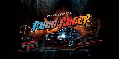 Road Racer is an esport style font that has a sporty character, very suitable for automotive design projects, sports and all products with a dynamic character.
 - Quirina by Autographis,
$39.50 Quirina is a very elegant joining Script that has – because of its high and open lowercase letters – excellent readability. It has a fat twin called Quiana.
 - Quiana by Autographis,
$39.50 Quiana is a very elegant joining Script that has – because of its high and open lowercase letters – excellent readability. It has a slim twin called Quirina.
 - Leonel Px by Letradora,
$12.00 Based on aa architect friend's handwriting with a calligraphic pen, this cool all-caps font comes with lots of alternates and a very complete character set.
 - Sunflor by YonTypeStudio Co,
$5.00 Introducing the elegant display serif fonts very suitable for the use of nature-themed logos, for wedding invitations, print projects, and posters, magazines and much more
 - Novel Mono Pro by Atlas Font Foundry,
$50.00 Novel Mono Pro is the monospaced typeface family within the largely extended award winning Novel Collection, also containing Novel Pro, Novel Sans Pro, Novel Sans Condensed Pro, Novel Sans Rounded Pro and Novel Sans Office Pro. Novel Mono Pro has a carefully attuned character design and a well balanced weight contrast. It combines the feeling of a modern humanist with the technical appearance of a typewriter. Many similarities with the other typeface families within the Novel Collection enable designers to combine the families and reach highest quality in typography. Novel Mono Pro [948 glyphs] comes in 12 styles and contains small caps for the uprights and the italics, ligatures, lining figures, hanging figures, small caps figures, positive and negative circled figures for upper and lower case, superior and inferior figures, fractions, extensive language support, arrows for uppercase and lowercase and many more OpenType™ features.
 - Marvis by Larin Type Co,
$15.00 Marvis is a vintage collection of fonts that includes serif, true italic, script, sans serif and slab serif each of them has two style - Clean and Rough style. Also for the script includes Alternates and Swashes. This collection was inspired by vintage signage, logos and this fonts are perfectly suitable for any vintage project and will make it at a high level. This fonts is easy to use has OpenType features. Font collection includes: Full Capital alphabet A-Z for Sans and Slab Full alphabet Uppercase and Lowercase A-z for Serif, Italic, Script Numbers, fractions for Serif, Italic, Script, Sans and Slab Punctuation and symbols for Serif, Italic, Script, Sans and Slab Alternates for Uppercase for Serif and Script Alternates for Lowercase for Script Swashes for Script Ligatures for Serif and Italic "Tb, Th, Tk, Tl, ct, fb, ff, ffi, fi, fh, fk, fl, st"
 - Adelphi PE by Rosetta,
$70.00 Adelphi is a geometric sans, redefined for the northern side of the English Channel. Typographic modernism was a late arrival in Britain — due partly to the Second World War and to the strong local type tradition. This delay provided for fruitful divergence, thus modernism was not adored in quite the same way as it had been in Germany and central Europe. It was instead rethought and repurposed against the backdrop of the bleak British weather and postwar social reform – a continental fashion statement reshaped into a more humanist variant. Likewise, when crafting Adelphi, Nick Job reimagined the constraints that defined the geometric sans as a genre. Whereas other typefaces seem overly bound by the rules, Adelphi feels relaxed and approachable. Elementary square and circular shapes are merely implied. A keen observer may notice that the uncomplicated letterforms occasionally reveal a subtle naïveté associated with early Grotesques. Brunel’s bridges and Harry Beck’s tube map spring to mind alongside the Bauhaus and Futura. But Adelphi is by no means nostalgic! It is a contemporary, comprehensive, and durable system with a pragmatic set of features. These include a wide array of weights, ‘uniwidth italics’, and variable extenders that go from tall and flat in Adelphi Text to short and sharp in Adelphi Display, with default Adelphi standing midway between these two extremes. You can set the extenders to your preference in the all-inclusive variable font or use one of the three static fonts that come packed together, priced as a single font. The pan-European support for Latin, Cyrillic and Greek scripts already makes for a vast character set, but Adelphi takes things a step further by including alternate glyphs to satisfy the DIN1450 legibility norm, a range of ordinals that can be used to create specialist compositions in all three scripts and two kinds of fractions and arrows. Play with the alternates or use it as-is. Either way, this understated beauty will carry you through.
 - Slicker - Unknown license

- Moksha - 100% free

- Blackout - 100% free

- Joyful Juliana Pro by CheapProFonts,
$10.00 This is Kimberly Gesweins own handwriting, named for a sweet California friend of hers. Kimberly has spotted the original free version of this font in use in the far outskirts of China, and now - with the expanded language support - this Pro version can also be used in more remote parts of the western world. ALL fonts from CheapProFonts have very extensive language support: They contain some unusual diacritic letters (some of which are contained in the Latin Extended-B Unicode block) supporting: Cornish, Filipino (Tagalog), Guarani, Luxembourgian, Malagasy, Romanian, Ulithian and Welsh. They also contain all glyphs in the Latin Extended-A Unicode block (which among others cover the Central European and Baltic areas) supporting: Afrikaans, Belarusian (Lacinka), Bosnian, Catalan, Chichewa, Croatian, Czech, Dutch, Esperanto, Greenlandic, Hungarian, Kashubian, Kurdish (Kurmanji), Latvian, Lithuanian, Maltese, Maori, Polish, Saami (Inari), Saami (North), Serbian (latin), Slovak(ian), Slovene, Sorbian (Lower), Sorbian (Upper), Turkish and Turkmen. And they of course contain all the usual "western" glyphs supporting: Albanian, Basque, Breton, Chamorro, Danish, Estonian, Faroese, Finnish, French, Frisian, Galican, German, Icelandic, Indonesian, Irish (Gaelic), Italian, Northern Sotho, Norwegian, Occitan, Portuguese, Rhaeto-Romance, Sami (Lule), Sami (South), Scots (Gaelic), Spanish, Swedish, Tswana, Walloon and Yapese.
 - Bingana by LetterStock,
$18.00 Bingana This pair was inspired by kids movie poster design that i saw on some gallery, It was crafted by hand specially to add natural handmade feeling in its brand identity than i make it clean with pentool. We improve with handmade to make a playful feel, this font is bold so it can look strong if you use it for branding or even title for your poster design with playful decorative style. Opentype features Bingana font has 175 character set included Bingana Font is very good looking in playful decorative logotype, labels, t-shirt prints, product packaging, invitations, advertising and others. This fonts works with folowing languages: Afrikaans, Albanian, Asu, Basque, Bemba, Bena, Chiga, Cornish, Danish, English, Estonian, Filipino, Finnish, French, Friulian, Galician, German, Gusii, Indonesian, Irish, Italian, Kabuverdianu, Kalenjin, Kinyarwanda, Low German, Luo, Luxembourgish, Luyia, Machame, Makhuwa-Meetto, Makonde, Malagasy, Malay, Manx, Morisyen, North Ndebele, Norwegian Bokmål, Norwegian Nynorsk, Nyankole, Oromo, Portuguese, Romansh, Rombo, Rundi, Rwa, Samburu, Sango, Sangu, Scottish Gaelic, Sena, Shambala, Shona, Soga, Somali, Spanish, Swahili, Swedish, Swiss German, Taita, Teso, Vunjo, Zulu Thank you for using this font. LS
 - Helvetica Monospaced by Linotype,
$42.99 Born in 1831, Hermann Berthold was the son of a calico-printer. On completion of his apprenticeship as a precision-instrument maker and after practical experience gained abroad in galvanography, Hermann Berthold founded his "Institute for Galvano Technology" in Berlin in 1858. Very quickly he discovered a method of producing circular lines from brass and not, as customary at that time, from lead or zinc. The soldering normally necessary could also be dispensed with. The lines were elastic and therefore highly durable. They produced outstandingly fine results. Most of German's letterpress printers and many printers abroad placed their orders with Berthold. His products became so popular that the print trade popularized the saying "As precise as Berthold brass". In 1878 Hermann Berthold was commissioned to put an end to the confusion of typographic systems of measurement. With the aid of Professor Foerster he succeeded in devising a basic unit of measurement (1m = 2,660 typographic points). This was the birth of the first generally binding system of typographic measurement. It is still used in the trade. Hermann Berthold served as the head of the Berthold type foundry until 1888.


