10,000 search results
(0.017 seconds)
- MCM Hellenic Wide by Victory Type,
$15.99 Victory Type Studios is pleased to announce the release of MCM Hellenic Wide, the first typeface from the upcoming Mid-Century Modern Collection--a set of vintage American typefaces rescued from the dustbin of history and rendered for digital use. You've seen it before. But it’s been a while... MCM Hellenic Wide is an extended slab-serif typeface that was painted on railroad cars and stamped on posters; it was found in textbooks and once proudly graced letterheads. MCM Hellenic Wide lacks frills and flourishes. Its trademark single-thickness alphabet features broad and squared-off serifs. Now that retro is en vogue, do yourself a favor and download MCM Hellenic Wide today. This digital revival of a once pervasive unappreciated typeface was rendered from scans of primary source material. MCM Hellenic Wide will add a bit of classy Americana to your next design. MCM Hellenic Wide is available for Mac and PC, in TrueType, OpenType and PostScript formats. Includes kerning.
 - Dancing Fool by PizzaDude.dk,
$15.00 A Dancing Fool is not always meant as a positive thing - but in this case it is 100 percent positive and innocent. It's just about someone who is dancing in a foolish way. A good way to describe this font, because it is silly looking, but not in any offensive way!
 - Beletrio by Storm Type Foundry,
$29.00 Beletrio was made as companion to Beletria, it has many shapes in common. We already have plenty of sans-serif fonts with classical proportions in the Stormtype library, such as John Sans, Sebastian or Andulka, but Beletrio is certainly the most peaceful of the bunch – it shares not only the feel of its serif originator, but its soft curves provide lovely visual caress as well. The smooth endings are not visible at first, they are balanced for easy reading as they solve some critical relations such as "rv, ry, rt", but in larger sizes you'll fully enjoy the picturesque details. It handles the smallest point sizes as well as large billboards, fashion magazines and philosophic tractates.
 - Queeta Brush by Realtype,
$16.00 Queeta inspired by natural brush typeface. Written in fast motion using a little bit dry brush pen. It will give you a fresh and modern design and will look beautiful with offer, magazine mode, offer logo, product packaging, headers, posters, merchandise, social media greeting cards & more.
 - Summer Knock by Seemly Fonts,
$14.00 Summer Knock is a unique and interesting display font. A little bit quirky, this font is a great choice for a wide variety of contexts! It looks stunning on thank you cards, quotes, greeting cards, logos, business cards, and every other design which needs a creative spark.
 - Stray by Tour De Force,
$25.00 Stray might be the lonesome cowboy in this big odd world, but it's his just public façade. Stray is handsome player that works well with any team or in any environment. He doesn't have a horse, but he can be the one, he can carry any weight. OK, let's talk serious now: Stray is distinctive geometric sans serif family in 9 weights and matching Italics. By it's design, Stray flirts with humanistic typefaces in some elements, while on the other side, we can see vintage letter forms as well. It is well balanced typeface, fully legible in any (reasonable) size, with power to present versatile tasks and situations. Specific joining of letter stem and bowl is one of design characteristics of Stray, so it is not just another geometric sans family, it really differs in it's own details. Contains extended Latin character map support and Cyrillic (no localizations, sorry). As any serious working horse family, it is equipped with decent OpenType features like Small Caps (for basic Latin only), Fractions, Tabular Figures, Denominator, Numerator, Ordinals and Ligatures. It also comes with small interesting set of dingbats. This Stray is not homeless, he just looks for the proper job :-)
 - Monaz by Craft Supply Co,
$20.00 Introduction to Monaz – Bubble Font Monaz – Bubble Font, a playful and airy display font, is inspired by the lightness and roundness of bubbles and balloons. Perfect for creating eye-catching headings, logos, and children’s books, this font not only grabs attention but also serves as an ideal choice for fun and whimsical projects. Design and Aesthetics In its design, Monaz – Bubble Font features characters that resemble bubbles, with rounded edges and a bouncy feel. Furthermore, the letters mimic the floating appearance of balloons, thus adding a cheerful and lighthearted touch to any design. Additionally, its rounded forms are easy on the eyes, ensuring readability while preserving its playful charm. Versatility and Usage Monaz – Bubble Font boasts high versatility, fitting a variety of design needs effortlessly. Not only does it shine in party invitations and product packaging, but it also excels in promotional materials. Moreover, its effectiveness extends to educational materials for children, making learning engaging with its friendly appearance. As a result, its readability and unique style make it a top choice for designers seeking to add a fun element to their projects. Accessibility and Appeal Designed for a wide audience, Monaz – Bubble Font features a simple and clear style that is easy to read. It appeals to all ages, capturing the whimsy of childhood while still being sophisticated enough for adult projects. In summary, this font brings a unique joy and playfulness to any design, making it a valuable addition to any font collection.
 - Kolkata Hotelroom by Hanoded,
$10.00 Hotel rooms in Kolkata don't top the list of 'luxurious habitations'. They are dingy, fly-ridden, dirty and noisy. But if you look really hard, you will find traces of long gone grandeur. This font is all of the above and more: it is sloppy and messy, it spikes and sags, but it does give your designs that extra oomph you are looking for.
 - Pisang Manis by Hanoded,
$16.00 Pisang Manis means ‘sweet banana’ in Bahasa Indonesia. I don’t think this particular combination is used in everyday life, but it sounds nice. Pisang Manis is based on an older font of mine, called Pisang, which I created in 2013. It looks similar, but it is a different font altogether. Pisang Manis is a ‘Tall & Thin’ display font, ideally used for product packaging, websites and book covers.
 - Squirrely Shirley NF by Nick's Fonts,
$10.00Another entry in the trusty old "Schriftatlas" named Phoenix—original source and designer unknown—provided the inspiration for this bouncy bit of alphabetical tomfoolery. Its animated typeforms, definitely retro chic, will put some bounce in the step of any headline it graces. Both versions of the font include complete Latin 1252, Central European 1250 and Turkish 1524 character sets, with localization for Moldovan, Romanian and Turkish - Kiddie Show JNL by Jeff Levine,
$29.00 The design for Kiddie Show JNL is based on the hand lettering for a piece of sheet music from 1946 entitled "Wee Marionettes". While basically an Art Deco-flavored monoline typeface, it contains characters with intersecting lines and assembled parts that give it an eccentric, playful look. Available in both regular and oblique versions to add a bit of playfulness to your next project.
 - Gumbo by Hanoded,
$17.00Lately I have been experimenting with different foods. At home, we eat a lot of Asian food, but I thought it would be nice to broaden my culinary horizon a bit. So far I have (successfully) added Georgian beef and walnut soup, Tacos (after a suggestion by my friend Stuart), Surinam Roti and various vegetarian dishes to our menu. When I created this font, I had to think of Gumbo - a dish I have never made. Gumbo is a handmade display font that comes in a rotund regular and an obese bold (with Italics). Use it for your book covers, product packaging and sticky notes. Gumbo comes with cute ‘end of word’ ligatures - just type the glyph + space and presto: you have a little swash. As for the dish Gumbo, well, I will make that this weekend! - Oops by Posterizer KG,
$22.00 The initial idea for the Oops font, was to create graphemes, and by using them it could imitate a mark of a spilled liquid-stain. In an attempt to make the most convincing effect, those graphemes were written on glass. The final appearance of the graphemes, mostly remain in their basic form, and have the characteristic of a liquid, like fluidity in motion. This manuscript is expressive, but that does not affect the readability of the letters. The generated font was created by using Photoshop, Illustrator and a little bit of interventions in Font Lab. Font Oops is updated and edited version of an old version of the Art decor font, which had just basic letters. Today, Oops font contains Latin and Cyrillic letters, and it can be ideal for use in subjects like a paintball, art, expression, ink, water...
 - Darkness Rising by Hanoded,
$15.00 I was in a bit of a gloomy mood just before I created this font. I had no inspiration whatsoever (which always affects me in a bad way). I was trying to create a font using broken satay skewers, as using those gives the letters a unique look. I broke about 25 skewers and they all broke ‘the wrong way’. Yes, it’s pathetic, I know, but that’s how it is. I decided to go to the gym and do a little workout, hoping my dark mood would pass. When I came back, I broke one more skewer and lo and behold, it broke exactly the right way! I made this font in one go, using that fantastic skewer and lots of Chinese ink. Darkness Rising comes with all the diacritics you’ll need, plus double letter ligatures and some cool underlined alternates.
 - Glam Rock MF by Masterfont,
$59.00 Either Futuristic or Space ship logo - it will sure fit to a mysterious poster.
 - Sandor by Eko Bimantara,
$18.00 Sandor is experimental serif font. Its fit for brand, titles, heading and display purposes.
 - AM Consist by Alexey Markin,
$50.00 This font I had, had only to wake up, sit down and draw it.
 - Sortie Super by Lewis McGuffie Type,
$40.00 Sortie Super is a take on one of the kings of display lettering - Caslon's high-contrast, reversed stress 'Italian' style. It looks great at big sizes and in short flurries... and shouldn't be used in confined spaces. When compared with the original face, the weight and contrast of Sortie Super has been exaggerated. To add gravity to the letters I've increased their width overall and reduced the spacing to a hair-line fracture for added visual impact. Characters like 'S', 'E','O' and 'Z' are relatively close to their historical precedents - however the terminals on the 'C-G-S-З-Є', which have been drawn so to be more consistent. Other aspects, such as the leg of the 'R' and 'Я', the apex of the 'A' and the spur of the 'G' are revised and simplified, to help spacing and optical weight across the alphabet. Also, to reduce visual noise terminals in characters like 'C', 'J' and 'R'' are horizontally aligned. Meanwhile, the central horizontal strokes in the 'B', 'P' and 'R' etc are reduced to a hairline, so as to create a more simplified system of thick-to-thin. The temptation when drawing this kind of esoteric display alphabet is to start to rely on modular components. Which, while copy-paste-repeat is a sure-fire way to make the face more visually consistent, it's a lazy method that risks allowing the font become soulless and mechanical. An early experiment I made was making a monospaced version, which was useful in headlines, but it lost that loving feeling. So, by maintaining a handful of flourishes – the tail of the '?', the inky drop of the '!', the bulbous gloop of arms of the 'Ж' and 'К', the swirling legs in the 'R', 'Я' and 'Л', the big-bowling weight of the 'J' and 'U' – plus a few in-built inconsistencies and a bit of its own silliness, Sortie Super retains some of the organic warmth of its ancestor. Conversely, the counters, apertures and negative space are largely rigidly geometric, which helps give the revival font a bit of a modern touch. Sortie Super is an uppercase-only display font that comes with Western, Central and East European Latin, extended Cyrillic, Pinyin, as well as a set of hairline graphic features and symbols.
 - WILK by Edyta Demurat,
$20.00 Do you need a hand-drawn, heavy, creative typeface? If so, WILK is perfect for you! This font was created specially for fairy tale "Little Red Riding Hood" and it was inspired by the fairy-tale's character of wolf . The typography is tight- knit and fat but also free and funny. It consists only of uppercases, but it has two up to five alternative gifs for each letter. This great choice of gifs makes WILK perfect for long texts but not only! It's also great in a large magnification.
 - Redig by Great Scott,
$16.00 Redig is a bold condensed display typeface with an assertive and athletic aesthetic. Inspired by newspaper headline typefaces from early 1900s it has chamfered corners with rounded edges that smooths out some harshness and generous x-height to its lower case characters. Redig will shine when used big. And I mean BIG. This is certainly a case when “bigger is better” really is the truth. Redig comes with an oblique style and ligatures and works best in headlines, logos, branding, social media or any display type use. Use it big.
 - Manye by Craft Supply Co,
$20.00 Introducing Manye – Blackletter Font A Unique Display Typeface Manye stands out as a captivating Blackletter Font, adding a touch of distinctiveness to your display and design requirements. Distinctive Elegance Manye’s design exudes a distinctive elegance, making it the perfect choice for attention-grabbing displays. Versatile for Creative Projects Beyond its elegant design, Manye’s versatility shines, allowing it to seamlessly complement a wide range of creative endeavors. Captivating and Memorable Manye ensures that your content is not only captivating but also memorable, leaving a lasting and distinctive impression. In Conclusion To sum it up, Manye – Blackletter Font is the ideal choice for display and unique design needs in the world of typography. Its distinctive elegance and versatility make it a great fit for a variety of creative projects. Manye captivates your audience, leaving them with a memorable and distinctive experience, ensuring accessibility to a broad readership.
 - Sarun Pro by Stawix,
$49.00 Sarun is a typeface that harmonises between Humanist, Geometric and Industrial Sans, it would be a bit problematic to define its definite character. Nevertheless, Sarun is very compatible with layouts and super easy to use in a variety of designs. Not only is Sarun equipped with Italic, Small Caps and a complete Alternate set, it also contains the 10 most significant Cryptocurrency signs. Sarun consists of 10 weights and 3 widths along with Italic in every styles.
 - Great Bromwich by Greater Albion Typefounders,
$14.95 Great Bromwich takes the ideas in Greater Albion's Bromwich family that little bit further. It can be used on its own, or as a compliment to Bromwich. Great Bromwich uses specially re-designed large and small capitals, to enable that bold headline statement to be made with impressive Edwardian flair. In the spirit of railway travel posters and illustrated news journals, its a wonderful font for poster design, or for book covers and other work with a period theme.
 - DSari by Latinotype,
$29.00 It is inspired by the friendliness and cordiality of neo-humanist typefaces with a mix of rounded shapes, some apexed characters, and a little bit of black. Although it follows the ductus, D Sari is also a daring font with less pointed shapes, as is the case with regular neo-humanist typefaces. D Sari has 22 variants, which make it a very dynamic typeface. Well-suited for highlighting lettering, magazines, motion graphics, advertising, logotypes, signs, etc.
 - Gain And Reverb by takoliko,
$9.00 Gain and reverb is a awesome raw typeface. Basicly its a serif hand drawn typeface. Inspired by the gain and reverb sound of a guitar and a rock band. It has a little bit rebellion vibe and a handmade touch on the characters. You can add a different weight to create a variation and uniqueness on the letters, make even more look like its a raw hand made design. So enjoy and have a great project with our typeface!
 - Ole by Fly Fonts,
$15.00Ole is a retro jazz inspired font with clean lines and a classic style. Use it big to fully appreciate the extreme nature of its design. - Kardust TS Condensed by ARToni,
$7.00 Kardust TS is a part of Kardust family, which is born from it skeleton to suit Transportation and Sport, but it will suitable for any purpose.
 - With You by Subectype,
$15.00 With you is a sweet brushed handwritten font. Its natural and unique style makes it incredibly fitting to a wide spectrum of ideas. Thank You, Subectype
 - Mairy by Typesketchbook,
$39.00 Mairy font family is a modern sans serif font family. Featuring 9 separate weights each followed by own true italics Mairy is positioned somewhere between rounded sans with humanist touch. In fact the humanist presence in Mairy is a little bit more than the usual doze adding more calligraphic elements mostly noticeable in italic weights but also very important in regulars. This symbiosis of Grotesk geometry with handwriting is well balanced regarding contrast and legibility so that at the end we have a highly usable font family. Light weights are very tender and elegant while the old and blacks are soft, friendly and full of vitality. The mid weights are just perfect with their medium contrast and excellent legibility. Mairy is very fresh font family and is surprisingly flexible when it comes to screen or print use – it is optimized for both even if the conditions are poor. Use it with OpenType compatible software and explore its true potential by accessing additional set of ligatures, alternates and multilingual support.
 - Aphrodite Slim by Typesenses,
$57.00 Aphrodite Slim Pro is not just a lighter version of its sister Aphrodite Pro. Aphrodite Slim Pro has duplicated the quantity of characters of its partner, and that means more than 500 new glyphs, reaching a total of more than 1000. More delicate and meticulous, Aphrodite Slim Pro is once more a new typography with deep calligraphic ideals: We immersed ourselves into the world of each calligraphy ductus and each calligraphy masters by studying from decoration to lettering books. This was the key for the logic of Aphrodite Slim’s behavior. The new concept of Aphrodite Slim Pro was to join diverse styles of calligraphy in one in order to achieve an autonomous expressiveness, in fact, this is what calligraphy aims to, and we agreed to bring those ideals to the world of typography: It is justifiable to be inspired in hundred-year-old calligraphies, but it is even better if the results you obtain have a plus. A personal plus. During the creation process we were wondering whether it was possible to mix certain strokes of such rigid styles as uncial, (Li·n’s favourite style), with strokes of the copperplate, (Sav’s favourite style), and also to take and mix cualities of cancelleresca cursiva, formata and moderna; finally giving our creation a roman-transition italic look. So Aphrodite Slim takes ideals and aspects from those formal styles, following its own logic though, and emphasizing the fact of being a decorative typography. Calligraphy masters of our past are who we are in debt with. They are the cause we have lovely letters now. They have been spontaneous at the moment of creation, what differs from the type-designers of nowadays, whose spontaneity is more limited. Digital faces that we are used to see these days are a result of long hours of optical adjustments, grids, macros and inspirations of other existing typography, but without personal contributions. Aphrodite Slim wants to refute this. Its mission is to rescue de spontaneity of the artesanal lettering in order to obtain unique words; those which only calligraphy masters of our past or lettering artists of our present could give us. We have worked hard to achieve this, making Aphrodite the most universal font we could: It was necessary to study the most common words, focalizing more in the ones referring to “sensitivity”, of four of the most spoken languages in the world. Aphrodite Slim has an enormous quantity of decorative characters and special ligatures for phrases and words in English, French, Spanish and German. (See English, Français, Español, Deutsch PDF in the gallery section). We promise there is no existing type that decorates/ligates glyphs and words like Aphrodite Slim does: It is the first time a font like this really considers its purpose. -The way glyphs are ligated is insane- : Aphrodite Slim rescues some ideals of persons like Jan van den Velde (Italian cancilleresca writing of XVI Century) who understands ascenders and descenders as possibilities to beautify the lines of writing with curved strokes that seem to be dancing above and below of the words. This master also creates ascenders and descenders even where they are not necessary, on letters that do not actually need them: Aphrodite Slim takes this ideal. The font counts with a wide range of glyphs that seem not to be satisfied with its more primitive form and prefer to extreme their parts to be decorative. It also existed masters of calligraphy like José de Casanova of XVII Century, who, with a magnificant skill and a really personal mark, had the particularity of ligating words that were actually separated with spaces. This is another innovative feature in Aphrodite Slim. An investigation of the most common beginnings and endings words of the English language was done. Having that feature activated (discretionary ligatures), common words will start to ligate or to be decorated even when they are separated by spaces. Impossible to forget Francesco Periccioli of XVII Century and our experience us designers to face with works of him: His letters, that today are included in the group of cancellerescas modernas, have been a direct inspiration to the oldstyle figures and historical forms variables in Aphrodite Slim. Giovanni Antonio Tagliente (XVI Century) and his particular way of making tails and diagonals longer than usual, qualities that our creation reflects too. Finally, our adventures in Biblioteca Nacional and Barrio San Telmo, Buenos Aires, were essential for us to make Aphrodite Slim more complete and interesting: Sav did an excellent work when studying how the decorative miscellanea and swirls of early XX century were. She also investigated what particularities made those roman titling characters look antique so she could rescue some ideals for the oldstyle figures and historical forms variables. This also leaded her to create the ornaments variable in Aphrodite Slim. We are really proud of presenting Aphrodite Slim Pro, a typography that was the result of days and nights of working hard, because we do love what we do; and we are glad we are living in a present that gives us the possibility to spread this kind of art, because that is the way we consider our job: Aphrodite Slim Pro is Art. Hope you can appreciate the enormous work this type has. Features. Aphrodite Slim Pro is the most complete variable. It includes more than 1000 glyphs. Thanks to the Open-Type programming, it counts with a easy way to change/alternate glyphs if the application in which the font is used supports this. The variables contained in Aphrodite Slim Pro are also offered separately. Aphrodite Slim Text: It is the variable for lines and paragraphs. Thus it is the least ornamental and the most accurate to achieve a satisfying legibility. It has the Standard Ligatures feature in order to improve the possible conflicts some glyphs could have by others. Aphrodite Slim Contextual: It is the one that makes emphasis in decorating. It has the particularity of ligating/decorating words of common use in English, French, Spanish and German. It also has the quality of ligating common beginnings and endings of the common words in English. Aphrodite Slim Stylistic: With similar features of Slim Contextual. It includes a set of decorative numbers for a display use. Aphrodite Slim Swash: This one has special beginnings and endings to decorate words. Aphrodite Slim Endings: It makes words look as a signature. Aphrodite Slim Historical: It adds an antique look to the written word. It also has the special historical ligature function. Aphrodite Slim Titling: This one is the most decorative. Its copperplate inspired ornaments give words a special color, in order to handle the quantity of decoration, it comes with the standard ligature feature, which has the most common ligatures plus others that make decorative swirls not to be conflictive. Aphrodite Slim Ornaments: A set of 52 ornaments. Aphrodite Slim Pro includes all this features plus the Stylistic Set 1; Stylistic Set 2 and the possibility of Slashed Zero. We recommend you to check out the gallery in order to see all these features in action.
 - Ace Crikey - Unknown license

- Balboa Plus by Parkinson,
$20.00 Balboa Plus is a condensed sans serif display family. It was originally conceived as a simple black and white typeface. But it seemed unfinished, begging for something more. I decided to try adding a couple layers of fill and detail to try and make it interesting. The result is this four-layer chromatic font family. The Primary Font is the Main Font. The other fonts ( Fill, Inline, and Gradient) only exist to support the Primary Font. The Fill font should sit behind the Primary font (there is a little color trapping going on). The rest is even easier. There is a free downloadable PDF Balboa User Manual in the Gallery section for this family. It has samples and some backstory. Balboa™ is a trademark of Parkinson Type Design.
 - Dubbel Zout by Hanoded,
$15.00 Dubbel Zout in Dutch means ‘Double Salt’. I admit, it sounds better in Dutch… Dubbel Zout is a kind of licorice which we (in Holland) love! Not many people actually like it, but I know of one addict in Denmark, who eats it by the bagful. Dubbel Zout is a ‘crayon-ish’ font - all caps, different upper and lower glyphs that you can mix and a royal assortment of diacritics. It may be an acquired taste, but once you get used to it, you’re hooked!
 - Bandleader JNL by Jeff Levine,
$29.00 How does one arrive at a font name? With the thousands of digital typefaces available, it's not an easy process. Bandleader JNL was modeled from the hand-lettered title on a piece of sheet music called "Largo", which means "slow tempo". Since the names "Largo" and "Tempo" were already taken, what other musical theme would fit? The lettering is in an Art Deco style, and Big Band was all the rage of the Art Deco period; therefore "Bandleader". Sometimes the road to naming a font takes on many twists and turns but the end result is always gratifying.
 - Dzulfiqar by Aisyah,
$12.00 Dzulfiqar is a simple and dainty handwritten font. Its natural and unique style makes it incredibly fitting to a large pool of designs. Use this font for your designs and explore its endless possibilities.
 - Seryliat by Aisyah,
$12.00 Seryliat is a simple and dainty handwritten font. Its natural and unique style makes it incredibly fitting to a large pool of designs. Use this font for your designs and explore its endless possibilities.
 - Subelek by Subtitude,
$28.00 First developped for a logo that was rejected we made a font of it! It is an old-style techno but still modern new font (what a mix!). It is simply playful and fashionable.
 - Phobey by Aisyah,
$12.00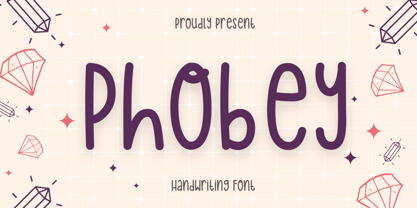 Phobey is a simple and dainty handwritten font. Its natural and unique style makes it incredibly fitting to a large pool of designs. Use this font for your designs and explore its endless possibilities.
 - Spinnenkop by Hanoded,
$15.00 Spinnenkop is an old Dutch word which means both ‘spider’ and (in dialect) cobweb. The word forms the basis for that English word: cobweb. Spinnenkop is a magical font. I didn’t use witchcraft to create it, but when it was finished, it reminded me of old fairytales, spell-books and potion recipes. Use it for anything you like, but book covers, product packaging and posters come to mind. Comes with a few swashed letters and a weird alternate g.
 - House Soft by TypeUnion,
$30.00 House Soft is the curvy, fun little brother of House Sans. Its exaggerated rounded corners give it a playful feel that will bring happiness and joy wherever it’s used. Like its big brother, House Soft is also made up of 100 weights in 5 useful widths (Compressed to extended) that make it a versatile font. From big bold headlines to playful brands House Soft offers the flexibility and uniqueness you and your project deserve. Go soft or go home.
