10,000 search results
(0.045 seconds)
- Angel Tears - Personal use only

- Optien - Personal use only

- Botanink - Personal use only

- Project Y - Personal use only

- Ringer - Personal use only

- Characteristic - Personal use only

- Project X - Personal use only

- BPpong - Unknown license

- JptBubbles - Personal use only

- Quimbie - 100% free

- Maskalin - Unknown license

- Balboa Plus by Parkinson,
$20.00 Balboa Plus is a condensed sans serif display family. It was originally conceived as a simple black and white typeface. But it seemed unfinished, begging for something more. I decided to try adding a couple layers of fill and detail to try and make it interesting. The result is this four-layer chromatic font family. The Primary Font is the Main Font. The other fonts ( Fill, Inline, and Gradient) only exist to support the Primary Font. The Fill font should sit behind the Primary font (there is a little color trapping going on). The rest is even easier. There is a free downloadable PDF Balboa User Manual in the Gallery section for this family. It has samples and some backstory. Balboa™ is a trademark of Parkinson Type Design.
 - Dubbel Zout by Hanoded,
$15.00 Dubbel Zout in Dutch means ‘Double Salt’. I admit, it sounds better in Dutch… Dubbel Zout is a kind of licorice which we (in Holland) love! Not many people actually like it, but I know of one addict in Denmark, who eats it by the bagful. Dubbel Zout is a ‘crayon-ish’ font - all caps, different upper and lower glyphs that you can mix and a royal assortment of diacritics. It may be an acquired taste, but once you get used to it, you’re hooked!
 - Bandleader JNL by Jeff Levine,
$29.00 How does one arrive at a font name? With the thousands of digital typefaces available, it's not an easy process. Bandleader JNL was modeled from the hand-lettered title on a piece of sheet music called "Largo", which means "slow tempo". Since the names "Largo" and "Tempo" were already taken, what other musical theme would fit? The lettering is in an Art Deco style, and Big Band was all the rage of the Art Deco period; therefore "Bandleader". Sometimes the road to naming a font takes on many twists and turns but the end result is always gratifying.
 - Mod Quad S - Unknown license

- Dzulfiqar by Aisyah,
$12.00 Dzulfiqar is a simple and dainty handwritten font. Its natural and unique style makes it incredibly fitting to a large pool of designs. Use this font for your designs and explore its endless possibilities.
 - Seryliat by Aisyah,
$12.00 Seryliat is a simple and dainty handwritten font. Its natural and unique style makes it incredibly fitting to a large pool of designs. Use this font for your designs and explore its endless possibilities.
 - Subelek by Subtitude,
$28.00 First developped for a logo that was rejected we made a font of it! It is an old-style techno but still modern new font (what a mix!). It is simply playful and fashionable.
 - Phobey by Aisyah,
$12.00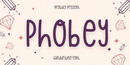 Phobey is a simple and dainty handwritten font. Its natural and unique style makes it incredibly fitting to a large pool of designs. Use this font for your designs and explore its endless possibilities.
 - Spinnenkop by Hanoded,
$15.00 Spinnenkop is an old Dutch word which means both ‘spider’ and (in dialect) cobweb. The word forms the basis for that English word: cobweb. Spinnenkop is a magical font. I didn’t use witchcraft to create it, but when it was finished, it reminded me of old fairytales, spell-books and potion recipes. Use it for anything you like, but book covers, product packaging and posters come to mind. Comes with a few swashed letters and a weird alternate g.
 - House Soft by TypeUnion,
$30.00 House Soft is the curvy, fun little brother of House Sans. Its exaggerated rounded corners give it a playful feel that will bring happiness and joy wherever it’s used. Like its big brother, House Soft is also made up of 100 weights in 5 useful widths (Compressed to extended) that make it a versatile font. From big bold headlines to playful brands House Soft offers the flexibility and uniqueness you and your project deserve. Go soft or go home.
 - Config by Adam Ladd,
$25.00 Config was influenced by geometric sans with circular forms but the proportions have been condensed by incorporating straight sides for a design that is sturdy and efficient yet friendly. The neutral design with subtle details makes it functional for type setting in small and large sizes. Its clean nature makes it readable at small sizes but the touch of character—as seen in the notched joints, rounded details, and horizontal/vertical terminals—make it interesting at large sizes.
 - SK Boncuk by Salih Kizilkaya,
$9.99 SK Boncuk is a very special font family I designed for my pet. Bead is a very smart and special rabbit. It can understand all commands and do whatever is said. It is very lively and fun in his daily life, but also monotonous. For this reason, I designed a fun font for him, with a single weight but with surprises. This font represents Boncuk's fun but monotonous life. SK Boncuk offers full support for the Latin alphabet and includes all the typographic elements you will need. This font family consists of 8 different fonts and 3288 glyphs and it supports hundreds of different languages thanks to the characters it contains.
 - Rosso by W Type Foundry,
$29.00 Rosso is a condensed geometric Sans with a retro style, inspired by various typographic styles. It features the Roslyn Gothic structure, which was popularly used for the covers of Philip K. Dick's books in the 1970s. Rosso has 10 variants from Ultra Light to Black with their respective Italics. In addition, it is divided into two Subfamilies, Normal and Alt. The normal one remains faithful to the proportions of Roslyn Gothic and classic geometric fonts, while the Alternative version expands its round shapes, generating a striking and unique rhythm and contrast, classic of Art Deco fonts. In addition, it has alternative glyphs and discretionary ligatures inspired by the work of Herb Lubalin, which add greater possibilities to face any design project. All this makes Rosso a font full of personality, striking and recognizable. Ideal for the construction of logos, eye-catching headlines, movie posters, volumetric posters, etc.
 - Realtime Rounded by Juri Zaech,
$30.00 Information displays have an aesthetic of their own. Functional design where transmission of information is key — and best in real time. The Realtime Rounded typeface is not meant to recreate the appearance of those applications, instead it takes inspiration from them. The result is a technical yet friendly design with details that serve function and visual impact alike. Its soft edges apply warmth to the otherwise rather technical appearance. As a monospaced typeface it lends itself to tabular designs, sturdy columns and tidy layouts. Nevertheless Realtime comes with a feature for setting continuous text — a proportional design employable through OpenType — it further comes in five weights, from light to black, and with a character set that covers over 200 latin languages. Please see the Realtime Rounded Type Specimen PDF in the gallery. Realtime Rounded is the soft companion to the standard Realtime Typeface which is available separately. Thanks for visiting!
 - Juxta by NaumType,
$19.00 Juxta is a unique experimental and futuristic script. It was born from the idea to combine two antipodes: programming fonts aesthetics and handwritten script. Juxta has witty and jagged character combined with a perfect grid structure and certain decorative elements, such as cross out letters, that gives it the spirit of Nordic minimalistic design. Juxta script is a part of Juxta superfamily, united by the same aesthetics, which currently also includes Juxta sans. Juxta script is available in 7 weights, including Thin, Light, Regular, Medium, SemiBold, Bold, and Black. It is a potential leitmotif of graphic design projects that need a creative breakthrough, including logos, labels, branding, identity, website design, album art, posters, advertising. Juxta offers standard ligatures, contextual and stylistic alternates. It extends multilingual support to Basic Latin, Western European, Euro, Catalan, Baltic, Turkish, Central European, Pan African Latin, Afrikaans, and Basic Cyrillic for exceptionally far-reaching global accessibility.
 - Thought by Scholtz Fonts,
$15.00 Thought, with its versatile five styles, is ideal for contemporary display work. It has style, flair, legibility, and interesting, flowing letter shapes. The Family: -- REGULAR - of medium weight - clear and legible; -- BLACK - for bolder statements and best readabilty; -- LINEAR 25 - light weight, mono width line -- LINEAR 45 - medium weight, mono width line -- ZEST - variable line, casual, exaggerated appearance Use a combination of styles for product branding, book covers, invitations, greeting cards. Thought has not been designed to be used in "ALL CAPS". The best effects for headings and subheads are obtained with an initial upper case letter followed by lower case characters. If you are using upper and lower case then it is not necessary to use kerning. Thought contains over 250 characters - (upper and lower case characters, punctuation, numerals, symbols and accented characters are present). It has all the accented characters used in most European languages.
 - Sunrise Till Sunset by Comicraft,
$19.00 Between twilight and daybreak it is said that the dark side of the human psyche eclipses the sun that shines from the depths of our souls. Certainty turns to doubt, clarity becomes confusion, man turns into wolf, the dead wake, vampires seduce the young are restless and milk boils over on the stove. Those that seek only to bathe in the light of a romantic new moon often end their tragic lives soaked in nothing other than their own blood, and the milk spilt on the stovetop has no one left to cry over it. There are fifty shades of grey during those hours after sunset and I think just as many in my porridge this morning. Yes, okay, I admit it, I spoiled the milk! This porridge tastes like it was left in a graveyard overnight. Death warmed over. Gothic and lumpy. Just like the Buried weights of this font.
 - TGL 31034-1 - Unknown license

- TGL 31034-2 - 100% free

- Caslon Open Face by Monotype,
$29.00Open, outline or inline faces became very popular in the 1940's. By removing the usual weight, a clear-cut letterform is achieved. In Caslon Open Face, the right-hand strokes are accentuated, providing a slightly three-dimensional effect. The ascenders of Caslon Open Face are large and the overall design of this version does not relate to Caslon 3 Roman. This Caslon Open Face font is good for personal stationery, or sentences where a decorative but distinguished result is sought. - Terror JNL by Jeff Levine,
$29.00Creepy...crumbly...spooky... that's Terror JNL. Originally an experimental outline font made in the early days of Jeff Levine's typographic work, it's been revised and properly spaced for the design professional. The font is based on Ray Larabie's 1990's freeware release Foo - and a hand-traced, weathered-look was applied to the letter shapes. There's no kerning and a limited character set - but Terror JNL is still perfect for any headline that depicts "things that go bump in the night"... - Alifut MF by Masterfont,
$59.00 A practical font family with 4 weights for all your day to day design needs: headlines, body text, signage etc. High legibility at small sizes. An extended sans serif typeface with rounded endings that provides a unique softness appearance without losing legibility. The Pro version is an excellent support for Niqqud (Vowels). All marks are programmed to fit each glyph's shape and width. Best used with apps that support right to left Hebrew text, like Adobe InDesign CC or MS Word.
 - Decima Nova Pro by TipografiaRamis,
$39.00 Decima Nova Pro is a geometric sans serif typeface family, built in eight styles. The typeface is ideal for use in display sizes, but also is quite legible in text and is well suited for editorial and brand design. Features include extended language support, small caps, multiple numeral styles, slashed zero, ligatures... Decima Nova Pro is released as font family in OpenType format with a Latin Western 1252, Eastern European 1250, Baltic 1257, Turkish 1254 and Cyrillic 1251 character set.
 - Caslon Open Face by Image Club,
$29.99Open, outline or inline faces became very popular in the 1940's. By removing the usual weight, a clear-cut letterform is achieved. In Caslon Open Face, the right-hand strokes are accentuated, providing a slightly three-dimensional effect. The ascenders of Caslon Open Face are large and the overall design of this version does not relate to Caslon 3 Roman. This Caslon Open Face font is good for personal stationery, or sentences where a decorative but distinguished result is sought. - Art School by AVP,
$25.00 Faithfully reproduced from my father’s design drawings made at The Municipal School of Arts and Crafts, Wolverhampton in 1939. Strong nostalgic influences of Art Nouveau and Art Deco. What caught my eye was the consistency with which each particular character was formed: every ‘R’ like every other, every ‘S’ the same. Tight letter spacing and loose word spacing characterised his titling but he didn’t trust himself to print without first ruling guidelines, a hint of which remain in this font.
 - GAMECUBEN - Unknown license

- theLUXX by Resistenza,
$39.00 The Luxx font was born in 2010 and in the 2013 has been redesigned. Luxx is based on a style of lettering often seen on Italian art deco posters and advertising of the 1930s. This font is very modern, and is inspired by the “velocitá-speed” of this artistic period. TheLuxx is perfect for when you want to use eye-catching big texts for anything from posters and retro-advertisements, and art, but it´s especially striking for printed projects.
 - Config Rounded by Adam Ladd,
$25.00 Config Rounded is a condensed geometric sans with rounded corners. Config’s sibling, this typeface was influenced by geometric sans with circular forms on the tops and bottoms of characters, but the proportions have been condensed by incorporating straight sides for a design that is efficient yet friendly. Use it for a subtle softness that still looks modern and strong. With 10 weights, there are options to fit the need—black and thin for extreme uses and intermediates for more common needs.
 - Shout by HiH,
$12.00 Shout is a “Hey, Look at ME” font. It is an attention-getting font for posters, flyers and ads. Its lineage includes the Haas Type Foundry’s 19th century advertising font, Kompakte Grotesk, which Jan Tschichold (1902-1974) dryly described as “extended sans serif” and which graphic designer Roland Holst (1868-1938) would have disapprovingly referred to as a “shout,” as opposed to the quiet presentation of information that he believed was the proper function of advertising. In 1963 Letraset released what appears to be an updated variation in multiple weights designed by Frederick Lambert called Compacta. Shout draws heavily on Compacta, as well as other similar fonts of the 50s and 60s like Eurostile Bold Condensed and Permanent Headline. In weight, it falls about halfway between Compacta Bold and Compacta Black, but with a relatively heavier lower case that is not so easily pushed around by the upper case. After all, one can shout while sitting down. Shout is the first font released with our new encoding, as noted in the All_customer_readme.txt. The Euro symbol has been moved to position 128 and the Zcaron/zcaron have been added at positions 142/158 respectively. Otherwise, Shout has our usual idiosyncratic glyph selection, with the German ch/ck instead of braces, a long s instead of the Greek mu and our usual Hand-in-Hand symbol. There are also left and right glyphs of a big mouth ]ing (135/137) and left and right glyphs of an angry man shouting (172/177). Please use Shout with discretion. Folks get tired of being yelled out. After awhile, they stop listening. Shout ML represents a major extension of the original release, with the following changes: 1. Added glyphs for the 1250 Central Europe, the 1252 Turkish and the 1257 Baltic Code Pages. Add glyphs to complete standard 1252 Western Europe Code Page. Special glyphs relocated and assigned Unicode codepoints, some in Private Use area. Total of 355 glyphs. 2. Added OpenType GSUB layout features: pnum, ornm, liga, hist & salt. 3. Added 266 kerning pairs. 4. Revised vertical metrics for improved cross-platform line spacing. 5. Revised hyphen, dashes & math operators. 6. Minor refinements to various glyph outlines. 7. Inclusion of both tabular & proportional numbers. Please note that some older applications may only be able to access the Western Europe character set (approximately 221 glyphs). The zip package includes two versions of the font at no extra charge. There is an OTF version which is in Open PS (Post Script Type 1) format and a TTF version which is in Open TT (True Type)format. Use whichever works best for your applications.


