10,000 search results
(0.031 seconds)
- Poly by Schriftlabor,
$34.00 Poly is a serif typeface inspired by vintage travel guides keeping the naïf style typical of those publications. It has spiky serifs and a retro style. It will shine in headlines and packaging, for example, but it’s versatile. It can bring a lot of personality to brands and warmth to communication.
 - Sakaboom by Creative17studio,
$11.00 Sakaboom is a high contrast font with strong and clean shapes. designed to support those of you who have an interest in the design of posters, magazines, invitations and various other designs. also supported for multilingual languages. If you have a problem with our product, just take a DM free updates
 - AntartidaEssential by Los Andes,
$18.00 AntartidaEssential is a minimal sans serif typeface. While its simple monolinear structure gives it a kind of neutral feeling, it is functional and clean. It is a essential family of 4 fonts, 2 weights and italics. This typeface no contains alternate glyphs and add only Windows 1252 Character set (219 Glyphs).
 - Lunturan by Differentialtype,
$10.00 Hello this is a Lunturan, display font with a blood theme or something melted. Lunturan can be used for all kinds of scary or melting themed purposes. This font is designed to be a true favourite, it has the potential to take any of your creative ideas to the highest level!
 - Sea Gate JNL by Jeff Levine,
$29.00 Sea Gate JNL is a hybrid font creation based in part on a 1930s-era WPA (Works Progress Administration) poster and the addition of slab serifs as well as a few modifications to some of the characters in the original design. The typeface is available in both regular and oblique versions.
 - CroMagnon by Letters by Wordsworth,
$23.00 CroMagnon began as an experiment with breaking the rules - crossbars thick, downstrokes thin - and evolved into a funky, sassy font (a little like the designer). CroMagnon offers a nice mix of edginess with respectability. There are alternates for almost all of the lowercase letters which keep the font fresh and fun.
 - ITC Giovanni by ITC,
$29.99ITC Giovanni is the work of the californian type designer Robert Slimbach, whose goal was to create a face of classic old style proportions that was nevertheless thoroughly contemporary. ITC Giovanni was given a modern feel with slightly shortened ascenders and descenders, a slightly larger x-height and optically lighter capitals. - Checkout by Hanoded,
$15.00 Checkout is a fat, slightly cursive, poster font. It was modeled after 'clearance sale' signs and a 1950 Mexican movie poster for Los Olvidados (directed by Luis Buñuel). Checkout can be used for headlines, posters and, of course, for your clearance sale! Comes with a hard-to-beat amount of diacritics.
 - Speaker by Arendxstudio,
$15.00 Speaker - Graffiti font is a type of font typically used in street art and graffiti designs. It is a bold and expressive font, which usually features stylized and distorted letters, drips, and splatters. Some characteristics of graffiti fonts Features : • Character Set A-Z • Numerals & Punctuations (OpenType Standard) • Accents (Multilingual characters)
 - Kalvesta JNL by Jeff Levine,
$29.00 A bit of experimentation with the Art Deco-flavored Sign Card JNL brings forth a hybrid alphabet where Art Deco meets Western. The result is Kalvesta JNL. This font's unusual character shapes defy and yet redefine the notion of the classic Western alphabet. The name is from a town in Kansas.
 - Nouveau Rock by Okaycat,
$29.95 Nouveau Rock creates a blend of old & new combined. Classic, yet funky. This font has a rough-cut elegance—surprisingly nostalgic. However, the influences of urban folk art also bring a modern familiarity. Nouveau Rock is extended, containing West European diacritics & ligatures, making it also suitable for multilingual environments & publications.
 - Phi Caps by Cas van de Goor,
$7.00 Phi Caps is a geometric all caps typeface designed on the basis of the golden ratio. Its simple monoline letters come together in a solid font. Note: There is a new and improved version of this typeface called Phi. It includes lowercase letters and supports Central, Eastern and Western European languages.
 - Nexhope by Niznaztype,
$10.00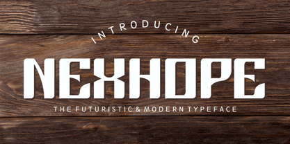 Nexhope is a modern typeface for postmodern and futuristic design. Nexhope inspired from level of needs a posmodern font is high. Nexhope is best for a variety of graphic projects, such as brochures, flyers, posters, lettering, t-shirts, editorial, postmodern design, headline, web design, minimalist design, branding, advertising and more.
 - Biff Bam Boom by Comicraft,
$19.00 Thrown from the pages of Spider-Man, Daredevil and Hulk comes BIFF BAM BOOM! Inspired by the Legendary Lettering Legerdemain of comics’ Silver Age, Biff Bam Boom is a font you can’t take a swing at without ending up with a broken nose. If you have any sense, duck and cover!
 - Hillbear by Stringlabs Creative Studio,
$25.00 Hillbear is an incredibly charming script font that will turn any design project into a true piece of art. Hillbear Path is a flowing and elegant handwritten font, created with the help of a brush pen. Get inspired by its unique and beautiful style and add it to your favorite designs!
 - Bokarms Slab by SMZ Design,
$19.00 Bokarms slab is a condensed font with a distinct look. Created for the design of martial arts clubs and boxing galas. Perfect for promotional projects of all sports disciplines, giving an academic character. It will also work as a universal typeface for promotional poster designs, branding, logo design, and clothing branding.
 - Chunky Chicken by Hanoded,
$15.00 Chunky Chicken is a fat, weird, funny and unique font. It was named in honor of my five chickens, who, despite the snow and freezing temperatures, keep laying eggs every day. Chunky Chicken is a headline font, ideal for books and posters and comes with a full range of diacritics.
 - French Bistro JNL by Jeff Levine,
$29.00 The 1930s French publication L'Art du Tracé Rationnel de la Lettre was a treasure trove of font revival ideas from the Art Deco era. One example featured a serif typeface with a number of stylized characters. This is now available as French Bistro JNL, in both regular and oblique versions.
 - Ridgewood JNL by Jeff Levine,
$29.00 While watching a movie filmed on location in New York, one scene stood out with a classic neon sign for a neighborhood restaurant. Ridgewood JNL is based on the lettering from that sign, and emulates many of the Art Deco elements that was so unique to sign work of the day.
 - Espectro by Corradine Fonts,
$24.95Espectro is a fabulous font full of swashes and alternates. Its free strokes give to your work a special feeling doing it very expressive and mysterious. Try the Open type version if you want to access to all its wonderful possibilities. Espectro has also a set of 26 related dingbats. - Strap Monogram by MonogramBros,
$12.00 Strap Monogram Font is a perfect shaped monogram font consisting of 52 letters and 1 basic frame. Octagon Monogram Font comes with font files in OTF format. With just a single font file you will be able to create beautiful strap monograms in just a matter of minutes after the purchase!
 - Eutheric by Typotheticals,
$10.00This plain serif can be used for a variety of purposes. Good for headlines and larger text usages. Hulbert is a comical look at the Eutheric family. It is useful for those moments where no other font will fit. Eutheric is a serif style look at the Cooper type of fonts. - Hatchery JNL by Jeff Levine,
$29.00 A photo from Gene Gable (a regular contributor of ideas to Jeff Levine Fonts) shows the vintage signage for the Lasher Hatchery in a slightly different take on the classic Art Deco solid letter style. Since good ideas, like eggs can be hatched, thus the font's name of Hatchery JNL.
 - Rockland by Monotype,
$15.99 This is an original, confident and cheeky little font; characterised by its boldness and dense letterforms, which boast a solid texture and distinctive lack of counters. Drawn with a marker pen, the bounciness of Rockland counteracts its solidity to make for a friendly aesthetic that’s as confident as it is playful.
 - Brevet by Solotype,
$19.95Authentic copy of the original, with a couple of minor changes to the caps, making them fit better. Although made for the American market by an American typefounder, we found this font in a York, England printshop when we went on a second visit to the famous DeLittle Wood Type factory. - Moon Dream by Eotype,
$12.00 Moon Dream is a wide sans serif display font that has beautiful curves. Each end is made slightly rounded giving the impression of a comfortable and friendly. Moon dream provides a collection of glyphs with unique shapes. With alternative styles and ligature features, this font is perfect for complementing various projects.
 - Tuskcandy by Ingrimayne Type,
$7.95 Tuskcandy is a decorative Tuscan font in which the prominent split serifs are made of two balls. It is available in two weights and also an inline style. It has a nineteenth century feel to it though it is not a copy of any particular font from that time period.
 - Linotype Laika by Linotype,
$29.99Linotype Laika is part of the Take Type Library, chosen from the entries of the Linotype-sponsored International Digital Type Design Contests of 1994 and 1997. This fun font was created by Dutch designer Mark van Wageningen, who based its forms on those of a sans serif font but gave them wavy, irregular contours. They look almost as though they lie just under the surface of a pool and the movement of the water gives them their undulating appearance. The dynamic Linotype Laika is especially good for headlines in larger point sizes or shorter texts in point sizes of 14 or larger. - Linotype Irish Text by Linotype,
$29.99Linotype Irish Text is part of the Take Type Library, chosen from the contestants of Linotype’s International Digital Type Design Contests of 1994 and 1997. German artist Torsten Weisheit designed this font based on Irish scripts of the 5th century. Characteristic of this style is the mixture of upper case letters in the mostly lower case alphabet and vice versa. The letters look as though written with a broad tipped pen and have triangular serifs, displaying a decorative tendency akin to that of Irish calligraphy. Linotype Irish Text is intended exclusivley for headlines in large point sizes. - Anavio by Greater Albion Typefounders,
$14.95 Anavio is named in honor of the ancient Roman name of an English Derbyshire town. Anavio is a classically inspired family of Roman faces, emphasizing simplicity of form and elegance. Regular and Bold weights are offered, along with condensed forms. Anavio is offered in both upper and lower case and small capitals faces. Its simple lines are immediately legible, lending it to both text and display uses. A range of ligatures, both standard and discretionary, are included as are stylistic alternates and two styles of numerals. Use Anavio to lend that indefinable air of elegance to your next project.
 - Architype Aubette by The Foundry,
$50.00 Architype Konstrukt is a collection of avant-garde typefaces deriving mainly from the work of artists/designers of the inter-war years, whose ideals have helped to shape the design philosophies of the modernist movement in Europe. Due to their experimental nature character sets may be limited. Architype Aubette is based on Theo van Doesburg’s 1928 signage lettering for the Café Aubette in Strasbourg. A collaborative project with Jean and Sophie Arp, the design and decoration of the entire restaurant and leisure complex was one of the largest projects to exemplify 1920s avant-garde, and the theories of Dutch De Stijl.
 - Beluga LT by Linotype,
$29.99 Linotype Beluga is a part of the Take Type Library, winners of Linotype’s International Digital Type Design Contest. The font was designed by Hans-Jürgen Ellenberger to suggest the writing of the Middle Ages but without any specific models from that time. A distinguishing characteristic of the font is its pointed, effusive serifs, which give Beluga its feel of the Middle Ages or of mysticism. In spite of its dynamic character, Beluga is legible even in smaller point sizes, which makes it equally good for headlines as for shorter texts. Beluga combines well with sans serif, slab serif and constructed fonts.
 - Pacifista by Suitcase Type Foundry,
$39.00 Pacifista takes advantage of the well-tested structure of our constructed typefaces, the directness and simplicity of which are by far the best suited to stencils. Straight lines, regular arcs and purity of drawing facilitate maintaining the maximum possible legibility even in a typeface that is practically devoid of any joining of strokes.
 - Flink Neue by Identity Letters,
$45.00 Geometric typefaces are a staple in every typographer’s toolbox since the 1920s. It was a time when iconic faces such as Futura, Erbar, and Kabel appeared on the scene and turned the world of type upside-down. Inspired by those early giants as well as later epigones with a legacy of their own (such as 1970’s Avant Garde Gothic), Flink Neue is the Identity Letters take on this genre, characterized by a clean and focused appearance. With neat shapes and the look of pure geometry, Flink Neue adapts to a vast range of applications and topics, from the fine print in contract to website body copy to logo design to billboard-size slogans. Its x-height is considerably larger than in classic geometric sans-serif fonts; its proportions are harmonized as opposed to strictly constructed. This makes for a more contemporary look, setting it apart from the classics. With three different widths, Flink is a true all-rounder. Geometric fonts are usually quite wide, which often leads to text-settings problems with headlines or small print. The Condensed and Compressed variants of Flink Neue solve this problem easily. This font family comes along in 18 weights from Thin to Black with matching Italics. There are almost 1400 characters per style, including nine stylistic sets that offer variations to the look and feel of Flink Neue, making it even more versatile. Besides the default mood of Flink Neue, there is also a Text and Bauhaus variant, where different letters have been changed to create a new mood. In theory, you just need one single font file to change between all three moods, but to make it easier for you, we also exported each mood within a separate file. Plenty of additional Open Type Features like ligatures, small caps, case sensitive forms, old-style figures, tabular figures and symbols make Flink Neue a valuable tool for the discerning typographer. Flink Neue is the reimagination of a classic genre, designed to suit the needs of our time.
 - H-AND-S by AND,
$89.00 A common creation: (to pass from one hand to the other): For the first time, various hand-signs from diverse sources are unified into one single visual style. This compendium is the result of 15 years of incubation and 7 years of creation. In his travels throughout the world, graphic designer Jean-Benoit Levy, principal of the visual studio AND, has collected pictures of multiple hand signage. Uncertain what to do with those signs, he kept them year after year until the idea came to unify almost 200 handsigns into one single family. In accordance with this entire collection, the name of the typeface is a mix: "h-and-s". A global collection: (To put in good hands): We all have one thing in common: Hand-signs are an international language, they are meant to be understood by all of us. Each of us regularly comes in contact with modern hieroglyphs such as the hand-sign-codes that are so prevalent in our daily life. This way of communication belongs to no one in particular and to all of us in general. Even if the sense of certain signs varies from one culture to the other, there is a common hand-sign language. We are surrounded by this language of handsigns each time we step in a store, we eat, open a container of milk, we clean up, use package of wash-powder, by shaving, when we work, use tools, at home, by tearing the envelope of a condom, by traveling, etc. When we encounter these signs, we all understand them easily. A visual connection: (To go hand in hand): This typeface is a global visual statement. Collecting, ordering, redrawing, unifying. Reconstructed and assembled into one original alphabet, H-AND-S is a unique and complex signs program. Our choice is based on daily gestures and global hand-codes. Logically this typeface starts with the "American Sign Language" and expands on two type-variations, each on two levels of keyboard. The international team of H-AND-S would like to send his special thanks to all of the anonymous graphic designers throughout the world who designed different hand-signage and who influenced and inspired to create such a sign collection into one unified family. We, the global nomad team of AND, hope that you will enjoy our H-AND-S. Additional Credits Production: Studio AND. www.and.ch. Concept, Idea & Creative Direction: Jean-Benoît Lévy, Switzerland / USA. Research & Sketches: Eva Schubert, Germany. Illustration, Graphic Design & Visual Fusion: Diana Stoen, USA. Transfer, Adaptation & Refining: Moonkyung Choi, Korea. Finalization & Checking: Sylvestre Lucia, Switzerland. Coaching & Technical Advice: Mike Kohnke, USA. Creative Energy & Implementation: Joachim Müller-Lancé, Germany / USA.
 - Ridtype Pro by Ridtype,
$30.00 Ridtype Pro is a custom font for our brand, and later this font will work in all roles in the type of brand we use. both in units of typography, printing, and type texting. This font is equipped with a modern semi-classic category type, so this font can work in all lines of business, both for supporters of implementation in modern and classic business. This font has been designed as best as possible, both in terms of letter design and the type of weight that is made to be compatible in all roles.
 - Churchward Design by BluHead Studio,
$25.00 BluHead Studio LLC is pleased to announce the release of 9 fonts from the Churchward Design family designed by New Zealand typeface designer Joseph Churchward. BluHead Studio is in the process of digitizing many of the fonts in Churchward’s extensive library of exciting and unique designs and will be releasing them in OpenType format on a regular basis. Churchward Design Lines is the latest addition to the Churchward Design family. The family now consists of nine unique fonts, all based on a classic, straightforward geometric glyph forms, with the addition of Churchward’s quirky details.
 - Classic Clips JNL by Jeff Levine,
$29.00 During the years of physically doing camera-ready paste-up work before the advent of the digital age, clip art books dominated the way stock art was added to a print project. Clip art books were eventually replaced by clip art CDs, DVDs and online download sites, just as the books themselves had replaced the stock photo engravings of the letterpress era. With the kind permission of Graphic Products Corporation, Jeff Levine Fonts offers up a sampling of images found within the pages of Graphic Source clip art books; aptly entitled Classic Clips JNL.
 - Deco Eccentrique JNL by Jeff Levine,
$29.00 The inspiration for Deco Eccentrique JNL was initially hand drawn contoured lettering from a mid-1920s piece of sheet music; the style of the letters showing influences of the upcoming Art Deco movement. This was made into a digital font entitled Poster Contoured JNL. Once all of the excess parts of the previous design were stripped away to only the inner letters, the pre-Art Deco influences remained along with characters of varying stroke widths and shapes. This non-conformist type face is available in both regular and oblique versions.
 - Architype Bayer Type by The Foundry,
$99.00 Architype Universal is a collection of avant-garde typefaces deriving mainly from the work of artists/designers of the inter-war years, whose ideals underpin the design philosophies of the modernist movement in Europe. Their ‘universal’, ‘single alphabet’ theory limits the character sets. Architype Bayer-type is based upon Herbert Bayer’s 1931 universal, modern serifed alphabet. Although the ‘modern’ style appears to be a radical departure from his first sans single alphabet of 1925, the structure of this later serifed style is still grid based and geometrically constructed.