10,000 search results
(0.401 seconds)
- Pringle & Tweed by Nicky Laatz,
$16.00 Stylish and unique, Pringle & Tweed is a new handwritten font with a graceful nuance.It’s gentle curves and natural lettering make it distinctive and elegant. To make your lettering look truly unique, Pringle and Tweed comes with a comprehensive set of double letter ligatures , and a set of stylistic alternate lowercase letters in it's opentype features. Pringle and Tweed includes a slanted version for an extra elegant feel.
 - Furius by Typogama,
$29.00 Furius is a display typeface inspired by the split serif style of woodcut or chiseled letters found in roman inscriptions and later popularized by the western genre in the United States. Created as a display typeface, Furius combines a host of Opentype features and equally incoporates a full extended latin and cyrillic character set to provide a versatile and complete design solution for titles or display settings.
 - Tea And Oranges by Hanoded,
$15.00 Tea And Oranges is a line from Leonard Cohen’s song Suzanne. “She feeds you tea and oranges that come all the way from China”… The song was a favourite of my brother Rizja who, sadly, recently passed away. Tea And Oranges is a a handwritten ‘pencil’ style font. It comes with impressive language support and a bunch of Discretionary ligatures for you to play with!
 - Heroline by Graptail,
$15.00 Introducing Heroline, a retro-inspired font that evokes the 1950s to 90s nostalgia. This font is perfect for creating vintage-themed designs and giving it a touch of nostalgia and personality. Heroline features a soft, solid design with curved corners and a unique letter shape. This font also includes a variety of alternative characters and ligatures, allowing you to create many different looks with the same font.
 - Safetread by Hatftype,
$15.00 Safetread is a magical handwritten font carefully created with a touch of elegance. This is a beautiful combination of timeless elegance and authentic calligraphy. It features an incredibly classic style, while still keeping a friendly feel. Safetread is the perfect font for making original and outstanding designs. Features: 01.A-Z Character Set 02.Numerals & Punctuations (OpenType Standard) 03.Stylistic Alternates 04.Multilingual 05.Ligatures
 - AT Move Specx Stncl by André Toet Design,
$39.95 SPECX Stencil This is my #11/12 Font a slabserif typeface. In fact it’s a very, very basic and extreme strong typeface! We gave this new Font a special touch by adding an extra family-member: a stencil-version of the SPECX. My inspiration for the SPECX is based on the cover of a 1955 French School-Notebook. Concept/Art Direction/Design: André Toet © 2017
 - Cafela by Look Minus Today,
$14.00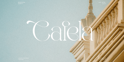 Introducing Cafela - A Elegant Modern Font With A Ligatures & Alternates by Rijesain x Look minus today Cafela - is a modern and elegant serif font that is perfect for adding a touch of sophistication to your designs. Its sleek and stylish look makes it suitable for a variety of applications, including branding, advertising, and editorial design. Features: Uppercase Lowercase Ligatures & Alternates Numerals & Punctuation Multilingual Thanks & Happy Designing!
 - Lovely Madness by Mirco Zett,
$18.00 Lovely Madness“ is a modern calligraphy font, which is a hybrid out of various types of calligraphy - based fonts. Lovely Madness“ is elegant and at the same time playful, as well as rough and maybe a little bit creepy. That is why there is a wide application possibility for this font and "Lovely Madness“ allows you to give your calligraphy – based creations a new touch.
 - Cammron by Creativetacos,
$23.00 Cammron, a modern serif font family, embodies a blend of elegance and boldness. It includes all essential glyphs and a variety of Non-English characters. Perfect for pairing with script or handwriting styles, its features extend to uppercase and lowercase multilingual letters, numbers, punctuation, and Latin Extended A characters. From standard English to diverse special characters, Cammron supports a vast range, enabling dynamic and inclusive typography designs.
 - ITC Mattia by ITC,
$29.99ITC Mattia is a typeface with an edge. It's nervous, tense, and a little disquieting, with twisted characters that are more scrawls than lettering. Designer Giuseppe Errico does not confine Mattia to a traditional baseline. When set in short blocks of copy, the design creates a tone of passion and candor. Not just another pretty face," Mattia is a rare and commanding communication tool." - Something Sweet Duo by Ghuroba Studio,
$13.00 Something Sweet is a beautiful and modern duo font. It combines a cute script with a great sans serif. Combining these two fonts on your next design will give a versatile and outstanding feel. This font is PUA encoded which means you can access all of the cute glyphs and swashes with ease! It also features a wealth of special features including alternate glyphs and ligatures.
 - Battlexoid by PizzaDude.dk,
$20.00Get ready for a battle - a battle of punk and grunge! This surely is a messy font...it looks like it has been run over by a VERY bad copy machine! Comes with a bunch of cool features such as: - Different lower/caps letters - Unique accented charaters - Ligatures for double letters/numbers - Alternative letters You will need to use OpenType supporting applications to use the autoligatures - Montello by Hanoded,
$15.00 Montello started out as an Illustrator exercise (a skill I am still learning). I made a couple of glyphs for fun, then realised it would make a nice font. The result is Montello. Montello is a classic connected script font, very neat and (in my humble opinion) not an eye-sore either. Montello comes with a whole bunch of ligatures for letters that just won’t connect nicely.
 - Cold Cuts by Good Gravy Type Co,
$12.00 Cold Cuts is an assorted spread of delicious fonts pre cooked to perfection. This 10 weight font family is $30 for a limited time it is the perfect way to stock your font fridge. Cold Cuts a lean upright font family with a lowercase caps option to give you bonus typesetting choices. A sleek modern vintage style which has a wide variety of display uses. Bon Appétit!
 - Poolkadot Palooza by Insan Perkasya,
$12.00 Introducing “Poolkadot Palooza,” a font that embodies the essence of handcrafted artistry, resulting in a font that’s both natural and uniquely captivating. “Poolkadot Palooza” is your versatile companion for crafting captivating magazine layouts, infusing quotes with a natural and distinctive charm, establishing a memorable brand identity through logos, and addressing a wide range of design needs. If you have any questions, please contact us
 - Raligur by Hishand Studio,
$15.00 Raligur is a harmonious blend of timeless aesthetics and modern versatility, making it a perfect choice for designers seeking a balance between tradition and innovation. Featuring exquisite details and a sense of timeless appeal, Raligur, the newly unveiled serif font, sets the stage for elegant typography that leaves a lasting impression on any audience. Complete with ligatures alternates regular italic icon kerning multilingual support
 - Something Fishy by Kate Brankin,
$17.00 A recent walk down memory lane through old college sketchbooks revealed a collection of caricature fish doodles. Then the sketches were discovered by my son who, being a marine life enthusiast, promptly demanded that I draw more fish. Thus, a collection of 71 fish-inspired drawings and bubbly numbers was born. There is even a lemon, since no fish is really complete without one.
 - Candy Coloured Clown by Jeremy Woods,
$15.00 Candy coloured clown is a unique and quirky display font created to invoke feelings of fun and carelessness that one might experience while visiting a carnival or circus. The font has a comic strip or cartoon aesthetic with it's thick outline and bubbly appearance. Candy Coloured Clown features a broad range of highly legible characters in both uppercase and lowercase, making it a guaranteed eye catcher.
 - Rombi Technocrat by Mans Greback,
$39.00 Rombi Technocrat is a geometric, heavy font that features a unique combination of square shapes and slanting angles. Inspired by the dynamics of forward movement and the rigidity of structured design, this italicized font family brings a sense of purpose and direction to your creative projects. The Rombi Technocrat font family includes five weights: Thin, Light, Regular, Bold, and Black, providing a broad range of stylistic options for designs that call for a distinct, angular touch. The font is built with advanced OpenType functionality and has a guaranteed top-notch quality, containing stylistic and contextual alternates, ligatures, and more features; all to give you full control and customizability. It has extensive lingual support, covering all Latin-based languages, from Northern Europe to South Africa, from America to South-East Asia. It contains all characters and symbols you'll ever need, including all punctuation and numbers.
 - Nilkuza by Twinletter,
$15.00 Welcome to the world of typography full of charm and nostalgia! Nilkuza is a Retro Display style font that brings a classic touch and fun to any of your projects. It's the perfect solution to bring a unique, vintage, and rustic look to life in a variety of visuals. Nilkuza is not just an ordinary font. With four family variants that include regular, distort, outline, and shadow, this font provides unlimited flexibility to explore your creativity. By using the ligature and alternate features, you can create unlimited letter combinations, making each of your works truly unique. We understand that every project has its own character and language, that's why Nilkuza supports multiple languages, so you can connect with a global audience without limitations. Make your every visual appearance an unforgettable nostalgic journey with Nilkuza. Get this font right away and take your projects into a dazzling era!
 - Magical Tours by IKIIKOWRK,
$17.00 Proudly Present Magical Tours - Psychedelic Type, created by ikiiko. Magical Tours is a stunning typeface with the retro appeal and allure of a psychedelic design. This distinctive bottom thickness typeface takes you on a fantastic journey through time while still maintaining a timeless aesthetic. Magical Tours, inspired by the writing styles of the 60s, where the psychedelic trend perfectly encapsulated the restless essence of youth at the time. This font has a distinct personality due to its inventive mix of vintage components and psychedelic influences, making it ideal for evoking the romance of the past. This typeface is perfect for an vintage stuff, retro poster layout, fashion ads, book cover, packaging, food & beverages and also good for quotes, or simply as a stylish text overlay to any background image. What's included? Uppercase & Lowercase Number & Punctuation Multilingual Support Works on PC & Mac Enjoy our font and if you have any questions.
 - Gerlach Sans by Juraj Chrastina,
$29.00 As the foundry’s top–of–the–line family, Gerlach Sans was named after the highest peak in Slovakia. Its functional design is enhanced by a few subtle ingredients, adding life and giving words a more playful voice. The family has eight weights ranging from delicate hairline to the super thick black. Each of them includes a genuine italic companion with variant shapes. The large character set accessible through OpenType features provides the designer with a wealth of opportunities and supports a wide range of Latin-based languages. It is stuffed up with tabular and proportional figures, old-style and lining figures, fractions, superscripts and subscripts, ordinals, case-sensitive forms, circled numbers, arrows, icons and many more. Combining legibility and usability of its grotesque style with cool elegance, Gerlach Sans provides a strong partner for your print and web project. You can download the instruction PDF here.
 - Terrapin by Missy Meyer,
$12.00 Introducing Terrapin! I named this after listening to a song called "Terrapin on a Tightrope." Considering the fact that a terrapin is a kind of turtle, it makes that song title seem pretty harrowing! This font has heavy roots in one of my favorite lettering styles. It's rough, scrappy, and likes to do its own thing. It has a full uppercase and lowercase set, numbers, punctuation, and lots of extended Latin characters for language support. It also includes alternate versions of 17 lowercase letters. Where Terrapin really shines is in the ligatures. I've written separate two- and three-letter combined forms for some of the most common letter combinations, and a few uncommon ones to boot. There are almost 100 ligatures in here, all PUA-encoded so everyone can access them (and also coded so if your software does automatic ligature replacement, they'll pop right in).
 - Grrr by ParaType,
$30.00 Grrr is a headstrong modular display typeface with a large amount of alternative glyphs. It consists of eight weights ranging from Thin to Black. A variable font is also available. The typeface is designed on a modular grid and it proudly ignores the rules of optical compensations: the horizontal and vertical strokes have identical thickness, and round and triangular letters have no overshoots at all! All these peculiarities are making the typeface usable at sizes from 21pt and larger in print and approximately from 24px on non-retina screens. Grrr is especially good at extremely large sizes. The typeface includes three stylistic sets with even more bizarre letterforms. These sets activate a cyclic pseudorandom substitution of letters from a range of alternates — the letterforms keep changing as you type! The typeface was designed by Dmitry Goloub and Alexandra Korolkova and released by Paratype in 2019.
 - Carmensin by Rafael Jordan,
$35.00 Carmensin is a beautiful humanist serif typeface created by Rafael Jordán. Designed in the 21st Century with all the flavor of the Renaissance. The conclusion of a story that began in Type@Paris program in June, 2015 & ended at February, 2020. Inspired by historical models, its classic conventional appearance with small details, smooth curves, large x-height and open counters made of Carmensin a great, efficient and solid typeface for long text settings. Also, its bigger sizes styles show the beautiful shapes and contrast, exhibiting its exuberance. Carmensin has a great collection of OpenType features that will satisfy any typographic necessity as ornaments, ligatures, stylistic sets, small caps, automatic fractions and more options along 3 optical styles (Text, Headline and Display) plus a fancy Stencil style. With an extensive Latin character set, Carmensin covers a wide amount of Latin-based languages, including Latin Plus encoding.
 - Amateur Typewriter by Ana's Fonts,
$12.00 Amateur Typewriter is a monospaced typewriter font, sampled from a real vintage typewriter, that is so much fun to use. Each letter and number includes 3 versions that are slightly different from each other and appear “randomly” through the contextual aternates OT feature. This gives this typewriter font an extra dose of realism. The alternative versions of the font (strikethrough, crossed and underlined variations) make it perfect for any design that needs a quirky but very legible typewritten feel, in both titles and longer texts. Use Amateur Typewriter in: logotype design, postcards and tags, editorial and website designs, projects that need a retro look, such as digital collages, among others. What you will get in this set: - A regular version of the Amateur Typewriter font with an Italic variation - Strikethrough, Crossed-out and Underlined versions of the font, with Italic alternatives, for a total of 8 fonts
 - Chypre by insigne,
$- 21st century innovation demands a 21st century style. It’s the age of virtual assistants. It’s machine learning and AI. It’s blockchain and cryptocurrencies. Shape the feel of these modern concepts with the mechanically-inspired forms of Chypre. Chypre’s subtle technological feel is perfect for our culture’s evolving electronic media applications. At its source, the carefully adjusted character designs and the balanced weight contrast convey to the modern reader an understanding of cutting edge concepts through a pleasing human feel. Unlike many other tech-driven fonts out there, this next-gen cyborg is a great option for text settings as well as headlines. The new face is composed of six styles, including numerous alternates which dramatically alter the appearance. There are also extra letter shapes, numerous figure options, and extensive language support. Designed to fit where you need a high-tech feel, Chypre is a modern font for a modern age.
 - Lavire by Nathatype,
$29.00 Elevate your design projects with the distinctive and captivating Lavire. Lavire is an uppercase display serif font that is effortlessly made in a truly unique typographic masterpiece. Each uppercase letter in Lavire is a work of art in itself. The serifs, which are typically known for their traditional elegance, take on a modern and imaginative twist with Lavire's addition of artistic lines and flairs. The artistic lines and flairs in this font are carefully crafted to enhance the overall composition of each letter. They bring a sense of motion and dynamism to the font, making it particularly well-suited for projects that seek to convey a sense of movement or elegance. Lavire fits in headlines, logos, posters, flyers, branding materials, print media, editorial layouts, and many more designs. Find out more ways to use this font by taking a look at the font preview.
 - Curvi Technocrat by Mans Greback,
$39.00 Curvi Technocrat is a rounded, geometric font that captures the essence of speed and forward movement. Inspired by the smooth curves of race cars and the energy of urban graffiti, this heavy, slanted font family adds a touch of dynamism and softness to your designs. The Curvi Technocrat font family offers five weights: Thin, Light, Regular, Bold, and Black, making it a versatile choice for a wide range of design projects that require a modern, geometric touch. The font is built with advanced OpenType functionality and has a guaranteed top-notch quality, containing stylistic and contextual alternates, ligatures, and more features; all to give you full control and customizability. It has extensive lingual support, covering all Latin-based languages, from Northern Europe to South Africa, from America to South-East Asia. It contains all characters and symbols you'll ever need, including all punctuation and numbers.
 - Bestyline by MJB Letters,
$20.00 Bestyline is a captivating Bold Script Font that seamlessly blends bold lettering with the artistic elements of calligraphy. Its unique design exudes confidence and energy, creating a striking visual impact. The font features thick, well-defined characters with artistic contours, adding a touch of elegance to each letter. The strong and impressive script style makes Bestyline an ideal choice for projects that require a bold and classy appearance, such as headlines, logos, posters, and other designs. The standout features of Bestyline include the clarity of each letter, ensuring that text using this font effortlessly captures attention. Its boldness and distinctiveness make it well-suited for both print and digital designs. Whether used in headlines or logos, 'Bestyline' brings a modern and sophisticated flair to any project, making it the perfect choice for those seeking a seamless combination of boldness and beauty in their typography.
 - Yesterday Morning by Mans Greback,
$59.00 Yesterday Morning is a lively handwriting font that captures the essence of an active and cute brush style. This handmade calligraphy font is perfect for fashion projects, adding a sense of energy and excitement to your designs. The font family's hand-brushed appearance brings an authentic, personal touch to your creative work, making it feel warm and approachable. The Yesterday Morning font family includes four engaging styles to suit various design needs: Regular: A balanced and energetic style for everyday use Regular Italic: Adds a playful touch and a sense of movement Bold: Offers a bolder, more assertive presence for impactful designs Bold Italic: Combines the strength of bold with the flair of italic Built with advanced OpenType functionality, Yesterday Morning ensures top-notch quality and provides you with full control and customizability. It includes stylistic alternates, ligatures, and other features to make your designs truly unique.
 - Hansplatz Grotesk by Heypentype,
$20.00 Hansplatz Grotesk is a sans serif type family of nine weight. Influenced by Akzidens Grotesk, Hansplatz typeface bring a new approach to this utilitarian style of grotesk. With more square proportions rather than geometric style, Hansplatz grotesk aimed to ease typesetting job when arranging a words or paragraph easily. A wide range of weight gives flexibility to every design project, hansplatz fit nicely to grid-system because of proportions. Furthermore Hansplatz Grotesk supplied with smart Opentype scripting to assist typesetter and designer very easily to Hansplatz feature. Hansplatz Grotesk truly a utilitarian, workhorse, neutral, and of course faceless. But, it makes the work done quickly. For display use, Hansplatz Grotesk Black to Semi-Bold is recommended, for paragraph heavy design, use regular and light weight. To spice up, adding Hairline or extra-light weight will make a design execution looks great and catchy but not intimidating.
 - Structorator by Furiosum,
$15.00 Structorator is a grid-based, experimental display font. This typeface emerged from experiments with generative type design. It evolved from a piece of code into a fully usable opentype font. The two main features are its rigid but playful design and a multitude of alternate glyphs. These features make it possible to create interesting lettering when using the default spacing. The glyphs are constructed from a limited set of patterns which are arranged within a predefined grid. The line thickness corresponds to the different cuts. Due to the rather complex shape this font will look best in larger sizes and resolutions. Its best suited for headline, display or illustrative work. - 3 weights: light, medium and heavy - 5 character sets - 3 number sets - Basic punctuation - Seperate diacrits - Ornamental glyphs - Access via stylistic sets *OT feature - Random access from the whole range of chars *OT feature - Total of 1062 Glyps
 - Steagal by insigne,
$24.75 I love geometric sans serifs, their crispness and rationality. Le Havre taps into this style, but for a while, I've wanted to create a font recalling the printed Futura of the 1940s, which seems to have an elusive quality all its own. After seeing an old manual on a World War II ship, I developed a plan for "Le Havre Metal" but chose to shelve the project due to Le Havre's small x-height. That's where Steagal comes in. When Robbie de Villiers and I began the Chatype project in early 2012 (a project which led one publication to label me the Edward Johnston of Chattanooga!), we started closely studying the vernacular lettering of Chattanooga. During that time, I also visited Switzerland, where I saw how designers were using a new, handmade aesthetic with a geometric base. I was motivated to make a new face combining some of these same influences. The primary inspiration for the new design came from the hand-lettering of sign painters in the United States, circa 1930s through 1950s. My Chatype research turned up a poster from the Tennessee Valley Authority in Chattanooga, Tennessee, which exhibited a number of quirks from the unique hand and style of one of these sign artists. Completing the first draft of Steagal, however, I found that the face appeared somewhat European in character. I turned then to the work of Morris Fuller Benton for a distinctly American take and discovered a number of features that would help define Steagal as a "1930s American" vernacular typeface--features I later learned also inspired Morris Fuller Benton's Eagle. The overall development of Steagal was surprisingly difficult, knowing when to deliberately distort optical artifacts and when to keep them in place. Part of type design is correcting optical illusions, and I found myself absentmindedly adjusting the optical effects. In the end, though, I was able to draw inspiration from period signs, inscriptions, period posters, and architecture while retaining just enough of the naive sensibility. Steagal has softened edges, which simulate brush strokes and retain the feeling of the human hand. The standard version has unique quirks that are not too intrusive. Overshoots have almost been eliminated, and joins have minimal corrections. The rounded forms are mathematically perfect, geometric figures without optical corrections. As a variation to the standard, the “Rough” version stands as the "bad signpainter" version with plenty of character. Steagal Regular comes in five weights and is packed with OpenType features. Steagal includes three Art Deco Alternate sets, optically compensated rounded forms, a monospaced variant, and numerous other features. In all, there are over 200 alternate characters. To see these features in action, please see the informative .pdf brochure. OpenType capable applications such as Quark or the Adobe Creative suite can take full advantage of the automatically replacing ligatures and alternates. Steagal also includes support for all Western European languages. Steagal is a great way to subtly draw attention to your work. Its unique quirks grab the eye with a authority that few typefaces possess. Embrace its vernacular, hand-brushed look, and see what this geometric sans serif can do for you.
 - FS Pimlico by Fontsmith,
$80.00 Born in the 70s Personal influences are unavoidable in type design and usually find their way through into finished fonts. At Fontsmith, one period in particular provides inspiration, according to FS Pimlico designer, Fernando Mello. “Jason and Phil have always known that I’m very into the visual language of the 70s. I know that Jason shares my love of the 70s and Phil will sometimes admit to being a fan, too. I think that’s the reason they were both so supportive in the development of this font. “And, of course, we all share an interest in good-humoured and intelligent design. We like to think it’s a Fontsmith characteristic.” Back from black FS Pimlico started in an unusual place: with a tubby, penguin-like lowercase “a” that Fernando Mello had been sketching. From “a” grew the rest of the alphabet – a bubbly, fat, friendly family with a brush-written quality that became FS Pimlico Black. The black weight certainly isn’t the normal starting point for creating a regular and bold weight, but Fernando pressed on, driven by a glut of influences: brush-writing; Letraset and early digital systems catalogues; the type of Herb Lubalin and Tony di Spigna; 70s clothes and vinyl; and 70s revival disco nights in London’s Pimlico and Vauxhall. Natural or flourished Not often do fonts come along that seem to span the ages. FS Pimlico is at home in an office environment providing a fresh clear identity in communications or providing text that’s clear and easy to read. But it likes to party, too, 70s style. With the OpenType features switched on, a designer can totally change the look of their work, and create point-of-sale, headlines and titles that stand out and get noticed.
 - FS Pimlico Variable by Fontsmith,
$249.99Born in the 70s Personal influences are unavoidable in type design and usually find their way through into finished fonts. At Fontsmith, one period in particular provides inspiration, according to FS Pimlico designer, Fernando Mello. “Jason and Phil have always known that I’m very into the visual language of the 70s. I know that Jason shares my love of the 70s and Phil will sometimes admit to being a fan, too. I think that’s the reason they were both so supportive in the development of this font. “And, of course, we all share an interest in good-humoured and intelligent design. We like to think it’s a Fontsmith characteristic.” Back from black FS Pimlico started in an unusual place: with a tubby, penguin-like lowercase “a” that Fernando Mello had been sketching. From “a” grew the rest of the alphabet – a bubbly, fat, friendly family with a brush-written quality that became FS Pimlico Black. The black weight certainly isn’t the normal starting point for creating a regular and bold weight, but Fernando pressed on, driven by a glut of influences: brush-writing; Letraset and early digital systems catalogues; the type of Herb Lubalin and Tony di Spigna; 70s clothes and vinyl; and 70s revival disco nights in London’s Pimlico and Vauxhall. Natural or flourished Not often do fonts come along that seem to span the ages. FS Pimlico is at home in an office environment providing a fresh clear identity in communications or providing text that’s clear and easy to read. But it likes to party, too, 70s style. With the OpenType features switched on, a designer can totally change the look of their work, and create point-of-sale, headlines and titles that stand out and get noticed. - Miedinger by Canada Type,
$24.95 Helvetica’s 50-year anniversary celebrations in 2007 were overwhelming and contagious. We saw the movie. Twice. We bought the shirts and the buttons. We dug out the homage books and re-read the hate articles. We mourned the fading non-color of an old black shirt proudly exclaiming that “HELVETICA IS NOT AN ADOBE FONT”. We took part in long conversations discussing the merits of the Swiss classic, that most sacred of typographic dreamboats, outlasting its builder and tenants to go on alone and saturate the world with the fundamental truth of its perfect logarithm. We swooned again over its subtleties (“Ah, that mermaid of an R!”). We rehashed decades-old debates about “Hakzidenz,” “improvement in mind” and “less is more.” We dutifully cursed every single one of Helvetica’s knockoffs. We breathed deeply and closed our eyes on perfect Shakti Gawain-style visualizations of David Carson hack'n'slashing Arial — using a Swiss Army knife, no less — with all the infernal post-brutality of his creative disturbance and disturbed creativity. We then sailed without hesitation into the absurdities of analyzing Helvetica’s role in globalization and upcoming world blandness (China beware! Helvetica will invade you as silently and transparently as a sheet of rice paper!). And at the end of a perfect celebratory day, we positively affirmed à la Shakti, and solemnly whispered the energy of our affirmation unto the universal mind: “We appreciate Helvetica for getting us this far. We are now ready for release and await the arrival of the next head snatcher.” The great hype of Swisspalooza '07 prompted a look at Max Miedinger, the designer of Neue Haas Grotesk (later renamed to Helvetica). Surprisingly, what little biographical information available about Miedinger indicates that he was a typography consultant and type sales rep for the Haas foundry until 1956, after which time he was a freelance graphic designer — rather than the full-time type designer most Helvetica enthusiasts presume him to have been. It was under that freelance capacity that he was commissioned to design the regular and bold weights of Neue Haas Grotesk typeface. His role in designing Helvetica was never really trumpeted until long after the typeface attained global popularity. And, again surprisingly, Miedinger designed two more typefaces that seem to have been lost to the dust of film type history. One is called Pro Arte (1954), a very condensed Playbill-like slab serif that is similar to many of its genre. The other, made in 1964, is much more interesting. Its original name was Horizontal. Here it is, lest it becomes a Haas-been, presented to you in digital form by Canada Type under the name of its original designer, Miedinger, the Helvetica King. The original film face was a simple set of bold, panoramically wide caps and figures that give off a first impression of being an ultra wide Gothic incarnation of Microgramma. Upon a second look, they are clearly more than that. This face is a quirky, very non-Akzidental take on the vernacular, mostly an exercise in geometric modularity, but also includes some unconventional solutions to typical problems (like thinning the midline strokes across the board to minimize clogging in three-storey forms). This digital version introduces four new weights, ranging from Thin to Medium, alongside the bold original. The Miedinger package comes in all popular font formats, and supports Western, Central and Eastern European languages, as well as Esperanto, Maltese, Turkish and Celtic/Welsh. A few counter-less alternates are included in the fonts.
 - TOMO Claire by TOMO Fonts,
$10.00 TOMO Claire is a handmade typeface with a relaxed style and committed to the environment. It comes in two styles, Regular and Waste with a distressed look. This typeface is ideal for all types of projects related to the care of the environment and everything else. Be green! Act now!
 - MaryTodd by TipoType,
$15.00 MaryTodd was created for small texts with a variety of hierarchies. Is condensed to save space. It has a rich set of glyphs: small caps, old style figures, monospaced numbers, numerators and denominators for fractions, etc. It is ideal for organizing and presenting information in a clear and simple way.
 - Insecticide by Arkalandara,
$110.00 Insecticide Infused with a laid-back charm, our casual handwriting captures the essence of relaxed authenticity. Effortlessly stylish, each stroke exudes approachable warmth, making it the perfect choice to connect with your audience on a personal level. Embrace a brand identity that feels as comfortable as your favorite pair of jeans