10,000 search results
(0.041 seconds)
- Hachura by Outras Fontes,
$24.00 Hachura is a sketchy typeface designed by Ricardo Esteves. Its general proportions are based on the garalde models, with traditional roman serifs. It was initially made by hand using a drawing technique to create a font that simulates the unfinished aspect of a work in constant progress. This textured face is useful for display sizes, making a very visible presence. Because of its basic dimensions and careful distribution of black and white, it still also very readable in text sizes like 10 or 8 points.
 - Koi by Talbot Type,
$19.50 Koi is a highly original, outline display font. Each character is represented by a single continuous line to create a fluid and rhythmic look. The result is something of a hybrid, sitting somewhere between an outline and an inline style, and with an asymmetrical look — something quite rare in a typeface. Many of the characters look like ready made logotypes. Further customisation is easily achieved by extending the end strokes of characters, possibly aligning them and joining them to others to create bespoke arrangements.
 - Finagle by Flawlessandco,
$9.00 Introducing "Finagle" - A Modern Handwritten Script Font. Unveil the beauty of modernity and the warmth of handcrafted charm with "Finagle," a contemporary handwritten script font that brings a touch of casual elegance to your designs. There's some connected letters and some alternates that suitable for any graphic designs such as branding materials, t-shirt, print, business cards, logo, poster, t-shirt, photography, quotes .etc This font support for some multilingual. Also contains uppercase A-Z and lowercase a-z, alternate character, numbers 0-9, and some punctuation.
 - BringInTheFrowns by Ingrimayne Type,
$14.95 Why use a simple emoticon to express unhappiness or sadness when you can have an entire font proclaiming your feelings? This is a font that may work for notes of sympathy, whether real or in jest. For the smiley version, see AllSmiles, and if you only want to proclaim a only a little sadness, you can temper the feelings with a plain version of the typeface, FebDrei. In the update of 2011, emoticons were added in the appropriate unicode slots (unicode 1F601 to 1F640 slots)
 - Yapari by Power Type,
$15.00 YAPARI is a font inspired by a street typography located in a Makassar city 2005, this writing is poured into a font and then made several variations of width which are Wide, Extended, and Expanded kind of stretched font then have thickness ranging from Thin, Extra Light, Light, Regular, Medium, Semi Bold, Bold, Extra Bold, Ultra. This font is suitable for use for design projects that have a bold impression and can also be used for all lines of media as well as formal and informal
 - Imagine a font that decided to wake up one morning, pull on its intergalactic superhero suit, and dive headfirst into an epic adventure across multiple dimensions. Ladies and gentlemen, meet *Battlef...
- Alchemila by Heyfonts,
$18.00 Alchemila "UNIQUE serif modern font" likely refers to a typeface that combines elements of traditional serif design with contemporary and distinctive features. Serif fonts have small lines or strokes attached to the ends of characters, which can contribute to a more formal or traditional appearance. The term "modern" in this context typically implies a contemporary or updated style. Here's an explanation of the characteristics and significance of a UNIQUE serif modern font: -Serif Elements: Serifs are the small lines or strokes at the ends of characters, and they are a hallmark of traditional typography. In a UNIQUE serif modern font, these serif elements are likely to be present but may have a distinctive shape or style that sets them apart from more conventional serif fonts. -Contemporary Design: The "modern" aspect of the font suggests a contemporary or updated design. This may involve a departure from the more classical serif styles seen in traditional typefaces, incorporating modern design principles, cleaner lines, and a more minimalist aesthetic. -Distinctive Characters: A UNIQUE serif modern font is likely to feature characters with unique and individual design elements. This could include unconventional serifs, letter shapes, or other stylistic details that make the font stand out and contribute to its uniqueness. -Versatility: While serif fonts are often associated with formality and readability, a UNIQUE serif modern font may offer versatility suitable for a range of design applications. It could be used in both traditional and modern contexts, providing flexibility for various design projects. -Applicability to Branding: Fonts play a crucial role in branding, and a UNIQUE serif modern font could be an excellent choice for businesses or projects that want to convey a sense of tradition and reliability while maintaining a contemporary and innovative image. -Digital and Print Design: Modern serif fonts are often designed with both digital and print applications in mind. The clarity of the typeface, even at smaller sizes, and its aesthetic appeal make it suitable for a variety of design projects, from websites and apps to print materials like brochures and posters. -Attention to Detail: The uniqueness of the font may be reflected in the careful attention to detail in each character. This could include refined curves, balanced proportions, and other design elements that contribute to the overall visual appeal and readability of the font. -Available Features: Unique serif modern fonts may come with additional features, such as alternative characters, ligatures, or stylistic sets, allowing designers to customize the appearance of the text for specific design needs. When selecting or working with a UNIQUE serif modern font, designers should consider the overall design goals, the intended audience, and the context in which the font will be used
 - Disquete by Tipos do aCASO,
$23.90Inspired by the shape of a 3.25" floppy disk this unicase font was designed from the combination of three square modules. Made in 1998 Disquete is one of the first projects of Buggy, founder of the Brazilian type foundry Tipos do aCASO. - MicroMieps - Unknown license

- Thermometer by Woodcutter,
$55.00 Font Thermometer, with a shattered style, imitating the effect of an earthquake in your designs, ideal for posters, covers of your work, with an aspect of destruction and movement.
 - Boink Rounded by Robert Petrick,
$19.95 Boink Rounded" is a new variation of my classic Boink font. The added softness of this new version extends the function of the easy and fun to use font.
 - Brutal Milk No 1 by Casloop Studio,
$9.00 Introducing Brutal Milk Font Collection where prominence, trustworthiness, and sophistication converge. Brutal Milk is a captivating grotesque typeface that seamlessly blends the robust aesthetics of brutalism with the sleek sophistication of Swiss Design and the nostalgia of Y2K. This collection featuring three distinctive variants – Brutal Milk No1, Brutal Milk No2, and Brutal Milk No3 – offers a unique typographic journey for extraordinary design. Let's break down what we present in this work - Brutal Milk No.1 | Modern Elegance with a Brutal Twist Aims for body text with the perfect balance of elegance and modernity. Brutal Milk No.1 is meticulously crafted for optimal readability, making it an ideal choice for a wide range of applications. - Brutal Milk No.2 | Softened Brutalism for Approachable Headers Aims for display/header text with a gentle and approachable impression. Brutal Milk No.2 is crafted to add a touch of warmth to your designs, making it perfect for conveying a friendly and inviting tone. - Brutal Milk No.3 | Rigid Rebellion for Prominent Headers Make a bold statement with headers that exude firmness. Brutal Milk No.3 is designed to capture attention with its rigid impression, injecting a sense of prominence and confidence into a visual identity. The Features The Brutal Milk Font Collection comes loaded with features such as case-sensitive forms, discretionary ligatures, ordinals, fractions, denominators, numerators, superscripts, and scientific inferiors – ensuring flexibility in design needs. Language Support From Western and Central European languages to South Eastern European, South American, Oceanian, and even Esperanto, Brutal Milk Collections caters to a diverse range of linguistic needs. Brutal Milk stands as a testament to versatility and innovation. Whether you're crafting a sleek logo, establishing a brand identity, adorning decor, creating impactful posters, delivering compelling presentations, designing dynamic websites, refining UI/UX experiences, or engaging in graphic design endeavour. The impressions it imparts—modern, minimal, youthful, funky, groovy, trendy, hip, fly, and undeniably cool—speak volumes about its adaptability to contemporary design trends. Redefine the boundaries of creativity and immerse yourself in the dynamic world of Brutal.
 - Brutal Milk No 2 by Casloop Studio,
$9.00 Introducing Brutal Milk Font Collection where prominence, trustworthiness, and sophistication converge. Brutal Milk is a captivating grotesque typeface that seamlessly blends the robust aesthetics of brutalism with the sleek sophistication of Swiss Design and the nostalgia of Y2K. This collection featuring three distinctive variants – Brutal Milk No1, Brutal Milk No2, and Brutal Milk No3 – offers a unique typographic journey for extraordinary design. Let's break down what we present in this work - Brutal Milk No.1 | Modern Elegance with a Brutal Twist Aims for body text with the perfect balance of elegance and modernity. Brutal Milk No.1 is meticulously crafted for optimal readability, making it an ideal choice for a wide range of applications. - Brutal Milk No.2 | Softened Brutalism for Approachable Headers Aims for display/header text with a gentle and approachable impression. Brutal Milk No.2 is crafted to add a touch of warmth to your designs, making it perfect for conveying a friendly and inviting tone. - Brutal Milk No.3 | Rigid Rebellion for Prominent Headers Make a bold statement with headers that exude firmness. Brutal Milk No.3 is designed to capture attention with its rigid impression, injecting a sense of prominence and confidence into a visual identity. The Features The Brutal Milk Font Collection comes loaded with features such as case-sensitive forms, discretionary ligatures, ordinals, fractions, denominators, numerators, superscripts, and scientific inferiors – ensuring flexibility in design needs. Language Support From Western and Central European languages to South Eastern European, South American, Oceanian, and even Esperanto, Brutal Milk Collections caters to a diverse range of linguistic needs. Brutal Milk stands as a testament to versatility and innovation. Whether you're crafting a sleek logo, establishing a brand identity, adorning decor, creating impactful posters, delivering compelling presentations, designing dynamic websites, refining UI/UX experiences, or engaging in graphic design endeavour. The impressions it imparts—modern, minimal, youthful, funky, groovy, trendy, hip, fly, and undeniably cool—speak volumes about its adaptability to contemporary design trends. Redefine the boundaries of creativity and immerse yourself in the dynamic world of Brutal.
 - Varietta by Sudtipos,
$39.00 Varietta is the result of my fascination with photographing the type designs of some marquees in Spanish markets. In them you can see many letter designs with reversed contrast and in different widths, probably based on the possibilities of photocomposition. At the same time I was working on the expansion of the Hastile typeface designed by Alessandro Butti for the Nebiolo foundry in Italy in the late 1930s, of which I had not seen any digitization. As I am not a fan of perfect revivals, I thought it could be interesting to connect Spain and Italy in a single typeface. The first step was to expand Butti's design to 27 styles, ranging from thin condensed to black expanded. To look for the Spanish connection and its characteristic inverse contrast I took advantage of the current technology that allows variable typefaces with many axes. From this, three scenarios of horizontal contrast were incorporated (top, bottom and mixed) which allows infinite possibilities of use. The final result is a collection of 108 static typefaces or a single variable file.
 - Bronto by W Type Foundry,
$29.00 Bronto is a typeface that mutated many times: it went from being morphologically conventional, to have soft features, to finally have some inverted contrasts that made it more dynamical; but all this without losing sight of the meaning of a typefamily, and the aim pursued by this work: Bronto doesn’t behave as a piece of art, but as a tool. In some weights, this typeface possesses fluffy characteristics and is boldly bighead, while in other versions is slightly contrasted and controlled; this in order to maintain the essential features of the typefamily along the versatility and usability of the 20 variations that composed it. Bronto it’s inspired in neo humanists typographies of the 20th century, and in Chilean lettering. This kind of work was made by the spontaneity of the paintbrush, which gave an inverted contrast to some characters. This typeface has plenty of OpenType features, specially an extensive set of ligatures in all weights. Bronto is well suited for motion graphics, letterings, web, advertisings, magazines and books.
 - Pepone by Storm Type Foundry,
$43.00 This typeface is primarily optimized for the setting of belles-lettres. The regular styles are balanced to suit small text sizes and enable the reading of long portions of text. The development of the typeface was guided by the goal of creating a contemporary, discreet book serif, with modern expression and numerous functions. Letters feature reduced contrast, the lighter styles may evoke wired letters, while the heavier ones bear distinct slab serif references. The extremes thus work in harmony and fulfil the demanding requirements of advertising and magazine layout. The typeface is suitable for bottle labels, invitations, exhibition catalogs and posters, for printed and online presentations alike. The name Pepone was chosen as an homage to Josef Kroutvor. Of course, the typeface isn’t solely reserved for the setting of the works of Josef K. On the contrary – we’d like to present a universal typeface suited for literature, catalogs and magazines. It wouldn’t be the first and the last example of a typeface created with a specific purpose in mind, which later became used universally.
 - Ephemera Sickles by Ephemera Fonts,
$35.00 A debut from the most anticipated vintage digital typefoundry by Gilang Purnama and Ilham Herry, who stucked their mind, body and soul back into the first era of 18th century. They build this intense visual-time machine that no one capable before. Started by the visual branding of the Ephemera Fonts, they bring every letters of it to the another level of journey. They called it Ephemera Sickles. Ephemera Sickles is a ornamented letterhead style typeface-inspired by the era of victorian (1800-1900) and this style was commonly used by engrossers at the turn of the century to embellish official documents, such as diplomas and other certificates. Carefully crafted for every single letters with the soul of Sickels Lettering, Spencerian, and some research from the Penmanship Journal book. The style is named after Charles Sickels, who headed the art department of Electro-Light Engraving Co. in New York City during the early 20th century. There’s no doubt that such a very strong presence typeface like Ephemera Sickles will bring a powerful identity to your visual project. Will be a perfect joint for a logo, visual branding, poster, beer label, packaging, classic bar decor, vintage hotel, et cetera.
 - Guillotine by Canada Type,
$24.95 Guillotine is inspired by an uncredited early 1970s film face called Rhythm Bold. While the original film type had plenty of round forms that were uneven and somewhat badly drawn to fit within the overwhelming pop wave of the time, this digital incarnation disposes of all curves, relies on a much sharper grid, and adheres to specific parameters of stroke widths and angles. Guillotine is a thick poster classic, mechanically constructed yet clearly exhibiting the idiosyncratic traits of hand drawing. Its forms embody the amalgamation of a multitude of influences, such as woodcut letters, punch card forms, and the unique art nouveau concepts that were popular in the 1960s and 1970s. The totality of the font is a strong display aesthetic that plays very well anywhere the eye is meant to see a strong but casual, sharp but hand crafted message. This font comes in all popular formats for all common platforms, and includes expanded language support to cover Western, Eastern and Central European Latin languages, as well as Baltic, Celtic/Welsh, Esperanto, Maltese, and Turkish. A few alternate characters are sprinkled throughout the character map.
 - The Great Wall by Gie Studio,
$9.00 The Great Wall, as the name of this font is created and inspired by a legendary world masterpiece, with a special uniqueness in a style that is very firm but looks elegant, so it is suitable for you to use for a variety of designs that accentuate the professional and charming. Various advantages of this font : This font consists of four (4) very interesting styles, please choose ! With a rather thick but consistent style line, accentuating the firmness and professionalism of the users of this font. This font is complete with Uppercase, Lowercase, Numeral, Punctuation, Multilingual support and ligature letters in each style. Can be applied in various software, such as Ms.office, Photoshop, Coreldraw, Adobe Illustrator, Inkscape and others. There are many purposes that are very suitable to use this font, among others: writing the name of a professional profession, for book covers, fashion branding, watches, jewelry, marketing products, magazines and more. With you using this font for any purpose, I hope your business will be more successful and known to the world as the name of this font. Thank you, I say for your visit and purchase.
 - Nomenclatur by Aronetiv,
$9.99 The font was created under the influence of German tabular inscriptions. Especially, DIN font influenced on Nomenclatur graphic. It adds clarity and conciseness in the font. Nomenclatur is intended for use in architectural and design topics. It is also intended for a set of instructions and manuals. The font has the aesthetics of the Bauhaus and other constructivist movements. Characters of font are designed with high intelligibility, which makes it well readable in a small size. The lowercase letter "l" has a tail, so as not to confuse it with the capital letter "I", which has serifs. It avoids confusion in words like "Illinois". The font is well suited for the design of signs and navigation texts. A wide selection of styles allows you to design complex typography. The font family includes 15 styles. The font family has a variable font with two axes of weight and width. The font contains a set of alternative characters that will allow you to create different moods. The font contains Western European Latin and standard Cyrillic. The font has more than 3,600 kerning pairs configured. The font contains beautiful ampersand.
 - Filigree by Scholtz Fonts,
$19.00 Filigree, reminiscent of the delicate lace and jewelry produced in Europe in the 16th to 18th centuries, was inspired by the font Always, and by the way in which the threads (or filia) of the characters in Always intertwined. It has a soft, wafty character. It is best used as a display font at a relatively large size. At too small a size the delicacy of the individual filaments will be lost. Best results also from a combination of upper and lower case characters. Using upper case characters alone will not look as good. Alternate characters and ligatures are also included. If your application program supports "kerning" then I suggest that you turn it on. Although not essential, this will enhance the spacing of the letters. The font contains over 272 characters - (upper and lower case characters, punctuation, numerals, symbols and accented characters are present). It also includes a number of "open-type" characters - these enhance the flexibility of the font by providing alternatives that are used either at the discretion of the designer or are determined by the circumstances in which the font is used. It has all the accented characters used in the major European languages.
 - Ornery Polecat JNL by Jeff Levine,
$29.00 In January of 2006, Jeff Levine fonts debuted with ten releases. Many of those first fonts were based on vintage lettering stencils, which were the "school years" catalyst for Jeff's interest in lettering and type design. Eight years later, his collection of fonts has become a giant catalog of display type ranging from Wood Type revivals to Art Nouveau, Art Deco to stencil, reinterpretations of old favorites, experimental fonts, dingbat fonts and typefaces reflecting a particular decade's styles of cultural popularity. Designs from old lettering books, type catalogs and advertising have also been fodder for many alphabets not previously available in a digital format. Along the way, many unusual lettering sources were also mined for type ideas. Vintage packaging, hand-lettered signage, sign making kits, rubber stamp type, water applied decals and at times just a singular letter example inspired many of the releases within this collection. It was a source of pride for Jeff Levine Fonts to reach 500 releases and a determined goal to grow the type library as far as possible. With this in mind, February 2014 brings forth many new releases. This one in particular, Ornery Polecat JNL, is the 800th typeface release from Jeff.
 - Blanchard by Canada Type,
$39.95 Blanchard is a revival and elaborate extension of Muriel, a 1950 metal face made by Joan Trochut-Blanchard for the Fonderie Typographique Française, that was published simultaneously by the Spanish Gans foundry under the name Juventud. Blanchard is a script that embodies the post-war narrow decorative aesthetic that would become the instantly recognizable feature of that era’s design. Its high ascenders corners make it the tuxedo of fonts, with slight and casual angles gradually revealing a trustworthy confidante, and sharp corners signaling a most expressive ally. Font. James Font. This digital version updates the original metal shapes to work within today’s design tools and designer needs. Some of the questionable metal shapes were optimized, plenty of alternates were added, and as many as five ending forms were built for most lowercase letters. Overall, this is one of the most useful packages for book cover, magazine and packaging design. Blanchard is available in all popular formats. Blanchard Pro combines all five fonts into a single one that makes use of OpenType’s cross-platform compatibility and programs that support OT’s fine typography features, like recent versions of Adobe InDesign and QuarkXpress.
 - Vito by Dots&Stripes Type,
$70.00 Vito is a strong and elegant sans serif family in 60 styles. A wide range of weights and widths offering tremendous typographic flexibility. Perfect to mix in magazines or packaging, corporate designs or movie titles. Masculine and sporty for adrenaline junkies, reliable and elegant for serious typographers, but with a touch of bling for high snobiety. Vito was selected as one of Typographica’s favorite typefaces of 2015. The Vito Family sets its goal to stay very functional but with a strong and unique look. Neutrality is good, but sometimes you need a bit more edge. The extreme weights and widths work great in title sizes, while the normal weights make longer texts deliciously readable. The classic and elegant outlook in all sizes make the family suitable for everything high quality. While the family looks great on the outside, it is even greater on the inside. Loads of OpenType-Features, a big amount of language support, and the flexibility of alternative letters, make working with Vito easy and exciting. And the big range of widths invite you to mix all together, and find new ways to express your designs. We would love to see, what you come up with!
 - Densit by Adtypo,
$32.00 Densit is a display mega black typeface, containing 6 styles. It aims for a ultimate density with a maximum weight on a minimum place. Glyphs therefore balances on a slim border of touch. The typeface is designed for expressive and short texts at big sizes and is suitable for photography or other visual materials underlaying. The 3 basic styles parodies ordinary type styles. They only differents from each other lays in the lenght of straight thin lines. The stencil style without these lines is intended especially for spray stencils, the sans style is imitating linear sans types and the serif style having stronger contrast and indicated serifs. The typeface contains a large set of special ligatures for playing with aesthetic qualities of text and obtain maximum space saving. Densit contains 34 special forms for members and frequently used short words in various languages. Very short terminals offer compact setting of multi-lines captions. Densit can be used for music posters, eye-catching headlines of art articles and everything in which is possible graphic impression from legibility prefered. • 6 styles (2 alternatives, 3 kinds) • 12 OT features • 1313 glyphs • sophisticated system of ligatures • support of latin languages
 - View Slant Black ExtExp - Personal use only

- Cesium by Hoefler & Co.,
$51.99 An inline adaptation of a distinctive slab serif, Cesium is an unusually responsive display face that maintains its high energy across a range of different moods. The Cesium typeface was designed by Jonathan Hoefler in 2020. An energetic inline adaptation of Hoefler’s broad-shouldered Vitesse Black typeface (2000), Cesium is named for the fifty-fifth member of the periodic table of the elements, a volatile liquid metal that presents as a scintillating quicksilver. From the desk of the designer, Jonathan Hoefler: I always felt that our Vitesse typeface, an unusual species of slab serif, would take well to an inline. Vitesse is based not on the circle or the ellipse, but on a less familiar shape that has no common name, a variation on the ‘stadium’ that has two opposing flat edges, and two gently rounded sides. In place of sharp corners, Vitesse uses a continuously flowing stroke to manage the transition between upright and diagonal lines, most apparent on letters like M and N. A year of making this gesture with my wrist, both when drawing letterforms and miming their intentions during design critiques, left me thinking about a reduced version of the typeface, in which letters would be defined not by inside and outside contours, but by a single, fluid raceway. Like most straightforward ideas, this one proved challenging to execute, but its puzzles were immensely satisfying to solve. Adding an inline to a typeface is the quickest way to reveal its secrets. All the furtive adjustments in weight and size that a type designer makes — relieving congestion by thinning the center arm of a bold E, or lightening the intersecting strokes of a W — are instantly exposed with the addition of a centerline. Adapting an existing alphabet to accommodate this inline called for renovating every single character (down to the capital I, the period, and even the space), in some cases making small adjustments to reallocate weight, at other times redesigning whole parts of the character set. The longer we worked on the typeface, the more we discovered opportunities to turn these constraints into advantages, solving stubbornly complex characters like € and § by redefining how an inline should behave, and using these new patterns to reshape the rest of the alphabet. The New Typeface The outcome is a typeface we’re calling Cesium. It shares many of Vitesse’s qualities, its heartbeat an energetic thrum of motorsports and industry, and it will doubtless be welcome in both hardware stores and Hollywood. But we’ve been surprised by Cesium’s more reflective moods, its ability to be alert and softspoken at the same time. Much in the way that vibrant colors can animate a typeface, we’ve found that Cesium’s sensitivity to spacing most effectively changes its voice. Tighter leading and tracking turns up the heat, heightening Cesium’s sporty, high-tech associations, but with the addition of letterspacing it achieves an almost literary repose. This range of voices recommends Cesium not only to logos, book covers, and title sequences, but to projects that regularly must adjust their volume, such as identities, packaging, and editorial design. Read more about how to use Cesium. About the Name Cesium is a chemical element, one of only five metals that’s liquid at room temperature. Resembling quicksilver, cesium is typically stored in a glass ampule, where the tension between a sturdy outer vessel and its volatile contents is scintillating. The Cesium typeface hopes to capture this quality, its bright and insistent inline restrained by a strong and sinuous container. Cesium is one of only three H&Co typefaces whose name comes from the periodic table, a distinction it shares with Mercury and Tungsten. At a time when I considered a more sci-fi name for the typeface, I learned that these three elements have an unusual connection: they’re used together in the propulsion system of nasa’s Deep Space 1, the first interplanetary spacecraft powered by an ion drive. I found the association compelling, and adopted the name at once, with the hope that designers might employ the typeface in the same spirit of discovery, optimism, and invention. —JH Featured in: Best Fonts for Logos
 - Baskerville Neo by Storm Type Foundry,
$69.00 One of the most widely used typefaces in the world is actually a legacy of 18th century aesthetics, representing the spirit of late Baroque design, architecture, fashion and society. It has been created and printed for millions of readers around the world for more than two and a half centuries. It influenced many modern typographers. It shaped culture, education, entertainment and science, but also the development of typography itself. As a calligrapher and technical innovator, Baskerville invented new design, papermaking and printing methods, and his typography is very natural and legible to this day. Graphic design today calls for clean and minimalistic solutions, where the use of historical typefaces can achieve a vivid contrast with contemporary elements on the page or screen. Baskerville is undoubtedly the best choice for any kind of publishing house. In keeping with the original inventor’s spirit of excellence, we hereby offer its most advanced digital version. This is not a precise remake of rare Baskerville prints or a restoration of the original punches cut by John Handy, but rather our ideal essence of transitional typography. The old masters were limited by the technology of the time, but today we can dare to have very fine lines, unlimited ligatures, size variations and sophisticated OpenType functions. Drawing, programming, proofing and testing took us many years of development and brought thousands of new letters and dozens of language options. We are convinced that your readers will enjoy this font mainly for reading extensive works, but also for creating corporate identity, orientation systems and cultural posters. Baskerville is perfectly modern in its antiquity, striking in its modesty and timeless in its transiency.
 - Mezalia by Arrière-garde,
$9.00 Mezalia is a one of a kind typeface. Its shapes were strongly influenced by bastarda scripts of high medieval times. Unlike most fonts sharing similar origin, Mezalia is not just another blackletter but a fully functional text typeface, blending medieval poise and character with modern sensibilities. Stroke widths, imitating a broad nibbed pen of a scribe, fluctuate constantly giving paragraphs a characteristic vibrating texture. Despite it's strong character Mezalia is very legible and will be an excellent choice for a book or an elegant magazine. Mezalia has two distinct styles: straight and cursive (true italic if you will, although the word is not really correct here), which come in seven weights, from thin to black. Each weight contains a set of old-style figures, lining figures, small caps and ligatures. A separate style containing drop-cap initials is also available.
 - Minehead by Hanoded,
$15.00 As a family, we love to go camping. We have a big Norwegian tunnel tent (4 season - with room for a wood stove), some really warm down sleeping bags and a primitive field kitchen. Even though our camping trips are usually devoid of luxury, the kids love them! We always choose campsites that are close to nature, like a national park or in the mountains. A couple of years ago, we toured the southern part of England and one of our camping stops was in Exmoor National Park. Minehead is a small coastal town, not far from where we camped, so I named this font after a fond memory! Minehead is a handmade display font. It was loosely based on Haettenschweiler. Use it for your packaging, your tourist information leaflets and your book covers. And do visit Minehead one day!
 - Milligan by Greater Albion Typefounders,
$14.50 Milligan is named in honor of the late Spike Milligan, a wonderful comedian who (amongst many other things) wrote and start in the Goon Show. It's a jolly, boisterous display Roman which can bring a sense of liveliness and fun to any project where it's used.
 - Bonlivet by Greater Albion Typefounders,
$12.00 Bonlivet is an all capitals display face, which starts from Roman letter forms and pushes them into wild decorative extravagance. There is a somewhat early 20th century feel to this, but really it’s just a bit of good fun, with a hint of elegance thrown in.
 - Vage by Katatrad,
$25.00 Vage™ is a family of 10 fonts, a contemporary sans-serif typeface. It is rooted in the style of a classic high contrast typeface provides advanced typographical support with features such as ligatures and alternate characters. Especially suited for fashion magazines, logotypes and luxury contexts.
 - Toronto Gothic by E-phemera,
$12.00Toronto Gothic was developed from a headline in a 1920s issue of the Toronto Star. In a previous life, it was probably Condensed Titling Gothic #11, but in this form its rounded corners and irregular lines are meant to make it look worn from years of use. - Hightide by Atlantic Fonts,
$26.00 Hightide is a rough, hand-lettered script font inspired by brush calligraphy of the 50’s and 60’s. It’s a cinch to use, and adds a welcome splash of salty vintage charm wherever it goes. Shown in posters with other Atlantic Fonts including Began and Reading.
 - Mermaid Monogram by MonogramBros,
$12.00 Mermaid Monogram Font is a perfect shaped monogram font consisting of 52 letters. With just a single font file you will be able to create beautiful monograms in just a matter of minutes after the purchase! Mermaid Monogram Font comes with font file in OTF format.
 - Book& by Holland Fonts,
$30.00A design reminiscent to school script and handwriting, yet slightly off beat, with a gracious and elegant motion. Originally designed for invitations for a book store, the typeface likes to think it refers refers to book typography of the 40s and 50s of the last century. - Kanakira by Jetsmax Studio,
$15.00 Kanakira is a modern sans typeface that is heavy on a geometric take of the neo-grotesque model, with a special ink-trap feature. Available in 9 weights from thin to heavy, Kanakira is ready to be your “go-to” font for any kind of project.
 - Silverway by KA Designs,
$14.00 Silverway is a mix of fun and elegance - with a unique take on modern calligraphy. This font has a strong brush texture, making all of your projects looking handwritten! Silverway is perfect for all modern projects, headings, branding, logos, advertisements, bloggers, business cards, social media and more!
 - Summer Calling by AEN Creative Studio,
$14.00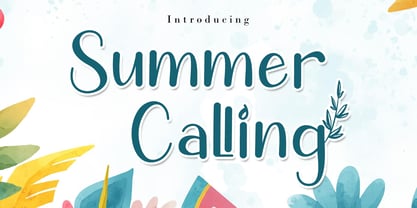 Summer Calling is a delicate, elegant and flowing handwritten font. It has beautiful and well balanced characters and as a result, it matches a wide pool of designs. Summer Calling is PUA encoded which means you can access all of the glyphs and swashes with ease!

