10,000 search results
(0.031 seconds)
- Neon Goo by Hanoded,
$16.00 I’m a bit of a sucker for neon lights, especially in big cities. My favourite city is Tokyo, with its brightly coloured billboards and its back alleys full of neon-lit eateries. At first sight, Neon Goo is a slightly warped font, with some funny looking glyphs and a generous spacing. When you start using it, you’ll find out that the glyphs do complement each other! Neon Goo comes with all diacritics and a set of alternates for the lower case letters.
 - Alta Mesa by FontMesa,
$25.00Alta Mesa is a revival of an old type design from the 1800's that was sold by most of the type foundries in the US and Europe of that time period so it is difficult to know the foundry of origin. New with this version are the fill fonts and plain styles, the fill fonts may be used as stand alone fonts, however the letter spacing is much wider, the plain versions are recommended if you desire a solid black weight. The regular Fill font is in registration with the Regular and Open versions while the Fill L font is in registration with the L and Open L versions. This was a very charming font in its time which was heavily used on old billheads and letterheads. We're pleased to bring this type design, which hasn't been used for over 100 years, into the digital world today. - FF Pastoral by FontFont,
$50.99 A sturdy workhorse with the grace of a gazelle, the FF Pastoral typeface family marries pure craftsmanship with rapturous excesses of form. With his fifteenth release under the FontFont brand, prolific French designer Xavier Dupré has filled a typographic toolbox with plentiful options ranging from a tender, feathery Thin to a robust, healthy Black. At a glance, FF Pastoral appears deceptively simple, particularly in the middle weights. That surface serenity is intentional and allows for easy reading and quick comprehension of short blocks of copy. Upon closer inspection, FF Pastoral is complex and nuanced, carrying a balanced tension in its forms. This plays particularly well in magazine spreads and corporate logos, where uniqueness is a virtue. In creating his latest design, Dupré drew inspiration from a tasteful mix of references, combining diverse elements with a deft hand. While its letter shapes were informed by humanist-geometric hybrid Gill Sans, FF Pastoral’s proportions have been optimized for contemporary typography. Slightly condensed but generously spaced, FF Pastoral features a tall x-height, open counters, and subtle, sprightly italics slanted at just 5°. Proportional oldstyle figures are the default in the family, with tabular and lining numbers and fractions accessible through OpenType features. Elegant details evocative of calligraphy judiciously pepper the FF Pastoral glyph set. The ‘e’ bears an oblique crossbar, while the right leg of the ‘K’ and the ‘R’ are insouciantly curved in both the upright and italic variants. Further flourishes appear throughout the italics, notably in the ‘T’ and the ‘Z’, the gloriously looped tail of the ‘G’, and an extraordinary ampersand. Sharp-eyed fans of Dupré’s work may feel like they’re in familiar territory, and they would be right. An early version of FF Pastoral sprang to life in 2017 as Malis, a family in four weights on the heavier side of the spectrum. Over time, Dupré refined his original design, expanding it with four lighter styles and including true italics for all. The lightest weights are ethereal, with exquisitely delicate strokes drawing the eye in and across a line of type. The most substantial styles are tremendous in their power, allowing text to make a deep impression in print or on screen. Fully fleshed out, FF Pastoral works sublimely in a vast array of text and display settings. Dupré sees his latest FontFont offering as a ‘cultural’ typeface, perfect for the pages of an oversized coffee-table book or business communications where warmth and informality will win the day. Born in Aubenas, France (1977), Xavier Dupré is a gifted user of type as well as an award-winning type designer and lettering artist. After training in graphic design in Paris, Dupré studied calligraphy and typography at the Scriptorium de Toulouse. Since releasing FF Parango in 2001, Dupré has published such FontFont classics as the FF Absara and FF Sanuk superfamilies, FF Megano, FF Tartine, and FF Yoga. A designer of Khmer fonts as well as Latin typefaces, Dupré splits his time between Europe and Asia.
 - Tradizione - Unknown license

- Målestok by Wilton Foundry,
$39.00 The Målestok family (Light, Light Italic, Bold, Bold Italic) is an eclectic solution for a broad range of applications. The rounded outer corners combined with select stencil effects makes for an interesting and friendly face. In large sizes, the bold version is strong and engaging, while the lighter weights are stylish and friendly. Thanks to its distinctive slightly technical style, both print and interactive designers will find that Målestok provides a multitude creative options with the perfect solution to draw attention with style. Målestok family his ideal for branding, collateral, advertising and packaging design. Målestok also fits comfortably in fashion , retail and sport related categories. Målestok family was designed in Norway, The Netherlands and USA.
 - Fortuita by Typographias,
$28.00 Fortuita is a versatile sans fit for text or display. The name carries some of its history as it was born from logo sketches that fortuitously grew into a type family over eight years. It comes with a tall x-height, rendering it readable at smaller sizes. It has sixteen weights, eight regular ones, and their italics, each with small caps, something you may not see very often with sans serifs. It counts with old-style numbers that can switch to its lining, small caps, or tabular versions through open-type features. The family carries a distinct personality in its design that will lend itself to its subject, all the while without becoming distracting or detracting from it.
 - Vinlatte by Miracledsign,
$8.00 Vinlatte is a font inspired by the uniqueness of a cake topping by giving a hollow accent and arranged in such a way that makes Vinlatte very elegant and classic with a style that displays a uniqueness in each character of the letter. Vinlatte is shaped and made by combining the contours and anatomy of regular letters in general as a strong base and modified by giving a cavity accent so that it has a unique value and when used in a template, poster, cake advertisement, children's magazine and of course it will be very interesting for them. . who see it and will definitely make the product look more attractive, unique and will bring the soul to your product and of course add to the selling value of your product.
 - ITC Skylark by ITC,
$29.99ITC Skylark, from designer Patty King, is an alphabet with a strong handwritten character and calligraphic influences. The figures look as though they were written with a broad-tipped pen on rough paper. The result is a light stroke contrast, irregular outer contours, pointed stroke endings and a clear slant to the right. These characteristics lend the font its spontaneity and liveliness. ITC Skylark is best used for headlines and short texts in point sizes of 12 and larger. - Legendary Legerdemain Leggy by Comicraft,
$29.00 Legendary Legerdemain’s lovely assistant, Leggy is just that -- she’s tall, dazzlingly attractive in her tight-fitting clothes, and has legs right up to her neck! She looks good, strikes attractive poses, and gives LL room to make magic. Gasp as Legendary Legerdemain saws her in half! Cheer as she floats in the air! Look Away as Legendary Legerdemain makes her the target of his knife throwing act! See the families related to Legendary Legerdemain Leggy: Legendary Legerdemain.
 - Demon Beast Blackmetal by Sipanji21,
$19.00 Demon Beast is a font filled with dark and menacing vibes, making it a perfect choice to evoke an intense Black Metal atmosphere that aligns well with Halloween themes. Inspired by terrifying creatures and symbols associated with darkness, each character in the Demon Beast font portrays power and fear. With sharp lines and angular shapes, it exudes a strong and mysterious impression, creating an eerie and captivating aura. This font embraces gothic elements, featuring intricate artistic touches and sharp details. Each letter resembles icons related to the supernatural world, as if conjuring up frightening creatures from the depths of darkness. With Demon Beast, you can create text that is captivating, powerful, and enchanting. It is well-suited for use in designing posters, stickers, greeting cards, or graphic elements to celebrate Halloween, adding a mystical and spine-chilling touch necessary to set the right atmosphere for Halloween-related projects. If you're seeking a font that exudes a strong Black Metal aura and embodies terrifying darkness, Demon Beast is the perfect choice. With its captivating and mesmerizing appearance, this font will serve as a powerful asset in embodying the aesthetics associated with Halloween and the Black Metal music genre.
 - TX Signal Signifier by Typebox,
$39.00Eight designers present a set of icons that indicate the fun and fantastic world of signage. Each collaborator's solution represents a completely different interpretations on signage vernacular. Akira Kobayashi's "Subsumption", obscured by foliage, offers a perspective that signs on Japanese roads can be vague and beautiful. M.A.D.'s "People Signs" is a graphical association of people signage with a variety of well known situation symbols. Cynthia Jacquette's "Honest Arrows" are a series of arrows that attempts to honestly tell you how to get from point A to Point B in a big, confusing city. Mike Kohnke's "Road Kill" and the "Bump & Bruise" highlight how signs make for perfect targets when unloading a round of buckshot, and the licking a contruction barrier often endures. Joachim Muller-Lance's "Traffic Blends" places faces on things! Hey, didn't you give your first car a nickname? Cars are alive, you know - they guzzle and smoke all day. Jean-Benoît Lévy's "Inner-State" was inspired while reading the California driver handbook to pass a driver's test. Kevin Roberson's "Tail Lighting" reminds us to drive carefully and not to forget to signal. Diana Stoen's "Drivers Out There" shows us "driver personality archetypes", including the lil'ol lady that everyone tries to avoid. - Haboro Contrast by insigne,
$- Meet Haboro Contrast, the stylish little sister of the Haboro hyperfamily. While built from the same clean, geometric shapes of Haboro Sans, this new addition has been rebalanced for elegant performance with her high-contrast sans letterforms and has been adjusted to provide the greatest impact for each weight. It's a personality all her own, gentle in approach yet refined and modern with a confident appearance. Capitalize on Contrast's style with OpenType features, too. Packed with options like OpenType ligatures, stylistic sets, fractions, crafted small caps and old-fashioned figures, this font will keep your work fresh and attractive. If you need even more combinations for the right statement, use the entire Haboro hyperfamily and create the right balance to capture your reader's eye. Haboro Contrast (along with the rest of the Haboro family) has been tested for the web and is ready for use in both print and digital applications. Designed to serve as a display character for such publishing projects as magazines and company brochures, Contrast gives you comfort in having a great amount of versatility in the fonts you rely on. It's a prime example where high contrast simplicity lends itself to achieve excellent design results.
 - Storyline by Comicraft,
$19.00 It starts slowly, gently drawing you in... you're introduced to a number of strangely interesting and compelling characters. The plot seems at first to be satisfyingly predictable, then -- suddenly -- the narrative takes a completely unexpected turn! The protagonist is thrown into a series of devastating and alarming twists and turns! The antagonist triumphs -- evil trounces good, mass hysteria seizes the city streets! Our Hero is separated from his One True Love, and it seems that she has fallen for The Villain of the Piece! Will Good Prevail? Will Evil Perish? Will Love Conquer All?!? I don't know yet -- that's as far as I've got. Don't worry, it has a Great Ending.
 - Happy Kids by Beary,
$12.00 Happy Kids embodies fun, quirkiness and authenticity. It features gorgeous and fun characters that will brighten up your crafting projects. It will elevate a wide range of design projects to the highest level, be it branding, comic design, children's books, headings, invitations, labels, and much more
 - Moonstore by Raditya Type,
$12.00 Moonstone is the definition of fun, uniqueness, and authenticity. This eye-catching font will turn your creative ideas into a standout. It will take your various design projects to the highest level, be it branding, headings, book cover, t-shirt, mug design, logos, labels, and much more!
 - Crunchy Orange by Raditya Type,
$12.00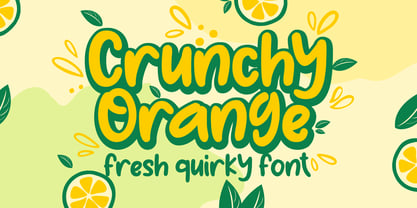 Crunchy Orange is a picture of fun, uniqueness, and authenticity. This eye-catching handwritten font will turn your creative ideas into a standout. It will take your various design projects to the highest level, be it branding, headings, wedding designs, invitations, signatures, logos, labels, and more!
 - Biosphere by Fype Co,
$16.00 Biosphere is inspired by industrial style typeface that's will give look a modern and technical industrial display font. That will take any design idea to the next level, covering a wide range of project types such as poster design, book covers, prints, headlines, id cards, packaging, branding.
 - Berfilem by Deeezy,
$14.00 Trendy, elegant, artistic, luxury & modern style serif font for your fancy projects. Elegant, fashion and editorial style on Berfilem font will be great for any branding project. Lot of alternates and ligatures will help you to create unique and original logo design or website header! Enjoy :)
 - Harri by Blancoletters,
$39.00 Harri –“stone” in Basque language– is a display font based on the peculiar letter forms used in signs and fascias all over the Basque Country. This idiosyncratic lettering style, very often used as an identity signifier, evolved from ancient inscriptions carved on gravestones which can still be found in the French part of the Basque Country (Behe Nafarroa, Lapurdi and Zuberoa).Harri takes some of its more significant features from those engraved letter forms, but also from the current overemphasized shapes derived from them, while keeping in sight their antecessors: the Romanesque inscriptions and ultimately the Roman Capitals. Gerard Unger once said “the black version of a font is a caricature of the regular”. This may explain how the odd heavy shapes in use in the Basque Country today might have evolved from their engraved roots, which are already an interpretation of Romanesque and Roman letter forms. This evolution is echoed in Harri through its weights, from the clean formal Roman-inspired light to the extreme expressive Basque-style extra bold.
 - VTC SikleCell - Unknown license

- Cinta by Tipo Pèpel,
$21.00 We are really happy to introduce you to Cinta, a brand new elegant sans serif font designed for text. It has a humanistic skeleton, dressed up with a hand-made mechanical suit, which made it rush, audacious. A dedicated tribute to the breakdown of mestizo music rhythm, bright, dreamy but completely real. Full of a broad variety of weights and versions, it’s able to produce subtle changes in the typographic stain. Perfect to make delicate hierarchy both in web and text and show the world their family background undoubtedly. Prudent and thrifty, condensed forms and with a generous x-height, it almost accidentally saves space and avoids being a spendthrift. Discreet even in the italic, slightly slanted to produce a subtle change of look on web use, will make a delightful for the most exquisite users with the audacity of modernity. Classic but not silly. Generous in abundance, with small caps, old numerals, denominators and numerators, fractions, ligatures, all you need to survive in the new modern life of Opentype with elegance. Polyglot, with support for Latin languages, Central European and Cyrillic. A delicate friend who will delight ladies and gentlemen who are discerning and cosmopolitan.
 - Buffalo Western by Kustomtype,
$25.00 Frederick Cody, as known as Buffalo Bill, and his renowned travelling Western Circus are now celebrated through the creation of the Buffalo Circus and the Buffalo Western type fonts, both developed quite in the spirit of the stirring wood type fonts from the 19th century. All characters are fully hand traced and vectorized and provided with appealing glyphs and cool catchwords.
 - Buffalo Circus by Kustomtype,
$25.00 Frederick Cody, as known as Buffalo Bill, and his renowned travelling Western Circus are now celebrated through the creation of the Buffalo Circus and the Buffalo Western type fonts, both developed quite in the spirit of the stirring wood type fonts from the 19th century. All characters are fully hand traced and vectorized and provided with appealing glyphs and cool catchwords.
 - HWT Geometric by Hamilton Wood Type Collection,
$24.94 This late 19th century design conjures up early 20th century Dutch DeStijl lettering with a mostly strict adherence to right angles and minimal stroke modulation. Geometric began its life as a metal typeface from the Central Type Foundry, circa 1884. Soon after, this design was officially licensed to Morgans & Wilcox and was shown in their 1890 catalog in Regular, Light and Condensed Light variations. After acquiring Morgans & Wilcox, Hamilton Manufacturing offered Geometric Light Face Condensed as their own No 3020 and the Geometric Light Face as No 3021. HWT Geometric has been expanded digitally to include a Regular Condensed version. A heavier wood type specimen was found from an unknown manufacturer and digitized as it was found, resulting in the HWT Geometric Shopworn and Shopworn Inked variations. These digital versions all include a full Western and Central European character set of over 380 glyphs.
 - Chusp by PizzaDude.dk,
$20.00A laid back slab serif font with a good deal of the funky side of pizzadude.dk! You will need to use OpenType supporting applications to use the autoligatures - Something - 100% free

- Blackboard Ultra - 100% free

- Fashionable JNL by Jeff Levine,
$29.00 For years, the print ads for the Hickok Jewelry Company [renowned for their line of men's belts, suspenders, wallets, cufflinks, etc.] featured its name and related main line ad copy hand-lettered in a condensed monoline with Art Deco styling. This has been reproduced in Fashionable JNL, available in both regular and oblique versions. For those of you who are wondering: yes, the founder of the company was a distant relative of "Wild Bill" Hickok.
 - Seventies by Lián Types,
$37.00 'Meeeeoooow'! Seventies is another of my 'funkadelic' attempts (1) to fill the existing gap of seventyish looking fonts. In my opinion, that decade has a hidden treasure regarding type that remains unexplored: Only very few fonts rescue its 'groovy' essence, its ‘colourful’ qualities. But, don't have a cow man , and keep on truckin! With Seventies, my new foxy mama , your projects will stand out among the rest. Since there’s not much information available about this kind of lettering I had to get ideas from other styles: Nowadays it’s easy to find all kind of books or guides to understand and practice how different styles of calligraphy and lettering should be done. However, for some reason, 60s and 70s letters seemed to ignore/be free of rules... Was this suggesting the birth of postmodernism? I incorporated some ideas of the copperplate style of calligraphy: The ductus of its forms may be compared to the way letters are made in snell/engrosser’s script. Obviously, this is just the idea behind; the delicacy of thins is replaced here with the graceful imprint of really thick thicks with a brushy look and tons of good vibe . Seventies will work awesome in posters, brands, magazines, book-covers of any kind, due to its modern look adapted to our century. Well, catch you on the flip~side ! STYLES To make you more psyched , Seventies is a layered font! See examples in the posters using Seventies Shade, Seventies Shine and Seventies Printed. NOTES (1) My first one was with Beatle in 2014.
 - Bex Script by The Ampersand Forest,
$35.00 Bex Script is a riff on traditional French script forms: the Bâtarde, the Ronde, and the Coulée. It has two versions: First, there’s La Belle, a straightforward, lovely interpretation of the script form, suitable for things like invitations, poetry and branding. La Belle’s evil twin is La Bête, a more whimsical (and considerably more hairy) version, great for anything that requires an elegant-but-beastly feel. Bex is surprisingly versatile! With three optional capital forms (Swash, Caps, and Small Caps) all taller than the x-height, Bex has a variety of voices. A full small cap set and a full set of Swash Caps, plus a large complement of alternates, initial forms, terminal forms, and ligatures makes it customizable and… well, FANCY! Additionally, both versions of Bex Script have a set of ten ornament glyphs. La Belle has a combination of fleurons on a culinary theme and symbols of France. La Bête has ten pseudoheraldic beasts that would feel at home at the top center of any whimsical letterhead. NOTE: A few years ago in Paris, I was lucky enough to stop at the Librairie Paul Jammes in St Germain-des-Prés, where I bought a turn-of-the-19th-century signature from a Type Specimen of the printer Joseph Gaspard Gillé. The irregularity of his script types — particularly the ones at smaller sizes, like the Cicéro — was very intriguing. They seemed to blend the Ronde with some elements of the Bâtarde and Coulée. And they, along with the work of French master penman Louis Rossignol, gave Bex Script its initial form.
 - Blooming Meadow by ParaType,
$25.00A set of original ornamental symbols was designed by Viktor Kharyk and licensed to ParaType in 2007. The name was inspired by the famous book “Champ Fleury” by Geoffroy Tory (1529) but the theme of blooming meadow was embodied much more literally. Each ornamental motive has a real prototype in flora. Mainly there are plants raising on Ukrainian wooded steppe. Plants were chosen for their Ukrainian and Latin names begin of proper letters from Ukrainian and Latin alphabets. The font is consisted of two styles: Day for normal and Night for reversed that reminds night lighting by its unexpected distribution of black and white areas. Fleurons may be used for creation of ornamental surfaces, composed borders and corners, decoration of any materials, and even as botanical illustrations. Blooming Meadow Day have been adjudged Award of Excellence in Type Design at TypeArt’05 international type design contest - March Evoked by SilverStag,
$12.00 March Evoked is a brand new display font pack that includes regular and outlined version. march Evoked is inspired by an early spring in Spain, with flowers in full bloom all over the capital city - Madrid. With contrast lines & curves it will give your design that chic & modern appeal you are looking for. It is perfect for logos, branding, posters, social media & all other creative projects. I invite you to check out the preview images, and I hope you will be immersed in my vision for this creative typeface that, I am sure, will work for all kinds of interesting projects you might be working on this year. If you end up publishing your designs on Instagram, tag me - https://instagram.com/silverstagco and I will make sure to showcase your design and work to my audience as well! March Evoked - Creaive Display Font Includes: Numerals & punctuation Full language support Would you like to get 5 completely free fonts worth over $75? No tricks, no hidden words, terms or anything. Just subscribe to my newsletter, make sure to check your email to approve the subscription, add me to your contacts so that the emails don't end up in spam folder and you will get 5 fonts for free. The fonts are packed with alternates, ligatures and some even come with extra goodies. https://view.flodesk.com/pages/63594052b967a943dd6cc528 Happy creating everyone!
 - Mayonaise by Hanoded,
$8.00 Ah, so you've noticed a typo! Mayonnaise - the sauce, is written with double 'n'! I know. This font was named after a Smashing Pumpkins song that I like very much. Mayonaise is a bit of an ugly duckling. It is strange, open and messy, and might not be love at first sight. BUT, when you spend some time with Mayonaise and get to know her, you might actually fall in love. Just like that song I mentioned earlier. Go on then, give it a try! At this price, you can't go wrong!
 - Always by Scholtz Fonts,
$19.00 Always is an elegant script font in six styles. Always makes full use of extravagant ascenders and descenders, giving the font a generous, opulent appearance. To use the font to its best advantage, we suggest that the user allows a generous line spacing. (For example: use multiple line spacing of no less than 1.3 when using the MS Word application). Always comes in six styles, condensed light, light, condensed regular, regular, black and fat, giving the user enough variety for all possible uses. Use a combination of styles for product branding, book covers, greeting cards, wedding media, women’s advertising media. The Always combination will enable you to use different styles of the same font for headings, sub-headings and body text. Always makes use of OpenType features and includes a number of automatic and discretionary ligatures, giving the font a varied, handwritten effect. Always contains over 283 characters - (upper and lower case characters, punctuation, numerals, symbols and accented characters are present) as well as characters for ligatures and alternate characters. It has all the accented characters used in the major European languages.
 - Wet Pussycat by Celebrity Fontz,
$24.99A sexy font hand-penned by a real bombshell that will catch the eye of that special someone you love. - Mixa by Fontfabric,
$29.00 Neo-grotesque Sans Serif mixed with the classical handwritten Script in slanted geometric shapes - that’s the way Mixa was born. Those two faces of the new font family makes it as much as unique and recognizable. When you’re using the Capitals only nobody will suspect that there is script hidden in the lowercase. That’s why all eight weights can be combined perfectly with wide list of classical Sans Serif, Slab Serif and Serif typefaces. The font offers wide range of ligatures to ensure smooth readability and beautiful letter combinations. The decorative swashes in some of the Capitals presented as a stylistic sets give unique touch in any design. Mixa has it’s own style and personality, but without lacking of legibility.
 - Aracne by Antipixel,
$15.00 The all-caps Aracne collection features tall, slightly scrawled letterforms, and is available in regular, condensed and ultra condensed styles for maximun functionality. With a spiritted quality and casual character, it will add a personal style to your work. Aracne is a full of energy handwritten font, with light and regular styles, including italics. It provides a wide range of possibilities, including the Aracne Soft and Stamp, which offer softer and cleaner edges. It’s has a glyph coverage supports languages such as English, Spanish, French, German, Polish, Czech, among many others. It’s recommended usage is for display titles, and small ammount of text, because of its good legibility and quality of glyphs. Check out her sisters Aracne Condensed and Aracne Ultra Condensed!
 - Marceaux by Hexagon Foundry,
$17.00 Marceaux is a sophisticated font with a touch of elegance and modernity. The letterforms are sleek and slender, with clean lines that give this font a refined and graceful appearance. Whether you're creating a logo, a book cover, or a website, Marceaux will bring a touch of class to your project. Marceaux features a complete set of small caps, uppercase, and lowercase letters. The font has been developed in six weights, from light to black, with corresponding true italics and oblique letters, and two styles (serif and sans-serif) for a total of 24 styles, making it versatile enough to use in a variety of design applications. Marceaux includes an expanded character set that supports over a hundred latin-based languages.
 - Mary Helen JF by Jukebox Collection,
$32.99 Mary Helen from Jukebox is a warm and feminine script font that is bright and happy. Named after the designer’s paternal grandmother, the typeface lends a sense of fun and joy to any design. Perfect for a variety of functions, Mary Helen will provide that touch of feminine grace, like a handwritten note from a friend or loved one. The font contains several alternate letters and a couple of ending flourishes as well, for variety. Jukebox fonts are available in OpenType format and downloadable packages contain both .otf and .ttf versions of the font. They are compatible on both Mac and Windows. All fonts contain basic OpenType features as well as support for Latin-based and most Eastern European languages.
 - Cardo - Personal use only


