10,000 search results (0.116 seconds)
  1. Big Sur by Mysterylab, $11.00
    Big Sur is a six-width slab serif font family with a unique look. At first glance, it is clearly in the tradition of old west style alphabets, with its chunky top and bottom strokes and serifs. But it also features a whimsical vibe in the curvy and pointed flourishes, the wavy baseline, and the swash terminals on many of the glyphs. It's a true standout with unique identifiers, and is bound to grab the eye as something new and different; yet it's traditional enough to establish a solid Western or vintage Americana style. Great for rodeo, county or state fairs, saloons, pubs & taverns, cowboy gear, and even vintage psychedelic posters.
  2. Big Bang by Haksen, $12.00
    Big Bang! Cute Sans with Additional Swashes Introducing the elegant "Big Bang!" Cute Sans with Additional Swashes If you are needing a touch of funnies chic cute sans for your designs, this font was created for you! Big Bang was built with OpenType features cute characters for uppercase and lowercase letters, loads of different swash character for numerical, uppercase and lowercase letters in file with the name Big Bang Swashes, in other side for Bing Bang regular and slant version include numbers, punctuation, ligatures and it also supports other languages :) Accessing the swashes / opentype features / glyphs: This font works best in a program that supports OpenType features such as Adobe Indesign, Adobe Illustrator CS, or Adobe Photoshop CC. You can access the swashes and alternates from the 'Glyphs Panel' in these programs. More Questions? Here are some (potential) answers! You are not permitted to resell this font in any way. Multilingual Support is included for Western European Languages Cheers!
  3. Big River by Ana's Fonts, $15.00
    Big River is an elegant sans serif and handwritten font duo with lots of extras. It includes: - A wide sans serif font in three weights (with caps and small caps); - A handwritten font with a regular and slant version, and bonus swashes to give your designs a more natural look. Each font includes: - A-Z, a-z, 0-9, accents, punctuation and symbols - Contextual alternates (script) - Ligatures (script) This font duo makes it so easy to achieve beautiful and eye-catching designs, and is perfect for both short and longer texts. It can be used for making postcards and notes, creating logotypes, social media posts, branding and packaging, etc. Please note: No special software is needed in order to access the extras, as they are in a different font file. You can simply access them directly in your font bar (a-z for terminals in regular, A-Z for terminals in italic, and 0-1 for squiggles).
  4. Big Flask by Nathatype, $29.00
    Looking for a font that’ll make your branding spark? Ready to enhance your project? Something that’s versatile and a bit touch of retro vibes? Get ready to transcend to a world of magic, laughter, and butterflies. Big Flask-A Display Font Big Flask is a typeface that will make your projects elevate. An excellent choice to add the right amount of retro touch. This typeface with artistic style looks very interesting for loads of different projects and promotions. Use it to create standout headings, logo, book cover, poster, t-shirt, branding, and advertisement needs. Features: Ligatures Stylistic Set PUA Encoded Numerals and Punctuation Thank you for downloading premium fonts from Nathatype
  5. Mister Big by SoftMaker, $9.99
    Mister Big is a decorative typeface published by SoftMaker.
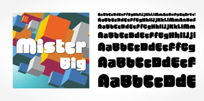
  6. Big Cat by FontMesa, $25.00
    Released in 2006 under the name Flatrock this new 2020 version takes back the original name of Big Cat. Also new for 2020 are two solid black weights and Big Cat now has additional accented glyphs for eastern European countries. If you're looking to make an authentic 1800's broadside poster then Big Cat is perfect for the job, combine it with other woodtype fonts from our collection.
  7. BIG UltraWide - Personal use only
  8. ITC Obliqua by ITC, $29.99
  9. D3 Circuitism Oblique - Unknown license
  10. My Puma Oblique - Unknown license
  11. Walkway Oblique Black - Unknown license
  12. 7 days oblique - Unknown license
  13. SF Obliquities Outline - Unknown license
  14. Mister Belvedere Oblique - Unknown license
  15. Walkway Oblique Bold - Unknown license
  16. Samson Bold Oblique - Unknown license
  17. Walkway Oblique Expand - Unknown license
  18. SF Obliquities Extended - Unknown license
  19. Pecot Outline Oblique - Unknown license
  20. Walkway Oblique SemiBold - Unknown license
  21. SF Obliquities Extended - Unknown license
  22. SF Obliquities Outline - Unknown license
  23. Walkway Oblique UltraBold - Unknown license
  24. Fairytale Serif Oblique by Nicky Laatz, $26.00
    A whimsical little serif transporting you back in time. Based on vintage hand scribed italics, Fairytale Serif is ready to charm it's beholder with its quaint inky edged letters.
  25. Ubuntu Titling Rg - 100% free
  26. SW Crawl Title - Unknown license
  27. P22 Monumental Titling by IHOF, $24.95
    Based on Transitional Roman forms, this tasteful and well crafted Humanist display face exudes an air of authority along with a subtle playfulness. Narrow proportions allow for space conservation. Alternate letterforms & ligatures give this caps-only font expanded possibilities for any given text setting.
  28. Gothic Outline Title by URW Type Foundry, $35.00
  29. Wild Title Sans by Caron twice, $39.00
    Wild Title Sans is ideal for projects that are intended to be leisurely and relaxed. The font deliberately destroys the principles of restrained fonts, emphasizing unbridled individuality. The distinct notches in the font are enlarged ink traps, which are used for typesetting in small sizes and usually copy the structure of the character. In this case, the ink trap becomes part of the structure of the character, giving the font a strong and original feature. The weight of individual styles is also distinct: the emphasis on the vertical breaks with traditional approaches to posture. This font literally draws attention to itself. Individual styles are suited to a variety of uses, from small-point texts to bold, distinctive headings. Specimen: http://carontwice.com/files/specimen_Wild_Title_Sans.pdf
  30. Eckhardt Titling JNL by Jeff Levine, $29.00
    Eckhardt Titling JNL is another treatment of a popular typeface that lends itself well to the hand-lettered sign and display work of days past. A clean sans serif with a slight touch of Art Deco, this font renders well from small point sizes to large posters. As with other fonts in this series, it is named in honor of Jeff Levine’s good friend Albert Eckhardt, Jr. who owned Allied Signs in Miami, Florida from 1959 until his passing.
  31. Film Title JNL by Jeff Levine, $29.00
    A World War II training film had its opening title card “First Aid” hand lettered in a casual, Art Deco sans serif design. This is now available digitally as Film Title JNL, in both regular and oblique versions.
  32. Titling Stencil JNL by Jeff Levine, $29.00
    Titling Stencil JNL is an extra bold stencil treatment of R. Hunter Middleton’s ‘Karnak’ (produced in 1936 for Ludlow) and is a companion font to both Bookkeeping JNL and Bookkeeper JNL (a lightweight version of the type design). Middleton based his ‘Karnak’ family of typefaces on the geometric slab-serif ‘Memphis’, which was designed in 1929 by Dr. Rudolf Wolf and released originally by the Stempel Type Foundry of Germany. According to Wikipedia, ‘Karnak’ was named after the Karnak Temple Complex in Egypt, in reference to the fact that early slab serifs were often called “Egyptians” as an exoticism by nineteenth-century type founders.” Titling Stencil JNL is available in both regular and oblique versions.
  33. Quick Titling JNL by Jeff Levine, $29.00
    An ad spotted in a 1960 issue of Billboard magazine promoting a 45 rpm release by Randy Lee doing the old song "Did You Ever See A Dream Walking?" featured the song title in a casual, brush lettered style. While the ad made a perfect model for a digital font design, the record itself tanked. Quick Titling JNL is available in both regular and oblique versions.
  34. Stylish Title JNL by Jeff Levine, $29.00
    The cover title for the July, 1935 issue of Harper’s Bazaar magazine was hand lettered in a condensed, squared slab serif design with a few stylized characters. This is now available as Stylish Title JNL, in both regular and oblique versions. For many years, each issue of the magazine had its title rendered in different type styles; offering many unique variations to coincide with that month’s cover art.
  35. Archive Black Title by Archive Type, $19.95
    Heavy blackletter display typeface.
  36. JAF Domus Titling by Just Another Foundry, $42.00
    JAF Domus Titling is a rounded typeface with classical Roman proportions. It is unique in that it was designed as an all-caps sans from the beginning. The fonts range from Extralight to Extrabold and include a large number of accented characters as well as small caps and alternates.
  37. Archive Harlem Title by Archive Type, $19.95
    Blackletter display typeface.
  38. Title Gothic Light by BA Graphics, $45.00
    A very thin light line gothic, great headline face.
  39. Breve Sans Title by DSType, $50.00
    Breve was designed for use in editorial projects. Simple but with enough personality to stand by is own, in a quest for a more forceful and contemporary appearance. All the fonts in Breve superfamily, share the same exact structure, both in terms of anatomy and functionality. The Text versions provide a softer and warm feel to the typographic palette and is intended for use in much longer passages of text, while the Title versions are distinguished by non-descending letterforms, making the titles and headlines much more uniform and interesting. The News version is more classic, with ball terminals and classic proportions, while the Display is, somehow, the set of fonts we had to design: extra-black, ultra-contrasted, proud-display fonts.
  40. FB Titling Gothic by Font Bureau, $40.00
    Titling Gothic FB is an immense series of nearly fifty styles inspired by that century-old favorite ATF Railroad Gothic. Led by the Los Angeles Times and Gentleman’s Quarterly, U.S. publications are using David Berlow’s series to unify the structure of headlines from its wide spectrum of options. Titling Gothic FB started as a relative of Berlow’s Rhode family, but took its own direction; FB 2005
Looking for more fonts? Check out our New, Sans, Script, Handwriting fonts or Categories
abstract fontscontact usprivacy policyweb font generator
Processing