10,000 search results
(0.089 seconds)
- HAPPY DONUTS - Personal use only

- DeerUp Shouttap Sans - Personal use only

- LT Glockenspiel Black - 100% free

- Lovely Amatis Signature - Personal use only

- Nostra 2003 J - Unknown license

- Baumfuss by Ingrimayne Type,
$9.95 Baumfuss and BaumfussTwo are unpolished, crude typefaces with small flared serifs and very few straight lines. They are a bit heavy to be easily readable at smaller point sizes. Baumfuss has a high x-height, while BaumfussTwo has a more conventional x-height.
 - Thenna LV by Miroslav Cunic,
$25.55 ThennaLV Bold is a slightly contrasted and a bit extended (not just basic) font family with two styles suitable for typing headlines in newspapers or magazines, giving the name of a book, composition and more. The font family consists Latin and cyrillic characters.
 - Vocalist JNL by Jeff Levine,
$29.00 Vocalist JNL is a bit of a novelty Art Deco typeface based on hand lettering from some 1940s sheet music. Using the classic "thick and thin" style of the day, a number of letters and numbers have wedges cut out of their designs.
 - Edkies by Holis.Mjd,
$10.00 A cute chubby and bubbly font for your design projects. Edkies is one of the bold, cute and funky collection fonts, a unique style and a bit messy is the concept of this font, it is available in uppercase only and multilingual supports.
 - Magellan by Monotype,
$29.99The Magellan font family is a roman in the Swedish Grace tradition. And since the Swedish language has long words, Magellan is a bit narrower than most romans. Magellan was an honorable prize winner in the Morisawa (Japan) international typeface design competition 1993. - VTG Juker by Voltage Ltd,
$35.00 Juker is a sturdy hand-drawn slab serif with proper country manners. Warm, hospitable, and just a little bit rough, Juker will lend its comfortable touch to a variety of projects. Activate the stylistic alternates feature to introduce slight variations in the letterforms.
 - Cabragio by Aah Yes,
$3.95Cabragio is a free-flowing informal font, very curvy and quite heavy. The free-flowing effect is especially apparent in the lower case letters, and this font is definitely something a bit different -- yet is highly readable and attractive. Original and distinctive! - Ashura by Sipanji21,
$10.00 Ashura is a spectacular display font. A little bit quirky, this font looks incredibly adept on a wide variety of contexts, this font look incredible for any design, and suitable for heading, logotype, advertising, shirt design, packaging, cap design, and much more
 - Streamwood JNL by Jeff Levine,
$29.00 Streamwood JNL is an outline sans wood type re-drawn from vintage source material. The design bears strong resemblance to Woodlawn JNL; but is a bit narrower and has a much different set of numbers as well as a more stylized letter "Q".
 - Yenda by Deniart Systems,
$20.00 Yenda is a bold angular font with just a bit of swoosh. Great for short text and headlines! Don't leave this one out of your next sci-fi or bold designs! This typeface includes all the special diacritics required for European languages.
 - MBF Nanomaton by Moonbandit,
$19.00 Nanomaton is a thin modern minimalist sans serif display font, with a lot of geometric shape and a bit of futuristic scifi flair. This typeface is versatile enough to be applied to multi-purpose projects. Nanomaton emphasize on clean, clarity and minimalism.
 - Kato by Autographis,
$39.50 Kato is a handwritten mostly-joining script with long, but not overly long ascenders and descenders, that make it a very elegant font. Scanned and finished carefully by hand on screen, with that little bit of extra effort to keep the "rough" touch.
 - Tangy Cream by Bogstav,
$18.00 Tangy Cream is handmade with a slightly geometric look. And to break the geometry, just a little bit, I have added 3 different versions of each lowercase letters. These automatically cycles as you type, leaving your text even more lively and organic looking!
 - Sevoya Pro by Jonahfonts,
$45.00 Sevoya Pro a captivating robust script font designed with fat strokes for those strong brands and logos. Featuring short ascenders and descenders making it a bit more legible. Sevoya Pro is perfect to create outstanding headings, logos, menus, graphics, and many more applications.
 - Eklekt by Yinon Ezra,
$9.00 The Magical look of Eklekt is not made by chance, it is created with the combination of graphic-sharp shapes and a flow curves that looks a bit like it is written by hand. Can be used for logos, headlines and short text.
 - Billy Hatter by Zeenesia Studio,
$15.00 Introducing Billy Hatter. Billy Hatter is quirky handwritten font. It is bouncy, charming and perfect for many design projects or crafting ideas, Billy Hatter perfect for large design project like Tshirt, Advertising, bags, quotes, food , poster, fashion, custom sticker, magazine, and many others.
 - Distressed Groovy Funky by Beast Designer,
$15.99 Distressed Groovy Funky Font is a cute classic display font. It’s suitable for retro design also perfect for designing t-shirts, tote bags, hats, stickers, wedding designs, logos, cards, and more! Incredibly distinct and timeless style and use it to create spectacular designs!
 - Fattty by Drawwwn,
$15.00 Fattty is a chunky fun font with plenty of wobbly bits. It's perfect for bold brands and funky projects. It's friendly curves are a great fit in kids books or on chubby posters. But remember, say it loud I'm fat and I'm proud!
 - Meter Room JNL by Jeff Levine,
$29.00 The design idea for Meter Room JNL comes from a vintage brass hand-cut stencil of the words "High Voltage". What makes this stencil font a bit different than others is the placement and angle of some of the "breaks" within the letters.
 - Pastiche Brush by Eclectotype,
$40.00 This handmade looking brush font is inspired by the titles of the 1959 movie, Imitation of Life, by prolific film titles artist, Wayne Fitzgerald. The 'pastiche' of the font's name derives from the 'imitation' of the film's title, and from the imitation of the brush. OpenType enabled software can make Pastiche Brush feel even more handmade. There are alternates for every letter and number, and most punctation marks and symbols. Every letter has at least one alternate glyph, and more commonly used (in English at least) letters have up to three, so when contextual alternates are enabled, the font automatically cycles through glyphs in a pseudo-random manner. This means no double letter combination will ever contain two identical glyphs. Not only this, but it's highly likely the same word will look different elsewhere in the sentence. The contextual alternates feature also takes care of start and end forms of letters, for an even more handmade feel. This is a great font for headlines in fashion glossies, food packaging where an organic look is desirable, posters, perfume bottles, wine bottles... the list goes on. And with extensive language support, it's going to be a very usable addition to your display font repertoire.
 - Nasser by Eyad Al-Samman,
$3.00 “Nasser” is a Kufic modern Arabic typeface. It is suitable for books' covers, advertisement light boards, and titles in magazines and newspapers. It is very distinctive when used in black and white printout. It decorates colored pages and makes artworks more attractive. This font comes in three different weights. My father’s name is “Nasser”. Consequently, “Nasser” Typeface was designed for eternizing the memory of my late father. He was the person who taught me how to like arts, literature, and languages. Besides, my first cute child is named also “Nasser.” The main characteristic of “Nasser” Typeface is in its modern non-descender style for some of its Arabic characters such as “Sad”, “Seen”, “Sheen”, “Qaf” and others. The shape of the characters' “dot”, “dots”, and “point” is innovative; a triangle with a semi-circle shape. “Nasser” Typeface is suitable for books' covers, advertisement light boards, and titles in magazines and newspapers. Its characters' modern Kufic styles give the typeface more distinction when it is used also in posters, greeting cards, covers, exhibitions' signboards and external or internal walls of malls or metro’s exits and entrances. It can also be used in titles for Arabic news and advertisements appeared in different Arabic and foreign satellite channels.
 - Blacker Pro by Zetafonts,
$39.00 Blacker Pro is the revised and extended version of the original wedge serif type family designed by Cosimo Lorenzo Pancini and Andrea Tartarelli in 2017. Blacker was developed as a take on the style that Jeremiah Shoaf has defined as the "evil serif" genre: typefaces with high contrast, oldstyle or modern serif proportions and sharp, blade-like triangular serifs. Due to the high contrast in the design - slightly reminescent of didone typefaces - Blacker has been developed in two optical subfamilies. The display version offers tighter tracking, higher contrast and sharper corners for maximum effect at big sizes, while the text variant offers better readability and screen rendering at smaller sizes, with lower contrast and looser spacing. In the pro version, two additional condensed variant families have been added (condensed display and condensed text) allowing for more freedom and versatility in typesetting where space constraints are present. Also, three titling uppercase-only variants have been added, with a slightly extended feel, and two decorative subfamilies (inline and diamond). Each of these seven variants has been developed in six weights from light to heavy, with matching italics, for a total of 69 styles covering a wide range of editorial and advertising uses. All Blacker Pro feature a revised and extended character set covering over two hundred languages using the latin, cyrillic and greek alphabets. Open type features include small caps, positional numerals, fractions, superior & inferior figures, alternate forms, and an extended set of standard and discretionary ligatures. With its bold personality, Blacker aims to be a modern classic used for bold statements and self-conscious brands, making your text look great both on paper and on the screens.
 - Bona Nova by Borutta Group,
$- ☞ Bona Nova is a collective revival project of Bona typeface designed in 1971 by the author of polish banknotes Andrzej Heidrich. Besides giving the project a digital font form the aim was to expand the base character set: preparation of small caps, designing the alternative glyphs and multiple opentype features. Working together with the author we designed two new text versions: regular and bold – to give the family a form of a classic script triad. ☞ It is accompanied by three title versions and three contour styles under the name of Bona Sforza. All styles contains over 1200 glyphs. ☞ Bona Nova is an unprecedented typographic adventure for our team. We hope that our work will allow the cultural heritage of Bona and the work of Andrzeja Heidricha to gain new followers and fans. This project connected three generations of graphic designers who graduated the same school – the Academy of Fine Arts in Warsaw. ☞ Bona Nova isn’t only a typeface. We have also prepared a book about the project (including an interview with Andrzej Heidrich, my text about the digitalisation and a font specimen). The Bona Nova release party was a big exhibition (over 1000 guests). I’ve invited 26 graphic designers to prepare their own initials of Bona Nova – they were presented as posters on exhibition too. LINKS Bona Nova WEB Bona Nova FP Bona-Nova-(FREE-FONT) Bona Nova Book BONA NOVA IN THE MEDIA Typeroom Typography Guru Slanted Designalley Stgu Typografie Info Wikipedia Bona Nova is a non-profit project, all founds that we raise we reinvest to develop the Bona Nova project (new styles, Cyrillic & Greek, extend character set).
 - Violety Dreams by Nathatype,
$29.00 Violety Dreams is a serene and elegant serif font that will transport your designs to a realm of beauty and sophistication. With its timeless letterforms and delicate swinging strokes on select letters, this typeface evokes a sense of tranquility and grace. This serif uniqueness in its graceful swinging strokes, which adorn certain letters, adding a touch of whimsy and charm. These elegant extensions create a sense of movement and fluidity, capturing the essence of grace and elegance. Inspired by the ethereal nature of dreams and the delicate beauty of violet flowers, Violety Dreams embodies a sense of tranquility and enchantment. The serif letterforms are meticulously crafted to exude elegance and sophistication, while the swinging strokes add a unique touch of whimsicality. This font strikes a perfect balance between classic charm and imaginative flair. The letterforms are designed with precision and clarity, ensuring legibility and readability. Each letter retains its distinctive shape, while the swinging strokes create a visual interest and draw the eye. You can use it in big text sizes to be greatly legible and enjoy the available features here. Features: Stylistic Sets Multilingual Supports PUA Encoded Numerals and Punctuations Violety Dreams is well-suited for headings, titles, invitations, wedding stationery, luxury branding, editorial layouts, branding materials, and any design project that calls for an elegant and dreamy typography. Find out more ways to use this font by taking a look at the font preview. Thanks for purchasing our fonts. Hopefully, you have a great time using our font. Feel free to contact us anytime for further information or when you have trouble with the font. Thanks a lot and happy designing
 - Erotique Sans by Zetafonts,
$39.00 Designed by Cosimo Lorenzo Pancini and Maria Chiara Fantini with the help of Solenn Bordeau, Erotique Sans is the sans serif version of Erotique: a typeface that evolved the original design of Lovelace mixing its romantic curves with the glitchy & fluid aesthetic of trans-modern neo-brutalist typography with the aim of creating a design that was feminine in an assertive and self conscious way. With its restrained, didonesque elegance, Erotique Sans is mostly thought for display use. Its high-contrast design is ready to take center stage in projects where a subtle elegance and an edgy, contemporary touch are required. All its weights (regular, medium, bold and monoline) have been paired with an Alternate version to give immediate access to a wide array of exotic alternate letterforms, available as Open Type Stylistic Sets in the standard family. For logo design and titling use Erotique Sans is paired by Erotique Flourishes, a set of whiplike fleurons that can not only be added to some letters, but also be used as interlocking patterns. For editorial use, since its high contrast requires big text size, the family is complemented by the Erotique Text weight that allows for longer text typesetting thanks to streamlined design, lower contrast and better readability. With a character set of over 500 glyphs, all the the weights of Erotique cover almost 200 languages using extended latin, and include advanced Open Type features as Stylistic Alternates, Standard and Discretionary Ligatures, Positional Numerals, Swash and Case Sensitive Forms. If you liked Erotique, you won't be able to avoid falling in love with Erotique Sans - the font that can't keep its serifs on...
 - KG Party On The Rooftop by Kimberly Geswein,
$5.00 In both chunky and tilted/3D versions, this font gives a dose of fun!
 - The font named GhostTown, created by SWFTE International, draws inspiration from the eerie, abandoned aesthetic often associated with ghost towns. This font has a distinctive character, blending elem...
- Slurp - 100% free

- Swish - 100% free

- Thoroughfare JNL by Jeff Levine,
$29.00 The Art Deco style of the 1930s offers many variants of the popular "streamline" look in hand lettering found on old sheet music titles. Thoroughfare JNL is one such example of a monoline design with the interesting curves and angles that was considered so modern and up to the minute for its time.
 - Beast Sketch by 38-lineart,
$19.00 "Beast Sketch" is an extraordinary handwritten font created with bold, untamed strokes using ink and a bamboo pen. It boasts a masculine aesthetic, an organic, natural feel, and extensive Latin character support. Perfect for book titles, magazine covers, logos, and more, it adds a raw, authentic, and compelling vibe to your projects.
 - Qairen by Letterena Studios,
$10.00 Qairen is a classic typeface with a unique style and modern look. It is perfect for elegant and luxury logos, book or movie title design, fashion brands, magazines, clothes, lettering, quotes, and so much more. This font is PUA encoded, which means you can access all of the glyphs and swashes with ease!
 - Stonefloral by Allouse Studio,
$16.00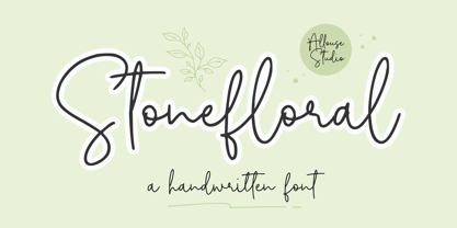 Proudly Presenting, Stonefloral A Handwritten Font. Stonefloral is perfect for any titles, logo, product packaging, branding project, megazine, social media, wedding, or just used to express words above the background. Stonefloral also come with Multi-Lingual Support. Enjoy the font, feel free to comment or feedback, send me PM or email. Thank You!
 - Steel Leg by Gatype,
$9.00 Steel leg is a font that was scratched with a brush pen, to get a natural texture, this font will show the characteristics of the hand.This font is perfect for various places such as clothing, posters, title books, stationery designs, quotes, branding, logos, invitations, greeting cards, t-shirts, packaging designs and more.
 - Rodista Brush by Stripes Studio,
$20.00 Rodista Brush is a super casual hand brushed script with detailed brush stroke texture, and a quirky, Can be used for various purposes. such as the title, signature, letterhead, signage, labels, newsletters, posters, logos, correspondence, wedding invitations, badges, etc. Rodista Brush Font international Support for a review of most Western languages included.


