6,670 search results
(0.013 seconds)
- Beehive by Matt Grey Design,
$29.00 Beehive is an Art Deco inspired display typeface with a unique slant, each word fits below one another neatly, which is perfect for creating stylised titling and logos. Beehive is made to look like a vintage, art deco styled typeface, the font is ideal for branding, posters, band artwork or album covers and endless other uses. Great for titling or medium sized text, made to be as big as possible because of the thin lines.
 - Rosebud by aRc,
$10.00 Rosebud is a great blend of simple yet organic rosy caps. Each big caps has a single rose while the small caps has the prickly, thorny stems. This decorative TrueType font is great for any occasion (from Wedding to Sweet 16 Party) or for surprising a rose lover with a flowery note. Plus, you can create your own border patterns or flower arrangements by using the rosy and/or the thorny punctuation marks.
 - Futurity by Hooper Type,
$9.00 A dystopian, CAPS only, title font used primarily for big type - so headlines in magazines, newspapers and articles. Though also amazing for posters and fdlyers where you want to grab attention. Futuristic values of a sans, which incorporate cut away elements that reflect reality - nothing's perfect - or invoke shadows when reversed out. Uppercase gives you a hard-edged version, lowercase keys will give you a rounded CAPS version, softer on the eye. Enjoy!
 - Swing Era JNL by Jeff Levine,
$29.00 Hand lettered Art Deco lettering for the title on the cover of the 1930s-era song "And I Still Do" provided the inspiration for Swing Era JNL. A bold, casual and friendly typeface, it features an intersecting inline through some of the characters. One could almost picture the hottest big band of the day promoted on a lobby card with this alphabet, beckoning all to come on in and "cut a rug".
 - Adget Sans by wearecolt,
$14.00 Adget Sans is a modern, strong statement typeface with clean lines and big curves. Inspired by classic geometric grotesque typefaces, this sans serif typeface is perfect for adding a striking title to your portfolio or website. This set includes ten individual weight fonts plus a variable weight font, Adget Sans consists of 328 glyphs across upper and lowercase, numerals, all European characters, linked letters and ligatures plus some bouns stylistic alternative characters.
 - Milica by PeGGO Fonts,
$18.00 Milica is a display font, inspired on action movies and urban Military culture, designed with straight verticals but slanted horizontals with no curves and sharped hard strokes, in 5 sizes, ExtraLight, Light, regular, Bold & ExtraBlack, plus italic version to each weight. Recommended for use in poster, Movies, video games, TV, Animation, letterhead, magazines titles, POP & Graphic culture, young stuff, hip-hop topics, urban, big sizes prints, Volumetric 3D shapes, labels, etc. Powered by OTF technology.
 - The PUNCHER by PAC Font Corner,
$120.00 ThePuncher typeface is made exactly for the book, poster, flyer or any type of titles, and for customers who wants to have bold and eye-catching final product. It can be used as a single letter for a logo or for numbering of anything you want. It is not made for long sentences. ThePuncher typeface purpose is to make big bang from your short and specific messages you want to share with the world.
 - Vestigia by Rodrigo Navarro Bolado,
$32.00 Vestigio m. Ing. & Fr. vestige: a trace, mark or visible sign left by something as an ancient city in a condition or practice vanished or lost. Vestigia is born by lost pieces of other typography, being then, Garbancera's descendant. It evolved to be seen in big point sizes and compete with other fierce competitors, while retaining some features of it ancient predecessor, navigates a gothic fraktur experimental style, existing between legible and illegible reading.
 - Baby Cakes NF by Nick's Fonts,
$10.00This robust, roly-poly typeface is patterned after a 1974 release from the Ludwig & Mayer foundry of Frankfurt am Main named Big Band, and designed by Karlgeorg Hoefer. The type color is even darker than the original, and the result is a delightful face that will definitely attract attention. The PC Postscript, Truetype and Opentype versions contain the complete Latin language character set (Unicode 1252) plus Central European (Unicode 1250) languages as well. - Expat by Parker Creative,
$18.00 Expat was designed to be used to make exciting promotional material for most industries. With its rugged and thick narrow body, Expat appears heavy to the eye and draws the eye, which is great for big headlines. Some examples of great uses of the typeface include high energy content seen in sports and apparel advertising, rustic and trendy restaurant materials, even event promotions for concerts or holidays like Independence Day and Oktoberfest.
 - JollyGood Sans by Letradora,
$18.00 Finally, a serious alternative to that other comic font. After years of mocking the font that shall not be named, I decided to create an alternative. I wanted to keep the fun feel and the comic book roots, but have a more polished look. The result? JollyGood, a complete font family, with great language support, a big range of weights and styles, and a friendly look. Check out the other members of the JollyGood family
 - Slice by Superfried,
$32.50 Slice is an experimental, circular, display typeface designed by Superfried. Slice, like its big brother Slash, also features key incisions to form the glyphs. Unlike Slash, Slice is much simpler in design based on basic geometric forms and features both upper and lowercase. Slice has a very retro feel and its chunky structure leads to a distinct, high-impact display font. Slice has been featured on the Behance curated typographic gallery TypographyServed.com.
 - Sabu by Larin Type Co,
$16.00 Sabu is multitasking, modern sans-serif font family, and a great solution for anyone your project. It includes upright and Italic style, each of them has weight weights from thin to extra bold. This is a multi-purpose one that is perfect for big and small text, it is constructed modern and easy to read. With it, you can create logos, banners, use in advertising, packaging, books covers and magazines, headings, descriptions and much more.
 - Attica by Resistenza,
$39.00 Attica is a slab typeface with inverted contrast that was inspired by Caslon’s Italian type and by Aldo Novarese’s Estro, published by the turinese foundry Nebiolo. We wanted to develop a wood type typeface and we designed the complete alphabet with a flat long brush and slowly we did the whole character set. Attica contains a big set of icons and dingbats. Enjoy it. More About Opentype Features: https://bit.ly/opentype-rsz
 - RNS Pictografica Cocina by RNS Fonts,
$9.00 RNS Pictografica Cocina (Kitchen, culinary arts and food related font) it is comprised of 230 glyphs, it's based on a modular structure of a minimal thickness on lines and round corners, making a clean visually drawing, give importance to the surround white for improve contrast. The font is better used on a big white canvas for achieve visual focus. And in great sizes for more impact, however the font is legible even at small sizes.
 - Linotype Down Town by Linotype,
$29.99Linotype Down Town is part of the Take Type Library, chosen from the contestants of Linotype’s International Digital Type Design Contests of 1994 and 1997. The cheerful character of this fun font from German designer Critzler is perfect for comics or posters. The figures dance across the base line, swinging between thick and thin, big and small. Linotype Down Town is intended exclusively for headlines and short texts in at least 18 point. - Thin Mint JNL by Jeff Levine,
$29.00Thin Mint JNL has a square, condensed look with a bit of a Deco influence. - Fester by Fontfabric,
$150.00 Get inspired with Fester Behance presentation After several years of iterations, our brand new sans family of 16 styles is ready to take over with vector excellence! Fester is a semi-condensed Grotesque developed to beam big messages across the galaxy with a clear, bold voice. Emerging as if from the future, this low-contrast sans warps slick lines and sharp terminals into unexpected geometric shapes for extra flair. Ranging from Thin to Heavy, the typeface is loaded with 8 weights + italics, one variable style, over 760 glyphs, and Extended Latin + Cyrillic for flawless work at hyper-speed. Fester syncs with designs that feature big type, sharp layouts, interfaces, outlines, and raster images to help decipher any cutting-edge idea and make a memorable first contact. Family overview: 8 weights (from Thin to Heavy) + italics Extended Latin Cyrillic 760 glyphs Variable Font 1 free font - Fester-ExraLight 130+ languages OpenType Features: Localized Forms Subscript and scientific inferiors Superscript (Superiors) Numerators and Denominators Fractions Lining Figures Tabular Figures Oldstyle Figures Case-Sensitive Forms Standard and Discretionary Ligatures Stylistic Alternates Contextual Alternates Slashed Zero
 - EraMax Radial by Our House Graphics,
$16.00 EraMax Radial is a geometric sans serif meant to be set BIG, for big statements. It's the perfect face for signage, packaging posters, branding and so on and on, where a strong voice is needed. It has a modern look that will work in a retro setting. Or, should that be a vintage look that will work in a modern setting. This is the first of what is to be a series to typefaces inspired by the original hand painted signage found in the TH&B train station in Hamilton Ontario. This classic Art Deco, Or, more precisely, Art Moderne building designed by the New York architectural firm of Fellheimer and Wagner and completed in 1933. The original lettering included about 75% of the uppercase letters only, so the balance of the uppercase and the lowercase plus all the other glyphs were extrapolated from the look and feel of the existing uppercase letters. Figures are based on the numerals on the station clock, with adjustments made to harmonised with the letters.
 - Pandilla by Typozon,
$39.00 Pandilla was inspired from personal sketches and letters developed by the past of the years making graffiti art. the forms of this typeface are related with the graffiti and street scenes of the different cities around the world and takes traits and elements of the Handstyle, Classic graffiti, Brazilian Pichação and different urban letters. This font has a variety of objectives, the first is to create a legible version of the graffiti inscriptions and use this typography for different print pieces, the second objective is to give back the essence of the meaning of the word "Pandilla", this word has been transformed for the past of the decades and now is associated with negative things. The original meaning of this word is a group of people who feel a close relationship, which usually have a friend or close interaction with ideals or common philosophy among members. Pandilla is to be used in different print purposes and graphic pieces like: Posters, Brochures, Magazines, Business cards and different stuff that uses big type sizes and big display formats.
 - Bebas Neue Pro by Dharma Type,
$14.99 Thank you for waiting. Finally, Bebas Neue has got lowercases! Bebas Neue is a world wide, the most popular font family with all caps released in 2010. Bebas Neue has been used from by big companies to by startup designers for many projects. In spite of the fact that Bebas Neue has only Uppercases, it became very popular font for these 10 years. At the same time, we received many requests for adding lowercases. To be honest, we had been developing whole new Bebas Neue with lowercases secretly for long time. Thinner Uppercase from thin to regular weights were redesigned for Pro. New lowercases were designed to match the Uppercases very carefully. You can access Tabular figures by using OpenType tnum features. Almost all European languages are supported by Pro. One more big thing is... Bebas Neue Pro has Italics! Please don't use sloped Bebas Neue. Pro has proper Italics! Bebas Neue “Pro” can extend your possibilities. Be the first to use this professional and premium Bebas Neue!
 - Joyscript Two by Jonahfonts,
$35.00 Joyscript-Two is an upgrade of the 'Plain-Joyscript' Font containing many more ligatures which makes it much more versatile and may be applied to many applications including headlines, logos, ads, captions, packaging, bulletins, posters, books and greeting cards.
 - Meigtan by Dicubit,
$10.00 Meigtan is a curly typeface/font designed with carefully handcrafted. This perfectly made to be applied in logo or branding, stationery, books, packaging, fashion, magazines, t-shirt, greeting or wedding cards, vintage design, novels, labels and many advertising purposes.
 - Simple Home by Goodigital13,
$20.00 This font perfectly made to be applied especially in logo, and the other various formal forms such as invitations, labels, logos, magazines, books, greeting / wedding cards, packaging, fashion, make up, stationery, novels, labels or any type of advertising purpose.
 - Notebug by PizzaDude.dk,
$15.00 Notebug looks like there was a bug playing around with an inky pen. Notebook with a bug = Notebug! Made with a hefty inky pen and quick strokes. You got 3 layers to play around with: Regular (the outline) Fill (The "inside" of the Regular version and Layer (best used as a background layer for Regular)
 - Hasta Luego by Hanoded,
$15.00 Hasta Luego means ‘see you later’ in Spanish. It is something you say when parting, but it doesn’t really mean you’ll have to see each other again. Hasta Luego is a happy, all caps font. It’s a bit random, a bit wobbly and it comes with some interesting discretionary ligatures for you to play with.
 - Comicbon by BaronWNM,
$12.00 Comicbon is a handwritten font that simultates text being writen on a comic, ads, creating logos, branding, teaching websites/apps/games, and many more.
 - Dever by insigne,
$24.00 Dever’s brute, industrial lines are rounded up in this new typeface from Jeremy Dooley. Dever combines plenty of inspirations. It’s the flair of the Wild West melded with a shout out to the sign painters and package lettering artists of the 1800s. Dever’s big, bold, and handy frame moves through all three of the family’s strapping members. First is the sans. No doubts on what this brother’s like. Dever Sans is as straight-forward as you’ll find in this family with its four separate weights and numerous distressed options. The second of the kin’s a bit of half-breed, you might say. Pointed serifs bring a sharpness to this outfit. Rounding out the family is Dever Wedge, a bit of wild rodeo all its own. This poke’s a quick draw with any of its 107 font, and with it’s auto-replacing alternates, no two repeating characters are alike. You’re guaranteed a great show anytime Dever leaves the chute. The route to Dever was long, with many a switchback. The Wedge variant was designed first, shelved, then developed into Plathorn. But I wanted to return to those brutish forms and decided to round out the family with a sans, serif and plenty of other options. Any of the Dever family have an extended character set including Central and Eastern European languages. The strong faces have specially adapted sub-families, too, so they’re bound and determined to have an outstanding impact at whatever size you use ‘em. It’s a hard ride ahead corralling all those words. Be sure and add these able-bodied boys to your posse today!
 - Go To Town JNL by Jeff Levine,
$29.00 Vintage sheet music for a song from the 1941 animated feature "Mr. Bug Goes to Town" featured a casual, hand-lettered inline type style on its cover page. Recreated as the digital font Go to Town JNL, this design is presented in all the imperfect glory of pen and ink lettering. Go to Town JNL is available in the regular inline version as well as a solid version. A bit about the cartoon: The project was created by the legendary Fleischer Studios in Miami, Florida (they had relocated from New York City), after they could not obtain the rights to adapt Maurice Maeterlinck's "The Life of the Bee". Beset by the expenses of relocating to Florida, growing production costs on the full-length feature cartoon and other problems; mid-way through the making of "Mr. Bug Goes to Town" the Fleischer brothers were forced to sell their studio to their distributor (Paramount Pictures) in order to continue in operation. It was released on Dec. 5, 1941 - just two days before the Japanese attack on Pearl Harbor. The release [and subsequent re-release by Paramount as "Hoppity Goes to Town"] was a disappointing failure, earning [as late as 1946] only $241,000 of the initial cost of $713,511 it took to make the film.
 - LT Staircase - 100% free

- Fartitudo by Tour De Force,
$25.00 A bit provocative, catchy and bouncy family for modern package designs, posters, labels, t-shirts etc.
 - KG Be Still & Know by Kimberly Geswein,
$5.00 Inspired by typewriter-style lettering, this font is legible and still has a bit of flair.
 - Bedaax - Personal use only

- wmxyo - Personal use only

- pixcoose - Personal use only

- roinert - Personal use only

- renvem - Personal use only

- Tropicollo by OzType.,
$16.00 Tropicollo is a handwritten mono weight cursive font. Its super clean and tidy design will turn any idea into a true standout end result! Works great applied to logos, prints, quotes, magazine headers, clothing, advertisements, product designs, labels, and much more!
 - Matrole by Viaction Type.Co,
$15.00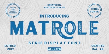 Matrole is a Display Serif with 3 styles: clean, rough and stamp, nice applied in various products. Complete with multilingual characters and stylistic alternates. It is suitable for quote, clothing design, vintage logo, label, poster, packaging design and other designs.
 - Cinestory by Goodigital13,
$20.00 This type of font perfectly made to be applied especially in logo, and the other various formal forms such as invitations, labels, logos, magazines, books, greeting / wedding cards, packaging, fashion, make up, stationery, novels, labels or any type of advertising purpose.


