10,000 search results
(0.058 seconds)
- Malistiona by Prioritype,
$15.00 Script font with a dazzling touch of love. I made this font with great pleasure. Given the alternative options and ligatures available, you can get a beautiful design feel. You can use this font for your design purposes such as craft designs, logos, quotes, wedding invitations, etc. See some of the previews above for reference. Features: -Uppercase -Lowercase -Numeral -Punctuation -Multilingual -Ligature -Alternate Note: To access the Opentype feature, it would be better if you use a program that supports it and is available with a glyph panel so you can see various alternative characters. Examples of programs such as Adobe Illustrator, Corel Draw or Inkscape. Thanks.
 - Davy Black by NJ Studio,
$9.00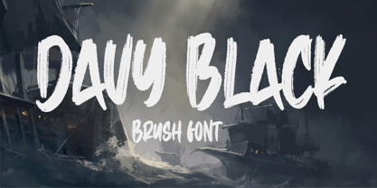 Hi...Thank for your visit :) Davy Black a brush font. It features ligatures characters that will take your projects to the next level! This font is PUA code which means you can easily access all the glyphs that are full of brush! It also features many special features including glyphs. font designs that are made for various vector designs, printing such as digital wedding blogs, online shops, social media, while printing can be used in the field of product clothing, accessories, bags, pins, logos, business cards, watermarks and many others ... so it can make your product look brush and attractive, and also Multilingual support!!! Happy design ...
 - Empire State Deco by Comicraft,
$19.00 Every face tells a story but this font is 77 stories high (1,046 feet with antenna included)! A lofty companion to Empire State Gothic , Empire State Deco is a tall, stately font containing four different styles, sometimes contradictory, united by the desire to be modern. Those familiar with the Exposition Internationale des Arts Décoratifs et Industriels Modernes will notice a post-postmodernism combined with the fine craftsmanship and rich materials for which those awfully nice chaps at Comicraft are known. During its Art Deco heyday, Comicraft represented luxury, glamour, exuberance, and faith in social and technological progress -- this new font recaptures those halcyon days in letter form.
 - Vindale by Letterhend,
$19.00 Introducing, The Vindale - a vintage script with reverse contrast and a touch of nostalgic look. The unusual reverse contrast make this typeface one of a kind. This type of font perfectly made to be applied especially in logo, and the other various formal forms such as invitations, labels, logos, magazines, books, greeting / wedding cards, packaging, fashion, make up, stationery, novels, labels or any type of advertising purpose. Features : uppercase & lowercase numbers and punctuation multilingual alternates and ligatures PUA encoded We highly recommend using a program that supports OpenType features and Glyphs panels like many of Adobe apps and Corel Draw, so you can see and access all Glyph variations.
 - Wasabi Taste by NJ Studio,
$19.00 Hi...Thank for your visit :) Wasabi Taste handwritten font. It features tall characters that will take your projects to the next level! This font is PUA code which means you can easily access all the glyphs that are full of authentic! It also features many special features including glyphs. font designs that are made for various vector designs, printing such as digital wedding blogs, online shops, social media, while printing can be used in the field of product clothing, accessories, bags, pins, logos, business cards, watermarks and many others ... so it can make your product look authentic and attractive, and also Multilingual support!!! Happy design ...
 - Rocky by NJ Studio,
$19.00 Hi...Thank for your visit :) Rocky modern sans font. It features tall characters that will take your projects to the next level! This font is PUA code which means you can easily access all the glyphs that are full of sans! It also features many special features including glyphs. font designs that are made for various vector designs, printing such as digital wedding blogs, online shops, social media, while printing can be used in the field of product clothing, accessories, bags, pins, logos, business cards, watermarks and many others ... so it can make your product look sans and attractive, and also Multilingual support!!! Happy design ...
 - Groundhog by Sparklefonts,
$22.00A digital foundry situated in England's rural South-West and established in 2005, Sparklefonts is Geoff Andersen, a man on a quest, from philosophy to aesthetics, from wild inspiration to wild gesticulation, from post-modernism right through to post-rationalisation. Boldly seeking unique and viable letterform architectures, he is equally determined to maintain legibility without compromising style. His journey has taken him through stencils and uncials, calligraphy and typography, through graphic design and guitar design. The story has been moving, the view spectacular, the punctuation superb. Geoff's sources are apparently limitless, his passion overwhelming, his fonts a labor of love, his therapist a Trojan! - Black Ruby by NJ Studio,
$19.00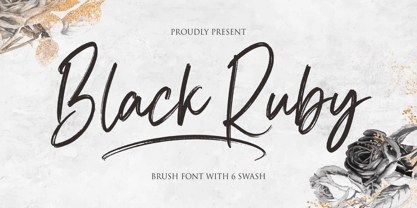 Hi...Thank for your visit :) Black Ruby a handwritten brush font. It features ligatures characters that will take your projects to the next level! This font is PUA code which means you can easily access all the glyphs that are full of brush! It also features many special features including glyphs. font designs that are made for various vector designs, printing such as digital wedding blogs, online shops, social media, while printing can be used in the field of product clothing, accessories, bags, pins, logos, business cards, watermarks and many others ... so it can make your product look brush and attractive, and also Multilingual support!!! Happy design ...
 - Master of Magic by NJ Studio,
$19.00 Hi...Thank for your visit :) Master of Magic a magical script font. It features ligatures characters that will take your projects to the next level! This font is PUA code which means you can easily access all the glyphs that are full of magic! It also features many special features including glyphs. font designs that are made for various vector designs, printing such as digital wedding blogs, online shops, social media, while printing can be used in the field of product clothing, accessories, bags, pins, logos, business cards, watermarks and many others ... so it can make your product look beautyful and attractive, and also Multilingual support!!! Happy design ...
 - Brush Effect by NJ Studio,
$19.00 Hi...Thank for your visit :) Brush effect a handwritten brush font. It features ligatures characters that will take your projects to the next level! This font is PUA code which means you can easily access all the glyphs that are full of brush! It also features many special features including glyphs. font designs that are made for various vector designs, printing such as digital wedding blogs, online shops, social media, while printing can be used in the field of product clothing, accessories, bags, pins, logos, business cards, watermarks and many others ... so it can make your product look brush and attractive, and also Multilingual support!!! Happy design ...
 - Sequal by Mans Greback,
$29.00 Sequal is a handwritten graffiti tag script. It was drawn and created by Måns Grebäck between 2018 and 2020. Its round and soft letters are youthful and active, and cool while being cute. Sequal is a typeface family of five weights: Thin, Light, Regular, Bold and Black. The different weights ensures usability in any context, while also giving the ability to emphasize phrases or words. The font supports hundreds of languages, including European and Asian Latin scripts. Composed of over 1250 glyphs, it is guaranteed to contain all characters you'll ever need, including all punctuation and numbers. It also contains OpenType features such as alternates and ligatures.
 - Hello Sweets Script by Seniors Studio,
$15.00 Hello Sweets Script is a hand-brushed modern calligraphy script font, created with both pen & brush. dancing baseline with separate swashes that can be applied to the beginning and ends of all lowercase. Were painted on paper. scanned, vectorized and carefully made into a font. Hello Sweets includes several ligatures, alternates and international support for most western languages. For the separate swashes font, type lowercase a-z for the beginning swashes and end swashes (can not access to a glyphs panel. need to add swashes manually). Ideal for logo, wedding invitations, businness card, poster, merchandise, greeting cards, prints, blog banners, apparel, quotes and so much more!
 - Back To Teacher Outline by NJ Studio,
$19.00 Hi...Thank for your visit :) Back to school (Outline & Inline) a simple handwritten font. It features fun characters that will take your projects to the next level! This font is PUA code which means you can easily access all the glyphs that are full of simple! It also features many special features including glyphs. font designs that are made for various vector designs, printing such as digital wedding blogs, online shops, social media, while printing can be used in the field of product clothing, accessories, bags, pins, logos, business cards, watermarks and many others ... so it can make your product look simple and attractive, and also Multilingual support!!! Happy design ...
 - Hodgepodge by Outside the Line,
$19.00 Hodgepodge is a confused mixture of letters that somehow work together. While I know this has been done before I create fonts that I need. And I occasionally have found a need for this. And it was not there, so now it is. There is a mixture of light and dark, bold and regular, caps and lower case but not where you would expect them to be. Since this is a headline font you can set the headline and then easily go back and change a letter here or there to get the best-looking combination. Hodgepodge was in the 2011 Typodarium Page-A-Day Calendar on 7-17-2011.
 - Handel Slab by URW Type Foundry,
$35.99 Handel Slab, designed by Ralph M. Unger, is a new offering which ideally enhances and extends the existing Handel Gothic family. Even so, Handel Slab can very well be used on its own. Obviously, Handel Slab is closely based on Handel Gothic, which was designed by Don Mandel in the mid 1960s and which has been popular and successful amongst users from day one. Even today, it is a futuristic sans serif, and it is used for a wide range of typographic tasks, for example in computer games. Handel Slab provides a perfect enhancement to Handel Gothic, and the combination of both families offers more flexibility to designers and typographers.
 - Aurum by Stasy Font,
$10.00 Aurum Script is a simple and luxurious script font. Combined with calligraphic styled handwritings will make your design project more powerful. Made for any professional project branding. It is the best for logos, branding projects, homeware designs, product packaging, mugs, posters, shopping bags, t-shirts, book covers, name cards, invitation cards, greeting cards, and all your other lovely projects. The alternative characters in this font were divided into several OpenType features such as Stylistic Alternates, Swash, and Titling Alternates. The OpenType features can be accessed by using OpenType program such as Adobe Illustrator, Adobe Photoshop, Adobe InDesign, and CorelDraw X6 - X7. Designers: Muhammad Akbar
 - Goliath by Kavoon,
$12.00 Goliath is a brush typeface with personality. You can use it as a logo, badge, insignia, packaging, headline, poster, t-shirt/apparel, greeting card, and wedding invitation. The flowing characters are ideal to make an attractive messages, mix and match Goliath with a bunch of alternative characters to fit your project. The alternative characters in this font were divided into several OpenType features such as Stylistic Alternates, Stylistic Sets, and Ligature. The OpenType features can be accessed by using OpenType program such as Adobe Illustrator, Adobe Photoshop, and Adobe InDesign. More importantly, please don't hesitate to drop me a message if you have any issues or queries: kavoonme@gmail.com
 - Qixohe by Twinletter,
$18.00 Qixohe is an elegant blend of tradition and modern style. With its strong Black letter characters, this font brings an irreplaceable classic element to your projects. It's the perfect choice for creating striking titles, memorable logos, or memorable prints. Qixohe's special features include alternative ligatures and characters that allow you to express your creativity to the fullest. With Qixohe, you can create a design like no other, one that will be remembered by all who see it. Whether for graphic design, branding, or printmaking projects, Qixohe will provide the character and notoriety you're looking for. So, grab Qixohe now and give your designs an unforgettable bold and elegant touch.
 - Kalkal by Gunjan,
$40.00 Kalkal is slab serif typeface with five style, inspired by sign-board. It looks like many typeface with three dimensional. The main layer is regular and in-liner bring little spark in the Typeface. Two shadow layers gives an eye catchy impression and opacity layer is charm of the family. This five layered typeface can be used alone or combined, which makes it a versatile. This type works both for vintage and modern designs. Now let’s see how it works: In-liner layer Regular layer Shadow one layer Shadow two layer Opacity shadow layer kalkal with its five layers gives you flexibility to design.
 - Breuer Condensed by TypeTrust,
$30.00 Breuer Condensed is a mechanical sans ideal for captions and headline settings, and may also be suitable for moderate lengths of body copy with its comprehensive offering of OpenType features. The italics are optically adjusted obliques with a selection of augmented lowercase glyphs to provide a warmer read. The overall design ensures a distinct aura of technical precision in a personable tone. This family of eight fonts is designed to accompany the Breuer Text and Breuer Headline sets released in 2007. Breuer Condensed offers a 76% narrower footprint compared to Breuer Text and is fine-tuned to render typographic color equivalent to each sibling Text weight.
 - Jacky Brushes by NJ Studio,
$19.00 Hi...Thank for your visit :) Jacky Brushes all caps textured brush typeface. It features ligatures characters that will take your projects to the next level! This font is PUA code which means you can easily access all the glyphs that are full of brush! It also features many special features including glyphs. font designs that are made for various vector designs, printing such as digital wedding blogs, online shops, social media, while printing can be used in the field of product clothing, accessories, bags, pins, logos, business cards, watermarks and many others ... so it can make your product look brush and attractive, and also Multilingual support!!! Happy design ...
 - Pressroom by Three Islands Press,
$24.00Pressroom is a modern "legibility face," designed to be easy-to-read under even the harshest conditions. As you might expect of such a typeface, it's got an ample x-height, robust serifs, and minimalist descenders -- but Pressroom displays more grace and allure than most families of this kind. (Its designer nonetheless describes Pressroom as having "the sophistication of a crocodile.") Pressroom has regular, italic, and bold italic styles, along with a special black weight intended for headlines, callouts, and other display uses. Numerals are semi-cap in all but the black, where they are fully lining. Would work well in newsletters, flyers, office forms, or even periodicals. - Stubby Rough by Tipos Pereira,
$10.00 Stubby Rough is a display type family with 4 styles, inspired by the vernacular landscape. It was made for titles, headlines and also packages, posters and everything that provide space for a rude, fat and widish type. Nonetheless it can be a type for text if you are looking for an informal shape, with eleven styles mixing from a narrowed thin to a sloppy ultrabold. Stubby has a tight spacing looking to fit in squeeze places, trying to simulate some real spirit of the botecos from Brazil, always serving very cold beer in stubby brown bottles. Stubby Rough is a distressed version of the original Stubby.
 - Freigeist by René Bieder,
$29.00 The story of Freigeist is a journey into the past, back to the early grotesk fonts and long before Helvetica and Co were standard fonts in operating systems. For what we take for granted today is the result of innovation and pioneering spirit of type foundries such as Caslon or Stephenson Blake in the 19th century, whose expressive designs are mostly forgotten today. The Freigeist family captures this untamed spirit — hence the name (German for “free spirit”) — and puts it into a contemporary context, resulting in a multi-faceted family with a wide range of applications, font styles and features for modern typesetting. Design Details Unlike other modern grotesk typefaces like Helvetica or Univers, Freigeist is characterized by a warm and dynamic appearance. It draws inspiration from various historical models such as Caslon’s Doric or the Grotesque variants of Stephenson Blake. Particularly noticeable are the narrow terminals, the serpentine S or the dynamic g in combination with ascenders that reach to the cap-height only. Italics Many italic grotesk fonts are strongly oriented towards their upright counterparts. Unfortunately, this often means that they cannot do justice to their actual task, which is to highlight words or sections of a text. The italic cuts of Freigeist try to remedy this situation by using the greatest possible formal distance while reinforcing the untamed spirit. What adds to this, is a reminiscent of handwritten forms, which can be found in a, n, y or g, as well as the German sharp s or the ampersand. Alternate Characters Alternative letterforms are ideal for customizing the overall appearance of a text, for usage in logos or they can even work as custom fonts for companies. Freigeist comes with ten stylistic alternatives that are easy to insert via the Opentype window, such as the single-storey a, a tail-less version of the a for compact text, when uses in condensed widths or a dialed down version of the r. Languages Freigeist has a built-in support for Latin and Cyrillic based languages and covers more than 210 languages. Opentype Features and Symbols The family comes with many opentype features to support modern typesetting. This includes ligatures, different number sets or alternative shapes for texts set in all caps. Styles Freigeist is available in five widths (XCon, Con, Normal, Wide, XWide) and six weights (Thin, Light, Regular, Medium, Bold, Black). Including the accompanying italics, the family comes in 60 cuts that are suitable for any application. Testfonts If you like to test the fonts before buying the full version, please follow the link below: https://www.renebieder.com/test-fonts Update 1 A lot has changed in this first update. It is more than just a 1.01 or 1.02. It is actually the 2.0! I’ve gone through all! single glyphs of the 18 master files, making the family more sharp and even a bit more modern. I’ve added some new opentype features and redesigned the italics, because I wasn’t happy enough with the result. I’ve added new kerning pairs, new metrics, and even new glyphs. Please check my website for more details on the new design and overview about the opentype features and alternate shapes. If you purchased the Freigeist family already, thanks a lot!! It is the most advanced family that I published so far. I hope that you’re happy with this new version. Thanks!
 - IM FELL FLOWERS 1 - Unknown license

- Akira Rosty by Gatype,
$10.00 Akira Rosty is a very unique handwriting, the shape is modern but pleasing to the eye and the style is very natural. This modern calligraphy font includes a modern Love font which can be varied with the Normal font, This font is designed to have the potential to take your every creative idea to the highest level! These designs are used for branding, web and editorial design, print, crafts, quotes, It's great for logos, wedding invitations, romantic cards, labels, packaging, name spelling and more. Akira Rosty includes OpenType style alternatives, ligatures, and International support for most Western Languages. To enable the OpenType Stylistic alternative,you need a program that supports Adobe Illustrator CS, Adobe Indesign & CorelDraw X6-X7, Microsoft Word 2010 or a later version. How to access all alternative characters using Adobe Illustrator: https://www.youtube.com/watch?v=XzwjMkbB-wQ Akira Rosty is coded with PUA Unicode, which allows full access to all additional characters without having to design any special software. Mac users can use Font Book, and Windows users can use Character Map to view and copy any additional characters for pasting into your favorite text editor / application. How to access all alternative characters, using the Windows Character Map with Photoshop: https://www.youtube.com/watch?v=Go9vacoYmBw
 - Lapoya by Cuchi, qué tipo,
$9.95 “LAPOYA” (meaning in english “the coolest”) is a large slab serif typeface family, with a certain Italian inverted contrast touch. Specially designed for advertising big shows and commerces, Lapoya has 36 variables and four axes, including a text and decorative versions, where the drawing and width of its counterforms vary. It also has icons that remember the old aesthetics of wood types from the early 20th century, and more than 400 characters with a multitude of signs and ligatures, that make Lapoya ideal for up to 89 languages. It is clearly inspired by the large wood types designed for posters, advertisements and newspapers. Since they were introduced in the 19th century, slab serifs have become extremely popular. In fact, serifs are often enlarged, not so much to look like beautiful or balanced letters, but to be more graphic and visual powerful than others. Furthermore, in the case of this typeface, this idea has been applied not only to capital letters, but also to the lowercase, numbers and signs of all kinds. “That’s why this typeface is LAPOYA!” Designed by Carlos Campos in 2023. cuchi@cuchiquetipo.com OPENTYPE FONT 426 GLYPHS 388 CHARACTERS 4 AXES 36 INSTANCES 9 LAYOUT FEATURES 89 LANGUAGES
 - Avilusia by Zanfonts,
$17.00 Introducing “Avilusia”, a captivating semi-gothic typeface that seamlessly blends tradition with a modern twist. With its unique character and versatile design, “Avilusia” is poised to make a bold statement in a variety of design projects. The design concept behind “Avilusia” revolves around merging the timeless charm of semi-gothic typography with contemporary design sensibilities. The goal was to create a typeface that reflects the rich historical roots of gothic letterforms while infusing it with a fresh and modern edge. “Avilusia” aims to be a versatile tool that empowers designers to explore new creative territories while honoring the legacy of classic typography. While “Avilusia” draws inspiration from the semi-gothic tradition, it is not based on any specific historical design. Instead, it pays homage to the stylistic traits of semi-gothic typefaces while embracing the demands of contemporary aesthetics. This approach results in a typeface that is both captivating and adaptable, suitable for a wide range of design applications. “Avilusia” is a captivating semi-gothic typeface that seamlessly blends tradition with a modern twist. Its distinctive design, versatile nature, and extensive character set make it an excellent choice for creating visually engaging designs. Whether you're working on branding, editorial layouts, or display graphics, “Avilusia”'s unconventional elegance will leave a lasting impression on your projects.
 - Quayside by Eclectotype,
$40.00 Quayside is a deliciously thick and bulbous baseball script, with a wealth of OpenType features. Features include: Contextual alternates - I would suggest having these on by default; they make letters connect more smoothly (uppercase letters like M and H, which are normally non-connecting for all-caps purposes, connect to lowercase letters. The swash variant of J, and all o and b characters connect to any e character at a lower junction for a smoother join). Contextual alternates also make sure special end-forms of lowercase letters are used at the ends of words. Ligatures - A nice collection of useful ligatures which make the text flow smoother. Swash - Gives you more exuberant capitals. Not recommended for all-caps usage! The swash function also gives a variation of the ampersand and turns # into a nice numero symbol. Oldstyle Figures - lining figures are default but with the flick of a switch in OpenType savvy applications, you get expressive oldstyle figures. Quayside is a versatile typeface. Depending on the mood you're after, it can easily be retro or modern, fun or (fairly) serious. I'm often pleasantly surprised by the wide variety of uses my fonts get put to, and I can't wait to see what you do with this one!
 - Tablet Gothic by TypeTogether,
$35.00 Graphic designers of any nationality and background know very well that the art of composing titles correctly is not easy, Especially when it comes to periodical publications where there is need for both flexibility and graphic coherence. Tablet Gothic was originally engineered as a titling type family, meant to help designers working on publications that require output as hard copies and a variety of digital platforms at the same time. As such, it is a grotesque sans serif that looks to the future of publishing with a clear understanding of its history, and reminiscences that go back to nineteenth century Britain and Germany. Tablet Gothic delivers the sturdy, straightforward and clean appearance expected from a grotesque, but it allows itself a good measure of personality to make it stand out on the page. Its 84 styles –six series of condensation and seven weights in each series plus obliques– guarantee that, whatever the publication format is, there's a Tablet Gothic font that will do the job and perform well both technically and aesthetically. Furthermore, the rounder styles, Tablet Gothic Wide, Normal and Narrow achieved amazing results at very small sizes, producing a beautiful texture and highly readable text blocks. Tablet Gothic fonts can be purchased individually, by series or as a complete bundle (best value!)
 - Glance Slab by Identity Letters,
$29.00 Dynamic and sportive. A well-balanced experiment for sparkling headlines. Glance Slab is an experimental design that plays on the tension between connection and detachment. In this typeface, serifs may be detached and some strokes may not connect to their stems. This creates a dynamic impression of balance and movement. The elegance of an ice skater and the determination of a quarterback: Glance Sans has it all. Where a curve meets a stem and where serifs seem to “hover” near their respective letters, the nonjoining elements create an impression similar to a stencil typeface. But here, the function of the gaps differs from strictly stencil designs: while the gaps provide a “sparkling” effect in Glance Slab that’s clearly visible in large sizes, they take on the role of ink traps when set smaller, making for surprisingly legible body copy. With its strong visual character, this font family is quickly recognizable, making it perfectly suitable for branding and any large-scale application, such as posters, billboards, and event signage. Glance Slab consists of seven weights from Thin to Black. Each style has a character set of about 570 glyphs, which includes circled numbers and arrows (positive and negative versions), ligatures, extended language support, and many other features.
 - FF Signa Slab by FontFont,
$72.99 FF Signa is a typically Danish typeface, rooted in architectural lettering rather than book typography. Originally designed for signage—hence the name—FF Signa is now a typographic family with three widths. All weights include italics, small caps, and several styles of figures. Because of the quality of this “vernacular-lettering-into-typeface” conversion, FF Signa received a Danish Design Prize in 2002. FF Signa is radically different from most sans serif text typefaces that were published during the 1990s. It neither belongs in the “humanist sans” category, nor is it on the list of typefaces based on 19th-century grotesques. Its concise letterforms and a minimum of detail produce clear and harmonious word images. Yet its proportions are classical, and the underlying geometry has been subtly adjusted in order to create letterforms which are at once interesting, harmonious, and contemporary. These features make FF Signa pleasant for reading, even at very small sizes. The typeface has developed into a versatile family, with Condensed, Extended, and Correspondence versions. Later on Signa Serif, Stencil variants and a Signa Slab family added even more versatility. The resulting FF Signa type system may be used for corporate identities, brochures, magazines, communication, books, and on-screen publications.
 - Isbit Pro by CheapProFonts,
$10.00 Inspired by the shape of melting icecubes (“isbit” is the norwegian word for “ice cube”), this small superelliptical font family is perfect for logos and headlines. An alternate lowercase a and n is available as stylistic alternates - and a straight lowercase j (which also will be automatically substituted when the normal j would collide with the preceding glyph). ALL fonts from CheapProFonts have very extensive language support: They contain some unusual diacritic letters (some of which are contained in the Latin Extended-B Unicode block) supporting: Cornish, Filipino (Tagalog), Guarani, Luxembourgian, Malagasy, Romanian, Ulithian and Welsh. They also contain all glyphs in the Latin Extended-A Unicode block (which among others cover the Central European and Baltic areas) supporting: Afrikaans, Belarusian (Lacinka), Bosnian, Catalan, Chichewa, Croatian, Czech, Dutch, Esperanto, Greenlandic, Hungarian, Kashubian, Kurdish (Kurmanji), Latvian, Lithuanian, Maltese, Maori, Polish, Saami (Inari), Saami (North), Serbian (latin), Slovak(ian), Slovene, Sorbian (Lower), Sorbian (Upper), Turkish and Turkmen. And they of course contain all the usual “western” glyphs supporting: Albanian, Basque, Breton, Chamorro, Danish, Estonian, Faroese, Finnish, French, Frisian, Galican, German, Icelandic, Indonesian, Irish (Gaelic), Italian, Northern Sotho, Norwegian, Occitan, Portuguese, Rhaeto-Romance, Sami (Lule), Sami (South), Scots (Gaelic), Spanish, Swedish, Tswana, Walloon and Yapese.
 - Bodrum Soft by Bülent Yüksel,
$19.00 You can download Bodrum Soft PDF Type Specimen here . "Bodrum Soft" is a rounded sans serif type family, designed by Bülent Yüksel in 20018/19. The font, influenced by serif styles that were popular in the 1920s and 30s, is based on optically corrected geometric forms for a better readability. "Bodrum Soft" is not purely geometric; it has vertical strokes that are thicker than the horizontals, an “o” that is not a perfect circle, and shortened ascenders. These nuances helps the legibility and gives "Bodrum Soft" an harmonious and sensible appearance for both texts and headlines. Bodrum Soft provides advanced typographical support for Latin-based languages. An extended character set, supporting Central, Western and Eastern European languages, rounds up the family. “Bodrum Soft 14 Regular” forms the central point. "Bodrum Soft" is available in 10 weights (Hair, Thin, Extra-Light, Light, Regular, Medium, Bold, Extra-Bold, Heavy and Black) and 10 matching italics. The family contains a set of 650+ characters. Case-Sensitive Forms, Classes and Features, Small Caps from Letter Cases, Fractions, Superior, Inferior, Denominator, Numerator, Old Style Figures can be accessed with one simple touch in all graphic programs. Bodrum Soft is the perfect font for web use. I hope you enjoy using it!
 - FS Industrie Variable by Fontsmith,
$279.99Changing nature of work FS Industrie is an extraordinarily versatile new type system, with 70 variants built around five different widths and seven different weights. Type in the future will be increasingly variable, and FS Industrie is specifically designed to address the changing needs of brands. As more of the things we make exist primarily in a digital space, so our need to create type that can adapt within that space grows. It is the spirit of variable design, adaptation and flexibility that drove us to create FS Industrie. A typeface for future work in a future world. FS Industrie is a response to the changing nature of type, for brands that are responding to the changing nature of work. Industrial style Stylistically, FS Industrie feels direct and simple without sacrificing its humanity. It takes inspiration from German fonts of the 1930s, with their roots in manufacturing and signage. A classic sense of functional utility combined with a progressive view of where type is heading. Expressions in width A fundamental challenge with variable type is to ensure that craft and precision is preserved at every interval. Each width and weight is drawn by hand, with subtle variations in terminals and angles as you progress through the system. This ensures each variant can play to its unique strengths, while also pairing perfectly with its siblings. From the closed terminals of the Condensed and the open terminals of the Extended. FS Industrie is a design system that maintains a practical, grounded and robust tone throughout every variable style. Variable nature The 70 styles offer a range of expression. Each width contrasts with the next to clearly define typographic roles in graphic layouts. Every glyph is crafted with adaptability and scalability in mind, creating a pliable design space for the user. The proportions of each letterform flex as weight scales up, stem weights increase as letter width broadens. These subtle design changes create an optically consistent visual impression. - Modern Neon by Ditatype,
$29.00 Modern Neon is an audacious display font that combines the allure of neon lights with an array of captivating lines. With its uppercase letterforms, this typeface commands attention, creating a visually stunning experience that leaves a lasting impression. The defining feature of Modern Neon lies in its bold and adventurous lines that adorn each letter. These radiant lines flow dynamically throughout the characters, adding an element of complexity and intrigue. The interplay of these luminous lines creates a visual spectacle, captivating the viewer's gaze and drawing them into a world of electrifying typography. Inspired by the vibrant glow of neon signs, Modern Neon exudes a futuristic energy. The font's luminosity casts a vivid hue, evoking a sense of innovation and modernity. Each letter pulsates with an otherworldly glow, creating a striking visual impact that cannot be ignored. Each letter of this font has been meticulously crafted to strike a balance between legibility and decorative intricacy. The interconnected lines add depth and movement to the characters, enhancing the overall composition without compromising readability. The result is a font that exudes creativity and boldness while ensuring your message remains clear and impactful. You can also enjoy the various features available in this font. Enjoy the various features available in this font. Features: Alternates Ligatures Multilingual Supports PUA Encoded Numerals and Punctuations The strong and bold strokes demand attention, making this font perfect for headlines, titles, and impactful statements. Whether you're creating posters, branding materials, digital artwork, or anything in between, this font will add a daring and captivating element. It particularly shines in applications related to technology, gaming, fashion, and futuristic themes. Find out more ways to use this font by taking a look at the font preview. Thanks for purchasing our fonts. Hopefully, you have a great time using our font. Feel free to contact us anytime for further information or when you have trouble with the font. Thanks a lot and happy designing.
 - FS Industrie by Fontsmith,
$50.00 Changing nature of work FS Industrie is an extraordinarily versatile new type system, with 70 variants built around five different widths and seven different weights. Type in the future will be increasingly variable, and FS Industrie is specifically designed to address the changing needs of brands. As more of the things we make exist primarily in a digital space, so our need to create type that can adapt within that space grows. It is the spirit of variable design, adaptation and flexibility that drove us to create FS Industrie. A typeface for future work in a future world. FS Industrie is a response to the changing nature of type, for brands that are responding to the changing nature of work. Industrial style Stylistically, FS Industrie feels direct and simple without sacrificing its humanity. It takes inspiration from German fonts of the 1930s, with their roots in manufacturing and signage. A classic sense of functional utility combined with a progressive view of where type is heading. Expressions in width A fundamental challenge with variable type is to ensure that craft and precision is preserved at every interval. Each width and weight is drawn by hand, with subtle variations in terminals and angles as you progress through the system. This ensures each variant can play to its unique strengths, while also pairing perfectly with its siblings. From the closed terminals of the Condensed and the open terminals of the Extended. FS Industrie is a design system that maintains a practical, grounded and robust tone throughout every variable style. Variable nature The 70 styles offer a range of expression. Each width contrasts with the next to clearly define typographic roles in graphic layouts. Every glyph is crafted with adaptability and scalability in mind, creating a pliable design space for the user. The proportions of each letterform flex as weight scales up, stem weights increase as letter width broadens. These subtle design changes create an optically consistent visual impression.
 - Cinema Macabre by Wing's Art Studio,
$10.00 Cinema Macabre: Horror Fonts Torn from the Pages of Giallo A Hand-drawn Display Font for Creating the Most Diabolical Horror Titles This loose and inky brush font takes its inspiration from the classic Giallo film posters of the 1960s to 1980s - a cult cinematic subgenre beloved for its stylish visuals, haunting soundtracks and exploitation led marketing. It's a devilishly drawn design that aims to capture the feeling of vintage horror, preserving analogue details of old print while remaining versatile enough to work across a variety of digital designs. The Cinema Macabre font family boasts six fonts, each containing a unique set of uppercase and lowercase characters, as well as numerals, punctuation and language support. Add to this a host of custom ligatures, underlines and graphic elements and you have an essential toolbox for creating truly hand-made looking title designs. Cinema Macabre if a font that rewards experimentation by mixing all the various upper and lowercase alternatives, with interesting combinations waiting to be found and inspire terror across your own movie posters, book covers, albums and editorials. Few other fonts offer the versatility to create such diabolical designs! A Brief Introduction to Giallo: In popular cinema, Giallo is a genre of mystery fiction and thrillers often containing slasher, psychological horror, exploitation, supernatural and erotic elements. The term giallo (meaning yellow) derives from a series of pulp novels published by Mondadori from 1929 taking the name from its trademark yellow covers. The series consisted of Italian translations of mystery novels by well-known authors such as Agatha Christie, Edgar Allan Poe and Raymond Chandler. The popularity of these cheap paperbacks eventually established the word Giallo as a synonym in Italian for a mystery novel. The cinematic Giallo subgenre developed during the 1960-80s and are noted for their vivid cinematography, memorable soundtracks and inventive gore-filled scenarios. Key examples include Dario Argento's Suspiria, Tenebrae and Deep Red - stylish films that at once influenced the American slasher (see Black Christmas and Friday 13th) up to todays horror in Censor and Last Night In Soho.
 - Aerovias Brasil NF - 100% free

- Sesquipedalian NF - Unknown license


