7,494 search results
(0.026 seconds)
- Beast Maker by Remedy667,
$18.00 Unleash the beast with Beast Maker, the ultimate gritty horror font from Remedy667. Inspired by 1970s Giallo films and perfect for creating a powerful and sinister vibe, Beast Maker is an essential tool for any horror designer. Beast Maker is perfect for spooky posters and flyers, horror-themed video games and movies, or any project that needs an eerie touch. Beast Maker - because fear is always in fashion. Doubles Elimination for letters and numbers gives you a more natural look. All caps font design. Includes a Remedy667 Font Catalog PDF, all your favorite fonts in one handy catalog. Unleash the Beast Maker!
 - Gabriel Bautista by Comicraft,
$29.00 Comix Gorilla GABRIEL BAUTISTA is the artist of John JG Roshell's CHARLEY LOVES ROBOTS series. His incredible watercolors graced the pages of ELEPHANTMEN #50. In some circles he is known as "Galvo" or "Gabo" and he has brought his brofu color skills to the pages THE SPIRIT, ALL STAR WESTERN and also illustrated JESUS CHRIST, IN THE NAME OF THE GUN. He is also the creator of comic battling site ENTERVOID.COM and indy press PULPOPRESS.COM. He loves his girl, his dog lulu and his font.
 - Architectural Lettering by Outside the Line,
$19.00 This font is for architects everywhere. This all cap font was created for use with CAD programs. It gives the handlettered look of old to computer generated blueprints. Architectural Lettering Bold is the heavier weight for Architectural Lettering. This additional weight makes a best selling font even more versatile. It has all the international currency symbols. Architectural Lettering Regular was redesigned in 2006 to include the same. It can be found in the book “Indie Fonts 3, a Compendium of Digital Type from Independent Foundries”.
 - Much Ado by The Very Awkward,
$12.95 Much Ado is a quirky-yet-practical all-caps handwritten font family with just enough subtle variation between uppercase and lowercase letters to keep things interesting. It's pretty great on: Informative infographics Clever indie comics K-Pop cover band posters (and other types of posters) Invitations to cool parties for cool people Eye-catching Instagram posts Sliced bread ...or anything that needs a pinch of fun and a double dose of legibility. Whimsical but supremely readable, Much Ado is imperfectly perfect for both body and headers.
 - KG Turning Tables by Kimberly Geswein,
$5.00 A neater version of my font Complete in Him, a hand-drawn marker font. Hand drawn with a brush marker, this font is neat but still has enough twists to make it fun. Perfect for painted or brushed looks.
 - Janda Christmas Doodles by Kimberly Geswein,
$5.00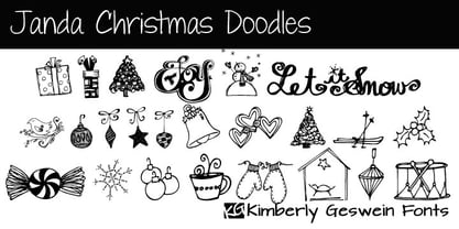 A variety of whimsical, hand-drawn Christmas doodles.
 - Gnarlee by Gerald Gallo,
$20.00 Gnarlee is a casual hand-drawn serif font.
 - Wingbrush by Michael Browers,
$25.00Wingbrush is a whimsical, hand-drawn brush font. - KR Jigsaw Joey - Unknown license

- Zoning Department JNL by Jeff Levine,
$29.00 A 1930s-era sign lettering template set manufactured for the National Carbon Company by Wrico (The Wright-Regan Instrument Company) yielded the familiar lettering that comprises Zoning Department JNL. This rounded-end typestyle was also widely used on architectural drawings, signage, blueprints and the like.
 - Impossible Ornaments by Gerald Gallo,
$20.00 Impossible Ornaments was inspired by the designs of Swedish artist Oscar Reutersvärd and Dutch artist M. C. Escher whose drawings may initially appear feasible yet cannot be physically constructed, therefore impossible. There is an assortment of 47 ornaments all located under the character set keys.
 - Food Doodles by Outside the Line,
$19.00 A playful dingbat/picture font of what else but food. Each tiny illustration is offered as a line drawing and a reverse. Great for menus or to add a little fun to inter office communications. Use the pickle as a header for 911 memos.
 - Rawbeat by Wasabib Type Foundry,
$9.00 RAWBEAT is a Display Font with graffiti style, this font coming with 3 style : Regular, Outline, and Extrude. this font will make your designs or branding stand out and eye catching. 100% hand drawing to get the artistic look and make it more powerfull.
 - Gluten by Andinistas,
$24.67 Gluten is an experimental font family designed by Carlos Fabian Camargo. It includes irregular shadows to communicate craftsmanship. Its multiple upper cases with condensed width and naive lines are notable for their expressive drawing with a high amount of contrast between thick and thin strokes.
 - Alexy by aRc,
$10.00 Alexy is a hand-drawing of a twisted ribbon resembling a limited set of characters. Its unusual design makes it great as a headliner or it can be used for any ribbon awareness projects. Not suitable for signage use -- All lines are very jagged.
 - Driade by IHOF,
$24.95 Driade is a font family based on personal calligraphic expression. It is exotic but still familiar, readable and graced with a human touch. The “Aged” style features irregularities found in Kothay’s original brush drawings. While the “Lined” pares the letterforms down to their basic forms.
 - HU Noodles by Heummdesign,
$15.00 HU Noodles is a latin alphabet font. This is a stencil-type font designed by drawing with one brush and following the stroke order. It is characterized by rounded strokes and a tight square shape. It is recommended to use it for characteristic titles.
 - Sanaa Pro V2 by GHEEN Studio,
$25.00 Font Sanaa is the second version of the Font family. It is an Arabic and Latin font and the splintered languages from them. It contains many characters, signs and languages. It is distinguished by its uniqueness in drawing and shape to meet the needs
 - Just Shoes And Purses by Outside the Line,
$19.00 Just Shoes & Purses… from silly to sophisticated, a collection of 26 line drawings of shoes and purses and those same 26 with areas filled in. Lots of cute girlie stuff… if you need more check out Hat Doodles , Diva Doodles or Diva Doodles Too .
 - Seizieme by URW Type Foundry,
$49.99 In 1905 the Parisian typefounders Peignot & Cie. issued their Série 16. This clear roman with a large x-height and an italics soon enjoyed a great popularity. Coen Hofmann’s drawings made for the Seizième follow the original Peignot Série 16 as close as possible. The regular font has the original small caps, while all members of the family are enhanced, next to the ranging ones, with old style figures. Also superior and inferior figures are available. The original series did not have a bold version. This was, however, carefully drawn for this digital rendition. The Série 16 and its versions for the composing machines were much used for the type setting of scientific publications. That is why a comprehensive set of mathematical and sundry characters are added to the Seizième fonts. Next to the accented characters for the several West and East European languages the Seizième was also enhanced with a Cyrillic, also available in regular, italic and bold versions.
 - P22 Barabajagal by IHOF,
$29.95 P22 Barabajagal is a unique take on the display fat face by way of doodling fun. Somewhat informed by the shapes of an early 1970s film type called Kap Antiqua Bold, this font’s aesthetic is the stuff of boundless energy and light humour, where an uncommon “peak” angle drawing perspective results in sturdy trunks, fat bottom curls, and active ascenders eager for mobility in space. This is the kind of font that makes you wonder whether it was drawn with rulers, protractors and compasses, or just by a mad doodler’s crazy-good free hand. Regardless, Barabajagal easily turns the geometry of modern forms into an exercise in sugar-loaded fun. It’s a very good tool to use in design geared at kids and young adults, such as food and toy packaging, books, animation, cartoons and games. Barabajagal comes with over 550 glyphs, lots of alternates, and a few ligatures and swash caps. It also contains extended support for Latin languages.
 - LTC Garamont by Lanston Type Co.,
$24.95Frederic Goudy joined Lanston as art advisor in 1920. One of his first initiatives was to design a new version of Garamond based on original Garamond designs of 1540. Goudy intended his free-hand drawings to be cut exactly as he had drawn them and fought with the workmen at Lanston to keep them from “correcting” his work. This new type was called Garamont (an acceptable alternate spelling) to distinguish it from other Garamonds on the market. (The other Garamonds on the market at that time were later confirmed to be the work of Jean Jannon.) In 2001, Jim Rimmer digitized Garamont in two weights. The display weight is based on the actual metal outlines to compensate slightly for the ink gain that occurs with letterpress printing. The text weight is a touch heavier and more appropriate for general offset and digital text work. Digital Garamont is available to the public for the first time in 2005. - Afrik by LomoHiber,
$10.00 Afrik is a hand painted font which letterforms were inspired by Proto-Saharan Ancient African writing system and scripts for African languages such as Mande and Vai. Drawing technique I took from Ethiopian Tribe Karo body painting. I drew each letter with my finger using self-made paint from crushed charcoal. Afrik is uppercase font and instead of tall capital letters uses wide. They can be used instead of double letters or just to diversify a typing. Also, I included up to 4 alternate "decorations" for most of the letters which will help you to create unique artwork (use "Contextual Alternates" feature to randomize look automatically). Afrik perfectly fits for posters, clothes design, and any design with a wild ethnic mood. Afrik Features: Handmade pant texture Up to 4 Alternative styles for each letter Carefully tuned kerning If you have some issues or questions, please let me know: lhfonts@gmail.com Hope you'll enjoy using Afrik!
 - CarlMarx by Adobe,
$29.00This typeface is based on lettering by Carl Marx (1911?1991), designed during his first semester at the Bauhaus in Joost Schmidt?s class, in 1932. Although the letter proportions are based on Schmidt?s teachings, the forms are not constructed from compass and ruler, but drawn with brush and marker, lending the words a warm and lively touch. Hidetaka Yamasaki redrew the letters from scratch and added all missing characters for today?s needs. A set of hanging figures, alternates for some critical letterforms (such as f, r, and t) as well as several ligatures make CarlMarx especially suitable for use in body text. As suggested by Marx, Yamasaki captured two weights from the original drawing and perfectly adjusted light and bold to highlight words and create hierarchy in headlines ? without losing or adding space. True to the original, Yamasaki captured the wobbly contour in CarlMarx, preserving warmth in the condensed geometric style of the early 1930s. - Scorpio by Fine Fonts,
$25.00 Scorpio is a font based on lettering Michael Harvey drew for the card “The Sign of The Nudge” which was designed in collaboration with the concrete poet, Ian Hamilton Finlay. The purpose of the card was to prompt those owing monies to IHF, into paying promptly. Michael also used it on some of the many book jackets he designed. As such, it is a condensed design necessary to enable a lot of text to be fitted with a restricted space. Scorpio has both style and verve. It was designed to attract the attention of potential purchasers browsing the shelfs in bookshops. In fulfilling this rôle, it succeeded admirably. In all these respects, it is unquestionably a unique Michael Harvey design. When Michael died in 2013, this font existed as a drawing of the basic upper and lower case letterforms plus numerals. Andy Benedek’s contribution to Scorpio was to digitise the existing letterforms and then create the remaining characters necessary for a modern font.
 - D.I.Y. Time by Latinotype,
$19.00 D.I.Y. Time is a hand drawn type system designed by Luciano and Coto inspired by the DIY philosophy which has been transformed into a whole global counterculture movement, identifying the new generations that reprice the handwork, paying attention to quality, processes and materials used in the manufacture of goods and objects, food, clothing, furniture etc. This beautiful philosophy inspires us every day. Is present in our homes, in our lifestyle and this time we have given him way through a typeface family that mixes different styles but integrates them through language handmade. The result is a typeface based on hand lettering drawing with different brushes and pens on paper. With versions ranging from organic proposals as DIY time hand to other based on the classic proportions of Gill as DIY time sans. To accompany a set of compound words designed on the needs of small farmers and a set of ornaments illustrated, everything you need to begin to make your own.
 - Caridade by insigne,
$29.00 Caridade is a bold and powerful script face. It draws some inspiration from heavy brush drawn vintage hand lettering but its heavy weight is much thicker with plenty of impact and more contemporary letterforms. The face offers a wide array of weights, from the powerful Heavy weight to the graceful Thin. Caridade can get the job done for many unique design tasks. Caridade includes many useful OpenType features, including a set of non-connecting alternates, 40 ligatures, and two types of end letterforms. OpenType features include ornaments, swash endings, ending contextual alternates, discretionary ligatures, ligatures and three different stylistic sets filled with alternates. In total, there are over 60 alternate letterforms. Please see the sample .pdf to see these features in action. OpenType capable applications such as Quark or the Adobe suite can take full advantage of the automatically replacing ligatures and alternates. This family also includes the glyphs to support a wide range of languages.
 - ITC Kendo by ITC,
$29.99 ITC Kendo is the work of British designer Phill Grimshaw, suggesting the dash and verve of quick, sketchy calligraphy, complete with splatters of ink. Grimshaw says he worked deliberately against his own habits to create the forms, drawing the letters with slow deliberation" and a pointed pen. He overloaded the pen with ink and drew on rough paper, "applying a lot of pressure at the beginning of a stroke and easing off towards the terminals. Accidental splashes occurred frequently owing to the nib catching the 'tooth' of the paper." Those splashes were refined into features which enhance but do not overwhelm the characters and carefully worked so as not to leave an obvious white strip of unsplattered space between lines and letters. The initial capitals can be used alone or combined with the lowercase alphabet, and the font includes a full set of f-ligatures and some extra ligatures as well as decorative elements."
 - 1525 Durer Initials by GLC,
$28.00 In 1525, Albrecht Dürer, the well known German great artist, was publishing the so-called “Underweysung der Messung mit dem Zirckel und Richtscheyt”, printed in Nuremberg. This handbook explained with numeral figures how to draw with a compass and ruler. A large part is devoted to the drawing of Roman characters, which can be used as decorative initials. We are offering two complete historical initial sets and also have entirely redrawn the missing letters: J, U and W, Eth, Lslash, Thorn and Oslash in the two forms, using the Dürer style. The font may be used with all our Humane and Garalde fonts, like 1543 Humane Jenson or 1592 GLC Garamond and others from the GLC foundry catalog.
 - Rich Dingbats & Bursts by Enrich Design,
$24.95 Rich Dingbats & Bursts was created with graphic designers in mind. I worked for a weekly newspaper, and finding different bursts was a challenge. You either had to draw your own (and who has time for that under tight deadlines) or use the same dull bursts over and over. I wanted to give the people I worked with at the newspaper choices, and Rich Dingbats & Bursts was born. There are several uses for this font. It's great for adding graphic elements to your Photoshop artwork. In FreeHand, users can convert the burst and paste a photo inside the burst for an interesting effect. QuarkXPress users don't have to import or draw bursts, just type the appropriate character!
 - Istoria by Hooper Type,
$12.00 New foundry on the block, Hooper Type, kicks off it's catalogue with a versatile, story-telling serif font. With a love of the magical and a yearning for adventure, Istoria pushes away from the static, drawing in whisps and whirls that entice and excite, without distracting. Unassuming in it's long form, with delicate strokes that draw the eye, it commands attention when used in short punchy titles, or set in caps. Istoria (meaing both history and story in Greek) delights in having unusual curves, curvy straights and twisty feet which emulate those adventures and myths from days gone by. Type shouldn't interfere with the content, but it absolutely can enhance it. Hope you enjoy it!
 - Sugar Cake by Larin Type Co,
$12.00 Sugar Cake this is a stunning handwritten font duo with hand-drawn illustrations. Script font includes many alternates, ligatures and swash with them you can create a more complete composition and make it more diverse and individual. A hand-drawn sans serif font will perfectly match the script and complement it. Also included in this font are hand drawn fancy illustrations that will be useful for design and decorate your project. Enjoy using!
 - Sixty Niners by Putracetol,
$24.00 Introducing Sixty Niners - a retro display font that draws inspiration from unique typography and lettering found in vintage magazines, combined with modern typography styles. This font features modern ligatures that allow you to create beautiful lettering and artwork. With its open type features, including a variety of alternates and end swashes, Sixty Niners provides ample options for customization and creativity. Sixty Niners is perfect for a wide range of design purposes, including logotypes, headings, covers, posters, logos, quotes, product packaging, headers, merchandise, social media posts, greeting cards, and more. Its distinctive retro style adds a touch of nostalgia and elegance to your designs, making them stand out and capture attention. To access the alternate glyphs in Sixty Niners, you can use design programs that support OpenType features, such as Adobe Illustrator CS, Adobe Photoshop CC, Adobe InDesign, and Corel Draw. This allows you to easily switch between uppercase and lowercase letters, apply alternates and ligatures, and create unique and customized lettering compositions that suit your design needs. In your zip package, you'll find the Sixty Niners font files in otf, ttf, and woff formats, providing versatility for different design projects. The font includes uppercase and lowercase letters, numerals, punctuation, and symbols, ensuring that you have all the elements you need for your designs. Sixty Niners also offers multilingual support, making it accessible for designers around the world to create designs in different languages. Whether you're designing for English, Spanish, French, or any other language, Sixty Niners has got you covered. In summary, Sixty Niners is a retro display font that combines vintage and modern typography styles, providing a unique and elegant look to your designs. With its open type features, multilingual support, and versatile design options, Sixty Niners is perfect for various design purposes. So, elevate your designs with Sixty Niners and create stunning artwork that captures attention and stands out from the crowd! Thank you for choosing Sixty Niners from our collection. Happy designing!
 - Uni Magnetic by Substance,
$10.00 Hand drawn, photocopied, scanned, printed and rescanned x 3.
 - FS Sophie by Fontsmith,
$50.00 Slinky Chic, svelte and slinky, FS Sophie was inspired by and designed in partnership with ATTIK UK. With clean lines, simple, elegant curves and dynamic forms, it brings a feminine sophistication to text and headlines in publishing and advertising. Kinky FS Sophie’s engaging simplicity arises from its construction, using a modular set of core, rounded shapes and straight strokes, drawn and then repeated to create letterforms. An extra technical detail of occasional, short 45-degree diagonals adds a distinctive little kink to Sophie’s cool exterior. Alchemy By some kind of typographic alchemy, the combination of simple curves and lines with unexpected twists to the shapes of characters creates an unusually spirited and lively design in all three weights and their italic sets. Born for the spotlight, FS Sophie is a natural for big headlines, pull quotes and other high-profile text elements.
 - Kaori - Unknown license

- Adigiana 2 - Unknown license

- Sabandija ffp - Personal use only

- CAC Lasko Even Weight - Unknown license

- Spork - 100% free


