326 search results
(0.028 seconds)
- Noir et Blanc by Pelavin Fonts,
$25.00 Noir et Blanc began as a proposed logo for a new Broadway production of Moulin Rouge and ended up as a challenge to find how bold a stroke weight could still be beautifully legible. Now that it is complete, we hope it will have the chance to become noir et blanc et rouge partout.
 - Chapeaux Noirs NF by Nick's Fonts,
$10.00 A simple stylistic device gives this clean, bold sans serif face a slightly spooky feeling. Both versions of this font support the Latin 1252, Central European 1250, Turkish 1254 and Baltic 1257 codepages.
 - Modern MT for Dior CS by Monotype,
$29.99Cut by Monotype between 1900 and 1902, the Monotype Modern font family was based on Miller & Richards News 23 and 28; slightly condensed news text types of the 1890s. Monotype Modern is a lively typeface, with long, fine hairlines and well rounded letterforms, representing the best of nineteenth century modern face design. A classic text face, and typical of the moderns that were produced in the United Kingdom at that time, being less extreme in its rendering than some of the models of purer form being produced elsewhere. Monotype Modern is an excellent text face for magazines, newspapers and books, the heavier and more condensed versions are useful in headlines and display. - Modern MT for Dior JP by Monotype,
$29.99Cut by Monotype between 1900 and 1902, the Monotype Modern font family was based on Miller & Richards News 23 and 28; slightly condensed news text types of the 1890s. Monotype Modern is a lively typeface, with long, fine hairlines and well rounded letterforms, representing the best of nineteenth century modern face design. A classic text face, and typical of the moderns that were produced in the United Kingdom at that time, being less extreme in its rendering than some of the models of purer form being produced elsewhere. Monotype Modern is an excellent text face for magazines, newspapers and books, the heavier and more condensed versions are useful in headlines and display. - Modern MT for Dior KO by Monotype,
$29.99Cut by Monotype between 1900 and 1902, the Monotype Modern font family was based on Miller & Richards News 23 and 28; slightly condensed news text types of the 1890s. Monotype Modern is a lively typeface, with long, fine hairlines and well rounded letterforms, representing the best of nineteenth century modern face design. A classic text face, and typical of the moderns that were produced in the United Kingdom at that time, being less extreme in its rendering than some of the models of purer form being produced elsewhere. Monotype Modern is an excellent text face for magazines, newspapers and books, the heavier and more condensed versions are useful in headlines and display. - Agatho by Andfonts,
$29.00 Agatho is a beatiful modern Serif font.
 - Trash - Unknown license

- Tetanus - Unknown license

- Taxidermist - 100% free

- Quirinus by Monotype,
$29.99Alessandro Butti designed the Quirinus font, released in 1939. Quirinus is a headline font with a strong contrast in strokes. - Rock - Unknown license

- Ettielier by Ettie Kim Studio,
$175.00 We are so pleased to introduce Ettielier, a refined, full-featured calligraphy font by Ettie Kim Studio. This fully unicode-mapped, high-powered font comes with multilingual support and 500+ characters, including stylistic alternates, double-letter ligatures, and swashes to achieve an authentic handwritten look that mimics Ettie Kim’s signature calligraphy style.
 - Serpents - Unknown license

- Janis - Unknown license

- Microgramma by URW Type Foundry,
$35.00 Designed to Swiss principles by Alessandro Butti and Aldo Novarese for Nebiolo in 1952 as an improvement on the squared-off Bank Gothic capitals. The design was revisited by the same designers ten years later; Eurostile was the result.
 - Torino by URW Type Foundry,
$35.99 The Torino font family was designed by Alessandro Butti in 1908 for the Nebiolo foundry in Turin. Torino is a narrow face in the Bold weight; the condensed weight is so narrow that it should be used in over 14pt.
 - Torino by ITC,
$39.00The Torino font family was designed by Alessandro Butti in 1908 for the Nebiolo foundry in Turin. Torino is a narrow face in the Bold weight; the condensed weight is so narrow that it should be used in over 14pt. - Pottery by Nurf Designs,
$16.00 Pottery is a beatiful script font. This font is great for your next creative project such as logos, printed quotes, invitations, cards, product packaging, headers, Logotype, Letterhead, Poster, Apparel Design, Label, and etc. Pottery comes with uppercase, lowercase, numerals, punctuations, multilingual support .
 - Funny Papers JNL by Jeff Levine,
$29.00 Sheet music for the 1910 composition "Good-By Betty Brown" has its title hand lettered in a thick and thin, condensed sans serif design reminiscent of lettering found in later comic strips and books of the 1930s and 1940s. Transcending both the Art Nouveau and Art Deco styles, Funny Papers JNL gets its name from the slang reference Americans of the early 20th Century gave the Sunday comics pages in their local newspapers, and is available in both regular and oblique versions.
 - Garden - Unknown license

- Athenaeum by Monotype,
$29.99Athenaeum was released in 1945 by Alessandro Butti and Aldo Novarese, probably for the Niebolo foundry in Turin, for whom this duo designed many successful types. Athenaeum is an Old Style face with strong calligraphic influence. The Athenaeum font family includes a set of decorative initials illustrated with a symbol beginning, resembling early paper watermarks. - Simply Marvelous by Comicraft,
$19.00 Darling, you don’t just look GOOD, you look FANTASTIC! IRRESISTIBLE! IMMACULATE! Those soft curves, those sharp lines, those INLINES... that MAGNIFICENT symmetry. This is a face that could launch a thousand spaceships, a face that doesn’t care if you feel good, because Heavens to Betsy, you LOOK good. Just utter those magic words: Simply Marvelous.
 - Hiroshige by Monotype,
$29.00 Hiroshige was designed in 1986 by Cynthia Hollandsworth (now Batty) of AlphaOmega Typography, Inc. The typeface was originally commissioned for a book of woodblock prints by the great nineteenth-century Japanese artist Ando Hiroshige, whose work influenced many Impressionist artists. The typeface has a gentle calligraphic flair that creates an interesting page of text as well as elegant headlines.
 - Hiroshige Sans by Linotype,
$29.99Hiroshige was designed in 1986 by Cynthia Hollandsworth (now Batty) of AlphaOmega Typography, Inc. The typeface was originally commissioned for a book of woodblock prints by the great nineteenth-century Japanese artist Ando Hiroshige, whose work influenced many Impressionist artists. The typeface has a gentle calligraphic flair that creates an interesting page of text as well as elegant headlines. - Hiroshige by URW Type Foundry,
$35.99 Hiroshige was designed in 1986 by Cynthia Hollandsworth (now Batty) of AlphaOmega Typography, Inc. The typeface was originally commissioned for a book of woodblock prints by the great nineteenth-century Japanese artist Ando Hiroshige, whose work influenced many Impressionist artists. The typeface has a gentle calligraphic flair that creates an interesting page of text as well as elegant headlines.
 - Deco Nights JNL by Jeff Levine,
$29.00 Sheet music for the tune "Put Your Arms Around Me Honey" (from the 1937 film "Coney Island" starring Betty Grable, George Montgomery and Cesar Romero) has the song title hand lettered in a condensed Art Deco sans serif design. This became the basis for Deco Nights JNL, which is available in both regular and oblique versions. For trivia buffs, the song was written by Junie McCree and Albert Von Tilzer and was first featured in the Broadway show "Madame Sherry" in 1910 and was revived for a second time in the 1949 Judy Garland -Van Johnson film "In the Good Old Summertime".
 - Boycott by Dharma Type,
$14.99 We are calling for a boycott against petty power struggles. Uppercase and Lowercase are slightly different from each other. This grungy font won prize at the best font 2006 and new Rising Star at MyFonts. “Boycott’s a noisy design -a little rough around the edges, but just the way we like our big grunge fonts. boycott is a perfect design for posters and large headlines.”
 - Microgramma by Linotype,
$40.99Following to Swiss design principles, Alessandro Butti and Aldo Novarese designed the Microgramma font for the Nebiolo typefoundry in 1952. Microgramma is wide, almost like an extended" font, and it has the typical look of 1950s industrial design. The font has been immensely popular as a display face ever since its original release. Use it in large sizes to help get your message across to readers." - Eurostile by URW Type Foundry,
$89.99 Eurostile Display Caps The Eurostile font family was designed (by Novarese and Butti in 1952) to complement the titling font, Microgramma, by offering a lowercase alphabet. Issued by the Nebiolo foundry, the rather square sans serif Eurostile became popular for display and advertising use. The linear nature of Eurostile suggests modern architecture, and its attraction is technical and functional. Eurostile is commonly misspelled Eurostyle.
 - Augustea Open by ITC,
$29.00Augustea was designed by Alessandro Butti and Aldo Novarese and is one of the most popular classical, monumental letterforms featureing a stone cut effect. This font is based on the classic proportions of Capitalis, which dates back to the first century AD during the reign of Augustus. It should be set with a widely spaced bias. Augustea is distinguished by its balanced, classic and majestic image. - Nouveau Days JNL by Jeff Levine,
$29.00 The basic design style for Nouveau Days JNL was inspired by the hand lettering on the sheet music cover for "Linger Longer Letty". This tongue-twisting song title comes from the 1919 musical comedy of the same name. Some of the characters originally had tiny spur serifs, but they were omitted in the digital version to keep the overall design consistent. The font is available in both regular and oblique versions.
 - Malibu Punch by Rachel White Art,
$12.00 Malibu Punch. I am loving this sassy script font! There are two versions: rough, with tons of texture, and smooth! I made it with an itty bitty brush and pretty watercolors. It's got loads of texture - check out those edges! Wobbly, rough watercolor edges! The capital letters work together, so it's like two fonts in one! The lowercase script is so sassy and full of attitude. Great for branding, logos, and quote art.
 - Kalidony by Arterfak Project,
$26.00 Kalidony is a wonderful wedding typeface. Inspired by the upscale wedding design and the luxury woman stuffs. Kalidony represents a classy impression with beautiful thick & thin strokes. Kalidony is perfect for elegant design which requires natural handwriting or signature style. Equipped with many alternate characters that give your design a floral touch and look calmer. You can use this typeface for wedding purposes, greeting cards, invitations, logotype, books, packaging, and more! Kalidony features: Complete standard character set, symbols & punctuations Stylistic alternates set: ss01 - ss09 PUA Encoded Multilingual support: ÀÁÂÃÄÅÆÇÈÉÊËÌÍÎÏÐÑÒÓÔÕÖ×ØÙÚÛÜÝÞßàáâãäåæçèéêëìíîïñòóôõöøùúûüýþÿĀāĂ㥹ĆćĈĉĊċČčĎ ďĐđĒēĔĕĖėĘęĚěĜĝĞğĠġĢģĤĥĦħĨĩĪīĮįİıIJijĴĵĶķĹĺĻļĽľĿŀŁłŃńŅņŇňʼnŌōŎŏŐőŒœŔŕŖŗŘřŚśŜŝŞşŠšŢţŤťŦŧŨ ũŪūŬŭŮůŰűŲųŴŵŶŷŸŹźŻżŽžȘșȚțẀẁẂẃẄẅ Thank you, bestie!
 - Edellyn Script by Letterhend,
$19.00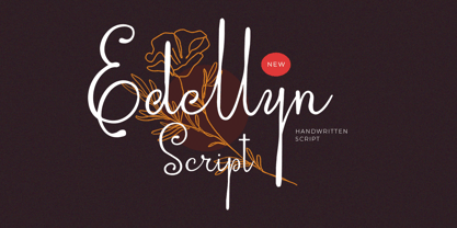 Introducing, Edellyn Script, a modern script typeface. This collection of scripts is perfect for personal branding. As you can see, this typeface has beutiful and modern look which is perfectly made to be applied especially in headline, logotype, apparel, invitation, branding, packaging, wedding card, advertising etc. Features : uppercase & lowercase numbers and punctuation multilingual alternates PUA encoded We highly recommend using a program that supports OpenType features and Glyphs panels like many of Adobe apps and Corel Draw, so you can see and access all Glyph variations. Thank you for purchase this font and Happy Creating !!!
 - Horse Drawn Carriage JNL by Jeff Levine,
$29.00 Picture if you will, a balmy autumn evening in Manhattan during the 1930s and a well-dressed couple out on the town. They hail one of the hansom cabs located near Central Park and climb in for an old-fashioned romantic ride around the green. Such are the type of images the stylized Art Deco hand-lettering comprising Horse Drawn Carriage JNL evokes. The inspiration for this font was the title card for a 1935 Bette Davis feature entitled "The Girl from 10th Avenue".
 - Poesie_Noire_DEMO - Unknown license

- Havel by T4 Foundry,
$39.00Havel is an updated interpretation of a Czech type design from the 1930s. It is powerful and very condensed. At a quick glance you might find kinship with other condensed typefaces of the same period, like Spire (Sol Hess, 1937), Onyx (Gerry Powell for ATF, 1937) or Quirinus Bold (Alessandro Butti, 1939). But Havel has its very own look, rooted in the rapidly disappearing "Eastern European Type", a typographical tradition where poster and packaging design were the highlights. Torbjörn Olsson has revived this classical Czech beauty, and the Open Type version, Havel Pro, can also be used for Czech, Hungarian, Polish, Estonian, Latvian and Lithuanian. - Crimestopper JNL by Jeff Levine,
$29.00Crimestopper JNL is the aptly-named font fresh out the era of film noir and clever private detectives who always seemed to have the right answer to the question "Whodunit?" - Ulissia by Autographis,
$39.50 Ulissia is a hand-drawn slab serif typeface with a strong character. It reminds me of the 50s, 60s and the film noir period or of old Wild West movies.
 - Mister Earl by Bitstream,
$29.99Mister Earl, released by Bitstream in 1991, was designed by Jennifer Maestre. Inspiration came from a page in a ‘how-to’ book published in the 1930s. Later versions of Extra Light, Light and Bold were added by Jim Lyles, with the help of Wally Petty. Mister Earl is named in honor of Earl Biscoe, a Bitstream designer who retired in the mid-1980s because of illness. In the winter of 1994–1995, Richard Stetler accidentally left a copy of Mister Earl outside his Alaska home... In the spring, amazed to discover the unfortunate font was still just about alive, he decided to release the result to a wider public as Snow Cap.


