3,957 search results
(0.012 seconds)
- MIR Next by Juliasys,
$22.00 MIR Next is a growing multi-script type family best described by the terms “humanist–semi–slab-serif”. Its character set contains Latin and Cyrillic, both extended, as well as Greek, covering more than 100 languages. Strong personality along with consistency between language systems were a basic aim when designing the family. As a result MIR has become a great tool for branding and international identities. A wide choice of symbols and numbers makes it also very useful for statistics, texts about mathematics and the sciences. Serious things are best be said in an unpretentious, relaxed way. MIR gives typography exactly that kind of appearance. Its texts emit a sense of authority but stay easily accessible at the same time. MIR’s name comes from the old Russian word Мир meaning both “world” and “peace” – a unity we will hopefully take for granted sometime in the future.
 - Thought by Scholtz Fonts,
$15.00 Thought, with its versatile five styles, is ideal for contemporary display work. It has style, flair, legibility, and interesting, flowing letter shapes. The Family: -- REGULAR - of medium weight - clear and legible; -- BLACK - for bolder statements and best readabilty; -- LINEAR 25 - light weight, mono width line -- LINEAR 45 - medium weight, mono width line -- ZEST - variable line, casual, exaggerated appearance Use a combination of styles for product branding, book covers, invitations, greeting cards. Thought has not been designed to be used in "ALL CAPS". The best effects for headings and subheads are obtained with an initial upper case letter followed by lower case characters. If you are using upper and lower case then it is not necessary to use kerning. Thought contains over 250 characters - (upper and lower case characters, punctuation, numerals, symbols and accented characters are present). It has all the accented characters used in most European languages.
 - Structorator by Furiosum,
$15.00 Structorator is a grid-based, experimental display font. This typeface emerged from experiments with generative type design. It evolved from a piece of code into a fully usable opentype font. The two main features are its rigid but playful design and a multitude of alternate glyphs. These features make it possible to create interesting lettering when using the default spacing. The glyphs are constructed from a limited set of patterns which are arranged within a predefined grid. The line thickness corresponds to the different cuts. Due to the rather complex shape this font will look best in larger sizes and resolutions. Its best suited for headline, display or illustrative work. - 3 weights: light, medium and heavy - 5 character sets - 3 number sets - Basic punctuation - Seperate diacrits - Ornamental glyphs - Access via stylistic sets *OT feature - Random access from the whole range of chars *OT feature - Total of 1062 Glyps
 - ITC Johnston by ITC,
$29.00ITC Johnston is the result of the combined talents of Dave Farey and Richard Dawson, based on the work of Edward Johnston. In developing ITC Johnston, says London type designer Dave Farey, he did “lots of research on not only the face but the man.” Edward Johnston was something of an eccentric, “famous for sitting in a deck chair and carrying toast in his pockets.” (The deck chair was his preferred furniture in his own living room; the toast was so that he’d always have sustenance near at hand.) Johnston was also almost single-handedly responsible, early in this century, for the revival in Britain of the Renaissance calligraphic tradition of the chancery italic. His book Writing & Illuminating, & Lettering (with its peculiar extraneous comma in the title) is a classic on its subject, and his influence on his contemporaries was tremendous. He is perhaps best remembered, however, for the alphabet that he designed in 1916 for the London Underground Railway (now London Transport), which was based on his original “block letter” model. Johnston’s letters were constructed very carefully, based on his study of historical writing techniques at the British Museum. His capital letters took their form from the best classical Roman inscriptions. “He had serious rules for his sans serif style,” says Farey, “particularly the height-to-weight ratio of 1:7 for the construction of line weight, and therefore horizontals and verticals were to be the same thickness. Johnston’s O’s and C’s and G’s and even his S’s were constructions of perfect circles. This was a bit of a problem as far as text sizes were concerned, or in reality sizes smaller than half an inch. It also precluded any other weight but medium ‘ any weight lighter or heavier than his 1:7 relationship.” Johnston was famously slow at any project he undertook, says Farey. “He did eventually, under protest, create a bolder weight, in capitals only ‘ which took twenty years to complete.” Farey and his colleague Richard Dawson have based ITC Johnston on Edward Johnston’s original block letters, expanding them into a three-weight type family. Johnston himself never called his Underground lettering a typeface, according to Farey. It was an alphabet meant for signage and other display purposes, designed to be legible at a glance rather than readable in passages of text. Farey and Dawson’s adaptation retains the sparkling starkness of Johnston’s letters while combining comfortably into text. Johnston’s block letter bears an obvious resemblance to Gill Sans, the highly successful type family developed by Monotype in the 1920s. The young Eric Gill had studied under Johnston at the London College of Printing, worked on the Underground project with him, and followed many of the same principles in developing his own sans serif typeface. The Johnston letters gave a characteristic look to London’s transport system after the First World War, but it was Gill Sans that became the emblematic letter form of British graphic design for decades. (Johnston’s sans serif continued in use in the Underground until the early ‘80s, when a revised and modernized version, with a tighter fit and a larger x-height, was designed by the London design firm Banks and Miles.) Farey and Dawson, working from their studio in London’s Clerkenwell, wanted to create a type family that was neither a museum piece nor a bastardization, and that would “provide an alternative of the same school” to the omnipresent Gill Sans. “These alphabets,” says Farey, referring to the Johnston letters, “have never been developed as contemporary styles.” He and Dawson not only devised three weights of ITC Johnston but gave it a full set of small capitals in each weight ‘ something that neither the original Johnston face nor the Gill faces have ‘ as well as old-style figures and several alternate characters. - Cosan by Adtypo,
$45.00 The idea was to find common intersections between the humanistic and the neo-grotesque model of sans. This variable font offers everything from the world of sans serif in one place – a broad range of weights, adjustable contrast, and a lot of alternative glyphs. As a bonus, you can choose the “cold” or “warm” impact of the text. The Cosan Cold variant has closed apertures and minimal tension in the manner of Helvetica, and the Cosan Warm is open, more dynamic, and airy. Cosan is very suitable for a parallel bilingual setting, as both types are equivalent in their proportions and text color. Like Yin and Yang, each has a piece of the other in him. The Warm version is not totally dynamic, nor is the Cold version totally rigid.
 - Skeletal Wish by Hanoded,
$15.00 Skeletal Wish is a line from one of my favourite Opeth songs: Heir Apparent. The lyrics are pretty veiled and bleak, describing the destruction and downfall of something that once was beautiful. I am worried about what is happening with our planet: the Amazon forest is burning down, our oceans are full of plastic and the earth is warming up. I had to think of this when I created Skeletal Wish and I thought the title was perfect. Skeletal Wish is a heavy and scary halloween font. It comes with blobs, splatter, gore and whatever else you may need for your designs. It won’t help save the Amazon rainforest, nor will it stop the flow of marine plastic, but you could use it to create a protest sign. After all, the change begins with you.
 - 1689 GLC Garamond Pro by GLC,
$42.00 This typeface family was inspired by a set of fonts, designed in the Garamond style, used for an edition of Remarques critiques sur les œuvres d’Horace by “D.A.E.P.”, published in Paris in 1689 by two different booksellers: Deny Thierry and Claude Barbin. We can see some differences in comparison with our “pure” Garamond (see our 1592 GLC Garamond), particularly in the lowercase of the Normal style and the uppercase of the Italic. Unfortunately, we know neither the name of the punchcutter, nor that of the printer. This complete font set contains small caps, fractions all the way up to 1999/1999, historical and standard ligatures, and all of the fleurons contained in the edition (Normal style only). The alphabet covers all Western, Eastern and Central European languages (including Celtic diacritics) and Turkish.
 - Mon Petit Cahier by Hanoded,
$15.00 My family and I are stuck in quarantine for a week; my eldest son tested positive for Covid19 (but everyone else tested negative), so we can’t go out. That means that the kids follow classes online. I noticed their notebooks and suddenly realised that a notebook used to be called a ‘cahier’, which is a French word meaning the exact same thing. I guess it sounded sophisticated at the time. Mon Petit Cahier (meaning: My Little Notebook) is a handmade script font. It is not meant to be awe-inspiring, nor do you want to use it for headlines or posters. It is a nice little font that feels at home wherever an unobtrusive script is needed. Comes with all the diacritics you want and a set of cool double letter ligatures.
 - Bambola by EdyType,
$60.00 BAMBOLA, Script put out by EdyType. Almost formal script, that gained a little weight. but she is taking care of that. BAMBOLA, a real doll, wants to be loved, she is trying hard to be popular. Is very conscious of her beauty, but trying not to be a show off. She'll be at ease in any place where normal faces gather, unpretentious, yet with a touch of class. Born to be readable, it’s ideal for packaging headlines and editorial work. Not thick, nor thin, just the exact weight, makes a good pattern at large texts, and reduces with no problems, her voluptuous initials makes it stand out always. A real romantic face, it belongs to the fashion world, where she’s come from. A real hip chick, she’s got what it takes!
 - Meta Language - Unknown license

- Robot Teacher - Unknown license

- Guild of Professional Actors - Unknown license

- Anamorphosée sample - Unknown license

- Just Square by Linotype,
$29.99Zoran Kostik began designing the Just Square font family in 1999, based on a logo that his son, an art student, had designed. The design project grew until Kostic had designed eight weights, for both the Latin and the Cyrillic writing systems. Just Square is a very geometric and constricted face best used in experimental designs (i.e., logos, web sites, flyers, and expressive headlines). - M Young HK by Monotype HK,
$523.99 M Young is a humanistic script design characterised by its modern, lively and youngster-like style. M Young incorporates features of the writings of felt-tip writing pen, its entry and finial points of strokes are rounded, parallel without flare. Contrast is low and the text is visible and eye-catching. It is best suited for casual and lively text, illustrations, set upright (non-slanted), non-condensed.
 - Cubevano by Lafontiva,
$19.00 Cubevano is a geometric, modular display typeface. It is the result of fascination with geometry, impossible objects and work of artists such as Oscar Reutersvärd. Family was created in 6 styles for any type of graphic design, such as logos, covers, posters, signs, shirts, etc. It looks best in large sizes. Cubevano typeface comes with uppercase and lowercase letters, numbers, currencies, punctations and multilingual support.
 - Kathleen Serif by ActiveSphere,
$30.00 Kathleen Serif is a geometric serif display font and works best in text and display applications, such as posters, headline, magazine, logos, titles, product branding, corporate branding and publishing. Kathleen Serif font has three weights: Light, Regular, and Bold, each available in italic, making a total of six styles. Each style has a full upper and lower-case, accents, punctuation and a selection of monetary symbols.
 - Redzein by Almarkha Type,
$15.00 Introducing our latest Vintage Slab called Redzein Retro Display Slab with vintage taste can make your logotype become more interesting. inspired by the decorative arts and architecture movement. Redzein fonts is perfect for your project and allows you to create designs, headlines, posters, logos, badges, t-shirts and many more that are beautiful. It is also best used for posts, logos, posters, certificates, labels and more.
 - Maraschino by Device,
$29.00 DF Maraschino Black - A sleek, sophisticated swash capital font with elegant thick and thin weight distribution. Bold yet poised, direct yet refined. The swash capitals are intended for use at the beginnings of words only - best not to set this in ALL CAPS. Use at larger sizes. Also includes stylistic decorative alternates for certain characters that can be toggled on and off in the Opentype panel.
 - Airo by LetterMaker,
$28.90 Airo is a monospace type family with inverted contrast. The distinct shapes and detailing give Airo a strong typographic voice. The family comes in six carefully selected weights, from Light to Extra Bold, making it a versatile typographic tool. The family works best as a display typeface for creating a strong visual impact, but you can use the lighter weights for medium length text as well.
 - Boycott by Dharma Type,
$14.99 We are calling for a boycott against petty power struggles. Uppercase and Lowercase are slightly different from each other. This grungy font won prize at the best font 2006 and new Rising Star at MyFonts. “Boycott’s a noisy design -a little rough around the edges, but just the way we like our big grunge fonts. boycott is a perfect design for posters and large headlines.”
 - Stenblak by Ascender,
$29.99Stenblak is a rough, stencil blackletter design created by Terrance Weinzierl. There is just the right amount of grunge and texture to make Stenblak stand out from other formal blackletter designs. Stenblak would be great for any printed Halloween materials as well as posters, flyers and greeting cards. Stenblak is available in OpenType and TrueType font formats and is best used in medium to large headline sizes. - Sketchup by Almarkha Type,
$25.00 Introducing our latest Sketch Display Slab called Sketchup Display Slab with Sketch taste can make your logotype become more interesting. inspired by the decorative arts and architecture movement Sketchup fonts is perfect for your project and allows you to create designs, headlines, posters, logos, badges, t-shirts and many more that are beautiful. It is also best used for posts, logos, posters, certificates, labels and more.
 - Amadeus by Classic Font Company,
$14.95Amadeus was inspired by an alphabet reputed to be used in the Papal Chancery in the 16th century. It has highly decorated capitals and to be used at its best requires a large point size. The lower-case characters have been deliberately made simple to contrast with the ornate capitals. Included within the font are many extra characters plus a complete set of framed numerals. - M Young PRC by Monotype HK,
$523.99 M Young is a humanistic script design characterised by its modern, lively and youngster-like style. M Young incorporates features of the writings of felt-tip writing pen, its entry and finial points of strokes are rounded, parallel without flare. Contrast is low and the text is visible and eye-catching. It is best suited for casual and lively text, illustrations, set upright (non-slanted), non-condensed.
 - Cookie Supply by Hanoded,
$17.00This month I seem to be stuck in the ‘Baked Goods’ section. I released Bloomer earlier and now I present Cookie Supply! Cookie Supply is a handmade display font. It is a bit uneven, a bit rough, yet very friendly, cute and useful. I guess it works best with products or books for children. Or oatmeal cookies by the dozen. Or organic apple juice. Or… - Gogles by Aqeela Studio,
$18.00 Inspired by strange classic typography, Gogles has its own unique style. This font is best suited for headlines of all sizes, as well as for blocks of text that have maximum and minimum variations. The Gogles style applies to all types of graphic designs on the web, print, moving images and more, and is perfect for t-shirts and other items such as posters and logos.
 - LineDrive by Ingrimayne Type,
$12.95 LineDrive was inspired by an obscure 19th century type design. It has no curved lines and what are normally circular elements in the lower-case letters are diamond-shaped. It might work best with only upper-case letters, which have a Victorian feel to them. In addition to the two weights of plain and bold, the family includes a shadowed version and an inline (or outlined) version.
 - Radonezh by Simeon out West,
$22.00 The Radonezh font is a Latin alphabet layout based on Russian Lettering I have seen. The font is designed to give a classic Medieval Eastern European feel with a hand-lettered style. Radonezh comes with full punctuation, a complete character set for most Western European Latin alphabet languages, Cyrillic languages, and polytonic orthography for Greek. Being a decorative font, it works best at larger point sizes.
 - My Love Letter by Putracetol,
$24.00 Introducing a quirky monoline love font called "My Love Letter", a quirky playful font with 3 different versions of the font, the difference between each version is in the shape of the heart. This font best uses for valentine, wedding, invitation, heading, cover, poster, logos, quotes, product packaging, header, merchandise, social media & greeting cards and many more. This font is also support multi language.
 - Baby Stingrays by Gassstype,
$27.00 Introducing our latest display typeface called Baby Stingrays - Strong Bold All Caps Font Display Vintage Serif with can make your logotype become more interesting. Font is 2 Style Best Vintage font and multilingual support. inspired by the decorative arts and architecture movement Baby Stingrays fonts is perfect for your project and allows you to create designs, headlines, posters, logos, badges and many more that are beautiful.
 - Joomplank by ZetDesign,
$15.00 Joomplank is a decorative font with a pointed shape at the end of each letter. The pointed tip gives a firm impression on the appearance of your design. This font has four families that allow designs to choose according to their needs, plus an opentype feature that helps designers produce the best work. This font is very suitable for use in posters, screen printing, logos, and more.
 - Caslon Antique by Linotype,
$40.99 Caslon Antique was designed by Berne Nadall and brought out by the American type foundry Barnhart Bros & Spindler in 1896 to 1898. It doesn’t bear any resemblance to Caslon, but has the quaint crudeness of what people imagine type looked like in the eighteenth century. Use Caslon Antique for that “old-timey” effect in graphic designs. It looks best in large sizes for titles or initials.
 - Simeon's Handwritten Blackletter by Simeon out West,
$20.00 Simeon's Handwritten Blackletter is the result of my desire to have my handwritten old English style writing available for my computer. It is a basic Gothic style font with my own touch to the lettering. Simeon's Handwritten Blackletter comes with full punctuation, a character set for most Western European based Latin alphabet languages. Being a decorative font, it works best at larger point sizes.
 - Sprouts by Wundes,
$18.00Sprouts is probably best described as "Bonsai-Nouveau". It's designed to look 100% organic up close, while maintaining good readability even at a distance. The looped letters terminate in playful swirls perfect for use on the cover of a menu or cookbook, yet would be equally at home in corporate logo art or as initials. Play with it, because creativity is an organic process. - Kuzimy by Twinletter,
$15.00 Introducing kuzimy Arabic style font. With this, Font lets you create designer-quality designs with ease. You will get a variety of styles for your project. They come in upper and lower case and alternate with different shapes. You will be able to easily create professional designs with an Arabic Style theme. This font gives you the best results when used in your projects.
 - The Bronkids by Bluestudio,
$15.00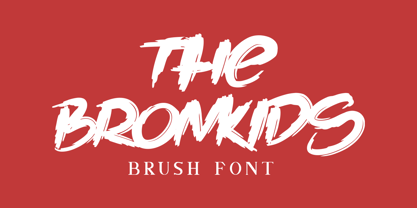 Introducing our newest product: The Bronkids. The Bronkids is a strong brush font, making it suitable for your design projects such as: logo design, clothing design, posters, magazines, quotes and more. Made with a natural touch, this font is the best choice for all your design projects. Includes: - The Bronkids TTF - Multilingual support: AÀÁÂÃÄÅCÇDÐEÈÉÊËIÌÍÎÏNÑOØÒÓÔÕÖUÙÜÚÛWYÝŸÆßÞþ - PUA Encoded Characters: Fully accessible fonts without additional design software.
 - Hedgehog Lake by Tom Simons,
$10.00 “Can you write this card? You have the best handwriting.” Was commonly heard question by Karin that inspired the creation of this font. Now anyone is able to write in her unique style. Hedgehog Lake includes over 400 glyphs for languages based on the latin alphabet and comes in two weights. Perfect for designs that need a human touch like invitations, titles, and more.
 - Mightam by Khaiuns,
$10.00 Say hello for Migtham Handstylish Font! Best match for logo, badge, packaging, headline, poster, t-shirt/apparel, greeting card, and wedding invitation. The flowing characters are ideal to make attractive messages. Migtham Font is the embodiment of modern design and calligraphy! Mightam Font has 82 ligatures that flow beautifully, I hope you have a blast using Migtham script Font! Thanks for use this font ~ Khaiuns
 - Tullamore by Fontdation,
$15.00 Introducing Tullamore, a display/serif font that inspired by the letterforms that used in vintage/classic signpainting scene. Mouse-crafted with high attention to details; clean lines, sharp edges and tempting curves. Available in slanted version too, gives you more options too play with. Suits best for title/headline, logo/logotype, packaging/label designs, etc.This font is a must have item for your designing arsenal.


