10,000 search results
(0.055 seconds)
- Outdoors by Vozzy,
$10.00 Introducing a vintage label layered font named Outdoors. A lot of punctuation and multilingual symbols. Also alternates for all lowercase. All set you can see at the preview. This strong typeface is perfect for lettering on vintage style labels, posters, t-shirts, logo etc.
 - Aphrodite Pro by Typesenses,
$37.00 Aphrodite Pro is an amazing handmade font full of alternate and ligature forms designed by Sabrina Lopez and Maximiliano Sproviero. Check out the brochure in the Gallery section to see some examples of this OpenType font in use and the wide range of combinations possible.
 - Amber by MADType,
$21.00 Amber is a minimal font which is built on a grid of 3x3 squares. It was an experiment to see if I could build legible glyphs out of such a small grid. The 3 weights can be layered over each other to create interesting designs.
 - Caligendings by Prioritype,
$15.00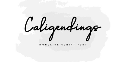 An elegant looking font that's perfect for your project and supports multilingualism. Can be applied to brochures, creative posts, boutiques and salons, women's jewelry, wedding invitations, business cards, photographer watermarks, clothing, and more. For reference, see preview. Features: -Uppercase -Lowercase -Numeral -Punctuation -Ligature -Multilingual
 - Austhind by Stringlabs Creative Studio,
$25.00 Austhind is a script font with stylish hand brush style. The Austhind font made with digital brush pen strokes that making this font look authentic and unique concept. This font is perfect for fashion brand, wedding invitation, business card, logo brand, signature, and then calligraphy.
 - Neeskens by Type-Ø-Tones,
$40.00 Neeskens, by Enric Jardí. A few years ago we used to talk about Neeskens as the font preferred by the crew of Ganimedes' commercial vessels. Now we see it as one of most solid geometrics of our typefaces. Neeskens has two versions: solid and inline.
 - Lawson Vintage by Okaycat,
$29.00 Okaycat Font Foundry proudly presents “Lawson Vintage”! A retro classic style font, perhaps futuristic, with vintage textured edges. containing European accents. Beautifully connected cursive with high legibility and style for your design, great for web, print and publication. See original Lawson without texture. Salon
 - Goldie Rainbow by Balpirick,
$15.00 Goldie Rainbow is a flowing and lovely handwritten font, created with the help of a beautiful brush pen. Fall in love with its incredibly versatile style and use it to create gorgeous wedding invitations, beautiful stationary art, eye-catching social media posts, and much more!
 - Roger by Tail Spin Studio,
$20.00The Roger family was designed in memory of a friend of ours who passed away recently. We created a humorous design for him because he was always laughing and never failed to see the funny side of things. We miss his great outlook on life. - MonsterHand by Resistenza,
$39.00 MonsterHand is our first Ruling Pen made face. This tool is usually used in calligraphy for expressive lettering. Giuseppe Salerno’s hand has been converted into this crazy typeface. This font includes also a set of icons. Check out also Modern Love Slanted Turquoise Nautica
 - Matt Antique by Bitstream,
$29.99A solid calligraphic letter designed by John Matt in the middle 1960s. The typeface did not see use until Compugraphic copied a set of the sketches in the late 1970s, naming the result Garth Graphic in honor of Bill Garth, late president and founder. - Designors by Sarid Ezra,
$15.00 Designors is a freestyle font that will make your project more stylish and free! You can use this font for any project. Suitable for quotes and your tees design. This font also support multilingual. With different lowercase and uppercase will make your design more natural!
 - Contigo by Resistenza,
$39.00 Contigo Is our new brushy script for your summer cards and gifts. This script has a lot of contrast created with a lot of pressure and release of the brush pen. The icon set contains tropical elements like leaves, pink flamingos, pineapple and more.
 - Outer Space by Vozzy,
$10.00 Introducing a vintage look label font named "Outer Space". You can see all available characters on the posters. This font have 4 styles (including layered shadow effect style). Outer Space will do well on any retro design like poster, t-shirt, label, logo etc.
 - Excelsis by Solotype,
$19.95This font began life as a metal type called Duerer, from the Boston Type Foundry about 1890. A wood type maker copied it, and that's where we got it (in Guadalajara, Mexico, already! Some people travel to see the sights; we travel to collect type.) - XKnightMares by Ingrimayne Type,
$6.00 There are three XKnightMares fonts. Each has rather formal chess fonts. The key layout is a bit complicated; see the key guide for detailed information on how to position pieces correctly. In addition to making chess boards, some of the pieces make interesting decorations.
 - Twinkletoes NF by Nick's Fonts,
$10.00 The Speedball Handbook strikes again, with this charming and playful offering from the pen of Ross George. Use it whenever you're tempted to use Comic Sans. Both versions of this font support the Latin 1262, Central European 1250, Turkish 1254 and Baltic 1257 codepages.
 - Dramatisk by Bogstav,
$17.00 Dramatisk is my attempt on making a square-is sans font, suitable for headlines, shoutouts and even massive amounts of text! Choose between the 5 different versions of each letter, or use the contextual alternates and see how the magic magically and automatically just happens!
 - Search Party by Hanoded,
$16.00 Search Party is a handwritten font, made with a Sharpie pen. It is a little wild, a little uneven, but legible and perfectly suited to be used in your designs. Comes with extensive language support and a set of alternates for the lower case letters.
 - Aviation Cocktail by Vozzy,
$5.00 Introducing a vintage look label font named "Aviation Cocktail". All available characters you can see at the screenshot. This font have 6 styles (including layered shadow effect style). This font will good viewed on any retro design like poster, t-shirt, label, logo etc.
 - Sophi Sophi by Daylight Fonts,
$50.00 This is a modern-day interpretation of the 1930s font. With a wide range of alternates, you can create Art Deco and Bauhaus style typography in one piece. People who see it will be fascinated by the stylish and feminine look of the font.
 - Donaldina by Solotype,
$19.95This came from an early-1900s lettering book. Never was an actual font, but it has a quaint look that should be useful. We hate to see alphabets just fade away, which is why we make fonts like this. We added a few touches. - Plumage by Wilton Foundry,
$29.00Plumage is somewhat unusual in that it has elements of calligraphy as well as script in a semi-loose form that gives it a pleasing appearance for both large and small sizes, and interesting flare finish strokes add to its unique character. As I read a dictionary description of "plumage", I realized that in many ways there is a parallel between a bird's plumage and how it is utilized in the context of writing: Plumage varies in pattern and arrangement for different purposes; what it expresses can of course be even more interesting. Plumage is disposable after a season, as new ones become available... imagine, a self-sustaining quill! - I guess that's equivalent to a refill or disposable pen. Historically, quill pens were made from feathers of a variety of birds, each chosen for its special characteristics. The sturdiest and most reliable feathers, however, come from turkeys, swans and geese. Feathers used to make pens are the stiff-spined flight feathers on the leading edge of the bird's wing. Pens for right-handed writers come from the left wing, and pens for left-handers, from the right! Each bird yields 10-12 good quills, and sometimes only 2 or 3 - so small a yield that the geese reared in England could not furnish nearly enough for local demand, and quills were imported from the Continent in large quantities. At one point St Petersburg in Russia was sending 27 million quills a year to the UK. It is said that geese were specially bred by US President Thomas Jefferson (1743-1826) to supply his own vast need for quills - in his lifetime he wrote almost 20,000 letters. The name "Plumage" was selected to pay homage to the noble birds that supplied countless quills for centuries of literary works. Plumage is recommended for any formal or informal invitation, decorations, awards, poetry, plaques, etc. We hope you will have the pleasure of using Plumage. - Bristles by Typodermic,
$11.95 Step right up folks and feast your eyes on the most authentic and pure font to ever grace the pages of your ad campaign. Bristles is the name, and it’s a font that speaks volumes of homegrown authenticity with every brushstroke. As you gaze upon this sun-bleached and weathered sans-serif, you’ll notice how the paint barely holds onto the substrate. It’s as if the letters themselves are just barely hanging on, like they were painted decades ago and left to weather the storm. But that’s what makes Bristles so special. Its wispy, textured lettering gives your message a voice of purity that simply can’t be replicated by other fonts. Each letter has its own unique character, telling a story that only a sign painter’s hand could convey. And with its letter pair ligatures, Bristles breaks up the monotony of blatantly repeating characters in OpenType-savvy apps. It’s a font that’s as versatile as it is beautiful, perfect for any project that needs a touch of old-school authenticity. So what are you waiting for? Give your message the voice it deserves with Bristles, the font that speaks volumes of homegrown authenticity. Most Latin-based European writing systems are supported, including the following languages. Afaan Oromo, Afar, Afrikaans, Albanian, Alsatian, Aromanian, Aymara, Bashkir (Latin), Basque, Belarusian (Latin), Bemba, Bikol, Bosnian, Breton, Cape Verdean, Creole, Catalan, Cebuano, Chamorro, Chavacano, Chichewa, Crimean Tatar (Latin), Croatian, Czech, Danish, Dawan, Dholuo, Dutch, English, Estonian, Faroese, Fijian, Filipino, Finnish, French, Frisian, Friulian, Gagauz (Latin), Galician, Ganda, Genoese, German, Greenlandic, Guadeloupean Creole, Haitian Creole, Hawaiian, Hiligaynon, Hungarian, Icelandic, Ilocano, Indonesian, Irish, Italian, Jamaican, Kaqchikel, Karakalpak (Latin), Kashubian, Kikongo, Kinyarwanda, Kirundi, Kurdish (Latin), Latvian, Lithuanian, Lombard, Low Saxon, Luxembourgish, Maasai, Makhuwa, Malay, Maltese, Māori, Moldovan, Montenegrin, Ndebele, Neapolitan, Norwegian, Novial, Occitan, Ossetian (Latin), Papiamento, Piedmontese, Polish, Portuguese, Quechua, Rarotongan, Romanian, Romansh, Sami, Sango, Saramaccan, Sardinian, Scottish Gaelic, Serbian (Latin), Shona, Sicilian, Silesian, Slovak, Slovenian, Somali, Sorbian, Sotho, Spanish, Swahili, Swazi, Swedish, Tagalog, Tahitian, Tetum, Tongan, Tshiluba, Tsonga, Tswana, Tumbuka, Turkish, Turkmen (Latin), Tuvaluan, Uzbek (Latin), Venetian, Vepsian, Võro, Walloon, Waray-Waray, Wayuu, Welsh, Wolof, Xhosa, Yapese, Zapotec Zulu and Zuni.
 - Vertical by Alias,
$60.00 Alias Vertical is a sans serif typeface with a vertical cut-off point for letter endings. The vertical cut-offs bend round characters (b, c, o, etc) into a squarish, high-shouldered shape, suggesting Roger Excoffon’s Antique Olive. In mid-weights, the typeface mixes Antique Olive with typefaces such as Gill or Johnston, for example the shape of the t, the l borrowing Johnston’s flick. Vertical has the same minimal difference in weight between verticals and horizontals as Gill and Johnston, and the same sharp connection point where curves meet straight lines. Like Antique Olive, Vertical has a narrow connection point here, adding contrast and definition. The overall effect feels austere at lighter weights and strident and graphic at bolder weights, and sharp and incised throughout. In the Bold and Black weights, the squarish and top heavy shape of Antique Olive is most noticeable. For example the wide uppercase, with the B having almost-even width between top and bottom curves, and the almost-overhang of the top curve of the G. But Vertical does not have as extreme an aesthetic or square shape as Antique Olive. As well as its wide design, the upper case is given extra authority by being a slightly heavier weight than the lower case. This is a device borrowed from Gill, and other ‘old’ typefaces, where the upper case is presented as a titling design. Modern sensibilities are more focussed on an even colour between upper and lower case. Vertical was originally intended as a sister typeface to Ano, like AnoAngular or AnoStencil. Vertical developed into a similar but separate design. Ano was designed for use in Another Man — in its modular, circle-base design, and the way there aren’t the amendments usually made in bolder weights to ensure letter clarity. This is for layouts where different weights are used together in different sizes so that the overall letter weight is the same, a feature of the magazine. Where Ano is simple and graphic, Vertical has nuance and texture. It is a pragmatic, utility design. In the balance between graphic and typographic, its focus is the latter.
 - Teutonia by HiH,
$10.00 How can Teutonia be called “Art Nouveau” with all those straight lines? It seems like a contradiction. In fact, however, Art Nouveau embraces a rather wide variety of stylistic approaches. Five well-known examples in the field of architecture serve to illustrate the range of diversity in Art Nouveau: Saarinen’s Helsinki Railroad Station, Hoffman’s Palais Stocklet in Brussels, Lechner’s Museum of Applied Arts on Budapest, Mackintosh’s Glasgow School of Art and Gaudi’s Sagrada Familia in Barcelona. Only the last fits comfortably within the common perception of Art Nouveau. Whereas Gaudi would avoid the straight line as much as possible, Macintosh seemed to employ it as much as possible. The uniting factor is that they all represent “new art” -- an attempt to look things differently than the previous generation. Even when they draw on the past -- e.g. Lechner in the use of traditional Hungarian folk art -- the totality of the expression in new. Teutonia clearly shows its blackletter roots in the ‘D’ and the ‘M.’ Roos & Junge of Offenbach am Main in Germany produced Teutonia in a "back-to-basics" effort that has seen many quite similar attempts in the field of topography. In 1883, Baltimore Type Foundry released its Geometric series. In 1910, Geza Farago in Budapest used a similar letter design on a Tungsram light bulb poster. In 1919 Theo van Doesburg, a founder with Mondrian and others of the De Stijl movement, designed an alphabet using rectangles only -- no diagonals. In 1923 Joost Schmidt at Bauhaus in Weimer took the same approach for a Constructivist exhibit poster. The 1996 Agfatype Collection catalog lists a Geometric in light, bold and italic that is very close to the old Baltimore version. Even though none of these designs took the world by storm, they all made a contribution to our understanding of letterforms and how we use them. Teutonia is compact and surprisingly readable at 12 points in print, but does not do as well on the screen. Extra leading is suggested. Four ligatures are supplied: ch, ck, sch and tz. The numerals are tabular.
 - View is designed to stand out, make an impact , and dominate any visual space with elegance. Its exaggeratedly wide proportions and black weight don't ask for permission: each letter is a statemen...
- Buddy jim - Unknown license

- Haakke by Dawnland,
$13.00 Haakke (or Håkke) - a casual, hand drawn (Stabilo OH pen, Fine) font with 4 alternates to all upper and lower case letters (a-z + å ä ö) as well as numbers for a realistic hand written look and feel! “Ligatures” have been created for double letters (TT, tt, ff, ll & LL (open type version of the font and open type compatible layout application required). Of course it holds all(?) the special characters that you will ever need. 451 glyphs... Haakke also includes symbols. Zodiak signs (letter a-l, upper case A-L write the corresponding name of the sign), planet signs (m-z, upper case M-Z write the corresponding name of the planet) triangles, squares and stars (from pentagrams (5 pointed) to Dodecagrams (12 pointed). (Write a 4, or shift-4 ("euro-sign", european keyboard, or "dollar sign", american keyboard) before your star or triangle and you will get a circle around it).
 - FingerSpeller BF by Bomparte's Fonts,
$40.00 Many years ago I studied American Sign Language in an effort to better communicate with some friends of mine within the deaf community. I found ASL to be a beautifully expressive language from a vibrant and active culture. Out of that attempt came this stylized depiction of the manual alphabet used in finger-spelling. Until recently it had only existed in analog form, born of pen and ink on paper. So now I'm glad to say it’s turned digital. Typing a period (.) will reveal the sign for “I Love You” (a combination of the letters I, L and Y), which fits nicely within the shape of a heart. Holding down the shift key while again typing period (greater symbol) will reveal the heart in its filled-in form, which can serve as an underlay. Use these in an application that supports layering in order to create different color combinations. There’s a stylistic alternate letter “S” and an “OO” ligature which can be accessed in OpenType-savvy apps.
 - Portiere by Cititype,
$14.00 "Portiere" is a natural handwritten font, we created this font using a marker pen, the natural emphasis of the pen makes the round size random. We write one by one on the paper and then we select each glyph to be the font. This is how we get a natural impression. To sharpen the natural impression we made several ligatures because in natural writing you will not find the same composition. Activate the ligature and feel a natural writing sensation. This font is very suitable for writing quotes and short sentences. Even more so for text animations such as on YouTube and other social media. Its unique shape also allows it to be used for logos.
 - Blue Goblet Florals by insigne,
$32.99 The designer-favorite Blue Goblet family has grown with the addition of Blue Goblet Florals. Blue Goblet Florals are flowing and abstract ornaments that resemble foliage or flowers rendered in Cory Godbey's unique illustration style. These fresh and lively foliage inspired ornaments can be resized easily without any loss of quality, and can easily be converted to outlines and modified. These floral ornaments can be combined to form unique compositions or inserted directly into layouts. Please see the sample .pdf to see all 55 floral ornaments in action, and be sure to check out the original Blue Goblet brush script and Blue Goblet ornaments, frames and vignettes. Blue Goblet Florals is a collaboration between insigne Design and Portland Studios.
 - Unusually Deco JNL by Jeff Levine,
$29.00 The hand lettered words “Pere Noel” under a vintage French magazine’s photo of Santa with two bikini-clad beauties inspired the digital version of this quirky, condensed type style. Unusually Deco JNL is available in both regular and oblique versions From Wikipedia: “Père Noël “Papi Christmas”, sometimes called ‘Papa Noël’ (“Daddy Christmas”), is a legendary gift-bringer at Christmas in France and other French-speaking areas, identified with the Father Christmas and/or Santa Claus of English-speaking territories. Though they were traditionally different, all of them are now the same character, with different names, and the shared characteristics of a red outfit, workshop at the North Pole/Lapland, and a team of reindeer.”
 - Spumante by Laura Worthington,
$39.00 A slim, semi-connected script with lithely upright curves, Spumante is ideal for food packaging and menus, cosmetic labels, book covers, or greeting cards and invitations. Dress it up with over 200 swashes, alternates, and ornaments, or use the titling alternates for a minimalist, unconnected look. Spumante Shadow (FREE!) was designed to complement the regular weight of Spumante. Check out this video to see Spumante’s features and how to use them. See what’s included! http://bit.ly/1yu2mKO *NOTE* Basic versions DO NOT include swashes, alternates or ornaments These fonts have been specially coded for access of all the swashes, alternates and ornaments without the need for professional design software! Info and instructions here: http://lauraworthingtontype.com/faqs/
 - Brushfox by Gatype,
$14.00 Brushfox is a brush script written in a relaxed and fast way. Letters made with brush pen on paper. It is then carefully scanned and drawn into vector format. That's why Brushfox has organic, authentic and relaxed characteristics. Brushfox has two sets of lowercase letters to give your text variety and a more natural look. You can enable Contextual Alternate in the OpenType panel to have these two sets vary randomly. It also has many style and underline alternatives which make your text and designs more attractive. Brushfox has two versions Textured and Solid. The textured version has a dry brush pen texture and the Solid is a slightly cleaner version. Brushfox is available in OpenType format. Thank You!
 - Gangsoka by Prioritype,
$15.00 A unique looking but classy and elegant looking font, that's the conclusion of this font. It's perfect for your design project and there is a choice of unique character alternatives. Can be applied to your designs such as logos, packaging, accessories, clothing, crafts, creative posts, branding, landing pages, UI / UX and others. See some of the previews above for reference. Features: -Uppercase -Lowercase -Numeral -Punctuation -Stylistic Alternate -Multilingual Note: To access the Opentype feature, it would be better if you use a program that supports it and is available with a glyph panel so you can see various alternative characters. Examples of programs such as Adobe Illustrator, Corel Draw or Inkscape. Thanks.
 - Hot Salsa by Sudtipos,
$59.00 Hot Salsa is a calligraphic script font inspired by the classic, fairly well-made brush letters from the casual sign painting style, mixed with the fast and gestural tags you can find on walls all around the world. This is a fresh font that allows you to play with its numerous swashes, alternates and ligatures to make it feel more sober or a little flirty depending on your needs. Hot Salsa started with a brush pen and a lot of paper. These were later re-traced onto many layers of tracing paper with the intention of maintaining the brush pen and handmade feeling while making the structure consistent to ensure its readability and performance.
 - Lincoln Road by District 62 Studio,
$29.00 Introducing our new Lincoln Road Font Collection. Deco, but not too Deco. A Lincoln Road is a family of 9 fonts including 2 weights of Deco and 6 weights of a coordinating Sans and an Elements font that contains the frames and elements you see used in the previews. Each Deco weight has a corresponding Sans weight. Lincoln Road was inspired by art Deco styles, but is a modern interpretation - in other words - not too deco. It works for modern projects that need a hint of a decorative look and can also be used for a more vintage vibe. Check out the previews to see some of the ways you can use this family.
 - Travelling by Ake,
$12.00 Travelling is a captivating display font designed to ignite wanderlust. Perfect for book covers, logos, and lettering, its bold and expressive design adds an enchanting touch to your creative projects. Embark on a typographic journey with "Travelling" and let your designs explore new horizons.
 - Bright Orchid by Balpirick,
$15.00 Bright Orchid is a Bold Handbrushed Font. Bright Orchid is perfect for product packaging, branding project, megazine, social media, wedding, or just used Bright Orchid has multilingual support. Enjoy the font, feel free to comment or feedback, send me PM or email. Thank you!
