10,000 search results
(0.012 seconds)
- Larrikin by HeadFirst,
$17.99
- Highriser by Nicolas Deslé,
$19.90
- Richard Miller by Miller Type Foundry,
$19.00
- Rianti by Lone Army,
$15.00
- Shady Grove NF by Nick's Fonts,
$10.00 - Honey Painting by Zefrar,
$19.00
- PIXymbols Crossword by Page Studio Graphics,
$25.00 - Baldur by Mad Irishman Productions,
$12.00 - Latin Fiesta JNL by Jeff Levine,
$29.00
- Train Car JNL by Jeff Levine,
$29.00
- Roundwood JNL by Jeff Levine,
$29.00
- FG Emmy by YOFF,
$19.95 - Alderman JNL by Jeff Levine,
$29.00
- Manual Typewriter JNL by Jeff Levine,
$29.00
- LT Speak - 100% free

- Classic Clips JNL by Jeff Levine,
$29.00
- Incy Wincy Spider by Comicraft,
$19.00
- The Black Shapes by Intellecta Design,
$15.90
- Rocket Space by Fargun Studio,
$13.00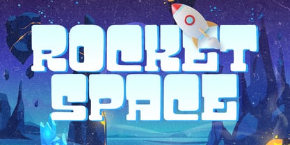
- Bang Zoom by Midwest Type,
$29.00
- Section by Monotype,
$29.99 - Disc - Personal use only

- Utendo - Personal use only

- LT Panneaux - 100% free

- LT Aspirer Neue - 100% free

- LT Afficher Neue - 100% free

- LT Starlight - 100% free

- Electrack - Unknown license

- Container Stencil JNL by Jeff Levine,
$29.00
- Wood Line JNL by Jeff Levine,
$29.00
- French Nouveau JNL by Jeff Levine,
$29.00
- Criminal Intent JNL by Jeff Levine,
$29.00
- Bitmap Typewriter JNL by Jeff Levine,
$29.00
- OCR-B BT by Bitstream,
$29.99 - Syndication JNL by Jeff Levine,
$29.00
- Kaila by ArimaType,
$18.00
- Macro by Gustav & Brun,
$10.00
- Hectonoid JNL by Jeff Levine,
$29.00 - Richard Miller Rounded by Miller Type Foundry,
$19.00
- Simplicity JNL by Jeff Levine,
$29.00


