10,000 search results
(0.029 seconds)
- Retiro Std by Typofonderie,
$59.00 Full of life Hispanic Didot in 2 optical sizes Retiro is a daring interpretation of Spanish typography. Severe, austere and yet, full of life, Retiro is a vernacular version of Castilian and Andalusian in a typical Didot. Named after a lovely park in Madrid, Retiro started life as a a bespoke typeface designed to give a unique voice to the magazine Madriz. In 2006, the founder of Madriz was looking for a Didot for his new magazine. The Didot is the archetypal typeface used in high-end magazines. Retiro is a synthesis of these high contrast styles mixed with an Hispanic mind. Result is then, after 2-3 years of work, a typeface with countless variations to establish typographic shades adapted to different sections and pages of the Madriz. In 2014, it was necessary to further revise the typeface before its launch at Typofonderie. In order to keep its originality, the unique weight was retained, but complemented with optical size variants to set highly contrasted headlines into various sizes, visually balanced. How to use Retiro optical sizes? Each font provided in Retiro family is named according to the scale of body size: 24 pt and 64 pt. Of course, these names are referring to the body sizes used in typographic design. In the “glorious old days,” the letterpress period, it was customary to cut punches directly to the size at which typefaces would be used. The punchcutter had to visually adapt his design to the engraving size. The aim was to optimize the best contrast and general weight, but also to respect both design’s and reader’s needs. In Retiro’s case, intended for large titling sizes, it’s an adaptation of this ancient practice for our contemporary uses. Although each font is named by a typographic point size, do not feel obliged to use this font at this precise size, but why not, in larger or smaller. It’s rather the concept of gradients that must be preserved in layouts, rather than strictly size numbers. It’s up to the designer to select the right font size for his own designs. Granshan Awards 2012 Creative Review Type Annual 2011 Designpreis 2011 Club des directeurs artistiques, 41e palmarès Type Directors Club 2010 Certificate of Type design Excellence
 - Pekin by HiH,
$15.00 Pekin is an unusual design with an oriental flavor. It was originally designed by Ernst Lauschke and released by The Great Western Type Foundry of Chicago as “Dormer,” which is similar to the French verb ‘to sleep,’ not exactly a marketing triumph. Barnhart Bros. And Spindler (independently-operated subsidiary of ATF since 1911) bought Great Western in 1918. According to McGrew, AMERICAN METAL TYPEFACES of the TWENTIETH CENTURY, BB&S renamed the typeface prior printing their 1925 specimen book — guess they wanted something just a tad more exciting. Quirky, distinctive and fun. Pekin ML represents a major extension of the original release, with the following changes: 1. Added glyphs for the 1250 Central Europe, the 1252 Turkish and the 1257 Baltic Code Pages. Added glyphs to complete standard 1252 Western Europe Code Page. Special glyphs relocated and assigned Unicode codepoints, some in Private Use area. Total of 415 glyphs (compared to 218 glyphs in the original release). 2. 652 Kerning Pairs. Note: Ag, Aj and gj will cross unless kerned. Alternative A may also be used. 3. Added OpenType GSUB layout features: onum, salt, liga, dlig, hist, ornm and kern. 4. Revised vertical metrics for improved cross-platform line spacing. 5. Refined various glyph outlines, based on improved scans. 6. Added set of Tabular Numbers at cap height, based on original design; added Old-Style Numbers based on default design. 7. Added a bunch of alternative characters: 18 upper case letters, 10 lower case letters, 1 ampersand and 1 bullet. The alternate c is actually the original design, but I don't like it - easily confused with e. Alt E H M h m n r t are from the original design. I added the rest. 8. 7 Ligatures, 4 Ornaments, 18 Geometric Shapes, 6 Arrows and 12 Misc. Symbols. The zip package includes two versions of the font at no extra charge. There is an OTF version which is in Open PS (Post Script Type 1) format and a TTF version which is in Open TT (True Type)format. Use whichever works best for your applications.
 - Pariphoom Compressed by Jipatype,
$27.00 ขอแนะนำ Pariphoom Compressed ส่วนเสริมของฟอนต์ Pariphoom ด้วยอักษรอันโฉบเฉี่ยวและทันสมัย เหมาะสำหรับงานออกแบบหลากหลายประเภท ด้วยอักษรแบบ sans-serif condensed และมุมโค้งมน แบบอักษรนี้ให้ความสมดุลที่ระหว่างความเป็นทางการและความเข้าถึงได้ง่าย ชื่อปริภูมิมาจากภาษาไทย แปลว่า “Space” และเช่นเดียวกับชื่อของมัน ฟอนต์นี้สามารถให้พื้นที่มากขึ้นในงานออกแบบของคุณ ไม่ว่าคุณกำลังสร้างสื่อสำหรับสร้างแบรนด์ พัฒนาแคมเปญการตลาด หรือออกแบบเว็บไซต์ Pariphoom Compressed มอบความยืดหยุ่นและความอเนกประสงค์เพื่อให้ได้รูปลักษณ์ที่คุณต้องการ Pariphoom Compressed มาพร้อมกับรูปแบบที่แตกต่างกันถึง 18 รูปแบบ สิ่งนี้ทำให้คุณมีตัวเลือกมากมายและมีความยืดหยุ่นในการใช้งานในหลากหลายบริบท นอกจากนี้ ฟอนต์นี้รองรับหลายภาษาสำหรับภาษาต่างๆ มากมาย แต่นั่นไม่ใช่ทั้งหมด Pariphoom Compressed มาพร้อมกับฟีเจอร์ Opentype เจ๋ง ๆ เช่น Small Caps และ Tabular ซึ่ง Small Caps เป็นวิธีที่ยอดเยี่ยมในการเพิ่มความหลากหลายให้กับงานออกแบบของคุณโดยใช้ตัวพิมพ์ใหญ่แทนตัวพิมพ์เล็ก ในขณะเดียวกัน Tabular ก็สมบูรณ์แบบสำหรับการสร้างตารางและจัดตำแหน่งตัวเลขเพื่อให้ดูเป็นระเบียบมากขึ้น โดยรวมแล้ว Pariphoom Compressed ทำให้เป็นตัวเลือกที่ยอดเยี่ยมสำหรับนักออกแบบที่ต้องการสร้างผลงานการออกแบบที่น่าจดจำและมีประสิทธิภาพ Introducing Pariphoom Compressed, a extended of Pariphoom with sleek and modern typeface that is perfect for a wide range of design projects. With its condensed sans-serif design and rounded corners, this font offers a unique balance of professionalism and approachability. Derived from the Thai language, the name Pariphoom means "Space" and just like its name suggests, this font can give you more space in your design. Whether you're creating branding materials, developing marketing campaigns, or designing websites, Pariphoom Compressed offers the flexibility and versatility you need to achieve your desired look. Pariphoom Compressed comes with 18 different styles. This gives you plenty of options to choose from and the flexibility to use it in various design contexts. Additionally, this font offers multi-language support for a wide range of languages. But that's not all – Pariphoom Compressed comes with some cool Opentype features such as Small Caps and Tabular. Small Caps are a great way to add variety to your design by using small capital letters instead of lowercase letters. Meanwhile, Tabular is perfect for creating tables and aligning numbers for a more organized look. Overall, Pariphoom Compressed making it a great choice for designers who want to create memorable and effective design projects.
 - Gunec by Twinletter,
$17.00 Introducing Gunec, a cutting-edge and futuristic font ideal for technology- and science-related designs. Gunec is the ideal choice for anyone looking to add a touch of futurism to their work thanks to its distinctive letterforms and svelte lines. The versatile font Gunec can be used for a variety of tasks, such as branding, packaging design, book covers, and more. However, Gunec is more than just a pretty face. This font is ideal for all of your design projects, from print to digital, as it is made to be highly legible and simple to read. Additionally, Gunec has all the elements required to produce a comprehensive and professional design, including a full set of upper- and lowercase letters, punctuation, and numerals. With Gunec font, you’ll be able to create designs that are both stylish and professional, with a futuristic look that’s sure to stand out. This font is perfect for those who want to be ahead of the curve in design, and for those who want to add a touch of innovation to their work. So don’t wait, make Gunec your font of choice today, and take your designs to the next level! What’s Included : - File font OTF, TTF, WOFF, WOFF2, CSS, HTML - All glyphs Iso Latin 1 - Alternate - Simple installations - We highly recommend using a program that supports OpenType features and Glyphs panels like many Adobe apps and Corel Draw so that you can see and access all Glyph variations. - PUA Encoded Characters – Fully accessible without additional design software. - Fonts include Multilingual support
 - Safari Squad by Mix Fonts,
$13.00 Introducing SAFARI SQUAD, the bold and stylish font perfect for making a statement. With its solid and italicized design, this font is perfect for creating impactful and attention-grabbing headlines and logos. The unique selling point of SAFARI SQUAD is the quirky stylized animal print alternates for the uppercase and lowercase letters, which add a touch of personality and originality to your designs. These alternates give you the flexibility to switch up your design and make it stand out even more. For those who can’t access the alternates, SAFARI SQUAD SUB is the same font but using the alternates as the default, making it accessible for everyone. SAFARI SQUAD SUB also offers the same solid and italicized design, perfect for creating impactful and memorable designs that will leave a lasting impression. SAFARI SQUAD and SAFARI SQUAD SUB are perfect for a wide range of uses, from social media posts and website design to marketing materials and publishing projects. These versatile fonts are sure to make your content stand out, whether you’re creating a bold and striking headline or a unique and eye-catching logo. Make your designs stand out with SAFARI SQUAD and SAFARI SQUAD SUB, the bold and unique fonts that’s sure to elevate your design game. SAFARI SQUAD comes with the following glyphs: ABCDEFGHIJKLMNOPQRSTUVWXYZ abcdefghijklmnopqrstuvwxyz 0123456789 !@#$%^&*()`~♥✿•· ÷×+−±≈=≠≥≤[]<>:;'”,.\|/?{}“”‘’-–—_ …‚„©®™‹›«»°¹²³¡¿₱¢€£¥¶§† ÁÀÂÄȦÃÅĂĀĄÆĆĈČĊÇÐĐÉÈÊËĖĒĘḞǴĜǦḠĠĤȞḦḢ ÍÌÎÏĪĮĴḰǨŁḾṀŃÑŇÓÒÔÖÕŌŐØŒṔṖŔŘṘŚŜŠŞȘŤṪȚ ÚÙÛÜŨŮŬŪŰŲẂẀŴẄẆÝŶŸŹẐŽŻƵ áàâäȧãåăāąæćĉčċçðđéèêëėēęḟǵĝǧḡġĥȟḧḣ ıíìîïīįĵḱǩłḿṁńñňóòôöõōőøœṕṗŕřṙśŝšşșťṫț úùûüũůŭūűųẃẁŵẅẇýŷÿźẑžżƶ SAFARI SQUAD SUB comes with the following glyphs: ABCDEFGHIJKLMNOPQRSTUVWXYZ abcdefghijklmnopqrstuvwxyz 0123456789 !@#$%^&*()`~♥✿•· ÷×+−±≈=≠≥≤[]<>:;'”,.\|/?{}“”‘’-–—_ …‚„©®™‹›«»°¹²³¡¿₱¢€£¥¶§† ÁÀÂÄȦÃÅĂĀĄÆĆĈČĊÇÐĐÉÈÊËĖĒĘḞǴĜǦḠĠĤȞḦḢ ÍÌÎÏĪĮĴḰǨŁḾṀŃÑŇÓÒÔÖÕŌŐØŒṔṖŔŘṘŚŜŠŞȘŤṪȚ ÚÙÛÜŨŮŬŪŰŲẂẀŴẄẆÝŶŸŹẐŽŻƵ áàâäȧãåăāąæćĉčċçðđéèêëėēęḟǵĝǧḡġĥȟḧḣ ıíìîïīįĵḱǩłḿṁńñňóòôöõōőøœṕṗŕřṙśŝšşșťṫț úùûüũůŭūűųẃẁŵẅẇýŷÿźẑžżƶ
 - Goxac by Twinletter,
$17.00 Introducing Goxac is a boldly shaped font that gives any project a cutting-edge, futuristic feel. Goxac’s slick lines and distinctive letterforms give your text a contemporary appearance, making it ideal for designs with a science fiction or technological theme. Goxac is the perfect tool for designing eye-catching headlines, posters, and social media graphics because of its bold aesthetic and futuristic theme. They are ideal for branding projects, packaging designs, book covers, and more due to their distinctive letter shapes. With a complete set of punctuation and numbers, Goxac is available in both upper- and lowercase letters. This multipurpose font is ideal for designers, marketers, and anyone looking to add a touch of futurism to their work because it has four different variants. With the Goxac font, rest assured that your designs will look unique, stylish, and futuristic. This font is perfect for those who want to stand out in the modern era, and for those who want to give their designs a touch of innovation. Goxac is a must-have for anyone looking to create a plan that really stands out. So don’t wait, make Goxac your font of choice today, and take your design to the next level! What’s Included : - File font - All glyphs Iso Latin 1 - Alternate, Ligature - Simple installations - We highly recommend using a program that supports OpenType features and Glyphs panels like many Adobe apps and Corel Draw so that you can see and access all Glyph variations. - PUA Encoded Characters – Fully accessible without additional design software. - Fonts include Multilingual support
 - Shock Graffiti by Riasyletter_Studio,
$19.00 Want to add an urban touch to your designs? Try using the Shock Graffiti font! This font offers a distinctive writing style and is very suitable for urban and street-themed designs. With Shock Graffiti, you can bring a strong and bold impression to every design you create. Shock Graffiti comes with a complete set of letters and fine details, so you can customize your design better. This font is also very easy to use and compatible with various design applications. Suitable for use in posters, merchandise, or even in t-shirt and hoodie designs. Get Shock Graffiti now and become a daring design creator! Available at an affordable price and with flexible licensing, so you can use it without limits on your future projects. What’s Included : - More than 200 of glyphs ( include Uppercase, Lowercase, Numerals & Punctuations ) - multilingual support - Works on PC & Mac - Simple installations - Accessible in the Adobe Illustrator, Adobe Photoshop, Adobe InDesign, even work on Microsoft Word. - PUA Encoded Characters (fully accessible without additional design software) Support For Language : Albanian, Basque, Breton, Chamorro, Danish, Dutch, English, Faroese, Finnish, French, Frisian, Galician, Italian, Malagasy, Norwegian, Portuguese, Spanish, Alsatian, Aragonese, Arapaho, Arrernte, Asturian, Aymara, Bislama, Cebuano, Corsican, Fijian, French_creole, Genoese, Gilbertese, Greenlandic, Haitian_creole, Hiligaynon, Hmong, Hopi, Ibanag, Iloko_ilokano, Indonesian, Interglossa_glosa, Interlingua, Irish_gaelic, Jerriais, Lojban, Lombard, Luxembourgeois, Manx, Mohawk, Norfolk_pitcairnese, Occitan, Oromo, Pangasinan, Papiamento, Piedmontese, Potawatomi, Rhaeto-romance, Romansh, Rotokas, Sami_lule, Samoan, Sardinian, Scots_gaelic, Seychelles_creole, Shona, Sicilian, Somali, Southern_ndebele, Swahili, Swati_swazi, Tagalog_filipino_pilipino, Tetum, Tok_pisin, Uyghur_latinized, Volapuk, Walloon, Warlpiri, Xhosa, Yapese, Zulu, Latinbasic, Ubasic, Demo
 - ITC Handel Gothic by ITC,
$40.99 The Handel Gothic? typeface has been a mainstay of graphic communication for over 40 years - all the while looking as current as tomorrow. Designed by Don Handel in the mid-1960s, and used in the 1973 United Airlines logo developed by Saul Bass, Handel Gothic was an instant success when released to the graphic design community. Its generous lowercase x-height, full-bodied counters and square proportions make the design highly readable at a wide range of sizes. Handel Gothic's slightly idiosyncratic character shapes gave the face a futuristic look 40 years ago that retains its power today. In addition, its Uncial-like lowercase is instantly identifiable - and unique among sans serif typestyles. Award-winning type designer Rod McDonald was attracted to the simple, decisive forms of the original, but he felt the design needed to be refined and updated. ?One of my goals was to bring a modern typographic discipline to what was really an old phototypesetting font.? To achieve his goal, McDonald re-proportioned every character and balanced the delicate relationship between the curves and the straight strokes. He also added a number of alternate characters to extend the range of the design. ?I wanted to give designers a large enough character set so they wouldn't feel constrained in what they could do. I want them to be able to play with the fonts, not just set words.? McDonald enlarged the family from the single-weight original to five weights, each with a full suite of alternate characters.In 2015 Nadine Chahine designed matching arabic weights to this family.
 - CrayonE - Unknown license

- DreadLox - Unknown license

- VenetiaMonitor - Unknown license

- 123 and... - Unknown license

- Mage - Unknown license

- Spaceracer - Unknown license

- PFHALL - Unknown license

- Trancet - Unknown license

- LateNite - Unknown license

- OpenMind - Unknown license

- Magehunter - Unknown license

- PLATSCH - Unknown license

- Fontovision - Unknown license

- Ogre by Australian Type Foundry,
$30.00A funky, lively display font originally designed for a tourism publication. - TOMO Fango by TOMO Fonts,
$20.00 A sans serif typeface, designed to speak very happy and friendly.
 - Kabel DT Condensed by DTP Types,
$49.00Based on custom design work by DTP Types Limited in 1992. - Blozend by Thinkdust,
$10.00 Blozend is a display font designed by Dani Montesinos in 2010.
 - Talbot by Suomi,
$25.00 Talbot is a connecting script with influence of car logo design.
 - Balloon by Bitstream,
$29.99Another informal script designed in 1939 by M.K. Kaufmann for ATF. - Altemus Security by Altemus Creative,
$11.00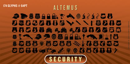 A collection of 174 law enforcemet and security icons and designs.
 - Graphicus DT by DTP Types,
$49.00Based on custom design work by DTP Types Limited in 1992. - Ka Boink by BA Graphics,
$45.00A loose fun design; great for childrens' books and happy ads. - Goudy Old Style DT by DTP Types,
$49.00Based on custom design work by DTP Types Limited in 1992. - Impuls by Bitstream,
$29.99A vigorous brush design by Paul Zimmermann for Wagner in 1954. - Convex DT by DTP Types,
$49.00Based on custom design work by DTP Types Limited in 1999. - Ad Lib by Bitstream,
$29.99Designed for informal effects in 1961 by Freeman Craw for ATF. - Garamond DT by DTP Types,
$49.00Based on custom design work by DTP Types Limited in 1992. - Newhouse DT by DTP Types,
$89.00Based on custom design work by DTP Types Limited in 1992. - Adolescence by Monotype,
$29.99The Adolescence font was created by Adam Roe through Lunchbox Design. - Pelham DT by DTP Types,
$49.00Based on custom design work by DTP Types Limited in 1992. - Stencil by Bitstream,
$29.99Gerry Powell’s stencil version of Clarendon designed for ATF in 1938. - Speedball Metropolitan Caps by Intellecta Design,
$6.00 a decorative caps font based in designs of old Speedball booklets


