8,647 search results
(0.054 seconds)
- FF Cocon by FontFont,
$65.99 FF Cocon’s designer, Evert Bloemsma (1958—2005) described it as a “serious typeface”. Despite first impressions, the description holds up well. Since its 2001 release, FF Cocon has been used in an astoundingly wide variety of design applications. At large sizes, FF Cocon works as a display face, with beautiful detailing. And at small sizes, it remains surprisingly readable. The lowercase letters a, b, d, g, h, m, n, p, q, r and u, were drawn without spurs, as Bloemsma made an attempt to erase every trace of handwriting; even “normal,” neutral sans serif typefaces still retain elements in their letterforms like this. Bloemsma wanted none of it. Although a difficult starting point for a typeface, this proved successful. Bloemsma’s design is a family of rounded yet rather asymmetrical forms with details reminiscent of brush-strokes, but that were not made with a brush in hand. In spite of its claim to seriousness, FF Cocon is a family of seductive, voluptuous styles. The original FF Cocon had two widths—normal and condensed. Later, a more compact Extra Condensed version was introduced, as well as italics.
 - Kindly Season by Ahmad Jamaludin,
$17.00 Present to you for New Modern Decorative Serif, Kindly Season! Kindly Season has a lowercase that is a unique uppercase letter, You can easily correct this by replacing the alternate letters with uppercase. It's very simple, isn't it? Comes in 3 versions: Condensed, Regular, and Expanded, with a whopping total of 60+ unique ligatures, it's easy to achieve custom typography for stunning logos, headlines, and quotes. Kindly Season has a unique 'S' that is perfect for headers in projects; it can even be used for logos. Additionally, Kindly Season features other cool, decorative-style letters that add a touch of creativity. Type in all lowercase in the type tester to try it out! What's Included? Kindly Season Main File Condensed, Regular and Expanded 60+ Ligatures Instructions (Access special characters in all apps, even in Cricut Design) Accessible in Adobe Illustrator, Adobe Photoshop, Microsoft Word even Canva! PUA Encoded Characters. Fully accessible without additional design software Language Support: Danish, English, Estonian, Filipino, Finnish, French, Friulian, Galician, German, Gusii, Indonesian, Irish, Italian, Luxembourgish, Norwegian Bokmål, Norwegian Nynorsk, Nyankole, Oromo, Portuguese, Romansh, Rombo, Spanish, Swedish, Swiss-German, Uzbek (Latin) Thank you Dharmas Studio
 - Atoverz by Twinletter,
$17.00 Introducing Atoverz, the perfect retro condensed font for your next project. This font features a classic retro design that is both stylish and functional. With 49 curved alternate characters and 32 beautiful ligatures, Atoverz allows you to easily create unique and stunning designs. Its multilingual support also ensures you can use it for projects in any language. The sleek and elegant design of Atoverz makes it perfect for a wide range of projects, from logos and branding to posters and advertisements. Its retro classic style is sure to catch the eye of your audience and leave a lasting impression. So why wait? Add Atoverz to your font collection today and take your designs to the next level. Browse our collection now to discover the versatility and charm of Atoverz retro condensed font. What’s Included : - File font - All glyphs Iso Latin 1 - Alternate, Ligature - Simple installations - We highly recommend using a program that supports OpenType features and Glyphs panels like many Adobe apps and Corel Draw so that you can see and access all Glyph variations. - PUA Encoded Characters – Fully accessible without additional design software. - Fonts include Multilingual support
 - Giraffenhals by TypoGraphicDesign,
$19.00 The kiddy and rough character and the huge capital height with the tiny x-height (plus the cute giraffe character dingbats), gives the typeface a high recognition value and uniqueness. Application Area The warm, child-like, bold and striking handmade font “Giraffenhals” would look good at logos, display size for poster, flyer, comics and graphic novel lettering, headlines in magazines or websites, packaging, music covers or webbanner etc. Technical Specifications ■ Font Name: Giraffenhals ■ Font Weights: Regular-Condensed + Bold-Condensed + DEMO (with reduced glyph-set) ■ Font Category: Display for headline size ■ Font Format:.otf (OpenType Font for Mac + Win) + .ttf (TrueType Font) ■ Glyph Set: 443 glyphs ■ Language Support: Afrikaans, Albanian, Catalan, Croatian, Czech, Danish, Dutch, English, Estonian, Finnish, French, German, Hungarian, Icelandic, Italian, Latvian, Lithuanian, Maltese, Norwegian, Polish, Portugese, Romanian, Slovak, Slovenian, Spanisch, Swedish, Turkish, Zulu ■ Specials: Alternative letters, stylistic sets, automatic contextual alternates via OpenType Feature. Euro, kerning pairs, standard & decorative ligatures, Versal Eszett (German Capital Sharp S), extras like Dingbats & Symbols, arrows, hearts, emojis/smileys, stars, further numbers, lines & shapes ■ Design Date: 2011–2017 ■ Type Designer: Manuel Viergutz ■ License: Desktop license, Web license, App license, eBook license, Server license
 - Dilemma by Sudtipos,
$39.00 Dilemma is a sans/sans serif type system with 42 styles; it is inspired by the anonymous Polyphème, Cyclopéen and Extra Condensé designs from the early 1900s at the Peignot Fonderie. From these initial points of reference, Sudtipos went further and reimagined these projects for an actual use by blending them into a unique and complex type system. Dilemma is defined as ‘a situation in which a difficult choice has to be made between two or more alternatives, especially ones that are equally undesirable’ and that is exactly how we designed this font. We created a workhorse system where each style functioned well alone but would be more powerful when working as a team, pairing the sans styles with the serifs. Dilemma comes in 3 different widths and 7 weights in both the sans and the serif, ranging from the more economical yet legible condensed styles, to the opulent bold and expanded weights. Dilemma also contains 2 Variable Fonts. We imagine Dilemma being used in a limitless array of graphic projects including identity systems, digital platforms, public spaces, editorial design and beyond. Now the Dilemma is yours.
 - VVDS Fifties by Vintage Voyage Design Supply,
$15.00Fifties is a mix of classic geometric and a bit of humanistic grotesque. The goal was to create the font for present with look to the past. In other words, I tried to came back the Modernism aesthetics of XX century into nowadays. The result gives you 60 styles including Italic (Slanted). Your typography may be airy and elegant with Expanded Thin, catchy and expressive with Condensed Bold or dynamic and sharp with Expanded Bold Italic. You will find your way to use this family certainly. Theatre posters or party flyers, vintage t-shirt or modern web service, movie titles or magazine header and even infographic – Fifties will suit you everywhere. You may use the completed styles or may use a Variable Font. To make it as you want to. Weights: Thin / Light / Regular / Medium / Semi Bold / Bold. Widths: Condensed / SemiCondensed / Medium / SemiExpanded / Expanded OTF and Variable Font (TTF) OpenType features: Stylistic alternates for A, G, K, M, N, R, W, a, e, g, j, m, n, r, t, u, w, y; Fraction figures; Subscript and Superscript figures; Tabular figures; Typographic spaces: Em / En / Third / Quarter / Thin / Sixth / Hair - Mariachi by FontMesa,
$25.00 Mariachi is a new condensed version of our Maison Luxe font which is a revival of an old 1800's classic ornate French font. This new 2021 condensed version takes this old classic to an all new level by adding small caps, italics and a new solid black version. Mariachi is perfect for headlines and logos from advertising to product labels, t-shirt lettering and restaurant menus. Fill fonts are also part of this family, new to this font style is the half fill font for creating a two color effect on the letters, you'll need an application that works in layers to use the fill fonts in Mariachi. The regular fill font for Mariachi isn't meant to be used as a stand alone font so we've created a solid black version with thicker serifs on top and adjusted outlines throughout for a better appearance as a solo font. The difference between Mariachi and our Mi Casa font is that Mariachi has a squared off shadow on the top half of the letters. We hope you enjoy Mariachi as much as we did making it. Mariachi is a trademark of FontMesa LLC
 - Alter Headletter by Alter Littera,
$25.00 This is Alter Littera’s second original design. It started as an attempt at translating into roman forms the lowercase metrics of classic blackletters, in particular those of The Oldtype “Alter Gotisch” Font. Eventually, the design process led naturally to an innovative and modern re-creation of the overall forms and style of classic bold condensed letters from the early twentieth century, especially those of the “Century Bold Condensed” type from American Type Founders (ATF) Company’s American Specimen Book of Type Styles, Jersey City, 1912 (pp. 274-7) [also seen in McGrew, M. (1993), American Metal Typefaces of the Twentieth Century, New Castle: Oak Knoll Books (pp. 76-7)]. In addition to the usual standard characters for typesetting in modern Western languages, the font includes a comprehensive set of special characters, alternates, ligatures and ornaments, plus Opentype features, that can be used for creating distinctive and attractive texts with virtually unlimited variations. The glyphs are clean, smooth and definitely readable, so the font will be suitable not only for large titles and headings, but also for full text pages. Specimen, detailed character map, OpenType features, and font samples available at Alter Littera’s The Oldtype “Alter Headletter” Font Page.
 - MVB Diazo by MVB,
$59.00 Mundane information—the sort you might ignore—often appears in the form of very simple, utilitarian lettering, devoid of personality, the sort of industrial lettering you find on old blueprints, park restrooms, and electrical boxes. MVB Diazo is such a thing. It looks like lettering done earnestly with a plastic template. The monoline caps—constructed from straight lines and simple curves—have rounded details as if rendered by a blunt pen on a topographical survey or by a router on a rustic campground sign. The MVB Diazo fonts are compact, available in two widths: Condensed and Extra Condensed. Each width offers four weights from Light to Black. The fonts are perfect for wherever plain and boring letterforms are required. All widths and weights are also available in two distressed textures (#1 and #2) that accentuate the industrial character of the design. Rough #1 is gritty, with finer texture for use at larger sizes. Rough #2 exhibits more damage, the roughness apparent when used at smaller sizes. The Rough fonts include alternates of a number of glyphs so that variation of texture is possible when letters repeat in a word.
 - Getoik by Twinletter,
$18.00 Introducing Getoik, the Retro Condensed Font that will take your designs to the next level. With its clean and smooth edges, this font is perfect for any design project. Getoik features multiple ligatures and alternates, giving you even more design options to choose from. Whether you’re creating a logo, branding materials, or any other design project, Getoik will add a touch of elegance and sophistication to your work. Its condensed shape allows for maximum impact while taking up minimal space, making it perfect for headlines, titles, and subheadings. With its versatility and attention to detail, Getoik is a must-have for any designer looking to elevate their work to the next level. So why settle for less when you can have the best? Get Getoik and take your designs to new heights! What’s Included : - File font - All glyphs Iso Latin 1 - Alternate, Ligature - Simple installations - We highly recommend using a program that supports OpenType features and Glyphs panels like many Adobe apps and Corel Draw so that you can see and access all Glyph variations. - PUA Encoded Characters – Fully accessible without additional design software. - Fonts include Multilingual support
 - Renois by Craft Supply Co,
$20.00 Introducing Renois – Display Sans Serif Powerful Impact, Bold and Condensed Renois – Display Sans Serif is more than just a font; it’s a meticulously designed tool for achieving a commanding presence in a variety of display applications. Command Attention Instantly Furthermore, Renois is purpose-built to command attention instantly. Its bold and condensed design ensures that your message takes center stage and captures the viewer’s gaze right away, making it perfect for headlines and displays that demand immediate attention. Clarity in Boldness Remarkably, despite its boldness, Renois prioritizes clarity. Each character is thoughtfully crafted for optimal readability, guaranteeing that your message is not only impactful but also effectively communicated, even at larger sizes. Versatile for Diverse Displays Moreover, Renois’s versatility shines in various display applications, whether it’s for posters, banners, or promotional materials. This typeface seamlessly adapts to your design needs, making a bold and impactful statement in any context. In Conclusion In summary, Renois – Display Sans Serif is the font of choice when you need to make a powerful and clear statement in your displays. Elevate your designs with Renois, ensuring your message rises above the noise, leaving an indelible and memorable impact on your audience.
 - bunker - Unknown license

- Hexil Pixel 2 by Konst.ru,
$20.00 Font with hexagonal dots for small texts, names, logotypes, titles, headers, topics etc. Big size of this font can be used for texts on posters, t-shirts and other surfaces.
 - Illumini by The Infamous Foundry,
$39.00 Illumini is a thin and rounded neoish sans-serif suitable for everything from logotypes to large text blocks. It contains several of the traditional ligatures normally found in serif fonts.
 - Amoonk by Product Type,
$18.00 techno, fancy, racing, super, movie, race, superhero, tech, film, automotive, calendar, font, motor, running, typography, futuristic, speed, drive, display, fast, power, action, game, branding, logotype, rally, sport, modern, car, esport
 - Outlast by BoxTube Labs,
$24.00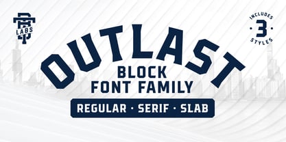 Introducing Outlast - A competitive sports font with three distinct and unique styles. Outlast was designed for creating powerful logotypes, sports branding, posters, apparel design, magazines headlines, labels and much more.
 - Logoform by Monotype,
$29.99At the inauguration of a new suburb, the local authorities needed a poster typefont, but wanted a modern, trendy type. The Logoform font is commonly used in logotypes and trademarks. - Overlord by Teweka,
$10.00 OVERLORD is a bold style font. This font is made in all capital letters. This font is very suitable for branding, logos, logotype and others. Overlord Features : Multilanguange PUA Encoded
 - Chillight by Zamjump,
$19.00 Chillight is a serif typeface that is unique and has character, having a narrow, sharp width and ends. making it effective when used at large sizes for logotypes or headlines.
 - Helixa by Designova,
$15.00 Helixa is a neo-grotesque typeface with a clean & modern design and an enduring appearance. This is a perfect choice for creating logotypes, branding, headlines, corporate identities, and marketing materials for web, digital & print alike. The typeface will be a great option for branding, logo/logotype design projects, marketing graphics, banners, posters, signage, corporate identities and editorial design. Adding extra letter spacing will make this font the perfect choice for minimal headlines and logotypes, as shown in the promo designs attached. Handcrafted and designed with powerful OpenType features in mind, each weight includes extended language support with Western European, Central European and South Eastern European sets. A total of 300 glyphs are available. Helixa typeface includes 12 fonts in total, with seven upright weights (Thin / Light / Book / Regular / Bold / Heavy) and Italic equivalents of all six weights.
 - Iknu font by Iknu,
$10.00 Iknu is a contemporary, minimal font that expresses spiritual life in its simplicity and mistery. Great font for religious / spiritual content and any other that needs a simple attractive font.
 - Boott Stitch by Aboutype,
$24.99Pen drawn in line, outline typeface originally designed for embroidery application. Boott was designed for print media in a wide point size range. Boott requires subjective display kerning and compensation. - Ann’s Valentines by Dingbatcave,
$15.00Ann's Valentines are heart-shaped dingbats that are perfect for web design as well as print that you'll use 'til your heart's content. A dingbat to fall in love with. - Magwey by Hazztype,
$24.00 Magwey is a fun and friendly retro groovy font, with experimental ink traps. suit for magazine cover, brochure, logos, Headlines or Quotes, Stand alone displays, and short paragraphs or contents.
 - Spacia by Designova,
$15.00 Spacia is a unique & modern Sans-Serif typeface specially designed for headlines, big text, branding, logotypes & display usage. The typeface could be the perfect choice for logo/logotype design, branding, marketing graphics, banners, posters, signage, corporate identities as well as for editorial design that can bring freshness and professionalism. Please see the examples shown above to get an idea of the capability of this typeface. Handcrafted and designed with powerful OpenType features in mind, each weight includes extended language support including Western European & Central European sets.
 - Carnero Variable by Monotype,
$209.99Carnero™ is a feisty hybrid of precise geometry and calligraphic flair; a design that walks that fine line between being sensible and a standout. In an increasingly monotone typographic landscape – Carnero has a unique pulse that moves the reader along with a new energy. Carnero gives life to simple utility with kinetic letter shapes, open apertures, and generous counters Drawn by Steve Matteson for the Monotype Studio, Carnero’s versatility is its strength. From digital ads and applications to packaging and branding, Carnero is comfortable and contemporary. The lightest and boldest weights create inviting headlines, while the middle weights read well for body copy. Used together, they build a lively brand and a clear hierarchy. Matteson infused Carnero with a modernist exterior resting on a 10th century calligraphic foundation. Delightful flourishes on the capital R and K, and lowercase a, k and l, give the design a distinctive demeanor; while the alternate italic swash caps are a saucy nod to the scribes. The result is a design that is warm, approachable – and a bit lighthearted. Matteson describes Carnero as, “transcending the static posture of the geometric sans genre.” The Carnero family is a compact collection of six distinct weights, ranging from an engaging light to an authoritative black, each with an italic counterpart. Its extended Latin character set ensures worry-free localization for eastern/western European languages. This is a design that will prove its value many times over. Matteson has drawn over 80 distinctive typeface families for major corporations, branding firms and retail sales. His passions for the outdoors and performing music balances an intense focus on work – and subtly finds its way into typefaces like Carnero. Matteson has designed custom fonts for three generations of the Microsoft Xbox® game console, the original core fonts for the Android® mobile-phone platform, in addition to branding typefaces for Toyota®, Rocket Mortgage®, and Google®. He also drew the Kootenay™ family, Monotype’s proprietary branding typeface. Matteson’s retail designs range from the elegant and utilitarian Open Serif™ (a companion to Google’s Open Sans), to a growing series of Frederic Goudy revivals. Carnero Variables are font files which are featuring one axis and have a preset instance from Light to Black. - Carnero by Monotype,
$50.99 Carnero™ is a feisty hybrid of precise geometry and calligraphic flair; a design that walks that fine line between being sensible and a standout. In an increasingly monotone typographic landscape – Carnero has a unique pulse that moves the reader along with a new energy. Carnero gives life to simple utility with kinetic letter shapes, open apertures, and generous counters. Drawn by Steve Matteson for the Monotype Studio, Carnero’s versatility is its strength. From digital ads and applications to packaging and branding, Carnero is comfortable and contemporary. The lightest and boldest weights create inviting headlines, while the middle weights read well for body copy. Used together, they build a lively brand and a clear hierarchy. Matteson infused Carnero with a modernist exterior resting on a 10th century calligraphic foundation. Delightful flourishes on the capital R and K, and lowercase a, k and l, give the design a distinctive demeanor; while the alternate italic swash caps are a saucy nod to the scribes. The result is a design that is warm, approachable – and a bit lighthearted. Matteson describes Carnero as, “transcending the static posture of the geometric sans genre.” The Carnero family is a compact collection of six distinct weights, ranging from an engaging light to an authoritative black, each with an italic counterpart. Its extended Latin character set ensures worry-free localization for eastern/western European languages. This is a design that will prove its value many times over. Matteson has drawn over 80 distinctive typeface families for major corporations, branding firms and retail sales. His passions for the outdoors and performing music balances an intense focus on work – and subtly finds its way into typefaces like Carnero. Matteson has designed custom fonts for three generations of the Microsoft Xbox® game console, the original core fonts for the Android® mobile-phone platform, in addition to branding typefaces for Toyota®, Rocket Mortgage®, and Google®. He also drew the Kootenay™ family, Monotype’s proprietary branding typeface. Matteson’s retail designs range from the elegant and utilitarian Open Serif™ (a companion to Google’s Open Sans), to a growing series of Frederic Goudy revivals. Carnero Variables are font files which are featuring one axis and have a preset instance from Light to Black.
 - ITC Stepp by ITC,
$29.99When Hal Taylor saw the 1930 logo for the Stetson Shoe Company of Weymouth, Massachusetts, he didn't run out and buy a pair of loafers. Instead, he seized on this striking example of an Art Deco logotype as the basis for a new typeface design. “I was impressed with the delicate and sophisticated letter forms,” Taylor recalls, “particularly the enlarged cap S -- in any other case it would have seemed unbalanced, but in the context of this logo, it worked perfectly.” All the letters in the original all-caps Stetson Shoe logo were rendered with condensed proportions except the O, which was a perfect circle. While the prominent O added visual interest to the logo, Taylor knew that such a character would limit his typeface to display applications. For versatility's sake, he drew his O for ITC Stepp with the same proportions as the rest of the alphabet. Taylor also gave the logotype's inverted S a more traditional design, but kept the original as an alternate character in the OpenType font. Taylor's toughest challenge during the design process was creating a lowercase. “A good type design tells you what it wants to be,” he says, “and after a little while the Stepp caps began to tell me what the lowercase should look like.” Taylor's lowercase is slightly more conventional than the caps. The jaunty g" and almost upside-down "s" add subtle charm, while the capital letters provide the broader gestures of Stepp's personality. Together, they create a versatile and distinctive typeface design. One of Hal Taylor's first jobs was as a photo-lettering typographer in Philadelphia, setting headlines and creating custom lettering. This was followed by a stint doing finished lettering for John Langdon, whose ambigrams appear in Dan Brown's best-selling novel, Angels & Demons. Today, Taylor works as a graphic designer in the publishing industry, but he still finds time to create an occasional hand-lettered book jacket, and draw handsome typeface designs. ITC Stepp is available in four weights, ranging from Light to Ultra Bold. All four weights have companion italics, and the lightest three weights also offer a suite of small caps." - Scriptuale by Linotype,
$29.00The Scriptuale family, which contains eight styles, is a contemporary upright calligraphic face. Designed by German designer Renate Weise in 2003, this family of typefaces speaks to the present, while at the same time reflecting on a lyrical past. The letterforms of the Scriptuale family are romanticized, they reference German calligraphic styles from the 19th and early 20th Centuries. For instance the design of Scriptuale's uppercase strays from the canon of classical proportion into romantic idealism. While the C and O are drawn according to the ancient quadratic proportions - almost twice as wide, optically, as the E or the L - the letter A is wider than would be expected, and the D narrower. These subtle differences introduce a different rhythm into text set in Scriptuale than Italic styles of calligraphy may offer. Scriptuale's Gs merit special notice: both the upper and lower case G lunge slightly forward, further enhancing the dynamic quality of the text. Also unique in Scriptuale's design is the lowercase width: the letterforms appear slightly condensed; they have large x-heights to compensate for this. In a delightful twist, the number 2's beak has been closed by drawing it full-circle, back into the stem: this references a style of letter design that was practiced, among other places, by artists from the old Klingspor foundry in Offenbach Germany. Typefaces constructed there easily captured the zeitgeist of the romantic period, but are less calligraphic than Scriptuale (e.g., Rudolf Koch's Koch Antiqua). A semi-serif face (like Prof. Hermann Zapf's Optima or Otl Aicher's Rotis Semi), some of Scriptuale's letters have serifs (D), and some do not (A). And although both the B and the E normally have the same "structure" on their left side, Weise has drawn them differently in Scriptuale. These strengthen the calligraphic-like quality of the family. Traces of the pen are easy to see in Scriptuale's design; it is a thoroughly calligraphic face. The eight typefaces in the Scriptuale family include Light, Regular, Semi Bold, and Bold weights. Each weight has a companion italic. Scriptuale is similar to one other contemporary calligraphic family in the Linotype portfolio, Anasdair , from British designer - Pricetag - Personal use only

- OldStyle 1 - Unknown license

- Robu Choco Script by Typeverything,
$38.00 Choco is a new upright script family designed by Andrei Robu. It has four different weights with lots of alternate characters which makes this typeface perfect for logotypes and cool packaging.
 - Reliva Sans by Rillatype,
$14.00 Reliva Organic Sans is a typeface that comes with many alternates and ligatures to make this font unique. Reliva is just the perfect font to make logotype, branding, packaging, and quotes.
 - Crypto by Vertigo,
$21.00 Crypto is a narrow, sans serif, geometric, display font with two weights. It works well for modern, contemporary projects, logotypes, films, posters, billboards, press advertisements, websites, packaging. It provides multilingual support.
 - Hello Mommy by Good Java Studio,
$19.00 Hello Mommy is a hand lettered script. This font includes full of Alphabetical glyphs, Numerals, and punctuation. This is so perfect for invitations, monograms, weddings, fashion, branding, labels, logotype and more.
 - Appetite by Serebryakov,
$49.00 Appetite is a bold sans font with a lot of sweet ligature glyphs. Specially designed for logotype, packaging & editorial design projects. Look at the new Appetite version — Appetite Pro — Release 2016!
 - Kole by NicolassFonts,
$25.00 The complete family contains 18 weights. Kole family is ideally suited for signage, packaging, brand identity, software, editorial design, as well as web and screen design. Perfectly for headlines and logotypes.
 - Filmmaker by Vertigo,
$20.00 The Filmmaker is a wide, slab serif, display font with four varieties. It works well for modern, dynamic projects, logotypes, films, posters, billboards, press advertisements, websites, packaging. It provides multilingual support.
 - Nagarawa by Beewest Studio,
$50.00 Nagarawa is an Asian style font, very suitable for various logotypes for Asian nuanced products, such as Asian food, martial arts clubs, music, novel and comic titles, apharel clothing and others.
 - Misegar by Owl king project,
$39.00 Creambelly is a clean and slim sans-serif font. It is perfect for product packaging, branding project, magazine covers, social media, logotypes, or just used to express words above the background.


