10,000 search results (0.461 seconds)
  1. Two Tones - Unknown license
  2. Circuitry - Unknown license
  3. Tasmin Ref - Unknown license
  4. winob - Unknown license
  5. Blocked Off - Personal use only
  6. Concielian Break - Unknown license
  7. Quark Outline - 100% free
  8. GAU_font_modern - Unknown license
  9. Deng Thick - Unknown license
  10. Induction - Unknown license
  11. Shadow of Xizor - Unknown license
  12. Hackers - Unknown license
  13. Spacebeach - Personal use only
  14. CARMEN - Unknown license
  15. Quadaptor - Unknown license
  16. Moby - Unknown license
  17. Ben Brown - Unknown license
  18. Shoguns Clan - Unknown license
  19. Tozuna - Personal use only
  20. Lady Ice - 3D - Unknown license
  21. Masterforce Solid - Unknown license
  22. Rasstapp 1.0 - Unknown license
  23. XPED Bold - Unknown license
  24. Alphabeta - Unknown license
  25. Big Blocko - Unknown license
  26. 11.20 - Unknown license
  27. Perolet - Unknown license
  28. Clearblock circular - Unknown license
  29. Romance Fatal Sans - Personal use only
  30. SF Willamette - Unknown license
  31. Ubahn - 100% free
  32. SF Diego Sans - Unknown license
  33. Venus Rising - Unknown license
  34. Walkway Condensed SemiBold - Unknown license
  35. Biscuit Boodle by insigne, $11.00
    Biscuit Boodle is a fun and uplifting script from Portland Studios Illustrator Justin Gerard. The characters are brush drawn with a slight texture. The font comes packed with OpenType alternates and ligatures. Included are small caps, old style figures, titling alternates and ending swashes. Sixty-four optional ligatures add a slapdash quality to your copy and make sure that no two letters in a word are alike, and auto replacing word ligatures add to the fun. The Biscuit Boodle family also includes an even more spontaneous alternate and even ornaments for even more creative options.
  36. Pistol Shot by Linotype, $29.99
    At first glance, Pistol Shot looks like it was originally drawn as a large, geometric slab serif font - a slab serif font that underwent an unfortunate accident, and had many of its extremities shot off! However, there is more to Pistol Shot's appearance than looking as if it had survived a showdown. Pistol Shot also looks vaguely like a pixel font viewed through a blurry filter. It also looks like it could have been cross-stitched into a craft project. Whatever its appearance, Pistol Shot Light and Pistol Shot Normal are perfect headline fonts for a wide variety of display applications. You might even want to try cross-stitching its letters into fabric yourself! Both weights of the Pistol Shot family were designed by the French design team of Roselyne and Michel Besnard in 2002, and are included in the Take Type 5 collection from Linotype GmbH."
  37. Preparatori by UICreative, $23.00
    Introducing our new product the name Preparatori Moden Serif Font Family comes with 9 different weights. Modern Serif font that feels beautiful classy, elegant, and modern. This font is perfectly suited for a wide variety of projects, such as signature, stationery, logo, wedding, typography quotes, magazine or book covers, website headers, clothing, branding, packaging design, and more. Also for fashion-related branding or editorial design and displays both masculine and feminine qualities.
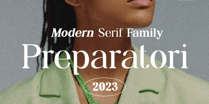
  38. ITC Jambalaya by ITC, $29.99
    The talented designer of the well-known Formata typeface, Bernd Möllenstädt was born on February 22, 1943 in Germany. He has lived in Westfalia, Berlin and Munich, Germany, and now permanently resides in Munich. From his earliest years he was interested in typography, first studying as a typesetter (1961-64) and then a student of graphic design (1964-1967). In 1967 Möllenstädt joined the Berthold typefoundry and his career as one of the leading type personalities began. One year after joining Berthold, he became the head of the type design department. For 22 years he worked as the head of that department, under the leadership of Günter Gerhard Lange. Upon Lange’s retirement in 1990, Möllenstädt ascended to the type directorship of Berthold where he was responsible for type design and font mastering. Möllenstädt designed two typeface for the Berthold Exklusiv Collection, Formata (1988) and Signata (1994). Under license from Berthold, Adobe marketed Formata as part of the Adobe Type Library. Formata is now one of the most successful sans serifs in the world, used both in American and European magazines, as well as newsletters in the Far East (Gulf New Kuwait). Formata also was chosen as the corporate typeface of Postbank, Allianz, VW Skoda, Infratest Burke, etc. In addition to his work for Berthold, Möllenstädt has lectured at local Munich schools on typography and graphic design, and designed corporate type identities and diverse logos for major corporations, including Allianz, Commerzbank, Mauser Officer and Hoepfner. Möllenstädt continues his association with Berthold as a designer. He most recently completed small caps and fractions for Formata. He also has substantially contributed to Berthold's Euro symbol program (e.g. adding the Euro symbol design-specific to the most popular families). Möllenstädt currently is working on a new Berthold Exklusiv design.
  39. Marconi by Linotype, $29.99
    Marconi was created by Hermann Zapf in 1973. According to Gerard Unger, it was the world's first digital typeface. Zapf’s design was developed as a text face for books and magazines. The round forms of the Marconi follow the principle of the superellipse. The lowercase letters are enlarged as the result of reading tests, while the capital letters are slightly reduced. The 8-point size — normally used for newspapers — looks more like 9 1/2 points. Marconi is a legible typeface with its large and open lowercase letters. It is ideal for long text blocks in newspaper, book, and magazine production.
  40. ITC Typados by ITC, $29.99
    ITC Typados is the joint effort of Roselyne and Michel Besnard and is composed of characters in two different senses of the word. First, it is of course made of letters and symbols, clean and legible with generous widths and x-heights. There is a hint of Art Nouveau style in the tapering, brush-like strokes. But the figures of ITC Typados are also made of characters in the theatrical sense: little tear-drop heads on tapering bodies that bend themselves into the shapes of an alphabet while maintaining a life of their own. The typeface is based on a recurring character in Michel's sculpture and painting, Ado. Ado is the first character who sings and repeats itself in all my creations," says Michel. "This adventure brings new forms for my painting and my sculpture: coiffed heads, bodies in the form of a cone, arms in the form of spread wings, etc." "Type" plus a number of "Ados" equals ITC Typados."
Looking for more fonts? Check out our New, Sans, Script, Handwriting fonts or Categories
abstract fontscontact usprivacy policyweb font generator
Processing