4,369 search results
(0.022 seconds)
- Zeneon by Ditatype,
$29.00 Zeneon is an extraordinary display font that combines the captivating allure of neon lights with an intriguing inline design. With its bold uppercase letterforms and electrifying neon style, this typeface creates a visually stunning and unforgettable impact. The defining feature of Zeneon lies in its mesmerizing neon-inspired design, enhanced by a distinctive inline element. Each letter is meticulously crafted to emanate the vibrant glow of neon lights, capturing the essence of urban energy. The inline detail adds an extra layer of visual interest, creating a dynamic and captivating composition. Inspired by the enchanting charm of neon signs, Zeneon infuses a sense of liveliness and modernity into each character. The font embodies the pulsating energy of neon lights, casting a radiant glow that demands attention. This neon style evokes a nostalgic urban atmosphere, adding a touch of excitement and intrigue to your designs. The uppercase letterforms of Zeneon are bold and assertive, making a powerful statement with their distinct design. The combination of the neon style and the intriguing inline element enhances the font's overall composition, creating a captivating visual impact. Zeneon is perfect for headlines, logos, signage, and any design project that seeks to command attention with a touch of neon-inspired flair. Enjoy the various features available in this font. Features: Alternates Multilingual Supports PUA Encoded Numerals and Punctuations Zeneon fits for creating posters, branding materials, digital artwork, or anything in between, this font will elevate your project to new heights. It particularly shines in applications related to nightlife, entertainment, technology, and urban-themed designs, where it adds a futuristic edge. Find out more ways to use this font by taking a look at the font preview. Thanks for purchasing our fonts. Hopefully, you have a great time using our font. Feel free to contact us anytime for further information or when you have trouble with the font. Thanks a lot and happy designing.
 - Tension by T-26,
$29.00 - Nelson by Laura Worthington,
$25.00 Evocative of paint on weathered wood, Nelson’s engraved capital letters are as rustic and confident as the Old West. Combine the engraved face with bold and rough versions to create handsome wordmarks, or use Nelson to captivate customers of food packaging, restaurant menus, and roadside attractions. See what’s included! Engraved • Ornaments • Rugged • Bold *NOTE* Basic versions DO NOT include swashes, alternates or ornaments These fonts have been specially coded for access of all the swashes, alternates and ornaments without the need for professional design software! Info and instructions here: http://lauraworthingtontype.com/faqs/
 - Hekson by Maulana Creative,
$14.00 Hekson is a block handwritten display font. With bold stroke, fun character with a bit of ligatures. To give you an extra creative work. Hekson font support multilingual more than 100+ language. This font is good for logo design, Social media, Movie Titles, Books Titles, a short text even a long text letter and good for your secondary text font with sans or serif. Make a stunning work with Hekson font. Cheers, Maulana Creative
 - Blasons by Intellecta Design,
$17.90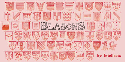
- Ressonant by Octopi,
$9.00 With reference to the Type Heritage Project, this font (designer unknown) was cut by Henry Brehmer of New York for the Dickinson Type Foundary of Boston in c1879 and had the original trade name of Renaissant. John F. Cumming later cut a light-face derivative called “Artistic.” A history of the un-patented face can be found at the Type Heritage Project website. Ressonant has a full character set as well as ligatures, superiors, inferiors, numerators, denominators, old style figures, and auto-fractions. There are also alternate caps for N and M as in the original, and, unlike the original, comes in four weights. This font is a documented revival of a 19th-century typeface. The year, country, designer and/or foundry of origin will be published in a series of textbooks entitled “The Type Heritage Project.” Volume I explores quintessential Victorian faces, a spectacular trove of innovative gems; you can see samples by clicking the Type Heritage Project link above.
 - Bestons by Maulana Creative,
$15.00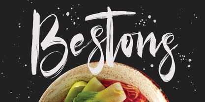 Give your designs an authentic brush handcrafted feel. Bestons Brush Font is perfectly suited to signature, stationery, logo, typography quotes, magazine or book cover, website header, flyer, clothing, branding, packaging design and more. Thanks for use this font. MaulanaCreative
 - Janson by URW Type Foundry,
$35.00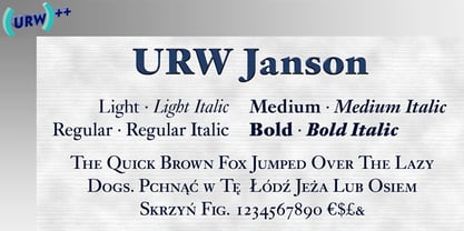
- Brenton by Letterena Studios,
$17.00 Brenton is a beautiful display font with a unique style and modern look. It is perfect for elegant and luxury logos, book or movie title designs, fashion brands, magazines, clothes, lettering, quotes, and much more. Add it to any of your creative projects, and you will be amazed by the results. *Uppercase
 - Mentone by Paragraph,
$18.00 Mentone is a new general purpose typeface, an attempt at extending the line of the great sans-serifs of the previous century, Frutiger - Stone Sans - Myriad. The font has round corners and subtle chamfers, which are all but invisible at text sizes, but add an upbeat, irreverent expression at display sizes. The typeface is named after the beautiful bayside suburb of Melbourne, Australia, where the designer lives. This new version (2.01) was spaced and kerned by Igino Marini of iKern. The semibold cuts are now free!
 - Brenson Charlotte by Grezline Studio,
$15.00 Brenson Charlotte is a unique retro script and sans font duo. It has a bold and dynamic looks and is perfect for making any design stand out. Brenson Charlotte is perfect use for a logotype, typography design, product packaging, quotes, t-shirt design, label poster, headings, letterhead, cutting sticker, hot stamping, signage, and anything that need retro taste. Get your nostalgic vibe with this unique font! Feature : - A lot of Alternates ( With a Total of 800+ Glyphs ) - Multilingual Language - Works on PC & Mac - Simple installations - Accessible in the Adobe Illustrator, Adobe Photoshop, Adobe InDesign, even works on Microsoft Word.
 - Phinney Jenson by HiH,
$12.00 Phinney Jenson ML is a font with deep historical roots firmly planted in the fertile soil of the Italian Renaissance. Twenty years after Lorenzo Ghiberti finished his famous East Doors, the Gates of Paradise, of Santa Maria del Fiore in Florence and about fifteen years before Sandro Botticelli painted his “Birth of Venus,” a French printer by the name of Nicolas Jenson set up a small print shop in the powerful city-state of Venice. The fifteenth century marked the end of the plague and the rise of Venetian power, as the merchants of Venice controlled the lucrative trade of the eastern Mediterranean and sent their ships as far as London and even the Baltic. In 1470, Jenson introduced his Roman type with the printing of De Praeparatio Evangelica by Eusebuis. He continued to use his type for over 150 editions until he died in 1480. In 1890 a leader of the Arts & Crafts movement in England named William Morris founded Kelmscott Press. He was an admirer of Jenson’s Roman and drew his own somewhat darker version called GOLDEN, which he used for the hand-printing of limited editions on homemade paper, initiating the revival of fine printing in England. Morris' efforts came to the attention of Joseph Warren Phinney, manager of the Dickinson Type Foundry of Boston. Phinney requested permission to issue a commercial version, but Morris was philosophically opposed and flatly refused. So Phinney designed a commercial variation of Golden type and released it in 1893 as Jenson Oldstyle. Phinney Jenson is our version of Phinney’s version of Morris' version of Nicolas Jenson’s Roman. We selected a view of the Piazza San Marco in Venice for our gallery illustration of Phinney Jenson ML because most of the principal buildings on the Piazza were already standing when Jenson arrived in Vienna in 1470. The original Campanile was completed in 1173 (the 1912 replacement is partially visible on the left). The Basilica di San Marco was substantially complete by 1300. The Doge’s Palace (not in the photo, but next to the Basilica) was substantially complete by 1450. Even the Torre dell'Orologio (Clock Tower) may have been completed by 1470—certainly by 1500. Phinney Jenson ML has a "rough-and-ready" strength, suitable for headlines and short blocks of text. We have sought to preserve some of the crudeness of the nineteenth-century original. For comparison, see the more refined Centaur, Bruce Rogers's interpretation of Jenson Roman. Phinney Jenson ML has a strong presence that will help your documents stand out from the Times New Roman blizzard that threatens to cover us all. Phinney Jenson ML Features: 1. Glyphs for the 1252 Western Europe, 1250 Central Europe, the 1252 Turkish and the 1257 Baltic Code Pages. Accented glyphs for Cornish and Old Gaelic. Total of 393 glyphs. 400 kerning pairs. 2. OpenType GSUB layout features: onum, pnum, salt, liga, dlig, hisy and ornm. 3. Tabular (std), proportional (opt) & old-style numbers (opt). 5. CcNnOoSsZz-kreska available (salt).
 - OL Jenson by Dennis Ortiz-Lopez,
$30.00 - Benton Modern by Font Bureau,
$40.00 Benton Modern was first prepared as a text face by Font Bureau for the Boston Globe and the Detroit Free Press. Design and proportions were taken from Morris Fuller Benton’s turn-of-the-century Century Expanded, drawn for ATF, faithfully reviving this epoch-making magazine and news text roman. The italic was based on Century Schoolbook. These display cuttings were prepared by Dyana Weissman and Richard Lipton; FB 2008
 - LTC Jenson by Lanston Type Co.,
$24.95 Jenson Oldstyle was designed by J. W. Phinney of the Dickinson Type Foundry in 1893. Jenson is based on the 'Golden Type' designed by William Morris in 1890 for his private press editions under the imprint of the Kelmscott Press. The original digital Lanston version of this face included a companion Oblique. This remastered set instead features a true italic based on the 1893 ATF italic version as well as a newly digitized Jenson Heavyface based on Phinney's design of 1899. Jenson Italic Pro features alternate lowercase forms based on ATFs then contemporary Cushing Oldstyle Italic.
 - Adobe Jenson by Adobe,
$35.00 - Jenson Classico by Linotype,
$29.99In 1458, Charles VII sent the Frenchman Nicolas Jenson to learn the craft of movable type in Mainz, the city where Gutenberg was working. Jenson was supposed to return to France with his newly learned skills, but instead he traveled to Italy, as did other itinerant printers of the time. From 1468 on, he was in Venice, where he flourished as a punchcutter, printer and publisher. He was probably the first non-German printer of movable type, and he produced about 150 editions. Though his punches have vanished, his books have not, and those produced from about 1470 until his death in 1480 have served as a source of inspiration for type designers over centuries. His Roman type is often called the first true Roman." Notable in almost all Jensonian Romans is the angled crossbar on the lowercase e, which is known as the "Venetian Oldstyle e." In the 1990s, Robert Slimbach designed his contemporary interpretation, Adobe Jenson™. It was first released by Adobe in 1996, and re-released in 2000 as a full-featured OpenType font with extended language support and many typographic refinements. A remarkable tour de force, Adobe Jenson provides flexibility for a complete range of text and display composition; it has huge character sets in specially designed optical sizes for captions, text, subheads, and display. The weight range includes light, regular, semibold, and bold. Jenson did not design an italic type to accompany his roman, so Slimbach used the italic types cut by Ludovico degli Arrighi in 1524-27 as his models for the italics in Adobe Jenson. Use this family for book and magazine composition, or for display work when the design calls for a sense of graciousness and dignity. - Planet Benson 2 - Unknown license

- Edge Of Madness - Personal use only

- MBF Futurist Edge by Moonbandit,
$9.00 Moonbandit presents a powerful technology scifi theme typeface, modern, clean, strong and sleek. Perfect for your modern futuristic projects. opentype features: kerning ligature alternate multilingual
 - LT Edge Sans - 100% free

- Benso Yolmi by madeDeduk,
$16.00 Benso Yolmi is a clean and modern minimalist serif font designed for clarity and simplicity. With its sleek lines and balanced letterforms, it conveys a timeless elegance that suits a wide range of applications. Feature Uppercase & Lowercase Number & Symbol International Glyphs Multilingual support Alternative Ligature Hope you enjoy it.
 - Benton Sans Std by Font Bureau,
$40.00 In 1903, faced with the welter of sanserif typefaces offered by ATF, Morris Fuller Benton designed News Gothic, which became a 20th-century standard. In 1995 Tobias Frere-Jones studied drawings in the Smithsonian and started a redesign. Cyrus Highsmith reviewed News Gothic, and with the Font Bureau studio expanded it into Benton Sans, a far-reaching new series, with matched weights and widths, offering performance well beyond the limits of the original; FB 1995-2012
 - 1543 Humane Jenson by GLC,
$38.00 In 1543 the well-known “De humani corporis fabrica” treatise on anatomy by André Vesale, was printed by Johann Oporinus in Basel (Switzerland). Various typefaces were used for this work, mostly in Latin but including Greek characters. Its Jenson-type font was the one which inspired this font. It is a very elegant one, including the “long s”, a few abbreviation forms and ligatures. As it was a Latin text, there were no accented characters and a few capitals were absent. I had to reconstruct them. A render sheet, in the font file, makes all characters easy to identify on the keyboard. This font may be used as a “modern” one for web-site titles, posters and flier designs, publishing ancient texts... and anything else you want! One of the most elegant types ever cut, it stands up very well to enlargement, remaining as readable as in its original small size.
 - Benton Modern RE by Font Bureau,
$40.00 Benton Modern was first prepared as a text face by Font Bureau for the Boston Globe and the Detroit Free Press. Design and proportions were taken from Morris Fuller Benton’s turn-of-the-century Century Expanded, drawn for ATF, faithfully reviving this epoch-making magazine and news text roman. The italic was based on Century Schoolbook. This version of the family is part of the Reading Edge series of fonts specifically designed for small text onscreen, having been adjusted to provide more generous proportions and roomier spacing, and having been hinted in TrueType for optimal rendering in low resolution environments.
 - Jenson Old Style by ITC,
$29.00In 1458, Charles VII sent the Frenchman Nicolas Jenson to learn the craft of movable type in Mainz, the city where Gutenberg was working. Jenson was supposed to return to France with his newly learned skills, but instead he traveled to Italy, as did other itinerant printers of the time. From 1468 on, he was in Venice, where he flourished as a punchcutter, printer and publisher. He was probably the first non-German printer of movable type, and he produced about 150 editions. Though his punches have vanished, his books have not, and those produced from about 1470 until his death in 1480 have served as a source of inspiration for type designers over centuries. His Roman type is often called the first true Roman." Notable in almost all Jensonian Romans is the angled crossbar on the lowercase e, which is known as the "Venetian Oldstyle e." Jenson Old Style™ was designed by Freda Sack and Colin Brignall for Letraset in 1982. Because of its darkness, this version is best used for display designs that call for a sense of old-world elegance and solidity." - Benton Sans RE by Font Bureau,
$40.00 A redesign of drawings of News Gothic from the Smithsonian, Cyrus Highsmith and the Font Bureau studio created Benton Sans, one the most popular and versatile families in this genre. This version of the family is part of the Reading Edge series of fonts specifically designed for small text onscreen, having been adjusted to provide more generous proportions and roomier spacing, and having been hinted in TrueType for optimal rendering in low resolution environments.
 - 1470 Jenson Latin by GLC,
$38.00 This family was inspired by the pure Jenson set of fonts used in Venice to print De preparatio evangelica in the year 1470. The present font contains all of the specific latin abbreviations and ligatures used in the original. Added are the accented characters and a few others not in use in this early period of printing, also small caps, these, contained in a separate file in the Mac TT version. This font supports strong enlargements as easily than small size remaining very smart, elegant and fine. Decorated letters like 1512 Initials, 1550 Arabesques, 1565 Venetian 1584 Rinceau or other fonts from GLC Foundry, can be used with this family without anachronism. If Italic style is required, we recommend the use of 1557 Italique.
 - Nicolas Jenson SG by Spiece Graphics,
$39.00 It was the original work of fifteenth century designer Nicolas Jenson that formed the basis for this roman serif style developed by Ernst Detterer in 1923. Similar in spirit to other early twentieth century revivals such as Centaur, Cloister Old Style, and Italian Old Style, Nicolas Jenson is distinguished by its pristine and delicate nature. A gifted young apprentice to Detterer, Robert Hunter Middleton, greatly expanded the family. And by 1929, bold, italic, and open were part of the Ludlow Foundry’s beautiful Nicolas Jenson Series. It was reintroduced under a new name, Eusebius, in 1941. This digital version includes a new medium and extrabold weight with intermediate small caps and swash alternates throughout the family. There is also a regular expert version with a variety of currency symbols plus a regular petite caps (regular x-height small caps) and old style figures version. Nicolas Jenson is now available in the OpenType Std format. Small caps, old style figures, and swash alternates have all been combined into one style for ease of use. You will also find an additional regular petite caps version included with the regular style. Some new characters have been added as stylistic alternates and historical forms. These advanced features work in current versions of Adobe Creative Suite InDesign, Creative Suite Illustrator, and Quark XPress. Check for OpenType advanced feature support in other applications as it gradually becomes available with upgrades.
 - Benton Sans Pro by Font Bureau,
$40.00 An upgrade to the original Benton Sans with extended Language support.
 - Bonbon Bleu - Unknown license

- Life-Lessons - Personal use only

- personal computer - Unknown license

- Rensor S by Smartfont,
$25.00 Rensor S is minimalist font with smooth and elegant rounded edges. It has been designed with a clean, modern design aesthetic. Rensor S is perfect for poster design, ui design, mobile apps, branding and logo development, wayfinding and signage, digital art and much more.
 - Monotype Janson by Monotype,
$29.00 The Monotype Janson font family is based on types originally cut by the Hungarian punch-cutter, Nicolas Kis circa 1690. Named after Anton Janson, a Dutch printer. The original matrices came into the hands of the Stempel foundry in Germany in 1919. New type was cast and proofs made; these were used as the source for Monotype's version of Janson. The original hand cut Janson types have a number of small design irregularities which give the typeface its unique charm. These have been carefully incorporated into the new version. The overall effect is of even color and an easy readability that makes Monotype Janson most at home in book and publishing work.
 - Second Lesson by Mans Greback,
$59.00 Second Lesson is a classic handwriting typeface. A calligraphic typeface family, Second Lesson follows the flowing and traditional handwritten typography taught at school. The script lettering is provided in styles Regular and Bold, and consists of over 1000 glyphs and support all Latin based languages as well as Russian, Bulgarian and other Cyrillic languages. Drawn and created by Mans Greback in 2021, this lettering has a slanted style and a beautiful personality. The font is built with advanced OpenType functionality and has a guaranteed top-notch quality, containing stylistic and contextual alternates, ligatures and more features; all to give you full control and customizability. It has extensive lingual support, covering all Latin-based languages, from North Europe to South Africa, from America to South-East Asia. It also supports Cyrillic. It contains all characters and symbols you'll ever need, including all punctuation and numbers.
 - Jensen Arabique by CastleType,
$39.00 This elegant typeface was suggested to me by type critic Daniel Will-Harris. Jensen Arabique is based on a set of capital letters drawn by Gustav Jensen that included the word "ARABIQUE" at the top of the first page, therefore the name. Daniel Will-Harris has this to say about Jensen Arabique: "I found an example of this unexecuted Gustav Jensen typeface in a type sample book from 1933, and Jason Castle lovingly digitized it with all its rare and unusual curves intact." Uppercase with alternates, numerals and some punctuation.
 - Bentron Calligraphic by Mans Greback,
$69.00 Bentron Calligraphic is a bold and beautiful brush font with a touch of speed and sophistication. Its rapid strokes and dynamic flow give it a signature-like quality that is perfect for adding a personal touch to your projects. Designed with a focus on the art of calligraphy, Bentron Calligraphic exudes elegance and grace with its smooth curves and flowing lines. This font is perfect for anything from logos and branding to social media posts and invitations. Bentron Calligraphic comes in four styles: Regular, Italic, Alternate Regular and Alternate Italic. This range of styles provides versatility and allows for dynamic and creative designs. Use underscore _ to create a swash anywhere in a word. Example: Space_jams Use multiple underscores to create different swashes. Example: Signa____tures The font is built with advanced OpenType functionality and has a guaranteed top-notch quality, containing stylistic and contextual alternates, ligatures and more features; all to give you full control and customizability. It has extensive lingual support, covering all Latin-based languages, from Northern Europe to South Africa, from America to South-East Asia. It contains all characters and symbols you'll ever need, including all punctuation and numbers.
 - Gans Blasones by Intellecta Design,
$27.00 GansBlasones images were selected from the vignettes catalog from Fundicion Gans published in 1920. Represents heraldry devices, Spanish city seals, world nations seals, coats of arms, helms, crowns, crests etc.
 - Lesson Learned by Gassstype,
$23.00 Introducing Lesson Learned is Fun Display Font,This Font Authentic that is written casually and quickly. Then scanned and carefully drawn into vector format. This handmade font will make your design has a beautiful natural touch for each details. It is perfect for any design project as Invitation,logo, book cover, craft or any design purposes. That is why Lesson Learned has charming, authentic and relaxed characteristic more natural look to your text with a more natural look to your text. It also features a wealth of special features including Ligatures glyphs.


