10,000 search results
(0.041 seconds)
- Cinema Macabre by Wing's Art Studio,
$10.00 Cinema Macabre: Horror Fonts Torn from the Pages of Giallo A Hand-drawn Display Font for Creating the Most Diabolical Horror Titles This loose and inky brush font takes its inspiration from the classic Giallo film posters of the 1960s to 1980s - a cult cinematic subgenre beloved for its stylish visuals, haunting soundtracks and exploitation led marketing. It's a devilishly drawn design that aims to capture the feeling of vintage horror, preserving analogue details of old print while remaining versatile enough to work across a variety of digital designs. The Cinema Macabre font family boasts six fonts, each containing a unique set of uppercase and lowercase characters, as well as numerals, punctuation and language support. Add to this a host of custom ligatures, underlines and graphic elements and you have an essential toolbox for creating truly hand-made looking title designs. Cinema Macabre if a font that rewards experimentation by mixing all the various upper and lowercase alternatives, with interesting combinations waiting to be found and inspire terror across your own movie posters, book covers, albums and editorials. Few other fonts offer the versatility to create such diabolical designs! A Brief Introduction to Giallo: In popular cinema, Giallo is a genre of mystery fiction and thrillers often containing slasher, psychological horror, exploitation, supernatural and erotic elements. The term giallo (meaning yellow) derives from a series of pulp novels published by Mondadori from 1929 taking the name from its trademark yellow covers. The series consisted of Italian translations of mystery novels by well-known authors such as Agatha Christie, Edgar Allan Poe and Raymond Chandler. The popularity of these cheap paperbacks eventually established the word Giallo as a synonym in Italian for a mystery novel. The cinematic Giallo subgenre developed during the 1960-80s and are noted for their vivid cinematography, memorable soundtracks and inventive gore-filled scenarios. Key examples include Dario Argento's Suspiria, Tenebrae and Deep Red - stylish films that at once influenced the American slasher (see Black Christmas and Friday 13th) up to todays horror in Censor and Last Night In Soho.
 - Sidney Bloom by Fromletterel,
$10.00 Sidney Bloom is a handmade display font, it suitable for display because it's bold and cheerful character, and because it was handmade Sidney Bloom also can be used to any project that need natural writing touch. So get creative with its playfulness, and use it to brighten up any project!
 - Brvsheed by Mofr24,
$10.00 Introducing Brvsheed, a modern handwritten font that exudes uniqueness with its brushed texture. With both Regular and Italic styles, it's a versatile choice for posters, marketing, T-shirt design, and more. Its multilingual support enhances its usability, while its distinctive look adds flair to titles, YouTube thumbnails, and gaming graphics.
 - CF Anarchy - Personal use only

- TaitDemo - Unknown license

- Drawing Blood - Personal use only

- Rekord Antiqua by RMU,
$30.00 Rekord Antiqua, regular and semibold, released 1911 by Wagner & Schmidt, is a perfect body text partner for Art Nouveau display fonts. Both styles come with a long s, which can be reached by the OT feature of historical forms or by typing [alt] + b. In addition, you find two framing elements on [alt] + P and [alt] + p, and an oblique style was added too.
 - Thick Fun by PizzaDude.dk,
$17.00 This is not a brush font! This is an imitation of brushstrokes, done by pen. But I guess you've already noticed that - the brushstrokes are way too obvious, to have been made by brush. Although being a "fake", the letters leaves you with quite a good impression. Letters were inspired by an old horror movie poster, but is very useful for something less terrifying!
 - Skyline by Font Bureau,
$40.00 Skyline was commissioned from Font Bureau by Condé Nast specifically as a headline typeface for Traveler magazine. This strongly personal work by Imre Reiner from 1929 and 1934 was known in Europe as Corvinus. Skyline Black and Bold Condensed offer immediate headline recognition through Reiner’s variations on the themes found in the classical Modern structure. Both styles were adapted by Jane Patterson; FB 1992
 - Garth Graphic by Monotype,
$29.99Released by the Compugraphic Corporation in 1979, the Garth Graphic font family is based on a design by John Matt from the 1960's, reworked by Renee LeWinter and Constance Blanchard. Garth Graphic was named after Bill Garth, a founder of Compugraphic. A fairly strong old style face suitable for text setting; the heavier weights and condensed forms are most used for display work. - Meyling by URW Type Foundry,
$35.99 Three carefully crafted script styles by the Brazilian type designer João Henrique Lopes. Another type project by Joao in which each style can be written by itself but combined they have an unique vitality and develop their full potential. An excellent readability make Meyling the perfect partner for a variety of projects, from stylish invitations to magazine ads, from poetry books to restaurant logos.
 - Orchard Street NF by Nick's Fonts,
$10.00This playful Art Deco classic was inspired by one of many posters produced by the WPA by anonymous artists during the 1930s. An inline version has been added to spice up the visual interest and add a touch of class. Both versions of the font include complete Latin 1252, Central European 1250 and Turkish 1524 character sets, with localization for Moldovan, Romanian and Turkish. - Kolo LP by LetterPerfect,
$39.00 The Kolo family was designed by Paul Shaw, inspired by the lettering of Koloman Moser, Gustav Klimt, Alfred Roller and other members of the Secession, Vienna’s turn-of-the-century Art Nouveau movement. Kolo’s family variants—narrow, regular, wide & alternates—serve as stand-alone display styles, or can be used in combination to pack text creatively in the manner characterized by Secession-period graphics.
 - Something - 100% free

- Blackboard Ultra - 100% free

- Quasi - Unknown license

- Kaela - Unknown license

- Some's Style - Unknown license

- Michel by sugargliderz,
$20.00 The design of this typeface was influenced by the typefaces left by Firmin-Didot. There are three weights, and all weights can be used in large font sizes to create a gorgeous and attractive impression.
 - Blick by ParaType,
$25.00 A display face with rounded terminals stylized like drops of a liquid. For use in large sizes in advertising matter and decorative headings. The face designed by Natalya Vasilyeva and licensed by ParaType in 2007.
 - the Incredibles - Unknown license

- Blade 2 - Unknown license

- Misfortune - Unknown license

- Republica - Unknown license

- Scriptura by Sylvestre Studios,
$20.00A fluid font drawn by hand. - Mamba by W Type Foundry,
$19.50 Mamba is inspired by Cooper Black.
 - Manic Tambourine AOE by Astigmatic,
$19.95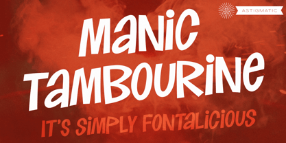 A dynamic font inspired by cartoons.
 - Confitería by Sudtipos,
$39.00 Confitería is the Spanish word for a shop where sweets and chocolates are made and sold, which sometimes has a tea room. And now Confitería is also a font that brings to mind lettering piped on delicate cakes ... sweet but never sickly. This font captures something of that simple and innocent beauty of traditional confiterías, where good manners will never go out of fashion, menus are elegant and time comes to a standstill to make way for life’s little pleasures. A confitería is a perfect place to share sweet tidbits with a friend or date, eavesdrop on the conversation at the next table, read a book, or just people-watch from the window. I celebrated my last birthday at one. There is one iconic confitería in Buenos Aires that I love more than the rest because, some 60 years ago, it put up its marvellous sign and never took it down. Walking by it is sure to bring a smile to your face. It’s big. Very big. And the lettering in its name is written in a timelessly beautiful vertical script – the most attractive I have ever seen. I joined forces with Sol Matas – who worked with me to update the Montserrat font –to design this geometrical connected font with pleasant, even strokes. It is elegant and saccharine-free. And to top it off, it comes in several flavors. Welcome! What can we get you?
 - Salad by Zetafonts,
$39.00 The island of Fuerteventura is more known for its white sand beaches and windsurf-friendly constant winds than for its typographic marvels. Still, it's on the walls of a ballroom next to its white-sand beaches that Debora Manetti found the hand-painted letterforms that she took as inspiration for her typeface Sala de Fiestas. The resulting font was a condensed sans serif full of curious details and a jumpy latino vibe that many years after still keeps its freshness and vernacular charme. Francesco Canovaro took the original typeface as a starting point for a grand tour into sign-painter aesthetics, developing a reboot of the original into a new type family: Salad. While being faithful to the original proportions and feeling, Salad provides extreme versatility through its five-weights range, its extended charset and its set of Open Type features including stylistic sets, alternates, positional numerals, small capitals and case sensitive forms. While the roman family with its italic counterpart provide a good workhorse tool for informal branding, packaging and editorial projects, the interlocking and the inline weights add additional possibilities for display purposes. This is enriched by the inclusion in the typeface of a set hand-drawn decorative dingbats that further complement the sign painting vibe of the family. All Zetafonts expertise in handmade lettering, typographic design and water sports has been put to test to assure Salad is the best typographical alternative to a a trip to Canary Islands!
 - Circe Rounded by ParaType,
$40.00 Circe Rounded is an extension for a popular Circe typeface, with rounded terminals. Bold and ExtraBold faces have two variants with different radius of the roundings. Circe Rounded is even more friendly than the original Circe. The typeface is designed by Alexandra Korolkova and Alexander Lubovenko and released by ParaType in 2015. It is known that the Circe typeface is distinguished by mild and humanist nature being formally a geometric sans-serif. However, as an experiment we decided to make it even softer: Circe now has a version with rounded terminals — Circe Rounded. Rounding is generally regarded as a mechanical operation, but in this case a lot of manual adjustment was needed because of the humanist nature and peculiarities of type design. Moreover, the two bold styles now have two options: a basic one is slightly rounded and an alternate one is fully rounded. In Circe Rounded we decided to dismiss characters with swashes that are rather inappropriate in such a rounded font, but the stylistic sets and alternate characters are remaining. Rounded terminals make an open and friendly typeface even more childish. For example, in quite large point sizes (because the x-height is still not big) it can be used as a body type in infant books. Circe Rounded, similar to Circe, has alternative forms of lowercase characters, which are called “infant” and are used in publications for children’s reading. However, a humanist basis is preserved alongside with its softness and it does not allow it to be as “plasticine” as many other rounded fonts. Two of the most obvious areas of possible application of Circe Rounded are everything for children and everything edible, especially all that is sweet and puff. However, we believe that there are other options.
 - Claston Script by Krafted,
$10.00 Turn the page to the future and leave all the past behind. It’s a new age and you will move the cogs of the world forward! There is no need to worry or fear, the Claston Script will pave the way for you. With its clean script-type design and curved indentations, this font will take your projects to the next level! Move forward with elegance and bring your audiences to where your vision is: the future. It might take some time to get them there, but that’s okay! You have the perspective, the frame of mind, and most importantly the attitude to wrap it all together into a neat project! The Claston Script aims to bring out a modern and stylish view to what you make. It fits right in with your designs, whatever it is! It’s beautiful without trying too hard, it’s gorgeous without being apologetic, it’s brave in the face of uncertainty, these all represent you. Easily connect with your urban and forward thinking audience with this script and blow their minds!
 - Chill Script by Eclectotype,
$40.00 Looking for a break from modern calligraphy? Tired of skinny scripts? Here's something seriously relaxed. Chill Script is a totally new typeface, it eschews any brush influence, but maintains a warmth that comes from not being rigidly constructed. It's a sans serif script, with a nice top-heaviness that makes it friendly. As you expect from fonts today, it's loaded (but not pointlessly overloaded) with OpenType features.
 - Elmcourt by Greater Albion Typefounders,
$20.00 Elmcourt is a clear and simple display slab-serif typeface family. It's offered in two weights and regular and italic forms. An extensive range of opentype features are included in all typefaces, including small capitals, ligatures, and old-style numerals. It's an ideal family for bold headlines and eye catching poster work. The simplicity of its outlines make it ideal for carved and cutout work.
 - Bronzino by Greater Albion Typefounders,
$8.95 Bronzino’s roots lie in the Arts and Crafts movement, and in the traditions of letterpress printed fine quality books. It’s ideal for legible headings which have just that hint of charm and difference outside of the normal and mundane. It’s formal enough to go anywhere yet it has a spirit of fun, it brings a world of bygone care and quality to the modern age.
 - Punch Pro by Produce,
$29.00 Punch was born because we wanted to create a stencil font. At first glance, Punch gives out an audacious persona with its bold shape and form. It’s softer side is revealed in it’s carefully cut stencil lines. The balance of heavy and refined gives the font family its very own charm. Punch Pro comes in six different weights; Slab, Bracketed, Wedge, Deco, Hairline and Sans.
 - Riverside by Letterhend,
$12.00 Riverside is a handmade monoline script and one caps weight. This font is perfect to be used as t-shirt design, logo / brand, signature, headline, lettering quotes, etc. It also comes in uppercase, lowercase, punctuations, symbols & numerals, stylistic set alternate, ligatures, etc also support multilingual. It also already PUA Encoded. The Riverside Script contain 3 style, regular, rough, stamp, and a special upright Caps weight.
 - Mencken Std by Typofonderie,
$59.00 An American Scotch remixed in 27 fonts Mencken has twenty seven styles, divided into three widths, three optical sizes, romans and italics. Generally, optical size typeface families belong to a same common construction. It falls into the same category of type classification, while presenting different x-heights or contrasts. Mencken is unique because it is designed according to different axis and optical sizes. Firstly, Mencken Text is a low-contrast transitional typeface, designed on an oblique axis, asserting horizontal with featuring open counters. Its capitals follow Didots to better harmonize the rest of the family. On the other side of the spectrum, Mencken Head (and narrow variations) is designed on a vertical axis, high contrast, in a contemporary Didot style. The Mencken is therefore a typeface answering to different sorts of uses, whose design is different according to its uses: from oblique axis in small size to vertical axis in large sizes. Vertical proportions (x-height, capitals height, etc.) were calibrated to be compatible with many Typofonderie typeface families. Lucie Lacava and I followed the idea launched by Matthew Carter few years ago for some of his typefaces intended for publications. From Baltimore Sun’s project to Typofonderie’s Mencken It is a bespoke typeface for American newspaper The Baltimore Sun started at the end of 2004 which marks the beginning of this project. The story started with a simple email exchange with Lucie Lacava then in charge of redesigning the American East Coast newspaper. As usual, she was looking for new typeface options in order to distinguish the redesign that she had started. At the time of its implementation, a survey of the newspaper’s readers has revealed that its previous typeface, drawn in the mid-1990s, was unsatisfactory. The Mencken was well received, some reader responses was particularly enjoyable: “It’s easier to read with the new type even though the type is designed by a French.” Why it is called Mencken? The name Mencken is a tribute to H. L. Mencken’s journalistic contributions to The Sun. According to the London Daily Mail, Mencken ventured beyond the typewriter into the world of typography. Because he felt Americans did not recognize irony when they read it, he proposed the creation of a special typeface to be called Ironics, with the text slanting in the opposite direction from italic types, to indicate the author’s humour. Affirming his irreverence, the Mencken typeface does not offer these typographic gadgets. Henry Louis Mencken (1880 — 1956) was an American journalist, satirist, cultural critic and scholar of American English. Known as the “Sage of Baltimore”, he is regarded as one of the most influential American writers and prose stylists of the first half of the twentieth century. He commented widely on the social scene, literature, music, prominent politicians and contemporary movements. Creative Review Type Annual 2006 Tokyo TDC 2018
 - WILD2 Ghixm by Fontry West,
$15.00 Accidents happen. Things go where they don't belong, get changed - remade. Something new crawls out of the murky depths. Ghixm is a retrospective of the horror comics and movie posters of the 1960s and the 1970s. It's fluid forms harken to watery graves and tentacled unnameable horrors. These twisted shapes are reminiscent of titles that will make your skin crawl. It’s already warped and twisted, so don't hesitate to abuse it. This face can take it and still deliver its chaotic message.
 - Hockeynight Serif Brush by XTOPH,
$25.00 "Hockeynight Serif Brush" is the handwritten version of my "Hockeynight Serif". It's a contemporary college-sports font with the little twist – that its a brush font. With its detailed brushmarks it is designed to go big and bold. "Hockeynight Serif Brush" is an uppercase font and it offers alternate glyphs as lowercases. It pairs perfect with my other "Hockeynight" Fonts – Check it out!
 - Hockeynight Sans Brush by XTOPH,
$25.00 "Hockeynight Sans Brush" is the handwritten version of my "Hockeynight Sans". It's a contemporary college-sports font with the little twist – that its a brush font. With its detailed brushmarks it is designed to go big and bold. "Hockeynight Sans Brush" is an uppercase font and it offers alternate glyphs as lowercases. It pairs perfect with my other "Hockeynight" Fonts – Check it out!


