10,000 search results
(0.024 seconds)
- Elmimore by Qwrtype Foundry,
$14.00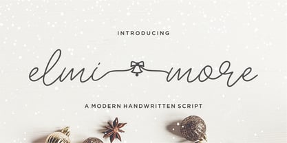 Introducing by Qwrtype Proudly Present, Elmimore Elmimore is a Monoline Script with Swash Elmimore is perfect for product packaging, branding project, megazine, social media, wedding, or just used to express words above the background. Elmimore also come with Multi-Lingual Support. Thank you!
 - Vedo by Wiescher Design,
$19.50 The name Vedo is derived from the Latin word for "I see". Vedo is a new, sturdy Sans Monoline in 7 weights and 7 Italic cuts. The Thin cuts are free of charge. Yours designing new fonts in the Bauhaus tradition - Gert Wiescher
 - Spearmint by Qwrtype Foundry,
$14.00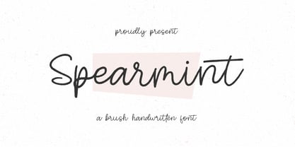 Introducing by Qwrtype Foundry Proudly Present, Spearmint Spearmint is a Brush Handwritten Font Spearmint is perfect for product packaging, branding project, megazine, social media, wedding, or just used to express words above the background. Spearmint also come with multilingual support. Thank you!
 - Dragon Drop by Elemeno,
$25.00Thick, wide and medieval, Dragon Drop would feel at home in Arthurian times. The name is an obvious play on words that the designer saved for a long time before creating the right font to use with it. Looks best at larger sizes. - Crown Heights JNL by Jeff Levine,
$29.00Named for his childhood neighborhood in Brooklyn, NY, Jeff Levine's Crown Heights JNL is a lightline all-caps titling font excellent for short words or phrases. Its inspiration is remotely based on the symmetry of earlier designs such as Beton and Stymie. - Monstera Garden by Timurtype,
$14.00 Introducing by Timur type Monstera Garden A Handwritten Font Monstera Garden is perfect for product packaging, branding projects, magazines, social media, wedding, or just used to express words above the background. Monstera Garden offers also multilingual support. Enjoy the font. Thank you!
 - Astrospy JNL by Jeff Levine,
$29.00Astrospy JNL is a square-shaped, futuristic techno-style font from Jeff Levine. It is very well suited for short phrases, but caution should be used in setting too many words with it because of legibility issues. Best used in larger point sizes. - Osnova Navigation by AndrijType,
$18.75 The common Slavic word Основа (Osnova) means basis in English and βάση in Greek. This universal but still distinctive typeface can make a good ground for any design project. Special Navigation version separated by Western Latin, Greek and Cyrillic families is here.
 - Flanela Monicha by Essentials Studio,
$16.00 Flanela Monicha Is a Modern Script Font Flanela Monicha is perfect for product packaging, branding project, megazine, social media, wedding, or just used to express words above the background. Enjoy the font, feel free to comment or feedback, send me PM or email
 - Meter Room JNL by Jeff Levine,
$29.00 The design idea for Meter Room JNL comes from a vintage brass hand-cut stencil of the words "High Voltage". What makes this stencil font a bit different than others is the placement and angle of some of the "breaks" within the letters.
 - JP MultiColour by jpFonts,
$29.90 Multicolored Fonts Many years ago, when Xerox Corporation still had its own font department, I came to Los Angeles in 1985 to train the IKARUS program. One day Bill Kienzel, head of the Xerox font department at the time, said we should go to the Hollywood Hills together; he knew people there who were experimenting with multicolored fonts. After a little wandering through the winding streets of the many hills, we reached a somewhat overgrown, simple family house standing under trees. A group of very inspired designers were waiting for us there. They immediately showed us the works they created using photomechanical tricks. They were fascinating. The American colors and the whole look seemed noble and enchanting. The problem was that this process was very difficult to implement and required a lot of effort on individual letters. They dreamed of a colored font that could be used for normal typesetting. We thought back and forth about how to save the individually colored letters in a common font, but soon gave up because we didn't see a technical option. So this idea and the memory of the time in Hollywood lay dormant in the back of my mind for many years, until at the beginning of this year 2023 I received an order to produce an outline typeface and the story came back to me. Suddenly I knew how to solve the problem from back then: if only the areas that should have the same color in all letters were saved in their own separate fonts, they could be colored independently of each other and later placed on top of each other. I implemented this in the 5 fonts that are now available with the 3 variants “Outside”, “Middle” and “Inside”. Together with the background, 4 colors can be combined with each other. This method works in text programs such as Word or InDesign. In Photoshop or Illustrator, the individual surfaces can also be colored by converting them into paths if the additional “Complete” variants (which contain all 3 contours) are used. There is also a “Basic” variant that can be used to achieve special effects such as overlay, bleed, etc. The first 5 fonts in this series are all based on the principle of contouring. Anyone who claims that you don't need any special fonts because they can be created automatically from any font using common programs is wrong or is only telling only half the truth. Anyone who has ever dealt with this knows that many individual adjustments to the design are necessary after contouring. This has happened in the 5 fonts that are now available and have very different styles. The dream from back then has come true. The user can set any text, long or short, in multiple colors, freely design the color scheme and apply all the usual typographic settings. Volker Schnebel, November 2023
 - Emynam Crew by Alit Design,
$23.00 Introducing the Emynam Crew: A Funky Retro Display Typeface Dear Design Enthusiasts, Are you ready to groove to the rhythm of creativity and nostalgia? Say hello to the Emynam Crew, the font that's bringing back the funky retro vibes of yesteryears with a modern twist. With its unique blend of style, flair, and a whopping 705 glyphs, this typeface is a must-have for anyone looking to make a statement. Key Features: Retro Vibes: Emynam Crew captures the essence of the 70s and 80s with its bold, funky letterforms. It's like a blast from the past, perfect for adding a touch of nostalgia to your designs. Ligatures and Alternatives: Dive into the world of creativity with multiple ligatures and alternative characters. Mix and match to create stunning, one-of-a-kind typographic compositions. PUA Multilingual Support: Emynam Crew is not just about style; it's about substance too. With PUA multilingual support, you can use this font to communicate in various languages, making it a versatile choice for global projects. Endless Possibilities: With 705 glyphs at your disposal, the possibilities are endless. Whether you're designing posters, album covers, branding materials, or anything else, Emynam Crew gives you the freedom to express your unique vision. Stylish Display: Make a bold statement with Emynam Crew as your headline or display font. Its eye-catching style ensures that your message won't go unnoticed. Perfect for Retro Revival: Whether you're working on a retro-themed project or just want to infuse a touch of nostalgia into your designs, Emynam Crew is your go-to choice. Easy to Use: Emynam Crew is designed with user-friendliness in mind. It's compatible with popular design software and is easy to install and use. Unleash your inner artist and let Emynam Crew transport your designs to a bygone era. Embrace the funk, the retro, and the style with this one-of-a-kind typeface. Don't miss out on this opportunity to own the Emynam Crew – a font that's all about style, character, and endless possibilities. Get ready to turn back the clock and add a touch of funky nostalgia to your next project. Order your Emynam Crew Typeface today and start designing with retro flair!
 - Take The Money by Kitchen Table Type Foundry,
$15.00 Take The Money is a wonky all caps font, made with a Sharpie pen. The name was inspired by something I read in the newspaper: apparently a Danish artist received €72.000 from a museum to create two works of art. The works of art should depict the average income of someone from Austria and someone from Denmark - in real money. The museum then loaned him the €72.000 and told him he'd receive €3.300 for his work. The artist decided that €3.300 would merely cover the costs, so he delivered two empty canvases and called the work: Take The Money And Run.
 - Scripps College Old Style by Monotype,
$49.00The story of Scripps College Old Style is a heart-warming and inspiring chronicle about a young librarian, a handful of students, a wealthy grandmother, a dedicated educator -- and two eminent American type designers. The story begins in 1938, when Dorothy Drake, the newly hired librarian at Scripps College, a small women's college in southern California, became an impromptu dinner companion of the American type designer Fred Goudy. By the 1990s, the original fonts that Goudy had created for Scripps College in the 1940s had become prized -- but they were seldom-used antiques. Scripps needed digital versions of the metal fonts. This goal posed two immediate challenges: finding a designer familiar with letterpress printing who was skilled at creating digital fonts, and locating the money to commission the designer's services. The first challenge was the easiest to conquer. Sumner Stone was my first and only choice," recalls Kitty Maryatt, the current curator of the Scripps College Press. "I knew he had letterpress experience, was an accomplished calligrapher, and that his typeface designs were simply exquisite. The choice was easy."The second challenge was more difficult. It took the dedication, hard work and tenacity of Maryatt to bring the beautiful Goudy designs into the twenty-first century. While Stone was eager to begin work on the project, the college had no more money for new typeface designs in the 1990s than it did in the1930s. Years of lobbying, cajoling and letter writing were necessary to obtain the college's approval for the design project. Once she had the necessary funding, the design brief posed yet a third challenge. Goudy had provided two sizes of type to the Press: 14 point and 16 point. Which would serve as the foundation for Stone's work? In addition, the Goudy fonts were quite worn. Should Stone use printed samples as his design master, or base his work on the original Goudy renderings? The 14-point master drawings were the ultimate choice, with the stipulation that the finished fonts would provide both a seamless transition from the worn metal versions and a faithful representation of the original Goudy designs. Once the budget and design brief were established, the process of converting the original Goudy drawings into digital fonts took just a little over two months. Stone delivered finished products to Scripps in the fall of 1997. The first official use of the fonts was to set an announcement for a lecture by Stone at Scripps in February of 1998. But the story is not quite finished. Maryatt was so pleased with the new digital fonts, she wanted to share them with the graphic design community. At Stone's suggestion, she contacted Monotype Imaging with the hope that the company would add the new designs to its library. An easy decision! Now Monotype Imaging is part of the story. We are proud to announce the release of Scripps College Old Style as a Monotype Classic font. The once exclusive font of metal type is now available in digital form for designers around the world. " - Open-Dyslexic - Personal use only

- American Advertise 014 by Intellecta Design,
$18.95from the wood type heritage of America - Back Fence by Bogusky 2,
$15.00A clever font derived from wood planks - Chumbitos by Fictilia,
$5.00 Wood Body w/ Electric Heart & Synthetic Mind...
 - Resiliency2 by Alphabet Agency,
$15.00 Resiliency2 has been designed for use in sports,and fitness themes to elevate design work in those genres. The fonts work great with esports themes, in particularly. .The font family contains 6 fonts;3 weights, 2 styles
 - Scratoon by ZetDesign,
$14.00 Scratoon is our latest font created for cartoon and comic-themed design work. This font is perfect for displaying posters, banners, flyers, and also suitable for cloothing. I hope this font really helps your creative working.. ... Thanks ...
 - FS Joey Paneuropean by Fontsmith,
$90.00Kangaroo FS Joey was the offspring of a project with Rudd Studio to develop a logotype for an online streaming TV service, in 2008. While under wraps, the secret project was code-named Kangaroo. The logotype led to a second project, to design a corporate typeface for the service. It was the first big project Fernando Mello had worked on with Jason Smith. “Like any designer who just joined a team, I was very excited about it, drawing and sketching lots of ideas. I remember Jason and I experimenting with lots of possibilities, for both the logo and the typeface.” Online As the font for a Spotify-style, internet-based service, FS Joey needed to be highly legible on-screen, including at very small sizes. There had to be a range of weights, and they’d have to work well in print, too. It was also important that it felt corporate, not too quirky, while still having a strong character of its own. Quirkiest “We designed three weights specifically for use on the Web,” says Jason Smith. “There was the usual fight between me and my team. I wanted at least one identifiable letter that was a quirk. As always I went straight for the lowercase ‘g’, and it was drawn numerous times with lots of variation. I got the quirkiest one accepted by the client.” But, later in 2009, the Competition Commission blocked Project Kangaroo, and Fontsmith were left with a couple of weights of an as yet unused font. From Kangaroo, Joey was born. A favourite “Straight away, people started to notice the typeface,” says Jason. “I can take the credit for pushing the art direction and standing up for the quirks. But it was Fernando who was the key to pulling it all together and adding his own distinct flavour. Now it’s one of my favourite designs in our library.” Fresh and friendly, geometric and energetic, Joey is available in five weights, all with italics, all finely-tuned for both screen and print. - FS Joey by Fontsmith,
$80.00 Kangaroo FS Joey was the offspring of a project with Rudd Studio to develop a logotype for an online streaming TV service, in 2008. While under wraps, the secret project was code-named Kangaroo. The logotype led to a second project, to design a corporate typeface for the service. It was the first big project Fernando Mello had worked on with Jason Smith. “Like any designer who just joined a team, I was very excited about it, drawing and sketching lots of ideas. I remember Jason and I experimenting with lots of possibilities, for both the logo and the typeface.” Online As the font for a Spotify-style, internet-based service, FS Joey needed to be highly legible on-screen, including at very small sizes. There had to be a range of weights, and they’d have to work well in print, too. It was also important that it felt corporate, not too quirky, while still having a strong character of its own. Quirkiest “We designed three weights specifically for use on the Web,” says Jason Smith. “There was the usual fight between me and my team. I wanted at least one identifiable letter that was a quirk. As always I went straight for the lowercase ‘g’, and it was drawn numerous times with lots of variation. I got the quirkiest one accepted by the client.” But, later in 2009, the Competition Commission blocked Project Kangaroo, and Fontsmith were left with a couple of weights of an as yet unused font. From Kangaroo, Joey was born. A favourite “Straight away, people started to notice the typeface,” says Jason. “I can take the credit for pushing the art direction and standing up for the quirks. But it was Fernando who was the key to pulling it all together and adding his own distinct flavour. Now it’s one of my favourite designs in our library.” Fresh and friendly, geometric and energetic, Joey is available in five weights, all with italics, all finely-tuned for both screen and print.
 - Cher Font - Unknown license

- Sabon Georgian by Linotype,
$67.99The Sabon® Georgian design translates the original Sabon typeface into Georgian language. Its old style Latin-based design traits and proportions have been carefully and beautifully interpreted as Georgian script characters. In the early 1960s, a group of German master printers wanted a typeface family which would provide them with consistent and predictable results, whether it was used as machine or hand-set composition. They approached one of Germany’s most distinguished type designers, Jan Tschichold, to undertake the design task. The end result of the design commission is a typographic tour de force, and the face that establishes Tschichold’s reputation as a type designer. The completed design, released in 1966, not only solved the imposed design problem of the early 1960s, it is also an exceptionally beautiful and useful digital design. The Sabon® Georgian design further extends the range of this remarkable typeface - Designer Notes Pro by FontFuel,
$12.00 Designer Notes Pro solves a design problem. When you are looking for that ‘handwritten’ look? Now you can typeset your handwritten notes using Designer Notes Pro. This font matches the look of a handwritten note, a diary entry, post-it note or sketchbook comment. The letter shapes are based on handwriting created using a Pilot Precise V5RTpen. There’s something special about how it puts ink on paper. This font falls in the script/handwriting font style. Designer Notes Pro Includes 4 versions: regular, italic, bold and bold italic. 4 font family includes Designer Notes Pro regular, italic, bold and bold italic -Mac & Win TrueType (.ttf) -Classification - script/handwriting -Each member of the this font family is a full Latin set of 228 characters/glyphs -Letters A-Z and a-z -Numerals 0-9 -Complete punctuation -Latin language glyphs -Mathematical symbols -Careful spacing and kerning
 - Annlie by ITC,
$29.99Annlie™ Extra Bold and Annlie Extra Bold Italic are two display faces designed by Fred Lambert in 1966 for the Annlie type family. These two samples from the Annlie family are both fat faces. Fat faces were offshoots of the modern, or Didone, typefaces that were de rigueur during the early 1800s. These fat faces were among the first typefaces to be used solely for advertising purposes. Naturally, they were always used in larger point sizes, in display functions. Annlie could be called an optimization of these old advertising typefaces. With high x-heights, ultra contrast between thick and thin strokes, and perfectly engineered drawing techniques, Annlie is a highly crafted typeface. Give it a spin in your next advertising campaign! Annlie’s fine thin strokes are very graceful in their appearance, and lend a strong, yet soft, feminine feeling to anything they touch. - 1805 Jaeck Map by GLC,
$42.00 This font is mainly inspired from the engraved characters of a German Map depicting Germany's roads and parts of surrounding lands, edited in Berlin probably in the end of 1700's. The engraver was Carl Jaeck or Jaek (1763-1808). The Map was bought by the French napoleonic general Louis Pierre Delosme (1768-1828) probably during the Napolenic campaign against Germany, circa 1805 or at least 1806, his sole staying in Germany. The font (with two styles, Normal and Italic)is containing standard ligatures and a few alternative characters. It is a "small eye" or "Small x-eight" font, as the Maps' characters are most often very small (some Italic lower cases of the map are 1mm hight, upper cases 2mm) The standard English characters set is completed with accented or specific characters for Western (Including Celtic) and Central European, Baltic, Eastern Europe and Turkish languages.
 - Verse Sans by Hubert Jocham Type,
$39.00 In 2006 the art director of Emotion, a women’s psychology magazine, asked me to design a copy typeface for them. Before I actually got the job I started to work on a serif. I wanted it to be feminine but still clear and modern. On one hand there are the floral round elements and on the other hand the angular serifs. In the composition I wanted the two extremes to work together. All the other elements had to be harmonized. The proportions needed to match the magazine’s requirements. The ascenders and descenders are short enough to work in narrow columns but long enough to work in small sizes. As you can imagine, the emotion-job never happened. In copy you should not get heavier than Heavy. Extrabold and Ultrabold work best in display.
 - Phone Pro Hebrew by Tamar Fonts,
$30.00 Note: the 'Phone Pro Hebrew' typeface, includes just the Hebrew characters of the comprehensive "Phone Pro" family font, sold separately [on this MyFonts site], so they are economical for those interested just in the Hebrew Characters. And regarding the “Phone Pro” project in general, this is what I wrote: 'PRISTINE'; this font is—neither beautiful nor ugly, neither vigorous nor weak, neither traditional nor modern, neither serif nor sans serif, neither script nor printable, neither a text font nor a display font—it is rather all of the above, which makes it a more versatile typographic tool—[handwritten] characters that are well-suited for a wide variety of applications—from editorial design, [friendly] greeting cards... to branding, advertising, publicity and digital. Each glyph design combines its unique shapes and stylish ink-traps with parabolic curves. Each glyph design has been treated as an 'individual character'—the way I would treat a breathing, living, vulnerable and courteous human being; looking after each and every character as if it was my only child — bringing to light the authenticity and uniqueness of each individual, as well as my objective to bring about peace and harmony between them all as a whole. Designed with the intention of harmonizing between four scripts — Latin, Cyrillic, Greek and Hebrew; the whole family has a comprehensive set of characters—in addition to the Latin letters, the Phone typeface also has a full set of characters for Vietnamese, partially extended Cyrillic, Greek and Hebrew (sold separately). The t_t ligature is something unique to Phone, as well as the t_z ligature, among others and extras. A distinctive trait of the Phone typeface, is a high x-height combined with relatively short ascenders. The Phone typeface is in a way evoking the feeling of some Gaelic font and of the [Egyptian] Papyrus font (by Chris Costello, though, not being based on neither of those), having an exotic and an exquisite look, under the category of "Soft Fonts & Friendly Faces".
 - Dahlia Darling by Sulthan Studio,
$12.00 This beautiful handwritten font we made very attractive with a natural touch we worked back to clean smudges and into smooth lettering it's easy when you cut as well as print stickers and other cool work you're working on this font has 3 front swashes and 3 back swashes for lowercase and one alternative for uppercase, 98 ligature Fonts include uppercase and lowercase letters, punctuation numbers, and language support
 - BOT by fontkingz,
$19.00The BOT font package includes two character sets, BOT-Regular and -Stencil. The futuristic looking characters are designed to work in both large scale and small sizes; it works very well as a comfortable, readable lettering on machines of any kind as much as in print and screen publications. In addition, the BOT-Stencil letters can easily be cut out and work as a template for painting type on any surface. - ITC Ancestor by ITC,
$29.99Canadian Serge Pichii was inspired by decorative lettering produced during the early 1920s by Jan Tschichold to create Ironwork. Similarly, his ITC Ancestor family was influenced by early work, but in this case, much earlier work: the characters carved by native British Columbian people on solid rock. He worked with anthropologists and linguists to produce a series of books dedicated to the history and culture of the people. - Dead Meal by Fonts of Chaos,
$10.00 Dead Meal is a cute hand made font made for pixel art style. Yes a mix of handmade pixel font style. Say like that is weird but trust me, it's simple useable for print works and web works.
 - Chockablock by Elemeno,
$15.00Chockablock is an homage to Charles Schulz's lettering in the comic strip Peanuts. It's not an exact match for Schulz's work, but the inspiration is obvious, as is the designer's love and respect for Sparky's body of work. - Serenity Font Duo by Nicky Laatz,
$18.00 An elegant duo of fonts and floral illustration extras - designed to work together in harmony, to produce a plethora of beautiful, sophisticated & feminine designs. The luxurious modern calligraphy script works perfectly together with the delicate hand-drawn florals - ideal for elegant branding projects, greeting cards, packaging, social media, logo design and of course, wedding invitations. Also included is Serenity Serif, a rustic serif font, with a touch of imperfection as you'd find in old printed press inks - to contrast with and therefore compliment the more refined luxurious contemporary flow of the script font . Serenity Script includes handy OpenType features that makes the font look more natural - it includes a universal beginning swash for lowercase letters , a full set of lowercase letters with ending swashes, a beginning swash that can be added via OpenType Ligatures by typing either { } or ( ), and a full set of alternate lowercase letters , as well as 70 beautifully crafted ligatures . A more slanted, and heavier version of the script is also included for you. OpenType capable software is required to access these features - The most popular of which is and Photoshop CC, any version of Illustrator, Indesign, Word (new versions). The Serif font comes in 4 versions: Regular, Bold, Heavy and Italic - when used together with different tracking settings and weights, they produce beautiful looking type designs to compliment the Script.
 - Logistra by Riasyletter_Studio,
$19.00 Make the typography logo on your brand more elegant and professional by using the Logistra font, The Logistra font is a serif font that has thick and thin strokes that contrast in the glyphs and is made with a straight line structure and smooth curves so that the Logistra font looks professional and elegant, and there are alternative letters and ligatures to make your typography design look unique and attractive. Logistra font is also perfect for various projects such as hand lettering, merchandise, advertisements, invitations, social media posts, video thumbnails, quotes and etc. What's Included : - Logistra (otf/ttf/woff) - More than 280 of glyphs (include Uppercase, Lowercase, Numerals & Punctuations,Ligatures and Stylistic) - multilingual support - Works on PC & Mac - Simple installations - Accessible in the Adobe Illustrator, Adobe Photoshop, Adobe InDesign, even work on Microsoft Word. - PUA Encoded Characters (fully accessible without additional design software) Support For Language : Albanian, Basque, Breton, Chamorro, Danish, Dutch, English, Finnish, French, Frisian, Galician, German, Italian, Malagasy, Norwegian, Portuguese, Spanish, Alsatian, Aragonese, Arapaho, Arrernte, Asturian, Aymara, Bislama, Cebuano, Corsican, Fijian, French_creole, Genoese, Gilbertese, Greenlandic, Haitian_creole, Hiligaynon, Hmong, Hopi, Ibanag, Iloko_ilokano, Indonesian, Interglossa_glosa, Interlingua, Irish_gaelic, Jerriais, Lojban, Lombard, Luxembourgeois, Manx, Mohawk, Norfolk_pitcairnese, Occitan, Oromo, Pangasinan, Papiamento, Piedmontese, Potawatomi, Rhaeto-romance, Romansh, Rotokas, Sami_lule, Samoan, Sardinian, Scots_gaelic, Seychelles_creole, Shona, Sicilian, Somali, Southern_ndebele, Swahili, Swati_swazi, Tagalog_filipino_pilipino, Tetum, Tok_pisin, Uyghur_latinized, Volapuk, Walloon, Warlpiri, Xhosa, Yapese, Zulu, Latinbasic, Ubasic, Demo
 - Maleha by Afkari Studio,
$13.00 Maleha Bold Modern Sans Serif Font Introducing Maleha, a bold and sophisticated modern sans serif font designed to elevate your projects with its confident and sleek aesthetic. Crafted with precision, Maleha embodies a perfect balance between professionalism and contemporary style. With two versatile styles—regular and slant—Maleha offers a dynamic range of possibilities, enabling you to effortlessly convey a sense of authority and modernity in your designs. The bold strokes and clean lines of Maleha's characters exude confidence, making it ideal for headlines, branding, editorial designs, logos, posters, and more. Its versatile nature ensures readability across various mediums while maintaining a strong visual impact. Maleha's boldness is matched by its adaptability; whether for digital or print, its clarity and elegance remain consistent. The regular style presents a crisp, clean appearance, while the slant adds a touch of dynamic flair, perfect for emphasis or adding a contemporary twist to your typography. Features: - Uppercase, Lowercase, Number, and Punctuation - Standard and Special Ligatures and alternates - Works on PC & Mac - Simple installations - Accessible in Adobe Illustrator, Adobe Photoshop, Adobe InDesign, and even works on Microsoft Word - Fully accessible without additional design software - Multilingual Support, ä, ö, ü, Ä, Ö, Ü, ß, ¿, and ¡. Unleash the power of expression and professionalism with Maleha, the bold modern sans serif font that effortlessly commands attention while conveying a sense of sophistication and modernity in every project.
 - Belugia by Riasyletter_Studio,
$19.00 Make the typography logo on your brand more elegant and professional by using the Belugia font, Belugia font is a serif font that has thick and thin strokes that contrast in the glyphs and is made with a straight line structure and smooth curves so that the Belugia font looks professional and elegant, and there are alternative letters and ligatures to make your typography design look unique and attractive. Belugia font is also perfect for various projects such as hand lettering, merchandise, advertisements, invitations, social media posts, video thumbnails, quotes and etc. What's Included : - More than 310 of glyphs (include Uppercase, Lowercase, Numerals & Punctuations, Ligatures and Stylistic) - multilingual support - Works on PC & Mac - Simple installations - Accessible in the Adobe Illustrator, Adobe Photoshop, Adobe InDesign, even work on Microsoft Word. - PUA Encoded Characters (fully accessible without additional design software) Support For Language : Albanian, Basque, Breton, Chamorro, Danish, Dutch, English, Finnish, French, Frisian, Galician, German, Italian, Malagasy, Norwegian, Portuguese, Spanish, Alsatian, Aragonese, Arapaho, Arrernte, Asturian, Aymara, Bislama, Cebuano, Corsican, Fijian, French_creole, Genoese, Gilbertese, Greenlandic, Haitian_creole, Hiligaynon, Hmong, Hopi, Ibanag, Iloko_ilokano, Indonesian, Interglossa_glosa, Interlingua, Irish_gaelic, Jerriais, Lojban, Lombard, Luxembourgeois, Manx, Mohawk, Norfolk_pitcairnese, Occitan, Oromo, Pangasinan, Papiamento, Piedmontese, Potawatomi, Rhaeto-romance, Romansh, Rotokas, Sami_lule, Samoan, Sardinian, Scots_gaelic, Seychelles_creole, Shona, Sicilian, Somali, Southern_ndebele, Swahili, Swati_swazi, Tagalog_filipino_pilipino, Tetum, Tok_pisin, Uyghur_latinized, Volapuk, Walloon, Warlpiri, Xhosa, Yapese, Zulu, Latinbasic, Ubasic, Demo
 - Techari by Letterjuice,
$35.00 Techarí comes from a commission in which the brief consisted of the creation of a typeface family to be used for the design of the third disc of the band called Ojos de Brujo based in Barcelona. This disc was called Techarí, which means “free” in Caló, the language of the Spanish gypsies. The starting point of the design was the music of this band, the meaning of the disc 's name, and three words given by the band as key concepts: ethnic, baroque and graffiti. Techarí is a mixture of lots of influences, which give it its unique personality. From its technical viewpoint designing Techarí was a challenge, on the one hand it had to have lots of personality, and on the other it had to work in text at 9 or 10 pt size. Its goal is precisely that, while keeping a strong personality it works in text size. The typeface also contains a Stencil version for use in display sizes which keeps Techarí's innovative spirit. The way it has been “cut" is unconventional, it has been carefully done to keep the freshness of the typeface by taking advantage of the letterforms' flow. Techarí extra complements the typeface by taking a classical typographic form, the ornament, and making it a contemporary graphic tool, vindicating this wonderful typographic element.
 - Analisa by Gatype,
$12.00 Analisa is a special modern style font. Crafted with pinpoint accuracy with beautiful curves. with alternate characters and bonds that make your work very special. Analisa is perfect for use in watercolor designs or bold handwriting styles, such as blog headers, branding, t-shirts, Great for branding designs, logos, greeting cards, title packaging, weddings, social media, product design, stationery , advertising, clothing, book covers, business cards, greeting cards, branding, merchandise, handmade invitations and quotes, and more. Immediately use our fonts to make your work more amazing. Feature analisa of OpenType style alternatives, International binders and support for most Western Languages included. To enable the OpenType Stylistic alternative, you need a program that supports OpenType features such as Adobe Illustrator CS, Adobe Indesign & CorelDraw X6-X7, Microsoft Word 2010 or later versions. How to access all alternative characters using Adobe Illustrator: https://www.youtube.com/watch?v=XzwjMkbB-wQ Analisa are coded with PUA Unicode, which allows full access to all additional characters without having to design special software. Mac users can use Font Book , and Windows users can use Character Map to view and copy any additional characters to paste into your favorite text editor/application. How to access all alternative characters, using the Windows Character Map with Photoshop: https://www.youtube.com/watch?v=Go9vacoYmBw If you need help or have any questions, let me know. I'm happy to help. Thanks & Happy Designing.

