10,000 search results
(0.02 seconds)
- Crossfit Core by TypeThis!Studio,
$50.00 Crossfit is a new headline font for great sizes, such as big movie posters, advertising or editorials. Matching topics might be adventures, sports, strong nature and all kind of challenging life events. Its bold stability transforms your creation into a non questionable design. It is bold, clear and also friendly thanks to its rounded corners. www.typethis.studio Thank you for checking out Crossfit font family. If you have any questions, please send us an email: hello@typethis.studio
 - Baby Salmon Script by Zane Studio,
$20.00 Baby Salmon Script is a beautiful script font with many alternative styles, natural looking, elegant and perfect for any extraordinary project. Baby Salmon Script is suitable for various products such as invitations, product packaging, product design, crafters, labels, photography, watermarks, logos & branding. Everything can be accessed using software that supports Opentype, such as Adobe Indesign, Adobe CS Illustrator, Adobe Photoshop CC, and Corel Draw. Please message if you have any questions, and say hello. Thank you :)
 - Terrasick by Gassstype,
$27.00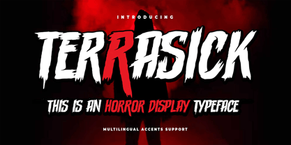 Hello Everyone, introduce our new product Font Terrasick is a Rough Brush Font.This is a Textured Natural Style and classy style with a clear style and dramatic movement. This font Terrasick is great for your next creative project such as logos, printed quotes, invitations, cards, product packaging, headers, Logotype, Letterhead, Poster, Design this font is great for your creative projects such as watermark on photography, and perfect for logos & branding. You can activate Alternate OpenType panel.
 - Side Note Variable by Jamie Clarke Type,
$199.00 Hello! I’m SideNote Variable. I specialize in: Annotations Headings Friendly dialogue Social media marketing Looking both smart & casual I’m perfect for descriptions and explanatory text. Use me to deliver tricky information in a helpful, reassuring manner. I look friendly and relaxed but professional enough to make you look awesome. I add personality to otherwise dry information making it fun and easier to understand. I come with all sorts of useful features, like emoji, arrows, and underlines.
 - Bristone by Almarkha Type,
$29.00 Hello Everyone, Introduce our new collection, Bristone – Expanded Sans Family famous logos of Technology and brands that have very strong characteristics, Bristone has 6 Fonts that allow you to get a job with satisfying results. very suitable for posters, t-shirt, packaging, branding, logotype and more. Bristone font with strong and challenging nuances. very suitable for the title, typography, clothes, Poster, magazines, brochures, packaging,Websites and much more for your design needs, making your designs more modern and professional
 - Michel Elisha Script by Fargun Studio,
$14.00 Michel Elisha Script! A new fresh and modern hand lettered font with decorative characters and a dancing baseline. So beautiful on invitation like handicraft, greeting cards, branding materials, business cards, quotes, posters, and more design concepts. Features : Unique ligatures Unique Alternates Stylistic sets Basic Latin A-Z and a-z Numbers International Symbols included Punctuation Please send a message if you have questions or problems, and don't hesitate to say hello on Instagram https://www.instagram.com/fargunstudio/ Thank you.
 - Pumpkin Magic by Anastasia Kuznetsova,
$16.00 Say hello to the "Pumpkin Magic" font! Funny font with bonus seamless patterns! The regular solid font version is also included for you. Great for sweet greeting cards and invitations, for playful branding and quotes, for unusual packaging and much more! This font is unique and simple :) Font Features • A-Z character set; • 1 language (English); • numbers and punctuation marks, symbols It is recommended to use it in Adobe Illustrator or Adobe Photoshop Made with love ♡
 - Al Boulevard Signature by Aluyeah Studio,
$125.00 Hello Aluyeaholics! Boulevard Signature, an exclusive handwritten signature font. Coming with 100+ stunning and super easy to use alternates and ligatures. Very suitable for your wedding invitation, packaging, apps, magazine, headline, website, ads and all type of design project you have. Super Easy to Use alternates - You can easily call alternates using special combination like a.2 k.3 b.4 t.h c.c etc. To get results like the preview just type Boul.4evard.3 Sig.4nature
 - Thealiens by Almarkha Type,
$25.00 Hello Everyone, introduce our new product Thealiens - Ligature Condensed Sans, inspired by the title of the sports poster and We make it very energetically, taking into account the thickness and density of each gliph, along with a ligature that makes this font look unique. Thealiens font with strong and challenging nuances. very suitable for the title, typography, clothes, Poster, magazines, brochures, packaging,Websites and much more for your design needs, making your designs more modern and professional.
 - Lundoon by Mazkicibe,
$11.00 Description Hello gaes! How are you guys ? I'm sure it's very good. Introducing, this is our newest product, we call this produc Lundoon Font.. Lundoon Font is Handwritten and modern font combined with a sweet touch and beautifully curved each letter. using a touch of soft curves so that it is pleasing to the eye Lundoon Font Spirit is great for: Wedding invitations, fashion magazines, logos, signatures, and suitable for watermark photography. Features: -Uppercase, -Lowercase, -Numeral, -Punctuation,
 - Choxr by Almarkha Type,
$29.00 Hello Everyone, ntroduce our new collection, Choxr Font is inspired by famous logos of shoes and brands that have very strong characteristics, Choxr has 4 styles that allow you to get a job with satisfying results. very suitable for posters, tshirt, packaging, branding, logotype and more. Choxr font with strong and challenging nuances. very suitable for the title, typography, clothes, Poster, magazines, brochures, packaging,Websites and much more for your design needs, making your designs more modern and professional
 - Sweet Girls by Haksen,
$12.00 Hello all, I will introduce my new font with the name “Sweet Girls” “Sweet Girls” is the form of letters that many variation and look very beautiful. available over than 50 glyphs for alternative letters that will make this font look so cute, funny, beautiful and fascinating. What's Included : Sweet Girls OTF Sweet Girls Slant OTF Sweet Girls Icons OTF Thanks so much for checking out my shop! Hope You enjoy it so much All the best, Haksen
 - Nieves by Anastasia Kuznetsova,
$17.00 Say hello to the freshly baked beautiful and neat vintage serif font! Amazing handwritten font Nieves :) The unusual, freshly baked font is perfect for greetings, illustrations, children's books, delicious packaging, labels, logos and much more :) This beautiful neat retro font with imperfect ink edges and slightly sloppy shading is inspired by nature. Eco-friendly fashion takes into account the health of consumers, the health of the planet. The font "Nieves" is perfectly combined with any stylized graphics, watercolors, and also looks great on its own within the framework of a minimalist design. Play with letters to get different effects. Font features: A-Z; character set a-z; 1 language (English); numbers and punctuation marks, symbols. A font containing uppercase and lowercase letters, numbers, and a wide range of punctuation marks. Fonts can be opened and used in any software that can read standard fonts, even in MS Word. It is recommended to use it in Adobe Illustrator or Adobe Photoshop. Made with love and magic ♡ Thank you for checking this out and feel free to write me a message if you have any questions! ~ Anastasia
 - Silver Raven by Ferry Ardana Putra,
$12.00 Hello there! We are introducing our new font - Silver Raven! This font is font created and inspired from the street writing of New York, and generated by creative hands of graffiti addictions. It has an incredibly unique design that can be perfect for a range of creative branding and packaging projects. Take your designs to the next level with this stunning font! You can apply this font to t-shirt designs, posters, covers, video thumbnails, merchandise, wall, and so on to make it look special. ——— Silver Raven features: A full set of uppercase and lowercase Numbers and punctuation Multilingual language support PUA Encoded Characters OpenType Features Layered Style +257 Total Glyphs Graffiti Swashes and Ornaments included! ——— Silver Raven Includes: Silver Raven (OTF/TTF) ——— ⚠️To enable the OpenType Stylistic alternates, you need a program that supports OpenType features such as Adobe Illustrator CS, Adobe InDesign & CorelDraw X6-X7, Microsoft Word 2010 or later versions. There are additional ways to access alternates/swashes, using Character Map (Windows), Nexus Font (Windows), Font Book (Mac) or a software program such as Pop Char (for Windows and Mac). ⚠️For more information about accessing alternative, you can see this link: http://adobe.ly/1m1fn4Y ———
 - Etnier by Ahmad Jamaludin,
$17.00 Introducing Etnier – A brand-new modern family with a unique! Etnier is a modern variable font. Essentially, it's a sans-serif font with a sturdy and squared appearance, ensuring excellent legibility. It offers various widths and italics that provide versatility for your designs. The bolder, the stronger – this defines Etnier. Its bold and robust qualities, especially in the italic version, make it ideal for UI/UX-related designs. In total, there are 14 font styles available, or even more if you use the single files variable. You have the flexibility to slide through the weight and width options to find the sweet spot for Etnier. shape! What's Included? Etnier Main File 14 fonts family with Weight and Oblique options Instructions (Access special characters in all apps, even in Cricut Design) Accessible in Adobe Illustrator, Adobe Photoshop, Microsoft Word even Canva! PUA Encoded Characters. Fully accessible without additional design software Language Support: Danish, English, Estonian, Filipino, Finnish, French, Friulian, Galician, German, Gusii, Indonesian, Irish, Italian, Luxembourgish, Norwegian Bokmål, Norwegian Nynorsk, Nyankole, Oromo, Portuguese, Romansh, Rombo, Spanish, Swedish, Swiss-German, Uzbek (Latin) Come and say hello over on Instagram! https://www.instagram.com/dharmas.studio/ Have a great day! Dharmas Studio
 - Shirelda Script by Picatype,
$12.00 Say hello to Shirelda Script - A contemporary calligraphy, with a vintage feel, style calligraphy with moving baseline and elegant touch. That makes the font look fabulous! Can be used for various purposes.such as headings, signature, logos, wedding invitation, t-shirt, letterhead, signage, lable, news, posters, badges etc. Shirelda Script features OpenType stylistic alternates, ligatures and International support for most Western Languages is included. To enable the OpenType Stylistic alternates, you need a program that supports OpenType features such as Adobe Illustrator CS, Adobe Indesign & CorelDraw X6-X7, Microsoft Word 2010 or later versions. How to access all alternative characters using Adobe Illustrator: https://www.youtube.com/watch?v=XzwjMkbB-wQ Shirelda Script is coded with PUA Unicode, which allows full access to all the extra characters without having special designing software. Mac users can use Font Book , and Windows users can use Character Map to view and copy any of the extra characters to paste into your favourite text editor/app. How to access all alternative characters, using Windows Character Map with Photoshop: https://www.youtube.com/watch?v=Go9vacoYmBw If you need help or have any questions, please let me know. I'm happy to help :) Thanks & Happy Designing!
 - White Rabbit - Unknown license

- ADD by Sea Types,
$20.00 A minimalist typography for short texts and individual words.
 - Dust Serif - Personal use only

- Advertisers Gothic by HiH,
$12.00 Advertisers Gothic is bold and brash, like the city it comes from, Chicago. It was designed by the accomplished German-American matrix engraver, Robert Wiebking, for the Western Type Foundry in 1917. As its name suggests, it was designed for commercial headliner work, much as Publicity Gothic by Sidney Gaunt for BB&S the year before. See our Publicity Headline. Alternate letters ‘A’ & ‘S’ are provided. The most popular ad words “Free!”, “New!” and “Sale” (with both esses) are provided at an angle for dramatic tension. Advertisers Gothic became quite popular because it was effective. It can work equally well for a flyer advertising a non-profit event as for a magazine product ad. This font refuses to be a wimp. Use it boldly. Advertisers Gothic ML represents a major extension of the original release, with the following changes: 1. A total of 335 glyphs (compare) with added glyphs for the 1250 Central Europe, the 1252 Turkish and the 1257 Baltic Code Pages. 2. Added OpenType GSUB layout features: pnum, ornm, liga, hist & salt ˜ with total 13 lookups. 3. Added 209 kerning pairs. 4. Revised vertical metrics for improved cross-platform line spacing. 5. The most popular ad words “Free!”, “New!” and “Sale” (with both esses) are provided at an angle for dramatic tension The zip package includes two versions of the font at no extra charge. There is an OTF version which is in Open PS (Post Script Type 1) format and a TTF version which is in Open TT (True Type)format. Use whichever works best for your applications.
 - Finalist Round Slab by Bülent Yüksel,
$19.00 The font was intended primarily to have a stronger body. It has a simple geometrical surface. This font has a strong personality, that makes it perfect for use in headline sizes but means it also works gracefully within text blocks. "Finalist Round Slab" is carefully crafted and a unique slab serif. Use for websites, print, motion graphics, logo design, packaging design, t-shirts and more. The designation “Finalist Round Slab Regular” forms the central point. The first figure of the number describes the stroke thickness: Thin to Black. "Finalist Round Slab" comes 7 weights and italics total 14 types. The family contains a set of 450+ characters. Case-Sensitive Forms, Classes and Features, Fractions, Superior, Inferior, Denominator, Numerator, Old Style Figures just one touch easy In all graphic programs. You can enjoy using it. UPDATES: - 30 December 2015 Opentype Feature (fractions) and some kerning. - 11 June 2018 Solving some UNICODE problems on the internet. - 12 March 2019 Some error has been fixed. - 19 November 2019 Some error has been fixed. - 16 August 2021 New Version - 2.0 Some error has been fixed.
 - Siseriff by Linotype,
$29.99 The Siseriff family of types contains nine different styles, which were developed by the master Swedish typographer Bo Berndal in 2002. Siseriff is a contemporary slab serif face. Except for the Siseriff Black weight, all of the letters display a slightly condensed appearance that is coupled with a relatively uniform width throughout the alphabet. Siseriff's nine styles are distributed across five weights (Light, Regular, Semi Bold, Bold and Black). The Italic companions for these styles (Siseriff Black does not have an italic companion) are true italics. These redrawn italics add a higher degree of differentiation from the Roman weights than could be achieved with obliques alone. Many common Slab Serif families (e.g., Serifa) do not offer this degree of differentiation. This variety makes Siseriff the perfect choice for journalistic and editorial work, where a good hierarchy may be achieved solely by relying on the various weights available, and their italics. All nine styles of the Siseriff family are part of the Take Type 5 collection from Linotype GmbH."
 - Stem by ParaType,
$40.00 The thing is that many sans-serif typefaces are usually intended for universal usage. But sometimes faces that work fine in body text look not so good in large point sizes for display purposes when all the contrast in non-contrast sans-serif, or ink traps, become visible to the naked eye. Every designer solves this problem in his own way. We offer a drastic solution in our Stem: a sans-serif with optical sizing. The first part of the type family, Stem Display, is for use in largest point sizes, from 36 pt indefinitely. Stem Display consists of 12 faces of widths from Hairline to Bold, and it has true italics. The development of Stem type family will include Stem Text for body text and “traditional”, universal use, and Stem Caption for small point sizes. Stem is a geometric sans-serif with semi-closed aperture, large x-height and modern proportions of uppercase letters, like in famous Avenir and Gotham. Its important feature is a professionally designed and carefully tested Cyrillic glyph set.
 - Ballet Mechanique by Characters Font Foundry,
$25.00 Ballet Mechanique is a custom designed font for musician Jeroen Borrenbergs, aka Ballet Mechanique. For his upcoming record releases Jeroen asked me to create a special font for him. As co-founder and graphic designer at Stoere Binken Design he creates his own artwork and therefor had very specific wishes. The font should be warm, soft and have soul. He gave me some sketches for his logo that I should use as a starting point. The result is a very narrow, kind of techno, monocased font called "Ballet Mechanique" (what else). After having served his purpose, Jeroen Borrenbergs allowed his font to be sold publicly. Jeroen Borrenberg’s debut work, in 1996, received hugely praising reviews. Muzik Magazine made Evolutionary Entities techno single of the month, Laurent Garnier and Mister C constantly played it in their sets and Morgan Geist just said “I won’t do a review here - let me just encourage all of y’all to listen to and/or pick up the new Eevolute 12″. Beautiful stuff - complex, melodic, soaked in just enough reverb to take it to another room. Check or regret.”
 - Maris by insigne,
$25.00 Maris is a rich, elegant script, subtly characterized by a whimsical handwritten calligraphy. The family is composed of six different weights, each one bolder than the last but all equally as filling. The lighter weights move delicately through each line, showing a gentle strength in their smaller frame. The six weights from these lighter forms to the bold include some textured versions such as jean, wood, print, rough and halftones. The Maris family performs superbly in custom headlines and logotypes. Turn on Swash, Stylistic or Contextual Alternates for even greater emphasis. Opentype lets you "auto-magically" swap out letter sets with alternate versions and creates the visual diversity that gives you the one-of-a-kind look of custom lettering. It also uses OpenType features to assist with letter flow. When you choose to make use of its open-type decorative glyphs, your headlines will dazzle. For the greatest benefit, grab the entire Maris family. Thanks to its variety of styles, Maris makes it easier for you to design. With this large font family, solve your design problem with just one typeface.
 - PAG Sottoterra by Prop-a-ganda,
$19.99Prop-a-ganda offers retro-flavored fonts inspired by lettering on retro propaganda posters, retro advertising posters, retro packages all the world over. This is perfect font for your retrospective project. PAG Sottoterra is heavy and high-contrast font, and you can see triangles in some letters. This font reminds us of old posters of science fiction movie. It works best for for display or titling. - Captura Now by TypeThis!Studio,
$54.00 Carefully refined shapes and sensitively balanced spacing and kerning create the gentle rythm that grants Captura Now its warm-hearted face, perfect in form and shape. Expanded with an enormous character set, Captura Now offers the freedom to transform your design into the Cyrillic-language world, as well as into any Latin based language — including Vietnamese. *Variable fonts work well in software that supports variable font technology.
 - Ad Lib by Image Club,
$29.99Ad Lib designed by Freeman Craw for the American Type Founders (ATF) in 1961. A bold Grotesque with irregular rectangular counters in round characters. This type was designed by cutting the letter images out and thus has some wood-cut character. Some lower case characters have slight inclination. Initially numerous alternative characters were provided. Unusual shapes make this typeface useful for advertising and display work. - PAG October by Prop-a-ganda,
$19.99Prop-a-ganda offers retro-flavored fonts inspired by lettering on retro propaganda posters, retro advertising posters, retro packages all the world over. This is perfect font for your retrospective project. PAG October, there is a extremely strong transition of line wight, it is eye-catching and unique. This is a retrospective font with friendly and cute look which works well for your posters, packages, and logos. - Strange Alphabets by Typodermic,
$11.95 Come one, come all, and see the beauty of Strange Alphabets. Inspired by the gilded book covers of the late 1800s and the iconic Siouxsie & the Banshees band logo of the early 1980s, this narrow Arts & Crafts typeface will transport you to another world. In OpenType savvy applications, the first and last letter of a word will receive a small diamond ornament, giving your words a touch of elegance. And if that’s not enough for you, words starting with M will have a single diamond that splits into three, while words starting with O will automatically use a tall O. But, if you want to force a tall O in the middle of a word, simply use a zero. Oolong lovers, rejoice! Words that begin with double O’s will receive a pair of tall O’s, while a pair of O’s in the middle or at the end of a word will be replaced by a linked ring ligature. But that’s not all! Accessing OpenType stylistic alternates allows you to change the A and H crossbars into small rings and remove all the diamonds from the M. And don’t forget about the hyphen, en dash, and em dash, which are replaced with ring ornaments. And if you’re feeling extra fancy, a separate diamond ornament ◆ is included under Unicode 25C6. Don’t let all these fancy features intimidate you. Play with your application’s OpenType features and see what happens. And if you want to disable the automatic OpenType substitutions, simply turn off your application’s standard ligatures feature. Experience the beauty of Strange Alphabets for yourself and let your words take on a life of their own. Most Latin-based European writing systems are supported, including the following languages. Afaan Oromo, Afar, Afrikaans, Albanian, Alsatian, Aromanian, Aymara, Bashkir (Latin), Basque, Belarusian (Latin), Bemba, Bikol, Bosnian, Breton, Cape Verdean, Creole, Catalan, Cebuano, Chamorro, Chavacano, Chichewa, Crimean Tatar (Latin), Croatian, Czech, Danish, Dawan, Dholuo, Dutch, English, Estonian, Faroese, Fijian, Filipino, Finnish, French, Frisian, Friulian, Gagauz (Latin), Galician, Ganda, Genoese, German, Greenlandic, Guadeloupean Creole, Haitian Creole, Hawaiian, Hiligaynon, Hungarian, Icelandic, Ilocano, Indonesian, Irish, Italian, Jamaican, Kaqchikel, Karakalpak (Latin), Kashubian, Kikongo, Kinyarwanda, Kirundi, Kurdish (Latin), Latvian, Lithuanian, Lombard, Low Saxon, Luxembourgish, Maasai, Makhuwa, Malay, Maltese, Māori, Moldovan, Montenegrin, Ndebele, Neapolitan, Norwegian, Novial, Occitan, Ossetian (Latin), Papiamento, Piedmontese, Polish, Portuguese, Quechua, Rarotongan, Romanian, Romansh, Sami, Sango, Saramaccan, Sardinian, Scottish Gaelic, Serbian (Latin), Shona, Sicilian, Silesian, Slovak, Slovenian, Somali, Sorbian, Sotho, Spanish, Swahili, Swazi, Swedish, Tagalog, Tahitian, Tetum, Tongan, Tshiluba, Tsonga, Tswana, Tumbuka, Turkish, Turkmen (Latin), Tuvaluan, Uzbek (Latin), Venetian, Vepsian, Võro, Walloon, Waray-Waray, Wayuu, Welsh, Wolof, Xhosa, Yapese, Zapotec Zulu and Zuni.
 - Caviar Dreams - 100% free

- Monotone - Unknown license

- Phoenica Std Mono by preussTYPE,
$29.00 Phoenica Std Mono expands the already large family of my very successful Phoenica. The motivation to develop a new mono-Phoenica family was that I was not satisfied with monospaced fonts in programming code, or simply in e-mail correspondence. The Mono Phoenica solves the problem of a typical monospaced font, a rigid, fixed width. The design gradations from Condensed monospaced to monospaced from 390em to 600em-square incurred a total of 21 fonts. Packages contain the fonts in CFF-OpenType and TrueType format, so you can use these beautiful fonts on all operating systems.
 - RF Barbariska by Russian Fonts,
$19.00 Handcrafted typeface with a friendly character. Two weights in three styles. Weights: Regular and Oblique. Styles: normal, rough1, rough2. Weight and shape of the letters allows using the font to solve any graphical problems. Package design for food or cosmetic products. Posters or music cover. Logos. Prints on sweatshirts or t-shirts. Children’s books or comics. Barbariska could be used in all sorts of projects. Features: ligatures, contextual alternates, old style numbers, fina and init for capitals letters. Support: cyrillic, cyrillic extended, latin, latin extended (Western European, Central European, South-East).
 - Sign Letters JNL by Jeff Levine,
$29.00 A few scant examples of some condensed Roman style water-applied decals inspired Sign Letters JNL. The decals were once part of the gold and black "Signmaker" letters and numbers once manufactured by the Duro Decal Company of Chicago and were sold through hardware and variety stores across the country. The condensed letters (which were eight inches in height) did not sell as well as Duro's mainstay sizes of 1/2 inch to 3-1/2 inches and were discontinued long before the rest of the line was supplanted by self-adhesive lettering.
 - Turkuaz by Fontop,
$10.00 Welcome my new typeface family Turkuaz. Funny and stylish, creative and distinctive Turkuaz is great in headlines, premiums and web sites + blogs. Being a super readable it can be used in texts as well. Three fonts are included into the family – Turkuaz Regular, Turkuaz Deco and Turkuaz Italic. Special ligatures that you can switch on/switch off make headlines and texts sooo cute, I love them! Both OTF and TTF are included for each font. Fonts are Latin multilingual and have uppercase letters, lowercase letters, numbers and basic punctuations.
 - Solitas Contrast by insigne,
$39.00 This sleek, high contrast typeface means business, but it looks great on any project, no matter how big or small. Solitas Contrast was developed because existing high contrast sans options were neither modern nor crisp. This design challenge was solved through a series of typefaces: the original low-contrast Solitas, its serifed cousins, and now a high contrast sans—each carefully considered for an organic and free flowing look. It evokes a Dutch or european feel. Solitas Contrast is a modern, clean sans-serif with a distinctive style and impact.
 - Autobats by Canada Type,
$24.95 Autobats is a set of over 100 different car and truck icons, minimal silhouettes that can be adapted to whatever context your design flings at them. The mystery of why this font has been so popular was solved when one of our customers said, “I always use this thing, because the name starts with A, so it’s one of the first fonts I see in my slap-a-logo collection”. To see all the icons available, a glyph palette would be come in handy while using the font. Honk if you like convenience. Beep beep!
 - School Project JNL by Jeff Levine,
$29.00 A set of self-adhesive poster board letters once made by the E-Z Letter Stencil Company and sold under the name "Quik Stik" was the model for School Project JNL. Ironically, the line was discontinued because they did not stick very well - the weight of the cardboard caused the letters (which used a rubber cement type of glue) to pull away from the surface they were mounted to. Unlike vinyl self-adhesive letters (which were formulated for indoor or outdoor use) these cardboard sets were relegated to indoors only; further restricting their usability.
 - Spinnenkop by Hanoded,
$15.00 Spinnenkop is an old Dutch word which means both ‘spider’ and (in dialect) cobweb. The word forms the basis for that English word: cobweb. Spinnenkop is a magical font. I didn’t use witchcraft to create it, but when it was finished, it reminded me of old fairytales, spell-books and potion recipes. Use it for anything you like, but book covers, product packaging and posters come to mind. Comes with a few swashed letters and a weird alternate g.


