10,000 search results
(0.022 seconds)
- Mainframe BB - Personal use only

- Lost Forever - Unknown license

- rhino dino - Unknown license

- StandingRoomOnly - Unknown license

- Liquidy Bulbous - Unknown license

- Kimberley - Unknown license

- Kicking Limos - Unknown license

- Nixon - Unknown license

- Nicotine Stains - Unknown license

- Pupcat - Unknown license

- Linear Curve Fatty - Unknown license

- Shazbot - Unknown license

- DS Thompson - Unknown license

- Black Eye Nue - Unknown license

- Bandwidth BRK - Unknown license

- LED - Unknown license

- Strasua - Unknown license

- Sergeant SixPack - Personal use only

- Fatboy Slim BLTC 2 BRK - 100% free

- GiantTigers - Unknown license

- Lounge Bait - Personal use only

- Chibaraki Now - Unknown license

- Eight Track program 4 - Personal use only

- Family Guy - Unknown license

- LetterOMatic! - Personal use only

- Kremlin Kourier II - Unknown license

- TeamSpirit - 100% free

- Nature Boy by Adorae Types,
$20.00 Nature Boy was born in a fantasy world of old, where you can find magic, elegance, dreams and fun all together... just like nature in its purest form with its leafy curves and shapes that make it peacefully enjoyable. Soft and simple yet fairly ornamental, attributes that create an enchanting atmosphere but keep the texts legible at the same time when combined. Nature Boy can bring life and magic to every design, from editorial to posters, brands and packagings. Just picture this font on any product intended to move your soul and take you on a journey into a different and most beautiful place and time and let the adventure begin. This font family is made up of optically corrected regular, italic and bold types. All of them contain functional ligatures with alternative glyphs for texts and words to be dynamical and fluently graphed.
 - RAN by URW Type Foundry,
$35.99 RAN Reformed Typeface for Beginners by Georg Salden - a headstrong and courageous approach to an improved handling of handwriting. Diverse and sometimes irreconcilable theories exist about how beginners are supposed to learn writing and reading. This has led to fierce discussions among experts already. We don’t want to pour more oil on the fire, but hope to create a new awareness for this topic, which is important to everyone of us. For beginners the combination of single characters (sounds) to whole words is essential during the acquirement of reading and writing. In this process they develop the skill to recall entire terms from memory. Therefore, after current practice, every word shall be written in a single stroke without lifting the pen in between. Georg Salden contradicts this postulate and warns, that coercively holding the pen down within a word can easily lead to exaggerated loop formations and a general meandering of the written text. The intellectual process in connecting single sounds to words while writing would happen anyway and the prohibition to lift the pen would often lead to tensions. To still support the necessary connections in general and to simplify the connecting, he teaches to write all round letters like a, e, g, o with inclusion of the connecting stroke, so that the spacing and combining with the next character arise by themselves. By settling the stroke at certain points and with a clear and logical writing method, a conscious and careful contact with the various strokes arises. All this automatically leads, together with a certain deceleration, to an increase of beauty and readability in the handwriting. The repeatedly discussed topic »connected or unconnected« appears to be solved in the most comfortable way as, depending on the particular character combination, both solutions are possible.
 - Hebrew Modern by Samtype,
$49.00 This is a classic design from the beginning of the 20th century. This font can be used in many kinds of books
 - Saint Regus by Sonar Hubermann,
$22.00 The story begin from Condensed, Standard & Expanded style. Saint Regus built and designed with a super family typeface in mind. Its still growing and growing by uniquely bold charismatic persona. The family itself have total 8148 glyphs with a standard glyphs and multilingual context.The possibilities are have a huge prospect in various design project, digital and print. Saint Regus development tried to explore the impact by its proportional display form. The project started from a Standard weights (Roman) and then it become a big families with 21 styles that you can use for a large design assets in any kind of design works.
 - Ritz Slab Serif JNL by Jeff Levine,
$29.00 Ritz Slab Serif JNL is a bold display face which shares a lot of similar design traits to Stymie and other similar metal type of the 1930s and 1940s, but in actuality was modeled from only four letters. On the sheet music for the 1937 song "Sweet Varsity Sue" [from the 20th Century Fox Film "Life Begins in College"], there is a picture of the Ritz Brothers - a popular comedy team from 1925 through the late 1960s. The hand lettered name "Ritz" became the basis for Ritz Slab Serif JNL, which is available in both regular and oblique versions.
 - Original Taste by Arttype7,
$12.00 I hope you are very happy today. we want to introduce our newest font, which we named `` Original Taste font ''. This font is a very bold bold cript font and has cool alternets and swashes. original taste font. This font has a taste, old, modern and unique.
 - Fugel by Attype Studio,
$15.00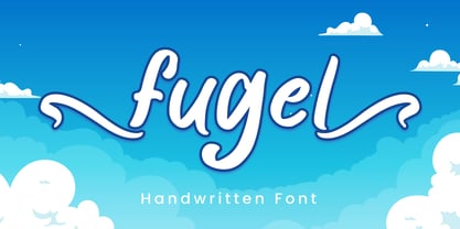 Fugel is a delicate and incredibly distinct handwritten font with beginning & ending swashes. Fall in love with its incredibly versatile style and use it to create spectacular designs! Fugel is perfect for branding, logo, invitation, stationery, social media post, product packaging, merchandise, blog design, game titles, cute style design, Book/Cover Title and more. What's Included : - Fugel.otf - Beginning & Ending Swash - Multilingual Support --- Hope you enjoy with our font! Attype Studio
 - Eagle by Font Bureau,
$40.00 The Eagle series realizes the ideas behind Morris Fuller Benton’s famous titling face, Eagle Bold, which was drawn in 1933 for the National Recovery Administration and became the symbol of American recovery. Font Bureau’s Eagle was started in 1989 for Publish magazine. David Berlow designed a lowercase, finished the character set, and in 1990 added Eagle Book for setting text. In 1994, Jonathan Corum added Eagle Light and Eagle Black to form a full series; FB 1989–94
 - Wagnesday by Arterfak Project,
$19.00 don't think you're alone, watch your behind "Wagnesday" is a thriller-horror styled font, inspired by thriller movies and designed with an elegant touch of horror, and thrilling. This all-caps font adds a dark vibe to your designs, making them more attention-grabbing. With its bold and sharp font style, Wagnesday can be applied to various themes, including underground, gothic, sports, and even vintage designs. Wagnesday becomes even more versatile with the addition of stylistic alternates.
 - Easton by Typemotion,
$15.00 I wanted to combine a classical antiqua with corners and edges. I was convinced this combination would create a new, a fresh design of types. At the beginning I used the forms from "Goudy Old Style", later I modified the sizes, the widths of the letters, the x-height and their forms in general. At the moment the Easton Family consists of 3 styles called Easton Serif, Easton Semiserif and Easton Sans.
 - Mrs Green by Hipopotam Studio,
$2.00 Mrs Green is a great typeface for short texts, invitations, headlines, logotypes and advertising. We’ve started with a heavy capital G and A. At the beginning it was supposed to be just one fat style (still our favorite). But after a few months we’ve ended up with a family of 20 styles. It has contextual alternates, fractions, four types of figures (old style, lining, superior and inferior), ordinals and a case feature.
 - Bethlehem Star by HiH,
$10.00 For much of the world, the last half of December encompasses the beginning of winter and the a season of gift-giving, marked by Hanukkah and Christmas. It is generally accepted that the tradition of giving of gifts at this time was begun by The Three Wisemen. As described in The Gospel According to Matthew, the wisemen, led by a star from a distant land to the east, found the baby Jesus. First, they worshipped him and then, "they presented him with gifts: gold, frankincense and myrrh." (Matthew 2:11). Thus began the tradition of celebrating the birth of Christ with the giving of gifts. There is a parallel tradition in the Jewish faith of the giving of gelt or gold at Hanakkuh to help support poor students, in keeping with the rich history of scholarship that is fundamental to the rabbinic system. Inevitably, in our secular culture, there has been a blending and a secularization of these traditions. The reasons have gotton lost in the “gimme.” What is often overlooked is what Paul realized when he told Timothy, “Neglect not the gift that is in thee.” The most importent gift is the gift inside of us, the gift of sacrificial love for others. When we let that gift be diminished in our minds amid the clutter of modern day material seeking, we can recall the prophesy of Micah over 2800 years ago, But thou, Bethlehem Ephratah, though thou be little among the thousands of Judah, yet out of thee shall he come forth unto me that is to be ruler in Israel: whose goings forth have been from of old, from everlasting." (Micah 5:2 KJV) Never underestimate the impact you have on others. Words of kindness can change people’s lives. The Talmud says that the highest form of wisdom is kindness. Be wise this holiday season. The font BETHLEHEM STAR was originally designed for the church to which I belong, The Star Bethlehem Church of Ansonia, Connecticut, USA and is based on the typeface Accent with the permission of URW++ of Hamburg, Germany. You might choose BETHLEHEM STAR for your personal greetings as well as for flyers and programs at your church this holiday season. Like most display fonts, it is most effective at 18 points and larger. Like most script fonts, it is most effective when set with both upper and lower case. All caps with this font is like eating two pieces of pecan pie — too much of a good thing.
 - American Oak by Ian Barnard,
$15.00 I've always been drawn to the beautiful typography of whiskey, gin, rum & bourbon bottle labels, as they enhanced the history that is behind this aged old spirits. A combination of elegant scripts and rugged serifs, these labels give sensibility to the slow process which these spirits go through in the distilling process.


