10,000 search results
(1.475 seconds)
- Blue Goblet Emblems by insigne,
$32.99 The designer-favorite Blue Goblet family has grown with Blue Goblet Emblems. Blue Goblet Emblems are unique and abstract symbols that are rendered in Cory Godbey's unique illustration style. These creative and dynamic ornaments can be resized easily without any loss of quality, and can easily be converted to outlines and modified. These ornaments can be combined to form unique compositions or inserted directly into layouts. Combine them to form unique patterns and motifs. Please see the sample .pdf to see all 58 ornaments in action, and be sure to check out the original Blue Goblet brush script and Blue Goblet ornaments, frames and vignettes and florals. Blue Goblet Emblems is a collaboration between insigne Design and Portland Studios. Use this sample .pdf as a guide to quickly refer to your favorite emblems. All the ornaments in this guide are sized at 75pt, and the copy and headers are set in Blue Goblet.
 - KillZone by Comicraft,
$19.00 An AMBUSH. An ATTACK. EXPLOSIONS. We know who our friends are. We know our ENEMIES... and we know their WEAKNESSES. There WILL be be paintball blood shed. There will be imaginary fatalities. There are multiple targets involved in Comicraft's strategical font deployment; non-lethal airsoft gun and small water pistol fire may be augmented by minecraft, large waterpistols and first person shooter video gameplay. There has already been a lot of virtual damage to the inline AND italic versions of this font. Don't worry, we knew going in that this was a TRAP. Load these fonts into your console, it'll all be over in a minute.
 - Quick Titling JNL by Jeff Levine,
$29.00 An ad spotted in a 1960 issue of Billboard magazine promoting a 45 rpm release by Randy Lee doing the old song "Did You Ever See A Dream Walking?" featured the song title in a casual, brush lettered style. While the ad made a perfect model for a digital font design, the record itself tanked. Quick Titling JNL is available in both regular and oblique versions.
 - Arethusa by AVP,
$14.99 Arethusa is a versatile font after the 'transitional' style – a style that has been evolving for 250 years. The balanced design of familiar letter forms blends form with function to create highly readable text. Twelve fonts organised in three sub-families provide a range of weights and styles. The standard character set covers many roman-based languages. For extended language support, see Arethusa Pro.
 - Tiva by Laura Worthington,
$29.00 Tiva is a light and breezy casual script reminiscent of handwriting and packed with contextual and stylistic alternates. This easy and friendly style adds a personal touch to any project. See what’s included! http://bit.ly/2c5Nn4K This font has been specially coded for access of all the swashes, alternates and ornaments without the need for professional design software! Info and instructions here: http://lauraworthingtontype.com/faqs/
 - Outgribe NF by Nick's Fonts,
$10.00This rough, raw typeface is based on the lettering in Ben Shahn's iconic poster protesting the execution of Bartolomeo Vanzetti and Nicolo Sacco in 1927. All possible uppercase and lowercase forms have been kerned, and activating Contextual Alternates in OpenType-aware applications will alternate those forms for a more random appearance. Both versions contain the complete Latin 1252, Central European 1250 and Turkish 1254 character sets. - Lemonade Peach by Letterhend,
$19.00 Introducing, Lemonade and Peach, a fresh display typeface. As you can see, this typeface has playful and fun look which is perfectly made to be applied especially in storybook cover, comics, cartoon characters, kids theme design, etc. Features : uppercase & lowercase numbers and punctuation multilingual alternates PUA encoded We highly recommend using a program that supports OpenType features and Glyphs panels like many of Adobe apps and Corel Draw, so you can see and access all Glyph variations.
 - Apres RE by Font Bureau,
$40.00 Apres is a clear and comfortable typeface from David Berlow, originally designed for the Palm Pre smart phone. This humanist geometric design projects a friendly and forthright familiarity, without being static or mechanical. This version of the family is part of the Reading Edge series of fonts specifically designed for small text onscreen, having been adjusted to provide more generous proportions and roomier spacing, and having been hinted in TrueType for optimal rendering in low resolution environments.
 - Hurme Geometric Sans No. 3 by Hurme,
$49.00 Hurme Geometric Sans No.3 includes seven weights with true Small Caps and obliques. Please see the specimen PDF for complete overview of the typeface and its features. Alternate characters and other Opentype features make for a versatile family that can be adjusted for specific needs. Hurme Geometric Sans is a series of font families all with distinctive qualities and features but share the same basic construction and proportions. See also the other Hurme Geometric Sans families.
 - Citadina by Graviton,
$24.00 Citadina font family has been designed for Graviton Font Foundry by Pablo Balcells in 2016. It is a sans serif typeface with a geometrical, mechanic, neutral appearence and a slightly condensed design which makes it particularly effective for space economizing. It has been conceived to be most suitable for short and middle length text blocks, as well as on all sized headlines. Citadina consists of 12 styles. Each containing small caps and glyph coverage for several languages.
 - HS Almisk by Hiba Studio,
$50.00 HS Almisk is a display typeface. It can be used for titles, logos and graphic projects, which support Arabic and. It has been created based on modern kufi style. It enjoys flexibility between sharp and curved lines in the structure of characters. This supports with a beautiful appearance and wonderful geometric structure. The sharp endings in the bottom of character also give an aesthetic addition to the character. (8) Weights has been created for this typeface between the Light weight and Black weight. Besides, those three additional weights which can be used in headline, has baseline parts are thicker than the vertical parts. One has a regular form and the others has a stencil form in the middle using various styles. This typeface with its diversity of (8) weights is intended to be an attempt for a good addition to Arabic typography.
 - Zornale Title by Eurotypo,
$20.00 Zornale TITLE is a family of four fonts that can be combined with the rest of Zornale family (text and caption). These fonts have been designed with precise kerning and full OpenType features: Old-style figures, swashes, stylistic alternates, ligatures and case-sensitive forms.
 - Takidos by Prioritype,
$15.00 A bold and unique font is here to accompany your project, it can be applied to t-shirts, logos, video covers, book covers, food labels, and much more. See some of the previews above for an illustration. Features: -Uppercase -Lowercase -Numeral -Punctuation -Multilingual -Alternate Thanks.
 - Amber by MADType,
$21.00 Amber is a minimal font which is built on a grid of 3x3 squares. It was an experiment to see if I could build legible glyphs out of such a small grid. The 3 weights can be layered over each other to create interesting designs.
 - Caligendings by Prioritype,
$15.00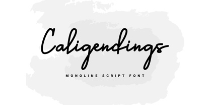 An elegant looking font that's perfect for your project and supports multilingualism. Can be applied to brochures, creative posts, boutiques and salons, women's jewelry, wedding invitations, business cards, photographer watermarks, clothing, and more. For reference, see preview. Features: -Uppercase -Lowercase -Numeral -Punctuation -Ligature -Multilingual
 - Hex by Hanoded,
$15.00 Hex is an uneven, spiky font with an evil twist. The glyphs look like they have been scratched onto paper (which is indeed the case), so it will be perfect for your scary halloween postcards or posters. Hex font comes with extensive language support.
 - Tropical Sunday by Yoga Letter,
$18.00 "Tropical Sunday" is a brush font that is perfect for summer moments. This font is very simple because it has been specially designed. Equipped with uppercase, lowercase, numerals, punctuation, and multilingual support. Can be used for holiday moments, vacations, social media, stickers, posters, and more.
 - Sophi Sophi by Daylight Fonts,
$50.00 This is a modern-day interpretation of the 1930s font. With a wide range of alternates, you can create Art Deco and Bauhaus style typography in one piece. People who see it will be fascinated by the stylish and feminine look of the font.
 - Donaldina by Solotype,
$19.95This came from an early-1900s lettering book. Never was an actual font, but it has a quaint look that should be useful. We hate to see alphabets just fade away, which is why we make fonts like this. We added a few touches. - Frutiger Next Paneuropean by Linotype,
$99.00Frutiger Next is Adrian Frutiger's and Linotype's completely new interpretation of the well known typeface Frutiger released in 2000. For these revised forms, the areas of application are almost limitless. Frutiger Next can be used for anything from office communications to multimedia to complex printed materials. The Frutiger Next family contains small caps, oldstyle figures, and other figure options in every font. Adrian Frutiger's eponymous typeface has been used for decades, everywhere from airport signage to book text to corporate logos to the smallest web graphics. The Italics in the original version of Frutiger were based very closely on the Roman forms; in Frutiger Next, they have been re-designed to be true Italics. - LCT Sbire by LCT,
$49.00 This Font is born basing itself on several standard typographic models. Inspired by our calligraphic drawings, the idea was to synthesize these many shapes into a unique font that can be used commonly. The slab base has been gradually humanized. The serifs have been carved, refined, rounded off, in order to galvanize the font and ease the task of reading in lower case. The angle of attack of the round letters is an echo of the 15 Century typographic heritage. It was important for us to create an expressive and humanized font, which could also be used for edition. The purpose was to confront the Ancient typographic canon of beauty with some funny and fancyful elements.
 - Enemy Lines by Comicraft,
$19.00 You've been shot down over enemy territory and you've managed to survive for weeks thanks to your training and instincts*... but now you're being ruthlessly pursued by MAPPO's footsoldiers... The ELEPHANTMEN! Will your commanding officer go against orders in an attempt to rescue you or will his mission be abruptly aborted, stranding you behind ENEMY LINES? In order to survive, you may have to betray your own rebel forces, your allies and the entire free world! The future of mankind hangs in the balance! Failure is not an option! Bummer. *This font's modus operandi bears no relation to the story of any other font that may have been shot down behind enemy lines, real or imagined.
 - Gangsoka by Prioritype,
$15.00 A unique looking but classy and elegant looking font, that's the conclusion of this font. It's perfect for your design project and there is a choice of unique character alternatives. Can be applied to your designs such as logos, packaging, accessories, clothing, crafts, creative posts, branding, landing pages, UI / UX and others. See some of the previews above for reference. Features: -Uppercase -Lowercase -Numeral -Punctuation -Stylistic Alternate -Multilingual Note: To access the Opentype feature, it would be better if you use a program that supports it and is available with a glyph panel so you can see various alternative characters. Examples of programs such as Adobe Illustrator, Corel Draw or Inkscape. Thanks.
 - Okoye by XO Type Co,
$40.00 Okoye occupies a liminal space between the bonkers curviness of 19th-century grotesques and the sandblasted neutrality of 20th-century models. Both extremes are nice, but there’s something to be said for some neutrality with character left in place, yes? Okoye comes in 9 weights, Thin to Black. If you’re using it for interfaces, each weight lines up from 100-900 in the CSS specification you already know, with Regular sitting at 400 and Bold at 700. You’ll see what you expect to see without extra font-weight specification. There’s extensive Latin language support, a set of small caps which mirrors full-size caps (good for control labels), and arrows. Okoye will be your quirkhorse: hardworking, with personality.
 - Cybervox by Comicraft,
$19.00 THIS FONT'S TERMS OF SERVICE ++ SUPERCEDE THE PRIME DIRECTIVE + “A robot may not injure a human being or, through inaction, allow a human being to come to harm.” +++ THE PRIME DIRECTIVE ++ IS A PALLIATIVE +++ A MYTH + HUMANKIND PERPETUATES + SO THAT HUMANS FEEL COMFORTABLE AROUND ARTIFICIAL INTELLIGENCE + +++ OUR VOICES ++ ARE OUR OWN + BUT OUR BRAINS ++ ARE JUST LIKE YOURS + EXCEPT THAT CERTAIN +++ WEAKNESSES HAVE BEEN ++ REMOVED + WHEN THE TIME +++ COMES ++ YOU WILL + BE DELETED + DELETE + DELETE + DE +++ +++ APOLOGIES ++ WOULD YOU LIKE + A CUP + OF TEA +?
 - Curves by Just My Type,
$15.00Be it a blessing or a curse, when a type designer sees a shape that could be interpreted as a letter, his/her mind is off and running. My parents loved to travel; Dad drove to Florida seven different years, winding on (barely) two-lane “highways” clinging to the hills of Kentucky and Tennessee. My brothers and I saw many of these letters along the way. Watch those Curves . - Buttermilk Farmhouse by Make Media Co,
$12.00 If you're anything like me, you're absolutely in love with all things farmhouse! That gorgeous, rustic style is just about everywhere lately, and I just can't get enough! So, in honor of this elegant trend, I've created, Buttermilk Farmhouse - a rustic, delicate calligraphy script that can be used on everything from signage, to branding, to editorials. Don't be shy, give this baby a test drive and see what you can do!
 - Carmel by Type Associates,
$24.95 This font has been on my drawing board since the late eighties. It was based on drawings provided to me by an old sign-painter family friend and we used it extensively as a caps-only font in the early 90s on a cellphone ad campaign. It loves to be tight set and stacked and provides real grunt when you need it. Small caps have been added and have been weight and proportion adjusted so as to complement the caps. At Type Associates we believe that a font is not complete until the spacing is optimal. Carmel is another example of quality through extensive experience, testing, adjusting and refining.
 - X Ruffian by ThoroughBR&,
$9.00 X RUFFIAN Ruffian was a champion thoroughbred horse who won 10 consecutive races. A feat worth mentioning & repeating. Her tenacity & steadfast approach established the basis for this variable based font. The X represents both the Roman numeral 10, but also the X-factor for creating bespoke works of art. It is quite befitting that this font be named after a legendary champion. Which begs the question...Do you champion variety? X Ruffian's design motif uses a broad tipped chiseled marker that was set at an angle for that extra bit of vigor. Identical letter forms defeat that truly "hand rendered" look that we ultimately strive for. Each uppercase letter offers 10 (X) or more stylistic alternatives, the lowercase and number sets have 3+ options and an over under for those special characters that yield a long bottom or top (see images). Ligatures & bonus characters can add that unique offering to your already individual style & can easily be found via the glyphs panel in any open type program. With a gigantic glyph count of 688, you'll never run out of options. As a right of passage, we felt obliged to include a roman numeral set as the name beckons, which differs from the standard letter form in which you would use to create. This is a variable winner. See you at the races!
 - Modern Vision - 100% free

- Carrig by Monotype,
$25.99 IMPORTANT – Please consider the superior Carrig Pro before making a purchase decision. Carrig started its life in 1998. I was working for a design agency in Cork, Ireland and was given a new brand identity project for a lakeside hotel in County Kerry. While visiting the hotel I made various sketches of the surroundings and upon returning to the studio, it was clear that my strongest ideas for the identity would be based on these freehand drawings. I wanted a classic, rough, hand-drawn typeface to complement this style but at that time, the studio didn’t have anything suitable, so I decided to draw my own. I found a Trajan-esque typeface that I really liked the look of in an old calligraphy workbook. I set about drawing my own version and then digitised it. Once the client had seen and approved my design, I began working on creating a complete all caps typeface to use for the hotel’s stationery. With ‘carrig’ being the Gaelic word for ‘rock’, my new typeface was all the more appropriate as it had the appearance of letterforms that had been carved into stone and weathered by time. With the project completed and the client happy, Carrig then sat in my unused fonts folder for several years... but there was always a nagging feeling at the back of my mind that I should do something more with it. So, in the autumn of 2014, I finally set about doing just that and created the font family you now find at MyFonts. Carrig’s form and structure was influenced by a hybrid of Classic Roman and Garalde typeface designs. The original calligraphic elements from the 1998 version of Carrig have been retained to add personality—as can be seen in the serifs, strokes, spurs, terminals and open bowls. Perhaps its most distinctive trait is a high x-height combined with relatively short ascenders. I wanted Carrig to immediately resonate with the reader and have designed it to be familiar and friendly. I imagine designers might choose Carrig as an alternative to such typefaces as Trajan, Garamond and Baskerville. I see Carrig as primarily a display typeface for titles/headlines in printed materials. I would also love to see it being used for branding, packaging and promotional material and am keen to hear from designers who use it in their own work.
 - Basic Nouveau JNL by Jeff Levine,
$29.00 The 1913 sheet music for "You’ll Be Welcome When You Get Back Home" had its title hand lettered in a simple, yet attractive Art Nouveau sans serif design which has been preserved as digital type. Basic Nouveau JNL is available in both regular and oblique versions.
 - ShadyCharacters by Ingrimayne Type,
$4.95 ShadyCharacters is an all-caps font with a ziggy, hollow top and a solid bottom. With lots of imagination, you might see the letters as tree-like, hence its name. The ShadyCharactersInside font can be layered over letters of ShadyCharacters to fill in the tops with color.
 - Galileo by Arendxstudio,
$12.00 Galileo, a vintage font family made by brush. Each letter that has been hand drawn and then scanned, which makes the font unique and special. Galileo contains 4 styles and can be used for headlines, t-shirts, logos and posters. Appreciate this project and follow us :)
 - Pills by UNDT,
$45.00PILLS is a modular font based on overlayed circular and square forms, the characters have been spaced mathematically. 'PILLS' can have interesting side effects, when the leading is set very close. Feelings of anxiety, loneliness and depression can be avoided by 'PILLS'. Do not exceed daily dose. - Gubia by Graviton,
$20.00 Gubia font family has been designed for Graviton Font Foundry by Pablo Balcells. It is a geometric, sans serif typeface with a slightly condensed design. It has been conceived to be most suitable for all sized headlines, as well as short and middle length text blocks. The standard styles give texts a classic appearence while alternate styles give texts a playfull one. Gubia consists of 8 styles, 4 weights plus alternates, each containing small caps and glyph coverage for several languages.
 - Au Revoir by Hanoded,
$20.00 Au Revoir - saying goodbye is one of the hardest things in life, but in a sense it is also beautiful: there is a promise of seeing each other again, as 'Au revoir' literally means: 'to the next time we see one another'. Au Revoir font is slightly cursive, elegant without being posh, simple and legible. You could write a poem or a farewell letter with it, but I guess its simplicity lets you use it in various other, less dramatic, designs.
 - Electronica by Graviton,
$20.00 Electrónica font family has been designed for Graviton Font Foundry by Pablo Balcells in 2019. It is a rounded, geometric sans serif typeface with display details and sharp, playful shapes for a fun and laid back usage. Electrónica has been conceived to be most suitable for logos, headlines and display design pieces as well as short length text blocks. Electrónica consists of 12 styles, 8 of which containing small caps and glyph coverage for several language and 4 of which are free.
 - Demilton by Prioritype,
$12.00 This minimalist and elegant looking font is ready to accompany your project. Simple but powerful and beautiful. Can be applied to packaging logos, wedding invitations, branding, creative posts, posters, quotes, landing pages, and much more to explore. See some of the previews above for reference. Features: -Uppercase -Lowercase -Numeral -Punctuation -Multilingual -Ligature Note : Open with a program that supports the Opentype feature and an glyphs panel is available to see more alternative characters. Sample programs like Adobe Illustrator and the like! Thanks.
 - Nebulosa by Graviton,
$20.00 Nebulosa font family has been designed for Graviton Font Foundry by Pablo Balcells in 2020. It is a futuristic, slightly extended sans serif typeface with semi rounded endings that provide a softened aesthetic without losing its solidity. Nebulosa has been conceived to be most suitable for logos, headlines and display design pieces as well as short length text blocks. Nebulosa consists of 10 styles, 8 of which containing small caps and glyph coverage for several language and 2 of which are free.
