10,000 search results
(0.029 seconds)
- Argenta by Ingrimayne Type,
$9.95 Argenta is an informal, "hand-printing" font that has the appearance of writing by a child in elementary school. Argenta comes in three weights and has an oblique style for each weight. The child handwriting characteristic is developed in the ArgentaBobbed fonts, which add dots or little balls to the ends of letters. (Could they be called, "Ball Serif?")
 - Startup by Serebryakov,
$30.00Startup is a nine style type famaly. It combines the aesthetics of gothic sans and Neo-grotesques. Created specifically for the creation of startup identity. When you need something that doesn't scream, but has personality. This type family can be used in the design of the logo, as well as apply it to headlines and secondary texts. - Roncial by Fontron,
$35.00Roncial is an Ultra Bold font with a hint of serif. This is one of the fonts originally designed before the advent of digital and started out being a bolder, slightly serifed version of Folio Extra Bold which was one of the boldest fonts at the time (old metal set). It is available as Roman and Italic. - IngyArrows by Ingrimayne Type,
$10.00 IngyArrows is a set of three fonts with three sets of arrows, with one of them a blend of the other two, where normally there are standard numbers, letters, and punctuation marks. The revision of 2011 added many of the arrows that exist in several places in the unicode codings and that cannot be accessed by normal keystrokes.
 - Nice One by Mightyfire,
$9.00 Nice One is the font with a modern, clean and semi formal looks. We have three styles on Nice One; light, regular and bold. The characteristic of the font is tall, neat and thin almost like a serif font. Try this font on your book, magazine, or poster and believe me your work will be the nice one! :)
 - Sails Next by East end,
$16.30 This font was created from scratch in a simple, strong, and unique style. No other fonts were used as references. Its name was inspired by the shape of the first letter, A, that flashed into being. Sails next is perfect as a display font for posters, flyers, and magazine headings. The font family consists of the regular font only.
 - Churchward Freedom by BluHead Studio,
$25.00BluHead Studio LLC is pleased to announce the release of 7 fonts from the Churchward Freedom family designed by New Zealand typeface designer Joseph Churchward. BluHead Studio is in the process of digitizing many of the fonts in Churchward's extensive library of exciting and unique designs and will be releasing them in OpenType format on a regular basis. - Insomniac by Hanoded,
$15.00 Insomniac is a tall, narrow, handwritten typeface. A little rough, a little shaky, a little uneven. The idea for this font came to me in the middle of the night - hence the name. Insomnia is an all caps font, but upper and lower case differ and glyphs can be freely interchanged. Comes with a diacritics dream team.
 - Oddly Deco JNL by Jeff Levine,
$29.00 A quirky and unusual Art Deco monoline typeface can be found within the pages of the Esterbrook Drawlet Pen instruction book [circa the 1940s]. Drawlet was the direct competitor to Speedball Lettering pen nibs. This unusual type design of varying width and character shapes is now available digitally as Oddly Deco JNL, in both regular and oblique versions.
 - Claude Sans by ITC,
$40.99Claude Sans is the work of British designer Alan Meeks. The conservative roman weight is complemented by a more extravagant italic. The proportions are based on those of the original Garamond typeface of Claude Garamond, from whom this type gets its name. Claude Sans can be used alone or combined with Claude Sans italic and bold weights. - Ollieva by Yeen Studio,
$19.00 Introducing Ollieva - Handwritten Script Font This Font can be used for any variety of purposes, such as: Photography, Wedding Invitation, Packaging Product, Logo Type, Brand, and also can be used for personal purpose. This Font Template contains Modern, Elegant, creative, Professional and Unique Concept. FEATURES Uppercase & Lowercase letters Numbering and Punctuations Ligatures Multilingual Support Works on PC or Mac Simple Installation Support Adobe Illustrator, Adobe Photoshop, Adobe InDesign, also works on Microsoft Word. All images on the demo is just for preview purpose only and not actually included on the files Hope you Like it. Thanks.
 - Jamitha by Yeen Studio,
$19.00 Introducing Jamitha - Signature Script Font This Font can be used for any variety of purposes, such as: Photography, Wedding Invitation, Packaging Product, Logo Type, Brand, and also can be used for personal purpose. This Font Template contains Modern, Elegant, creative, Professional and Unique Concept. FEATURES - Uppercase & Lowercase letters - Numbering and Punctuations - Ligatures - Multilingual Support - Works on PC or Mac - Simple Installation - Support Adobe Illustrator, Adobe Photoshop, Adobe InDesign, also works on Microsoft Word. All images on the demo is just for preview purpose only and not actually included on the files Hope you Like it. Thanks.
 - Mega Arsyta by Yeen Studio,
$19.00 Introducing Mega Arsyta Script Handwritten Font This Font can be used for any variety of purposes, such as: Photography, Wedding Invitation, Packaging Product, Logo Type, Brand, and also can be used for personal purpose. This Font Template contains Modern, Elegant, creative, Professional and Unique Concept. FEATURES - Uppercase & Lowercase letters - Numbering and Punctuations - Ligatures - Multilingual Support - Works on PC or Mac - Simple Installation - Support Adobe Illustrator, Adobe Photoshop, Adobe InDesign, also works on Microsoft Word. All images on the demo is just for preview purpose only and not actually included on the files Hope you Like it. Thanks.
 - Battle Road by Fachranheit,
$15.00 The Battle Road is an old, vintage display typeface. It has regular characters and a ventage style. It can be used for logos, t-shirts, quotes, badge, branding, headers, labels, packaging and much more! This is what you'll be get : Battle Road Regular.ttf Battle Road Italic.ttf Battle Road Ventage.ttf Battle Road Ventage Italic.ttf Features : Character Set A-Z Numerals & Punctuations (TrueType Standard) Accents (Multilingual characters) Above the description of this font, I hope you're satisfied with what I have created. if there's anyone who purchase and find some problem, don`t hesitate to using product support Thanks and enjoy designing.
 - Anastalia Script by OldStudioo,
$14.00 Hi ... Introducing the latest styles Anastalia Script with the kind of modern hand scratches, I hope you are interested in this font, if you want to use for your work this font can be used easily and simply because there are a lot of features in it to contain a complete set of letters lower and uppercase letters, assorted punctuation, numbers, and multilingual support. font also contains several ligatures and alternate style Stylistic Sets for those of you who have software that is able to work OpenType (Photoshop / Illustrator / InDesign). Anastalia Script is suitable use for market design developed at this time, this font has a model Trendy, natural and gentle, with this font you can take advantage of the opportunity in every moment of one wonderful way to highlight the celebration of the feast of your best, because this font will be advocates for purposes such as wedding invitations, party, graduation, birthday, gathering, etc. This Font has given PUA unicode (specially coded fonts). Thanks!
 - Dealove Script by OldStudioo,
$14.00 The latest styles Dealove font Script with the kind of modern hand scratches, I hope you are interested in this font, if you want to use for your work this font can be used easily and simply because there are a lot of features in it to contain a complete set of letters lower and uppercase letters, assorted punctuation, numbers, and multilingual support. font also contains several ligatures and alternate style Stylistic Sets for those of you who have software that is able to work OpenType (Photoshop / Illustrator / InDesign). Dealove font Script is suitable use for market design developed at this time, this font has a model Trendy, natural and gentle, with this font you can take advantage of the opportunity in every moment of one wonderful way to highlight the celebration of the feast of your best, because this font will be advocates for purposes such as wedding invitations, party, graduation, birthday, gathering, etc. This Font has given PUA unicode (specially coded fonts).
 - Astronef Std Super by Typofonderie,
$59.00 The Astronef Super borrows from the charm of retro-futuristic universes. Without concessions, and even radical, the Astronef Super, declined in three styles, pushes the weight limits as far as possible systematically while preserving a unique design. Using the Astronef Super in large size is a real pleasure, it is a very identifiable typeface family, recognizable immediately. Undeniably, choosing the Astronef Super in your designs is not insignificant. This typeface used in large sizes will strengthen your graphic identities. Background The Astronef Super could be considered as the “Spin-off” of the Astronef currently being designed, that will offer an important variation of styles. Of course the Astronef, is wiser in his drawing, it places himself in the tradition of the Univers more than the Helvetica. Genesis and the creative process The idea for an Astronef Super comes from an excerpt from a 60s TV show which shows a logo in the background with a very bold S and this super thin in the middle. The Astronef is already modular in its design. The brief then becomes simple for the Super: accentuate the strongest weights of the Astronef by minimizing the counterform that will remain constant for the three styles. It is the mass effect that maintains the overall cohesion of the Astronef Super family.
 - P22 Tyndale by IHOF,
$24.95Quill-formed roman/gothic with an olde-worlde flavor. Some background in the designer's own words: "A series of fonts came to mind which would be rooted in the medieval era -for me, a period of intense interest. Prior to Gutenberg's development of commercial printing with type on paper in the mid-1400s, books were still being written out by hand, on vellum. At that time, a Bible cost more than a common workman could hope to earn in his entire lifetime. Men like William Tyndale devoted their energies to translating the Scriptures for the benefit of ordinary people in their own language, and were burned to death at the stake for doing so. Those in authority correctly recognized a terminal threat to the fabric of feudal society, which revolved around the church. "This religious metamorphosis was reflected in letterforms: which, like buildings, reflect the mood of the period in which they take shape. The medieval era produced the Gothic cathedrals; their strong vertical emphasis was expressive of the vertical relationship then existing between man and God. The rich tracery to be seen in the interstices and vaulted ceilings typified the complex social dynamics of feudalism. Parallels could be clearly seen in Gothic type, with its vertical strokes and decorated capitals. Taken as a whole, Gothicism represented a mystical approach to life, filled with symbolism and imagery. To the common man, letters and words were like other sacred icons: too high for his own understanding, but belonging to God, and worthy of respect. "Roman type, soon adopted in preference to Gothic by contemporary printer-publishers (whose primary market was the scholarly class) represented a more democratic, urbane approach to life, where the words were merely the vehicle for the idea, and letters merely a necessary convenience for making words. The common man could read, consider and debate what was printed, without having the least reverence for the image. In fact, the less the medium interfered with the message, the better. The most successful typefaces were like the Roman legions of old; machine-like in their ordered functionality and anonymity. Meanwhile, Gutenberg's Gothic letterform, in which the greatest technological revolution of history had first been clothed, soon became relegated to a Germanic anachronism, limited to a declining sphere of influence. "An interesting Bible in my possession dating from 1610 perfectly illustrates this duality of function and form. The text is set in Gothic black-letter type, while the side-notes appear in Roman. Thus the complex pattern of the text retains the mystical, sacred quality of the hand-scripted manuscript (often rendered in Latin, which a cleric would read aloud to others), while the clear, open side-notes are designed to supplement a personal Bible study. "Tyndale is one of a series of fonts in process which explore the transition between Gothic and Roman forms. The hybrid letters have more of the idiosyncrasies of the pen (and thus, the human hand) about them, rather than the anonymity imbued by the engraving machine. They are an attempt to achieve the mystery and wonder of the Gothic era while retaining the legibility and clarity best revealed in the Roman form. "Reformers such as Tyndale were consumed with a passion to make the gospel available and understood to the masses of pilgrims who, in search of a religious experience, thronged into the soaring, gilded cathedrals. Centuries later, our need for communion with God remains the same, in spite of all our technology and sophistication. How can our finite minds, our human logic, comprehend the transcendent mystery of God's great sacrifice, his love beyond understanding? Tyndale suffered martyrdom that the Bible, through the medium of printing, might be brought to our hands, our hearts and our minds. It is a privilege for me to dedicate my typeface in his memory." - Bradley Gratis - Unknown license

- Able by T-26,
$39.00The history of Able’s connection with the Harry Potter phenomenon is really up in the air. It’s a catch-22 in this business - you either promote your own work and negotiate expensive exclusive licenses, or you work with a promoter and sell your designs to anyone and everyone. It could have been an in-house designer at Rowling’s publisher, Scholastic, or a freelancer who proposed Able for the headings and such. The responsible party licensed it from T26, and JK Rowling’s storytelling made it a star. (I suppose it’s ironic that there’s a whole lot of unwritten history in the typography business.) Able’s rise to fame really is a classic love story between reading and type design. If the books weren’t so popular, Able might still be waiting for some Mexican fast food chain to pick it up for packaging design. The movie deal certainly made the font all the more recognizable, what with its merchandising campaign. Popularity can also cripple a great decorative face. It’s always being recognized as “The Harry Potter Font.” It might just have to wait a few decades for the Potter phenomenon to subside to be freed from the “Chamber of Pigeonholed Fonts.” In the meantime, I’m sure that a lot of fledgling graphic design apprentices are reading their new Potter books, being charmed by the idea of type design when they’re not turning the pages too fast to notice. - Obvia by Typefolio,
$29.00 Obvia, a geohumanist type for all media. Obvia appeared as a result of direct observation on typefaces classified as geometric and the plan to explore for the first time width axes - to be published soon - expanding its usability. The idea behind Obvia’s design was to create a distancing from geometrically pure shapes, in this case, square shapes. Then some details were added, such as subtle inktraps, concave endings of the stems and carefully drawn alternate characters, giving a ‘geohumanist’ tone to the font. This first family of Obvia has 9 weights ranging from Thin to Black with their respective italics, delivering a strong typographic identity, from the paper to the pixel.
 - Stripes by profonts,
$41.99 Stripes is a caps only font and does not contain additional ligatures, because there is an easy way to create as many of them as you like. To form a ligature, convert your word or word string into vectors. Activate the corner points of the straight lines (not the round ones) of a letter and drag them over the next or the previous letter. This way you can create any ligature of your own. Beware of overkilling, it could decrease the legibility of your text. Besides the normal J, Stripes contains a stylistic alternate which should be used to avoid ugly gaps between critical letter pairs (see pdf document).
 - Top Speed - Unknown license

- Top Speed Outline - Unknown license

- Top Speed Heavy - Unknown license

- HWT Konop by Hamilton Wood Type Collection,
$24.95 HWT Konop is a monospaced (fixed-width) typeface that is also square! Designed by Mark Simonson (Proxima Nova) as square characters that can be arranged vertically or horizontally and in any orientation. To a traditional letterpress job printer, a font like this wouldn’t make much sense. But to a modern letterpress printer it is an unusual and creative design toolkit. The bold gothic style is reminiscent of gothic wood types but more geometric. Since the characters are meant to be used in any orientation, the usual optical adjustments, such as making verticals thicker than horizontals and making tops smaller than bottoms are set aside. This results in a quirky but charming design. To provide more design options, Simonson came up with a modular system consisting of three sizes: 12-line, 8-line, and 6-line. These three sizes can be used together like Lego® bricks, with endless arrangements possible. And the sidebearing match so that characters always align when different sizes are used together. The digital version of Konop replicates the wood type version as much as possible, including the three different size designs. It includes OpenType stylistic sets that allow most characters to be rotated in place, 90° left, 90° right, or 180°, just like the wood type version. Extra characters not available in the wood type version are included with the digital fonts. The set of 3 is priced just $5 more than one single font, so order via "Package Options" HWT Konop is named for Don Konop, a retired Hamilton Manufacturing employee, who worked from 1959 to 2003. In addition to serving on the Two Rivers Historical Society Board from 2004 to present-day, he was also instrumental as a volunteer in helping with the museum’s move to its current home in 2013.
 - Anselm Sans by Storm Type Foundry,
$63.00One of the good practices of today’s type foundries is that they release their type families as systems including both serif and sans serif type. Usually, the sources of inspiration need to be well tried with time and practice, since production of a type family is such a laborious and complex process. From the beginning, it needs to be clear that the result will be suited for universal use. Such systems, complete with the broad, multi-lingual variations permitted by the OpenType format, have become the elementary, default instrument of visual communication. Non-Latin scripts are useful for a wide scope of academic publications, for packaging and corporate systems alike. And what about outdoor advertisement designated for markets in developing countries? Cyrillics and Greek have become an integral part of our OpenType font systems. Maybe you noticed that the sans serif cuts have richer variety of the light – black scale. This is due to the fact that sans serif families tend to be less susceptible to deformities in form, and thus they are able to retain their original character throughout the full range of weights. On the other hand, the nature of serifed, contrasted cuts does not permit such extremes without sacrificing their characteristic features. Both weights were drawn by hand, only the Medium cut has been interpolated. Anselm Ten is a unique family of four cuts, slightly strengthened and adjusted for the setting in sizes around 10 pt and smaller, as its name indicates. The ancestry of Anselm goes back to Jannon, a slightly modified Old Style Roman. I drew Serapion back in 1997, so its spirit is youthful, a bit frisky, and it is charmed by romantic, playful details. Anselm succeeds it after ten years of evolution, it is a sober, reliable laborer, immune to all eccentricities. The most significant difference between Sebastian/Serapion and Anselm is the raised x-height of lowercase, which makes it ideal for applications in extensive texts. Our goal was to create an all-round type family, equally suitable for poetry, magazines, books, posters, and information systems. - Anselm Serif by Storm Type Foundry,
$63.00 One of the good practices of today’s type foundries is that they release their type families as systems including both serif and sans serif type. Usually, the sources of inspiration need to be well tried with time and practice, since production of a type family is such a laborious and complex process. From the beginning, it needs to be clear that the result will be suited for universal use. Such systems, complete with the broad, multi-lingual variations permitted by the OpenType format, have become the elementary, default instrument of visual communication. Non-Latin scripts are useful for a wide scope of academic publications, for packaging and corporate systems alike. And what about outdoor advertisement designated for markets in developing countries? Cyrillics and Greek have become an integral part of our OpenType font systems. Maybe you noticed that the sans serif cuts have richer variety of the light – black scale. This is due to the fact that sans serif families tend to be less susceptible to deformities in form, and thus they are able to retain their original character throughout the full range of weights. On the other hand, the nature of serifed, contrasted cuts does not permit such extremes without sacrificing their characteristic features. Both weights were drawn by hand, only the Medium cut has been interpolated. Anselm Ten is a unique family of four cuts, slightly strengthened and adjusted for the setting in sizes around 10 pt and smaller, as its name indicates. The ancestry of Anselm goes back to Jannon , a slightly modified Old Style Roman. I drew Serapion back in 1997, so its spirit is youthful, a bit frisky, and it is charmed by romantic, playful details. Anselm succeeds it after ten years of evolution, it is a sober, reliable laborer, immune to all eccentricities. The most significant difference between Sebastian/Serapion and Anselm is the raised x-height of lowercase, which makes it ideal for applications in extensive texts. Our goal was to create an all-round type family, equally suitable for poetry, magazines, books, posters, and information systems.
 - Beiko by Nantia.co,
$12.00 Beiko Uppercase Greek Font is a decorative display font, made from digitized brush hand lettering. Of course, the uppercase font supports a full set of Greek characters and an extended Latin character set with diacritics. Also, this handwritten font is ideal for handcrafted projects. The hand-brushed organic style of Beiko is ideal for logotypes. In fact, this cute typeface can be your next typeface for your graphic design needs. From Instagram quotes to product packaging, merchandise, and branding projects, this font is so fun to use. Also, it can be used on social media content, for branding, poster design, for children projects, and any other kind of product packaging.
 - Shiver by Comicraft,
$29.00 Is your character vibrating slightly or feeling shuddering feverishly, as if from fear or excitement? Is he or she a warm-blooded animal experiencing the early onset hypothermia? Is your protagonist experiencing a pleasurable sensation of anticipation or maybe he/she has a fragment or splinter of glass or stone in the tip of his/her finger. Any which way, Comicraft now has the font for you to effectively convey the way your characters are feeling to comic book readers everywhere... It'll be just like they're listening to a track by Coldplay while trying to shake off the flu in a haunted house. See the families related to Shiver: Shake.
 - Penta Rounded by Wiescher Design,
$29.00 This is the rounded version of Penta! »Penta« is a new Sans typeface, designed in the American tradition with contrast between the up- and downstrokes. The contrast is hardly visible on the »thin« cut, but the heavier the weights get, the more contrast becomes visible. That makes this font very useful, almost linear in the lighter weights and very distinct rhythm in the heavier ones. »Penta« is extremly versatile, it can be used for bodycopy in the lighter weights and for heavy headlines.
 - Buttery Signature by Fontysia,
$13.00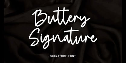 Buttery Signature is a unique and elegant monoline font, this font was created by being inspired by a signature by someone, then developed into a work that can be used by many people. It comes with an elegant and unique style which is perfect to make any design stand out! This font is perfect for branding, wedding invites, magazines, mugs, business cards, quotes, posters, and more.
 - CAL Bodoni Palazzo by California Type Foundry,
$47.00 The Greatest Caps Of The Greatest Font Designer Bodoni's Most Beautiful Display Caps, Finally Available in Digital This font is the largest display caps that Bodoni ever made, painstakingly handcarved and now digitized to wow in any situation. It is one of the most beautiful fonts for whenever you need a stunning all caps display. The obvious and easy choice over tired standards like Trajan, Palazzo will be a highlight in your font collection. Bodoni Palazzo was updated in 2021 to include Small Caps and other new features. Previously only included the "old style" figures (top); Now with lining figures to better match all caps, and small caps numbers to match the small caps. CAL Bodoni Palazzo is a member of our Origin Series. Origin Fonts are designed to be true to the original designer's intentions and fonts. Our Bodoni origin fonts ARE Bodoni fonts, not imitations or interpretations. They were drawn by Bodoni, our team just expanded it for modern use.
 - Cartes by insigne,
$39.00 Cartes has a bit of a strange origin story, as far as fonts go. It’s a combination of ideas from 1920’s advertising and hand-painted letters from the 1500s. The typeface was designed to flow with elegance and speed yet retain a sense of the handmade. The serifs flow with indentations implying movement and terminate with inky globules that lend your copy a sense of gravitas. This typeface can be used for headlines, short texts, posters, logos, headlines, headlines in big sizes or just as easily for ad text. At large sizes, pen strokes can be seen that give the typeface a touch of humanity and vigor. At smaller sizes the type is still unique, but readable.
 - Great Copper by Pixesia Studio,
$19.00 Introducing Great Copper - An Old Handcraft Display Font With a perfect combination of its unique yet classic shapes, Great Copper greatly portrays the familiar feeling that you are looking for. This typeface suits the nostalgic feeling you want to evoke through words. It comes as if Great Copper is written personally as letters to deliver good news. As splendid it curves in delivering the sweet vibe, Great Copper comes also with its firm shape to emphasize how valuable the messages and stories that it brings. Enchanting yet emphatic, Great Copper typeface will be perfect to depict the great story about the past you'd be delighted to tell and share. Hope you Like it. Thanks.
 - Ms Kitty NB by No Bodoni,
$35.00Some scribbles on a bar napkin, a note from a cute girl passed in history class, what is there to say but why not a typeface? Actually it's that late night, �let's get this typeface done� madness that causes these flights of fancy. Anything to relieve the boredom of doing all those kerning pairs. Or maybe it's sunspots? Ms Kitty is all uppercase letterforms so there are two versions of each letter, one in the cap position, another in the lowercase position. Besides the regular weight and bold, there�s a bolder and much bolder in the works. And perhaps there will be a "too bold to be believed" version. Depends on the sunspots. - Swashington by CounterPoint Type Studio,
$29.99 Inspired by a few letters in a hand-drawn logotype, Swashington is a serif font with both an early 20th Century feel and yet is evocative of the swash fonts of the 1970s as well. The real meat of this typeface comes with using all the swash and ligature variants allowing for an enormous amount of typographic flair. Starting with the original logo, Jason Walcott was moved to develop these interesting letterforms into a full typeface with all the swashy might he could muster. In addition to a comprehensive set of Swash and Alternate letters, there are also over 270 Discretionary Ligatures that can be used to create different possibilities by mixing and matching. Included with the downloaded fonts are two .pdf files showing all the swashes and ligatures, that can be printed and used for easy reference. All of the alternates are available via the Glyph Palette or with OpenType features. The font includes support for all Latin based and Eastern European languages.
 - Nantua by Characters Font Foundry,
$- Nantua is inspired by the Russian Constructivism from the early 1920s. Artists like Aleksandr Rodchenko used typography as forms. Nantua can be used with that very same principal. It's a very geometrical display font with hard edges. Used in big sizes it is very 'in your face'. Used in small sizes it tends to work like a compact background pattern. With very small inner forms, Nantua needs to be used in big sizes to be legible. It's preferably seen on posters or flyers.
 - Neuland by Linotype,
$29.99 A rough sanserif titling cut by Rudolf Koch for Klingspor in 1923. The letters give the appearance of being crudely cut in wood.
 - Sánchez Niu by Latinotype,
$- Sánchez Niu is a redesign of Sánchez—one of the first font families by Latinotype designed in 2011. In the typedesign industry the terms ‘nova’, ‘neue’, ‘next’, ‘new’ are often used to refer to a typeface that has been modified in different ways: redesign, technical readjustments, greater number of characters, etc. At Latinotype we are now starting to use the word ‘niu’ to refer to these kinds of typefaces. Niu is an adaptation of the original word ‘new’, i.e., we have adapted this English word to the phonology and spelling of our own language but keeping the original meaning. Race mixing, diversity, change and adaptation are part of the essence of Latin American culture and, at Latinotype, we are all constantly expressing these elements in everything we do. Latin Power! This new version includes improvements that make it work well with longer text. Such improvements have not had a major effect on the look of the font, though. We have adjusted the original proportions and added a number of new characters as well as OpenType features such as small caps, oldstyle figures, tabular numbers and stylistic alternates. Sánchez Niu contains a set of 720 characters that support 219 languages. The font is well-suited for long text, headlines and logotypes, and it has been optimised for web usage. Sánchez Niu comes with two free fonts—Regular and Regular Italic! Corrections, digital editing and review by César Araya, Rodrigo Fuenzalida and Alfonso García.


