10,000 search results
(0.038 seconds)
- Degaule by Forberas Club,
$16.00 Degaule is handwritten font. Will be nice if you application this font for cute, special moment, beauty, tees, simple word quotes, wedding party, invitation.
 - Return Pass JNL by Jeff Levine,
$29.00 Return Pass JNL is the solid version of Forward Passed JNL and can be used as a standalone font or in combination with Return Pass Fill JNL (the inline version with the main letters stripped away) for a dual color design. In some applications the inline fill may appear to create a cast shadow effect, so it may be necessary to manually adjust any overlaid copy.
 - Typnic by Corradine Fonts,
$19.95 Everybody likes to have a picnic: some fresh fruits, cheese, ham, wine and so on. Like a “typographic picnic,” Typnic font system gathers many fonts with different flavors too, and you can enjoy them mixed or on their own. Typnic was drawn and calligraphed by hand and is made with eighteen typefaces, including three totally compatible yet different styles. It also has enhancement sets containing labels, dingbats, patterns and ornaments. The Headline style has six layered fonts that can be mixed in a wide variety of combinations to obtain powerful mastheads and headlines. It can be used to construct very nice advertising pieces. If you need to write informal texts, then use Typnic Script, which also comes in six variants and additionally has a complementary font with tails, double letters and ornamented ascenders. Finally, use Typnic Roman to add some secondary texts without losing the general appearance of your work. Typnic has a cool and natural feeling and could be used in all sorts of projects. Typnic is a very ambitious project and we will be working on it to further expand the whole system. Please check out our Typnic Headline Slab.
 - Ghost Zone by Sakha Design,
$12.00 Ghost Zone Is a fun, quirky, and spooky decorative font. This font is PUA encoded which means you can access all of the glyphs and swashes with ease! Add it confidently to your favorite creations and let yourself be amazed by the outcome generated.
 - Angela by Sealoung,
$25.00 Angela is a modern, bold and highly detailed serif font. This font is PUA encoded which means you can access all of the amazing glyphs and ligatures with ease! Add it confidently to your favorite creations and let yourself be amazed by the outcome generated.
 - Carimbo by Misprinted Type,
$15.00 Carimbo is probably one of the most handy dirty fonts around. It works well with most projects, creating that stamp-like effect, without being too much distressed. It has 2 uppercase variations, so you can combine letters without repeating them in the same word.
 - Good Father by Andrey Font Design,
$9.00 Good Father is a cool, bold and modern display font. This font is PUA encoded which means you can access all of the amazing glyphs and ligatures with ease! Add it confidently to your favorite creations and let yourself be amazed by the outcome generated.
 - Andrea Handwriting by StuArt,
$9.00 Born out of an insatiable addiction to handwriting fonts, Andrea's Handwriting fonts are simple, readable and easy on the eyes. Each font is cool, casual and fun all at the same time. Perfect for printing your personal thoughts be they silly, pensive or absolutely nonsense!
 - Balduino by Sipanji21,
$10.00 Balduino is a cute and trendy display font with a thin shadow. No matter the topic, this font will be an incredible asset to your fonts library, as it has the potential to elevate any creation: logotype, tote bag, branding, Snack package, title, or headline.
 - Anayu by Rashatype,
$11.00 Anayu is an elegant, whimsical and uniquely shaped lettered handwritten font. This font is PUA encoded which means you can access all of the glyphs and swashes with ease! Add it confidently to your favorite creations and let yourself be amazed by the outcome generated.
 - Revelio by ArimaType,
$14.00 Revelio is a cool, bold, retro-styled display font. This font is PUA encoded which means you can access all of the beautiful glyphs and swashes with ease! Add it confidently to your favorite creations and let yourself be amazed by the outcome generated.
 - Spooky Place by AEN Creative Studio,
$15.00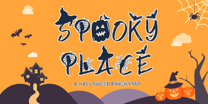 Spooky Place is a cool and quirky halloween display font. This font is PUA encoded which means you can access all of the glyphs and swashes with ease! Add it confidently to your favorite creations and let yourself be amazed by the outcome generated.
 - Hex by Hanoded,
$15.00 Hex is an uneven, spiky font with an evil twist. The glyphs look like they have been scratched onto paper (which is indeed the case), so it will be perfect for your scary halloween postcards or posters. Hex font comes with extensive language support.
 - Black Thunder by Letterafandi Studio,
$14.00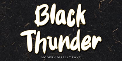 Black Thunder is a Modern and friendly brushed display font. This font is PUA encoded which means you can access all of the glyphs and swashes with ease! Add it confidently to your favorite creations and let yourself be amazed by the outcome generated.
 - Simply Conception by Muksal Creatives,
$10.00 Simply Conception is a unique and modern family of serif fonts. Simply Conception has 18 families Regular and italic font, starting from the small thin to the largest black. This typeface is versatile and can be used successfully in magazines, posters, branding, websites, etc.*
 - Sassoon Felt by Sassoon-Williams,
$48.00 Sassoon Felt’s more casual letterforms can be used either as informal text or for the teaching of reading and handwriting; having the letterforms most taught in UK schools. These fonts are an educators alternative to Comic Sans (from Microsoft) and Chalkboard (from Apple), which are more appropriate for ‘Print’ style writing in United States Elementary schools and may also be appropriate for parts of Australia, which can be identified usually by crucifix t, diagonal y downstroke, short f, two-stroke and there may be more. Free to download resources: How to access Stylistic Sets of alternative letters in these fonts
 - Quenione Unico by WNGSTD,
$10.00 Quenione Unico - Unique sans serif is a playful and modern font. featuring a lightweight, it offers support for all characters. standard punctuation glyphs are included. Quenione Unico - Unique sans serif is perfectly suited for traditional media and the web. great for the crafter and graphic artists. compatible with all tools. its playfulness makes it great for creative project., be inspirational wall poster, or for communicating your brand. This font can be used for any variety of purposes. FEATURES : uppercase lowercase symbol & number
 - Jeff Script by ParaType,
$30.00Jeff Script is based on original handwriting of renowned Russian type designer Vladimir Yefimov. Vladimir designed a plenty of Cyrillic fonts that became the classical ones between contemporary Cyrillic type designs. Being extreme busy with type projects, he never had time to digitize his own script and this lacuna was filled by Gennady Fridman. The font was developed to the 60th anniversary of Maestro and released by ParaType in 2009. - Takhie by Nantia.co,
$8.00 The Takhie Pro Multilingual Brush Font is a 100% hand-drawn decorative font with which you can achieve a handwritten-type lettering feeling. T This typeface is a multilingual lettering font with Greek (of course), Latin characters and diacritics. The style of the font is perfect for your modern graphic design needs. Also, the font has a really nice flow so you use it in a large text if you want to give them a touch of personality. In addition, this typeface can be used on social media content, for branding or packaging. Also, this font is perfect for crafting and invitations material.
 - Dunelm by MADType,
$21.00 Dunelm is a typeface that was inspired by the type used in an English book from 1636. The typeface used in the book was unique and the goal in creating this font was to emulate the printing feel of the 17th century. The authentic ink-blotted and imperfect feel of the letter-pressed type was preserved with care. For best effect, this font should be used at text and smaller title sizes.
 - Generic by More Etc,
$15.00 The Generic Typeface Collection is a series of sans-serif typefaces inspired by the craftsmanship of graphic design, typesetting, and printing in the analogue era – before Adobe, Macintosh computers and desktop publishing – when dinosaurs ruled the earth. With the use of various typesetting apparatuses or dry transfer type, photo copiers, and shooting layouts and paste-ups to film, the printed results was not as exact, precise and predictable as it is today. When examining old prints, it is difficult not to like the way that characters in over- or underexposed film have a special type of vibe to them that is often sadly lost in today’s pursuit of total perfection. Encouraged by this, I saw a need for a collection of typefaces that are non-clinical and non-conformist, and some that are coarse, rough and distorted – errors that might come from poor exposure when put on film, enlargements from small point texts, or maybe quality loss from successive generations of photocopies. Or all of the above. This is an attempt to incorporate spirit and personality into a set of typefaces without losing distinction. You might call it a homage to non-perfection. I call it human. The Generic Typeface Collection consists of 11 fonts divided into four series. The three standard series – the Formal Release series, the Coarse Copy series, and the Rough Display series – all contain three fonts each. The Extra Splendor series contains a couple of shadow fonts for that little extra sparkle. Formal Release – Handcrafted & Clean The Formal Release series features sans-serif typefaces for everyday use. They are handcrafted and clean, human and uncomplicated. The Formal Release series contains three typefaces that add tons of personality to any text. G10 FR ‘Slim’ – a slightly under-exposed and clean typeface in a regular weight (228 glyphs - 1 alternate) G20 FR ‘Classic’ – a properly exposed clean typeface in a bold weight (228 glyphs - 1 alternate) G30 FR ‘Bulky’ – a heavily over-exposed clean typeface in an ultra weight (228 glyphs - 1 alternate) Coarse Copy – Dirty & Rough The Coarse Copy series features non-conformist typefaces that are worn and rough, maybe after going through that bad copier a few times too much. The Coarse Copy series contains three sans-serif typefaces that add tons of spirit to any text without compromising too much on legibility. Try them on in poster-sizes and everyone will know that you mean business. G40 CC ‘Slender’ – an under-exposed coarse typeface in a regular weight (228 glyphs - 1 alternate) G50 CC ‘Typic’ – a properly exposed coarse typeface in a bold weight (228 glyphs - 1 alternate) G60 CC ‘Huge’ – a heavily over-exposed coarse typeface in an ultra weight (228 glyphs - 1 alternate) Rough Display – Faded & Decorative The Rough Display series features attention-seeking decorative typefaces in three feature-packed fonts. Faded and gritty like the image distortion and degradation from successive generations of photocopies, they are eye-catching typefaces intended to stand out in bigger point sizes. Use these typefaces for signage, headlines and similar situations were a strong typographic statement is desired. We have packed no less than 1,334 alternate characters and 212 discretionary ligatures into this series for a greater chance of not having characters that look exactly the same more than once. G70 RD ‘Slinky’ – an under-exposed rough and decorative typeface in a regular weight (741 glyphs – 448 alternates – 66 discretionary ligatures) G80 RD ‘Standard’ – a properly-exposed rough and decorative typeface in a bold weight (748 glyphs – 448 alternates – 73 discretionary ligatures) G90 RD ‘Swollen’ – a heavily over-exposed rough and decorative typeface in an ultra weight (748 glyphs – 448 alternates – 73 discretionary ligatures) Extra Splendor – Sparkling & Extraordinary The Extra Splendor series features two shadow typefaces for that little extra sparkle. One clean shadow to be used with G20 FR ‘Classic’, and one rough shadow to be used with G80 RD ‘Standard’. Having the shadows separate from the main typeface adds another layer of expressiveness in that you can try out color combinations for that extra splendor. Tips for matching (applies to both the base font and the shadow font): Set the kerning to Metric, not optical. Increase tracking to accommodate for the shadows extra width. G25 ES ‘Classic Shadow’ – a clean shadow to be used with G20 FR ‘Classic’ (228 glyphs – 1 alternate) G85 ES ‘Standard Shadow’ – a rough shadow to be used with 80 RD ‘Standard’ (227 glyphs) OpenType features – alternate characters and discretionary ligatures – can be accessed by using OpenType friendly professional design applications, such as Adobe Illustrator, Adobe InDesign, and Adobe Photoshop.
 - Ongunkan Rosetta Stone by Runic World Tamgacı,
$50.00 The Rosetta Stone, or Rashid Stone, was accidentally found by a French soldier during an excavation in the fortification of Egypt. The stone was inscribed in three languages, intended to be sent to three major Egyptian temples. These languages are: Demotic (the language used by the people in Egypt), Hieroglyphic and Ancient Greek. This font contains ancient greek.
 - Correntino Railway by Fabio Ares,
$- Correntino Railway is a product of argentine typographic archeology project called “Tipografía Histórica Ferroviaria” (Fabio Ares & Octavio Osores, since 2012). Is about the signboards of the stations of the line of the Argentine Correntino Economic Railway (1892-1969). The letter of this signboards can be described as display type, with elementary geometric shapes, vertical line modulation and slight contrast.
 - Mushin by Satori TF,
$16.99 Mushin is a typeface, that comes with 14 fonts, roman and the matching italics, which draws inspiration from the grotesques of the beginning of the 20th century. However, its humanistic details and endings, remove the coldness so characteristic of this style, making Mushin a typeface of lively and dynamic curves, which can be used for various purposes.
 - Hiragino Sans Rounded by SCREEN Graphic Solutions,
$210.00 Hiragino Sans Rounded (Maru Gothic) is derived from the basic design of the Hiragino Sans (Kaku Gothic) with its wide counters and comfortable appearance. It features gentle typeface that provides graceful roundedness to the tips of all the strokes of a character. On the flip side of this gentle impression is the fact that every single element in the Hiragino Sans upon which this typeface is based has been carefully polished down in every respect in pursuit of an elegant roundness that makes it possible to handle carefully executed typesetting. That approach is clearly different from the general rounded typeface that makes full use of the body, and makes it possible to respond the requirement of professional typesetting. It is never-uninteresting design whose letterform is rooted in the traditions of traditional printing type. It is a font that of course can be used on its own and easily formatted just like Hiragino Sans while adding splendid coloring to the page. Furthermore, when used with other Hiragino fonts such as Hiragino Sans or Hiragino Serif (Mincho), the fact that all their designs are oriented on the same vector creates a multiplier effect. The user may be surprised at the sense of unity that cannot be experienced when combining it with other typefaces.
 - Monkeytails by Wiescher Design,
$39.50 I don't know what other typedesigners call those long swirling embellishment, but I call them "Monkeytails". So when I decided on this version of my good old Royal Bavarian, I decided to call the new font "Monkeytails". I just fell in love with this name. Monkeytails and Royal Bavarian should be used together, in order not to have too many embellishments. That's why I offer the two together for a good price. Your swinging typedesigner Gert Wiescher
 - Victoria Rogers by Rillatype,
$20.00 Proudly introducing, Victoria Rogers! Victoria Rogers is a special font that crafted carefully with heart and aimed to achieve the purpose of this font to be used as an elegant editorial font, but you can use it for anything you want! This font is special because the uppercase and lowercase have different style, uppercase with feminine feel with swash, and lowercase with thin and crips elegant display serif, mix them both and voila, you have an elegant design instantly!
 - Santa Fe by ITC,
$29.99Santa Fe was created by British designer David Quay in 1983. Distinguishing are its script characters and the lower case e, which has the form of a capital E. The letters of this font emphasize the base line. Rounded corners pair with elegant forms to give Santa Fe a flowing, cheerful look. The figures are reminiscent of American advertisements of the 1960s with their light, carefree images. Like with most script fonts, the letters of Santa Fe should be set close enough together that they touch. An added bonus are the various alternative forms with which Quay provided Santa Fe and the many design possibilities which they offer. - RePublic by Suitcase Type Foundry,
$75.00In 1955 the Czech State Department of Culture, which was then in charge of all the publishing houses, organised a competition amongst printing houses and generally all book businesses for the design of a newspaper typeface. The motivation for this contest was obvious: the situation in the printing presses was appalling, with very little quality fonts existing and financial resources being too scarce to permit the purchase of type abroad. The conditions to be met by the typeface were strictly defined, and far more constrained than the ones applied to regular typefaces designed for books. A number of parameters needed to be considered, including the pressure of the printing presses and the quality of the thin newspaper ink that would have smothered any delicate strokes. Rough drafts of type designs for the competition were submitted by Vratislav Hejzl, Stanislav Marso, Frantisek Novak, Frantisek Panek, Jiri Petr, Jindrich Posekany, and the team of Stanislav Duda, Karel Misek and Josef Tyfa. The committee published its comments and corrections of the designs, and asked the designers to draw the final drafts. The winner was unambiguous — the members of the committee unanimously agreed to award Stanislav Marso’s design the first prize. His typeface was cast by Grafotechna (a state-owned enterprise) for setting with line-composing machines and also in larger sizes for hand-setting. Regular, bold, and bold condensed cuts were produced, and the face was named Public. In 2003 we decided to digitise the typeface. Drawings of the regular and italic cuts at the size of approximatively 3,5 cicero (43 pt) were used as templates for scanning. Those originals covered the complete set of caps except for the U, the lowercase, numerals, and sloped ampersand. The bold and condensed bold cuts were found in an original specimen book of the Rude Pravo newspaper printing press. These specimens included a dot, acute, colon, semicolon, hyphens, exclamation and question marks, asterisk, parentheses, square brackets, cross, section sign, and ampersand. After the regular cut was drafted, we began to modify it. All the uppercase letters were fine-tuned, the crossbar of the A was raised, E, F, and H were narrowed, L and R were significantly broadened, and the angle of the leg and arm of the K were adjusted. The vertex of the M now rests on the baseline, making the glyph broader. The apex of the N is narrower, resulting in a more regular glyph. The tail of Q was made more decorative; the uppercase S lost its implied serifs. The lowercase ascenders and descenders were slightly extended. Corrections on the lower case a were more significant, its waist being lowered in order to improve its colour and light. The top of the f was redrawn, the loop of lowercase g now has a squarer character. The diagonals of the lowercase k were harmonised with the uppercase K. The t has a more open and longer terminal, and the tail of the y matches its overall construction. Numerals are generally better proportioned. Italics have been thoroughly redrawn, and in general their slope is lessened by approximatively 2–3 degrees. The italic upper case is more consistent with the regular cut. Unlike the original, the tail of the K is not curved, and the Z is not calligraphic. The italic lower case is even further removed from the original. This concerns specifically the bottom finials of the c and e, the top of the f, the descender of the j, the serif of the k, a heavier ear on the r, a more open t, a broader v and w, a different x, and, again, a non-calligraphic z. Originally the bold cut conformed even more to the superellipse shape than the regular one, since all the glyphs had to be fitted to the same width. We have redrawn the bold cut to provide a better match with the regular. This means its shapes have become generally broader, also noticeably darker. Medium and Semibold weights were also interpolated, with a colour similar to the original bold cut. The condensed variants’ width is 85 percent of the original. The design of the Bold Condensed weights was optimised for the setting of headlines, while the lighter ones are suited for normal condensed settings. All the OpenType fonts include small caps, numerals, fractions, ligatures, and expert glyphs, conforming to the Suitcase Standard set. Over half a century of consistent quality ensures perfect legibility even in adverse printing conditions and on poor quality paper. RePublic is an exquisite newspaper and magazine type, which is equally well suited as a contemporary book face. - Blanquotey by Sartstudio,
$10.00 Blanquotey is a simple and modern font. Whether it�s for web, print, moving images or anything else � Blanquotey will look spectacular. This font is very suitable for the needs of branding, logos, technology themes and others. very easy to use and can be installed on any graphics software such as Adobe illustrator, photoshop, Microsoft Office and others. Works on PC & Mac Simple installation Can be accessed in Adobe Illustrator, Adobe Photoshop, Adobe InDesign, and even works in Microsoft Word. Long-term support, Can be accessed completely without additional design software.
 - Neo Sans by Monotype,
$34.99 Designer Sebastian Lester describes his Neo Sans type collection as “legible without being neutral, nuanced without being fussy, and expressive without being distracting.” Featuring rounded, square sans letterforms, the Neo Sans family is available in six weights, ranging from light to ultra, with companion italics. Its forward-looking personality makes it an excellent choice for branding projects, as well as for editorial or publication design. Pair the Neo Sans collection with a serif design for interesting typographic contrast; for more direct continuity, consider the typeface's sister design—the Neo Tech family also from Lester, available in six weights with matching italics.
 - KOGAMA by Twinletter,
$15.00 Introducing Kogama, our newest Japanese-style inspired font, which was created specifically to carry the Asian font concept and will make your project look beautiful and appealing. Start utilizing this typeface to make your project stand out and be well received. Logotypes, food banners, branding, brochure, posters, movie titles, book titles, quotes, and more may all benefit from this font. Of course, using this font in your various design projects will make them excellent and outstanding; many viewers are drawn to the striking and unusual graphic display. Start utilizing this typeface in your projects to make them stand out. Caps only fonts.
 - Gowes by Twinletter,
$15.00 We designed Gowes, a graffiti-themed display font, for your bold, forceful, and speedy projects. This font was created as a supporting element for your limitless creativity. If you use this typeface, your project will have a unique and distinctive design. Your visual presentation will pique the interest of your audience. If you utilize this typeface, all of your creations will be of good quality. This graffiti font is great for product logos, poster titles, headlines, packaging, film titles, logotypes, gorgeous writing, and trendy graffiti designs, among other things. Of course, if you utilize this font in your numerous creative projects, they will be perfect and outstanding. Use this typeface right away for your one-of-a-kind and remarkable projects.
 - Legendum - 100% free

- Saral Devanagari by Linotype,
$187.99Saral, meaning simple in Hindi, is a monolinear design supporting most Devanagari based languages. Derived from the older Linotype typeface Rohini, it has been greatly expanded into three weights and a wide character set. Saral Light, Regular, and Bold are made to coordinate with the respective weights of Helvetica. This design works well in many environments, such as corporate designs, advertising, packaging, signage, and especially for bi-lingual texts. The OpenType font format accommodates hundreds of pre-composed conjuncts, accurate placement of vowel signs, and supports varying length matras. Saral's Unicode encoding guarantees your text is rendered correctly and is compatible across different software and computer platforms. Please note that due to current operating system and application limitations the OpenType features in complex scripts such as Davanagari are not universally supported. Saral is designed to be rendered correctly in Microsoft Word on Windows running the latest version of Uniscribe. If using a Mac or Adobe products such as InDesign then many features may not function as expected. This is including glyph reordering, substitutions, and mark positioning. In the case of small passages of text, alternate input methods can be employed. Apple's character palette and Adobe's glyph palettes are two readily available options that can be used to manually insert glyphs as needed." - Omed Brush by Alit Design,
$22.00 Presenting the Omed Brush Signature Script font by alitdesign. The Omed Brush Signature Script font is inspired by spontaneous and dynamic signature strokes with an ink texture that makes the Omed Brush Signature Script look real. The Omed Brush Signature Script font looks unique and charming which makes designs using the Omed Brush Signature Script look more prominent and cool. The Omed Brush Signature Script font is perfect for a collection of new fonts on your computer, tablet and smartphone for making unique designs or lettering. The Omed Brush Signature Script font is perfect for magazine cover designs, brochures, flyers. Instagram ads, Canva Design and so on with unique and modern concepts. besides that this font is very easy to use both in design and non-design programs because everything changes and glyphs are supported by Unicode (PUA). The Omed Brush Signature Script contains 804 glyphs with many unique and interesting alternative options. Language Support : Latin, Basic, Western European, Central European, South European,Vietnamese. In order to use the beautiful swashes, you need a program that supports OpenType features such as Adobe Illustrator CS, Adobe Photoshop CC, Adobe Indesign and Corel Draw. but if your software doesn't have Glyphs panel, you can install additional swashes font files. Thank You Alit
 - Rankday by Alit Design,
$14.00 Presenting the 🎃 Rankday Typeface 🦇 by alitdesign. Rankday typeface is designed for the needs of design concepts themed about Halloween and events in October and November. The Rankday font has a horror character with a character shaped like dripping blood, making the horor Halloween themed design concept even better and unique. The Rankday font also gets a bonus character of 150 Halloween-themed illustrations that make creating designs even easier. Simply by downloading the Rankday font, creating a Halloween themed design is very quick and easy. The Rankday Typeface is perfect for magazine cover designs, brochures, flyers. Instagram ads, Canva Design and so on with halloween and dark concepts. besides that this font is very easy to use both in design and non-design programs because everything changes and glyphs are supported by Unicode (PUA). The Rankday Typeface contains 607 + 150 bonus glyphs with many unique and interesting alternative options. Language Support : Latin, Basic, Western European, Central European, South European,Vietnamese. In order to use the beautiful swashes, you need a program that supports OpenType features such as Adobe Illustrator CS, Adobe Photoshop CC, Adobe Indesign and Corel Draw. but if your software doesn't have Glyphs panel, you can install additional swashes font files.
 - Teapot by Ingrimayne Type,
$9.00 Teapot is a font with letters on teapots. Upper-case letters have the handles on the right and lower-case characters have the handles on the left. The letters on the teapots are from the typeface InsideLetters. A revision in 2018 added some characters that can be used to create multicolored lettering. A pdf file here shows how to use them.
 - ITC Dartangnon by ITC,
$29.99ITC Dartangnon is a work of English designer Nick Cooke and began with the thought, It's a long shot but it might just work as a font." It started as a doodle with a chunky pencil. "So many script fonts look too stylized so I thought I'd try to produce one that looks more like handwriting." He scanned the doodles and used Fontographer to draw a set of monoline letters. "Working quickly I soon drew the whole alphabet, and without being too pedantic about the characters joining exactly, I arrived at this script." ITC Dartangnon is an energetic font which remains legible even in small point sizes. And, Cooke adds, "It is supposed to be used as upper and lowercase only, NEVER just caps."" - Nono by Wiescher Design,
$39.50 Nono is the nickname of my oldest son, Konstantin. His little brother could not really speak yet, but he was always looking for him and said something to the tune of, "wea is a nono". From that time on I call Konstantin Nono. I designed a handwritten script with his real name, that i named Konstantin. Now I made this slick version of that script – hence – Nono! I made three basic sets of characters plus a smallcaps version. To top things off, I designed a set of endletters that I throw in for free. Everything can be mixed! I sell single cuts but the best deal would be the entire packet, it goes for a very fair price. Your generous typedesigner, Gert Wiescher
