10,000 search results
(0.072 seconds)
- Castle Fleurons by CastleType,
$29.00 A delightful collection of classic fleurons. Useful for adding a tasteful accent to your documents or for creating borders. Left-facing fleurons are complimented by right-facing ones (and vice versa). Some fleurons have four 90-degree rotations for creating interesting tiling patterns.
 - Summer Rose by Krafted,
$10.00 Roses are the epitome of beauty, simplicity, and love. Summer provides us with warmth, laughter, and happiness. Combine the two and you get a shimmeringly spectacular combination. Introducing Summer Rose - A Sweet, Casual Handwritten Font. Summer Rose can be used for a variety of different content needs such as headings, logos, business cards, printed quotes, cards, packaging, resumes, and even your website or social media branding. Breathe the sweet-smelling freshness of Summer Rose into your branding and dazzle your guests, audience, or clients. Let the world see your beautiful ideas with this Sweet, Casual Handwritten Font. What you’ll get: Multilingual & Ligature Support Full sets of Punctuation and Numerals Compatible with: Adobe Suite Microsoft Office KeyNote Pages Software Requirements: The fonts that you’ll receive in the pack are widely supported by most software. In order to get the full functionality of the selection of standard ligatures (custom created letters) in the script font, any software that can read OpenType fonts will work. We hope you enjoy this font and that it makes your branding sparkle! Feel free to reach out to us if you’d like more information or if you have any concerns.
 - Weird Better by Heyfonts,
$15.00 Weird Better fonts are typography designs that imitate or simulate the appearance of liquids. They are often fluid and dynamic in nature, providing an illusion of movement and flow in letters and characters. Weird Better fonts can be created using different design techniques, including hand-drawn illustrations, digital effects, or 3D modeling software. Some common features of liquid fonts include: Fluid and dynamic appearance: Weird Better fonts have a free-flowing and organic appearance, mimicking the look and movement of liquids such as water, ink, or paint. Variations in thickness: The thickness of the lines and curves in Weird Better fonts can vary, creating an uneven and organic appearance. Versatile use: Weird Better fonts are commonly used in creative designs such as logos, album covers, and advertising campaigns to create an eye-catching and memorable visual impact. Overall, Weird Better fonts are a unique and creative way to portray text, giving a sense of energy, motion, and fluidity to design projects.
 - Liquidity by Heyfonts,
$15.00 Liquidity fonts are typography designs that imitate or simulate the appearance of liquids. They are often fluid and dynamic in nature, providing an illusion of movement and flow in letters and characters. Liquid fonts can be created using different design techniques, including hand-drawn illustrations, digital effects, or 3D modeling software. Some common features of Liquidity fonts include: Fluid and dynamic appearance: Liquidity fonts have a free-flowing and organic appearance, mimicking the look and movement of liquids such as water, ink, or paint. Variations in thickness: The thickness of the lines and curves in liquid fonts can vary, creating an uneven and organic appearance. Versatile use: Liquidity fonts are commonly used in creative designs such as logos, album covers, and advertising campaigns to create an eye-catching and memorable visual impact. Overall, Liquidity fonts are a unique and creative way to portray text, giving a sense of energy, motion, and fluidity to design projects.
 - Englewood by Lipton Letter Design,
$19.00 Richard Lipton’s inspiration for Englewood came from the calligraphic hand of Philip Grushkin. Lipton has always admired his somewhat loose but disciplined hand and felt that it was worthy of keeping this style alive in a typeface that could be a somewhat accurate emulation of the warmth and life found in these letterforms. Spontaneity is a challenge to capture in a type treatment but with Englewood, Lipton hopes to honor Mr. Grushkin with a design that works especially well for an invitation, a menu, or in any display setting that calls for an informal calligraphic hand. This single weight display script includes small caps — somewhat of a rarity for a handwritten script — for flexible typesetting, along with 42 alternates that include 18 contextual ligatures to simulate the appearance of spontaneous writing.
 - Achiever by Letterhend,
$19.00 Introducing, The Achiever- a unique display script with reverse contrast. The unusual reverse contrast make this typeface one of a kind. This type of font perfectly made to be applied especially in logo, and the other various formal forms such as invitations, labels, logos, magazines, books, greeting / wedding cards, packaging, fashion, make up, stationery, novels, labels or any type of advertising purpose. Features : uppercase & lowercase numbers and punctuation multilingual alternates and ligatures PUA encoded We highly recommend using a program that supports OpenType features and Glyphs panels like many of Adobe apps and Corel Draw, so you can see and access all Glyph variations. How to access opentype feature : letterhend.com/tutorials/using-opentype-feature-in-any-software/ Email us to letterhend@gmail.com if you need something! Happy Designing!
 - Bigfoot by K-Type,
$20.00 Bigfoot K-Type is a whole font based on the slab capitals used by Victor Moscoso in his 1960s psychedelic rock posters. Capital A alternatives can be found at keystrokes ± and §.
 - Kraut by design-tourist,
$19.00 Kraut is a decorative headline font that can be used for posters, packaging, logos and on football jerseys. It contains all small and capital letters from the Latin and Cyrillic alphabet.
 - Hideout by Monotype,
$50.99 Jim Ford's Hideout typeface is definitely walking on the wrong side of the law. Inspired by the flared serif lettering of antique tobacco tins, its sturdy shapes are confident, eye-catching, and hark back to the Wild West. Large sizes bring Hideout's details to life, emphasising the delicate nicks in its Ks and Rs. For designers that need to soften some of its swagger, a set of decorative alternatives offer a little Art Deco elegance, adding some refinement to its chunky letterforms. With its 14 weights, Hideout is an adaptable design that works especially well when used for display – for example in book covers, packaging, posters, restaurant menus, or editorial. Don't miss the ghost weights, which hint at the kinds of weathered lettering found on faded and peeling Wanted posters.
 - Big Brush by Canada Type,
$20.00Big Brush is the result of me seeing Brush Script everywhere around me. Toronto signage is full of Brush Script. My last two trips to the West Coast showed me mostly Brush Script. Brush Script must be the most widely overused North American script font of all time. Don't we all know at least one restaurant or bar with its sign made in Brush Script? And aren't you just sick of the weird F, Q and T of Brush Script? Well, out with the old and in with the new. Big Brush was made as a replacement for Brush Script, and then some. While Brush Script has only the single familiar letters we all know, Big Brush comes in two fonts, so you can keep the design fresh the neat and keep them guessing at the same time. The next time you want to design something that calls for strong, fast brush calligraphy, do the world's bored eyes a favor and use Big Brush instead. - Caldwell Script by madjack.font,
$15.00 Caldwell Script is a modern calligraphy design. This typeface is casual and beautiful with swash. It can be used for various purposes such as logos, product packaging, wedding invitations, branding, headlines, signage, labels, signatures, book covers, posters, quotes, and more. Caldwell Script includes changes in the OpenType language style, binders and international support for most Western languages. To enable alternative OpenType alternatives, you need a program that supports OpenType features such as Adobe Illustrator CS, Adobe Indesign & CorelDraw X6-X7, Microsoft Word 2010 or newer versions. How to access all alternative characters using Adobe Illustrator: https://www.youtube.com/watch?v=XzwjMkbB-wQ Caldwell Script is coded with Unicode PUA, which allows full access to all additional characters without having special design software. Mac users can use Letter Book, and Windows users can use Character Maps to view and copy any of the additional characters to attach to your favorite text editor/application. How to access all alternative characters, using Windows Character Map with Photoshop: https://www.youtube.com/watch?v=Go9vacoYmBw If you need help or have questions, let me know. I am happy to help. Thank you & Happy Designing!
 - Albertya by Gatype,
$12.00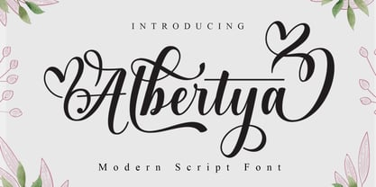 Albertya is a modern calligraphy font. This font is casual and pretty with a stroke. Can be used for various purposes. such as logos, product packaging, wedding invitations, branding, headlines, signage, labels, signatures, book covers, posters, quotes and others. Albertya Script featuring OpenType style alternatives, ligatures, and International support for most Western Languages is included. To enable the OpenType Stylistic alternative, you need a program that supports OpenType features such as Adobe Illustrator CS, Adobe Indesign & CorelDraw X6-X7, Microsoft Word 2010 or a later version. How to access all alternative characters using Adobe Illustrator: https://www.youtube.com/watch?v=XzwjMkbB-wQ Albertya Script is encoded with PUA Unicode, which allows full access to all additional characters without having to design special software. Mac users can use Font Book , and Windows users can use Character Map to view and copy any additional characters to paste into your favorite text editor/application. How to access all alternative characters, using the Windows Character Map with Photoshop: https://www.youtube.com/watch?v=Go9vacoYmBw If you need help or have any questions, let me know. I'm happy to help. Thank you
 - Yosyita Script by Romie Creative,
$13.00 Yoshita Script is a modern calligraphy design, including Regular. This typeface is normal and beautiful with swashes. It can be used for various purposes, such as logos, product packaging, wedding invitations, branding, headlines, signage, labels, signatures, book covers, posters, quotes, and more. Yoshita Script includes OpenType features, binders, and international support for most Western languages. To activate the OpenType Stylistic alternative, you request a program that supports OpenType features such as Adobe Illustrator CS, Adobe Indesign & CorelDraw X6-X7, Microsoft Word 2010 or newer versions. How to access all alternative characters using Adobe Illustrator: https://www.youtube.com/watch?v=XzwjMkbB-wQ Yoshita Script is coded with Unicode PUA, which allows access to all additional characters without having to install special software. Mac users can use Letter Books, and Windows users can use Character Maps to view and use one of the additional characters to enter their favorite text editor / application. How to access all your alternative characters, use Windows Character Map with Photoshop: https://www.youtube.com/watch?v=Go9vacoYmBw If you need help or have questions, let me know. I am happy to help :) Thank you & Happy Designing!
 - Intro Rust by Fontfabric,
$25.00 Intro Rust is one of the biggest packages on the market, including 214 fonts. The font family is a rough version of the famous Intro. Intro Rust includes 4 sub-families - Intro Rust, Intro Script, Intro Head and Intro Goodies. It can be used to create almost all types of design projects like print materials and web design. Just use your imagination and your project will become more alive and vivid than ever with one of the Intro Rust fonts. You want to make a greeting card or a package design, or even a brand identity? Feel free to play with all the patterns and shapes, scripts or those cool fonts with the dots and that will lead you to your next successful project.
 - Corpesh by Typotheticals,
$4.00 Corpesh was drawn in Adobe Illustrator during the wee hours of the night. It is a single weight set of fonts, no bold version. As is/was much of what I have done over the last year, it was created purely to pass time. As a self taught amateur in this field, I only do this for the enjoyment it brings me. This typeface is being released early, at the same time as 'Brainstroke', for exactly the same reason that typeface is, that being a health crisis. I know this typeface is not complete, with, as mentioned, no bold version, and probably never will have.
 - Ulga Grid Rounded by ULGA Type,
$19.00 ULGA Grid Rounded is the smooth, rounded sibling of ULGA Grid and ULGA Grid Solid. The typeface consists of three weights, regular, medium and bold, with corresponding oblique styles. Every character in the extended ULGA Grid family shares the same width. ULGA Grid Rounded features a rounded square design, giving this typeface a soft, yet sturdy appearance. A contradictory mix of stiffness and suppleness, characters slide around like lead-filled snakes trying to find their way through a maze. If this typeface were a snack, it would be a smooth, chocolatey treat - too much of it and you’ll feel dizzy and a bit sick. But, hey, I’m not your dad, do what you want. Learn from your mistakes, that’s what I say. A versatile display typeface that can be used for a wide range of purposes including CD covers, posters, packaging, advertising, name badges for robots, brochures and film titles. Mix and match with ULGA Grid and ULGA Grid Solid, use the alternatives, sneak in an oblique style to spice things up, but most of all this is a fun typeface family. The character set supports Western Europe, Vietnamese, Central/Eastern Europe, Baltic, Turkish and Romanian.
 - Curves by Just My Type,
$15.00Be it a blessing or a curse, when a type designer sees a shape that could be interpreted as a letter, his/her mind is off and running. My parents loved to travel; Dad drove to Florida seven different years, winding on (barely) two-lane “highways” clinging to the hills of Kentucky and Tennessee. My brothers and I saw many of these letters along the way. Watch those Curves . - Serca by Adam Ladd,
$25.00 Serca is a structured geometric sans serif font family with normal and condensed proportions. It is professional and precise, open and legible. The modern, clean design lends itself to being a workhorse for a variety of applications—branding, advertising, websites, mobile apps, logos, magazines, etc.—able to be used in both small body text and large headlines alike. The vast range of weights gives plenty of options to choose from.
 - Copasetic NF Pro by CheapProFonts,
$10.00 Another typical Art Deco font from Nick Curtis. Uppercase only, but with alternate letterforms in the lowercase positions. I have completely redesigned all the diacritics (which were way too flimsy for this robust design) before expanding the character set in the usual fashion. Nick Curtis says: "Back in the Olden Days of Graphic Design B.C. (before computers), type freaks used to wait in anxious anticipation for each new release of the Letraset catalog. The inspiration for this font, Premiere Lightline, was one such release, and probably help spur my interest in Deco designs. The original font was VERY light indeed, suitable only for use in large sizes. My version is beefier, and includes an entire lower case of alternate letterforms, making this (at least) two fonts in one. The name is the 40’s hep talk equivalent of “Cool!”". ALL fonts from CheapProFonts have very extensive language support: They contain some unusual diacritic letters (some of which are contained in the Latin Extended-B Unicode block) supporting: Cornish, Filipino (Tagalog), Guarani, Luxembourgian, Malagasy, Romanian, Ulithian and Welsh. They also contain all glyphs in the Latin Extended-A Unicode block (which among others cover the Central European and Baltic areas) supporting: Afrikaans, Belarusian (Lacinka), Bosnian, Catalan, Chichewa, Croatian, Czech, Dutch, Esperanto, Greenlandic, Hungarian, Kashubian, Kurdish (Kurmanji), Latvian, Lithuanian, Maltese, Maori, Polish, Saami (Inari), Saami (North), Serbian (latin), Slovak(ian), Slovene, Sorbian (Lower), Sorbian (Upper), Turkish and Turkmen. And they of course contain all the usual “western” glyphs supporting: Albanian, Basque, Breton, Chamorro, Danish, Estonian, Faroese, Finnish, French, Frisian, Galican, German, Icelandic, Indonesian, Irish (Gaelic), Italian, Northern Sotho, Norwegian, Occitan, Portuguese, Rhaeto-Romance, Sami (Lule), Sami (South), Scots (Gaelic), Spanish, Swedish, Tswana, Walloon and Yapese.
 - Braveold by Trustha,
$25.00 Braveold is a serif font family with swashes, making it multifunctional. It is inspired by classic and retro fonts in the 70 and comes with 5 weights which can be selected for body text or headlines. Alternative swashes will be an attractive choice, so that your project becomes more beautiful and dynamic.
 - Klop by Invasi Studio,
$19.00 Klop is a display typeface with a bloated and fat appearance. Combining this with round corners and a natural shape, Klop has a quirky and endearing appearance. You can use alternative glyphs to create a different appearance for your design. The Klop font is ideal for branding projects or packaging that need a modern and playful feel.
 - Framework Mono by High Peak,
$21.00 Framework Mono is a modern monospaced typeface. A close relative of the original Mittelhorn font family, with whom it shares some letter and number design features, the two fonts are ideal companions. It comes in 3 weights, 3 uprights and matching italics. Designed with opentype features, each weight includes extended language support, fractions, arrows, ligatures and more. Perfectly suited for graphic design and for any display use. It could nicely work with code editors, web, editorial design, as well as corporate tabular data sheets and more. Enjoy!
 - Flink Neue by Identity Letters,
$45.00 Geometric typefaces are a staple in every typographer’s toolbox since the 1920s. It was a time when iconic faces such as Futura, Erbar, and Kabel appeared on the scene and turned the world of type upside-down. Inspired by those early giants as well as later epigones with a legacy of their own (such as 1970’s Avant Garde Gothic), Flink Neue is the Identity Letters take on this genre, characterized by a clean and focused appearance. With neat shapes and the look of pure geometry, Flink Neue adapts to a vast range of applications and topics, from the fine print in contract to website body copy to logo design to billboard-size slogans. Its x-height is considerably larger than in classic geometric sans-serif fonts; its proportions are harmonized as opposed to strictly constructed. This makes for a more contemporary look, setting it apart from the classics. With three different widths, Flink is a true all-rounder. Geometric fonts are usually quite wide, which often leads to text-settings problems with headlines or small print. The Condensed and Compressed variants of Flink Neue solve this problem easily. This font family comes along in 18 weights from Thin to Black with matching Italics. There are almost 1400 characters per style, including nine stylistic sets that offer variations to the look and feel of Flink Neue, making it even more versatile. Besides the default mood of Flink Neue, there is also a Text and Bauhaus variant, where different letters have been changed to create a new mood. In theory, you just need one single font file to change between all three moods, but to make it easier for you, we also exported each mood within a separate file. Plenty of additional Open Type Features like ligatures, small caps, case sensitive forms, old-style figures, tabular figures and symbols make Flink Neue a valuable tool for the discerning typographer. Flink Neue is the reimagination of a classic genre, designed to suit the needs of our time.
 - Seddon Penmans Paradise Capitals by Intellecta Design,
$29.50 John Seddon (1644-1700), was a famous English writing master, the leading calligrapher of his time, and master of Sir John Johnson’s Free Writing School in Priest’s Court, Foster Lane. His portrait was drawn by William Faithorne and was engraved by John Sturt as the frontispiece for his copy-books, such as ‘The Ingenious youth’s companion’ of c.1690 and 'The pen-man’s paradise' of c.1695. These were engraved after his work by others. Your extra-rare book - "The Pen-mans Paradise Both pleasent & Profitable OR Examples of all ye usuall hands of this Kingdome. Adorn'd with variety of ffigures an Flourishes done by Command of hand. Each ffigure being one continued & entire Track of the pen most where of may be struck as well Reverse (or to answer bothwayes) as Forward", London (1965). - (YES, that is the title of the book!) was the starting point to these new extra accurated works of Iza W, a series of revivals of the penmanship Seddon’s artworks, like this highly ornamented animal kingdom inspired capitals and alphabets: the Seddon Penmans Paradise Capitals typeface. And, on the other hand, you can get the animal and human kingdon inspired penmanship forms in the Bestiario font. The “SeddonsFleurons” will complete the collection. Fantastic choice to elaborated barocque/renaissance inspired and historical accurated layouts.
 - Ecuador by WAP Type,
$15.00 This font has a unique character and can be used for your logos, business cards and other projects for a unique vintage look.
 - Stay Glory Script by Letterfreshstudio,
$10.00 Stay Glory is a luxury font. which comes with a combination of modern and elegant fonts, namely serif and Monoline style. You can combine it to make beautiful typography. This hand display style makes it perfect for use in all your design projects be it logos, labels, packaging designs, blog titles, posters, wedding designs, social media posts, Instagram designs, card invitations, art quotes, home decor, book / cover titles , etc. Already matched up and ready to be used together for your next design! Here’s what’s included : Stay Glory Script Regular Stay Glory Serif Regular Language Support • Supports the following languages; English, French, Italian, Spanish, Portuguese, German, Swedish, Norwegian, Danish, Dutch, Finnish, Indonesian, Malay, Hungarian, Polish, Croatian, Turkish, Romanian, Czech, Latvian, Lithuanian, Slovak, Slovenian. I hope you enjoy this font. If you have questions, don't hesitate to give me a message :) Thank you for your purchase!
 - Kaglia by Letterhend,
$17.00 Kaglia is a font duo package contain a hand drawn bold script and sans serif which looks great to be paired especially for vintage and adventure theme! This font duo is purposely made for headline, display or logotype, and signature which need a standout appearing. This font is also suitable to be applied especially in logo, and the other various formal forms such as invitations, labels, logos, magazines, books, greeting / wedding cards, packaging, fashion, make up, stationery, novels, labels or any type of advertising purpose. Features : Kaglia Script Regular and Rough Kaglia Sans Regular and Rough uppercase & lowercase numbers and punctuation multilingual alternates & ligatures PUA encoded We highly recommend using a program that supports OpenType features and Glyphs panels like many of Adobe apps and Corel Draw, so you can see and access all Glyph variations. How to access opentype feature : letterhend.com/tutorials/using-opentype-feature-in-any-software/
 - Virgolate by Letterhend,
$19.00 Virgolate is a beautiful and classy script based on manual calligraphy ink on a paper. This fnt has many swashes that allows you to create beautiful lettering instantly. it has many stylistic set alternates that you can choose from. This font perfectly made to be applied especially in logo, and the other various formal forms such as invitations, labels, logos, magazines, books, greeting / wedding cards, packaging, fashion, make up, stationery, novels, labels or any type of advertising purpose. Features : uppercase & lowercase numbers and punctuation multilingual ligatures alternates swashes PUA encoded We highly recommend using a program that supports OpenType features and Glyphs panels like many of Adobe apps and Corel Draw, so you can see and access all Glyph variations.
 - Macho Modular by CAST,
$45.00 Macho was designed in 2010 for MAN, Museo d'Arte Provincia di Nuoro, as a part of the corporate identity designed by Sabina Era. Macho is based on the idea of modular widths of the 20th-century typesetting systems, as the Olivetti Margherita and the hot-metal Linotype machine. The basic module is 7,5 percent of the body size (75 upm units) and every letter width is up to 20 modules. Every letter has the same width across different weights. Macho includes a large set of boxes and underlines that can be overlapped on the letters.
 - French Typewriter by Typorium,
$15.00 French Typewriter is a slab serif typeface created in 2019 by Jean-Renaud Cuaz. It takes roots in the typewriting font styles with a French flair. In the history of this font style, early typewriters were initially thought to be replacements for printing and so featured proportional fonts, before being replaced by monospaced typefaces. French Typewriter was created with proportional design, departing from the constraint of identical width and space. Designed for vintage and modern use with a script influenced italic, French Typewriter provides a large range of weights from Extra Light to Black with matching italics offering a large palette of styles for both vintage and modern design. A series of swash capitales has been created for all 6 italic weights along with ligatures and alternative a, g, y signs to provide opportunities for attractive text design. Fine tuned kerning has been implemented to make this slab serif font family greatly legible in small size. Condensed styles will be available in 2019.
 - Eveningnews by Wiescher Design,
$39.50 Since many years I live in Munich and read the daily newspaper Abendzeitung. One morning they had redesigned the paper, using Eric Gill's Joanna for the body copy and a tweaked version of Franklin Gothic for the headlines. Since both typefaces are my all-time favorites, I was very pleased. The old hand-lettered title lettering designed by in-house designer Ernst Friedrich Adler around 1947 or 48 was untouched as it always was. Adler had worked for the newspaper an incredible 47 years! Ernst Friedrich Adler celebrated his 100th birthday in the summer of 2007 looking very healthy. But someone had adapted his title lettering for use in the chapter headings, and I did not like the way that was done. Every morning I saw those letters and thought "one day I have to clean that up". About 15 years later I finally did it! Being at it, I designed the whole typeface and added a second fancy cut. And, what do you know, the people at the Abendzeitung called me up and said they liked what I did and started using it. So since that day in 2005 I can read my morning paper without having to wonder about the chapter headings. Well maybe one day they will do another redesign and maybe they will use another one of my fonts. Your editorial typeface designer, Gert
 - Madriz by SilverStag,
$14.00 Introducing Madriz, a slab serif font with a retro feel that's perfect for any project that needs a touch of old-school charm. With over 32 fonts in one font family, Madriz offers a wide range of styles to suit any need. You can choose from Thin to Black weights and Regular to Extra Expanded widths to create your perfect look. Madriz is inspired by the old-school signage of Madrid, Spain. The name "Madriz" is actually the affectionate nickname that Madrileños, the people of Madrid, gave to their city. The font's bold, blocky letters capture the essence of Madrid's vibrant and historic streets. Madriz's versatile nature makes it a great choice for a wide range of projects. Its bold, retro style is perfect for showcasing heritage brands or giving a modern touch to classic designs. Madriz can also be used to create a sense of nostalgia, making it ideal for retro-themed projects or campaigns. Here are some of the ways you can use Madriz: Titles and headings: Madriz's bold, eye-catching style is perfect for titles and headings. Text blocks: Madriz's wide range of weights and widths makes it suitable for text blocks, from body copy to large paragraphs. Logos and branding: Madriz's retro charm makes it a great choice for logos and branding. With its 32 font styles and support for over 90 languages, Madriz is an incredibly powerful tool for any designer. It can be used to create a variety of looks, from classic and elegant to modern and edgy. Whether you're working on a print project, a web design, or an app, Madriz has the potential to make a lasting impression. Madriz is the perfect font for anyone who wants to add a touch of old-school charm to their designs. With its wide range of styles and features, Madriz is sure to make a statement in any project. Would you like to get 5 completely free fonts worth over $75? No tricks, no hidden words, terms or anything. Just subscribe to my newsletter, make sure to check your email to approve the subscription, add me to your contacts so that the emails don't end up in spam folder and you will get 5 fonts for free. The fonts are packed with alternates, ligatures and some even come with extra goodies. Happy creating everyone!
 - Ridasbin by Twinletter,
$17.00 Say hello to Ridasbin, a loyal friend in the world of design! With this classic serif font, you can feel the luxury of classic modernism in every project you work on. Whether you are creating posters, brochures, or other designs, Ridasbin will give you an elegant and unforgettable touch. The elegant and classy serif style on Ridasbin will make your designs look professional and classy. Each letter is designed with subtle details and perfect proportions, creating a timeless look. Not only that but Ridasbin is also equipped with special features such as ligatures and alternative characters that allow you to experiment with various interesting letter combinations. You also don’t need to worry about using various languages, because Ridasbin supports multilingualism. This means you can be creative and reach audiences from all over the world easily. With Ridasbin, you can present a stunning classic modernism charm in your designs. Display unforgettable elegance and charm, and make a lasting impression on your potential customers. Don’t miss the chance to own this beautiful classic serif font. Get ready for satisfaction and great design results with Ridasbin! What’s Included : File font All glyphs Iso Latin 1 Alternate, Ligature Simple installations We highly recommend using a program that supports OpenType features and Glyphs panels like many Adobe apps and Corel Draw so that you can see and access all Glyph variations. PUA Encoded Characters – Fully accessible without additional design software. Fonts include Multilingual support
 - Typek by Agnieszka Ewa Olszewska,
$25.00 Typek is a sans serif typeface for the lovers of minimal design and great curves. Typek outlines' professional shapes are perfect for large display usage.. Perfect for branding, posters, web and publications. The idea is to treat the letters' stroke create absorbing and interlaced shape. The design of small interfering in letters' construction makes Typek unique. Typek contains uppercase, diacritics and digits. The Typek Family is in two versions: Regular and Outline. Outline version can be an interesting addition and decoration for the Regular version.
 - Ripe Apricot by ParaType,
$30.00Ripe Apricot is a display typeface with flared semi-serifs. The design was created by renowned Armenian type designer Manvel Shmavonyan who gave to the typeface such a name not because of some associations with letterforms but just because the end of the long work happened at the time of apricot maturity in Armenia. The font family consists of four standard styles. It can be recommended for use in advertising and display matters as well as in magazine and Web design. Released by ParaType in 2010. - Sweet Square by Sweet,
$39.00The Engraver’s Square Gothic—like its rounder cousin, the engraver’s sans serif, Sweet® Sans,has been one of the more widely used stationer’s lettering styles since about 1900. Its minimal forms, made without curves, were popularized long ago by bankers and others seeking a serious, established feel to their stationery. One might argue that the design is a possible precursor to Morris Fuller Benton’s Bank Gothic® typeface. Sweet® Square is based on antique engraver’s lettering templates called “masterplates.” Professional stationers use a pantograph to manually transfer letters from these masterplates to a piece of copper or steel that is then etched to serve as a plate or die. This demanding technique is rare today given that most engravers now use a photographic process to make plates, where just about any font will do. But the lettering styles engravers popularized during the first half of the twentieth century remain both familiar and appealing. Referencing various masterplates, Mark van Bronkhorst has drawn Sweet Square in nine weights. The sources offered just uppercase, small caps, and figures, yet similar, condensed examples had a lowercase, making it possible to interpret a full character set for Sweet Square. Italics were also added to give the family greater versatility. The fonts are available as basic, “Standard” character sets, and as “Pro” character sets offering special characters, a variety of typographic features, and full support for Western and Central European languages. Sweet Square gives new life to an uncommon class of typeface: an early twentieth-century commercial invention that brings a singular verve to modern design. Its unique style is as useful as it is novel. Bank Gothic is a registered trademark of Grosse Pointe Group LLC. - Sweet Square Pro by Sweet,
$59.00 The Engraver’s Square Gothic—like its rounder cousin, the engraver’s sans serif, Sweet® Sans,has been one of the more widely used stationer’s lettering styles since about 1900. Its minimal forms, made without curves, were popularized long ago by bankers and others seeking a serious, established feel to their stationery. One might argue that the design is a possible precursor to Morris Fuller Benton’s Bank Gothic® typeface. Sweet® Square is based on antique engraver’s lettering templates called “masterplates.” Professional stationers use a pantograph to manually transfer letters from these masterplates to a piece of copper or steel that is then etched to serve as a plate or die. This demanding technique is rare today given that most engravers now use a photographic process to make plates, where just about any font will do. But the lettering styles engravers popularized during the first half of the twentieth century remain both familiar and appealing. Referencing various masterplates, Mark van Bronkhorst has drawn Sweet Square in nine weights. The sources offered just uppercase, small caps, and figures, yet similar, condensed examples had a lowercase, making it possible to interpret a full character set for Sweet Square. Italics were also added to give the family greater versatility. The fonts are available as basic, “/fonts/sweet/square/” character sets, and as “Pro” character sets offering special characters, a variety of typographic features, and full support for Western and Central European languages. Sweet Square gives new life to an uncommon class of typeface: an early twentieth-century commercial invention that brings a singular verve to modern design. Its unique style is as useful as it is novel. Bank Gothic is a registered trademark of Grosse Pointe Group LLC.
 - Octagon by Nariswari Creativitype,
$8.00 Octagon is a basic sans serif font. This font showing a simplicity in design and readable. One of the feature is the optical kerning precisision, that supporting ellegantly in the writting result Hope this font will be fit on your next design project. If you have any question please feel free to contact.
 - Cher Font - Unknown license

- Loose Pen by Pedro Teixeira,
$14.00 Do you suffer from OCD? Then this font is perfect for you. Or maybe not. Sometimes I like confusion, chaos, imperfect things, because I can often see beauty in them. In this font I drew the letters with a pen and or with just the index finger on a tablet, completely free, without improvement. The chaos ensuing. As if I was rushing notes just for me. Then, without changing the design any further, but to make the chaos minimally legible, I decided - look at this madness! - to organize the chaos. In other words, I aligned metrics and kerning, and the end result was this. I hope you like it and that it is very useful for you. Cheers.
