10,000 search results
(0.053 seconds)
- Break Dance by Fran Studio,
$20.00 Break Dance is a hand-brushed modern calligraphy script font, created with both pen & brush. It includes a dancing baseline with separate swashes that can be applied to the beginning and ends of all lowercase. Break Dance includes several ligatures, alternates and international support for most western languages. Perfect for branding, logos, greeting cards, wedding stationery and so much more! To activate OpenType Stylistic alternative, you need a program that supports OpenType features such as Adobe Illustrator CS, Adobe Indesign and CorelDraw X6-X7, Microsoft Word 2010 or later. How to access all of the alternate characters, using the Windows Character Map to Photoshop: https://www.youtube.com/watch?v=Go9vacoYmBw How to access all of the alternate character using Adobe Illustrator: http://youtu.be/iptSFA7feQ0nn How to use stylistic sets font in Microsoft Word 2010 or later versions: https://youtu.be/x1A_ilsBsGs Break Dance is PUA encoded with Unicode, which allows full access to all the extra characters without having to design special software. Mac users can use Font Book, and Windows users can use the Character Map to view and copy one additional character to paste into your text editor / favorite applications.
 - Fresh Mood by Fran Studio,
$20.00 Fresh Mood is a hand-brushed modern calligraphy script font, created with both pen & brush. It includes a dancing baseline with separate swashes that can be applied to the beginning and ends of all lowercase. Fresh Mood includes several ligatures, alternates and international support for most western languages. Perfect for Branding, Logos, Greeting Cards, Wedding Stationery and so much more! To activate OpenType Stylistic alternative, you need a program that supports OpenType features such as Adobe Illustrator CS, Adobe Indesign and CorelDraw X6-X7, Microsoft Word 2010 or later. How to access all of the alternate characters, using the Windows Character Map to Photoshop: https://www.youtube.com/watch?v=Go9vacoYmBw How to access all of the alternate character using Adobe Illustrator: http://youtu.be/iptSFA7feQ0nn How to use stylistic sets font in Microsoft Word 2010 or later versions: https://youtu.be/x1A_ilsBsGs Fresh Mood PUA encoded with Unicode, which allows full access to all the extra characters without having to design special software. Mac users can use Font Book, and Windows users can use the Character Map to view and copy one additional character to paste into your text editor / favorite applications.
 - Maulydia by Straight.Co,
$12.00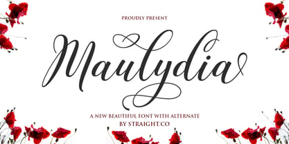 Maulydia Script is elegant calligraphy font, including Regular and Slant. This font is casual and pretty with swashes. Can used for various purposes. such as logo, product packaging, wedding invitations, branding, headlines, signage, labels, signature, book covers, posters, quotes and more. Maulydia Script features OpenType stylistic alternates, ligatures and International support for most Western Languages is included. To enable the OpenType Stylistic alternates, you need a program that supports OpenType features such as Adobe Illustrator CS, Adobe Indesign & CorelDraw X6-X7, Microsoft Word 2010 or later versions.How to access all alternative characters using Adobe Illustrator: https://www.youtube.com/watch?v=XzwjMkbB-wQ Maulydia Script is coded with PUA Unicode, which allows full access to all the extra characters without having special designing software. Mac users can use Font Book , and Windows users can use Character Map to view and copy any of the extra characters to paste into your favourite text editor/app.How to access all alternative characters, using Windows Character Map with Photoshop: https://www.youtube.com/watch?v=Go9vacoYmBw If you have any question, don't hesitate to contact me by email. Thanks so much for looking and Enjoy it!
 - Ink Blank by Fran Studio,
$20.00 Ink Blank is a hand-brushed modern calligraphy font, created with both pen and brush. It includes a dancing baseline with separate swashes that can be applied to the beginning and ends of all lowercase. Ink Blank includes several ligatures, alternates and international support for most western languages. Perfect for Branding, Logos, Greeting Cards, Wedding Stationery and so much more! To activate OpenType Stylistic alternative, you need a program that supports OpenType features such as Adobe Illustrator CS, Adobe Indesign and CorelDraw X6-X7, Microsoft Word 2010 or later. How to access all of the alternate characters, using the Windows Character Map to Photoshop: https://www.youtube.com/watch?v=Go9vacoYmBw How to access all of the alternate character using Adobe Illustrator: http://youtu.be/iptSFA7feQ0nn How to use stylistic sets font in Microsoft Word 2010 or later versions: https://youtu.be/x1A_ilsBsGs Ink Blank PUA encoded with Unicode, which allows full access to all the extra characters without having to design special software. Mac users can use Font Book, and Windows users can use the Character Map to view and copy one additional character to paste into your text editor / favorite applications.
 - Chopper by Canada Type,
$24.95 In 1972, VGC released two typefaces by designer friends Dick Jensen and Harry Villhardt. Jensen’s was called Serpentine, and Villhardt’s was called Venture. Even though both faces had the same elements and a somewhat similar construct, one of them became very popular and chased the other away from the spotlight. Serpentine went on to become the James Bond font, the Pepsi and every other soda pop font, the everything font, all the way through the glories of digital lala-land where it was hacked, imitated and overused by hundreds of designers. But the only advantage it really had over Venture was being a 4-style family, including the bold italic that made it all the rage, as opposed to Venture’s lone upright style. One must wonder how differently things would have played if a Venture Italic was around back then. Chopper is Canada Type’s revival of Venture, that underdog of 1972. This time around it comes with a roman, an italic, and corresponding biform styles to make it a much more attractive and refreshing alternative to Serpentine. Chopper comes in all popular formats, boasts extended language support, and contains a ton of alternate characters sprinkled throughout the character map.
 - Christofer by Straight.Co,
$12.00 Christofer Script is elegant calligraphy font, including Regular and Slant. This font is casual and pretty with swashes. Can used for various purposes. such as logo, product packaging, wedding invitations, branding, headlines, signage, labels, signature, book covers, posters, quotes and more. Christofer Script features OpenType stylistic alternates, ligatures and International support for most Western Languages is included. To enable the OpenType Stylistic alternates, you need a program that supports OpenType features such as Adobe Illustrator CS, Adobe Indesign & CorelDraw X6-X7, Microsoft Word 2010 or later versions.How to access all alternative characters using Adobe Illustrator: https://www.youtube.com/watch?v=XzwjMkbB-wQ Christofer Script is coded with PUA Unicode, which allows full access to all the extra characters without having special designing software. Mac users can use Font Book , and Windows users can use Character Map to view and copy any of the extra characters to paste into your favourite text editor/app.How to access all alternative characters, using Windows Character Map with Photoshop: https://www.youtube.com/watch?v=Go9vacoYmBw If you have any question, don't hesitate to contact me by email. Thanks so much for looking and Enjoy it!
 - Mount Buller by Fran Studio,
$15.00 Mount Buller is a hand-brushed modern calligraphy script font, created with both pen & brush. dancing baseline with separate swashes that can be applied to the beginning and ends of all lowercase. Mount Buller includes several ligatures, alternates and international support for most western languages. Perfect for Branding, Logos, Greeting Cards, Wedding Stationery and so much more! To activate OpenType Stylistic alternative, you need a program that supports OpenType features such as Adobe Illustrator CS, Adobe Indesign and CorelDraw X6-X7, Microsoft Word 2010 or later. How to access all of the alternate characters, using the Windows Character Map to Photoshop: https://www.youtube.com/watch?v=Go9vacoYmBw How to access all of the alternate character using Adobe Illustrator: http://youtu.be/iptSFA7feQ0nn How to use stylistic sets font in Microsoft Word 2010 or later versions: https://youtu.be/x1A_ilsBsGs Mount Buller PUA encoded with Unicode, which allows full access to all the extra characters without having to design special software. Mac users can use Font Book, and Windows users can use the Character Map to view and copy one additional character to paste into your text editor / favorite applications.
 - Kefir by ROHH,
$39.00 Kefir™ is charismatic, cheerful and full of character. It is inspired by such classics as Cooper and Windsor and serves as their modern alternative. It is a display font family with very strong personality and feels at home in editorial design, all kinds of headlines, posters, badges, websites and branding. Its light weights let you set friendly and legible paragraphs of text as well! Kefir has beautifully flowing lines, its nature is soft, rounded and elegant with charming retro vibes. The letterforms were crafted with much passion and love in order to send powerful positive message whenever used! Kefir has two additional stylistic sets to adjust the font to your liking and decide if you choose upright or sloping stems (in characters like h, m ,n , a) or go even more playful with some super-friendly letterforms. Kefir family consists of 7 styles + 1 variable font, letting you adjust the weight to your exact needs. It has extended latin language support as well as broad number of OpenType features, such as stylistic sets case sensitive forms, ligatures, swash caps, final forms, contextual alternates, lining & oldstyle figures, basic fractions, superscript and subscript, ordinals, currencies and symbols.
 - Respondent by Mans Greback,
$49.00 Respondent is a flowing and handwritten font. Drawn, created and published by Mans Greback in 2021, this script family has a genuine and empathic personality, while being wild and vivid. Respondent can be used in a product or company logo, or in any digital design where you want the appearance of true, released handwriting. Originally inspired by the lettering on the cover of GTA Vice City, over the design process is has evolved to a very diverse typeface that can be used in a wide variety of contexts, much more than a Grand Theft Auto font. The Respondent Family is provided in five weights: Thin, Light, Medium, Bold and Black The different styles supplies a flexibility in both character and size. The font is built with advanced OpenType functionality and has a guaranteed top-notch quality, containing stylistic and contextual alternates, ligatures and more features; all to give you full control and customizability. It has extensive lingual support, covering all Latin-based languages, from North Europe to South Africa, from America to South-East Asia. It contains all characters and symbols you'll ever need, including all punctuation and numbers.
 - Berthusen by Sabrcreative,
$25.00 Introducing Berthusen, a stunning handwriting signature font that exudes elegance and sophistication. With its graceful curves and fluid strokes, this script font captures the essence of handwritten beauty and adds a touch of refinement to your designs. Whether you're creating logos, branding materials, invitations, or any creative project, Berthusen will elevate your work with its timeless charm. Berthusen features a perfect balance between uppercase and lowercase letters, offering versatility and creative freedom. The inclusion of numbers and punctuations ensures seamless integration into your designs, allowing you to craft captivating compositions. With multilingual support, this font enables you to express your message effectively across different languages, reaching a broader audience. The PUA encoding of Berthusen allows for easy access to its extensive collection of unique glyphs and ligatures. These special characters and letter combinations add an authentic and handcrafted touch to your typography, enhancing the overall visual appeal of your designs. With its refined script style, Berthusen is perfect for various design projects where a touch of elegance is desired. Its versatility makes it ideal for wedding invitations, stationery, quotes, branding, and much more. Let Berthusen elevate your designs and leave a lasting impression on your audience.
 - Anindira by Straight.Co,
$15.00 Anindira Script is elegant calligraphy font. This font is casual and pretty with swashes. It can used for various purposes, such as logo, product packaging, wedding invitations, branding, headlines, signage, labels, signature, book covers, posters, quotes and more. Anindira Script features OpenType stylistic alternates, ligatures and International support for most Western Languages is included. To enable the OpenType Stylistic alternates, you need a program that supports OpenType features such as Adobe Illustrator CS, Adobe Indesign & CorelDraw X6-X7, Microsoft Word 2010 or later versions. How to access all alternative characters using Adobe Illustrator: https://www.youtube.com/watch?v=XzwjMkbB-wQ Anindira Script is coded with PUA Unicode, which allows full access to all the extra characters without having special designing software. Mac users can use Font Book, and Windows users can use Character Map to view and copy any of the extra characters to paste into your favourite text editor/app. How to access all alternative characters, using Windows Character Map with Photoshop: https://www.youtube.com/watch?v=Go9vacoYmBw If you have any question, don't hesitate to contact me by email. Thanks so much for looking and Enjoy it!
 - Montine by Gatype,
$8.00 Montine Script is elegant calligraphy font. This font is casual and pretty with swashes. Can used for various purposes such as logos, product packaging, wedding invitations, branding, headlines, signage, labels, signatures, book covers, posters, quotes and more. Montine Script features OpenType stylistic alternates, ligatures and International support for most Western Languages is included. To enable the OpenType Stylistic alternates, you need a program that supports OpenType features such as Adobe Illustrator CS, Adobe Indesign & CorelDraw X6-X7, Microsoft Word 2010 or later versions.How to access all alternative characters using Adobe Illustrator: https://www.youtube.com/watch?v=XzwjMkbB-wQ Montine Script is coded with PUA Unicode, which allows full access to all the extra characters without having special designing software. Mac users can use Font Book , and Windows users can use Character Map to view and copy any of the extra characters to paste into your favourite text editor/app.How to access all alternative characters, using Windows Character Map with Photoshop: https://www.youtube.com/watch?v=Go9vacoYmBw If you have any question, don't hesitate to contact me by email : chaidirgata@gmail.com Thanks so much for looking and Enjoy it!
 - Dx Slight by Dirtyline Studio,
$39.00 Dx Slight a new fresh & modern Sans with a Ultra Condensed style. The font it’s look good in posters, it is ideally suited for setting titles. However, the font has gained wide popularity among designers, and now you can find Dx Slight on the covers of magazines, on restaurant signs and on the main pages of websites. Dx Slight Display Typeface is the part of a strong and modern display family. This typeface both impressive at display sizes and easily readable in text size, while the sharp shapes of the triangular sans and the distinctive letter shapes show their strength in logo design and impressive editorial use. Dx Slight comes with elegant style, strength, and contrasts, with features an extended Latin character set of 366 glyphs covering over 88 languages. It has been designed as a variable font to give lots of options and access to unique type looks, however, it also includes nine weights, three axis H-height and Slant to give just as much access to creativity to those without access to variable supporting software. Its distinctive character and many variables make it a versatile, stylish workhorse, great for interfaces and design.
 - Boister Black Pro by CheapProFonts,
$10.00 I loved the look of this font so much that I couldn't resist reworking it - although it probably had the most basic character set I've ever used as a starting point. But here it is in its complete, professional, multilingual state. I hope this wonderful swashbuckling font now finds many new users and uses. Celebrate! ALL fonts from CheapProFonts have very extensive language support: They contain some unusual diacritic letters (some of which are contained in the Latin Extended-B Unicode block) supporting: Cornish, Filipino (Tagalog), Guarani, Luxembourgian, Malagasy, Romanian, Ulithian and Welsh. They also contain all glyphs in the Latin Extended-A Unicode block (which among others cover the Central European and Baltic areas) supporting: Afrikaans, Belarusian (Lacinka), Bosnian, Catalan, Chichewa, Croatian, Czech, Dutch, Esperanto, Greenlandic, Hungarian, Kashubian, Kurdish (Kurmanji), Latvian, Lithuanian, Maltese, Maori, Polish, Saami (Inari), Saami (North), Serbian (latin), Slovak(ian), Slovene, Sorbian (Lower), Sorbian (Upper), Turkish and Turkmen. And they of course contain all the usual "western" glyphs supporting: Albanian, Basque, Breton, Chamorro, Danish, Estonian, Faroese, Finnish, French, Frisian, Galican, German, Icelandic, Indonesian, Irish (Gaelic), Italian, Northern Sotho, Norwegian, Occitan, Portuguese, Rhaeto-Romance, Sami (Lule), Sami (South), Scots (Gaelic), Spanish, Swedish, Tswana, Walloon and Yapese.
 - Galapogos BRK Pro by CheapProFonts,
$10.00 A very chunky and rounded font. I have shortened the r and t, increased the size of the dots, and tweaked a little here and there - before expanding the character set substantially. I actually like the font so much that I also used it for the CheapProFonts logo! ALL fonts from CheapProFonts have very extensive language support: They contain some unusual diacritic letters (some of which are contained in the Latin Extended-B Unicode block) supporting: Cornish, Filipino (Tagalog), Guarani, Luxembourgian, Malagasy, Romanian, Ulithian and Welsh. They also contain all glyphs in the Latin Extended-A Unicode block (which among others cover the Central European and Baltic areas) supporting: Afrikaans, Belarusian (Lacinka), Bosnian, Catalan, Chichewa, Croatian, Czech, Dutch, Esperanto, Greenlandic, Hungarian, Kashubian, Kurdish (Kurmanji), Latvian, Lithuanian, Maltese, Maori, Polish, Saami (Inari), Saami (North), Serbian (latin), Slovak(ian), Slovene, Sorbian (Lower), Sorbian (Upper), Turkish and Turkmen. And they of course contain all the usual "western" glyphs supporting: Albanian, Basque, Breton, Chamorro, Danish, Estonian, Faroese, Finnish, French, Frisian, Galican, German, Icelandic, Indonesian, Irish (Gaelic), Italian, Northern Sotho, Norwegian, Occitan, Portuguese, Rhaeto-Romance, Sami (Lule), Sami (South), Scots (Gaelic), Spanish, Swedish, Tswana, Walloon and Yapese.
 - Links by HouseOfBurvo,
$36.00 Links was built adhering to a strict grid of 'linked' squares; and comes with special "Grid Glyphs" that line up perfectly with all characters. These Grid Glyphs can be used to create an invisible grid for your layout or as a background to enhance your design. Perfect for posters, logos and headlines, this font is available in four styles; Round and Square with accompanying obliques. This font was inspired by much of the lettering from the Dutch movement, or Functionalism which in turn was a descendant of the International Style pioneered by the Swiss. In keeping with these traditions, Links was build adhering to a strict grid of linked squares, taking a clear scientific approach to construct each character. One of the main features of International Style is the implementation of a Grid. This font has built in special characters that I call 'Grid Glyphs'; these Grid Glyphs line up perfectly with every character, enabling you to construct your own grid that echoes the form of the characters. These glyphs can also be used to create a background for your layout, as can be seen in the gallery pictures.
 - Sears Tower - 100% free

- Elsain by Maculinc,
$15.00 Elsain is a serif family font that is very unique on the edges with different angular styles, the spacing between these fonts is made very tight to deepen the character of this font. This font is great in layout design for quotes or body copy, best used as a display for headings, logos, branding, magazines, product packaging, invitations or anything else. Elsain Serif Family has many features such as Multilingual support, has 14 font families from thin to thick and also 2 variables. This font is also available in Cyrillic to complement many other languages. Not to forget it is also available in Greek form, and some other accessories. This completeness can be used in various letters from various countries such as English, Indonesian, Afrikaans, Basque, Breton, Catalan, Danish, Dutch, Finnish, French, Gaelic, German, Icelandic, Irish, Italian, Norwegian, Portuguese, Saami, Spanish, Swahili , SwedenCroatia, Czech, Estonian, Hungarian, Latvian, Lithuanian, Polish, Romanian, Serbian, Slovak, Slovenian, Turkish, Avar, Balkar, Belarusian, Bulgarian, Chechen, Erzya, Ingush, Lezgian, Macedonian, Moldavian, Ossetian, Russian, Serbian, Ukrainian, Greek and others. What do you get: Elsain Serif Regular and Italic Elsain Variable Regular and Variable Italic TTF. Accessible in Adobe Illustrator, Adobe Photoshop, and Adobe InDesign, it even works in Microsoft Word. Fully Encoded Characters are accessible without additional design software. Images used: All photos/images/vectors used in the preview are excluded, for illustration purposes only. Feel free to follow, like and share. thank you very much for checking my store!
 - Lady Rene by Sudtipos,
$59.00 Looking back on my production to date, neither so little nor so large, it does not come as a surprise to find myself now introducing Lady René. A brief review of my career would read as follows: graphic designer graduated from Buenos Aires University, a 10-year professorship in Typography in the same institution, an illustrator in the making. For almost 15 years now my work has focused on the design of editorial pieces, predominantly books and CD sleeves. Typography proper has always been central to my research projects. All my obsessions eventually embodied as much the search for a perfect, spotless text as for a daring and provoking one. In my view, "how-to-say-something" ranks highest amongst a graphic designer’s responsibilities. It was in this vein that I called in the written word to illustrate, to draw, to narrate. Why not reverse the saying and proclaim that “a word is worth a thousand images”? If so, one single word could trigger endless meanings, associations, ideas, and memories in every reader’s mind. Language, we know, has a strong power and is a living expression of a culture. In my illustrations, letters and drawings reunite in one synergy said and unsaid, the finiteness of the message and the freedom of the free reading. And this is how and when, Lady René, my first born type font sees the light of day conceived out of a love of illustration and a reverence for the written word, recalling the whimsicality of the handmade drawing and reflecting its sensitive, warmth and spontaneity. Enabled by the characteristics of Open Type and the hard, outstanding work of designer Ale Paul, Lady René succeeds in composing texts in a simple, organic way by means of its contextual and stylistic alternates, swash characters, ligatures and connecting words. A bundle of decorative miscellanea completes the set of signs, enabling the user considerable freedom to create new typographic landscapes. Lady René is then prepared, very much like a character in a short story, to come to life in the reader’s mind. I expect you will enjoy her as much as I did creating her. Laura Varsky
 - Courage by Positype,
$35.00 High-contrast? High impact? Have Courage? Eye-catching and (extra, extra) bold, Courage balances ultra-high stroke weight, delicate details, and unique letterforms with a self-indulgent passion that will make you feel a little guilty using it. Honestly, use it large and don’t try to force it into a small space, because these fearless letterforms need room to move. Flavored with both upright and italic styles, each font includes an indulgent level of alternates, swashes and titling options, visual elements and more. A backstory with a different name Years ago, I was commissioned to take my Lust typeface and produce something unique to use for large format graphics for an event…cool. It needed to be hyper-contrast with a lot of over-the-top details. With a tight turnaround, I looked for primers within my development catalogue to help me, and settled on some early work on a typeface I had drawn called Hedonist. I used those sketches and its conventions to retrofit and build out Lust Hedonist (only to see the project go bust on the client’s end). I intended to go back shortly after the Lust Hedonist release to finalize a retail version of the OG Hedonist, but I never could settle on the look of the 'g' or the numerals, got distracted with other projects, and never picked it back up… until last year. After randomly doodling a fat, flat ‘g’ with an extremely tilted counter axis, I knew immediately how it could be used and that (re)set things in motion. Only problem was, in the process of refining the letterforms I began truly dissecting the pieces, rediscovering all of the recklessness within Hedonist, and decided on fundamentally rewriting the approach to the typeface… literally flaying it to the bone. I’m much, much happier with this finished typeface now, but the name no longer fit the moniker given to the first, adolescent approach—there’s far more audacity and cleverness in these letterforms, tenacious in their resolution now. As a result, the name Courage fit the mettle of this typeface so much more, so I kept it.
 - Once upon a time, in the mystical land of AEnigma, there was a font that decided it didn't want to play by the rules. Its name? Bandwidth Bandless BRK. This font was the digital equivalent of that qu...
- KG Two Is Better Than One by Kimberly Geswein,
$5.00 This font was created in honor of my husband for our 12th wedding anniversary. 14 years ago, I met this tall, skinny guy from Indiana in the lobby of a hotel in Hong Kong. We talked. The next day, we had lunch together. And that night we had dinner together. And the next day. And the next. We met just before my 19th birthday, and on my birthday he took me to the top of Victoria Peak, where we looked out over the city of Hong Kong- such a beautiful place to begin a lifetime of love! We spent 4 months together in Hong Kong, falling in love with each other and with the beautiful city we were privileged to call home for that short time. We married the next year. We've lived in Indiana, Texas, China, Kentucky, and Florida over those 12 years of marriage and have welcomed 2 daughters into our lives. I know beyond a shadow of a doubt that he completes my life in a way I didn't know was possible. And I know that I'm blessed beyond words to have a supportive, wonderful, encouraging husband who is also a loving, involved, caring dad to our daughters. This font is for you, Keith!
 - Between The Lines BF by Bomparte's Fonts,
$29.00 The famous Catalan architect, Antoni Gaudí, used to say “there are no straight lines or sharp corners in nature…” However, with Between The Lines that’s exactly what you’ll find: straight lines, parallel and perpendicular, all in a glorious display of Art Deco style. Here the verticals and horizontals dominate while the diagonals “sit this one out”. Curvilinear lines also run free here: they serve as refreshing counterpoints to prominent straights. These forms suggest a somewhat expressive script-like characteristic, (especially in lowercase) wherever the font’s many initials, terminals and contextual alternates are employed. Between The Lines offers many options for alternate letterforms (ligatures, stylistic alternates, contextual alternates, etc.). When these OpenType features are used judiciously and selectively, your typography will be greatly heightened. You’ll find BTL right at home in a number of environments: music album covers, snack food packaging, magazine headlines, cosmetics, signage and more. PLEASE NOTE: due to its very tall ascenders, Between The Lines benefits from generous leading (line spacing). Multilingual support included.
 - VLNL TpDuro by VetteLetters,
$30.00 VLNL TpDuro was designed by chef Martin Lorenz and Juanra ‘Wete’ Pastor. Its concept was inspired by an Albrecht Dürer design from 1525, which shows a system to construct a gothic lowercase letter. Following the logic of this lowercase construction, but not the traditional uppercase letters of regular fraktur (brokenscript) alphabets, some brand new upper case letters were designed. The 45 degree tilted square that forms the basis of the letters, is as square and hard as a cracker. And we love crackers. You can put cheese on them. The ‘pixel’ feeling of the downstroke was intensified by repeating the rotated square module as often as they could. All this resulted in a strong, dark typeface with a steady rhythm, with one foot in history and the other in modern times. It works well as a display typeface for short texts, headlines and logos. Music festivals and heavy metal bands should also pay attention. This is hard stuff.
 - Neospace Expanded by deFharo,
$21.00 Neospace Expanded is an avant-garde typeface designed for technology and science fiction lovers. With its elegant geometric minimalism, Neospace redefines typographic aesthetics with a perfect fusion between modern and futuristic. Geometric Inspiration Designed with an expanded proportion and thin thickness, it exudes its own high-tech, futuristic and space style. Each Neospace character has been sculpted from the letter “O”, using the mathematical proportions of the Fibonacci sequence in curves, metrics and kerning, adding a golden ratio to each character. This meticulous approach ensures exceptional readability and a unique aesthetic that evokes a sense of order and precision. Three styles: Regular, which provides a modern and clean look; the Dot Layer, which adds a touch of color and creativity to typographic titles; and the Bold version, which evokes the feeling of futuristic and sophisticated electronic circuits, bringing a sense of avant-garde and advanced technology to your projects. Neospace allows you to create typographic titles in various colors, imitating the sophistication of futuristic electronic circuits. Limitless Versatility Neospace goes further by offering alternative letters and signs, multiple sets of numbers and capital letters, as well as monetary and cryptocurrency symbols. In addition, it incorporates complex OpenType functions that further enrich the design possibilities, allowing even greater customization in your typographic designs.
 - Carlton by ITC,
$29.99Carlton is based on a typeface designed by Prof. F. H. Ehmcke. In 1908, Ehmcke released his Ehmcke-Antiqua design through the Flinsch typefoundry in Germany. Ehmcke-Antiqua was later distributed by the Bauer typefoundry in Frankfurt am Main. The Caslon Letter Foundry in England discovered the design and released their own typeface based upon the model, which they named Carlton. Carlton entered the Stephenson Blake program after they acquired the Caslon Letter Foundry in the late 1930s. As hot and cold metal typesetting became outdated technologies, Carlton and Ehmcke-Antiqua fell out of general use. In the 1990s, Letraset revived this classic design, distributing it under its English name, Carlton. Carlton's clean and generous capitals, as well as its understated yet detailed lower case, have found popularity again in recent years. The elegance of Carlton is best used for displays with large letter and word spacing. Carlton shows all of the hallmarks of a delicate serif typeface design; its forms capture a distinct moment that was common within Central European type design during the first third of the 20th Century. Carlton is similar to several other expressive typefaces from the early 1900s, including Bernhard Modern, Koch Antiqua, Locarno, and Nicolas Cochin." - Uppercut Angle by Delve Fonts,
$39.00 Joachim Müller-Lancé's Uppercut is a rather sporting fellow, originally developed for the Krav Maga training center of San Francisco (Krav Maga is a simple and efficient self-defense system that has become equally popular in Hollywood and with law enforcement). Joachim has spent several years training, hitting things and people whenever he needs a break from kerning. Uppercut can be seen on the school's t-shirts and other articles. Despite bearing the same moniker as an upwards punch to the chin, the name actually fell together quite naturally as Uppercut is an all uppercase typeface, and the word "cut" is also historically used to describe a type style in hot metal type. For this slanted look, "Angle" felt just right (with thanks to Mia McHatton). The design idea sprang from pencil sketches for the center's new identity. Uppercut's shapes are not calligraphic or handwritten, more like lettering seen in comics or sports logos. Its brush movements are imaginary, not too literally brushy. During development, details were simplified and reduced until a bit of a cut-paper feel emerged, but more fluid like writing. The shapes are economical and efficient; simplicity makes the font versatile, holding up in small as well as big sizes. Uppercut is decidedly analog, muscular but not bulky, with the fluid but determined movements of a boxer or martial artist - not theatrical but powerful, fast, confident and dynamic. Well... it has punch. In the proportions, there is emphasis on a strong upper edge "keeping its guard up", while several stems protrude downward, giving the impression of leaping or being "light on the feet". Use Uppercut to pick up the pace, add snap, verve and drive - on movie posters for action and adventure, to advertise your dojo, rumble or prizefight, racing team or tuning shop, or invite friends to your barbecue with old time rock'n'roll and homemade hot pepper sauce.
 - Garamond Premier by Adobe,
$35.00Claude Garamond (ca. 1480-1561) cut types for the Parisian scholar-printer Robert Estienne in the first part of the sixteenth century, basing his romans on the types cut by Francesco Griffo for Venetian printer Aldus Manutius in 1495. Garamond refined his romans in later versions, adding his own concepts as he developed his skills as a punchcutter. After his death in 1561, the Garamond punches made their way to the printing office of Christoph Plantin in Antwerp, where they were used by Plantin for many decades, and still exist in the Plantin-Moretus museum. Other Garamond punches went to the Frankfurt foundry of Egenolff-Berner, who issued a specimen in 1592 that became an important source of information about the Garamond types for later scholars and designers. In 1621, sixty years after Garamond's death, the French printer Jean Jannon (1580-1635) issued a specimen of typefaces that had some characteristics similar to the Garamond designs, though his letters were more asymmetrical and irregular in slope and axis. Jannon's types disappeared from use for about two hundred years, but were re-discovered in the French national printing office in 1825, when they were wrongly attributed to Claude Garamond. Their true origin was not to be revealed until the 1927 research of Beatrice Warde. In the early 1900s, Jannon's types were used to print a history of printing in France, which brought new attention to French typography and the Garamond" types. This sparked the beginning of modern revivals; some based on the mistaken model from Jannon's types, and others on the original Garamond types. Italics for Garamond fonts have sometimes been based on those cut by Robert Granjon (1513-1589), who worked for Plantin and whose types are also on the Egenolff-Berner specimen. Linotype has several versions of the Garamond typefaces. Though they vary in design and model of origin, they are all considered to be distinctive representations of French Renaissance style; easily recognizable by their elegance and readability. Garamond Pemiere Pro was designed by Robert Slimbach, and released in 2005." - Swollen - Unknown license

- TT Norms Std Condensed by TypeType,
$35.00 TT Norms® Std Condensed useful links: Specimen | Graphic presentation | Customization options TT Norms® Std Condensed is the logical development of our bestselling TT Norms®. Since the release of TT Norms®, we received a bunch of requests to create its narrow version and even managed to make several custom projects of the narrow TT Norms® before we decided to start creating a full-fledged commercial version of the typeface. At the very beginning of the project, we did some research and tested several options for the possible width of the typeface. Despite the fact that TT Norms® Std Condensed has narrower proportions than the original family, it inherited the classic proportions of characters, attention to detail and meticulous elaboration of each character in the typeface. The TT Norms® Std Condensed font family consists of 18 faces (9 upright and 9 italics). Each style includes a sufficient set of characters that allow you to solve most of the problems that arise in the field of graphic design, branding, packaging design or website design.
 - Sequel Geo by OGJ Type Design,
$35.00 Sequel Geo is a geometric/neo-grotesque hybrid superfamily, influenced by formalized sans-serif typefaces from Germany and Swiss modernist type design—particularly Max Bill’s greek-styled lettering. 8 subfamilies and 120 individual fonts allow for a wide range of typographic expressions. Sequel Geo’s hallmark features, such as the circular “G” and punctuation, simple “t”, and two-story “a” turning one-story in bolder weights, persist throughout all styles. But it’s the formal and functional differences between subfamilies that let you really fine-tune your layouts. The three optical sizes of the core collection, “Body Text”, “Headline”, and “Display”, boast optimized spacing for the intended use. “Extended” packs some extra punch with 18 display-oriented styles. Finally, 48 “Graphic” styles in 4 subfamilies push to the Geometric side, replacing horizontal and vertical stroke endings with angular ones, simplifying letterforms. Sequel Geo is a journey through time and space. From 1920s Germany to 1950s Switzerland. All the while, its archetypal shapes are neutral yet confident, its appearance is classic.
 - Jazmo by URW Type Foundry,
$49.99 Jazmo is an offspring of an assignment I did for a Dutch architect. A classic building and coincidently the place of my studio in my hometown Zwolle, Netherlands, needed to be renovated. My job was to design the house numbers and signs for this building. This building I refer to was built in 1932 and designed according to the ‘New objectivity’ architecture. Now it accommodates several artist and craftsmen and also houses students. In my design I used elements of the Art Nouveau, which is related to the ‘New Objectivity’. Words as stately, angular, linear, stylish, artful, playful and frolic came to mind. It should be a design with a hint of the past and a flirt with the future. This house numbering is the root wherefrom Jazmo arises. The name Jazmo cites to the Jazz scene, which was a new and very popular artistic influence that time and age and is still a vibrant source of musical renewal. Mo stands for my Name Marit Otto. Together with my intern Arie Blok I created the missing characters and completed the font. Welcome Jazmo!
 - Caslon #540 by Linotype,
$29.99The Englishman William Caslon punchcut many roman, italic, and non-Latin typefaces from 1720 until his death in 1766. At that time most types were being imported to England from Dutch sources, so Caslon was influenced by the characteristics of Dutch types. He did, however, achieve a level of craft that enabled his recognition as the first great English punchcutter. The original Caslon specimen sheets and punches have long provided a fertile source for the range of types bearing his name. Identifying characteristics of most Caslons include a cap A with a scooped-out apex; a cap C with two full serifs; and in the italic, a swashed lowercase v and w. A few of the many interpretations from the early twentieth century were true to the source, as well as strong enough to last into the digital era. These include two from the American Type Founders company, Caslon 540 and the slightly heavier Caslon #3. Both fonts are relatively wide, and come complete with small caps, old style figures, and italics. - As of my last update in April 2023, there isn’t a widely recognized font specifically named "Madonna" that is part of standard typographic resources or libraries. However, let's explore a hypothetica...
- As of my last update in 2023, "Blue Jeans" by Bradford Cox is not widely recognized as a specific font in mainstream typographic resources or font directories. It's essential to clarify that Bradford...
- SteamCourt by insigne,
$22.00 Think smart. Think regal. Think SteamCourt, a new font designed specifically for the card game SteamCourt. A bit of background if you will: In early 2014, some friends from my college days banded together to form their own game company. Their first launch? A current Kickstarter they named SteamCourt. I love Kickstarter. It’s a fantastic platform, a great way for individuals to introduce the public to their visions. I've started a couple of them myself--both including fonts designed specifically for the projects. The first is Chatype, a font created exclusively for the city of Chattanooga. The second: Cabrito, a font developed as part of the children’s typeface book, The Clothes Letters Wear. It’s wonderful to work with so many others who come alongside to help you vision become reality. Naturally, hearing of my friends' project, I contacted them about adding a new face to their venture as well. I gave them carte blanche. They wanted steampunk. It was a great challenge, the result of which is now SteamCourt, an unforgettable display typeface that draws from the mix of Victorian regals, metallic and brass engineering, cogs, clocks and blackletter typography. It evokes a time of skillfully forged metalwork and an era of intrigue and excitement, filled with audacious feats of engineering and innovation and the perilous journeys of the airship. While influenced by the era of blackletter, SteamCourt is an unmistakable departure from the style of two centuries past, yet it still shines in its given display roles with a distinct regal twist. The serifs are asymmetrical, yet the characters are all specially and delicately balanced. It’s an eye-catching alternative to blackletter with modern steampunk touches. The game’s signature typeface has sizeable language support on top of 90 alternate characters as well. In addition to a generous number contextual alternates, SteamCourt features stylistic alternates that allow for buyers to customize its visual appearance for their preferences, helping to make it a superior option for packaging, branding and enormous typesetting logotypes as well as shorter textual content. Check out the game, but grab the font, too, to be a part of that crib created as a companion for the new game in court. It'll be the ace up your sleeve for many rounds of design ahead.
 - The "Butterfly Chromosome AOE" font, designed by Astigmatic One Eye, is a striking testament to the imaginative and experimental spirit that defines much of modern typography. This font manages to en...
- Sirkle by Invasi Studio,
$19.00 Sirkle is a semi-serif typeface for display, constructed with sharp and curvy characters. All Letters are handcrafted and made to fit each other perfectly without exception, with a modern and edgy style that gives them a unique look. Sirkle comes with ligatures, alternates, and supports 60+ Latin-based languages. The Sirkle is ideal for logotype, signage, posters, packaging, and much more! Features: Uppercase & Lowercase Numerals & Punctuation Alternates and Ligatures Multilanguage Supports 60+ Latin based languages
 - Hacky by madeDeduk,
$17.00 Hacky is a stylish luxury serif family. It's clean and have the smooth angle with 9 variable weight and much alternative inside. Suitable to create any branding, product packaging, invitation, quotes, t-shirt, label, poster, logo etc. Feature UPPERCASE Lowercase Number & Symbol International Glyphs Uppercase Alternative Lowercase Alternative Ligatures If you need anything else just shoot me on email at: dedukvic@gmail.com or find more previews on my Instagram here : https://www.instagram.com/acekelgondolayu/?hl=en Hope you enjoy it.
 - Malino by Lafontype,
$25.00 Malino is a humanist sans serif that gives a slightly stiff and strong feel but still presents a harmonious blend. The main characteristic of Malino is the flat shape at the end of the letter (specific : inner side of the letter C, G, J, S, a, c, e, g and s) and still maintain the curvature of the outside (Overshoot) so that empty space ( Open Counter) looks wider and the level of readability produced is much higher.

