10,000 search results (0.133 seconds)
  1. Bionic Type Shadow - Unknown license
  2. Hendrix Demo - Unknown license
  3. Kleptocracy - Unknown license
  4. Outta Control Caps - Unknown license
  5. VTCSuperMarketSaleSC - Unknown license
  6. MoDi Khilari 1 - Unknown license
  7. Wanax Demo - Unknown license
  8. Kremlin Emperor - Unknown license
  9. Marsh Gas - Unknown license
  10. Mage 1999 - Unknown license
  11. Mainframe BB - Personal use only
  12. Lost Forever - Unknown license
  13. rhino dino - Unknown license
  14. TeamSpirit - 100% free
  15. StandingRoomOnly - Unknown license
  16. Liquidy Bulbous - Unknown license
  17. Kimberley - Unknown license
  18. Kicking Limos - Unknown license
  19. Nixon - Unknown license
  20. Nicotine Stains - Unknown license
  21. Pupcat - Unknown license
  22. Linear Curve Fatty - Unknown license
  23. Shazbot - Unknown license
  24. DS Thompson - Unknown license
  25. Black Eye Nue - Unknown license
  26. Bandwidth BRK - Unknown license
  27. LED - Unknown license
  28. GiantTigers - Unknown license
  29. Lounge Bait - Personal use only
  30. Chibaraki Now - Unknown license
  31. Eight Track program 4 - Personal use only
  32. Family Guy - Unknown license
  33. LetterOMatic! - Personal use only
  34. Kremlin Kourier II - Unknown license
  35. Strasua - Unknown license
  36. Sergeant SixPack - Personal use only
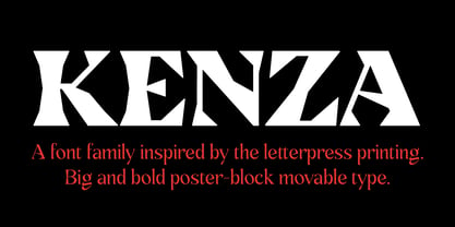
  37. Kenza by Alex Camacho Studio, $20.00
    Kenza is a serif geometric font, which is inspired by letterpress printing. Hand crafted wood letters used in the mid-20th century. It is characterized by being large, bold poster-block movable type.
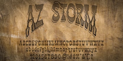
  38. AZ Storm by Artist of Design, $20.00
    AZ Storm was inspired from old '70's skateboard logo. This font was designed for use as a fun bold headline.
  39. AW Conqueror Std Sans by Typofonderie, $59.00
    AW Conqueror Sans was born out of this desire to fuse geometric and humanistic sans. It remains a typeface fundamentally influenced by both Bauhaus spirit — with its simplified geometric forms — and Jan Tschichold’s attempts to link this modular spirit to Eric Gill’s humanist sans serif. AW Conqueror Sans is a claimed French synthesis of Germanic Modernism and English classical tradition. Spheres of influence The core set of capitals are based on the proportions of the Roman capitals like Futura, Erbar, Nobel, Johnston, Gill Sans. During the 1930s, the Futura was a true success. Since then, Monotype offered a geometric version of the Gill Sans, and Linotype added Futura-like variants to WA Dwiggins’ Metro. AW Conqueror Sans is kind of a “fusion” of this approach. The lower case “b, d, p, q” are also directly influenced by Eric Gill’s, while the “y” is influenced by some of Jan Tschichold’s alphabets. In italics, drawn narrower, AW Conqueror Sans reinterprets Gill’s idea: a rigorous italic like a roman but which sometimes reveals some aspects of a Renaissance italic. AW Conqueror Sans and its extensions AW Conqueror Sans is the initial reference point for an extended family, including AW Conqueror Inline, Slab, Carved, Didot. The potential of these mixed families is powerful. Because AW Conqueror typefaces are based on an identical structure, and compatible proportions.
Looking for more fonts? Check out our New, Sans, Script, Handwriting fonts or Categories
abstract fontscontact usprivacy policyweb font generator
Processing