2,620 search results
(0.017 seconds)
- Magalith Tanach Pro by Samtype,
$124.95 This is a font to build an hebrew Bible (Tanach) or any Hebrew prayer book. Magalith Tanach Pro has all unicode hebrew marks and others like, ShevaNa, Dagesh Chazak, Qamats Katan and Cholam Chaser. You can even hide marks You don't want to use. This font has a complex and exclusive programmation of opentype features. Probably is the first hebrew font with this opentype feature programmation level in MyFonts site. Including in Tanach Pro family are 2 captions fonts to use in footnotes, explanations and small text sizes .
 - Chelistine by Abo Daniel,
$13.00 introducing CHELISTINE - Beauty Handwritten Font - CHELISTINE is a natural font, that is made using a real brush pen. It is great for Signature, logos, branding, advertising, titling, quotes, and more. It came in 2 styles: Regular Slant Features: Uppercase Lowercase Number & Puncturation Multilingual Support Swash PUA encoded The ending swashes make this product so complete and perfect. Very easy to access. You only need to add an underscore twice after the lowercase character. example: a_ _ it will become a with swash So, don't hesitate to purchase this product. It is fantastic. Regards, Abo Daniel
 - Horrified Tonight by Arendxstudio,
$16.00 Horrified Tonight - Halloween Font Horrified Tonight - Halloween Font is a display font that is inspired by horror style because its shape is very unique and is perfect for any project that you will use with this theme. Horrified Tonight came with opentype features such stylistic alternates, stylistic sets & ligatures good for logotype, poster, badge, book cover, tshirt design, packaging and any more. Features : 1.Uppercase & Lowercase 2.Multilingual support 3.Number 4.Symbol 5.Punctuation 6.Extra Dingbat 7.Support in Mac and Windows OS -Support in design application (photoshop, illustrator, and more)
 - Culinary by Latinotype,
$39.00 Culinary is a typographic system inspired by the art of cooking. This family comes with 2 subfamilies: one Regular Family of 4 weights plus a Sans Line font and a set of Borders, and one 4-weight Script Family that also includes Sans Line and Borders. Culinary is well-suited for packaging, restaurant and cafe branding, bakeries, logos, magazines, menus, recipe books, invitations and much more. The OpenType features allow access to a wide set of characters, including ligatures, swashes, endings, initial and terminal forms, and lots of alternates.
 - PR Cauldron by PR Fonts,
$9.02 Whether your subject is scary, or just ancient, this font can help get the right feeling across. PR-Cauldron has capitals based on Uncials, and lowercase based on Celtic Minuscule. “Potion” has a rough finish, and “Curse” has the same letters dripping with gore, suitable for Halloween. Letters are size matched in both fonts, so you can put in as much, or as little messiness as you like. Combines well with: PR Bramble Wood 1, PR Bramble Wood 2, PR Hallow Doodles 01, PR Hallow Doodles 02, PR Swirlies 01, PR Swirlies 05
 - FF Dirty One by FontFont,
$41.99 British type designer Neville Brody created this display FontFont in 1994. The family contains 2 weights: Regular and Bold and is ideally suited for advertising and packaging, music and nightlife as well as poster and billboards. FF Dirty One provides advanced typographical support with features such as ligatures, alternate characters, and case-sensitive forms. It comes with tabular oldstyle and tabular lining figures. This FontFont is a member of the FF Dirty super family, which also includes FF Dirty Four, FF Dirty Seven, FF Dirty Six, and FF Dirty Three.
 - Sticky Blood by Arendxstudio,
$13.00 Sticky Blood - Dripping Halloween Font is a display font that is inspired by gothic and horror style because its shape is very unique and is perfect for any project that you will use with this theme. Sticky Blood with opentype features such stylistic alternates, stylistic sets & ligatures good for logotype, poster, badge, book cover, tshirt design, packaging and any more. Features : 1.Uppercase & Lowercase 2.Multilingual support 3.Number 4.Symbol 5.Punctuation. 6.Extra Dingbat 7.Support in Mac and Windows OS -Support in design application (photoshop, illustrator, and more)
 - Montana Belluci by Hatftype,
$17.00 Is a display font that is inspired by gothic and horror style because its shape is very unique and is perfect for any project that you will use with this theme. Features : 1.Uppercase & Lowercase 2.Multilingual support 3.Number 4.Symbol 5.Punctuation. 6.Extra Dingbat 7.Support in Mac and Windows OS -Support in design application (photoshop, illustrator, and more). I really hope you enjoy it. Comments & likes are always welcome and accepted. More importantly, don’t hesitate to send a message if you have a problem or question.
 - Poole Chiselcut by Poole,
$36.00The Poole Chiselcut faces are a useful companion to the regular Poole fonts. In the Standard weight, the diamond shapes inside each character, work toward an elegant, sophisticated look. In the Mid and Heavy weights the chisel cut makes the alphabets look Victorian. In particular, the Heavy weight look is that of a circus letter. Of course the 2 color options for this group are endless. Used in concert with the rest of the Poole Family, or as stand alone fonts, the Poole Chiselcut set is a useful addition to your library. - Mellifret by Java Pep,
$13.00 Mellifret is a semi-bold script font which has strong, bold, and elegant characters. Mellifret is suitable for posters, logos, book covers and magazines, website tittles, wedding cards and more. Mellifrent offers: 1. Multi-lingual support for Danish, Cornish, Croatian, Czech, Filipino, French, Portuguese, Hungarian, Irish, English, Finnish, Norwegian, Polish, Romansh, Italian, Swiss German and others. 2. Includes ligatures set, alternates and swash characters set. I hope you enjoy using Mellifret! If you have any question about this font, please let me know with your comments. Thanks for watching!
 - Biotrip Sans — a typeface that breathes. I've brought to life a friendly typeface family that is, above all, a journey. A journey (Trip) from the purity of geometry to the warmth of the organic (Bi...
- Weekend Mood by Colllab Studio,
$9.00 Presenting Weekend Mood! An Aesthetic Font in 2 Versions. This font made with the perfect combination of each character. You can combine to get a unique combination. It looks original and can be used for all your project needs. Each glyph has its own uniqueness and when meeting with others will provide dynamic and pleasing proximity. This font can be used at any time and in any project. You can see in the presentation picture above, Weekend Mood looks unique and playful style on design projects. So, Weekend Mood can't wait to give its touch to all your design projects such as quotes, crafted, kids design, poster design, personal branding, promotional materials, website, logotype, product packaging, etc. WHAT'S INCLUDED? 1. Weekend Mood Regular (Version One) • The first version comes with uppercase, lowercase, numeral, punctuation, symbols, and Standard Latin Multilingual Support (Afrikaans, Albanian, Catalan, Danish, Dutch, English, French, German, Icelandic, Indonesian, Italian, Malay, Norwegian, Portuguese, Spanisch, Swedish, Zulu, and More). 2. Weekend Mood Alt (Version Two) • The second version comes with uppercase, lowercase, numeral, punctuation, symbols, and Standard Latin Multilingual Support (Afrikaans, Albanian, Catalan, Danish, Dutch, English, French, German, Icelandic, Indonesian, Italian, Malay, Norwegian, Portuguese, Spanisch, Swedish, Zulu, and More). A Million Thanks Colllab Studio
 - Chopic by Alit Design,
$15.00 Presenting the 🗯️💬CHOPIC Comic Typeface💬🗯️ by alitdesign. The CHOPIC Comic Typeface is inspired by the style of letters in comics that have less serious and fun characters. The lettering of CHOPIC Comic Typeface is a sans serif with display font characters which gives a fun and design impression for retro pop art. The CHOPIC Comic Typeface has 2 style font regular and brushed style and has 2 characters solid and 3D. The CHOPIC Comic Typeface is perfect for creating designs with non-serious concepts, designs for children, book headers, and of course for text on comics. The CHOPIC Comic Typeface also gets a bonus character of 230 Comic-themed illustrations that make creating designs even easier. Simply by downloading The CHOPIC Comic Typeface creating a Comic and non formal themed design is very quick and easy. The CHOPIC Comic Typeface is perfect for magazine cover designs, brochures, flyers. Instagram ads, Canva Design and so on with comic, non-serious, pop art, game mobile and fun design. Besides that this font is very easy to use both in design and non-design programs because everything changes and glyphs are supported by Unicode (PUA). The CHOPIC Comic Typeface contains 565 + 230 bonus glyphs with many unique and interesting alternative
 - Hex Braille by Echopraxium,
$5.62 The purpose of this monospace font is to display braille in an original although rather steganographic way. Its glyphs are built from a flat hexagon which can be read as 3 rows of 2 vertices (i.e. regular braille glyph grid). The initial design is illustrated by glyphs 'ç' (no dot) and 'û' (6 dots) as shown by poster 5. Glyphs are connected to each other, thus 6 connections for each hexagon (2 on left/right and 4 on top/bottom). In the final design many diagonal segments of the hexagon were removed for esthetical reason. Text is displayed not as a honeycomb but as a lattice instead which mixes hexagons, squares and "irregular convex octagons" (mostly unclosed), the design favored squares over octagons. The whole slightly resembling a PCB. Text can be framed with 3 sets of Frame glyphs (as shown in Poster 4): Octagonal: { €, °, £, µ, §, ¥, ~, ¢ } which can be mixed with Rectangular High Rectangular Low: { è, é, ê, ï, î, à, â, ä } Rectangular High: { Â, ù, Ä, Ê, Ë, ô, õ, ë } which can be mixed with Octagonal NB: When using Frame glyphs, it is advised to show Pilcrow (¶) and Non Breaking Space, which are replaced by empty shapes (e.g. in Microsoft Word, use CTRL+8 or use [¶] button in the ribbon).
 - Kinfolk Pro by Fontforecast,
$29.00 Kinfolk Pro is a font collection of six fonts. The main styles Rough and Smooth are extremely sturdy and bold brush fonts. As the name suggests the smooth style has clean, crisp contours and the rough version has the authentic strokes of a slightly dried out brush. Both versions have 606 glyphs and 4 alternate ornamented capital letters to play with, organized in stylistic sets. With Discretionary Ligatures and Contextual Alternates activated you can access elongated swashes by simply typing +1 (+2, +3, +4, +5) in front of any letter and =1 (=2, =3, =4, =5) at the back. On top of that Kinfolk Pro Rough and Smooth have some extra stand alone swashes that can be accessed via the glyphs panel or by typing _1, _2 ,_3 _4 _5. Kinfolk Pro Script is a fully connected script that goes together beautifully with the other styles. For the best connections, activate Discretionary Ligatures and Contextual Alternates. Additionally there is Kinfolk Pro Ornaments for extra swashes, ink blobs and interesting strokes. Kinfolk Pro Arrows and Kinfolk Pro Flowers both offer 230 glyphs to further juice up your designs. You'll need an Open Type savvy application to get the most out of Kinfolk Pro.
 - Chomixi by Alit Design,
$14.00 Presenting the 🗯️💬CHOMOXI Comic Typeface💬🗯️ by alitdesign. The CHOMOXI Comic Typeface is inspired by the style of letters in comics that have less serious and fun characters. The lettering of CHOMOXI Comic Typeface is a serif with display font characters which gives a fun and design impression for retro pop art. The CHOMOXI Comic Typeface has 2 style font regular and brushed style and has 2 characters solid and 3D. The CHOMOXI Comic Typeface is perfect for creating designs with non-serious concepts, designs for children, book headers, and of course for text on comics. The CHOMOXI Comic Typeface also gets a bonus character of 230 Comic-themed illustrations that make creating designs even easier. Simply by downloading The CHOMOXI Comic Typeface creating a Comic and non formal themed design is very quick and easy. The CHOMOXI Comic Typeface is perfect for magazine cover designs, brochures, flyers. Instagram ads, Canva Design and so on with comic, non-serious, pop art, game mobile and fun design. Besides that this font is very easy to use both in design and non-design programs because everything changes and glyphs are supported by Unicode (PUA). The CHOMOXI Comic Typeface contains 579 + 230 bonus glyphs with many unique and interesting alternative options.
 - Khatija Calligraphy by 38-lineart,
$24.00 Khatija Calligraphy is a beautiful calligraphy font in base style of penmanship with a modern look, an eclectic concept by paying attention to the beautiful choice models. This fonts consist of 2,484 letters ready to use. To make it easier for you to use it, we utilize the access all alternates feature so that you only need to type and then select one of the letters then the alternative letters will appear automatically. We also use the stylistic set selection feature from SS01 - SS20, because we made a very unique alternate pair, alternate 1 paired with alternate 2, alternate 3 paired with alternate 4. We matched the alternate pair's kernings perfectly. For wedding themes and elegant product brands, believe it.. this font is the perfect choice, because we also prepare a ligature that raises flower ornaments to complement your design, you only need to press your keyboard | 1 | 2 | 3 to | 10. Now you have very beautiful flower ornaments. You can combine these ornaments again according to your needs. Khatija Calligraphy has 27 language support: Afrikaans Albanian Catalan Croatian Czech Danish Dutch English Estonian Finnish French German Hungarian Icelandic Italian Latvian Lithuanian Maltese Norwegian Polish Slovak Slovenian Spanish Swedish Turkish Zulu.
 - Code Next by Fontfabric,
$39.00 10 years later, one of the first geometric typefaces in our portfolio and a popular favorite of yours is rising to a whole new level! We’re revealing the stand-alone type family Code Next—a staggering evolution from Code Pro in functionality, versatility, and application. The transformation includes 6 new weights, 10 new Italics, full support of Extended Cyrillic and Greek, full redesign and glyphs refinement, 2 variable fonts, to name but a few. Going back to 2011, the grotesque-inspired Code Pro was designed to complement memorable pieces that make a statement. Balancing between stylization and simplification, it was encoded with the distinct voice of basic organic shapes to stand the test of time. Little did we know, it would expand and live up to the potential of a “font from the future” as the new Code Next. Today, a type family of 22 styles, this geometric sans solidifies its relevance and carries a strong constructive aesthetic through simplified forms with a twist. These fit any modern design in print, web, and display visualization. Developed to go above and beyond, Code Next comes prepared for multi-script projects with Extended Latin, Extended Cyrillic, and Greek. Explore Code Next’s versatility and switch things up with the help of 2 variable fonts, more than 1280 glyphs, and an extensive OpenType features set including small caps, standard and discretionary ligatures, contextual and stylistic alternates, stylistic sets, case sensitive forms, and much more. Overview: • Font family of 22 fonts • 10 weights • Languages - Full support of Extended Latin; Extended Cyrillic; Greek • Entirely refined design and metrics • Glyph count - 1288 • Variable fonts - 2 fonts OpenType features: • Small Caps • Standard Ligatures • Discretionary Ligatures • Contextual Alternates • Stylistic Alternates • Stylistic Sets • Case-Sensitive Forms • Ordinals • Localized Forms • Lining Figures • Proportional Figures • Tabular Figures • Oldstyle Figures • Subscripts • Scientific Inferiors • Superscripts • Numerators and Denominators • Fractions • Roman figures • Extensive mathematical support • Navigation symbols
 - Pirouette by Linotype,
$40.99Pirouette is based on a logo that Japanese designer Ryuichi Tateno created for a packaging design project in 1999 (a shampoo container!). Tateno's logo experimented with complex, overlapped swash letterforms. He continued to develop these outside of the initial packaging project, until they took on a life of their own. Eventually, Tateno designed a full typeface out of the logo, Pirouette, which was the first place display face in Linotype's 2003 International Type Design Contest. The Pirouette typeface contains six different fonts. The basic font is Pirouette Regular. This is an engraver's italic lowercase paired with elaborate swash capitals. The swash capitals have two visual elements in their forms: thick strokes and thin strokes. Pirouette Text includes the same lowercase as Pirouette Regular, but the uppercase letters are much shorter and simpler. This "text" font can be used to set longer amounts of copy. Pirouette Alternate contains different lowercase glyphs and additional ligatures, which can be used as substitutes for the lowercase forms in the Pirouette Regular and Pirouette Text fonts. Pirouette Ornaments contains swashes and other knick-knacks that can either be added onto the end of a letter, or used as separate decorative elements or swooshes (accolades) on a page. Pirouette Separate 1 and Pirouette Separate 2 are two fonts that can be layered over top of one another in software applications that support layering (e.g., most Adobe and Macromedia applications, as well as QuarkXPress). Pirouette Separate 1 contains the thick stroke elements from Pirouette Regular's uppercase letters, as well as the same lowercase glyphs that can be found in Pirouette Regular and Pirouette Text. Pirouette Separate 2 contains only the thin stroke elements from Pirouette Regular's uppercase letters. By layering Pirouette Separate 1 and Pirouette Separate 2 over one another, you can give the uppercase letter's thick and thin stroke elements different colors and create unique, more calligraphic designs. The Pirouette family, Tanteno's first commercial typeface, was greatly influenced by the calligraphic and typographic work of the master German designer, Prof. Hermann Zapf, especially his Zapfino typeface. - MMC Insignia Pro by MMC-TypEngine,
$42.50 MMC INSIGNIA PRO, is an Iconic & Emblematic Neogothic Geometric Display… Assembled by Trivial Squares and Diagonals Symbols Pattern from a puzzled grid Aftermath!! Includes Small Caps & Stylistic Alternates!! +Extra Monospaced Figures. In 22 styles, with Obliques, both for single display and layer Typesetting, plus OpenType Features & Bonus Blocks Fonts! MMC Insignia Pro, is the cursive version of MMC Insignia and the default or main lowercases in ‘SC’ feature plus cursive stylistic alternates and sets such as Monospaced figures… Its atmosphere stands by on both Corporative to Decorative, Modern & Fashion, Federalist, Bohemian, Romantic, Ludic, Treasured Look, Etc. This Display font-family is the result of the repeated applications of this unique infamous Icon or Symbol, of two counterpointed triangles, implicit as hourglasses, in order to compose an innovative and unprecedented typographic pattern and modulation concept through the letterforms, in an extremely Geometric style. The Graphic Sign used throughout this type, is a remarkable trend used already in Logos of different businesses, whose most famous case refers to a famous International Bank, which doesn’t need to be mentioned, as it is instantly associated! This characteristic innovation was the main motivation while creating this type. Usage Suggestions: Type Fancy Titling texts, Display Remarkable Logos, Branding Projects, Labels, Emblems, Fashion Patterns, or in everything Noble and designed for Excellence as a type of Insignia, or distinguished marks and attributes of Royalty and Power!! That’s also forwardly, the reason why it was named MMC Insignia… TIPS: 1-Combine styles into innumerous possibilities of Chromatic Typesetting, by ‘central pasting’ layers… You may dislocate layers for improvisations! 2-USE BLOCK “FREE-STYLES” 1 & 2 also to add default 3D! Change 3D directions by switching Block 1 to Block 2, that way you can Zig-Zag words and lines. *Also shift the block layer up to bottom limit, it makes the 3D direction turn upside down. Greetings! André, MMC-TypEngine.
 - Antique by Storm Type Foundry,
$26.00The concept of the Baroque Roman type face is something which is remote from us. Ungrateful theorists gave Baroque type faces the ill-sounding attribute "Transitional", as if the Baroque Roman type face wilfully diverted from the tradition and at the same time did not manage to mature. This "transition" was originally meant as an intermediate stage between the Aldine/Garamond Roman face of the Renaissance, and its modern counterpart, as represented by Bodoni or Didot. Otherwise there was also a "transition" from a slanted axis of the shadow to a perpendicular one. What a petty detail led to the pejorative designation of Baroque type faces! If a bookseller were to tell his customers that they are about to choose a book which is set in some sort of transitional type face, he would probably go bust. After all, a reader, for his money, would not put up with some typographical experimentation. He wants to read a book without losing his eyesight while doing so. Nevertheless, it was Baroque typography which gave the world the most legible type faces. In those days the craft of punch-cutting was gradually separating itself from that of book-printing, but also from publishing and bookselling. Previously all these activities could be performed by a single person. The punch-cutter, who at that time was already fully occupied with the production of letters, achieved better results than he would have achieved if his creative talents were to be diffused in a printing office or a bookseller's shop. Thus it was possible that for example the printer John Baskerville did not cut a single letter in his entire lifetime, for he used the services of the accomplished punch-cutter John Handy. It became the custom that one type founder supplied type to multiple printing offices, so that the same type faces appeared in various parts of the world. The type face was losing its national character. In the Renaissance period it is still quite easy to distinguish for example a French Roman type face from a Venetian one; in the Baroque period this could be achieved only with great difficulties. Imagination and variety of shapes, which so far have been reserved only to the fine arts, now come into play. Thanks to technological progress, book printers are now able to reproduce hairstrokes and imitate calligraphic type faces. Scripts and elaborate ornaments are no longer the privilege of copper-engravers. Also the appearance of the basic, body design is slowly undergoing a change. The Renaissance canonical stiffness is now replaced with colour and contrast. The page of the book is suddenly darker, its lay-out more varied and its lines more compact. For Baroque type designers made a simple, yet ingenious discovery - they enlarged the x-height and reduced the ascenders to the cap-height. The type face thus became seemingly larger, and hence more legible, but at the same time more economical in composition; the type area was increasing to the detriment of the margins. Paper was expensive, and the aim of all the publishers was, therefore, to sell as many ideas in as small a book block as possible. A narrowed, bold majuscule, designed for use on the title page, appeared for the first time in the Late Baroque period. Also the title page was laid out with the highest possible economy. It comprised as a rule the brief contents of the book and the address of the bookseller, i.e. roughly that which is now placed on the flaps and in the imprint lines. Bold upper-case letters in the first line dramatically give way to the more subtle italics, the third line is highlighted with vermilion; a few words set in lower-case letters are scattered in-between, and then vermilion appears again. Somewhere in the middle there is an ornament, a monogram or an engraving as a kind of climax of the drama, while at the foot of the title-page all this din is quietened by a line with the name of the printer and the year expressed in Roman numerals, set in 8-point body size. Every Baroque title-page could well pass muster as a striking poster. The pride of every book printer was the publication of a type specimen book - a typographical manual. Among these manuals the one published by Fournier stands out - also as regards the selection of the texts for the specimen type matter. It reveals the scope of knowledge and education of the master typographers of that period. The same Fournier established a system of typographical measurement which, revised by Didot, is still used today. Baskerville introduced the smoothing of paper by a hot steel roller, in order that he could print astonishingly sharp letters, etc. ... In other words - Baroque typography deserves anything else but the attribute "transitional". In the first half of the 18th century, besides persons whose names are prominent and well-known up to the present, as was Caslon, there were many type founders who did not manage to publish their manuals or forgot to become famous in some other way. They often imitated the type faces of their more experienced contemporaries, but many of them arrived at a quite strange, even weird originality, which ran completely outside the mainstream of typographical art. The prints from which we have drawn inspiration for these six digital designs come from Paris, Vienna and Prague, from the period around 1750. The transcription of letters in their intact form is our firm principle. Does it mean, therefore, that the task of the digital restorer is to copy meticulously the outline of the letter with all inadequacies of the particular imprint? No. The type face should not to evoke the rustic atmosphere of letterpress after printing, but to analyze the appearance of the punches before they are imprinted. It is also necessary to take account of the size of the type face and to avoid excessive enlargement or reduction. Let us keep in mind that every size requires its own design. The longer we work on the computer where a change in size is child's play, the more we are convinced that the appearance of a letter is tied to its proportions, and therefore, to a fixed size. We are also aware of the fact that the computer is a straightjacket of the type face and that the dictate of mathematical vectors effectively kills any hint of naturalness. That is why we strive to preserve in these six alphabets the numerous anomalies to which later no type designer ever returned due to their obvious eccentricity. Please accept this PostScript study as an attempt (possibly futile, possibly inspirational) to brush up the warm magic of Baroque prints. Hopefully it will give pleasure in today's modern type designer's nihilism. - Lemondrop - Personal use only

- Wanker - Unknown license

- Bagilean Geliayditan by Gold Type,
$12.00 Bagilean Geliayditan is the new editorial serif with all clean and soft lines, tight curves, and a trendy and elegant look! Bagilean Geliayditan has 16 fonts. which comes with 2 font family styles: - Bagilean Geliayditan: Regular, Italic, Medium, Medium Italic, Condensed, Condensed Italic, Outline and Outline Italic. - Bagilean Geliayditan Elegant: Regular, Italic, Medium, Medium Italic, Condensed, Condensed Italic, Outline and Outline Italic. Bagilean Geliayditan is perfect for your design needs such as to create nostalgic designs but still clean and elegant such as headlines, magazines, logos, packaging, editorials, titles, branding projects, logo designs, packaging, magazine titles, advertisements, short or long texts. Etc......
 - Dominant Type by Hanoded,
$15.00 We’re in a lockdown of sorts (again) and things are pretty … uhm … boring at the moment. No going out for a coffee, no school (so the kids are at home), no meeting with friends… The new reality kinda sucks if I say so myself. Besides that, it turns out that we have a new dominant type of Covid in Holland.. wait, Dominant Type! Ahh, great name for my latest font! Dominant Type is a handmade all caps font. It comes with extensive language support (including Vietnamese) and 2 sets of alternate glyphs for that bit of ‘random awesomeness’!
 - Pretty Night by Haksen,
$10.00 Hello Guys, In this case I will let You know if I’ve released new font product with the name “Pretty Night” “Pretty Night” is a font that is designed with a natural impression on every scratch, As you can see in the preview how "Pretty Night" is written like handwriting, it is suitable for various brands. What You Will Get darling? :) - Pretty Night otf - Pretty Night S-1 otf - Pretty Night S-2 otf - Bonus swash and doodle otf - Bonus swash and doodle otf S - Bonus swash and doodle otf S2 Please enjoy and have fun with this font. Thanks
 - Rosie Brown by Letterhend,
$17.00 Rosie Brown is a pair of font that brings the modern and casual feel in the same time. The pretty high contrast serif combined with the natural hand writing script are the perfect match for you who needs a typeface for headline, logotype, apparel, invitation, branding, packaging, advertising etc. Features : 2 fonts (serif and script font) uppercase & lowercase numbers and punctuation multilingual alternates & ligatures PUA encoded We highly recommend using a program that supports OpenType features and Glyphs panels like many of Adobe apps and Corel Draw, so you can see and access all Glyph variations.
 - Maglisan by Kartiny Type,
$12.00 Maglisan is a beautiful script perfect for branding, wedding invitations, and other romantic projects. This love centered look makes it perfect for use in all your design projects be it logos, labels, packaging designs, blog titles, posters, wedding designs, social media posts, Instagram designs, etc. Font Features: Lowercase letters start and end swash swipe up and down 2 Style Connect hearts You will get : Contains full set: -Uppercase -Lowercase -Alternative -Ligatures -Punctuation -Number -Multilingual support. I hope you enjoy this font. If you have any questions, feel free to message me :) Thank you for your purchase!
 - Taro by Dharma Type,
$19.99 Taro Why do designers make more and more geometric fonts? There are already many geometric sans in the world. Because It is a natural flow of design. It is true that we like geometric type instinctively. Taro was designed to archive a good balance between the following three things geometrically. 1. To be Natural, Flowing, Organic. 2. To be Neutral, Unbiased, Universal. 3. To be legible, distinguishable, readable. Consists of eight weights and their matching italics. Supporting almost all latin languages. All-caps text for one line or a few is as wonderful as normal mixed-case typesetting.
 - Uranos by Paweł Burgiel,
$38.00 Uranos is a serif type family with uncomplicated appearance and modern, geometric glyphs shapes. Available in three styles, include many stylistic alternates and automatic ligature creation. Character set contain the complete Unicode Latin 1252 (Western European; ANSI), 1250 Latin 2 (Central European), 1254 Turkish, 1257 Baltic. Supported OpenType features: Acces All Alternates, Capital Spacing, Case-Sensitive Forms, Contextual Alternates, Fractions, Kerning, Localized Forms, Ordinals, Proportional Figures, Slashed Zero, Small Capitals, Small Capitals From Capitals, Stylistic Alternates, Stylistic Set (1-20), Superscript, Tabular Figures, Titling. Kerning is prepared as single ('flat') table for maximum possible compatibility with older software.
 - Zirkle by Ingrimayne Type,
$9.00 Zirkle is a monoline font in which the upper-case letters were designed from circles or bits of circles, with interior straight lines. It was the first font I designed in Fontographer when Fontographer was still in version 2 and the most advanced Macintosh was the Macintosh II. I have heard from people who like it, but it was designed not to meet some need but to play with the geometry of circle-based letters. ZirkStressed is a “squared” version that was the result of playing with a font distortion program, which in this case produced a result that seemed interesting.
 - FF Prater Serif by FontFont,
$62.99 German type designers Henning Wagenbreth and Steffen Sauerteig created this display and serif FontFont in 2000. The family contains 2 weights: Regular and Bold and is ideally suited for advertising and packaging, festive occasions, film and tv, editorial and publishing as well as poster and billboards. FF Prater Serif provides advanced typographical support with features such as ligatures, alternate characters, and case-sensitive forms. It comes with tabular lining and proportional lining figures. This FontFont is a member of the FF Prater super family, which also includes FF Prater Block, FF Prater Sans, and FF Prater Script.
 - Furious Night by Hatftype,
$17.00 Furious Night - Blackletter Display Font is a display font that is inspired by gothic and horror style because its shape is very unique and is perfect for any project that you will use with this theme. Furious Night with opentype features such stylistic alternates, stylistic sets & ligatures good for logotype, poster, badge, book cover, tshirt design, packaging and any more. Features : 1.Uppercase & Lowercase 2.Multilingual support 3.Number 4.Symbol 5.Punctuation. 6.Extra Dingbat 7.Support in Mac and Windows OS -Support in design application (photoshop, illustrator, and more) There it is! I really hope you enjoy it
 - Bountiful Signature by Arendxstudio,
$17.00 Bountiful Signature is a high energy signature-style script font guaranteed to make a big impression. Digitally hand-drawn, it's super-clean smooth flow and high-intensity pen strokes make an unmistakeable impact in logo/branding projects, large header text and product packaging. Features: 1.Uppercase & Lowercase 2.Numer & Punctuation 3.Multilingual support 4.Ligatures 5.Alternates There it is! I really hope you enjoy it - comments & likes are always welcome and accepted. More importantly, don't hesitate to send a message if you have a problem or question. Now just read this, go there and make it happen :)
 - Karolinus Fraktur by Cercurius,
$19.95 A slightly regularized digital version of a late Baroque Fraktur type, probably from the beginning of the 18th century, issued by the Norstedts type foundry in Stockholm in 56 point size as "Sju petit fraktur nr 2". This digital font is designed for rather large sizes, at least 30 points. The font includes accented letters for all Western languages, as well as a long s and the usual Fraktur ligatures, e.g. ch, ck, st, tz. The font can be used for logos, packaging, posters, restaurant menus, beer and wine labels etc. associated with traditional German and Scandinavian culture.
 - Victory Script by CozyFonts,
$25.00 Victory Script is the sixth font family created by American Graphic Designer Tom Nikosey. Tom specializes in Lettering, Typographic Design, Illustration for Branding and Trademarks. CozyFonts Foundry is Tom's intro into the world of font design. Aladdin Family is the first font, Skratchbook Family is the second & Noodlerz Family is the third, Toms Finger Family is the fourth, Posterface Family is the fifth & Introducing Victory Script Family as the sixth with 2 fonts: Victory Script & Victory Script Aged. Please visit www.TomNikosey.com or Google Tom Nikosey for more info on his illustrious career. CozyFonts is Tom's intro into the world of font design.
 - Motherland by Scratch Design,
$9.00 Introducing Moonlight it's modern handwriting with a signature style and brush texture. This font comes in 2 styles with alternates. The Moonlight has natural handwriting texture making this font look authentic but still readable in incredibly versatile. This font will look outstanding in any occasion design concept, whether it’s being used on colorful backgrounds or as a stand as a headline in a minimalist background! Moonlight has multi-language support, swashes, alternate and ligature dan you can apply it in OpenType mode in adobe photoshop or adobe illustrator. Please enjoy the Moonlight signature Font which makes some stunning designs.
 - Small Bunny by Illushvara,
$12.00 Small Bunny is a display font mix with two character styles. Made it special for Valentine's and Easter Season. Suitable for you who needs a typeface for greeting cards, logotype, Easter invitations, Valentines day, branding, book cover, packaging, advertising, watermark, merchandise or make a craft gift, etc. This typeface is comes in uppercase, lowercase, punctuation's, symbols & numerals, support opentype features in Private Use Area (PUA) Unicode. Stylistic set in 2 alternate, ligatures, etc. Also support multilingual. If you have any question, don’t hesitate to contact me by email or send me massage. Happy designing !!! Thank you, Bayu Suwirya
 - Saltbush by Estudio Calderon,
$39.00 Saltbush is a collection of 3 hand made fonts following Pistacho's design line. Through an intelligent ligatures system we could design a typeface that imitates the strokes of a round brush pen and generates a flowing and organized writing. Saltbush contains 3 variables: 2 scripts, regular and bold, each one has 776 glyphs and; a beautiful display font. This typefamily has an extended characters set to support the languages in central and east Europe, as well as the ones used in west Europe. Keeping in mind the particularity of Saltbush design, it is possible to create beautiful graphics with a "hand made" look.
 - Love The Journey by Letterhend,
$14.00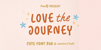 Love The Journey is a cute handwritten font. It comes with 2 looks, regular and slant version. This font perfectly made to be applied especially in logo, and the other various formal forms such as invitations, labels, logos, magazines, books, greeting / wedding cards, packaging, fashion, make up, stationery, novels, labels or any type of advertising purpose. Features : Uppercase & lowercase Numbers and punctuation Alternates & Ligatures Multilingual PUA encoded We highly recommend using a program that supports OpenType features and Glyphs panels like many of Adobe apps and Corel Draw, so you can see and access all Glyph variations.

