10,000 search results
(0.281 seconds)
- MPI Egyptian Ornamented by mpressInteractive,
$5.00 Egyptian Ornamented is a decorative font based on the shapes found in a French Clarendon. Serifs are chunky and bifurcated, and “spurs” have been added to the strokes. This font emits the feeling of Old West wanted posters, rodeo broadsides, etc. It was first introduced by William H. Page & Company in 1870.
 - Tuscaloosa by Greater Albion Typefounders,
$7.00 Tuscaloosa is a classic American 'Wild West' Tuscan typeface-we thought it would make a suitable Independence Day tribute to our many American clients. It's ideal for wherever that 'Western' feel is wanted. Posters, signage, the sides of stagecoaches etc... Three faces are offered, a pristine and sharp regular form, a somewhat distressed 'Rustic' face and the rather more distressed 'Extremely Rustic'. So why not mosey on down the saloon with Tuscaloosa!
 - Breda by Eurotypo,
$18.00 Breda is a Geometric Sans-serif; it is constructed from simple geometric shapes such as the circle and rectangle. This family of fonts starts from a very thin single-line face to a strong heavyweight, called Black Face. The Breda font is austere style, functional and clear, emerged from straight lines, primary shapes, which is now jumping into the typographic and graphic design scene. They are presented in six wights with their corresponding italics.
 - CarbonPlus by Cadson Demak,
$29.00 The original Carbon is a popular face at T26. It was released in 2003 under influence of modern typewriter and OCR typeface. Carbon Plus, a re-work version, was commissioned by local communication technology firm and is now available for commercial release. This revised version was designed with more sensible letter forms in order to add some human touch to the face. The initial release of this font also known as Carbon C6.
 - Bobik by Lewis McGuffie Type,
$35.00 Bobik is a display type family with three faces – sans, serif and slab. The family was drawn initially on basic principles described in Jean Alessandrini’s Codex 80 and then further developed, including adding a lowercase and ligatures. With a clean sans, robust slab and dramatic serif, Bobik has a contemporary European feel and is ideal for headlines, editorial and short copy. Each face contains upper and lowercase plus West, Central and East European language support.
 - Replay Pro by MAC Rhino Fonts,
$59.00 Replay is a pure hymn to the classic typeface Caslon originally made by William Caslon (1692–1766). The typeface that bears his name, was made between 1720 and 1726. In 1739 he founded the Caslon Foundry which later become a property of Stephenson, Blake & Co., but remained an independent foundry until 1937. The typeface have been popular ever since it was made and still stand proud as a classic text face. MRF made detailed research, including versions from Adobe and Justin Howes. The end result is leaning more towards the original. Some minor »imperfections« are also incorporated in order to make the typeface more lively and old fashioned.
 - Cynosure by Device,
$39.00Cynosure is a humanist sans with a subtle thick/thin stress. This gives it a clean, sharp elegance and precision that can be missing in some more familiar monoline sans faces. The wide range of weights and the matching reweighed italics make it a versatile solution where a consistent appearance across a broad range of applications is required. Its clear and inarguable design make it suitable for a wide variety of uses, from corporate to entertainment, text to headline, signage, logotypes, magazines and reports. The italics retain the design of the upright across all characters, again ensuring consistency. Includes tabular, lining and old-style numerals. - Politica by Sudtipos,
$39.00 Describe the 21st century politician. Left or right? Fat or thin? War or peace? Straight or gay? Hard or soft? Male or female? Pro or con? Young or old? East or west? Now look at the Politica super-family and see which font they may be. The overused sans serif faces don’t cut it anymore. This day and age requires a sturdy, modern and straight-to-the-point sans to cover the issues. The Politica family also come in OpenType variations which extend the character set to include Cyrillic, Greek, Baltic, Turkish and Central European languages. You have no excuse: the globe is yours with Politica.
 - Pudgy Puss NF by Nick's Fonts,
$10.00Here’s a new take on an old favorite, the Lubalin-Carnase classic Fat Face. This version, intended for large headlines, cranks the original’s very high contrast up another notch. Both versions of this font contain the complete Unicode Latin A character complement, with support for the Afrikaans, Albanian, Basque, Bosnian, Breton, Catalan, Croatian, Czech, Danish, Dutch, English, Esperanto, Estonian, Faroese, Fijian, Finnish, Flemish, French, Frisian, German, Greenlandic, Hawaiian, Hungarian, Icelandic, Indonesian, Irish, Italian, Latin, Latvian, Lithuanian, Malay, Maltese, Maori, Moldavan, Norwegian, Polish, Portuguese, Provençal, Rhaeto-Romanic, Romanian, Romany, Sámi, Samoan, Scottish Gaelic, Serbian, Slovak, Slovenian, Spanish, Swahili, Swedish, Tagalog, Turkish and Welsh languages, as well as discretionary ligatures and extended fractions. - Bangkokean by Cadson Demak,
$29.00 This font was originally designed side by side with my first attempt at a semi serif typeface in 1997. The design made it through to full development only a couple years ago when our studio decided to complete the regular weight for a local project here in Bangkok. The face is a traditional serif with narrow stem (somewhat like sans serif) and industrial stroke. A good mix of Bangkok character where you can find Wat (old buddhist temple) next to futuristic high rise. This font was shown in Klingspor-Museum Offenbach, Germany, at a Typographic & Type Design exhibition Schrift in Form 3-26 September 2008.
 - Cynapse OT by Positype,
$29.00 Several years ago I was faced with a project that required very small type to be used in a directory. In general, there was a need for a lot of 'fine print'. Faced with this, all of the tests I was making with existing faces were producing too much bleed of the individual glyphs...Cynapse was born. It evolved into this pseduo-techy looking type that standardized and glorified the ink trap (the small, tiny allowances of white space that reduces the amount of ink hitting the page, and in effect, reducing the appearance of bleed). The results was promising. The new OT version contains additional OpenType features that include expanded ligature sets, fractions, 5 sets of numerals as well as small caps and Central European diacritics.
 - ITC Luna by ITC,
$40.99 ITC Luna is the work of Japanese designer Akira Kobayashi. He turned to the designs of the 1930s for his inspiration for both ITC Luna and ITC Silvermoon. Luna is designed to fill the gap between a pure Art Deco display face and an ordinary text face," says Kobayashi. "It has an Art Deco style but is still fairly easy to read. It can be used in short passages of text. As for individual characters, I especially liked the distinctive O, shaded only on one side. Lowercase a and g are also unusual, but they are somehow legible enough in text matter." And for a finishing touch on his Luna, Kobayashi added the charming moon face as an extra character.
 - Sterling Script by Canada Type,
$54.95 Sterling Script was initially meant to a be digitization/reinterpretation of a copperplate script widely used during what effectively became the last decade of metal type: Stephenson Blake's Youthline, from 1952. The years from 1945 to 1960 saw a heightened demand for copperplate faces, due to post-war market optimism, as well as the banking and insurance industries booming like never before, which triggered the need for design elements that express formal elegance and luxury. The name Sterling Script is a tip of our hat to England, the Stephenson Blake foundry's country of origin. It is also a historical hint about copperplate scripts having been used mainly for banking and bonds in the 19th century. Originally we just wanted to resurrect a gorgeous metal type from the ashes of forgotten history. But after the main font was done we saw that the original s really needed an alternate. We made one. But we felt sorry for the original s and didn't want to see it dropped from use altogether, so we saved it by building a set of ligatures that solve the minor connection problem with the s at large sizes. Before the completion of the ligatures, a few different alternates were also drawn, and we were faced by the fact that the single font we set out to do was now a much larger set than we anticipated. While thinking about how to split up our unexpected bundle of large characters, we drew a few more alternates and some swashes. This abundance "problem" reached a certain point where there was no looking back, so we just decided to go all the way with this font. We added many more alternates, swashes, ligatures, and two full sets of each beginning and ending lowercase letter. The result is over 750 characters of sheer elegance. Sterling Script has many features that set it above and beyond other copperplate scripts: - It has 2 beginning and 2 ending alternates for every single lowercase character. The beginning and ending variants on the vowels are also available in accented form in the appropriate cells of the character map. - Sterling Script is the ultimate elegant font choice for luxury design. Very elegant, but not too soft. Its strong and confident shapes convey a message that is real, comforting and assuring. - One of the eventual purposes of expanding Sterling Script this extensively was to create a script that finds the middle ground between formal and informal without compromising either trait, a script where the degree of formality can be gauged, tweaked, cranked up or toned down depending on the layout's needs. Aside from beginnings and endings, there are multiple variations for the majority of the basic characters. This is a formal script on steroids, where twirls and swashes can be set to come out unexpectedly from any place in the word, which is great for reducing the inherent rigidity of words set in copperplate scripts and "humanizing" them whenever needed. This is especially useful for wedding, postcard and invitation design, where not every viewer of the collateral material has something to do with banking or insurance. - With such an extensive character set, a designer can easily set a word or a sentence in 10 or more different ways, and choose the perfect one for the task at hand. This is particularly useful for work where details are of utmost importance, like logos, slogans, or elegant engravings that consist of one to three words. Let those swashes and twirls intertwine for maximum elegance. The Sterling Script complete package consists of 7 fonts: Sterling Script, Alternates, Beginnings, Endings, Swashes, Swash Alternates, and Ligatures. Sterling Script is available in five different purchase options and price ranges. But with such a massive offering of variation, the Sterling Script complete package is definitely the most value-laden set in its class. Once you use Sterling Script, you will never want to go back to other copperplates.
 - Serapion by Storm Type Foundry,
$39.00Another variation on the Renaissance-Baroque Roman face, it extends the selection of text type faces. In comparison with Jannon, the contrast within the letters has been enhanced. The dynamic elements of the Renaissance Roman face have been strengthened in a way which is illustrated best in the letters "a", "b" and "s". These letters contain, in condensed form, the principle of this type face - in round shapes the dark stroke invariably has a round finial at one end and a sharp one at the other. Another typical feature is the lower-case "g"; the upper part of this letter consists of two geometrically exact circles, the inner of which, a negative one, is immersed down on the right, upright to the direction of the lower loop and the upright knob. The vertical strokes slightly splay out upwards. Some details of the upper-case letters may seem to be too daring, but they are less apparent in the text sizes. It has to be admitted that typographers tend to draw letters in exaggerated sizes, as a result of which they stick to details. Serapion Italic are italics inspired partly by the Renaissance Cancelleresca. This is obvious from the drop-shaped finials of its lower-case descenders. The type face is suitable for illustrated books, art posters and short texts. It has a rather ugly name - after St. Serapion. - Somatype by ArtyType,
$29.00 As with any attempt at a new typeface, you want to create something different. A difficult task as most legible fonts are based on something previous. Somatype isn't actually based on any particular font but it has unavoidable similarities to others. The important difference here being the distinctive quirk of the connection points going opposite to the norm; exemplified best by the lower case d & e. Once devised, the unique characteristic was applied wherever possible, keeping the rest of the characters in a sympathetic, rounded style. I first designed this in the light weight version, seeing it working best as a large open display font for magazines etc. but realized it would be too light for body copy at small scale, so, medium and bold weights were created to resolve that issue. Incidentally, the word ‘somatype’ literally means body-type.
 - RM Imber by Ray Meadows,
$19.00 A great new display face. The slight serif gives extra character to this solid looking design, whilst the outline version has an open, clean look.
 - Whiteboard Modern by Albatross,
$19.95 Whiteboard Modern is a hand-drawn face resembling the flowing motion and freedom of writing in an open space, such as a dry-erase board.
 - Modernistic by Monotype,
$29.99Designed by W.A. Parker in 1928, Modernistic is a headline face with a 1920s Art Deco appeal. Use the Modernistic font for posters and packaging. - Edwardian by ITC,
$29.99Edwardian font was designed by Colin Brignall, a free-flowing roman face with hints of the early Edwardian period. Edwardian exudes warmth, individuality and charm. - Paola by astype,
$24.00 Paola is a redesigned, new interpretation of a typeface from Carl Rudolf Pohl. OpenType features: Central European faces Ligatures & contextual alternates Proportional & mediaeval numerals Fractions
 - Jasper Squeeze by Ingrimayne Type,
$6.00 JasperSqueeze was an attempt to do a decent text face. Blending it with XAabced resulted in JabcedHy, which seems to be superior to both parents.
 - Adage Script JF by Jukebox Collection,
$32.99 A warm script font with a down-home feel. Digitally revived from a vintage photo-typesetting face. The character set has been expanded and modernized.
 - Singular by Jonahfonts,
$30.00 A semi-heavy face slightly condensed, inspired by the Germanic & European type fonts. Applications include captions, packaging, invitations, cards, posters, ads, book jackets, and manuals.
 - Edwardian by Linotype,
$40.99Edwardian font was designed by Colin Brignall, a free-flowing roman face with hints of the early Edwardian period. Edwardian exudes warmth, individuality and charm. - Chitchy by Baseline Fonts,
$24.00Chitchy is a rough-hewn heavyweight display face perfect for headlines and emphasis body copy. Extended character set includes foreign language support for many countries. - Persia BT by Bitstream,
$50.99Masoud Nejabati has drawn upon his capable calligraphic skills to create this typeface. Persia represents his first latin-based design. This gentle and finely rendered script reveals Nejabati's extensive background in Islamic calligraphic art. The slight back slant further enhances the appearance of hand-scribed pen calligraphy. - Bourton Hand by Kimmy Design,
$10.00 Bourton Hand is a new typeface by Kimmy Design. It’s the hand drawn version of Bourton and a sans-serif cousin to Burford. In addition to a new look, it boasts more layering options, stylistic alternatives, graphic extras and even comes with its own script font! Okay...so here’s everything you get with Bourton Hand: • 6 Base Layer Fonts (Base, Inline, Marquee, Stripes A, Stripes B, Stripes C, Sketch A, Sketch B) • 6 Top Layer Fonts (Base Drop, Dots, Line Light/Medium/Bold, Outline Light/Medium/Bold) • 6 Extrude Fonts (Extrude, Outline, Shadow, Extrude Outline) • 5 Drop Shadow Fonts + 5 solo styles (Drop Shadow, Drop Extrude, Drop Line, Drop Stripes A, Drop Stripes B) • 2 Line Fonts for secondary text (Line Medium, Line Bold) • Bourton Hand Script Light • Bourton Hand Script Bold • Bourton Hand Extras - Ornaments, banners, frames, borders, flags and line break • Bourton Hand Extras - Flourishes Happy Creating!
 - Rosart and Fleisch Hi Res by California Type Foundry,
$129.00 This font is not just historic, but classy, timeless, and in its current form, a modern classic. The original Titling Caps and icons Jacque François Rosart painstakingly carved, now meticulously digitized to be a true, accurate, and complete representation of the original designs. You can get the fully matching family with "ALL", or choose the set that meets your immediate needs: Zodiac and Constellations - The Stars Have Aligned into a Great Font So what's your sign? Whatever it is, R&F has it, and in so many ways! Pictograph, symbol, constellation and picto-constellation are all included. Constellations are useable even in scientific and education settings: based on current star charts and matched to Bayer designations, these stars shine both in design and accuracy! Includes Rosart's original moon and sun faces. Faces for the planets to match those for the sun and moon. Rosart's symbols for the planets. Astrology symbols including, Rosart’s pictographs for the twelve signs. Constellations of the Zodiac from precise star charts. Precise small star shapes, so you can design other constellations. Pinwheel, saltires, asterisks, solid stars, and even the Christmas star. Dave Lawrence, "Each symbol was carefully designed to match the main font." Alchemy Symbols - Turns A Design into Gold From labeling your cupboard of magical ingredients to getting one step closer to the golden goose, these rare alchemical symbols are a treasure trove of possibilities. Including: classic symbols for elements combinations medicinals chemistry mathematical symbols Includes music symbols for titling, as well as Verse and Response symbols. Seasons - Symbols to Keep Things Organized Throughout the Year Classic weather stylings, including old fashioned lightning and an eclipsing moon with the four-o'clock shadow. Map Markers Religious Symbols Phases of the moon. Pointing symbols: fingers, arrows, triangles, with circles Matching Italics CAL's Dimension Slant™ Instead of sloping all the pictures and drawings to an even slant, a multidimensional approach was used. And each symbol was evaluated and crafted individually. Pro World1 Font The pro world font contains all of these: Latin Standard set Rosart's original backwards X alternate. Alternate U shape. In the italic: swash variants for the J, Q, and Y. Proportional Lining (default), proportional old style, small caps figures. CAL Dimension Slant, for dynamic italics Includes Rosart's original moon and sun faces, along with additional faces for each planet. Rosart’s symbols for the planets and pictographs for the twelve signs of the zodiac. Constellations of the Zodiac along with small star shapes. Large stars, pinwheel, saltires, asterisks Symbols for chemistry Medicine Music symbols Mathematical symbols Pointing symbols like the finger, acorn, arrow and triangle. Geometrical shapes. Plus these more: Latin Pro character set for central European languages and Turkish. Rare kerns for Polish, Czech, Slovakian and others. Ligatures needed for some central European orthographies. Lowered German Umlauts for better line spacing. Cyrillic uppercase and small caps for eastern Europe, southern Europe, and Russia, with kerning. Rosart’s original Greek uppercase and small caps, but also tonos for monotonic Greek. Vietnamese, which has been kerned. Pinyin, including a special form of the Ü so that titles can be set closer. Numbers: A set of stacking (nut) fractions, along with very elegant automatic fractions A large set of currency symbols in lining, old style, small caps, denominator and numerator sizes. Our first Retail Pricing Feature: (ss03 + ss04) Just turn on the feature and type $1.99 and Rosart will do the rest. Ampersand alternates. Numerator sized musical sharp and flat symbols. Dave Lawrence, “From the moment I saw these letters I knew I had to make this typeface. What I didn’t know was that I would end up drawing most of Rosart’s special symbols... But it was too hard to resist."
 - Foverdis by insigne,
$22.00 Foverdis is a versatile and powerful ornate script face. Foverdis features flowing hand lettering with tall and graceful ascenders. The face offers a wide array of weights, from the powerful Black weight to the graceful Thin to unique Hairline. Foverdis can get the job done for many unique design tasks. Its wide range of weights at a great price, and OpenType alternates make it a very valuable font for your design toolbox. Foverdis OpenType features include a set of non-connecting alternates, 20 ligatures, and two types of ending letterforms. OpenType features include ornaments, a full set of swashes, swash endings, ending contextual alternates, discretionary ligatures, ligatures and twelve different stylistic sets filled with alternates. In total, there are over 150 alternate letterforms and ornaments. Please see the sample .pdf to see these features in action. OpenType capable applications such as Quark or the Adobe suite can take full advantage of the automatically replacing ligatures and alternates. This family also includes the glyphs to support a wide range of languages. Foverdis is great for a professional designer that wants to maximize design capabilities.
 - Newspoint by Elsner+Flake,
$35.00 The design of the Newspoint typeface is based on the tradition of the American sans serif faces of the last century. This form expression was greatly influenced by the News Gothic type which was created by Morris Fuller Benton in 1908, and has, once again, become very popular. When the development of sans serif types such as Futura and Kabel by Renner and Koch began in 1925, the design of American sans serif types receded somewhat into the background. In the 1950’s, however, they experienced a renaissance which continues to this day. Thanks to its clean design and the relatively large x-height, the Newspoint is well suited for informative texts in newspapers, magazines, and brochures. In packaging design, as well, the Newspoint can display its strength in small print. Newspoint was developed as a customer-specific variation of the News Gothic. In contrast to the News Gothic, however, the face appears to be softer and more appealing thanks to the changed interpunctions. If so desired, the alternative characters give the typeface expanded individuality and a richness of design options.
 - Zierde Grotesk by Lewis McGuffie Type,
$35.00 Zierde is a take on early advertising, small-copy grotesks of the late 19th/early 20th century, and is largely inspired by Miller & Richard’s own range of Grotesques. More importantly, Zierde is accompanied by a large set of ornaments (+200) which hark back to the look-and-feel of the early-modernist arts and crafts movement. The ornaments in, and presentation of, Zierde owe much credit to J.G Schelter & Giesecke’s 1913 type specimen book ‘Die Zierde’. The strong functional uppercase sans-serifs alongside luscious, beautiful patterns in ‘Die Zierde’ make for beautiful combinations. This early-modernist use of grotesk alongside ornament looks bizarre in the eyes of us used to seeing sans-serifs in more formal, sterile settings. The face itself retains some historical flourishes such as the eccentric leaning angle of the italics, the long cross-bar on the ‘G’, the gammy-leg of the ‘R’, a strange ampersand and some irregular terminals across the weights. Zierde is display face meant for headlines, titles, short-copy, labels and logos. It comes in caps and small caps, Latin and Cyrillic.
 - Bell MT by Monotype,
$39.00 Monotype’s hot metal Bell series from 1931 was based on original types made by the punchcutter Richard Austin for the foundry of John Bell in the 1780s. The different sizes of Monotype’s series were not all based on the same model. As type historian James Mosley wrote on Typophile, “For 18 point and above (the metal type was cut in sizes up to 36 point) Monotype’s model was a larger type [than the model used for the text sizes], the ‘Great Primer’ cut by Austin. This has greater contrast in the capitals and a flat foot to letter a.” The digital Bell closely follows the design of the hot metal 18pt version, and is therefore somewhat lighter in color than the text sizes of Monotype’s original metal face. James Mosley’s Typophile article can be found here.
 - Type Prodigy by VP Creative Shop,
$39.00 Introducing Type Prodigy, a timeless serif logo font that combines classic elegance with modern versatility. This font is a designer's dream, boasting over 310 crafted ligatures and alternate glyphs that add flair and sophistication to any project. With support for 87 languages, Type Prodigy is truly a global font that caters to diverse design needs. Type Prodigy is a font that exudes professionalism, making it perfect for creating logos, branding, editorial designs, and more. Its refined serifs and clean lines convey a sense of authority, while its generous ligatures and alternate glyphs allow for creative customization, making each design truly unique. Whether you're designing for a luxury brand, a boutique business, or a creative agency, Type Prodigy delivers exceptional results. Its extensive character set and language support make it ideal for international clients, enabling you to communicate effectively in multiple languages and markets. With Type Prodigy, you'll have access to a versatile font that combines classic beauty with modern functionality. Its exquisite design and extensive features make it a profitable choice for professional designers who demand the best. Unlock your creative potential with Type Prodigy, and elevate your designs to new heights of excellence. Language Support : Afrikaans, Albanian, Asu, Basque, Bemba, Bena, Breton, Chiga, Colognian, Cornish, Czech, Danish, Dutch, Embu, English, Estonian, Faroese, Filipino, Finnish, French, Friulian, Galician, Ganda, German, Gusi,i Hungarian, Indonesian, Irish, Italian, Jola-Fonyi, Kabuverdianu, Kalenjin, Kamba, Kikuyu, Kinyarwanda, Latvian, Lithuanian, Lower Sorbian, Luo, Luxembourgish, Luyia, Machame, Makhuwa-Meetto, Makonde, Malagasy, Maltese, Manx, Meru, Morisyen, North Ndebele, Norwegian, Bokmål, Norwegian, Nynorsk, Nyankole, Oromo, Polish, Portuguese, Quechua, Romanian, Romansh, Rombo, Rundi, Rwa, Samburu, Sango, Sangu, Scottish, Gaelic, Sena, Shambala, Shona, Slovak, Soga, Somali, Spanish, Swahili, Swedish, Swiss, German, Taita, Teso, Turkish, Upper, Sorbian, Uzbek (Latin), Volapük, Vunjo, Walser, Welsh, Western Frisian, Zulu Ligatures : AB,AC,AD,AE,AF,AG,AH,AI,AK,AM,AN,AO,AP,AR,AS,AT,AU,AV,AW,AY,AZ,BA,BE,BF,BG,BH,BM,BO,BU,CA,CB,CC,CE,CF,CG,CH,CI,CK,CL,CO,CQ,CR,CT,CU,DA,DE,DG,DI,DK,DM,DN,DO,DR,DU,EA,EB,ED,EE,EF,EG,EH,EI,EK,EL,EM,EN,EP,ER,ES,ET,EU,EV,EW,EX,EY,FA,FE,FF,FG,FI,FL,FO,FP,FR,FS,FT,FU,FY,GA,GE,GH,GL,GR,HA,HB,HD,HE,HF,HI,HK,HL,HO,HT,IB,IC,ID,IE,IF,IG,IK,IL,IM,IN,IO,IR,IS,IT,IU,KA,KC,KE,KF,KG,KI,KO,KP,KQ,KR,KS,LA,LC,LD,LE,LF,LI,LK,LL,LM,LN,LO,LP,LT,LU,MA,MB,ME,MF,ML,MM,MO,MP,MS,MU,NA,NB,NC,ND,NE,NF,NG,NH,NI,NK,NL,NM,NN,NO,NQ,NT,NU,OA,OB,OC,OD,OE,OF,OG,OH,OI,OK,OL,OM,ON,OO,OP,OR,OT,OU,OV,OW,OX,OY,PA,PC,PE,PF,PG,PM,PN,PO,QA,QE,QU,RA,RB,RC,RD,RE,RF,RG,RH,RI,RK,RL,RM,RN,RO,RP,RR,RS,RT,RU,RY,SA,SD,SG,SS,ST,SU,TC,TD,TE,TF,TH,TI,TK,TL,TM,TN,TO,TP,TR,TT,TU,TW,TY,UH,UK,UL,UM,UN,UO,VA,VE,WA,WD,WE,WF,WO,XA,XC,XE,XT,YE,YO,YT,ZE,MEN,WER,FRO,RON,ROM,THE,AND,ING,HER,HAT,HIS,THA,ERE,FOR,ENT,ION,TER,WAS,YOU,ITH,VER,ALL,THI,TIO,OUL,ULD,IGH,GHT,AVE,HAV,ICH,HIC,HIS,HIN,HEY,ATI,EVE,HING,WERE,FROM,THAT,THER,TION,HERE,OULD,IGHT,HAVE,HICH,THIS,THIN,THEY,ATIO,EVER,MENT How to access alternate glyphs? To access alternate glyphs in Adobe InDesign or Illustrator, choose Window Type & Tables Glyphs In Photoshop, choose Window Glyphs. In the panel that opens, click the Show menu and choose Alternates for Selection. Double-click an alternate's thumbnail to swap them out. Mock ups and backgrounds used are not included. Thank you! Enjoy!
 - the EV$NT - Personal use only

- Lovera by Din Studio,
$29.00 Lovera is elegant serif font. Made for any professional project branding. It is the best for branding, printing, wedding and quotes. Every letter has a unique and beautiful touch. Includes: Lovera (OTF) Features: Beautiful Ligatures Many Swashes Stylistic Sets PUA Encoded Multilingual Support Numerals and Punctuation Thank you for downloading premium fonts from Din Studio
 - Kingroad by Din Studio,
$29.00 Kingroad is authentic and modern blackletter font. The font is suitable for any branding project like logo, t-shirt printing and many more. Outstanding in a wide range of contexts. Includes: Kingroad (OTF) Featured : Alternates Accents (Multilingual characters) PUA encoded Numerals and Punctuation (OpenType Standard) Extra Ornaments Thanks for downloading premium font from Din Studio
 - Hunterlife by Din Studio,
$29.00 Hunterlife is authentic and modern blackletter font. The font is suitable for any branding project like logo, t-shirt printing and many more. Outstanding in a wide range of contexts. Includes: Hunterlife (OTF) Featured : Alternates Accents (Multilingual characters) PUA encoded Numerals and Punctuation (OpenType Standard) Extra Ornaments Thanks for downloading premium font from Din Studio
 - Marrline by Din Studio,
$29.00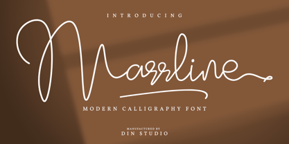 Marrline is a modern calligraphy font. It brings a beautiful and attractive typeface. Made for any professional project branding. It is the best for logos, branding, wedding and quotes. Includes: Marrline (OTF) Features: Stylistic Set Beautiful Ligatures Swashes Multilingual Support PUA Encoded Numerals and Punctuation Thank you for downloading premium fonts from Din Studio
 - Blastine by Din Studio,
$29.00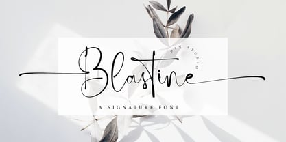 Blastine is a beautiful signature font. It brings a modern and attractive typeface. Made for any professional project branding. It is the best for logos, branding, wedding and quotes. Includes: Blastine (OTF) Features: Stylistic Set Many Swashes Beautiful Ligatures Multilingual Support PUA Encoded Numerals and Punctuation Thank you for downloading premium fonts from Din Studio
 - Okinawa by Din Studio,
$29.00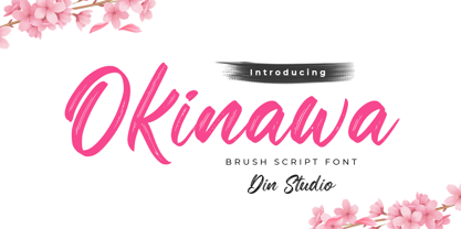 Okinawa is a classy script font. This brush font will make your design project more powerful. Made for any professional project branding. It is the best for logos, branding and quotes. Every letter has a unique and beautiful touch. Features: Ligatures Multilingual Support PUA Encoded Numerals and Punctuation Thank you for downloading from Din Studio.
