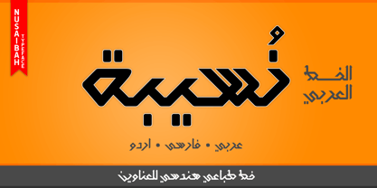
“Nusaibah” is the first name of an early convert woman to Islam, and the first female to fight in defense of the Islamic religion. Her full name is Nusaibah bint Kaíab Al-Maziniyyah and she took part in the Battles of Uhud, Hunain, Yamama and the Treaty of Hudaibiyah with Islam’s prophet Muhammad (pbuh). Nusaibah is best known for her brave and heroic feat during the Battle of Uhud - fought on March 19, 625 - when she entered the battle carrying a sword and a shield to protect the prophet Muhammad (pbuh) from the arrows of the enemy, and she accordingly received several wounds while fighting and these wounds were not healed until the following year. The prophet Muhammad (pbuh) mentioned her distinct courage by saying that in whichever direction he turned in the battlefield, he could see her defending and protecting him. "Nusaibah" is a modern, geometric, and headline Arabic display typeface. The main trait of this typeface is the novel symmetrical design of its letters which renders it as one of the modern stylish typefaces used for headlines and titles. This is can be noticed in its letters such as “Theh”, “Jeem”, “Ain”, “Sheen”, and others. Moreover, “Nusaibah” font has a character set which supports Arabic, Persian, Urdu, and Latin letters and numerals with a limited range of specific Arabic and Latin ligatures. This font comes in two weights (i.e., regular and bold) with nearly 643 distinctive glyphs. Due to its geometric and linear design, “Nusaibah” typeface is appropriate for heading and titling in Arabic, Persian, and Urdu magazines, posters, and surfaces of different equipment. It is also elegantly suitable for signs, books’ covers, advertisement light boards, products’ and services’ names, and titles of flyers, pamphlets, novels, and books of children. “Nusaibah” typeface is one of the Arabic typefaces that has a novel and modern-day design which can be used in versatile graphic, typographic, and artistic works in different languages for diverse cultures.
Kangaroo FS Joey was the offspring of a project with Rudd Studio to develop a logotype for an online streaming TV service, in 2008. While under wraps, the secret project was code-named Kangaroo. The logotype led to a second project, to design a corporate typeface for the service. It was the first big project Fernando Mello had worked on with Jason Smith. “Like any designer who just joined a team, I was very excited about it, drawing and sketching lots of ideas. I remember Jason and I experimenting with lots of possibilities, for both the logo and the typeface.” Online As the font for a Spotify-style, internet-based service, FS Joey needed to be highly legible on-screen, including at very small sizes. There had to be a range of weights, and they’d have to work well in print, too. It was also important that it felt corporate, not too quirky, while still having a strong character of its own. Quirkiest “We designed three weights specifically for use on the Web,” says Jason Smith. “There was the usual fight between me and my team. I wanted at least one identifiable letter that was a quirk. As always I went straight for the lowercase ‘g’, and it was drawn numerous times with lots of variation. I got the quirkiest one accepted by the client.” But, later in 2009, the Competition Commission blocked Project Kangaroo, and Fontsmith were left with a couple of weights of an as yet unused font. From Kangaroo, Joey was born. A favourite “Straight away, people started to notice the typeface,” says Jason. “I can take the credit for pushing the art direction and standing up for the quirks. But it was Fernando who was the key to pulling it all together and adding his own distinct flavour. Now it’s one of my favourite designs in our library.” Fresh and friendly, geometric and energetic, Joey is available in five weights, all with italics, all finely-tuned for both screen and print.
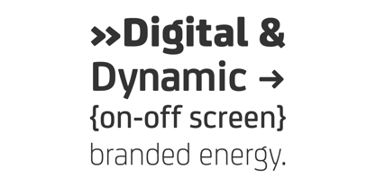
Kangaroo FS Joey was the offspring of a project with Rudd Studio to develop a logotype for an online streaming TV service, in 2008. While under wraps, the secret project was code-named Kangaroo. The logotype led to a second project, to design a corporate typeface for the service. It was the first big project Fernando Mello had worked on with Jason Smith. “Like any designer who just joined a team, I was very excited about it, drawing and sketching lots of ideas. I remember Jason and I experimenting with lots of possibilities, for both the logo and the typeface.” Online As the font for a Spotify-style, internet-based service, FS Joey needed to be highly legible on-screen, including at very small sizes. There had to be a range of weights, and they’d have to work well in print, too. It was also important that it felt corporate, not too quirky, while still having a strong character of its own. Quirkiest “We designed three weights specifically for use on the Web,” says Jason Smith. “There was the usual fight between me and my team. I wanted at least one identifiable letter that was a quirk. As always I went straight for the lowercase ‘g’, and it was drawn numerous times with lots of variation. I got the quirkiest one accepted by the client.” But, later in 2009, the Competition Commission blocked Project Kangaroo, and Fontsmith were left with a couple of weights of an as yet unused font. From Kangaroo, Joey was born. A favourite “Straight away, people started to notice the typeface,” says Jason. “I can take the credit for pushing the art direction and standing up for the quirks. But it was Fernando who was the key to pulling it all together and adding his own distinct flavour. Now it’s one of my favourite designs in our library.” Fresh and friendly, geometric and energetic, Joey is available in five weights, all with italics, all finely-tuned for both screen and print.
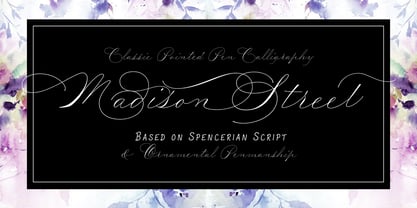
Madison Street is a font family with 8 fabulously fun typefaces! Eliza Gwendalyn & Jim Lyles of Studioways have teamed up with Spencerian calligrapher Elaina DeBoard to create a classic pointed pen calligraphy font. From its ornamental monograms, to its variety of complimentary text styles, and to its Madison Street Pro, with its elegant stylistic swashes and OpenType goodies, there is a font for every designer. Enjoy the sleek Madison Street Sans, Serif or Script, paired with the Ornaments font, complete with ornate monograms, or use each typeface on its own! Madison Street Pro has all the OpenType bells and whistles. The Ligature feature automatically substitutes beginning and ending letterforms, as well as 100 ligatures. Turn on the Swash feature for elegantly sweeping swash lowercase forms. Enable Stylistic Alternates for even more variations. There are also 10 Style Sets to chose from. And many more OT features! Madison Street is a basic version of the Pro font, intended for users who do not have OpenType savvy applications. Madison Street Stylistic is also a basic version of the Pro font, intended for users who do not have OpenType savvy applications. It has stylistically different ascenders and descenders. Madison Street Swash is intended to be used with the basic fonts, Madison Street and Madison Street Stylistic. It has lowercase beginning and ending swash glyphs and cannot be used to set text by itself. Madison Street Sans, Serif, and Script are text fonts modeled after the handwriting of Elaina. They are intended to be complimentary to any of the script fonts. However, you'll need to set them at a smaller point size (about 1/3 the size) in order to get the preferred scale and weight. Finally, the hairline weight of the Madison Street script fonts is very thin, and at small sizes up to 40 pt, you may notice some breaking up when printing to desktop printers. To remedy this, we recommend outline stroking the text a small amount (.1 -.3 value). this should improve the output without adding to much weight overall.
Based on a specimen of an obscure and uncredited old face called Kitterland, Hamlet is one of those curiosities hardly ever noticed in the world of modern fonts, the kind that infuses a variety of historic Blackletter and calligraphy traits in an otherwise Roman alphabet. Such typefaces, what few of them exist, are almost always classified by typophiles as traditional decorative Roman alphabets. We beg to differ. We think such hybrids are fascinating enough to deserve a classification of their own. And we think today's aspiring letterers and type designers would benefit from paying special attention to this kind of hybrid alphabet, not only because it has much more hand than machine in it, but also because it is a prime example of how to succeed in mixing different lettering techniques into one self-contained and distinctly functional alphabet. As in any efficient mixture of lettering methods, Hamlet ended up with characters that are uniquely its own, such as the cupped A, M, V, W and Y, the very luscious and inviting curves on the arms of E, F, L and T, both single- and double-story forms of the a, and the humblest, friendliest g and y ever. A dozen alternate characters are sprinkled throughout the character set, so check out the map for a few pleasant surprises. We also made the Handtooled and Headstone styles because we thought these friendly forms were just crying out for such treatments. The Handtooled version turned out quite lovely, if we may say so ourselves, perhaps even better than the main font. The Headstone version is available as a free bonus to those who purchase the complete Hamlet package. All Hamlet styles come with lining figures as well as old style ones. Hamlet comes in all popular font formats. The OpenType fonts contain push-button swapping alternates and figures, which come in handy in software programs that support this kind of thing.
Florentine SwashCaps is a font that embodies the flourish and elegant complexity of the Renaissance period, harking back to a time when handwriting was an art form and every letter a masterpiece of d...
WildWest-Normal is a font that beautifully captures the rugged spirit and unbridled adventure of the American West. This typeface is designed to evoke images of dusty trails, sprawling deserts, and t...
"Dot.com" by Iconian Fonts is an eclectic and modern typeface that exemplifies the digital age with its unique characteristics, blending creativity and functionality in equal measures. Designed by th...
Quarx Outline by dustBUSt Fonts presents itself as a playful and dynamic typeface, straddling the fine line between the whimsical and the geometric. This font captures the essence of innovation and c...
Wiegel Latein Medium, crafted by the talented typeface designer Peter Wiegel, is a font that encapsulates elegance and versatility within its characters. Its design harks back to the grace of traditi...
The Gabrielle font, crafted by the renowned German typographer Dieter Steffmann, is a quintessential representation of Steffmann's dedication to reviving classic typefaces and adding his unique twist...
Deco Blocks is not just a font; it's a creative journey back in time blended with a modern twist. This artistic font is a celebration of the bold geometric patterns and intricate designs characterist...
The "BeachSunshine" font created by Mozzarella is a vibrant and playful typeface that captures the essence of carefree summer days, sandy beaches, and radiant sunshine. This font is meticulously desi...
The Philosopher font, crafted by the talented type designer Jovanny Lemonad, stands as a distinct and thought-provoking typeface in the realm of typography. This font is not merely a collection of le...
Red October is a distinctive display font created by the talented designer Ivan Filipov. Its design is rooted in a unique blend of style and functionality, making it highly recognizable and versatile...
OldSansBlack is a distinctive font that traces its roots back to the creative endeavors of Manfred Klein, a prolific typographer known for his wide range of fonts that vary from whimsical to seriousl...
The Diner font, created by Brøderbund Software, is a captivating display typeface that harks back to the mid-20th century American diner culture. Its design embodies the spirit of the era, characteri...
The FarHat-Quintas font, crafted by the designer known as FarHat, embodies a unique blend of creativity and expression. This innovative typeface captures the essence of modern design while maintainin...
Carnivalee Freakshow, designed by Chris Hansen, is a distinctive and charming font that harkens back to the early 20th century and the ambiance of old carnival and circus posters. This font captures ...
The Jellyka BeesAntique Handwriting font, designed by the talented Jellyka Nerevan, is a captivating and unique typeface that evokes a sense of nostalgia and intimate expression often found in person...
The font "Ivory Chill - Personal Use" by Typhoon Type embodies a relaxed and approachable aesthetic, reflecting an artful balance between creativity and readability. Crafted by the skilled hands at T...
Neues Bauen, crafted by the skilled typographer David Kerkhoff, is a font that harkens back to the Bauhaus movement, blending a timeless aesthetic with functionality. Its name, German for "New Buildi...
Imagine a font that wakes up in the morning, blasts motivational anthems, and high-fives itself in the mirror. Meet "YES!" — the typographical equivalent of a double espresso shot infused with pure o...
Old Script is a font that transports the reader back to a time when penmanship was an art form, and every letter was crafted with meticulous attention and grace. Imagine the elegant swirls and the re...
The ChickenScratch AOE font, designed by the prolific Astigmatic One Eye Typographic Institute, carries with it a distinct personality and playfulness that sets it apart from more traditional typefac...
"Joint by PizzaDude" is a font that resonates with the creative ethos of its creator - a person or entity known for crafting fonts with a distinctive character and a playful edge. This particular fon...
Metro-Retro is a distinctive font designed by Nick Curtis, which draws its inspiration from the art deco era, combining the past's aesthetic charm with modern design sensibilities. The font is charac...
The "Scribble" font, as its name suggests, belongs to a category of typefaces that mimic the hurried, erratic characteristics of handwritten scribbles. It encapsulates the essence of spontaneity, cre...
Rock ‘n Roller is a dynamic and charismatic typeface that captures the rebellious spirit and energetic beat of rock and roll music. Its design is inspired by the vibrant aesthetics of rock culture, b...
Ah, LT Funk by LyonsType is like a fresh breeze in the bustling city of typography, bringing with it a vibe that's both retro and deliciously modern. This font dances between the lines of funk and fu...
The Saddlebag font, created by the renowned German typeface designer Dieter Steffmann, is an evocative and distinctive font that harks back to the adventurous spirit of the Wild West. Its design enca...
Ah, Urban Brigade, the font that struts down the street of typography like it owns the place. Imagine, if you will, a graffiti artist and a highly disciplined calligrapher had a love child; Urban Bri...
Imagine a font that put on its Sunday best, but with a cheeky twist, and you've got yourself Belta Bold by Antipixel. This isn't your run-of-the-mill, stiff-upper-lip typeface. No, sir! Belta Bold is...
The "Soviet" font by Iconian Fonts is a captivating and visually impactful typeface that harks back to the graphic design style prevalent in the Soviet Union during the 20th century. Designed to evok...
UA Squared, crafted by Unauthorized Type, is a distinctive font that carries a bold and innovative aesthetic, striving to stand out in a world crowded with conventional typefaces. It is characterized...
Kerater, a font meticulously crafted by the renowned font designer Måns Grebäck, is a striking embodiment of craftsmanship and artistry in the realm of typography. Its design is a harmonious blend of...
The NFL Falcons font is a distinctive typeface often associated with the brand identity of the Atlanta Falcons, a professional American football team based in Atlanta, Georgia. While not available fo...
CloseCall, designed by the talented Simon Schmidt, is a captivating font that stands out for its distinct personality and versatile usability. It is a typeface that encapsulates a balance between mod...
The ThunderBay font is an invigorating blend of bold charisma and adventurous spirit, designed to capture the essence of spontaneity and raw energy. This typeface stands out with its robust and dynam...

