10,000 search results
(0.17 seconds)
- Logtown by Jinan Studio,
$12.00 Logtown Duo is a hand-drawn font that blends vintage charm with a rugged edge. It's the perfect choice for your vintage-themed logos, branding, and adventurous designs. This font combo combines both elegant Script and Slab Serif styles, giving you options from solid to textured looks. Plus, it's got your back with support for multiple languages, making sure your message reaches everyone. Whether you're aiming for nostalgia or a modern twist on the classics, Logtown Duo has you covered for stylish and impactful designs. Features A set of uppercase and lowercase glyphs Number, symbol, and punctuation Multilingual Support Alternates, ligatures, and swashes (script version) Type j_1 until j_9 to features swash, ligatures will automatically replace the standard letter pairs whenever available, when using any OpenType capable software (script version).
 - Raindrop by Great Lakes Lettering,
$30.00 Raindrop is a fun and flirty typeface that pulls inspiration from editorial illustration. Each letter was carefully crafted to feel hand made and give the appearance of custom lettering. Through a variety of stylistic alternates and pairings, Raindrop is the perfect typeface choice for projects that aim for a one-of-a-kind feel when hiring a lettering artist isn't an option. Raindrop is made up of three separate styles being serif, sans, and script. The ability to pair styles together will add texture and personality to your design, leaving the viewer wondering: lettering or type?
 - Speed Rush by Pixesia Studio,
$10.00 Speed Rush - A Race Display Font Speed Rush is an assertive and modern display font that oozes strength and toughness. It suits perfectly any racing theme or online game. Have fun with this beautiful font and explore its endless variations. FEATURES - Uppercase and Lowercase letters - Numbering and Punctuations - Multilingual Support - Works on PC or Mac - Simple Installation - Support Adobe Illustrator, Adobe Photoshop, Adobe InDesign, also works on Microsoft Word Hope you Like it. Thanks.
 - Pleiad by URW Type Foundry,
$39.99 Seven superb scripts, to be freely mixed with one another. Alone, each of them flows nicely, but combined they reach ultimate vitality and grace. The Pleiades are one of the most beautiful constellations in the sky, and in Greek mythology they were seven divine sisters. Luxurious freedom of choice and excellent readability make Pleiad the perfect face for a variety of projects, from stylish invitations to magazine ads, from poetry books to restaurant logos. Sometimes calm, sometimes flittering – but always fair and graceful – this sublime calligraphic type family will hold an everlasting fascination.
 - Flysito by Keristyper Studio,
$14.00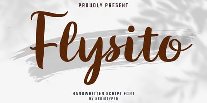 Flysito is a modern script font with a bold brush style and fun characters. This font is perfect for any design needs such as badges, logos, posters, branding, packaging, signage, and book cover. Multilingual support: Afrikaans, Albanian, Catalan, Danish, Dutch, English, Estonian, French, Finnish, German, Icelandic, Indonesian, Italian, Malay, Norwegian, Portuguese, Spanish, Swedish, Zulu, and many more. What’s Included : Standard & Multilingual glyphs Ligature Works on PC & Mac Simple installations Accessible in Adobe Illustrator, Adobe Photoshop, Adobe InDesign, and even work on Microsoft Word. Hope you enjoy our font!
 - Asteroid by ryan creative,
$9.00 Asteroid is a script typeface with hand-drawn strokes and a monoline which makes this font look natural and modern. Get a touch of a simple, and fun, signature script font with glyphs and open type features with styles and binders, Swash, and the addition of Alternative and Ornament. This font is more decorative and artistic suitable for art or fashion brands. It can be used for various purposes. such as brand name, signature, logo, etc. Features; -Uppercase, Lowercase, Foreign Support, Numbers and Punctuation. -Alternative, Swash, Ligature and Ornament. -Works on PC. -Simple installation. -Accessible in Adobe Illustrator, Adobe Photoshop. Adobe InDesign, even works in Microsoft Word. -Fully accessible without additional design software. Asteroids is coded with Unicode PUA, which allows full access to all additional characters without having to design any special software. Mac users can use the Font book, and Windows users can use the Character map to view and copy any extra characters to paste into your favorite text editor/app. Thanks for visiting ;)
 - Nondescript JNL by Jeff Levine,
$29.00 One good pun is worth a simple description… Nondescript JNL… 'Non' - not. 'de' - of, in Spanish. script - a cursive (handwritten) letter form. So… while nondescript generally means lacking any defining description, in this case it also means "not of a script"… which is precisely what a typeface such as this one is!
 - Linotype Startec by Linotype,
$29.99Linotype Startec, from Jan Tomás, is part of the TakeType Library, chosen from the entries of the Linotype-sponsored International Digital Type Design Contest 1999 for inclusion on the TakeType 3 CD. This is another fun font from Tomás, who also designed Alphabat, and the two share some characteristics. Linotype Startec is an outline font whose unique forms are reminiscent of futuristic dreams and space adventures. It should be used in point sizes of at least 18, but the phrase 'the bigger the better' fits this font well. The careful details and figures of the alphabet turn into UFOs and space ships from another world when set in very large point sizes. Linotype Startc is best for very short texts and headlines. - Caltic by Ingrimayne Type,
$12.95 Caltic-Holiday, Caltic-Festival, and Caltic-Straight are three eye-catching, very bold typefaces that are suitable for posters and signage. Caltic-Holiday and Caltic-Festival base letter shapes on trapezoids with curved sides but with curves that are reversed going from one to the other. Caltic-Straight has letters based on trapezoids with straight sides. None are suited for text and with their built-in spacing will not work as all upper-case or all lower-case. All three come in two widths, regular and wide, giving the Caltic family six members. Caltic has nothing to do with Celts. The Calt refers to the calt or contextual alternative OpenType feature that makes this typeface work. When the letters on the upper-case keys alternate with the letters on the lower-case keys, they fit snuggly together. As long as the user has a word processor that supports the contextual alternatives feature, there is no need for the user to alternate letters; the calt feature does it automatically. Although the fonts seem similar to hand-drawn lettering that was done on posters and signs during the hippie era of the 1960s and 1970s, I can find nothing quite like them. My inspiration for them is older, in a newspaper from 1932 that led to the typeface family PoultySign. Caltic (and Lentzers) are the result of seeing what else I could do with the inspiration that sprang from that 1932 newspaper.
 - Think Straight by HIRO.std,
$20.00 Think Straight a Bold Display Font. This font describes about fun, dynamic, street style, headline, pleasure, humanist, easy going, and easy to use. FEATURES - Uppercase and Lowercase letters - Support Opentype Features - 89 Ligatures - Numbering and Punctuations - PUA Encoded Characters - Multilingual Support - Works on PC or Mac USE Think Straight works great in any branding materials, logotype, poster, print, headline, t-shirt, packaging, magazine etc. Enjoy using! Thanks.
 - Skeletor - Personal use only

- Rollgates Victoria by Cotbada Studio,
$16.00 It's too much fun! Of all the fonts I have designed, this is my favorite. Thin strokes and delicate embellishments really do it for me and I hope it's for you too! You won't find curves like this in regular fonts. This is modern meets the classic, minimally meets the decorative. Look at the numbers ... then, look again. They have curves of all kinds of unusual places. If you want to stand out then this is the font for you. Logo or title, fashion distribution to masthead, monogram or Instagram, create beautiful art with this font. Rollgates Victoria can do it!
 - Sussan by Estudio Calderon,
$20.00 The Sussan type family is a hand lettering collection designed by Felipe Calderón. It contains sixteen different hand-drawn fonts and a set of funny illustrations designed by Jhony Velasco. On this occasion, we tried to match several font concepts to create nice pieces with them and each one is equipped with automatically exchanging alternates, ligatures, swash letters and some other feature.
 - Beast Energy by Ditatype,
$29.00 Beast Energy is a brush-copying-script font in letter designs having uneven edges as its artistic and organic characteristics. This brush script font can express dramatic, fun impressions through its capital letters making the brush wipe details clearer. The edges will look wider and thicker on certain parts of the letters. The color applications in this brush script font will also give amazing, artistic effects. For example, brighter colors will live up the letters, while darker ones will have dramatic and mysterious effects. Above all, you need to make sure the letters remain legible even in bigger text sizes. Furthermore, you can enjoy the available features here. Features: Multilingual Supports PUA Encoded Numerals and Punctuations Beast Energy fits best for various design projects, such as brandings, quotes, printed products, merchandise, social media, etc. Find out more ways to use this font by taking a look at the font preview. Thanks for purchasing our fonts. Hopefully, you have a great time using our font. Feel free to contact us anytime for further information or when you have trouble with the font. Thanks a lot and happy designing.
 - Heikudo Freedom by Hanzel Space,
$25.00 A typeface that proves its usefulness over time. Letter strokes that produce unique characters on each glyph so that they display a natural impression. This font is very suitable for branding, film titles, book titles, quotes, product names and the business you want to create. What's Included : Heikudo Freedom Standard glyphs Works on PC / Mac Simple installations Accessible in the Adobe Illustrator, Adobe Photoshop, Adobe InDesign, even work on Microsoft Word.
 - Gromvies by ahweproject,
$10.00 Gromvies feels playfully nostalgic and delivers an incredible vintage retro aesthetic. Inspired by unique retro themes, this fun typeface is suitable for any vintage theme concept, Illustration posters, stickers, fun graphics, and more. Masterfully designed to become a true favorite, this font has the potential to bring each of your creative ideas to the highest level!
 - Sigmund Freud Typeface by Harald Geisler,
$29.00 “For those who regret what keyboards and touch screens have done to their penmanship, typographer Harald Geisler has an answer: Sigmund Freud.” — The Wall Street Journal Sigmund Freud was a neurologist who lived from 1856 to 1939. His research and studies led to the foundation of ‘Psychoanalysis’. When I first saw Freud’s century old letters, I was fascinated by the beauty of these historic manuscripts. It made me smile to imagine a person writing his or her shrink a letter set in Freud’s handwriting. I started to plan creating a font based on his manuscripts. I contacted the Sigmund Freud Museum Vienna and Freud Museum London. To start the creation I selected eight handwritten documents from the archive in Vienna – This selection of specimen was my orientation during the design process. The Samples were created between 1883 to 1938 and are of various character such as handwritten scientific papers, personal letters, notes and a telegram. A successful Kickstarter Campaign "The Sigmund Freud Typeface - A Letter to your Shrink" with over 1400 Backers enabled me to visit the archive in Vienna and study the original manuscripts of Sigmund Freud. After a year of preparation and design work, I finished four alphabets based on Freud’s handwriting. What are the different Versions PRO, Kurrent, #1, #2, #3 and #4 about? “This project gives people the convenience afforded by the computer while maintaining the romantic nostalgia, beauty, and character of letter writing with real handwriting.” — Daniel Vahab, The Huffington Post When you write with your hand, every letter looks a little different. When you write a text on your computer every letter looks exactly the same. In order to make type look like handwriting, I chose four different variations of each letter from Freud’s manuscripts, drew and stored them in the font. The font is then programmed to exchange letters while you are typing. This makes the rendered result on your screen or print look like unique handwriting. PRO While you are typing… the PRO Version actively combines all four alphabets and exchanges them automatically. Through this mechanism never the same two o’s will stand next to each other. With every touch a unique look is generated. This works in certain applications i.e. Word 2010(or newer), Pages, TextEdit, Editor(Pre-installed on Windows 7 or newer), InDesign, Illustrator… →Here you can see an animation of what this effect looks like in action. (Please Note: some applications like LibreOffice, OpenOffice do currently not support this feature. Date: December 2013) #1 #2 #3 and #4 The Sigmund Freud Typeface #1, #2, #3 and #4 each hold one individual lowercase alphabet based on Freud’s handwriting. Kurrent Most of Freud’s correspondence was written in German. Until the 1950′s a different handwriting was taught throughout German speaking countries (Switzerland, Austria, Germany). This style is called Kurrent. The name Kurrent and Cursive derive from the Latin word currere - to run, hurry - both styles were designed to write fast. As you can see in the samples above, Freud practiced both Kurrent and when writing english Cursive (Latin script or Joined-up). Kurrent has three significantly different letters (s,h,e). Use Kurrent to render the authentic look of an historic Sigmund Freud letter in German. Bundle On the Top of this page you can get all six fonts of the Sigmund Freud Typeface Family in a bundle. International Typeface All styles of the Sigmund Freud Typeface feature a wide range of accented letters so you can write to all your friends in Sweden (Bjørn) France (Chloé & Zoë), Ireland (Dáirine), Poland (Łucja), Germany (Jörg) and almost everywhere around the globe (Find a complete list in the tech specs). Usage recommendations I hope that this design will be valuable to you and most of all that you have fun with this typeface! 1. Point Size — To reproduce the size of Sigmund Freud’s handwriting adjust the type size between 18-24 point in your word processor. If you are using an imaging software like Photoshop set the resolution to 300dpi and adjust the point size between 18-24. 2. Line Spacing — Narrow the line hight until swashes of capital letters touch the baseline above. This also happens when you write a letter and gives the document a unique handwritten look. 3. Right Aligned — Freud had the habit to write towards the right edge of the page and start loosely on the left. Set your text alignment to ‘right’ to incorporate this dramatic expression also to your documents. What do other People say about the Sigmund Freud Typeface? “Wouldn’t you love to write a letter to your shrink using the Sigmund Freud typeface?” — Dorothy Tan, Design TAXI ''“JUST DON’T WRITE A LETTER TO YOUR MOTHER WITH IT… …until the reader looks a bit closer, and they see 70+ years of modern science weighing in on turn-of-the-century pop psychology."'' — Mark Willson, Fast Company “Doctor, what does it mean if you dream of creating a font of Freud’s handwriting?” — Ayun Halliday, Open Culture “…geekily romantic, at once artistic and scientific” — Edie Jarolim, Freud’s Butcher “…sympathisch” — Jürgen Siebert, Fontblog !WOW! Thank you for reading the complete font description! You are awesome! If you still have a question please contact me through MyFonts or my website haraldgeisler.com. Credits This project was made possible by the help of 1481 Backers on Kickstarter and the kind support of the Sigmund Freud Museum Vienna and the Freud Museum London. Thank you. All of Freud’s Manuscripts shown are © Sigmund Freud Museum Vienna. Poster Image: IN17 - Sigmund Freud, Germany 1932. © Freud Museum London. Flag Image: IN19 - Sigmund Freud 1930’s. © Freud Museum London.
 - Birmingham New Street by Greater Albion Typefounders,
$12.50 Birmingham New Street is the latest updated development of a typeface family inspired by the hand lettered title on a 19th century railway map. The map, prepared by the London and North Western Railway was headed "Birmingham and environs". New Street, meanwhile is the great 19th century commercial road linking the city centre of Birmingham with the train station of the same name. So, in a spirit of 19th century enterprise, we present "Birmingham New Street", a fun family of three display faces, laden with open type features and late Victorian charm, ideal for posters, book covers and any other high flown design you might have in mind.
 - Nightcap JNL by Jeff Levine,
$29.00 It's not a new idea - combining two typefaces into one design, but when it works, it makes for an interesting novelty font. Nightcap JNL is a fun typeface that can be used by itself, or along with the two original fonts that comprise it (Parkitecture JNL and Typesetter Oblique JNL) to create some wonderful retro headlines. Nightcap JNL contains only the alphabet, numbers and basic punctuation.
 - SK Boncuk by Salih Kizilkaya,
$9.99 SK Boncuk is a very special font family I designed for my pet. Bead is a very smart and special rabbit. It can understand all commands and do whatever is said. It is very lively and fun in his daily life, but also monotonous. For this reason, I designed a fun font for him, with a single weight but with surprises. This font represents Boncuk's fun but monotonous life. SK Boncuk offers full support for the Latin alphabet and includes all the typographic elements you will need. This font family consists of 8 different fonts and 3288 glyphs and it supports hundreds of different languages thanks to the characters it contains.
 - ZT Bros Oskon 90 s by Zelow Type,
$13.00 ZT Bros Oskon 90s is a captivating typographic creation that seamlessly blends the aesthetic charm of the 1990s retro era with a modern touch. With unmatched serif elegance and a unique 90s style, this font offers 72 variations, including sharp Condensed forms, graceful Expanded, and captivating italic styles. Every character in ZT Bros Oskon 90s is meticulously crafted, creating a vintage ambiance that is truly enchanting. Featuring 6 font weights ranging from Extra Light to Bold, this font provides you with the flexibility to create a wide range of striking and memorable designs. Features of ZT Bros Oskon 90s: 72 Unique Variations Aesthetic Retro Vibes from the 1990s Elegant Serif Style Condensed, Expanded, and Italic Forms 6 Font Weights: Extra Light, Light, Regular, Medium, Semi-Bold, Bold Exceptional Creative Versatility ZT Bros Oskon 90s is the perfect choice for graphic design projects, branding, posters, and other promotional materials that require a captivating retro touch. Unleash limitless creativity with this font and infuse a nostalgic 1990s vibe into every one of your creations. ZT Bros Oskon 90s has 6 free styles, you can get them on my GUMROAD I hope you have fun using ZT Bros Oskon 90s. Thanks for using this font ~ Zelowtype
 - Paris by kapitza,
$99.00 Walking around Paris looking for inspiration for our latest people font, we encountered chic Parisians, yummy food markets, and bakeries on virtually every street corner with delicious baguettes and pastries. We were surprised how many people were cycling, motorcycling and rollerblading along the vast boulevards and side streets of Paris. We spotted classic French cars like the 2CV and Citroën CX and watched the world go by in one of the many sidewalk cafes whilst enjoying a 1664 or a café crème. With our latest people font, Paris, we tried to capture this unique Parisian atmosphere and hope we succeeded. All 64 illustrations are based on photographs taken on location over a period of time. The photographs are then hand traced to create high quality, detailed silhouettes.
 - Staple Remover JNL by Jeff Levine,
$29.00 Hand lettering on the packaging for an Arrow "Commander" Staple Remover seen in an online auction is the inspiration for the unusual and angular typeface comprising Staple Remover JNL. The Art Deco era of the 1930s and 1940s offers many wonderful examples of stylized and experimental lettering, and this, by far is one of the more eclectic styles of the time.
 - Dante by Monotype,
$39.00 Dante was designed by Giovanni Mardersteig. Mardersteig started work on Dante after the Second World War when printing at the Officina Bodoni returned to full production. He drew on his experience of using Monotype Bembo and Centaur to design a new book face with an italic which worked harmoniously with the roman. Originally hand-cut by Charles Malin, Dante was adapted for mechanical composition by Monotype in 1957. The new digital font version has been re drawn, by Monotype's Ron Carpenter, free from any restrictions imposed by hot metal technology. The Dante font family was issued in 1993 in a range of three weights with a set of titling capitals. Dante is a beautiful book face which can also be used to good effect in magazines, periodicals etc. Dante® font field guide including best practices, font pairings and alternatives.
 - Smashed Display by Raquel Fernandes,
$17.49 Smashed Typeface is a reversed-contrast, slab serif, display font. Was inspired by the old west days that we can often see in printing, circus posters and wanted notices in western movies, even tho the style was really used in many parts of the world during that period. This style is sometimes called as "circus letter" too. Was designed to have a modern look, using straighter lines and an extended style, can be used on various situations like posters, logos for restaurants, alternative business like an old washing station (as you can see on the next images), music bands etc. I believe that is a promising typography that can be used by various designers in a lot of diverse project. It counts with 226 multi language characters, one weight on version 1.0, on a next version I hope to take this project to another level, creating a variable typeface from condensed to really extended weights. It would complete this typography and eliminate the limits of use.
 - 99 Names of ALLAH Linear by Islamic Calligraphy75,
$12.00 We have transformed the “99 names of ALLAH” into a font. That means each key on your keyboard represents 1 of the 99 names of ALLAH Aaza Wajal. The fonts work with both the English and Arabic Keyboards. We call this Calligraphy "Linear" for obvious reasons. The first "Alef" has a "fatha", this indicates that the name can be pronounced only one way, "AR-RAHMAAN". (in the zip file you will find a pdf file explaining the differences in the "harakat", pronunciation and spelling according to the Holy Quran). This calligraphy is very clear and no letters overlap. Decorative letters used in this calligraphy: "Mim, Aain, Sin, HHe, He, Kaf, Ta & Saad". Purpose & use: - Writers: Highlight the names in your texts in beautiful Islamic calligraphy. - Editors: Use with kinetic typography templates (AE) & editing software. - Designers: The very small details in the names does not affect the quality. Rest assured it is flawless. The MOST IMPORTANT THING about this list is that all the names are 100% ERROR FREE, and you can USE THEM WITH YOUR EYES CLOSED. All the “Tachkilat” are 100% ERROR FREE, all the "Spelling" is 100% ERROR FREE, and they all have been written in accordance with the Holy Quran. No names are missing and no names are duplicated. The list is complete "99 names +1". The +1 is the name “ALLAH” 'Aza wajal. Another important thing is how we use the decorative letters. In every font you will see small decorative letters, these letters are used only in accordance with their respective letters to indicate pronunciation & we don't include them randomly. That means "mim" on top or below the letter "mim", "sin" on top or below the letter "sin", and so on and so forth. Included: Pdf file telling you which key is associated with which name. In that same file we have included the transliteration and explication of all 99 names. Pdf file explaining the differences in the harakat and pronunciation according to the Holy Quran.
 - Entitled JNL by Jeff Levine,
$29.00Way back before digital imaging, video tape and computer editing, the home movie enthusiast had to shoot on film his own titles using any one of a variety of movie titling kits on the market. One common approach was to arrange white ceramic letters on a colored background and film them. A set of such letters provided the inspiration for Entitled JNL from Jeff Levine. The classic, sleek Art Deco lines of this font makes it an all-purpose design for any headline needs. - Ardista Script by Mercurial,
$15.00 This is ARDISTA SCRIPT, a new fresh & modern script with calligraphy style. a charming typeface and So beautiful on invitation like greeting cards, branding materials, business cards, quotes, posters, and more. ARDISTA SCRIPT also has a swash letters from a - z, alternates, ligatures that would make it a more attractive font. The Open Type features can be accessed by using Open Type savvy programs such as Adobe Illustrator, Adobe InDesign, Adobe Photoshop Corel Draw X version, And Microsoft Word. And this Font has given PUA unicode (specially coded fonts). so that all the alternate characters can easily be accessed in full by a craftsman or designer. so, let's get it! Thanks and have fun ...!. :)
 - Andy Bear by Gatype,
$8.00 Andy Bear embodies oddity and authenticity. This dazzling display font will turn any creative idea into a standout. Get inspired by its fun styles, and use them to brighten up kids or school projects! This font has no shadow effect by default. You can create this effect by duplicating the text and placing the duplicates
 - Roashe by Nathatype,
$29.00 Do you sometimes have an appetite for a bit more wholesome typography? Do you dream of creating headings that stand out and inspire creativity, imagination, and endless fun? Wait no more, we will give you the best choice. Roashe-A Serif Font One of the most elegant, exquisite yet strong fonts. Roashe is made to bring out a modern and stylish view of what you make. This font contains all in uppercase characters. Well suited to titles, poster designs, branding, logos, and many more. Roashe includes Multilingual Support to make your branding reach a global audience. Inspire your audience, clients, or guests with this beautiful, statement font. Features: Ligatures Alternates PUA Encoded Numerals and Punctuation Thank you for downloading premium fonts from Nathatype
 - Fox Chick by Fox7,
$14.00 Fox Chick is a cute and fun color font. This font is your go-to for crafting cute greeting cards that express affection and warmth. Fall in love with its authentic feel and use it to create gorgeous invitations, beautiful stationary art, eye-catching social media posts, and cute greeting cards. Learn more about color font support on third-party apps here: https://www.colorfonts.wtf/ 🌺🌺 Please note that the Canva do not support color fonts! 🌺🌺
 - Maughan Script by Lettersams,
$16.00 Maughan Script is a modern calligraphy font. Vintage script font that is thick, elegant & fun. Very suitable for various purposes and desires. Such as logos, labels, wedding invitations, brands, t-shirts, letterhead, signboards, news, book covers, magazines, posters, badges, etc. Maughan Script includes changes in the OpenType language style, binding and international support for most Western languages. To activate the OpenType Stylistic alternative, you need a program that supports OpenType features such as Adobe Illustrator CS, Adobe Indesign & CorelDraw X6-X7, Microsoft Word 2010 or newer versions. Maughan Script is coded with PUA Unicode, which allows full access to all additional characters without having to design special software. Mac users can use the Letter Book, and Windows users can use the Character Map to view and copy one of the additional characters to paste into your favorite text editor / application. If you need help or have questions, let me know or via email "lettersams@gmail.com" I am happy to help :) Thank you & Congratulations on the Design!
 - GoGipsy by Latinotype,
$32.00 GoGipsy is a script font based on Coto Mendoza's modern calligraphy works created with the technical assistance of Luciano Vergara. GoGipsy is inspired by a magical journey—full of love, art and nature—through the Mexican Caribbean. GoGipsy tries to capture such incredible blend through gestures and calligraphy strokes, conveying freedom, expressiveness, strength and spontaneity. The family consists of four versions: regular, italic, drop and italic drop plus a set of ornaments based on the visual appealing Mexican textile art and embroidery full of colour and beauty. GoGipsy's baseline emphasises movement and rhythm. Have fun with OpenType features, swashes, ligatures and a wide array of initials. Go Gipsy! Each journey, new inspiration...
 - Platinum Sign Over - Personal use only

- Hibiscus - Unknown license

- ParmaPetit - 100% free

- Bric-a-Braque - Unknown license

- Aracne Regular - Personal use only

- jano - Unknown license

- MKAbelRough-random - 100% free


