10,000 search results
(0.032 seconds)
- Costly by Graphicxell,
$19.00 This typeface encapsulates a rhythm that is symmetrical and balanced due to a unique mix of different sources of inspiration. Proportions are precisely adjusted with subtle contours and subtle contrasts. These shapes give the font an attractive look without compromising on elegance and minimalism, ensuring that any glyph will work well in any graphic design purpose such as brochures, videos, advertising branding, logos, magazines, layout designs, posters, post templates, games and others
 - Doing by Graphicxell,
$19.00 This typeface encapsulates a rhythm that is symmetrical and balanced due to a unique mix of different sources of inspiration. Proportions are precisely adjusted with subtle contours and subtle contrasts. These shapes give the font an attractive look without compromising on elegance and minimalism, ensuring that any glyph will work well in any graphic design purpose such as brochures, videos, advertising branding, logos, magazines, layout designs, posters, post templates, games and others
 - Hugest by Graphicxell,
$19.00 This typeface encapsulates a rhythm that is symmetrical and balanced due to a unique mix of different sources of inspiration. Proportions are precisely adjusted with subtle contours and subtle contrasts. These shapes give the font an attractive look without compromising on elegance and minimalism, ensuring that any glyph will work well in any graphic design purpose such as brochures, videos, advertising branding, logos, magazines, layout designs, posters, post templates, games and others
 - Million Design by Graphicxell,
$19.00 This typeface encapsulates a rhythm that is symmetrical and balanced due to a unique mix of different sources of inspiration. Proportions are precisely adjusted with subtle contours and subtle contrasts. These shapes give the font an attractive look without compromising on elegance and minimalism, ensuring that any glyph will work well in any graphic design purpose such as brochures, videos, advertising branding, logos, magazines, layout designs, posters, post templates, games and others
 - Iron Maiden - Unknown license

- Smackeroo NF by Nick's Fonts,
$10.00 The model for this monocase typeface was issued in the early 1900s by Barnhart Brothers & Spindler with the rather prosaic name of Steelplate. A hundred years later, it still retains its currency (ouch!), which is how it got its name. Complete Adobe character set except for superior numbers. The Opentype version of this font supports Unicode 1250 (Central European) languages, as well as Unicode 1252 (Latin) languages.
 - Hedgehog Hans by Hanoded,
$15.00 Hans My Hedgehog is an old fairytale which was made famous by the Grimm Brothers, when they published it in the early 19th century. Hedgehog Hans font is a fat, rounded and rather cute typeface, which is ideal for children's books and posters. It is highly legible, and comes with extensive language support.
 - Grane by Fontsphere,
$16.00 GRANE is the brother of GRAJ and is a minimalist, geometric font. It has a pixel style and is characterized by a sophisticated and original form. This font is quite experimental and stands out with its unique geometric elements, making it perfect for creating custom designs, logos, and other projects requiring a modern aesthetic. It is also quite versatile and can be used in a variety of projects, from large text projects and headers to custom projects. GRANE is the perfect choice for any project requiring a modern and experimental font.
 - LTC Creepy Ornaments by Lanston Type Co.,
$24.95 In researching historic decorative material offered by Lanston Monotype as well as other metal foundries such as Barnhart Brothers and Spindler, there were occasionally ornaments that defied description. Perhaps it was a Victorian sense of humor or someone really thought these were a good idea or perhaps popular taste has just changed so much over the last hundred years, or our forbearers were completely insane. In any case, LTC is somewhat proud to present a collection of the most bizarre, disturbing and baffling printers ornaments we could find. Along with mutant fowl-children and frolicsome amphibians, there are also Masonic and other secret fraternal symbols that may not be creepy to everyone, but just enough to be moderately disturbing.
 - Coldera by Haniefart,
$12.00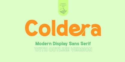 Coldera is a sans serif typeface deliberately modified to make it look beautiful, attractive and modern, available in uppercase, lowercase, ligature and alternative letters. Coldera is suitable for business brands, brochures, posters, magazines, comics, t-shirts, banners and many others.
 - Brer Rabbit by Kitchen Table Type Foundry,
$15.00 Brer Rabbit (or Brother Rabbit) is the central figure in an oral tradition passed down by African-Americans. Brer Rabbit is a trickster, just like the other popular trickster character in African stories called Anansi the spider. Brer Rabbit was based on an old font of mine called Rabbit On The Moon. It is a nice, cute children’s book font that comes with extensive language support and Brer Rabbit himself, in the shape of the alternative asterisk glyph.
 - Savage Sword by Comicraft,
$29.00 Mother of Mitra, Crom’s Devils and other Savage WORDS! The only thing better than one dead Pict is TWO! Or THREE! Or FOUR! And what better than this SAVAGE font to sound the sword strokes of a BARBARIAN BORN?! Hack! Slice! Cut your fiendish foes into pieces with Comicraft’s SAVAGE SWORD and tell your SAVAGE TALES to all and sundry and even those you’ve sundered! BE AWARE! Handle with care and keep some neosporin or other antibacterial cream at hand -- being Savage and filled with Berserker Rage may result in unintended wounds to yourself and your kinsmen. Savage Sword features two sets of automatically alternating uppercase characters, plus support for Western & Central Europe and Vietnamese.
 - Jalopy JNL by Jeff Levine,
$29.00 History, as it's said, tends to repeat itself. The round-point pen lettering used in the 1920s logo and ads for Dodge Brothers cars (pre-General Motors) is an early predecessor to the techno type styles of the 1980s. Square in shape, with unique stylization to some letters, Jalopy JNL can cross the decades and be used for a 1920s period piece and still look fresh in an ad for computer parts. Rather than round out the inside lines of the characters to fully emulate the strokes of a lettering pen, the inside lines have straight intersections for the contemporary side of this font's design.
 - Golden Opportunity JNL by Jeff Levine,
$29.00 The cover of vintage sheet music for "With Plenty of Money and You (The Gold Diggers' Lullaby)" from the Warner Brothers musical "Gold Diggers of 1937" had the movie title hand-lettered in a classic Art Deco style. Bold, brash and totally fun, this became the model for Golden Opportunity JNL.
 - Mr Lucky by Hipopotam Studio,
$22.00 Mr Lucky is Mr Happy's slab brother and a hand-drawn narrow typeface designed for one of our books. You can layer different styles over the background style to achieve lots of colorful effects. Use just one style to get a single color letter or set Fill over Background or Stripped Background to get a two color mode. Mr Lucky has upper and lowercase characters with up to three alternate glyphs and special alternate uppercase diacritics. Build in OpenType Contextual Alternates feature will automatically set alternate glyphs depending on frequency of appearance of the same character (even in web font but only in HTML5 browsers). The script doesn’t throw random glyphs. For example in the word “HIPPOPOTAMUS” you will automatically get three different “P” glyphs and two “O” glyphs. It really works great but of course you can always fine tune it by hand.
 - Sonetto by TupiType,
$33.00 Sonetto is a typeface designed for the making of poetry books comprised of two styles: Regular, for setting prose, and Italic for verses. It is the result of a typographical exploration carried out at the UBA Type Design Master’s which sought to relate italics and cursive italics. Initial drawings were based on Griffo’s italics and early 16th century italian manuscripts that showcased connections between letters. Sonetto is in fact a historical revival, not of a particular style, but rather of a broader concept.
 - Nouveau Hippie JNL by Jeff Levine,
$29.00 The cover of the 1907 sheet music for "I'd Rather Twostep Than Waltz, Bill" was hand lettered in an Art Nouveau sans serif alphabet. During the hippie counter-culture movement of the 1960s, rock posters, album covers and other printed ephemera of the time embraced the styles of lettering and art made popular during the early 1900s. It seemed only fitting to name this type design Nouveau Hippie JNL as an homage to both eras. The font is available in both regular and oblique versions.
 - Bodoni Elegant by Alan Meeks,
$45.00 Whenever I went to use Bodoni I could never quite find a version I was happy with, so I designed my own incorporating, hopefully, the best of all the others. I decided to make a slight curve on the uprights, rather like Optima, because I thought this added touch of elegance which many of the others lacked....hence the name.
 - Doc Holliday by Type Innovations,
$39.00 Doc Holliday is an original design by Alex Kaczun. It's a classic revival of a Western-style slab serif font extended to include Eastern European Latin and Baltic languages. Doc Holliday has a mid to late 1800s wood type feel, and one can envision a sign over the O.K. Corral in Tombstone, Arizona, and the legendary Gunfight between the three Earp brothers and "Doc" Holliday and the Claytons and McLaurys. This font can be applied to sports team promotions and other nostalgic projects. "Howdy pardiner!"
 - Morning Cookie by Bogstav,
$17.00 Yet again, a font inspired by my work as a kindergarten teacher! The other day, I had a conversation with some of the kids, about what they ate for breakfast. Some had oatmeal, some bread and others yogurt. But this kid - he insisted that every morning, his mother would serve him cookies, “morning cookies”. It sounded too good to be true, and when I asked his mother, it turned out that “cookies” were actually bread, but to make it sound more appetising, they called it cookies! The letters are rounded and in some way quite naive, but still clear and legible. With an extreme ascender and descender, the font stands out with its oddities. I’ve added 3 different versions of each lowercase letter!
 - LazyMeow - Personal use only

- Janda Celebration Script - Personal use only

- Head-injuries - Unknown license

- Lobster 1.0 - 100% free

- Face Your Fears - Personal use only

- CANDY INC. - Personal use only

- Tevegraphy - Personal use only

- KG The Last Time Bubble - Personal use only

- Rostock Kaligraph - 100% free

- FlyingHollander - 100% free

- Scooter Boy Free - Unknown license

- AddShade - Unknown license

- Arrobatherapy - Unknown license

- Brassiere Line - Unknown license

- SwishButtons - 100% free

- Kingthings Stirrup - 100% free

- Pinda - Personal use only

- Barber shop - Unknown license

- KR YoYo - Unknown license

- CoventryGarden - Unknown license


