3,463 search results
(0.023 seconds)
- Village Hall JNL by Jeff Levine,
$29.00 A 1918 poster issued during World War I from the YWCA encouraged women to pitch in to the war effort by joining the “United War Work Campaign”. The Art Nouveau hand lettering of that poster was a slight throwback to the “Western” or “Victorian” style of typography because of the characters having split serifs. This is now available as Village Hall JNL, in both regular and oblique versions
 - Poster Paint by Canada Type,
$24.95 Poster Paint is a fun shocard alphabet which came about from Jim Rimmer’s admiration of Goudy Stout, a design he liked in spite of the fact that Goudy himself claimed to detest it. Extremely eye-catching and humourous to a fault, Poster Paint is an ideal fit for fun environments like theme parks, concession stands, cofee and juice bars, and in print design for children books and fun food packaging. Poster Paint was updated and remastered for the latest technologies in 2012. It comes with a glyphset of over 375 characters, and supports the majority of Latin-based languges. 20% of this font’s revenues will be donated to a GDC scholarship fund, supporting higher typography education in Canada.
 - Belanga by Gatype,
$10.00 Balanga is a smooth, elegant and flowing handwritten font. It has a beautifully balanced character, goes well with many designs. Balanga features varied baselines, smooth lines, beautiful glyphs, and stunning alternatives. Hand-drawn design elements allow you to create many beautiful typographic designs in an instant such as branding, web and editorial designs, prints, crafts, quotes, It's great for logo types, wedding invitations, romantic cards, labels, packaging, name spelling and other . Add to your most creative ideas and see how they make it happen! Balanga includes OpenType style alternatives, ligatures, and International support for most Western Languages. To enable the OpenType Stylistic alternative, you need a supporting program such as Adobe Illustrator CS, Adobe Indesign & CorelDraw X6-X7, Microsoft Word 2010 or a later version. Balanga is coded with PUA Unicode, which allows full access to all additional characters without having to design special software. Mac users can use Font Book , and Windows users can use Character Map to view and copy any additional characters to paste into your favorite text editor/application.
 - Joane Stencil by Compañía Tipográfica de Chile,
$25.00 Joane Stencil™ is Joane's fearless sequel. Mixes the elegancy of French didones, calligraphic endings, glyphic serifs and the split of the Stencil is treated very carefully. Thus its features convey a warm unique style. Moreover, it has powerful OpenType features for each style, including stylistic sets, extended language support, beautiful ligatures, contextual alternates, lining figures, oldstyle figures, fractions, and many more. Joane Stencil is perfectly suited for magazines headlines, branding, advertising, labels, web and packaging.
 - MuskitosCaps by Ingrimayne Type,
$8.95 MuskitoCaps is a Tuscan (split-serif) font that is rather narrow and a bit awkward. It is caps only, though the lower case differs from the upper case(the lower case lacks the mid-stem spike). The family has three styles, plain, shadowed, and shadowinside. The last has the same shapes as the plain style but has the spacing of the shadowed style so it can be layered with the shadowed style to easily produce bi-colored lettering.
 - Linotype BlackWhite by Linotype,
$29.99BlackWhite is a titling typeface created by Ferdinay Duman in 1989 styled after the designs of the late 1980s. Like the name says, the figures emphasizes the play between dark and light. To this end, most inner spaces have been deleted. The constructed outlines of the robust figures draw the attention. In some weights, Duman split the figures horizontally, giving them a unique look. The technical and mechanical BlackWhite is perfect for generous headlines on fliers or in trendy magazines. - Zabars by K-Type,
$20.00 ZABARS is a full font developed from the six characters in the spectacular logo of the Zabar’s speciality foodstore in New York City. The Zabar’s lettering is a jewel, possessing greater sophistication and subtlety (and a more contemporary flavor) than the usual bifurcated (split serif) font which might simply suggest ‘Circus’ or ‘Old West’. And it’s been given an even fresher twist through the addition of a new lowercase which helps add to the 1960s countercultural aspect of the font’s personality.
 - Paulo by Ron Nevers,
$20.00 Paulo is a versatile display font with a modern take on the classic split bifurcated design. The clean, sleek look lends itself to logos and headlines. Created to feel familiar and new simultaneously, Paulo has a versatility that can invigorate your traditional designs with a fresh spin, giving them a timeless and modern feel. Its vertical nature and clean, swooshy serifs, create a rhythm that helps draw the eye. Paulo suits various design styles, from urban to an upscale look and feel.
 - Gabilo Script by Sulthan Studio,
$14.00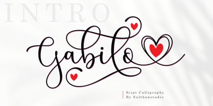 Gabilo Script font with a smooth, handwritten style. Gabilo script is perfect for branding projects, homeware design, product packaging, use in business cards, invitation cards, etc. Simply as a stylish text overlay onto a background image or anything that requires a touch of elegance. also comes with heart swashes that can be spliced.
 - Portfolio by Wilton Foundry,
$29.00 In spite of the fact that Portfolio's capitals are highly ornate, it is still very legible. Portfolio, in combination with its elegant lowercase, creates a prestigious presentation useful for Certificates, Wedding Invitations, Corporate Identities, Brochures, and Headlines.
 - Vglee by Ingrimayne Type,
$8.50 With its split serifs, Vglee looks like it could be a copy of an “Old West” font but it is not. It was constructed by taking a motif and applying it regardless of consequences. Vglee does not have lower-case letters but it does include a full set of Western and Central European accented characters. Its distinctive, odd appearance can be useful in small doses for decorative purposes. The VgleeStar style contains only the ornament. It is intended to be used in layers with Vglee.
 - Elysia by Factory738,
$15.00 We present Elysia, a fresh two-faced serif with both MODERN and CLASSIC curves. Elysia is a split personality font that can be used for a variety of projects, including bold magazine imagery, wedding invitations, branding, poster design, and much more. 2 Weights (Light & Bold) 2 Styles (Modern & Classic) Basic Latin A-Z and a-z Numerals & Punctuation Stylistic Ligatures glyps Multilingual Support for ä ö ü Ä Ö Ü ... Free updates and feature additions Thanks for looking, and I hope you enjoy it.
 - Zook - Unknown license

- Nothing by Dharma Type,
$19.99 The real handwriting script. Very powerful impression because of its heavy, wide and speedy shape. Award Winning No. 1 font 2007 at MyFonts and Rising Star. There is one more script designed by in the same concept. -Banana -Nothing
 - Weltschmerz by Hanoded,
$15.00 Weltschmerz, world-weariness… I love the sound of it, so I chose this name for my new font. Weltschmerz font is a hand made Jugendstil typeface which was modeled on a 1910 poster from Austria. Weltschmerz is a classy typeface, a little melancholic, but with a positive uplift in the end. Weltschmerz comes with extensive language support.
 - Spread Out NF by Nick's Fonts,
$10.00Here's another gem from perennial Speedball penmaster Ross F. George, originally called Split Caps. George's original design has been enhanced with the addition of lowercase characters, borrowed from another of his alphabets, and adapted to the style of the caps. This font derives its name from one of the catchphrases of the estimable Stooge-in-Chief, whose signature hairdo can be found in place of the Section mark. Both versions of the font include complete Latin 1252, Central European 1250 and Turkish 1524 character sets, with localization for Moldovan, Romanian and Turkish. - Romford Stencil by Paula Minelgaite,
$30.79 Romford Stencil is a Brexit inspired typeface. It’s letterforms represent the idea of a union splitting apart and the stylistic differences between the upper and lower case symbolise the notion of being different from one another. Research for this typeface started off in Romford which is an area where the majority of UK voters wanted to leave the European Union, hence the name. Romford Stencil is designed to be readable for body copy and look impressive when used as a display typeface. However, the bigger it's size the better it looks, especially in all capitals.
 - Virus by Chris Costello,
$22.75 This design was inspired by a laser printout of a corrupt font. I designed the entire character set from a strain of seven infected letters. Virus is surprisingly legible in spite of its distortions so let your imagination run loose with this one.
 - 1871 Dreamer Script by GLC,
$38.00 This script font was inspired from a lot of manuscripts, notes and drafts, written by the famous American poet Walt Whitman. It is a very elegant type, in spite of a few curious ligatures, often concerning the r or z small letters. Notice the very characteristic “th”. It is used as variously as web-site titles, posters and fliers design or greeting cards, all various sorts of presentations, menus, certificates, letters. This font, in spite of its small size, supports very strong enlargements as well as small sizes ( the original size was about 36 to 48 pts ). When printed, it remains perfectly legible and elegant from 9/11 pts even if using an ordinary inkjet printer.
 - Channel B by Just My Type,
$25.00 Channel B was derived from the logo for Channel B, a British entertainment internet channel, anchored by former Soccer AM presenter Tim Lovejoy at www.dailymotion.com/channelbee. I’m not sure what it was in 2008 when I first ran across the logo, but that elegant capital B seemed to cry out for a font to support it. Many of the capitals, numbers and other glyphs of Channel B are split into a top and bottom, but not all. The tall, condensed capitals are contrasted to the rounded lowercase (derived from the bottom half of the B, rotated 180°).
 - Cottonwood by Adobe,
$29.00Cottonwood is a group effort of the typeface artists K.B. Chansler, B. Lind and J. Redick and displays the unmistakable look of the Wild West. It is stylistically modelled on the typefaces used in advertisements and signage toward the end of the 19th century. Typical for these capital alphabets are the split serifs which emphasize the markedly decorative character. Cottonwood is a kind of homage to the Western typefaces (woodtypes) which became popular through their use on Wanted signs in Western films. Cottonwood is best used sparingly in headlines to best emphasize its decorative, 'wild' character. - 2009 Lollipop by GLC,
$38.00 This font is not a historical one, in spite of the fact that it was inspired by the Cancellaresca pattern (look at 1491 Cancellaresca and 1610 Cancellaresca). We have created this one as a fantasy script for a decorative use, like for invitation, greetings, menus, posters and so on...
 - Between by Monotype,
$40.99 Akira Kobayashi’s Between™ typeface comes in three main states. While different from each other, they all offer human-centered design to ensure that copy set in them is affable and approachable. An added benefit is the ability to transition “between” font designs, choosing different styles – or even individual characters – to create hierarchy, contrast or emphasis. Kobayashi designed the Between typeface in response to the current popularity of rounded, humanist sans serif designs over the cool grotesques of the 20th century. Between 1 melds industrial and humanist sans ethics. Between 2 represents a sans version of Kobayashi’s Cosmiqua® typeface, striking a balance between crisp and legible, organic and friendly. Between 3 is a freestyle sans with an uplifting sprightly mien. Between has 48 styles; each has eight weights of roman with its own italic counterpart. The family offers a large set of alternative glyphs and OpenType® features. A full interactive type specimen can be viewed here: http://www.monotype.com/fonts/between/ Featured in: Best Fonts for Logos
 - Curro by Bon Bon Lab,
$12.00 Curro is a handwritten font that radiates joy and happiness. With playful and charming curves, this typeface adds a lighthearted touch to any design. Whether it's crafting greeting cards, designing invitations, or adding a touch of whimsy to your branding. Curro will uplift and captivate your audience. Unlock a world of positivity and vibrant creativity with this font, and let your designs come alive with the infectious spirit of happiness.
 - Dead Mans by Comicraft,
$19.00 Shiver me Timbers and Splice me Mainbrace! There's strange goings on in Smugglers' Cove... A gathering of thieves, brigands, piratefolk and back-stabbing blackguards the likes of which have not been seen since the days of Redbeard! Someone'll be swinging from the yardarm or walking the plank if the map identifying the location of the fonts created for Grim Todd McFarlane's SPAWN: THE DARK AGES doesn't turn up soon!
 - Fluidum by Monotype,
$29.99 Aldo Novarese designed the Fluidum typeface in 1951. As its name implies, the design is very fluid. This high contrast script face curls and twists across the line. It is sort of a cross between Giambattista Bodoni's cursive letters, and Aldo Novarese's later, heavier designs, like Microgramma, Eurostile, and Sprint. Fludium should be set in very large pint sizes. It is perfect for invitations, greeting cards, and fine logos.
 - PT Banana Split, though not a real font in widespread use as of my last update, conjures up whimsical and delightful imagery with its vivid name alone. Let's imagine it as a font that captures the es...
- ITC Malstock by ITC,
$29.99ITC Malstock is the work of Czech designer Frantisek Storm. The idea is based on a sign painting technique that uses a flat brush and a Maalstok, a long bar with soft padding which is used as a rest for the painter's hand and a guide for vertical lines. The strokes of this font end with a split stem which recalls the traces of the writer's brush. ITC Malstock is a narrow typeface which is ideal for headlines, invitations and advertisements. The designer recommends combining his typeface with others, to create harmony with sans serif typefaces in text sizes or contrast with serif typefaces. - Ink Gothic by VersusTwin,
$39.00 Ink Gothic is a contemporary slab serif with a split personality - a mix of heavy industrial with light typographic twists. Unique letterforms evolve the typeface into a class all its own. The Ink Gothic Alt styles add italic letter-styling and cursive loop appeal to the lowercase characters, taking the more refined stylings and giving them an elegant twist adding versatility and beauty. Stylistic Alternates are available for the b & k characters. The Ink Gothic Complete package bundles all of the versatile and elegant styles of the Ink Gothic, Ink Gothic Alt, Ink Gothic 3D, and Ink Gothic Inked typefaces into one powerhouse of a collection.
 - Eccles by Greater Albion Typefounders,
$14.50 Eccles is another of our 'Early Victorian' typefaces, a series we started with the Wolverhampton family a little while ago. It might be described as 'extreme-Tuscan' in style but has a delicacy that many other Tuscan faces seem to lack. It's ideal for giving design projects a clear period feel, particularly in design and advertising work. We also see it having considerable application in preparing invitations to a certain type of happy event. At the other extreme, some of our younger associates have described it as 'your latest Steampunk font'. So perhaps we'll just have to settle on it having a split personality...
 - De Bambeet by Zamjump,
$17.00 De Bambeet is a serif font that has a little style compared to other serifs, with multiple languages, alternate and also ligature is quite cool and suitable to be paired in various media like a posters, wedding invitations, craft products, book covers, photography, t-shirts , product packaging and other media. By using De Bambeet, I am sure that your products will look elegant, classic and luxurious. Font Featured : Uppercase Lowercase Numbers Symbols Punctuations Sylistic alternates Discretionary Ligatures
 - Salera Script by Afkari Studio,
$19.00 Introducing Barona Script - Handwritten Signature Font Barona Script exudes timeless elegance with its graceful handwritten brush strokes. This font embodies a contemporary calligraphy style that seamlessly blends sophistication and playfulness, making it the ultimate choice for elevating your branding and digital designs. Barona Script offers a treasure trove of alternative glyphs and ligatures for endless creative possibilities. Whether you're crafting quotes, logos, social media content, websites, blogs, or invitation cards, this font is your artistic companion. Barona Script's Features: - Uppercase, Lowercase, Number, and Punctuation - Standart and Special Ligatures - Works on PC & Mac - Simple installations - Accessible in Adobe Illustrator, Adobe Photoshop, Adobe InDesign, and even work on Microsoft Word - Fully accessible without additional design software. - Mültîlíñgúãl Sùppört; Embrace Barona Script, and let your creativity flourish. Happy designing!
 - Main Street by FontMesa,
$25.00 Main Street is a revival of the old font Soutache, the original version of this decorative alphabet was created in 1873 by Julius Herriet, a type designer active during the period marked by the Western expansion. Main Street with its split serifs and ornate scrollwork reflects the romantic splendor of the old west from fancy garb and Cowboy Saddles to Ice Cream Parlors and painted window signage. Main Street goes one step further by creating a base fill font which can be placed behind the regular Main Street font giving this font more of an inline appearance. You will need an application that allows layering of your fonts in order to take advantage of FontMesa Fill fonts.
 - Shojumaru Pro by Stiggy & Sands,
$29.00 Shojumaru draws inspiration from a movie poster for a 1957 film titled Sayonara, starring Marlon Brando. It breaks the formula of a chop suey style by mixing chop suey and traditional letterforms to create a powerful and unique letterforms all its own. The "Split" style adds further dynamics to the visual language. An already SmallCaps style font, it includes additional SmallCaps features when SmallCaps is enabled in applications for a wider range of use. Opentype features include: - SmallCaps (standard) - Full set of Inferiors and Superiors for limitless fractions - Standard & SmallCaps figure sets - A Smallcaps feature (Stylistic Alternates) that converts all characters to a small caps format, including punctuation, numerals, and other figures.
 - Beurre by Wilton Foundry,
$29.00 In thinking about a way to express the character of this script, it occurred to me that the splitting of the main downstrokes in the caps is almost like when knife cuts into butter. Picture a butter knife that slices into butter, slowly wedging the cut wider so that when it is pulled back, the remaining shape would resemble the main downstroke of any capital letter. The lowercase characters have an almost roundhand-like character but with a slightly more formal presence. Available in Postscript, Truetype and Opentype for both Mac and Windows, Beurre is ideal for Menu's, Invitations and pretty much anywhere you need a reasonably strong, but friendly legible script. Enjoy!
 - Zebrawood by Adobe,
$29.00Zebrawood font is a joint work of the typeface designers K.B. Chansler, C. Crossgrove and C. Twombly, who also designed Rosewood, Ponderose and Pepperwood together. Like its relatives, Zebrawood also displays a kind of Wild West character. Its style can be traced back to the Toscanienne typefaces which appeared in advertisements and on signs at the end of the 19th century. Typical of this capital alphabet are the split serifs and robust base forms, which emphasize the typeface's decorative character. Zebrawood is, like Rosewood and Schwennel, meant as a bicolor font, meaning that the weight Zebrawood fill complements the inner spaces of Zebrawood regular. When used carefully in headlines, Zebrawood font will be sure to attract attention. - HWT Brylski by Hamilton Wood Type Collection,
$24.95 HWT Brylski is a typeface by Nick Sherman, named for retired wood type cutter Norb Brylski and designed to be cut as wood type at the Hamilton Wood Type & Printing Museum. This font is the digital counterpart to the wood type made as part of the Hamilton Legacy Project . It incorporates several themes that were common in 19th-century type design, including split tuscan serifs with angled mansard-style sides, heavy weight placement at the top and bottom of letters (traditionally referred to as French or Italian/Italienne, regardless of any actual relation to those countries), and an extended overall width. This digital version contains over 400 glyphs for full European language coverage.
 - Tasci Kufi by Abdullah Tasci,
$50.00Tasci Kufi is the today’s commentary of the minimalist comprehension of the geometric balance in the epigraphs of the Seljuk period. The typeface offers innumerable alternatives for the balance component needed for headlines and logotypes. - Electrica by Scannerlicker,
$33.00 Electrica is a contemporary monospaced typeface family; a tribute to classic typewriters, while designed for today’s needs and media. In spite of taking inspirations from several typefaces used in typewriters (most notably the IBM Selectric), Electrica is far from a revival: it’s a typeface on its own, winking to the past while standing its ground confidently in a contemporary environment.
 - Stefania Antique by insigne,
$21.99 Stefania Antique is an aged version of Stefania, an elegant italic script. Stefania Antique is perfect for creating unique and ancient looking chancery manuscripts. A regular version and a more distressed alternate are available. Stefania Antique includes 64 OpenType ligatures that are used to automatically replicate the natural appearance of letterpress printing. Stefania Antique works great in conjunction with insigne Splats!
