10,000 search results
(0.03 seconds)
- Baltimore Typewriter by Intellecta Design,
$20.90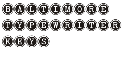 a comprehensive family of fonts
 - Rotola TH Pro by Elsner+Flake,
$40.00 Karl-Heinz Lange presented his first drafts of Rotola during a Typoart® type design competition in 1985 under the name "Boutique". A year later, Norbert du Vinage, former manager of the type design department, integrated "Boutique" in his production plan. Due the Fall of the Wall, it took about 18 years until Lange finished this font family in cooperation with Elsner+Flake. Karl-Heinz Lange was born on July 29, 1929 in Wiesenkirch in West Prussia. He was enrolled in the Humanistic Gymnasium at Elbing from 1939 to 1945 and changed to the Wernigerode High School after his family had to flee to central Germany. From 1949 to 1951, Karl-Heinz Lange studied at the Werkkunstschule Halle, where one of his teachers was Professor Post. After 1951, he continued his studies at the Hochschule for Grafik und Buchkunst in Leipzig with an emphasis on book design. He received his diploma in 1955 with distinction based on his design of a hot metal typeface. From 1956 to 1961, Karl-Heinz Lange worked as a lecturer for Type and Commercial Graphics at the Hochschule für Angewandte Kunst in Magdeburg. From 1961 to 1963, he taught at the Hochschule für Grafik und Buchkunst in Leipzig, and finally as a freelance commercial designer in Magdeburg. He worked on a variety of assignments, one of which was the design of trick films. From 1969 to 1976 he took the position of Artistic Director of the Henschelverlag, Berlin; from 1976 to 1994 he was Professor of Type and Typography at the Fachschule für Werbung und Gestaltung in Berlin; and, until 2004, he taught at various institutes for advanced professional education. From 2005 to 2007 he taught at the Fachhochschule Magdeburg/Stendal. Karl-Heinz Lange was awarded the second prize at the "International Type Design Contest 1971" for a headline typeface, and, in 1984, at the XI. Biannual of Graphic Design in Brno, he won a Silver Medal for the design of his typeface family Publica. He created the telephone book typeface Minima and re-designed the Typoart Super Grotesk® (Arno Drescher, 1930) as well as the Newspaper typeface Magna® by Herbert Thannhaeuser for the use on digital typesetting systems. To the day of his death on June 29, 2010, Karl-Heinz Lange lived and worked as a type designer. Among others, he closely followed the designs of the typefaces which were developed under his guidance for Typoart®: "Publica®", "Typoart Super Grotesk®" and "Minima®" which he launched as "Publicala", "Minimala" and "Superla" in 2009. In cooperation with Elsner+Flake, he developed the Typeface family "Rotola" between 2006 and 2009 as well as the script families of the "Viabella®" series. To the end, he followed the development of his first typeface, the "Diplom Antiqua", which he also wanted to bring to market together with Elsner+Flake.
 - Windevere by Greater Albion Typefounders,
$10.00 Windevere is a family of display faces designed for easily readible headings and titles that convey a sense of speed and motion. The family includes three faces: Windevere Regular, Windevere Bold and Windevere Rounded.
 - Vista Slab by Emigre,
$69.00 The Sans Narrow and Slab versions were added to the Vista family in 2008, extending this super-family to a total of 108 fonts. For more information, see the original Vista Sans Design Information.
 - Vista Sans Narrow by Emigre,
$69.00 The Sans Narrow and Slab versions were added to the Vista family in 2008, extending this super-family to a total of 108 fonts. For more information, see the original Vista Sans Design Information.
 - Saveur Sans Round by Arkitype,
$10.00 Saveur Sans Round is the softer, friendlier cousin of Saveur Sans, a font family inspired by art deco and French cafes. This display family has clean, simple letterforms that feel modern but at the same time have a retro, art-deco styling. This family can add a sophistication to any layout whether it be print or online. Saveur Sans Round is a great selection for headlines, logotypes and branding. it is an all-caps display family with some neat alternatives including an alternative O and E that instantly give your copy that retro-deco look. The promos have been inspired by French food and design. This family is perfect for use in packaging and branding of food products as well as menus and restaurant or cafe branding.
 - Mehdi Mutamathil by Arabetics,
$32.00 The Mehdi Mutamathil type family follows the guidelines of the Mutamathil type style. It has only one glyph for every basic Arabic Unicode character or letter. The Mehdi Mutamathil family includes all required Lam-Alif ligatures and selected marks positioning so it does use limited glyph substitutions or forming. Mehdi Mutamathil employs variable x-height values. Text strings composed using typefaces of this family are non-cursive with stand-alone isolated glyphs. The Mehdi Mutamathil family includes both Arabic and Arabic-Indic numerals, all required diacritic marks, Allah ligature, in addition to all standard English keyboard punctuations and major currency symbols. The fonts in this family support the following scripts: Arabic, Persian, Urdu, Pashtu, Kurdish, Baluchi, Kashmiri, Kazakh, Sindhi, Uyghur, Turkic, and all extended Arabic scripts.
 - Calton by LetterMaker,
$22.00 Calton is a utilitarian workhorse sans serif family. It’s designed to work in as many environments as possible, from small text to big headlines. The roman and italic styles work well for any typographical situation while the stencil really packs a punch and shines as a display family. The design has a hint of familiarity from classical humanist sans serifs, but the proportions are much more economical and the detailing is distinctly modern. All styles come in eight weights, from Thin to Black and the family is well suited for film and TV, advertising, editorial design, packaging, branding, logo, sports, web and screen design. The family is available in multiple bundle options so check out the different choices. The family package is available with a bargain price.
 - Ainslie by insigne,
$- Get your Aussie on! The new typeface, Ainslie, with its mix of influences from Oz, makes its mark as the first semi-serif from insigne Design. Ainslie, named for Mt. Ainslie and Canberra’s inner suburb of the same name, was originally developed for the Canberra Australia Centennial Typeface Competition. Canberra is Australia’s capital, and it’s a planned city designed by American Walter Burley Griffin, a contemporary and one-time associate of Frank Lloyd Wright. Griffin’s plan involved a distinctly geometric design with several focal points--one of which was Mt. Ainslie. This same purely geometric scheme is now the basis for insigne’s new release. Similar to the Chatype project in its scope, its challenge, and the way its concept was developed, Ainslie incorporates influences from Canberra and surrounding areas to form a font that is uniquely Australian. In comparison, Chatype was developed for the city of Chattanooga, Tennessee by insigne in conjunction with designer Robbie de Villiers. Chatype took elements from Chattanooga’s industrial character and Cherokee past and merged them with the area’s technological influences. Likewise, Ainslie takes Canberra’s distinct, geometric design and blends it with the organic, flowing effect of aboriginal art. Add in touches from the smooth, aerodynamic design of the boomerang and Ainslie gives you a look uniquely Australian yet usable in a wide range of applications. The fashionable typeface includes a multitude of alternates that can be accessed in any OpenType-enabled application. These stylish alternates along with a number of swashes as well as meticulously refined details with ball terminals and alternate titling caps keep the font well accessorized. Also included are capital swash alternates, old style figures, and small caps. Peruse the PDF brochure to see these features in action. OpenType enabled applications such as the Adobe suite or Quark can take full advantage of the automatic replacing ligatures and alternates. This family also offers the glyphs to support a wide range of languages. While Ainslie wasn't selected as the final font in the Canberra competition, the outcome allowed for additional adjustments to the typeface. Several approaches were attempted for the final product including a technological hexagonal concept, which may still be developed to another form later. Some of the organic forms were removed and substituted with more abrupt endings, leaving the face looking pretty spiffy and a fair bit more legible. In the end, Ainslie was pulled back to the basic forms from which it was started. Give it a go for your next project. It’s guaranteed to be anything but a barbeque stopper.
 - Airo by LetterMaker,
$28.90 Airo is a monospace type family with inverted contrast. The distinct shapes and detailing give Airo a strong typographic voice. The family comes in six carefully selected weights, from Light to Extra Bold, making it a versatile typographic tool. The family works best as a display typeface for creating a strong visual impact, but you can use the lighter weights for medium length text as well.
 - Displayer by Tour De Force,
$30.00 Displayer font family is modern, wide and sans serif family available in 7 weights and Variable type file. It’s strong, stable, compact, futuristic family with some specific letter design and generous ink-trap. With it’s display charm, Displayer fits perfectly into any branding project – use it in posters, package, website, logo, video games, magazines. Contains fractions and standard ligatures with Extended Latin character map.
 - Rounded Elegance by Douglas Charles,
$12.00 In the "Rounded Elegance" font family you will find modern, clean and elegant fonts. The family is thought and designed to provide smooth and modern logo creation as well as writing subtitles and brand slogans for end customers. The "Rounded Elegance" family is a unique sans serif type, with smooth, rounded contours. The package contains the new version (2.0) of the well-known Rounded Elegance font.
 - Mavel by Arodora Type,
$40.00 Mavel is a large font family where you can find simplicity and elegance together. With this font, you can create impressive presentations and increase their contrast by using sub-family members. You can create unique looking layouts and banners. The luxury logo will look great for your work. Apart from its wide family, this aesthetic font offers you alternative characters, ligatures and many more usage features.
 - Earth Tone by Sarid Ezra,
$15.00 Introducing, Earth Tone - Organic Sans Family Earth Tone is a handmade font family with natural and organic feels! Contain three weight. Including Light - Regular - Bold. You can use this font for every project. Suitable for branding logo, hand lettering, or apparel design. When you want a handmade touch in your design, this font will never disappoint. This font family also support multilingual, number and symbol.
 - Elkysis by Typogama,
$19.00 Elkysis is a striking, contemporary slab serif type family of six weights designed for use in titles, headlines or branding. With a distinctive look, this family aims to provide a unique voice for small passages of text yet remains surprising legible in smaller point sizes. With a full extended latin language support and a Variable family, Elkysis aims to provide a creative and striking solution.
 - Legal by Linotype,
$29.99The Legal typeface family grew out a sans serif project that Hellmut G. Bomm began in the 1970s (his HGB Grotesk). This refined, industrial type family is well suited for short amounts of text, headlines, corporate identity and logo design. In small sizes, the typeface works like many other sans serifs, but with better differentiation between characters. The Legal family includes oldstyle figures and true italics. - Ambergate by Greater Albion Typefounders,
$19.00 Ambergate is a new typeface family redolent of the late 19th and early 20th centuries. It’s a display family of four small capitals roman faces, incised and elaborated with filigree scrollwork. The four typefaces which comprise the family recapture the elegance of traditional flourished sign writing and make and provide ideal lettering for period inspired design work such as posters, signage and book covers.
 - Boughy by Craft Supply Co,
$17.00 Boughy – Font Family is a versatile display serif font family with 9 weights from ultra condensed to extra expanded. perfect for headings, titles, branding and much more. Boughy – Font Family contains everything you need to create stunning typography – from headline fonts to body text fonts – all in one place. Whether you’re starting out or you’ve been designing for years, Boughy has everything you need.
 - Matita Geometric by Trine Rask,
$30.00 Matita Geometric is part of a larger type family developed from 2005-2019 with handwriting and teaching in mind. A humanistic geometric sans serif in five weights containing mathematical symbols, roman numerals, fractions, superior-& inferior numerals, tabular & proportional figures. The family share proportions and weights to ensure all fonts (family members) work together well. Matita Geometric is also a very basic typeface suitable for many purposes.
 - Randu Sans by Yukita Creative,
$14.00 Randu Sans Serif Display Font Family is a sleek, modern font family with an elegant typography style. Created with clarity and boldness in mind, this font offers a variety of bold and italic styles, providing flexibility in its use. Whether used for titles, headings, or poster designs, the Candied Sans Serif Display Font Family provides the clarity and appeal needed to hold an audience's attention.
 - Taffee by Suomi,
$25.00 A friendly family with six weights.
 - Springsteel Serif by Paragraph,
$21.00 A companion to Springsteel (sans), this serif typeface is intended for longer text blocks and smaller sizes. Like the sans-serif, it has unusual construction using curves on the outside and straight lines inside characters, giving it quite an expressive and warm feel. It contains small caps and old-style figures, as well as superior/inferior figures and common fractions and mathematical symbols. It supports Western plus Nordic, Eastern European and Turkish languages. Excellent spacing and extensive kerning (over 2800 pairs) provided by Igino Marini/iKern. The free fonts in the Springsteel Serif Extreme family (thin and heavy weights) should only be used as display typefaces, at large size and short text blocks.
 - Core Escher by S-Core,
$30.00 Core Escher is an optical illusion type family which has two sub-families: Core Escher A and B. Core Escher A has impossible shapes inspired by the optical illusion works of artist M.C. Escher. The letterforms in this type family are structurally twisted and complicated but it looks simple because of its simple strokes. And for easy color variations, it split into two fonts, Core Escher A Left and Right. Core Escher B has a different kind of optical illusion. The letters of Core Escher B look like three dimentions by just putting thin lines on bold letters. Also B has two sub-families that have different viewpoints. Core Escher Family supports complete Basic Latin, Cyrillic, Central European, Turkish, Baltic character sets. Each font includes proportional figures, tabular figures, numerators, denominators, superscript, scientific inferiors, subscript, fractions and case features. This family is really nice for book titles, headlines, logotypes and any artworks.
 - Mutamathil Taqlidi by Arabetics,
$39.00 The Mutamathil Taqlidi type family is the largest size member of the Mutamathil type style. It has one glyph for every basic Arabic Unicode character or letter and one additional, final-position, glyph for each Arabic letter that is normally connected with other letters from both sides in traditional cursive Arabic strings. With each glyph being slightly symmetrical around its vertical axis, this family is only suitable for right to left ordering. The Mutamathil Taqlidi family includes all required Lam-Alif ligatures and uses final position glyph substitutions, ligature substitutions, and marks positioning. Text strings composed using types of this family are non-cursive with stand alone isolated glyphs. The Mutamathil Taqlidi family includes both Arabic and Arabic-Indic numerals, all required diacritic marks, in addition to all standard English keyboard punctuations and major currency symbols. The fonts in this family support the following scripts: Arabic, Persian, Urdu, Pashtu, Kurdish, Baluchi, Kashmiri, Kazakh, Sindhi, Uyghur, Turkic, and all extended Arabic scripts.
 - Cumhuriyet by Fontuma,
$24.00 About the font family Cumhuriyet is an Arabic concept that means "the form of government in which the nation holds the sovereignty and uses it through the deputies elected for certain periods". The reason why I gave this name to the font is that 2023 is the centennial anniversary of the Republic of Turkey, which was founded by Atatürk. This typeface, which is sans serif, consists of three families: ▪ Cumhuriyet: Font family with Latin letters ▪ Cumhuriyet Pro: Font family including Latin, Arabic and Hebrew alphabets ▪ Cumhuriyet World: Font family including Latin, Cyrillic, Greek, Arabic and Hebrew alphabets Cumhuriyet is a family of multi-purpose typefaces designed in a geometric style. This font is an extremely useful font for media and digital media as well as for printed products. In this respect, the Cumhuriyet font can be used as a text and title font in publishing and printing areas, magazines, newspapers, books, banner and poster designs, and websites.
 - Ulga Grid by ULGA Type,
$19.00 Update November 2022: ULGA Grid now features an oblique variant. It’s also been expanded into a family of different but related designs with the addition of ULGA Grid Solid and ULGA Grid Rounded typeface families. All variants and new designs are monospaced, sharing the same width as the original ULGA Grid font and matching character sets. The character set has also been enlarged and now supports Western Europe, Vietnamese, Central/Eastern Europe, Baltic, Turkish and Romanian. ULGA Grid is a modular, monospaced typeface reminiscent of the old Letraset LCD & Quartz typefaces from the 1970/80s with lots of alternative characters and ornaments to bring a fresh twist to the genre. The idea’s seed germinated while I was going through a phase of binge watching my favourite 1980/90s sci-fi movies (classics such as Terminator, Total Recall and RoboCop). However, perception and reality don’t always align. Thirty years later, when compared to today’s technology, some visual elements look kind of outdated, almost Retro Futuristic. The initial design process started out in Adobe Illustrator when I constructed letters from a few geometric shapes within a square block. Just playing around with different shapes was so engrossing that it wasn’t long before there were enough characters for a basic typeface. The project grew again as I experimented with designs within the shapes and set paragraphs of text in patterns, resulting in over a hundred alternative characters and ornaments, some of which double up as border designs. This typeface may be square but it’s anything but boring. What it lacks in legibility ULGA Grid makes up for in style and the end result is a surprisingly versatile typeface that you'll have fun using for a wide range of display purposes including CD covers, posters, packaging, advertising, brochures and film titles. Ironically, the fixed grid structure frees the characters to create patterns of text not possible with variable widths.
 - Referenz Grotesk by Sudtipos,
$49.00 Made in Germany, Referenz Grotesk is a typeface full of references referring to the type design history of Stuttgart State Academy of Art and Design. Its typographic history holds a broad spectrum of shapes and characters, including F.H. Ernst Schneidler (1882–1956), Imre Reiner (1900–1987), Walter Brudi (1907–1987), Kurt Weidemann (1922–2011) and Frank Heine (1964–2003). During extensive research phases for Referenz Grotesk included collection and analysis. This led to further research in the Academy’s collection and archive where the majority of Weidemann’s estate is housed next to works of other designers and professors like F.H. Ernst Schneidler and Walter Brudi. Another place of research was the typesetting workshop where Schneidler had previously taught and worked. Some of his freshly cast fonts were tested and used there for the first time and are still stored in several of the type cases. Regarding the more recent history, for instance about the Emigre designer Frank Heine, former colleagues and professors have been consulted. These studies resulted in the new font Referenz Grotesk that includes traces of Kurt Weidemann’s Corporate as well as calligraphic hints that link to Schneidler’s Stuttgarter Schule (Stuttgart School) where writing played an important role during the form finding process. For the regular text fonts these features are integrated in a subtle manner whereas several alternative glyphs pick up more expressive forms. The final sans serif type family has a clarity and contemporary straightness that becomes more characteristic in its heavier weights. Additionally more than 60 alternative glyphs per weight allow for individual combinations that can be tailored specifically for each application and context. They open up a broad range of visual expressions, from subtle to playful and eccentric characteristics. Referenz Grotesk is available in six weights: Light, Regular, Medium, Bold, Extra Bold and Black, plus italics. In addition, the family includes multiple OpenType functions such as Stylistic Sets, Tabular Figures and Case Sensitive forms. Variable version of the font is included when you license the full pack.
 - Koumon by Muksal Creatives,
$8.00 Koumon is modern family of Display fonts. Koumon has 8 families font, starting from the small thin to the largest black. This typeface is versatile and can be used successfully in magazines, posters, branding, websites, etc.*
 - Burkey by Muksal Creatives,
$10.00 Burkey is modern family of Display fonts. Koumon has 8 families font, starting from the small thin to the largest black. This typeface is versatile and can be used successfully in magazines, posters, branding, websites, etc.*
 - Abraham by Sabrcreative,
$15.00 Discover the versatile and stylish Abraham Font Family at MyFont. With 8 unique styles, including Regular, Italic, Rough, Stamp, Shadow, Outline, and Rounded, this modern sans-serif modular family offers endless creative possibilities. Perfect for a wide range of design projects, Abraham is suitable for logos, greeting cards, quotes, posters, branding, business cards, stationary, blog headers, and more. Each style of the Abraham Font Family features both uppercase and lowercase letters, ensuring flexibility in your designs. Additionally, it includes stylistic alternates, standard ligatures, and numerals & punctuations in OpenType format for seamless typography. Enhance your artwork with the multilingual support of the Abraham Font Family, which includes a wide range of accents and characters to accommodate various languages. The font family is PUA encoded, allowing for easy access and usage across different platforms and software. With the Abraham Font Family, you'll receive the following fonts: Abraham Regular, Abraham Regular Italic, Abraham Outline, Abraham Outline Italic, Abraham Rough, Abraham Stamp, Abraham Shadow, and Abraham Rounded. Whether you're designing greeting cards, package designs, brand identities, or art projects, Abraham Font Family will add a touch of sophistication and creativity to your work.
 - Pro League 2020 by Alphabet Agency,
$20.00 Pro League 2020 font family is a sleek modern sans serif font family that provides italic and weight options that balance well with each other and provide various options for the user. If you are looking to present a clean, sleek professional look that is easy on the eyes - then this is a font family for you. Pro League 2020 font family contains 6 fonts - Pro League 2020 Condensed Regular, Pro League 2020 Condensed Regular Italic, Pro League 2020 Condensed Light, Pro League 2020 Condensed Light Italic, Pro League 2020 Condensed Extra Light and Pro League 2020 Condensed Extra Light Italic.
 - Ariom Sans by S6 Foundry,
$25.00 Ariom is a fresh, geometric, sans-serif font family inspired by iconic typefaces. Ariom has a big x-height value, geometrical letterforms, sharp edges, and strong stroke contrast as the neo-grotesque fonts from the 20th Century. The typeface is versatile and can be successfully used in magazines, posters, branding, websites, headlines, large-format prints, brand identities, social media, advertising, editorial design, posters. The family contains over 40 alternative glyphs and over 50 ligatures in each style. The family comes in 3 weights with their corespondent italics. The family Latin supports Western, Central, South Eastern, South American, Oceanian, Pan African, Vietnamese, and Sámi.
 - Lupio by Tour De Force,
$25.00 Lupio comes as 102nd family in our catalogue. It is geometric sans serif family with humanistic elements. Lupio family contains variable and classic versions, so you can pick which one suits better for you and your project. Classic version is additionally fine tunned to get overall character look more equalised and uniform. When it comes to distinction – in sea of dozen other sans serif famlies, we made Lupio decently recognizable. You won't mistaken him with others. Lupio is designed as working horse family, to be used in all possible situations – from websites to packages, editorial design and applications.
 - Normaliq by Differentialtype,
$12.00 Normaliq is a geometric and modern sans serif family that exudes a unique and minimalist charm. comes in nine weights, ranging from Thin to Black, combined with an Italic style, as well as the addition of Black Outline and Black Italic Outline. The balance of hard lines and subtle curves provides strength and eye-catching for every weight of the family. Each font in the family can stand alone, dynamic and authoritative. This font family offers versatility for a variety of design needs, designed specifically for looks such as titles, branding, logos, books, branding and other impactful editorial work.
 - Postea by TypeTogether,
$47.00 The Postea font family is Veronika Burian and José Scaglione’s take on German geometric typefaces, reshaped with the right attributes for setting paragraphs and headings, and perfect for branding and text use. Some typefaces are a rough tool, like a pumice rock: abrasive to the senses, unforgiving, and unhelpful for most reading situations. Postea is an obsidian: smooth and classy, with attractive nuances in any light. The classic curves and purposeful details keep its individuality intact while allowing it to fit an incredible range of geometric font needs. Because of these qualities, Postea makes normal reading in paragraphs a cinch and your branding memorable. Compared to midcentury attributes of restraint and a sparse appearance, Postea’s deliberate play between character widths injects life and distinctiveness into its personality. The default ‘t, f’ have lyrical doses akin to a robust evening drink and are rounded out with a serpentine ‘s’ and rotund ‘o, g, b’. Another nice surprise awaits: spacing for the Hairline weight is tighter for optimal use in large headings and titles, while the regular weights have the expected, slightly looser spacing for text. Setting the test word ‘bogarts’ brings all this together nicely, invoking a balance between a constructed and human feel while brushing away the dust from a century of derivatives. Postea is opinionated and its modern stylistic sets allow it to be accommodating with softer, specially-designed alternative characters. SS01 replaces ‘b, f, M, m, t’, while SS02 changes only the lowercase ‘a’ to the round style, and SS03 swaps out the angled ‘y’ for a straight version. The fourth and sixth stylistic sets are packed with wallpaper-worthy geometric patterns, ornaments, arrows, and symbols aplenty. Postea’s 14 styles (seven upright and italic) and two variable fonts are accompanied by an all-new family of icons in three weights, which we developed a new, easy way to activate. Simply bookend the desired icon name with colons (:arrowUp: :chargingStation: :aid: :firstAid:), making sure to capitalise each word after the first word, then highlight and activate SS05. Icons include wayfinding, social interface, sanitary precautions like face masks, thermometers, and hand washing, and much more. Postea is resilient in the number of ways the family can be used, and its recognisable characters make it a prime selection for branding, signage, corporate typefaces, and magazines. Beginning with midcentury virtues, Postea is the rational response for text — a lyrical take on geometric sans serifs.
 - Entendre Rough by Wordshape,
$30.00 Entendre Rough defies the conventions of most distressed typefaces, as it is an actual text typeface family. Sure, you can use it for your big display type, but you can also use it for body text. Entendre Rough is a stately, commanding and handsome distressed sans serif typeface family that pulls reference from Trajan capitals, the history of English calligraphy, and a variety of other sources to summon a sense of warmth, consideration, trust and authority. Entendre Rough spans 22 weights and styles including Regular and Condensed versions. The large x-height and refined characteristics of the family lend the family a sober and sophisticated appearance that is suitable for both print design and on-screen use. Entendre Rough includes Central and Eastern European language support as well as Western European language support, including Greek and Cyrillic. Entendre Rough’s generous x-height and medium-length ascenders and descenders offer pronounced readability, making the family useful for text typesetting both in print and on screen. Within, humanist elements are tempered with monumental construction, making the heavier weights go-tos for display design work. All of the Entendre Rough family of typefaces feature Western, Eastern and Central European language support alongside nuanced Greek and Cyrillic. Entendre Rough pairs well with our non-distressed Entendre family and our rounded sans serif family Elpy, sharing similar proportions and spacing.
 - Venus by Linotype,
$29.00The Venus type family is a historic hot metal face with left slanted weights that is used for the german cartographic map production. There are also special typefaces required like the Roemisch and Topografische Zahlentafel type family." - Venus Egyptienne by Linotype,
$29.00The Venus type family is a historic hot metal face with left slanted weights that is used for the german cartographic map production. There are also special typefaces required like the Roemisch and Topografische Zahlentafel type family." - Stoxina by FSdesign-Salmina,
$39.00 Stoxina. Pixel and Swashes. The screeching contrast between the historically extraneous ages of Baroque and the computer era characterises this new member oft the Atoxina family, “Atoxina family” with experimental character. Hazard the style-split, with Stoxina.
 - Deco Experiment 6 by Intellecta Design,
$11.00a naive family of art deco inspiration