10,000 search results
(0.042 seconds)
- Hello Beauty by FHFont,
$17.00 Hello Beauty is a script in a hand-lettered, modern, calligraphy style. It is suitable for a variety of uses such as in design, weddings, events, t-shirt, logos, badges, sticker, and more.
 - Filthy Creation by Wing's Art Studio,
$9.00 Filthy Creation; An Outrageously Cartoonish Slime Font - Barf Bag Optional! Creeping off my ink-drenched drawing board, these illustrated slime fonts offer designers a unique set of diabolical tools for use in their gruesome creations. The five hand-drawn font styles are reminiscent of the best in vintage horror comics, 80s trading cards, gross-out movies, paperbacks and Saturday morning cartoons. Each style comes with uppercase and lowercase characters, plus numerals, punctuation, language support and symbols. Added to this is a complete set of alternatives (no need to repeat those oo’s, tt’s and ee’s) and an extra collection of grotesque illustrations that’ll leave you reaching for the barf bag! When you need the most gory, disgusting and slimy looking titles, look no further than this Filthy Creation.
 - Jubileum by Hanoded,
$15.00 Some time ago, I found myself in a clinic with my wife: at the time she was 20 weeks pregnant and had to do an ultrasound. To pass the time, I leafed through some (ladies') magazines which were lying around. Most of them tackled big issues like which shoes to wear and what type of foundation to plaster on, but one glossy featured a photo shoot. The photographer had found an old building with a beautiful art deco tile mural and had placed his skinny model in front of it. Fortunately for me, the mural featured a lot of text in a beautiful frilly style. I re-created the font I saw and it became "Jubileum" - which just means Jubilee in Dutch.
 - ITC Greengate by ITC,
$29.99ITC Greengate is the result of a time-traveling, intercontinental collaboration--one between 21st century South African designer Richard Every, and early 20th century Scottish artist Jessie Marion King. Jessie Marion King (1875-1949) began her professional career as a book designer and illustrator, but over time her creativity found its outlet in many forms, including posters, jewelry, ceramics, wallpaper, fabrics, murals, interior design and costumes. After eventually settling in Kirkcudbright, Scotland, she founded Green Gate Close, a center for women artists. Although her style is reminiscent of the Art Nouveau artist, Aubrey Beardsley, King's aesthetic was an offshoot of the “Glasgow Style,” a Scottish hybrid of the Arts and Crafts movement and Art Nouveau. Often, her illustrations included hand lettering. It was just this kind of lettering that gave Richard Every his inspiration for ITC Greengate. When he saw some children's book illustrations that King created in 1898, he knew on the spot he had to complete the hand lettering as a typographic font. He began working on the typeface in 1996, but it took six years to be released as an ITC typeface. Every simplified and harmonized King's letterforms slightly and, most importantly, added a suite of lowercase characters. The result is a somewhat earthy Art Nouveau design, with a character quite distinct from typical digital revivals. Every's career has been as diverse as King's. He was born in Durban, South Africa and studied graphic design at ML Sultan Technikon in Durban. He's been an art director, freelance designer, the owner and manager of a nightclub and co-manager of a South African band. “Through it all,” he says, “typography has always been one of my passions.” - Nageka by GSH,
$44.00 Nageka is a distorted typeface, ideal for posters, slogans, headlines, particularly for hardcore bands' posters. The additional set of dirt patterns is comfortable to use with subtitles. Language support includes Western, Central and Eastern European character sets, as well as Baltic and Turkish languages.
 - Murality by Mans Greback,
$49.00 Murality is a cartoon graffiti typeface. The letters are fun and friendly, with a happy personality and optimistic quirkiness. A street sans-serif style, Murality is drawn and created by Mans Greback, and is the perfect combination of cool and childish typography. This hip-hop styled comic typeface family consists of six styles: Regular, Thin, Black, Black Thin, Outline, Shadow The font is built with advanced OpenType functionality and has a guaranteed top-notch quality, containing stylistic and contextual alternates, ligatures and more features; all to give you full control and customizability. It has extensive lingual support, covering all Latin-based languages, from North Europe to South Africa, from America to South-East Asia. It contains all characters and symbols you'll ever need, including all punctuation and numbers.
 - Ah, the Amsterdam Graffiti font! Picture this: you're wandering the vibrant streets of Amsterdam, where the scent of fresh stroopwafels fills the air and bicycles whiz past at every turn. Suddenly, y...
- Cherubina by Hanoded,
$15.00 Cherubina means ‘Blessed’. It is a name derived from the Akkadian “karabu / kuribu”, meaning “blessing, blessed”. A cherub is a type of spiritual being mentioned in the Hebrew Bible, often depicted as a baby with wings. This font was based on the hand lettering I found on a 1962 Japanese poster for the movie “Mother Joanna Of The Angels”. The poster was designed by Hiroyoshi Oshima. Cherubina font is an all caps font (upper and lower case differ and can be used together) with a medieval feel to it. I tried to keep the ‘spirit’ of Hiroyoshi Oshima’s lettering, but changed the glyphs and designed most of them myself, as I had nothing but the title of the poster to work with. I have added some ligatures as well. Comes with my blessing and an eternity of diacritics.
 - Dip Pen JNL by Jeff Levine,
$29.00 Answer Songs have been around for [probably] just as long as there have been songs. 1917's "If I Catch the Guy Who Wrote Poor Butterfly" was the answer to the 1916 hit "Poor Butterfly" [by Raymond Hubbell and John Golden], which in turn was inspired by the Puccini opera "Madame Butterfly". "Poor Butterfly" was so popular that this "answer" tune had as part of its lyrics "That melody haunts me in my sleep; it seems to creep." Nonetheless, the sheet music for William Jerome and Arthur Green's comic lament had the title hand lettered with an oval nib lettering pen and is now availably as a digital type face called Dip Pen JNL.
 - Starlight Lovers by Hanoded,
$15.00 I have always loved gazing at the stars. Too bad that you don’t get to see a true starry night these days - mostly because of light pollution. Starlight Lovers is a messy serif. It is hand painted, using a brush and Chinese ink, so the edges may be a bit rough. In my opinion, this adds to the font’s character! Starlight Lovers is an ideal font for (Christmas) cards, book covers, posters and product packaging. Comes with a milky way of diacritics as well!
 - mathieu by Gino Belassen,
$10.00 mathieu was created with a Krink K-60 marker – a paint marker that allowed gravity to dictate the outcome of each handwritten letterform. The font is the union of 26 mixed-case letters, 10 numbers, and roughly 100 glyphs, and has been seen in videos by artists Marshmello and Louis the Child. mathieu reflects Gino’s abstract style of writing, and reveals beauty in imperfection.
 - Mustang by Robert Arnow,
$21.99 Mustang is a powerfully expressive brush font that combines an edgy urban aesthetic with a smooth feminine flow. Some have suggested that Mustang is romantic. Some say it has something to do with speed or freedom. While precisely what Mustang expresses is up to debate, there’s no doubt that it’s expressing it with intensity. The style was born in my high school years, when I would wreck my notebooks with multiple layers of graffiti tags which would start in the margins and then creep in to cover the entire page. I developed a sensibility towards a very fast, expressive use of my hand, which later easily and naturally translated into brush. I used this style typographically on several projects throughout the years, and even turned it into a signature illustration style. Mustang is the second font, after Streetbrush, to use this brushwork as its inspiration. Mustang will be especially evocative at large sizes, where the details and sharpness of the shapes really come to life. It also holds together well for use as body copy, but may lose some of its aesthetic integrity at really small sizes.
 - Film Critic JNL by Jeff Levine,
$29.00 An ongoing movie review column known as the "Critic's Forum" (such as was found in the May 23, 1936 issue of The Film Daily) had a simple Art Deco monoline hand lettering of the column's name. Redrawn digitally as Film Critic JNL, this typeface is now available in both regular and oblique versions.
 - Sea of Japan JNL by Jeff Levine,
$29.00 A 1922 piece of sheet music entitled “Japanese Sailor” had its title hand lettered in a Far Eastern motif. This design is now available as Sea of Japan JNL, in both regular and oblique versions.
 - Amassian by Akifatype,
$12.00 Amassian is a modern smooth brush and natural handwritten font, organic, dynamic and energetic sytle.Can used for various purposes. such as the title, signature, logo, correspondence, wedding invitations, letterhead, signage, labels, newsletters, posters, badges, etc.
 - Milk Child by HafisHidayat,
$20.00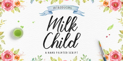 Milk Child is an organic, energetic, dynamic and modern handwriting script that can be used for various purposes, such as with titles, correspondence, wedding invitations, letterheads, signage, labels, signature newsletters, logos, posters, badges, and more.
 - Merriment JNL by Jeff Levine,
$29.00 Within the pages of the 10th edition of the Speedball Lettering Book (1927) is an alphabet called “Vanitie”. This had been redrawn digitally as Merriment JNL, and is available in both regular and oblique versions.
 - Granding Script by Romie Creative,
$13.00 Granding Script is a very easy to read Script typeface, a beautiful, classy and elegant typeface. Can be used for various purposes such as logos, wedding invitations, t-shirts, letterhead, signage, news, posters, badges etc.
 - Kyboshed - 100% free

- Larks Tongues by Hanoded,
$15.00 Larks' Tongues in Aspic is the fifth studio album (released in 1973) by the English progressive rock group King Crimson. I have always liked this name, as it reminded me of old stories in which witches threw all kinds of weird ingredients (larks’ tongues, bat wings and petrified dragon dung) into a big cauldron. When I created this font, it looked like the writing in an old book of spells, so I just had to call it Larks’ Tongues. Larks’ Tongues is a very lively headline font which would look good on (children’s) book covers, posters and product packaging. So, if you are about to write a book about witches, want to throw a halloween party or want to market your Larks’ Tongues in Aspic, then by all means, use this font! Comes with a magical amount of diacritics.
 - Brooklyner by Hanoded,
$15.00 Brooklyner font is based on the typeface used for The Brooklynite, a magazine which saw its heyday in the 1920's. The typeface before you is an all caps affair, making it a perfect choice for headlines, posters and ads. Since I had to work with just a handful of glyphs (11 to be precise), it took me a while to design the rest. Brooklyner font is loose, cartoonesque and very legible - and it comes with extensive language support.
 - All Smiles by Ingrimayne Type,
$14.95 AllSmiles is a sunny little face in which all the letters smile at you. It can be used in notes and cards of congratulation or in celebrating good-news announcements. In the update of 2011, emoticons were added in the appropriate unicode slots (unicode 1F601 to 1F640 slots). For the sad version, see BringInTheFrowns, and if you only want to proclaim a little joyfulness, you can temper the feelings with a plain version of the typeface, FebDrei.
 - Abdo Misr by Abdo Fonts,
$29.50 Abdo Misr is a geometrical style. This is an OpenType Font supporting Arabic, Persian, Urdu, abd English to and compatible with the various operation systems and modern software. The combination of modern Kufi and Geometrical styles and varying between straight and curved parts made it a beautiful typeface appropriate to the titles and slogans, and able to meet the desire of the user in the design of ads and modern designs of various types of audio and visual.
 - Marborn by OCSstudio,
$14.00 Marborn Bold Script Typeface modern suitable for your design needs. This font is suitable for designs such as logo designs, t-shirts, branding, social media posts, thumbnails, mugs, tupperware, tote bags, and various other design purposes.
 - Control spirit by Sulthan Studio,
$12.00 Introducing Control spirit - Bold typeface handwritten font It is suitable for all types of work that you do with various purposes such as logos, wedding invitations, titles, t-shirts, letterheads , signboards, labels, news, posters, badges, etc.
 - Gemstone JNL by Jeff Levine,
$29.00 A late-19th Century song book entitled "Gems of Scotland - A Beautiful Collection of Scottish Songs" had the words "Gems of Scotland" hand lettered in an ornate, condensed type style now reproduced digitally as Gemstone JNL.
 - VNI-Thufap3 - Unknown license

- Fresh Hansler by Struggle Studio,
$11.00 Fresh Hansler contains a script style, a capitals style as well as a set of extras. They are made with brushes and so they look modern, organic, dynamic, and energetic. This family can be used for various purposes such as titles, signatures, logos, correspondence, wedding invitations, letterhead, signage, labels, bulletins, posters, badges, and more.
 - DejaVu Sans Condensed - Unknown license

- DejaVu Sans - Unknown license

- Plantin by Monotype,
$29.99 Plantin is a Renaissance Roman as seen through a late–industrial-revolution paradigm. Its forms aim to celebrate fine sixteenth century book typography with the requirements of mechanized typesetting and mass production in mind. How did this anomalous design come about? In 1912 Frank Hinman Pierpont of English Monotype visited the Plantin-Moretus Museum in Antwerp, returning home with “knowledge, hundreds of photographs, and a stack of antique typeset specimens including a few examples of Robert Granjon’s.” Together with Fritz Stelzer of the Monotype Drawing Office, Pierpont took one of these overinked proofs taken from worn type to use as the basis of a new text face for machine composition. Body text set in Plantin produces a dark, rich texture that’s suited to editorial and book work, though it also performs its tasks on screen with ease. Its historical roots lend the message it sets a sense of gravity and authenticity. The family covers four text weights complete with italics, with four condensed headline styles and a caps-only titling cut. Plantin font field guide including best practices, font pairings and alternatives.
 - Thrasher Head by IKIIKOWRK,
$17.00 Proudly Present Thrasher Head - Raw Type, created by ikiiko Thrasher Head is distinctive handwriting and encapsulates the essence of street style. It gives every design project an urban vibe with its rugged and raw characteristics. This font is the perfect choice for people looking for a strong and influential typeface inspired by the rebellious spirit of street culture and graffiti. This font is designed to be versatile, making it suitable for a wide range of creative projects. Whether you're working on a skateboard deck design, streetwear stuff, or a poster for an underground event, this font will infuse your work with an urban attitude and a raw, handcrafted feel. The uppercase characters in Thrasher Head are bold and impactful, while the lowercase letters exhibit a slightly more refined style, providing a balanced mix of legibility and street-inspired aesthetics. This typeface is perfect for a poster event, movie title, streetwear stuff, magazine layout, fashion brand, quotes, or simply as a stylish text overlay to any background image. What's Included? Uppercase & Lowercase Numbers & Punctuation Bonus: Swashes & Ligature Multilingual Support Works on PC & Mac
 - Bonedigger by Hanoded,
$15.00 For some reason I had Paul Simon’s song ‘You Can Call Me All’ in my head when I was busy working on this font, so I just had to call it Bonedigger. Bonedigger does not dig bones, but it does have ‘heavy bones’, as it is quite big. Bonedigger is seriously eroded and would look great on book covers and product packaging. It comes in a lovely regular and italic style and a seriously twisted inline style (with, of course, its own italic). As the song goes: With a knick-knack paddywhack, give the dog a bone, this old font came rolling home.
 - Negroni by Letrizmo,
$18.00What font to choose when it comes to malevolent, wry or downright bad seeded phrases? Negroni can show a nervous, chaotic facade ideal for those rancorous posters, flyers or anonymous messages. Subtly irregular contours and a slight, almost imperceptible difference in the weight of each letter make up Negroni's shy, embittered essence. - Tourist by Solotype,
$19.95MacKeller, Smiths and Jordan had a font called Giraffe Wide which we liked, but like many Victorian display fonts it had no lowercase. We fixed that! - Wonky Kitten by The Arborie,
$11.00 Here we have a loopy and whimsical font called Wonky Kitten. Its crazy and unstructured form gives this font a mad personality while maintaining an air of innocence. It's perfect to use in book titles, children's and teen branding, as well as type for a poster or canvas.
 - Eveningnews by Wiescher Design,
$39.50 Since many years I live in Munich and read the daily newspaper Abendzeitung. One morning they had redesigned the paper, using Eric Gill's Joanna for the body copy and a tweaked version of Franklin Gothic for the headlines. Since both typefaces are my all-time favorites, I was very pleased. The old hand-lettered title lettering designed by in-house designer Ernst Friedrich Adler around 1947 or 48 was untouched as it always was. Adler had worked for the newspaper an incredible 47 years! Ernst Friedrich Adler celebrated his 100th birthday in the summer of 2007 looking very healthy. But someone had adapted his title lettering for use in the chapter headings, and I did not like the way that was done. Every morning I saw those letters and thought "one day I have to clean that up". About 15 years later I finally did it! Being at it, I designed the whole typeface and added a second fancy cut. And, what do you know, the people at the Abendzeitung called me up and said they liked what I did and started using it. So since that day in 2005 I can read my morning paper without having to wonder about the chapter headings. Well maybe one day they will do another redesign and maybe they will use another one of my fonts. Your editorial typeface designer, Gert
 - Bodoni Classic Initials by Wiescher Design,
$55.00 I became interested in designing Bodoni Classic because of a lazy graphic designer at Jacques Damase publishing house. He had to change a single letter on a bookcover about J. B. BODONI. The French call him Jean Baptiste instead of Giambattista! And that unknown graphic designer just took any old “J” from some newly cut Bodoni. All the new Bodoni cuts have square serifs, whereas the originals had rounded serifs and slightly concave feet. The single letter “J” with the squared off serif was for me like a road sign to start redesigning the entire Bodoni family. That’s exactly what I started in 1993 and a dozen years later I am finished. Okay, I am still adding new Bodoni Classics, but those are my personal additions. Yours very retro, Gert Wiescher
 - Bodoni Classic Chancery by Wiescher Design,
$55.00 I became interested in designing Bodoni Classic because of a lazy graphic designer at Jacques Damase publishing house. He had to change a single letter on a bookcover about J. B. BODONI. The French call him Jean Baptiste instead of Giambattista! And that unknown graphic designer just took any old “J” from some newly cut Bodoni. All the new Bodoni cuts have square serifs, whereas the originals had rounded serifs and slightly concave feet. The single letter “J” with the squared off serif was for me like a road sign to start redesigning the entire Bodoni family. That’s exactly what I started in 1993 and a dozen years later I am finished. Okay, I am still adding new Bodoni Classics, but those are my personal additions. Yours very retro, Gert Wiescher
 - Bodoni Classic Text by Wiescher Design,
$55.00 I became interested in designing Bodoni Classic because of a lazy graphic designer at Jacques Damase publishing house. He had to change a single letter on a bookcover about J. B. BODONI. The French call him Jean Baptiste instead of Giambattista! And that unknown graphic designer just took any old “J” from some newly cut Bodoni. All the new Bodoni cuts have square serifs, whereas the originals had rounded serifs and slightly concave feet. The single letter “J” with the squared off serif was for me like a road sign to start redesigning the entire Bodoni family. That’s exactly what I started in 1993 and a dozen years later I am finished. Okay, I am still adding new Bodoni Classics, but those are my personal additions. Yours very retro, Gert Wiescher


