10,000 search results
(0.045 seconds)
- Metrisch by Gumpita Rahayu,
$18.00 Metrisch is new sans serif typefamily of seven weights plus seven italics uprights in each weights. The typefaces designed based on traditional geometric construction that have been built with letter size wider, the x-heights taller and short descender that almost proportioned with the basic letter shape. With little details added like clean vertical cuts on the terminals and optimized sharp corners that makes this fonts smooth and refined looks. It was represents the flavor of the most common humanist typefaces style and grotesk feels. The weights comes from extra light to extra bold suitable to make display appearance, and the book and medium weights also works well as small/medium text sizes to accompany your design, such as editorial fashion magazine, solid headline, websites heading, poster, advertising, logo, signage, etc Also, Metrisch type-family fully loaded with OpenType features such as some stylistic alternates, case-sensitive forms, fractions, small capitals,and another most common numerals features such as super & subscript, tabular & oldstyle figures, numerator-denominator, and has more extended latin diacritics characters.
 - Pacific Clipper SG by Spiece Graphics,
$39.00 Pacific Clipper has its roots in an old 1930s showcard lettering style. An extra bold version of this sign painter’s relic is shown in Carl Holmes' wonderful book on lettering. It may be described as what happens when Rudolf Koch's Kabel Heavy meets ATF's Novel Gothic. Also known as Sam’s Tune, Pacific Clipper’s noteworthy features include wedged crossbars in the capital A, E, F, and H. Overcurving is present in the capital B, D, P, and R while vertical strokes in the lowercase b, d, h, k, l, and t are chopped off obliquely. Figures in Pacific Clipper are also refreshingly different, particularly the number 4. This lettering favorite turned retro typeface has been extended to include a variety of weights. Pacific Clipper is now available in the OpenType format. Some new characters have been added to this OpenType version as Stylistic Alternates and Historical Forms. These advanced features work in current versions of Adobe Creative Suite InDesign, Creative Suite Illustrator, and Quark XPress. Check for OpenType advanced feature support in other applications as it gradually becomes available with upgrades.
 - Mi Casa by FontMesa,
$25.00 Mi Casa is a new condensed version of our Home Style font which is a revival of an old 1800's classic ornate French font. This new 2021 condensed version takes this old classic to an all new level by adding small caps, italics and a new black version. Mi Casa is perfect for headlines and logos from advertising to product labels, t-shirt lettering and restaurant menus. Fill fonts are also part of this family, new to this font style is the half fill font for creating a two color effect on the letters, you'll need an application that works in layers to use the fill fonts in Mi Casa. The regular fill font for Mi Casa isn't meant to be used as a stand alone font so we've created a solid black version with thicker serifs on top and adjusted outlines throughout for a better appearance as a solo font. We hope you enjoy Mi Casa as much as we did making it. Mi Casa is a trademark of FontMesa LLC
 - Le Monde Courrier Std by Typofonderie,
$59.00 A rounded slab in 4 styles In our age, since the arrival of microcomputing, the majority of professional letters have been composed in quality typefaces. Typewriters & the typestyles they used have become antiques. A letter set in Times or Helvetica & printed with a laser printer at 600 dpi or more are of such quality that one can no longer distinguish it with a document produced by offset printing. But letters composed in this way appear overly institutional when a bit of informality is needed. Le Monde Courrier, designed by Jean François Porchez, attempts to re-establish a style halfway between writing and printing. Informal neo-tech style This rounded slab serif returns the informal character of “typewritten” fonts to letters and suit well all bad conditions, from inkjet printed memos to webfonts use. With a unique typographic colour, it integrate itself with the rest of the Le Monde family with effective contrast. The verticals metrics and proportions of Le Monde Courrier are calibrated to match perfectly others Typofonderie families. Bukva:raz 2001 Type Directors Club .44 1998 European Design Awards 1998
 - Mule Cargo by Menagerie Type,
$20.00 The Mule is a very special mix – it has a donkey father and horse mother, and they often inherit the best qualities of both. "The mule is an example of hybrid vigor, Charles Darwin wrote: The mule always appears to me a most surprising animal. That a hybrid should possess more reason, memory, obstinacy, social affection, powers of muscular endurance, and length of life, than either of its parents, seems to indicate that art has here outdone nature." They are typically very strong for their size compared to horses and are able to cope with bad weather better than donkeys. Mules rarely become ill and their behavior is Intelligent and sensitive. In the right home, they can make great companions for other equines, and wonderful pets. However, if they are unhandled or not correctly trained, mules have the potential to be dangerous. The inner shapes of Mule Cargo are almost identical between the Regular and the Heavy weight. This shared genom make them very powerful pair and a useful design tool for display purposes.
 - LT Chickenhawk - Personal use only

- TV Nord by Elsner+Flake,
$39.00The typeface family TV Nord is based on the corporate typeface NDR Sans which was developed by Elsner+Flake for the Norddeutsche Rundfunk (www.ndr.de) between 1999 and 2001. This new design came into being as part of a complete overhaul of the visual image of the NDR. This became necessary because the NDR, founded in 1954, incorporated the stations of the East German states Mecklenburg-Vorpommern (1992) and Brandenburg (1997) after the re-unification of Germany. The Hamburg advertising agency DMCGroup developed a new and unified image for the NDR which is in existence to this day. The typeface TV Nord relates to the design of the Trade Gothic and similar American sans serif typefaces of the early part of the last century. Its development concerns itself as much with good legibility for print, as it does for the reproduction on TV screens, which among others, is achieved through its high x-height. The logotype for the NDR as well was developed from the capitals of the NDR Sans. In 2014, the TV Nord was revised stylistically and expanded to incorporate all European-Latin languages. As part of this effort, further complementary cuts were added. - Vellvé by ITC,
$29.99For over 30 years, Tomás Vellvé created beautiful graphics and distinctive typefaces in his native homeland of Spain. First drawn as a phototype display design in 1971, Vellvé’s only typeface in digital form is an uncommon solution to the problem of creating a new sans serif design. The end result, which bears his name, is a design that stands out from the crowd of other sans serif typefaces. The phototype version was only available in a single, light weight. With the release of the digital fonts, however, three additional weights as well as a companion italic for the light weight were created.The typeface designs were originally drawn for Agfa Monotype (now Monotype Imaging) in 1996 as part of the company’s “Creative Alliance” initiative. Through an exclusive licensing arrangement, the Vellvé™ family has now been added to the ITC Typeface Library.ITC Vellvé is a wide design with strong calligraphic overtones. This is no “anonymous” design like so many modern sans. Letters like the `R, `e and `s clearly show the hand of Tomás Vellvé in the design process. Vellvé provides a fresh choice between geometric sans serifs such as Helvetica® and industrial sans serifs like Futura®. - Lyra by Canada Type,
$39.95 Lyra is an Italian Renaissance script that might have developed if metal type had not broken the evolution of broad pen calligraphy. It lies in the area between the humanist bookhand and the chancery cursive, combining the fullness and articulation of the Roman letters with a moderate italic slant and condensation. A steep pen-angle allows use of a broader pen relative to the x-height, giving the letters more contrast with light verticals and heavy curves. Lyra embodies the Renaissance spirit of refining technical advances of the late middle ages with reintroduction of ancient classical principles. Based on the moving penstroke with constantly changing pen-angle, it brings the vitality of handwriting to the ordered legibility of type. Lyra is a formal italic, too slow for copying books. By eliminating the element of speed, digital technology opens up a new level of calligraphy, bringing it into the sphere of typography as would naturally have happened if metalworkers had not controlled the process. If classical Western traditions are respected, digital calligraphy has the potential to recapture the work of the past and restart its stalled evolution. There is of course no substitute for the charm of actual writing, with each letter made for its space; but the tradeoff is for the formal harmony of classical calligraphy as every curve resonates in tune with every other. This three-weight font family marks Philip Bouwsma's much-requested return from a three year hiatus. It also reminds us of his solid vision in regards to how calligraphy, typography and technology can interact to produce digital beauty and vesatility. Each of the three Lyra fonts contains almost three character sets in a single file. Aside from the usual wealth of alternates normally built into Bouwsma's work, Lyra offers two unique features for the user who appreciates the availability of handy solutions to subtle design space issues: At least three (and as many as six) length variations on ascending and descending forms, and 65 snap-on swashes which can be attached to either end of the majuscules or minuscules. The series also offers 24 dividers and ornaments built into each weight, and a stand-alone font containing 90 stars/snowflakes/flowers, symmetric contstructs for building frames or separators, masking, watermarking, or just good old psychedelia.
 - Lemonilla by Asd Studio,
$10.00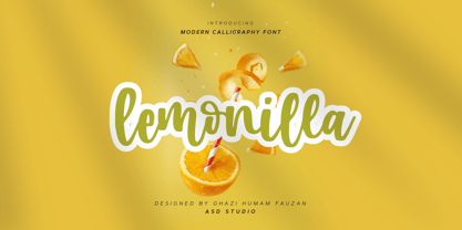 Introducing Lemonilla by Asd Studio Lemonilla is a calligraphy font. Whatever the topic, this font will be a wonderful asset to your font library, as it has the potential to enhance any creation. What's Included? :: Uppercase & Lowercase :: Numbers & Punctuation :: Multilingual Support Enjoy our font, thank you.
 - Sign Stickers JNL by Jeff Levine,
$29.00 In the early 1960s, the Duro Decal Company of Chicago, Illinois added to its line of water-applied decal lettering a retail sign cabinet of die-cut, pressure sensitive vinyl letters and numbers. Four of the six sizes offered for sale were cut from white plastic with a black outline and a secondary gold inline for a tri-color effect. Sign Stickers JNL emulates as closely as possible the look of these nostalgic pieces, complete with the slight shifts in line weight due to hand-cut silk screens and the printing process. For those of you who prefer to make your own multi-colored letters, a three piece fill font set is available for the low price of a single font purchase. Combine the backfill, midfill and frontfill layers for a truly retro look!
 - Bernhard Brushscript SG by Spiece Graphics,
$39.00 This extremely heavy informal script was created in the early 1920s by Lucian Bernhard. Like so many of his designs, this typeface has its roots in his earlier poster work. Bernhard Brushscript invokes a rather warm, pleasant feeling despite a number of quirky characters. Originally created for the Bauer Foundry of Frankfurt, Germany, the face looks as though it’s been drawn with a brush and contains looping ascenders and descenders. Perfect for situations where a quaint and casual lettering effect is desired. The Bernhard Brushscript is also available in the OpenType Std format. Some new characters have been added to this OpenType version. Advanced features currently work in Adobe Creative Suite InDesign, Creative Suite Illustrator, and Quark XPress 7. Check for OpenType advanced feature support in other applications as it gradually becomes available with upgrades.
 - Emainell Script by Josstype,
$12.00 Emainell Script is a handwritten typeface with classic roots, a beautiful formal script with an elegant touch. It works perfectly in the world of weddings, logos, greeting cards, branding, print ads, quotes, signage, magazines etc. Emainell Script features 466+ glyphs and 278 alternate characters. including initial and terminal letters, alternates, swashes, ligatures and multiple language support. To enable the OpenType Stylistic alternates, you need a program that supports OpenType features such as Adobe Illustrator CS, Adobe Indesign & CorelDraw X6-X7, Microsoft Word 2010 or later versions. There are additional ways to access alternates/swashes, using Character Map (Windows), Nexus Font (Windows), Font Book (Mac) or a software program such as PopChar (for Windows and Mac). Thank you for your purchase! and please let me know if you have any questions.via email: joelpopon@gmail.com
 - Le Havre Width by insigne,
$- Le Havre Width is the loveable putty of fonts. Stretch it. Squish it. Squeeze it. Whichever way you play with it, you’re bound to find hours of fun ahead. This avant-garde typeface family has six distinct weights--each one including a set of four different widths. It’s randomized rhythm also includes selectable glyphs for customization, enabling you to bounce plenty of ideas around for diverse logotypes as well as for specific looks focused on a single width. Looking for even more fun with this geometric sans? Try adding in some of the alternate ligatures, or use the two different art deco styles included with the font. The all-around whimsical nature of Le Havre Width is perfect for toys, posters, T-shirts, cards, and anywhere else where fun is the name of the game.
 - Glaciar by TripleHely,
$16.00 Glaciar is a script typeface based on brush handwriting and inspired by old-style bas-reliefs. All contours were carefully cleaned of brush roughness, but at the same time, minor imperfections were left to create the unique character of this font Glaciar has a built-in auto replacement for lowercase letters without connecting strokes (in the case of word ends) and for ligatures (in the case of letter pairs that do not fit well together). In addition, there are alternates glyphs with starting and ending swashes - the last ones can be used with any OpenType software. And finally, the font has wide multilingual support and can be used in texts in 195 languages Glaciar is a good choice for branding and design projects as well as a cute text overlay to any background image
 - Bonna by Eurotypo,
$28.00 Bonna and Bonna Bold is a casual calligraphy family Font with an original textured appearance that will allow you to create an effect even more authentic. It’s an exclusively Open Type release with 815 glyphs, 93 ornaments to combine with letters and decorate your text. There are plenty of options to create something unique and special with lots of possibility an infinity of combinations: standard and discretionary ligatures, several swashes and stylistics alternates for each letter, catchwords, tails that can be added to the beginning or end of each letter, and much more. These ravishing fonts have already an extended character set to support Central and Eastern as well as Western European languages. Bonna was designed to help your projects look more creative, wonderful and fascinating! Have fun with it!
 - Circe by ParaType,
$50.00 Circe™ is a geometric sans-serif with some humanist qualities. It consists of seven weights from Thin to Extra Bold in both Normal and Italic styles. Circe, like the Greek goddess it is named after, is capable of metamorphosis. While being clean and simple in its basic form, Circe can become intricate and fancy with its numerous decorative glyph variations. The extensive character set provides support for almost all European languages based on Latin and Cyrillic scripts. Abundant alternates and swash variants organized in stylistic sets inspire creative design options. Circe is good for small point size paragraphs as well as for headlines and posters. The typeface was designed by Alexandra Korolkova and released by Paratype in 2011. The Italic styles were added in 2018 by Alexandra Korolkova and Maria Kharlamova (Selezeneva).
 - Beitris by Kodhibanks,
$15.00 Beitris is a beautiful and elegant script font. Perfect for designing branding, blog logo, website logo, print ads, book covers, film covers, apparel, cards, logos, posters, etc. Beitris typeface gives you more alternatives in designing.
 - HU Ketchup KR by Heummdesign,
$25.00 In HU Ketchup KR, the consonant and vowel strokes are naturally connected to add writing power to the thick headline, and the vowels are shaped like 'ㅅ', adding personality and cuteness at the same time.
 - Ruby by SparkyType,
$25.00Ruby is a poster font with proud geometry and rounded terminals. With its roots in skateboard graphics it is young, fresh, strong and confident. Ruby comes with two complimentary styles for adding that precious sparkle. - Julmeme-Kun by Julmeme,
$25.00 Julmeme-Kun is a fully italic font. This unique characteristic added to its tall and elegant proportions makes it a very dynamic typeface. Applicable for any type of graphic design, especially for posters and logotypes.
 - Squint by Hanoded,
$15.00 Squint is a unique typeface, created with just 2 basic forms: a rectangle and a line. Squint is ideal for use in (futuristic) posters, designs and ads. It comes with old fashioned extensive language support.
 - Prankster JNL by Jeff Levine,
$29.00 Prankster JNL gets its inspiration from a casual typeface popularly used in print ads of the 1950s and 1960s. Its friendly, unstructured approach to titles made the style an all-purpose workhorse of the era.
 - Turnier by RMU,
$35.00 G. G. Lange’s expressive italic ‘Derby’ with its calligraphic touch has come to life again. Carefully redrawn and extended for multilingual usage, ‘Turnier’ is an ideal font for ads, posters, book titles and much more.
 - Text Book by ParaType,
$30.00 Designed at Polygraphmash in 1958 by Elena Tsaregorodtseva; Latin characters and italic were added in 1987 by Emma Zakharova. An early sans serif ('Grotesque'), it was developed for primers and the first level school textbooks.
 - Peperoncino Vintage by Resistenza,
$29.00 Peperoncino is a sans serif font. Designed first with a marker, the irregular strokes create a fresh handmade feeling. After the big success of Peperoncino Family, we create its vintage version adding some "rusted" elements.
 - Teksi by AdultHumanMale,
$10.00 Teksi Teksi I saw you everywhere, I just had to have you. Teksi is a marker felt style font, I’ve seen various hand drawn styles of this typeface or something similar on taxis and vans all over the island of Penang.This hand drawn style is slowly being replaced with boring Arials and other Serif printed fonts, so I wanted to capture the charm of the original. A heavily weighted font which could work for comic styles and headlines. I hope you like it.
 - Hartsinger by Maulana Creative,
$12.00 Hartsinger is a fancy handwritten font. With cartoon vibes or notes on the book scratch, had a fun character with a bit of ligatures and fun swashes. To give you an extra creative work. Hartsinger font support multilingual more than 100+ language. This font is good for logo design, Social media, Movie Titles, Books Titles, a short text even a long text letter and good for your secondary text font with sans or serif. Make a stunning work with Hartsinger font. Cheers, MaulanaCreative
 - Maryland JNL by Jeff Levine,
$29.00 The 1913 sheet music for "There's A Girl in the Heart of Maryland (with a Heart That Belongs to Me)" may have had no shortage of words in the title - fifteen to be exact, but it also offered some nice hand lettering in the Art Nouveau style. Maryland JNL is a condensed typeface with an unusual twist. The "S" and "G" both have spurs on them, which is reminiscent of the preceding Victorian period and the popular spurred Tuscan alphabets of the time.
 - Jean Paul Fraktur by RMU,
$25.00A typographic treasure, originated at the end of the 18th and the beginning of the 19th century, had been brought back to life. With its charming touch it makes a wonderful font for poems, bookcovers, reprints and other historically relevant projects. To get access to all ligatures, it is recommended to activate both Standard and Discretionary Ligatures; the round s you find on the # key, and typing the combination N-o-period and activating the OT feature Ordinals gets you the numero sign. - Dharma Gothic P by Dharma Type,
$19.99 Dharma Gothic P font family is designed based on Dharma Gothic and a distressed offshoot from the original. The glyphs that damaged by printing the original had been tweaked by hand work with great care. This family contains basic Roman, Italic, Bold and it’s Italic to suit a wide range of creative works. g, r & y have their alternative glyphs that can be used with OpenType salt feature. This font will be one of the most powerful solutions for printing and web.
 - Ishtar by Hanoded,
$15.00 Ishtar was the Babylonian goddess of war, fertility, love and sex - all in all a lethal combination. She wasn't the sweetheart her lovers had hoped for; I guess the 'war' part in her resume is a dead give-away. Ishtar font is no sweetheart either: it doesn't have a real baseline and its spooky character might not be everyone's cup of tea. It does have a certain charm, however, and befitting a Babylonian goddess, it comes with Babylonian language support!
 - Paisleigh by Reyrey Blue Std,
$14.00 Paisleigh is a delicate, elegant and flowing handwritten font. It has a beauty feel that will turn any crafting idea into a true standout. 'Paisleighis' perfectly suited to logos, branding projects, homeware designs, product packaging, mugs, quotes, posters, shopping bags, t-shirts, book covers, name card, invitation cards, greeting cards, label, photography, watermark, special events, and all your other lovely projects that need a beautiful script taste. Features : · All Uppercase and Lowercase · Number & Symbol · Supported Languages · Alternates and Ligatures · PUA Encoded
 - Morexbomb by WingBuk Studio,
$27.00 Morexbomb is an exclusive piece made with a touch of cold darkness, featuring a heavy and death metal feel to compliment your design. Morexbomb is very easy to use in any variation or writing combination with extra custom bracket, also perfect for metal band logos, merchandise, clothing, apparel, or anything else that calls for a metal feel. Here is tutorial how to use it : https://youtu.be/Qi5tgAc2MMw Recomended Software to use : Corel Draw Adobe Photoshop Adobe Illustrator Clip Studio Paint
 - Rising Sun by Proportional Lime,
$25.95 This typeface was inspired by Gering and Remboldt's work during the late 1490s. Their printing concern, the Soleil d'or in Paris, was one of the printing business to engage in the use of blackletter printing, when the rest of the Parisian printers where using humanist influenced roman typefaces. This peculiar backwards trend was really one of the original examples of "retro", taking advantage of the desires of the more conservative northern Europe that had not yet embraced the newer roman types.
 - Apparel JNL by Jeff Levine,
$29.00 An image spotted online showed a rendering of a ladies’ fashions storefront that had appeared in the Libbey-Owens-Ford Glass Company’s 1939 brochure. The signage consisted of the hand lettered word ‘Apparel’, and was done in a variant of the Art Deco stencil style of lettering that’s most recognizable in Futura Black. From these few sign letters came the inspiration for a digital font of the same name, Apparel JNL – which is available in both regular and oblique versions.
 - Brownless by Zamjump,
$17.00 Introducing Brownless! This is a modern script font with a texture brush ink style. Recommended for those of you who want to create some designs with textures in font styles. This font will work for invitation designs, logos, badge designs, posters, packaging, book cover titles, quotes, social media posts, etc. Just go to your Opentype feature when using script fonts to use ligatures and swashes. Additionally, this font includes alternatives for upper and lower case characteristics. Included : - Ligature - Lowercase Alternate - Swash - Multilingual
 - Kaapeli by Suomi,
$20.00 I've had mixed feelings about Kabel; It is a brilliant headline font with a lot of character, but it's the characters I have problems with. The versions of all big foundries have the same flaws (in my opinion), especially lowecase a and s. So I finally went ahead and made an all new version. It is not Kabel, but very much like it. It has unique x-height, weight and width, and many individual characters are also different from the original.
 - Blitz by Wiescher Design,
$20.00 A very glitzy Blitz! I always wanted to design a typeface that was top heavy, but I never knew how not to make it look like Antique Olive, until recently -- I had an idea. My new family is very readable despite it beeing top heavy, thin on the low end and thick on the upper end. The font gets a special shine because of this effect. And it stays readable despite its special design. Your designer of surprising typefaces, Gert Wiescher
 - Codeplay by Gie Studio,
$11.00 Are you looking for handwritten originals with fun characters? Yes, you will find it right here. Codeplay is a original handwritten font. It is suitable for svg designs, pottery, shirts, hats, tote bags, wall art, interior prints, and get creative with its childlike playfulness. Codeplay includes Multilingual Options to make your branding globally acceptable. Features: Funny Ligatures Swash collection Multilingual Support 83 country PUA Encoded Numerals and Punctuation Thank you for your visit and downloading premium fonts from Gie Studio Designers: Gie Studio
